Reprinted card sets are a hotbed of art analysis for me.
I honestly enjoy reviewing them more than full expansion sets. The core sets would give me glimpses into not only what choices were made but also why they were made. Since there isn’t deeper story implications other than one preview card that Snacktime covered, I’m going to take a moment to talk about the Magic Invitational cards. Stick with me, it’s a lot of text and not much art, which you know is hard for me too.
Invitational Cards - Same ol’ Song
I don’t like the idea of cards with likenesses of players on them. That is my bias having made them years ago for another TCG. The lighting reference is always off, artists struggle to make the face close enough, and the player always wants to design the card more than intended. It needs to be clear and not ham-fisted, yet integrating is surprisingly difficult.
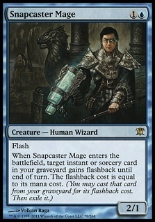
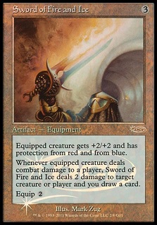
I understand why Snapcaster Mage got new art, but it not being Tiago Chan is disappointing to some players and fans. I get that, but we knew this was coming. The card is too valuable to not reprint, and with history to look back upon, we know not a single invitational card has kept the same art, nor has any likeness of the player or reference been kept in a new version. This isn’t new — yet here we are again with the same cyclical reaction from the community.
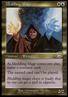
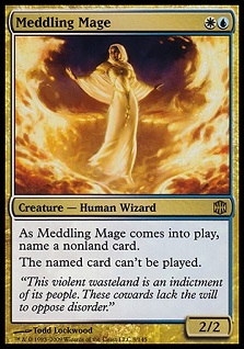
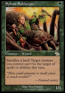
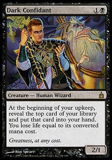
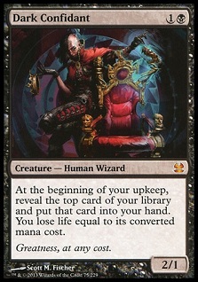
People were up in arms when Meddling Mage became a black woman instead of Chris Pikula. When Jens Thoren and Bob Maher were removed from Solemn Simulacrum and Dark Confidant, there were similar outcries. No one seemed to care about Sylvan Safekeeper no longer being Olle Råde.
 |
 |
 |
 |
Finkel himself wrote the Shadowmage Infiltrator preview card article, handing off the torch, with a nod and wink saying that “this reprint won't be nearly as attractive as the original version.” I feel that was handled well and he took the change with grace, as he knew it was inevitable. To think his card would be exempt is just silly.
Fame has much to do with it and how a pro speaking to ego could find instant, visceral validation from the crowd and the power level of the card. This can be done by passing the torch like Finkel, yet often is a blindside hit, not handled well from a PR perspective. The last invitational was ten years ago. We still had dozens of TCGs back then. We also had the final Weatherlight story in Time Spiral block too.
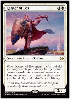
Notice, we aren’t even discussing that Ranger of Eos, another invitational card with new art. It’s not Snapcaster strong, nor is Antoine Ruel, just as he is another Olle, not a Tiago, not a mythic staple card in multiple formats.
 |
 |
Players do not lose heritage or knowledge or history by giving other players more options. Of anything, making new art retains investment value of the original.
Of anything, adding diversity should be a priority for every one of the invitational cards. Since every invitational winner has been a man, making them women or working in more diverse characters should be a serious effort. In reality, by keeping the original invitational card special, you allow other fans to enjoy customization. It is not as if Wizards is burning all copies of the Invitational art. They still exist. If people want white guy Meddling Mage they can have that too.
 |
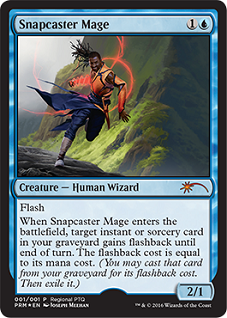 |
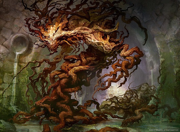
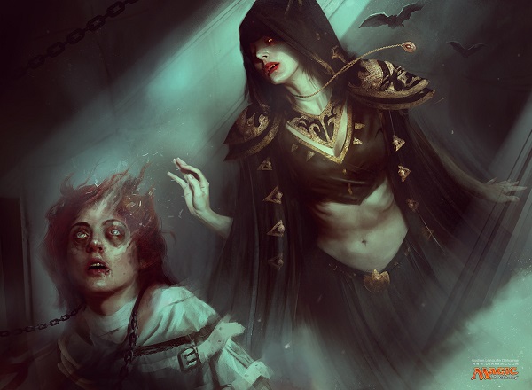
I’d like to think racism isn’t the reason people disliked the promo Snapcaster Mage, but I cannot assume an Asian man into a black man is solely because the “game’s heritage” is being stifled.
https://twitter.com/TeferiOfZhalfir/status/836963107234807808
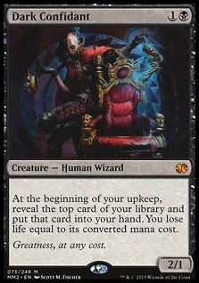
I can’t think that yet it’s hard to dismiss people talking about it. In less than a year, Wizards releases a more default Blue mage who’s white. With Dark Confidant by Scott Fischer being reprinted with the same new art, I call shenanigans as trying to appease fans.
That said, Ryan did a great job with the artwork, giving us a monochromatic artwork lit by blue light. I can appreciate it while still mentioning nuance on both why it’s an issue and how it could potentially be improved. Art works like that, and I have some solutions that could work.
Snapcaster Mage by Ryan Alexander Lee
Three ways to keep the Invitational cards special
1. Make two assumptions and make Wizards listen.
Assume they will be immediately upon reprint, given new art. At the same time, players are to expect if a special promotional version is to come out, an old border foil of the original art will be used. This allows an evergreen version to be made, while keeping the invitational winner’s likeness special and valuable in the original blinged out foil version. Known associate Cary Thomas Barket said it succinctly, “Customization fuels the game, adding new art doesn't subtract old art.” By making new art extra special, it alleviates up in arms players and fans who were on the cards.
We have to keep asking for these, at every moment. Full art, borderless, old frame foil or any other combination of the original is a good usage of a promotional card.
 |
 |
 |
 |
2. Designer credit
Unlike Magic 2015, where designed cards by prominent members of the gaming community were mentioned on cards, only to be erased with reprints, add this credit to all future versions of invitational cards.
It’s a bit of an eyesore, but it keeps the lineage alive on so few cards that it could be used as a memorial. The lack of Magic having a memorial to Chris Rush, whereas Warcraft did, is known.
Additionally, since this will take up more space, eliminate all reminder text. Keep it quiet, keep it clean.
 |
 |
3. New art with nods to the original.
There are a ton of options where the original likeness could still be integrated while printing a new card art. Imagine if we are to see Snapcaster’s son in his workshop, with a painting of his father, Tiago on the wall. It gives incredible fan service with an easter egg that begs for other iterations.
The other option is to repaint the same likeness, except in a different artwork. I’m not a fan, as that wasn’t the deal for winning the invitational. They receive one card, not a suite of them over time. It also creates the potential for PR issues were something to occur. One tax fraud case or a major trial would have news stations posting the card art in addition to a stock photo.
By keeping the same art, you are only eating chocolate ice cream and you will never receive Rocky Road, or Spumoni. We have yet to see the range of options possible and like seeing Koth fighting on New Phyrexia in Phyrexian Arena or Jin-Gitaxias on Serum Visions below, we’re thinking too myopically to just revert to the original depiction.
 |
 |
Let’s get into the other art!
Let’s get into the other art!
Let’s get into the other art!
Serum Visions by Izzy
Ant and I received this card for our preview on Snacktime Cast.
To reiterate the podcast, which is worth a listen, we discussed these things:
- The mainlining of serum to see the future, or game mechanic scry, is a good addition.
- Making any inght into other planes and other planar characters is a delight for both Ant and I. We see that he is indeed still alive.
- As this card is played in modern decks, Grixis Aggro and Infect, having an artwork reflect one of the decks is the fusion of Vorthos and Mel, flavor and depth with rules and mechanics. As the original Serum Visions was a human, the art didn’t fit into the infect deck. Nothing about corruption or compleation is mentioned in the original art.
Being able to revisit with reprinted cards allows story to continue, even if flavor texts across the set and gives updates into planes that are hard to revisit or cannot be revisited, fused with a much needed reprinted card to reflect the deck.
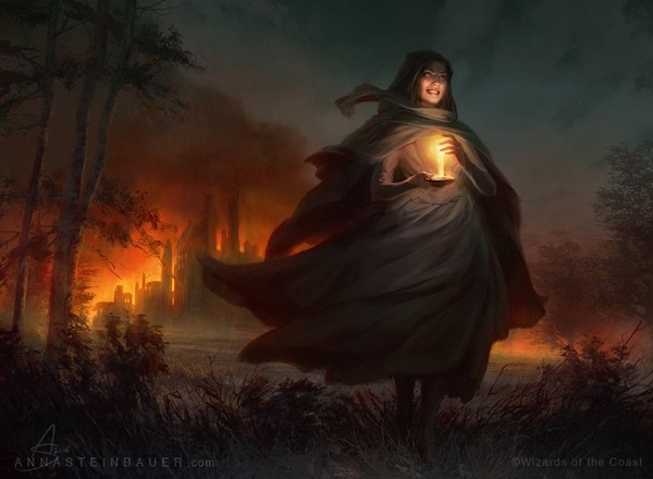
Past in Flames by Anna Steinbauer, digital
This card art, takes the opposite view from Serum Visions and it doesn’t refer to the deck that utilizes it at all.
Anna sure took the prompt literally when a woman’s past is behind her, in flames. As such, it’s just a rather dull art description. It’s a punt, as it were, for really trying to say something, to depict a story or some nuance in background flavor of one of Magic’s planes. Anna did the best she could, incorporating beautiful usages of light both in terms of oranges in fire, and a white/yellow candle. Normally I’d argue for some sort of religious iconography of purity with the candle, but here, it’s the opposite.
This is a simple commission, done by an Austrian who understands playfulness
This is, in essence, the Disaster Girl meme.

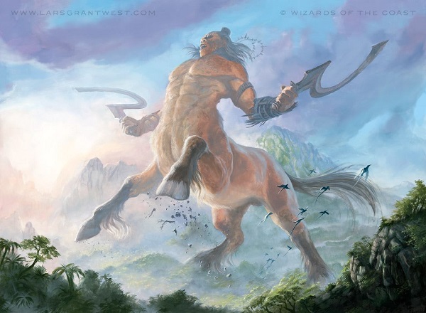
Might of Old Krosa by Lars Grant-West
Lars paints large.
I have seven foot long painting of his Scars of Mirrodin lands.
This is no different in scale. At a whopping 32” across, it’s one of the largest Magic paintings in recent history. As I just mentioned Serum Visions fitting the deck, Lars made his fit the effect of making something gigantic.
Photos copyright of Lars Grant-West, image copyright Wizards of the Coast
I asked Lars for more, to see if we could get insight into the painting itself; and, after zooming in, you can see that +4/+4 creates a 5/5 human, which, while large, isn’t a centaur. This creature doubled in strength, power and uses scale dragons to show hard large it is.
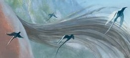 Scale.
Dragons.
Infect players will want this, myself included, and a new improved artwork is unlikely to come soon, if ever.
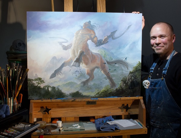
I also had to ask to see it next to Mumpkin ,the adorable french bulldog of his. With an asking price starting at $4000 to prevent him from auctioning it, it’s right in line with Invigorate being sold for $3000 over the summer, except it’s four times larger. If you’re interested in it, send Lars a message on Facebook. He isn’t hard to find.
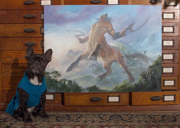
Photos copyright of Lars Grant-West, image copyright Wizards of the Coast
Golgari Germination by Svetlin Velinov, digital
Oh how far from the original concept we have come.
The original Golgari saproling creations always had stone or another hard material locked into them. I have the color concept art, which you can see below.
The moss on the walls have a soft textured approach to them, Nils Hamm feeling, I would say, considering The Magic Man Sam's video on Nils is still fresh in my mind. Unlike Nils, Svetlin has a couple of focal points in the “face” of the saproling with thick brushstrokes of yellow, umber and orange, the dead creature in the midground and a light spot on a pipe in the farthest of vision. Artists are taught to compose in space and this shows that the saproling isn’t numerous. The Golgari Swarm guild of Ravnica needs living materials and dead creature aren’t thrown down the sewer constantly.
It’s a lovely little piece. It will be a great adventure for any fanart to mimic the style of thick brush strokes on roots.
Stony Silence by Mark Poole, 14x20”, oils
I had no idea why there are stones in the foreground at card size. They look out of place and really forced into the central space of focus.
Only when you see the larger art, can you tell that they’re the golem’s hand, totally covered in dirt. While that prompt is confusing and doesn’t read at card size, I can see that they're fingers now, which is nice. Thanks larger art!
The stairs on his neck are a nice touch from the art description but make it appear that Stony Silence was cast a bajillion years ago. You have to forget this thing was alive to make it a playground. Otherwise, if it wakes up quickly, you’re toast. Is that really what the enchantment does? It’s cast once and forgotten? And where is the enchantment? Is it in the sky?

Agent of Masks by Allen Williams
Allen Williams, or LA Williams, understands what shows at card size. Kev Walker understands that too, stripping away unneeded information, for coherent visual cues. The background is just brick and loosely painted to show lines of force and that’s it.
While the masks appear to float on the wall, not making them adhere to a nail or shown lighting changes, Allen forced the image to show as six faces, which are incredibly clear. The design of the masks are very much his signature style of fairy tale, folklore and macabre god fused together. I get what he was trying to do.
When we get to see weathered, older hands on the woman, we’re given a story. She is older, experienced and not new to politics, or a life of a facade. While she looks young, and uses great skin care products, you can never hide age on people’s hands. It’s the best way to tell how old someone is, I’ve found. We now have an ambitious woman with a narrative, a story, in a reprinted set without a story, that could weave her way back into an official Magic story if enough people take note and make her a fan favorite.
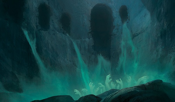
Cavern of Souls by Richard Wright, digital
Yes, we’ve seen green hands before from Izzy and Soul Swallower’s promo card. It’s a bit tropey, sure. I like the updated card. The old, original version, didn’t make much sense in decks. Now, we have some sort of tomb or jail, with souls of the presumed damned are waterfalling into a pool. I’m not sure how souls give me mana, or make a creature I name (a soul?) uncounterable. It’s a fun image rather than conceptual. It’s a scene you can understand, which may not be conceptual enough for the uninitiated.
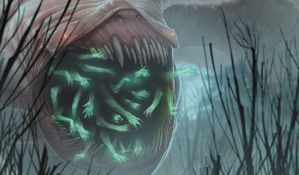
Soul Swallower by Izzy
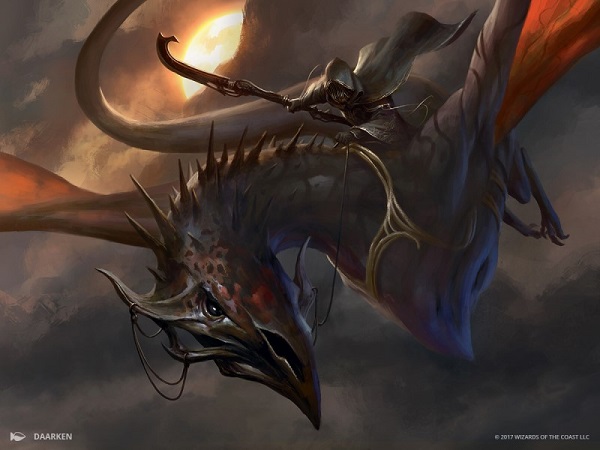
Abyssal Specter by Daarken
Specters and archons are pretty rare these days.
They don’t fit in a ton of design space for a game with all metallic or full storybook worlds. Their adaptability is just lower. Case in point here by Daarken, is a concept that is a Nazgul.
I’ve seen my share of Eowyn and the Nazgul from the 2011 ArtOrder Challenge. I know what they can look like. That challenge had more submissions, from a wider gap of skill, winning more awards than any other submission I have been aware of in the fantasy realm. Titans from Donato Giancola to a young Sidharth Chaturvedi and, brand new to the American scene, Filip Burburan were all part of it. ArtOrder was a side project to help artists improve under former Wizards art director on the Dungeons and Dragons side Jon Schindehette. It predated One Fantastic Week as the seminal content provider for new artists to this field.
Daarken spoke about this piece on his blog, which answers your question on, “Why is there filigree on this beast?”
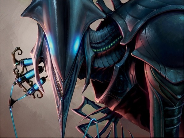
”I actually received the commission for Abyssal Specter in the same email with Arcbound Ravager and the Aether Revolt story illustration. Since I grew up playing Magic, I knew Abyssal Specter was an existing card (I remember it from Ice Age), but I just assumed they were releasing a Kaladesh version for Aether Revolt.
Animals on Kaladesh have filigree incorporated into them, like patterns on their fur or horns that grow in a filigree pattern. I wanted to mix some elements of a bird head with a dragon head and have the reins attached to its horns.”
I figured it was the case, it just looked too coincidental to not be that. Older Coldsnap looking images wouldn’t fit because there is no ice and Daarken wasn’t working for Magic then. He started in Future Sight, when Jeremy Jarvis started art directing alongside Jeremy Cranford at the time.

Terminate by Lucas Graciano
Sun Titan is the new drake.
In Magic, drakes are wyverns, or dragons without front arms. In the 1990s, they were a constant source of inspiration for lightning spells and other effects that affected a creature. Today, we see fewer of them, but we do see Sun Titan having a rough day.
Graciano’s Terminate burns from within, akin to a cigarette or a tube filled with a combustible. We saw the concept earlier from a self-immolating dragon, or immediately skeletonizing a person.
To mark it for the future, this does have a direct after effect from the original Sun Titan-the chest gorget gave that away. If you recall Animate Dead from Premium Deck Series: Graveborn, you’ll see the shoulder pauldron for the same Sun Titan. That image was a random depiction that, while cool, didn’t have a connective thread. They have now finished the three story act.
https://twitter.com/_SEV8/status/836412689903730689
While Howard Lyon had six years and four images to show the progression of Isobel the angel, these unfinished stories are all over Magic’s history. Let’s revisit a few of them soon.
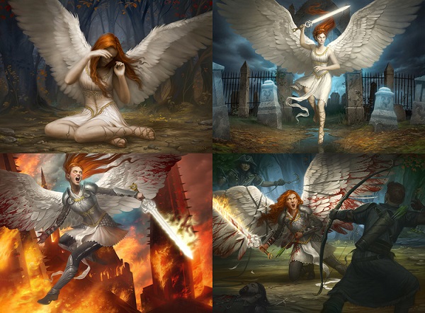
Progression of Isobel the Angel by Howard Lyon
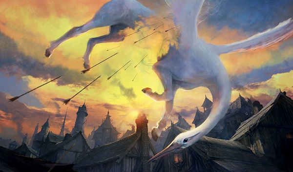
Momentary Blink by Ev Shipard
This isn’t technically a new cardart, but I didn’t cover Blessed vs. Cursed. I’m ok with adding it in here, as I normally do.
This Innistrad heron is a mix of two styles, as it were.
We see a fish-eye lense realism of Innistrad, which is 1800s Prussia, complete with vibrant blues and yellows, only being broken up by chimneys firing and the focus of the artwork — the disappearing heron.
Or is that a heron?
It has hooves?
His head is a swan?
What’s going on here?

Ranger of Eos by Ryan Pancoast
Ryan has confirmed that the shield animal is indeed, a dog.
Ryan had a gumroad episode on this painting for $5. (It’s an art tutorial.)
For 42 minutes, it’s invaluable to a new artist or a group of friends who are in art school together to watch on a projector instead of Mario Kart on a weekend evening.
Ryan often uses a soft purple sky in his pieces. Here, he pulls that palette into the armor, giving us a weathered tarnish instead of adding another color to the soldier for patina, or worse, adding dent marks everywhere. I especially enjoy the breastplate, with the elongation vs. shortening of the plate due to our angel, and the lighting reflecting off the medals attached to his chest. It’s so minor, yet without reference, it can get muddy, busy, and visually incorrect rather quick. Since his arm is also so close, painting and repainting isn’t really an option. He had to have it correct on the first go.
Finally, if you look close, you’ll see waterfalls on “Bant” behind the figure, in the bottom right. Since Alara is now reunited, did the geography change on where mountains are as well? Were streams rerouted? This isn’t as overt as Jin-Gitaxias, though it could be with a tiny amount of effort.
https://www.facebook.com/rpancoast/posts/10102139290252225?pnref=story
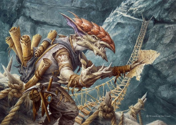
Goblin Guide by Filip Burburan
Yes, yes, the goblin is female, according to the Zendikar art book guide according to the head plating:
https://twitter.com/RealEvilGenius/status/836270018509828098
I also get the feeling that the goblin has a better grasp on where they’re taking us at this point. The original had a goblin looking at a map, lost, as it is evening, and pointing after resting his hand on his head. The Steve Prescott promo doubled down on the confused goblin, though the concept of maps was made much more clear, which has continued into Filip’s new painting. We can see all of Filip’s choices in clear view, the details and all of the trinkets and scrolls are plain to see. He made it to be shown at card size.
You see, the entire piece struggles with the darkest darks and the lightest lights. I don’t love how mid-toned this entire piece is. The light source is indeterminate and readability trumped a better painted composition in terms of light. If you look at the broken trees holding the giant cables of rope, they’re all the same, and muddy. We aren’t supposed to look at them and yet, there is barely a shadow on them or the bridge, making us assume the light is from above yet the painting doesn’t reinforce the staging.
It’s fine.
It’s that paper you got a B on in college that will get the class passed, you just wanted a little bit more out of it.
Molten Rain by Sung Choi
The spires on the edge of the keep are stellar. They aren't even remotely worth building for a fortified fortress and yet, they keep it fantasy for us to look into. It has weight, like the Alara Bant ones, which mimic the boots of their soldiers. This is more angular, sleek. It feels more Dark Elf in Warhammer over a human fortress of Magic.
It’s the second most important feature of this painting, the first being the fireball and explosion of the swamp, the fourth castle created there, of course:
I feel like I’ve seen a painting like this before, it’s a speedpaint with interesting groundwork, yet we can’t see it at card size and the top of the castle is obscured in soot.
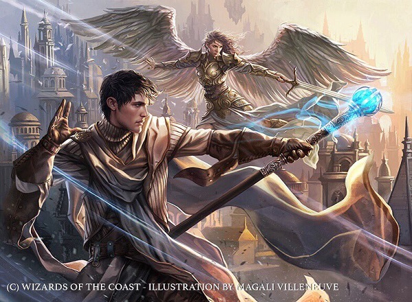
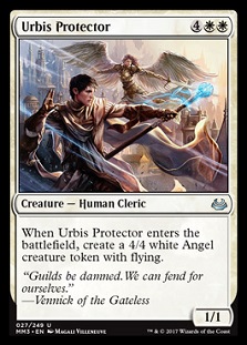
Urbis Protector by Magali Villeneuve
I normally only care for the art, though the flavor text here is important. The human cleric has no guild symbols on him, because he isn’t part of a guild. Without the background cityscape, it’s impossible to place this on Ravnica. This is also likely why the composition is so constructed. They must be standing atop a building, yet, we don’t see an edge or a guardrail or an understanding how we can be looking down on buildings, and at eye level to giant skyscrapers.
 |
 |
I’ll admit, I struggle with Magali. I can’t unsee every image she creates to not be A Game of Thrones or Lord of the Rings LCG. She’s so ingrained in their creation and so frequently utilized that both of those brands and her style are intertwined.
Instead of seeing a technically strong human and angel, seen through the female gaze, I assume one of Tolkien’s elves with skin so perfect and smooth. Her art lacks realism, and like Guillermo Del Toro often states in interviews, without imperfection, art can kick you out of immersion.
It’s not a bad thing for Magic to have Magali. If anything, she follows in contemporaries like Steve Argyle and Chase Stone and many, many players love her style.
Just as one can tell a soldier made by Wayne Reynolds with triangles and points, so too is hyperrealism with Magali.
Recover by Bastien L. Deharme
The hooded figure appears to be a derivative, a riff, on his first rare card, Asylum Visitor. I see what you did there, Bastien. It may not be the same outfit, but I touched base with him and he did laugh and say it was the same model.
He also had a funny anecdote that he uses models all the time, as if it’s nonchalant like everyone does that. Though his other model, Oscar, is a skeleton in his art studio area.
One quick note for everyone — check out the thick brushstrokes of the bones. They’re quick and intentional without much nuance. At card size, they then stick out as bright, simply by not over blending and shadowing them. Bastien put some light effects over them and he’s set.
Asylum Visitor by Bastien Lecouffe-Deharme

Compulsive Research by Sara Winters
In both iterations of this card, the art description is digging through books. The discard a land mechanic, while you could justify a piece of knowledge being discarded as unneeded, doesn’t really work for a mana line. Mana or land enables knowledge, they themselves are not knowledge. As the library or your deck differs from your hand, the mental gymnastic skills ramp up quickly to understand. Doug Beyer explains the library vs. hand difference in Share the Spark:
Your library represents the sum total of all the spells you know, and all the lands you've come in contact with. Think of it as your deep storage, or long-term memory, or your subconscious — they're the spells that you've learned but aren't currently focusing on. They're your magical arsenal, the storehouse of arcane weaponry you might unleash during any given duel.
Your hand, on the other, um, hand, is your conscious mind. It's the magical ideas that you have tossing around in your head presently, the plans you have developing for the next several moments of your duel. It's the sum of magical weapons you have ready and waiting, sheathed in their scabbard of your conscious attention, at your beck and call for whenever they're needed.
So, immediate knowledge of how to channel mana is being lost, short term forgot, as a choice instead of recalling something better. Got it. That’s near impossible to show without someone sticking out their tongue and looking slightly up and to the left. Instead, use the wizard study art trope and it’ll work when the artist shows some magical runes with a confused faceworks. It’s a nice little illustration with a diverse woman seamlessly part of Magic. Other than myself mentioning it, we wouldn’t even look twice. That’s a good thing.
Dimir Signet by Raoul Vitale, Traditional, MTGO original release
The Dimir guild does serve a purpose on Ravnica other than devious secret stealing and blackmail. They work in knowledge and are couriers, investigators, reporters, and archivists.
A side of a building that reveals itself to be part of House Dimir may be gone the next day in a cloud of smoke, which we see above.
I like Raoul’s usage of blue for the MTGO promo, now finally made real in printed cards here. It feels like a neon sign, which would be comical for a Dimir meeting, but perhaps the clouds obscure it and only reveal when someone paswor is said or by proximity it lights up. It’s a simple image that fits the guild and Raoul expertly painted some clouds to lend some mystery to the most mysterious guild.
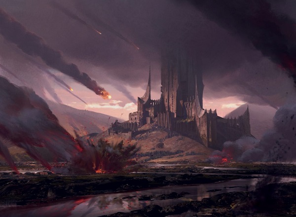
And yes, it does appear to be on Orthanc, the Carved black Tower of Isengard from Lord of the Rings.
Moving on.
Azorius Signet by Raoul Vitale, Traditional, MTGO original release
How strange is it to see the W/U guild, the law and order guild, using green, white and gold that the Selesnya utilize? If you take a couple seconds, you can see the figure, likely a woman, in the shadow on the seal.
It makes me wonder if the Azorius guild helps to make locks on doors, or verbal commands with disabled Ravnica citizens who can’t easily open doors. Instead, they announce themselves, documented of course, and they can walk into a space without effort. I like understanding day to day operations of the guilds. The Dimir, contrary to Tumblr’s belief, actually do have purposes in daily life.
If you’re interested in the original painting to this, it’s now $1500 on the MTG Art Market, being sold by a member there, a fellow admin that work with me on the page.
—
Short one today. Luckily for everyone, it’s allowed a preview article on Egyptian art to come very soon in preparation for Amonkhet. Stay tuned, and in the interim, check out Snack Time with Mike and Ant. We Have had fifty episodes and they’re always under thirty minutes and yes, I talk about art there too.
Let’s talk art soon!
— Mike