There is a staggering amount of Magic art, and often, the newest or cheapest version is bought when players make decks. When you have a limited amount of time to build a deck and get it all sleeved and finally together, you play with that oddly connective white-border/black-border mess with different artworks. But once you’ve been playing for months with a concoction or even a deck “improved” upon by yourself, having a play set of different artworks has to go. They all have to be the same art, and this usually begins with your commons. It’s an ask to a friend—a non-trade saying, “Yeah, okay, whatever,” to get a free $.25, or it’s the laziest bulk-rare trade ever.
Then, you upgrade.
Whether you’re a foil player or a foil-Russian-misprinted-and-altered collector, you change your play sets to fit you. My job today is to shine the light on cards you may know of but that you haven’t sat down and looked closely at—look at different art versions to see a more perfect depiction.
I saw the Grand Prix Singapore Top 8 decks and figured that’s a great place to start—even top-tabled decks could have a very cheap art improvement with a little showcasing.
Let’s upgrade those commons in your decks!
Affinity
Ornithopter is built on the original concept of 1994. I love the Leonardo Da Vinci/Guilermo Del Toro idea of concept sketch page as finished art—sure, don’t we all? There’s just something to Dana’s that makes me want to play it. It’s a refreshing lightness, perhaps, that really makes me feel that I’m attacking for 0. It’s always like a kite, devoid of strength or will. It’s there to be built upon, to be improved, and this art really speaks to the mechanics of the card more the other versions in my mind.
Lars Grant-West made this beautiful promo of Vault Skirge, earning him a nod in Spectrum 19, an annual art book signifying the best in fantastic art, that of Imaginative Realism. I kick myself often for not buying it from him! His robot/imp/insectoid creature is quintessentially Mirrodin, a triumph of taking a singular creature and, by concept alone, you know what plane it’s on.
 |  |


Jund
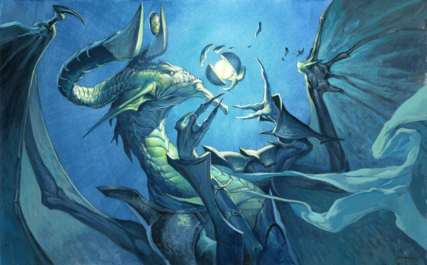
Terminate showcases a pivotal storyline moment of Darigaaz, a dragon hellbent on gathering power. These singular card as set explanations still occur, so choosing this version is an iconic idea. I love the Friday Night Magic promo version, but the original will always be in my decks—unless it’s Vintage Art Constructed with Wayne’s deck, necessitating his version.
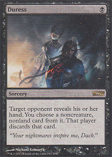
Duress’s art is a promo from the IDW comic-book line. We never were able to see the full Ashiok storyline play out, but the promos are beautiful! Anything I see to flesh out Ashiok is something necessary to jam into decks for me. This card isn’t cheap, but pretty things are often expensive, after all.
 |  |
Abzan Midrange
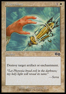
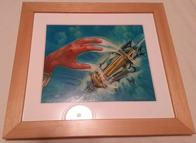
This deck can really only have a common in the sideboard, and I’ve seen a Disenchant in there! I love’s Donato Giancola’s art quite a bit, owning an original or two from him. I also really enjoy any Phyrexian mention in my flavor texts. Brings me back to the 1990s, you know?
Temur Twin
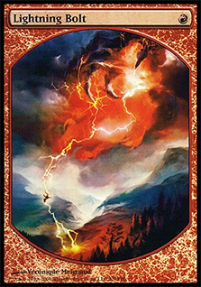
Lightning Bolt has been so iconic for so long that it only has three versions. I hope it gets opened up to more supplemental products. I like Véronique’s version, as a hand (a dragon’s?), but every Kevy Metall out there may differ for now. Perhaps in a few years we’ll see a Ral Zarek version in a promo if he ever gets the spotlight. I hope he does!
4-Color Company
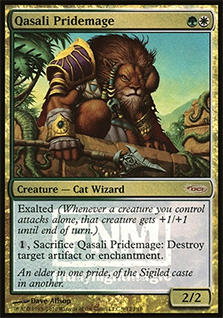
Qasali Pridemage has one promo, and it feels lot more like Naya than the original version. You can clearly see the vines and building materials, and it exudes that Mesoamerican/Aztec sort of feel that Naya was based on. I also see that shoulder brace in purple and gold, being a Minnesota Vikings fair-weather fan. Purple is the regal color, and in medieval Europe, a common person just couldn’t afford or even buy that color. We never see much purple in card arts unless it’s a horizon painted by Chris Rahn.
Negate has been printed a bunch of times in the core set with the same artwork, making you perhaps forget about the textless version with Jace saying “no easy buckets,” countering both your jump shot and a fire-based spell. I think it’s delightful, and it’s really not very expensive.
 |  |

Temur Delver
Gitaxian Probe’s original art brings you, as the viewer, into the horror of Phyrexia. The promo version is what you see if you’re strapped down to a table, waiting to be probed and eviscerated. While one artworks is a logical viewer’s perspective; Trevor’s below is bit more chilling of a representation of Mirrodin’s new normal.
Mana Leak has three versions of its art, and one of them you may not have seen yet. In a vacuum, you wonder why he isn’t in generic fantasy clothing. Well, this was during Kamigawa block, so all the promotional cards fit into that as well. I love textless cards—the allow the art to breathe a lot more. The character is also the same one for Field of Reality! How cool is that?
 | 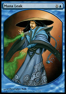 |

Mana Leak by Christopher Rush
Griselbrand/Could Be Banned/Won’t Be Banned Deck
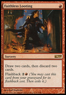
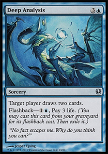
Faithless Looting is exactly the epitome of Planeswalker Dack Fayden, and what better depiction exists than this chump stealing something, only to jettison other stuff in the meantime? Karl dug deep in his painterly style, making these comic depictions also work as cards, reading at 2" × 3" and at 4" × 6" with ease. That’s absurdly difficult, and we don’t even consider it. It’s just natural for him to make it flawless. In addition, Karl jumps back and forth in his paintings with digital or traditional mediums. If you look closely, he uses paintbrush strokes, but it’s becoming more difficult to tell what’s “real” and what isn’t.

And There’s More!
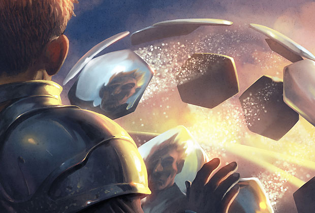
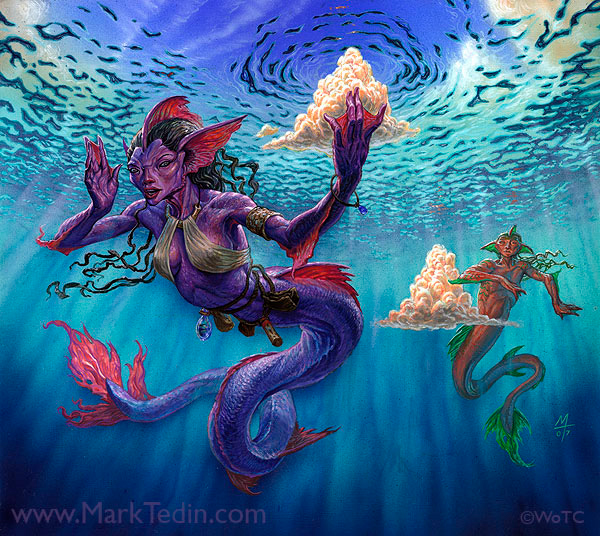
While doing research on commons in decks, I came across these beauties, and while they might have had homes in the past, if you ever build a deck, even at your kitchen table with these mechanics, use these beautiful examples of art. I’ll let them breathe a little just so you can soak them up. Give your eyeballs some candy—that’s how I like to live my life.
 |  |

 |  |

 |  |
 |  |

 |  |
 |  |

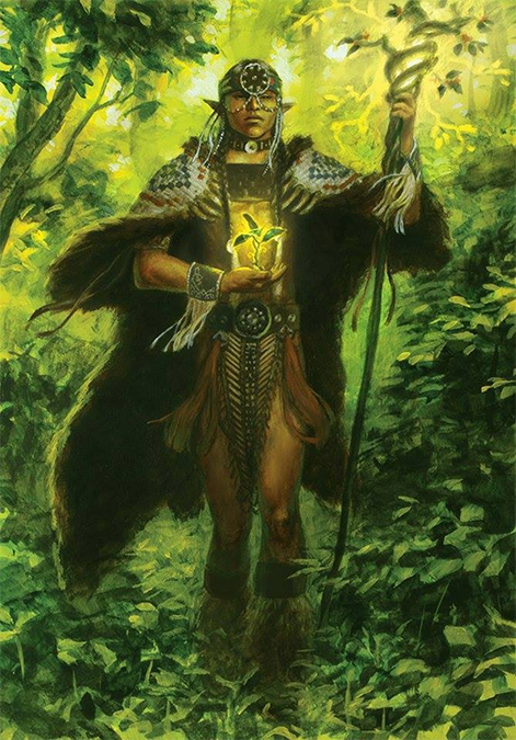
Ending with Winona Nelson is always a good choice. The other paintings are just cool versions, but Winona’s differs. You see, this is a bit of a self-portrait of her. As she is an Ojibwe Native American, you start to see the artwork without the card, and it’s abundantly clear to see her narrative elements, including traditional garments and reverence she had in painting this. It’s one of the best artworks in the last five years that too few people have even seen. I think it’s utterly delightful.
I hope you could find a few cards you may use. I know I had some fun looking at new artworks or ones I’d forgotten. If you want to do this again, let me know, and if you missed my first two installments, Better Basic Lands and Better Commander Art, check them out!
Mike