


People who know me find my Instagram to be one-third wiener dogs, one-third geek-related things such as Magic, and one-third America. As such, I've been on a Norman Rockwell kick as of late. He was the quintessential artist who defined modern culture in post-war America.
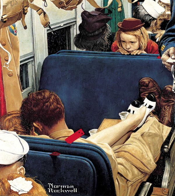
”Voyeur” (Little Girl Observing Lovers on a Train), Norman Rockwell, Saturday Evening Post cover, Aug 12, 1944.
What made him so unique was not only his soapbox, the cover of one of the most important magazines in America, but that Americans believed his depictions. He wasn’t distorting the truth of what Americans believed to be true.
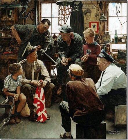
"The Homecoming Marine," 1945, Norman Rockwell
Early in his career, editorial policies stated the number of and placement of minorities in his illustrations. They were service positions only. As he aged and progressed, in 1963, Rockwell confronted the issue of prejudice head-on in what is arguably his most powerful painting. “The Problem We All Live With,” commenting on Ruby Bridges, fought against the 1950s white-picket fence while rampant racism was hidden beneath the surface.
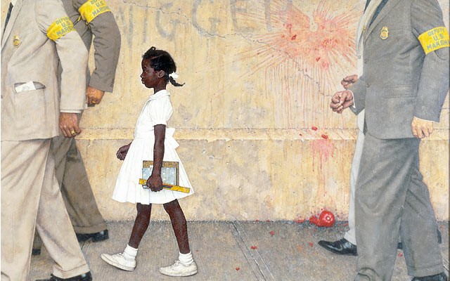
“The Problem We All Live With”, 1963, Norman Rockwell. Illustration for “Look,” January 14, 1964
I like the Americana depictions he made that were iconic of our culture. More importantly, every gesture in his painting had purpose. The key to understand his art is knowing that nothing is accidental. Rockwell chose everything with some purpose in mind. Everything is intentional, and it's your task, as the viewer, to answer the why. If you want to really learn about Rockwell’s art, you should read this review. Read it slowly.
They were visual storytelling masterpieces with only a single frame.
Rockwell was an illustrator, but he commented on contemporary culture. He had assignments, such as drawing a member coming back from the war, but all the extra details—the nuance and interaction in the piece—would be something outside an art description. I like his ‘Merica depictions, stripped away from the coal-rolling bullshit of today. He showed Americana, the ideal that binds all Americans together in our melting pot, and when I see images like that on Instagram, boy do I get the flutters. It’s moving and makes me reflect.
This brings us to today.
Magic art is arguably better than it’s ever been. Art is selling for higher amounts than ever before, original art collectors are shortening their lists, and I have a “State of the Art” article coming in the next few weeks. That would’ve never happened even five years ago.
The game still struggles to make transcendent art: making a Rockwell when the assignment is just a magazine cover. I have very subjective tastes when it comes to “good art,” but artists of this mere game are beginning to comment, to be intentional about a small impact, a tiny commentary of contemporary culture.
- When will an artist comment on harassment at conventions?
- How can an artist show a better gamut of gender, religious, and sexual representation in a fantasy world?
- Where will the first art exhibition be on art with a social agenda, based solely out of the game?
This is just a frickin’ game. And this shouldn’t matter.
But it does. It does a lot.
I’m betting money that it will be Cynthia Sheppard. Noah Bradley will follow, and Marco Nelor will subtlety do so, and that’ll knock the door down. Far-too-established artists are a bit tentative in swinging for the fences. I’ll talk about this more soon. Consider this a teaser trailer.
Looking Back, Looking Forward
Conspiracy gave us opulence, and we loved it.
 |  |
Alas, we're back to figures with cloudy backgrounds or walls behind them. It’s the standard Kev Walker background that he’s perfected. It’s easy to see and easy to recognize, and he’s done so many cards that it’s damn near a stylistic trait of Magic at this point. It’s also boring. See Rockwell, above, for the why.
 |  |  |
We need more Muzzios—with that kind of opulence.
We should be asking for this in art descriptions, with pay to make it work.
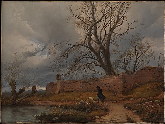
"Wanderer in the Storm," 1835 Julius von Leypold (German, Dresden 1806–1874) Oil on canvas. 16 3/4 × 22 1/4 in. (42.5 × 56.5 cm.) — in the collection of the Met Museum
You know our current stock of artists can do that; you just have to let them do it. Lars can do it if you give him the time. Boom, we have a classical reference image, referencing something lofty or a social commentary on the inevitable hard loft of American farmers in the Great Plains, and you get fine art. I swear it isn’t that difficult, and it all comes from writing art descriptions.
While core sets have a lower amount of time to really do world-building, they also have fewer constraints saying things like, “That goblin is wrong,” or, “That human needs to fit the style guide more.” It’s the one time of the year that repeats where art descriptions can flow a little more and where leeway is more apparent. Conspiracy allowed for artists to stretch their creative muscles, but it was a very selective group, and it was the utter cream of the crop. That vein needs to be exploited and encouraged throughout the year. Blank, misty backgrounds are for startup trading card games. Adding a wall behind a character to “give it a place” just looks amateurish at this point in Magic. There are ways to elevate or fix a painting when things go awry, but the standard needs to be raised. Magic art is up for more Chelsey Art Awards. Don’t let up; hit the throttle, and give us some amazing like the below. Volkan Baga can’t hold it down by himself.
Swamp by Dan Frazier — in a private collection
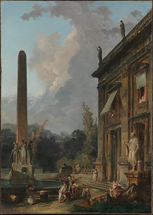
"Wandering Minstrels," 1779. Hubert Robert (French, Paris 1733–1808 Paris) Oil on canvas. 68 3/4 × 48 1/4 in. (174.6 × 122.6 cm.) — in the collection of the Met Museum
On Slivers
Well, I guess we get a taste of the Promised Land and some sort of ass-covering that’s abundantly obvious via the weird middling slivers. The two below are utterly fantastic. Pre-ordering both at CoolStuffInc will set you back under $20, and God knows both will be Commander staples upon the opening of the first pack. They might dip in Standard, but they’re a sure speculation bet as a long-term hold. Also, they look great.
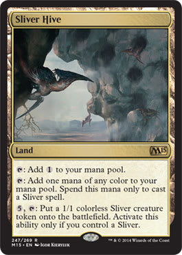 | 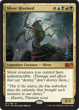 |
From Sam Stoddard’s “Magic 2015 Wrap Up” article from Latest Developments:
Whoever is covering their collective ass internally to say “Slivers need variety” needs to fall on his or her sword now. It’s corporate speak and—sigh—just incorrect and lazy. Wizards has the choice of some of the greatest artists of our time; they can create variety in an instant. If some VP is adamant about it, Jeremy Jarvis can probably pound out four concepts—on a smoke break with a crayon while eating a triangle of watermelon in his other hand—that look all insect-like, such as how Tempest and Time Spiral block showed them.
Fix the other ones in the future. These two arts above are great. Do that. Do more of that. You’re obviously listening, and artists are taking a pounding when you’re forcing them to make things that players dislike. Do you think they like hearing, “It’s not a Sliver, and it looks wrong”? As though artists need more reasons to be gun-shy about the Magic community.
Do the market research to show that every preview, review, and commentary will mention Slivers and they will go, “Well, those cards are cool! Why the hell do the other Slivers still look odd though?”
It bogles my mind.
M15 Short Hits
How about we do the top two for each color, with some honorable mentions as a quick way to say, “Look at the art now—before you crack packs.”
I haven’t seen the cards up close, so bear with me. I only have Internet information, and artists haven’t posted high-resolution anything en masse yet. They will soon.
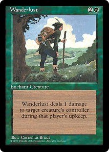
White
Ajani Steadfast by Chris Rahn

Wanderlust by Cornelius Brudi
Tireless Missionaries by Dave Kendall
Tireless Missionaries by Dave Kendall
You go over the top by showing multiple things in the background.
People ask me why my Archivist image is so strong and why I bought it. It's because the piece could just have a blank wall, but Donato painted another painting, giving us a greater idea of a visual storytelling piece. The apprentice doesn't own that piece, and he is of a lower rank than even depicted. See this for reference.
Honorable Mentions — Soul of Theros by Zack Stella and Hushwing Gryff by John Severin Brassell
 |  |
This was a close second. The top image gives us that world-building wow feeling of the scene being small compared to the visual storytelling.
Blue
Mercurial Pretender Promo by Karla Ortiz
Aeronaut Tinkerer by William Murai

What makes this image unique is the shift to digital concept artists. There are utterly thousands of deviantART speed-painters, trying to make it into video-game design studios. One thing they often forget is showing perspective fully fleshed out. Often, a figure is tiny, to show the vastness of a ship or ice wall or something. It's rarely fully rendered. This image feels like a sci-fi piece.
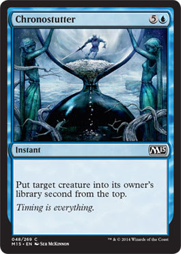
Honorable Mentions — Chronostutter by Seb McKinnon and Mercurial Pretender by Izzy
 |  |
Black
Caustic Tar by Jung Park

Feast on the Fallen by Dave Kendall

Honorable Mentions — Necromancer's Stockpile by Seb McKinnon and Blood Host by Cynthia Shepard
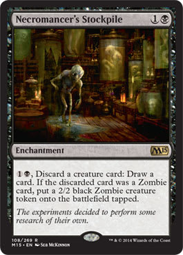 |  |
The Stockpile looks like Oddworld and a video game concept—with their guest designer marketing whatever filtered into the art. That's not a good thing for overall branding. It dilutes the brand to cater to whims. That's really, really bad.
Blood Host should've been in Innistrad.
Red
Scrapyard Mongrel by Svetlin Velinov

Might Makes Right by Mark Winters

Honorable Mentions — Kurkesh, Onakke Ancient by Slawomir Maniak and Aggressive Mining by Franz Vohwinkel
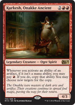 |  |
On Kurkesh: There’re so many shadows, and this image is so integral to any visual storytelling of this set. Why is this an ogre when the “ancient race” of the Onakke were trolls? The Chain Veil was from here; what’s his story about how all that relates? I really want to know. I wish it were given a Norman Rockwell art description.
Green
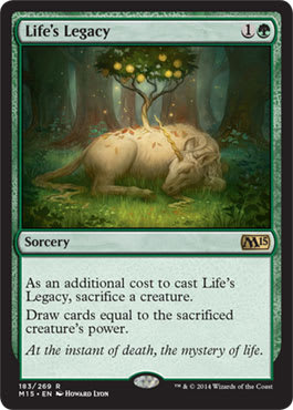
Life's Legacy by Howard Lyon
This doesn’t belong here.
This is an image of Magic’s history that looks like slush art. Why I think that is that conceptual images that are quite restrained are rather rare these days. There is a ton of foreground–background stuff with foreshortened everything and wisps of smoke with light poking through in beams. This is just a calm unicorn showing its ability. Howard has been making angels as of late, but I really enjoy this piece. It’s a throwback, and a core set is the perfect place to include an artwork like this.
Sunblade Elf by Lucas Graciano

Just stop it.
“Oh, an elf commission that isn’t a rare? Huh. How about I make an image about the environment and add some elfy armor just to appease the art description? Then, I’ll make this uncommon look better than most rares.”
Drops painting.
Yells, “What!?”
Walks out of studio.
Collects all the money.
Honorable Mentions — Carnivorous Moss-Beast by Filip Burburan and Nissa, Worldwaker by Peter Mohrbacher
 | 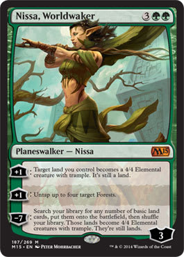 |
There were so many options in green in M15. There are a lot of fantastic artists making great works. I really wish I had high-resolution images for the green cards.
I was really lucky that I was able to work with Filip briefly. He’s utterly a delight to work with on a commission, and his art is just so uniquely his. It reminds me of Ian Miller: unique and fun. Miller’s Brushwagg is still among my favorite artworks of all time. Filip just looks like he’s just having so much fun making monsters. He visits conventions, and he’s the person Todd Lockwood wants to trade with for art. We’ll see if Filip makes some iconic Magic monster that will stick around. I wouldn’t be surprised.
So photo comparison of Nissa Worldwaker and Die Antwoords Yolandi Visser. #mtg #m15 pic.twitter.com/OwKXZ65qPy
— christine sprankle (@cspranklerun) June 25, 2014
Pete, great work. Not only is it a fantastic reference with a nod and wink, but it’s also a good artwork. Stoical Nissa is now up and alive, trying to save her world, and she gained a helluva lot of confidence, apparently, since the Eldrazi were released. Don’t read the book, just know that Nissa is quite irritating in it—she’s almost childlike compared to a more mature version shown and articulated through the mechanical Planeswalker abilities.
Also, a factoid regarding the reprinted Charging Rhino: It was included in Spectrum 5 for the best art of that year. It was on the Tempest version of the card.
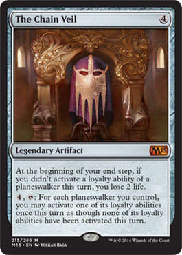
Artifact and Multicolored
The Chain Veil by Volkan Baga
Sacred Armory by Yeong-Hao Han

The light use is on point, and the armor makes me want to zoom in—it looks believable. This is just a great little image that feels more Magic than video-game, and that’s often a difficult line to distinguish.
I’ve made armories before; if you don’t get the lighting, everything else doesn’t matter and falls apart. The fact that you don’t really notice the armor standing out shows restraint that comes from a strong command of the digital arts.
Honorable Mention — Avarice Amulet by Steve Belledin
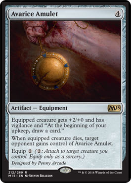
For the four hundredth time, if you aren’t reading Steve’s blog, you’re utterly missing out. It’s the most honest artist blog that Magic has to offer. He’s incredibly insightful. Read it, and share in his struggle.
Land
Why the hell weren’t pain lands given new art? The last full cycle reprinting was a mere eight years ago in 2007. I do wish there were a reprint number that “unlocked,” thereby forcing new art. Perhaps once a card hits its fourth printing of one art, the fifth will be new. It could be a fun speculation target, and the community would really pick up on it. I do love art rules that fellow Vorthoses could get onboard for in the future. Legitimize us!