This review took the longest out of any article I have written due to, in summation, my amateurish ability to articulate why I feel this set is a visual stumble instead of a writing a rash, opinionated mess, relegated to a flood of open letters. I also am aware of the importance of continuity, and writing these art reviews is important for art critique and the understanding of visual culture, even in our little niche of imaginative realism.
I don’t know what happened behind closed doors, but I do know that art directors had an impossible task of combining a multitude of subplots into one narrative.
Polishing The Impossible
To set up the stage for this set and why I feel it fell so short of the mark, I need to set a baseline of what this final set is in the Shadows over Innistrad block. Eldritch Moon is the second set of the first return trip to the plane of Innistrad. This is the fourth ever “return to” set; and, coming off a returned plane, the first back to back returned to planes in sets that weren’t Dominaria. These two new sets will build upon the visual narrative of the roughly Germanic/Prussian themed sets, and the visual narrative will be set as two villains emerge in the block: an archangel turned evil and an Eldrazi creature named Emrakul, Magic: The Gathering’s interpretation of Lovecraftian horror. We’re in a known plane, overlaid with new and quite different antagonists, while trying to keep homages and connective threads from old cards to the new like this:
 |  |
 |  |
Visually, as I am the one writing this art review, the original Innistrad block was shown and experienced from a human perspective and had two other rather definitive rules, as it were:
“The first is restraint. The set is on-foot, resonant, and more restrained than most Magic settings.”
“The last element of Innistrad, and really what puts the gothic feeling into any gothic horror, is romanticism.”
-Jeremy Jarvis, Creating the Art of Innistrad, 2011
It’s arguable whether even one of the three visual gags remains true. Let’s look a the “gags” or art rules of the previous Innistrad.
Restraint?

Ulvenwald Abomination by Chris Rahn
Do these feel like Innistrad? I’d argue no because the restraint isn’t a strong gag anymore. On one end, you have Fiend Binder, which is just on the nose in every way. To see the minor changes, Certain Death shows an evil spirit in full lit glory. Does that feel like Innistrad? What is the horror in showing a Slenderman? It’s like M. Night Shyamalan’s The Village, it’s just all so in front of your face and obvious. That isn’t necessarily wrong, either. Is that what we’re expecting from an Innistrad set, though? I’m not sure.
 |  |  |
And what about the Romanticism?
We had the realistic John Stanko card artworks as idealized farm folk. Now, we have gritty realism.
 | 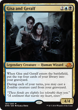 |
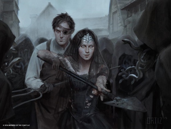
Gisa and Geralf by Karla Ortiz
Human perspective as focus?
Innistrad was also previously defined by what it wasn’t, which I explained in my previous art review for Shadows over Innistrad. It’s darker than Rise of the Eldrazi, showing more evening. We as viewers are also experiencing, not merely observing, which is what the Scars of Mirrodin block defined itself as. This set, Eldritch Moon, dances between the two perspectives, experiencing and observing.
 |  |
Though, the investigational elements, like Jace’s entire role, clues, and finding Emrakul, isn’t exactly a fly on the wall, breaking one of Innistrad’s foundational rules.
I guess we still have hats?
https://twitter.com/VorthosMike/status/678269673037676544
 |  |
Todd’s work here is also digital. I know. I asked him straight away.
The Late Reveal
Moving onward to good ideas, I now understand fully why the reveal of Emrakul being the “otherworldly” threat in Eldritch Moon was announced so late. We argued for days on how we knew it was Emrakul but they were dragging their feet.
The set is chocked full of references to Emrakul. The control of the marketing reveal was truly remarkable in this day and age of hyper aware social media.
The niche Vorthos community knew it was going to be Emrakul, and even the set’s name is about as obvious as you can get for what’s happening. The main characters of the set, the legendaries, couldn’t be shown early because they explain exactly what’s happening. An angel is affected by . . . something, oh, there are giant tentacles behind her. It must be Emrakul’s influence and the angels are affected too. Ah, that explains why Avacyn went nuts. Look at the backgrounds, it’s constant.
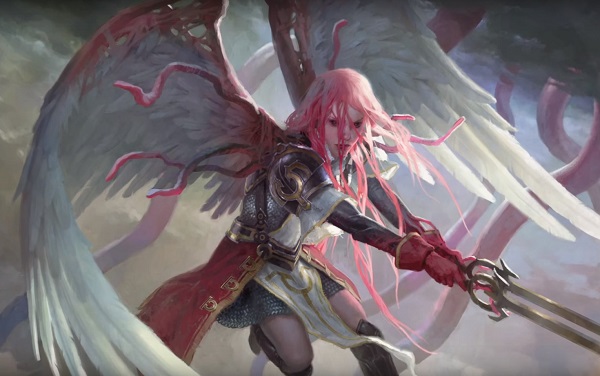
Gisela, the Broken Blade by Clint Cearley
Also, here’s a quick side note: The skirt with knee high socks? Interesting allusion to Japanese school girls, especially with the bubble gum pink hair and corrupted by tentacles thing. Her arms and thighs are even anime thin, not muscled like a battle hardened angel should be.
As a former track athlete, the variety of forms on a track & field team, from tall and lean high jumpers, to the absurdly strong shotput throwers, all forms can be found represented in an idealized fashion if you look at Olympians. For a battle angel, I think the multi-event athletes, like decathletes or heptathletes like Jessica Ennis below here, are more appropriate. They‘re a bit more realistic.

Image via herbiceps.com
Dunking head instead of toe dip into Lovecraft
Below you’ll see a great depiction of what Eldritch and Lovecraftian influences in gaming looks like, staying close to the source material, that being H.P. Lovecraft writings. The creatures in question are to be uncanny, unearthly, and weird in a supernatural way. This image is done quite well to not be clear, not be fully in focus. The mood trumps the realism. It’s INCREDIBLE! It’s a real shame that’s just marketing art and not on a card.

The issue is that restraint is low in the set, to reiterate.

This deconstruction or going “full entangler” is something influenced by Emrakul. It’s also very aligned in classic Lovecraftian horror. Though the actual monster wasn’t all together common. It came at the end of the story, with the buildup being psychological or internal to the narrator. Below would also fit the mold of an unknown monster. You aren’t sure if it’s a merfolk or humanoid (at this point) and it’s eerie. It fits the plane well and sits in the “Ah! Clever” above.

Wharf Infiltrator MtG Art by Daarken
The “clever” transformation we already saw, which aligns to previous depictions. Emrakul had similar depictions that resembled her and also, you could tell they were from something humanoid. They were more restrained but showed Emrakul’s form considerably more.
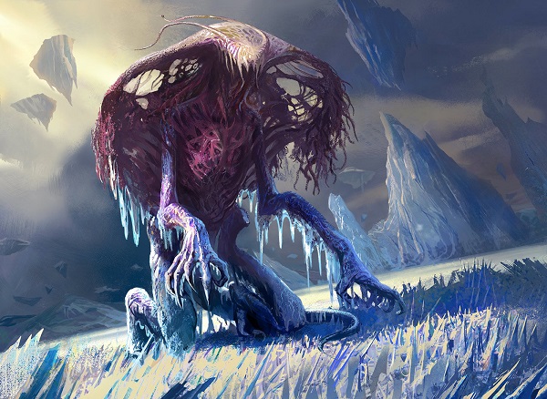
Rush of Ice by Deruchenko Alexander
Moving onward, we see our eldrazi’ed wild boar here and the artwork includes Emrakul tentacles in the sky behind. Why? Are background tentacles really needed? Now, it forces any reprint of this card to have to be connected to this moment in time, or another plane annihilated by Emrakul. If there aren’t Eldrazi, this cannot be reprinted.

I feel Emrakul was like Cayenne Pepper and instead of a dash, someone pushed too much into the set because the rest of the set is very specific and it works wonderfully!
For example, this card is not the same as the core sets using the “Jace’s x” or “Chandra’s x” thing. The mechanic is investigate and the card is rather difficult to reprint. By putting it as a specific moment in time for the set’s story, it makes it significant. The ability is unique, fitting for limited and has nothing of Emrakul.

There is no better example than Vincent Proce trying to hit the target of old Innistrad vs. new. Like trying to contain a tidal wave of new concept, while maintaining the semblance of the old. Vincent did a phenomenal job:
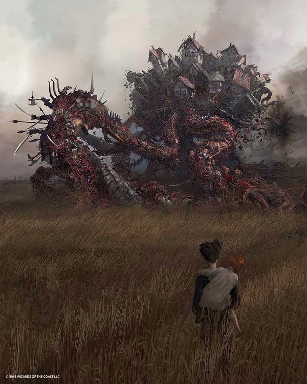
Hanweir, the Writhing Township by Vincent Proce
Surprise Delights
I love process gifs. They give me instant insight into an artist’s process in a matter of seconds. It’s also great for young artists and the community to gain knowledge into how a piece changes over time. In the case of Josu here, check out the previous concept of “icy geist” and how much stronger the concept is when you get to see some costuming on its victim.

 |  |
Jeremy Jarvis told the story of the sister angels, which you should watch. It’s the best video of the series as he and Jenna Helland are just captivating creatives.

Concept art by Vincent Proce
The sketch changes are just magnificent. Enjoy it below.

Highlights
I couldn't whittle down all the art which I feel are notable, so instead, let’s do lightning rounds on them. Doing a full set is voluminous and, frankly, I’ve found that people largely don’t care about life gain commons. What they do care about is gaining insight that will aid in conversation at FNM. With that in mind, let’s touch on a few pieces. I found White to be the highest concentration of really great art in the set, if you’re curious.
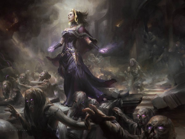
Dark Salvation by Cynthia Sheppard
Cynthia is good at making art.
Paint this traditionally and it’s a $5000 painting in an hour on eBay. But, the time needed to paint something this impressive, would beg to be 24x36” and did I mention that Cynthia works full time during the day? It’s a hustle of a life and she manages it well.
The touches of purple are lovely touches to bring Magic and this art to Magic.
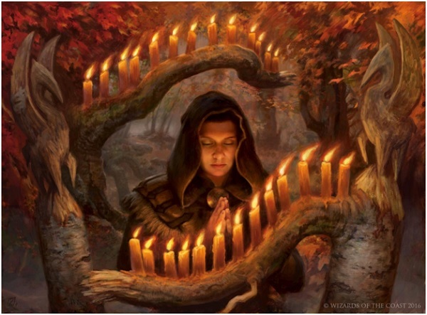
Providence MtG Art by Zack Stella
Is this digital? Look at her face.
Is this done traditionally? Look at the candles.
I love this piece. Zack is leveling up and dabbling in traditional painting more and more. His asymmetrical composition must’ve shown up beautiful at sketch stage. I would’ve loved to have an image like this coming into a pile of sketches from a new set. It doubles the “13” motif with twenty-six candles and the autumnal palette is so very Kessig and Innistrad.

Voldaren Pariah MtG Art by James Ryman
This piece made me smile. It’s not only an outrageous concept of a vampire being eldrazi’ed to gain extra appendages and having her form break down, the proportions are crazy of her neck and body! I thought right away of the Mannerism movement in art.
The early 16th century movement is largely found by elongated proportions. If you see Renaissance looking art with legs and necks that are silly long? That’s mannerism. It tells us, the viewer, that the artist understands perspective but chooses not to use it. It’s also highly stylize poses. Once you see it, you can’t unsee it.
The slight off center character is really well done by Ryman. I really enjoy this piece, it’s odd and horror and very Innistrad.

Madonna with the Long Neck (1534-40) by Parmigianino
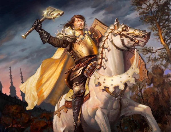
By Aaron Miller
Sorry, the original painting is already sold. Yes, an Asian-American art collector bought this the day it was previewed because why wouldn’t he? It’s a beautifully idealized soldier on a great looking horse. It’s the new normal for the game, having diverse characters as the norm, rather than isolated inclusion.
How’s that cloak?
That glowing chest armor?
That horse musculature?
What isn’t great about this artwork? It’s old time Magic art in a new set.
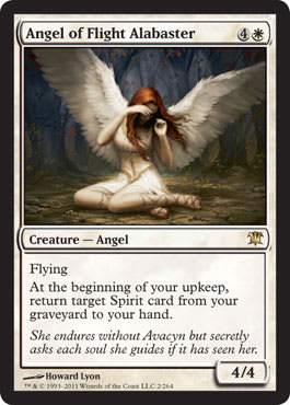
[caption id="attachment_68793" align="aligncenter" width="600"] Sigarda’s Aid by Howard Lyon[/caption]
Let’s ignore the fact that Howard is a religious man and understands the symbolism here. Let’s ignore that the Creation of Adam by Michelangelo is overt here. Let’s ignore that you didn’t know that Howard is an art boss.
Let’s examine the importance of the artwork in a vacuum. The only surviving archangel is bestowing an artifact to an injured soldier of Innistrad. Instead of mere prayer to help, the angel is granting tangible aid. A single image can show a narrative change of a character who has no card and tells us what Innistrad will be after the page turns. The surviving angel will be the way the humans of the plane are able to continue on, as prayers will be answered and vampires won’t annihilate the plane, just as Sorin knew to happen, thereby creating Avacyn.
Layered above the angel is a woman helping a man get healed, a trope as old as time AND to get back onto his horse, as it were, by handing him a weapon. It turns the soldier trope on its head in that these angels aren’t just religious figureheads. They interact with humans and are a terrible foe in battle. Who else but Howard, a devoutly religious man, could depict an angel with every symbol from hundreds of years of improvements to be so meticulously crafted to align with civil war and neo-classicism homages? This is Howard’s set just as it was John Stanko’s before, but you didn’t really notice the amount of leaning some card artworks have on future deck-building.
Peace of Mind by Christopher Moeller
Ant and I talked about his humdinger of a gorgeous piece on SnackTime, as it was our preview card. It’s well worth a listen and we explain the butterfly.
Terrarion by Titus Lunter
This artwork combines two things I love about art today: using different mediums mashed together and taking simple concepts to high quality results. Titus wrote about making this on his blog, and I highly recommend you read his blog Project Discovery in entirety. You’ll have to add it to your Muddy Colors and whenever Steven Belledin reading list. It’s that good.

Ironclad Slayer by Ryan Pancoast
I know, I talked about Ryan’s gumroad videos in a previous Gathering Magic article but I cannot stress it enough. For $10, he shows you and tells you exactly how he made this piece, from success to struggle, reference creation to fixing problems. www.gumroad.com/rpancoast The lighting is just on point and the ability to see how he did that? It’s worth every penny.
Campaign of Vengeance by Igor Kieryluk
I want to know what Igor based this picture on. I’ve seen poses like this a hundred times in museums, so called propaganda pieces. You’ll see Napoleon or some war general helping unite the tribes or relive a scene that never happened. I think it’s fabulous and the white armor is so perfect. It's just a strong juxtaposition of light and dark that reads beautifully, even at card size.
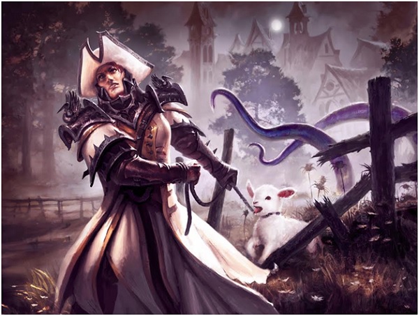
Desperate Sentry by Mathias Kollros
Of course adding a lamb is fantastic. I’m not sure the tentacles are needed in the image, as they force your eye to focus on them instead of the lovely buildings behind them.
Talking to Mathias, this piece was apparently made rather quickly, and the haste isn’t shown at all. Of anything, looser forms are intentional, to keep your focus away from them. It’s a lovely looking hat too.

Thalia’s Lancers by Dave Palumbo
This is traditionally painted.
Both of these badass women aren’t wearing helmets.
Oddly, this original is still available. I’m not sure how. They’re even getting amazing advertising.
Let the Germanic city zoom into focus and in doing so, you get to breathe in the dust kicked up by the horses, the thick, loose brushstrokes that move this painting from good to great. The slight off center composition pushes your eye to the right, readying for maybe a singleton Eldrazi horror or two. Without a contingent or help, they don’t seem too worried to be able to protect a town. It only reinforces how intense these lancers are. I love this piece and it shouldn’t last long on the open market once you realize that it isn’t a tiny work.
And with any shameless self promotion, Geoffrey Palmer is available to be contracted to animate cards. He’s incredible and made this kitten by Howard Lyon move from great to incredible. It’s the whimsy of the set and arguably, the best card art and who else to do it than Howard, who is firing on all cylinders.
https://twitter.com/livingcardsmtg/status/753652486267736064
The artists had a tall order. Art directors had a tough job to do. I personally see an impossible task with cards adding tentacles on a universal basis. Looking at card art beyond the marquee cards. Do cultists need to be Eldrazi’ed? Does it aid in the storytelling? Why weren’t cultists just, cultists? Could Emrakul and a few stray Eldrazi drones be it, just as our source material told us in the past? Would that not make Emrakul even more impressive and unique, whereas now she’s like the other two titans were who obliterated by Chandra. We’re seeing Zendikar’s Eldrazi on Innistrad, and it’s difficult to tell one apart from the others.
As for the storyline, visually, Ob Nixilis and Nahiri have been our only short reprieves from this threat since Origins, but both interacted with the Eldrazi in some way. It’s been the Eldrazi for nearly a full year. Backgrounds change but tentacles and purple creatures have been the norm for entirely too long. Players are tired and the art is reflecting the constant visual gags.
Villains can endure but when backdrops are altered, bending gravity to a visiting Eldrazi comet, we dilute plane uniqueness. Eldrazi don’t fit the Innistrad mold. They aren’t supposed to fit. But was that a correct decision?
It breaks the rules of the original plane and people who loved Innistrad have their cherished nostalgia stomped on for storyline that doesn’t feel better. Returning to a beloved plane but changing every trope, altering all the familiar, makes Innistrad something entirely new, and I can’t agree that it’s better.
Boy, I can’t wait until Kaladesh.
Despite a few standouts like Howard Lyon, Eldritch Moon is a set lacking a visual focus and the art showcases the overly directed, stiff art due to antagonist fatigue, ignoring the uniqueness of Innistrad, and body horror being ubiquitous.
-Mike