Welcome to another installment of squinting at card art, Googling for larger images on Tumblr, and asking artists if a chase rare’s original art is already sold. It’s my Khans of Tarkir art review! Welcome to those of you who are new.
For those of you who are new, I write a weekly column here at Gathering Magic covering the flavorful side of Magic. Most notably, I write from a Vorthos perspective. Vorthos players are ones who enjoy the elements outside the game, such as art and storyline. I worked as a gaming art director, and I still do from time to time when I pick up a Kickstarter project. I love fantasy art quite a bit. As I talk about it here, I use the terms “fantasy art” and “imaginative realism” rather interchangeably because they’re the same thing. The latter is what you would call a dragon in an art gallery. If you search through Christie’s, Heritage Auctions, or another large auction house, you find boom-boom Magic art in those categories. I write mostly on the art of the game, and I write art reviews, like this one, for every set and release. You can check my archive to find older ones.
Khans: Things I See
This isn’t exactly a Mongolian set. This set just begins there and fans out. Cavalry and archers on horses are the basis, but add regional differences, and you can see how the Mongol Empire differed according to geography.
It’s actually an Ottoman Empire set. It’s “More than Mongolian.” I wrote briefly about the khans a couple weeks ago here. The Ottomans were Mongolians, and they later became Turks. Due to Magic’s need to have very distinct-looking and -feeling clans, the next step in territory after the Mongols was the later empire of the Ottomans. While the four split parts of the full Mongolian Empire, the Ilkhanates, feel like the clans, they’re still a bit too similar to each other. They didn’t give us just Mongolia, they gave us the freaking entirety of Asia.
There are a lot of subtle allusions to the Kamigawa block. This has approachable Asian flavors; Kamigawa was like spicy pho when all you eat is tomato soup. (P.S. You know Pho 79 in Minneapolis? That’s my jam. Such taste.) I’ll let Tumblr find the allusions, and I’ll retweet them. There are oodles of them.
Traditionally-painted art is back. Due to a lot of increased interest in owning original art—including the shining of a big spotlight on the issue through columns such as mine—artists are choosing to paint more. While it takes more time, supplies cost more money, and you inhale a crap-ton of oil-paint fumes, being able to sell an original for $500 to $3,000 or more is not lost on people. With Bazaar of Baghdad’s Vintage Master’s version being painted by Christopher Moeller and fetching over $10,000, he was able to turn down freelance and work on some personal projects. I heard from a colleague that he’s working on some American Civil War paintings, which sounds awesome. It sounds ideal to be a Chris Seaman, able to do personal projects like his fairy tales, but you need them to sell, and that risk is minimized if you take a Magic card knowing that it’ll sell for serious money. Noah Bradley going from traditional to digital and now back to traditional is your indicator on what is popular. Expect a lot more artists to do this soon.

Image via www.rockwell-center.org
Some fan-favorite artists are back. Steve Argyle is back in Magic. He was out of the game for an entire year. That’s often a death sentence to be all in then receive no new commissions. I’m happy to see him back in the mix. Mark Zug is also fully back. He had six commissions in the Return to Ravnica block and another six in Theros block. Already at three, I hope to see a lot more of Mark Zug. He’s one of the guys you think is long gone, and boy, he’d be a great person to invite to a Grand Prix or a Pennsylvanian Grand Prix trial, Pro Tour Qualifier, or the like.
Insight into concepting – In January 2013, Daarken—along with Chase Stone, Tyler Jacobson, Sam Burley, and Wayne Reynolds—was on the concept-art push for this set for two weeks. They made sixty to eighty images apiece! From Daarken’s (Mike Lim) blog, we learn a few things that were changed:
- Temur had DJinn . . . or will.
- A warrior on a horse was always a concept.
- Mardu was originally called Mordu. Mordu? Good upgrade, Wizards!
- Sarkhan had a few versions.
I would love to see more from-the-concept-push perspectives shared on blogs. That would be awesome. I hope all that’s unfit for the creative-team articles or Arcana could be offered by artists. That would be fantastic. More of this!

 |  |
 |  |
Four new artists to Magic make their appearances. Anastasia Ovchinnikova, YW Tang, David Gaillet, and Torstein Nordstrand all join the ranks of being Magic artists. Congrats to all of them!
I worked with David Gaillet on an Elder Sign expansion called “Unseen Forces.” He really leveled up after working with Applibot’s Legend of the Cryptids. I’m happy to see him getting in.
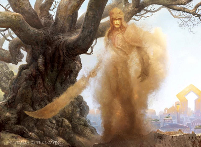
This set also reintroduces efreets and djinn. I could write an entire article on them, but what we need to know is that there has been a pretty wild-west approach to deciding what’s an efreet and what’s a djinn in the past. In short, djinn and efreets are both demons, and depending on what Middle Eastern text you read, it changes what they are and how they act. In Magic, efreets are flavorfully closer to elementals. Efreets are now more red-based, and they’re often evil.
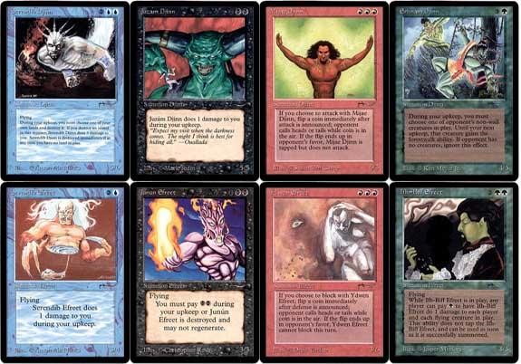
Djinn (twenty-six versions) | Efreet (nineteen versions) |
 | 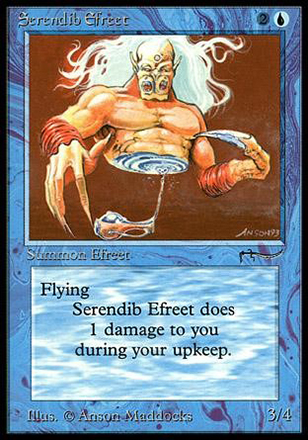 |
Efreet were interchangeable with genie in One Thousand and One Nights or Arabian Nights. | |
Back in the Arabian Nights set, every color of Magic received a Djinn or Efreet except for white, as white was seen as the good color, working with order and harmony—the exact thing these creatures aren’t supposed to do. Now there are benevolent Djinn and Efreets in Quranic lore, but they were omitted.
As for the efreets and djinn of today, what differentiates them internally is hidden in a style guide, unavailable to be shared with us.
What we can decipher is that efreet are based in the red slice of the color pie, filled with chaos, but only usable in the game as disciplined monks part of the Jeskai Way, the “W/U/R Tang Clan,” if you will. Efreets do not fly. They can be shamans or monks. They are tricksters and play pranks.
Djinn are based in the blue slice of the color pie, being more fragile but evasive and tricky. They can be wizards or monks. We know officially nothing else about them. According to Warden of the Eye, they know the history of Tarkir, which seems relevant. It appears to me that there are two versions—is one male and the other one female? Or perhaps the skinny ones turn into the larger, beefier ones. We need an article on this stat.
How to put art into perspective: the rating and ranking questions. As art is subjective at best, and going through Easter eggs of each card takes about three weeks to write, literally pushing this article out two more weeks. I like touching on the hits, yes, but I also have to consider how to put things into perspective. There are masterpieces compared to pieces that seem phoned in, and that is a normal course of things, even for Magic. But I ask myself, What makes a piece good or great? Is a marginal artwork on a Magic card still “good” in the greater gaming illustrative market? Does a strong card mechanically make the art better in many people’s minds? If obviously yes, how much better? These are hard questions, so I’ll touch on the set and call out four great ones.
To the Artworks!
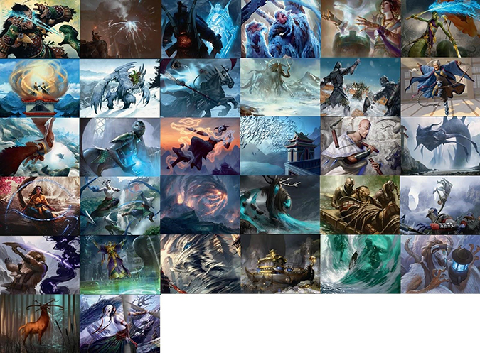
White
The mono-white creatures and spells really separate quickly into factions. Sand is Abzan’s, snow is only seen to smite a Temur creature, pearls signify Jeskai, rock outcroppings show the Mardu Horde, and the plains all appear to take place in wide-open deserts with blue skies. As a bunch of cards, the usage of atmosphere in sand, clouds, and obscuring factors is clear. The plains cards on Tarkir don’t deal with wheat and farmland as they normally do. Rather, plains here signify vastness and isolation.
White is often known as the “good” color with angels, but white also is the color of fascism, blind devotion, and sacrificing critical thought for survival. Wizards creative is definitely pushing the point more and more that bright and white don’t equate to Dungeons & Dragons’s chaotic good alignment. This is a very good thing.

Blue
Comparing the blue cards to the white shows an utterly different set. If you take these as standalones, you’d probably think this were was Asian-themed, maybe even consisting of unused Kamigawa artworks, which would then be known as slush art.
Blue also feels different. Blue as representing a counterspell-laden mind mage, outsmarting and thinking ahead, isn’t what is represented here. I see that isolation factor again, but blue-aligned individuals wish to be alone. Intrusions are taken care of through countermagic. It feels defensive, as though they will attack far too hard for an intrusion, not unlike what prowess—their mechanic—shows. Blue just wants to study, and the art shows an uneasiness, as though their defenses are far too powerful, clouding what their actual intentions have shifted toward.
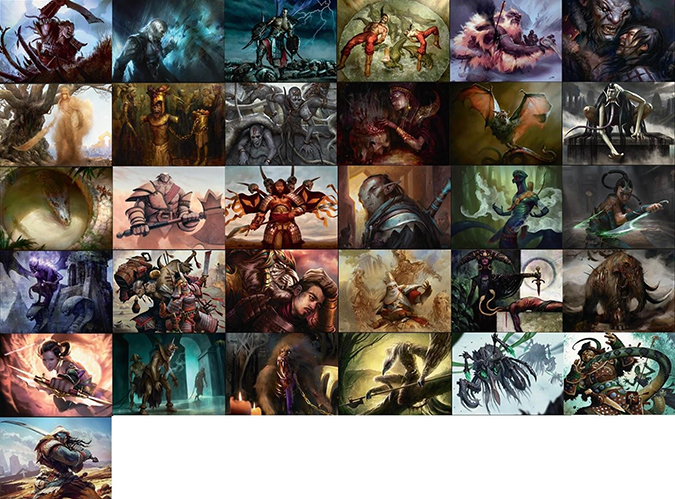
Black
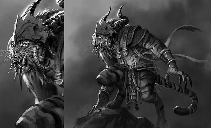
When did black become so lazy? Aesthetically, black has the most variety, from sand to dingy interior, from might-makes-right to a selfish warrior on the field. On a visual-concept-and-design basis, when did black stop taking care of business? Black has always been about summoning demons to do its bidding—but with a high cost. The delve mechanic shows this high cost, but the drawback is time, allowing for opulence. I see the opulence as laziness. Throwing humans to crocodiles? Using zombies as furniture? Trusting an unbound rakshasa? They’re made to cross deals and cause harm. Rakshasas, the tiger demons, are like normal, big ol’ horned, black demons, except they will be unbound. I like the idea of excess food, pleasure dens, and the like to show this shift. We might see black as a vulnerable clan in the future because they aren’t willing to go all-in. I love what this may hold.
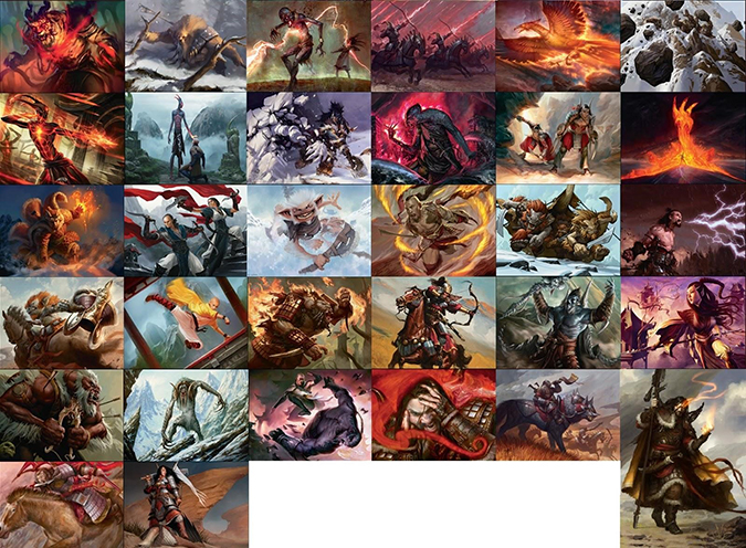
Red
Show me what bloodfire is!
Before we go all Airbender, the bloodfire shamanism that efreets bring has to be explained. We were given nearly nothing on the cards to understand, and yet, it feels incredibly pivotal. As red is Mardu’s main color, it’s actually quite hard for other colors to squeeze their due space in red other than with efreets. Efreets will be the new tall and skinny man’s cosplay, no doubt about it.
As for the art, there is a very real fury–merciful feeling I see. Mercy isn’t quite the best word, but it’s the pivot the creative team chose to undertake with Urabrask the Hidden in New Phyrexia. He said, “Let them be,” to the surviving humans. The merciful and pitiful red is flexing its muscles and counters the madness of Sarkhan, the efreets, and the normal fire and brimstone we always see. Temur has this suppressed rage, this merciful aspect. I love this idea of efreets needing to calm themselves, juxtaposing with Jeskai’s letting go of all emotion with bloodfire magic. That’s a flavorfully interesting concept that needs to show through on cards. I see some inklings—but not enough yet.
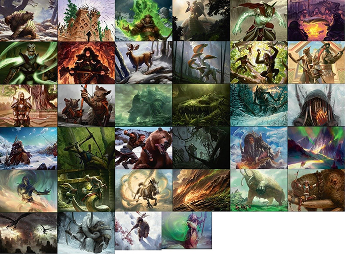
Green
On a warrior-driven plane, seeing humans in green makes utterly no sense to me. Hermetic shamans as humans do exactly what in green? I like their bones and fetish objects; that’s an interesting concept, but green isn’t fond of thinking about things. Green relies on instinct, not on altering time and such. Obviously, Temur will determine the time shifting of past and new future that’s being positioned, but that’s so comical in that green shouldn’t care about those things. That isn’t natural, and interference with things isn’t their jam. Bears? Those are natural and fantastic. Getting huge? That’s their jam. This color is in a weird place in this set, and the mood of each artwork kind of reflects this. What motivates green in this set is a question that needs to be answered because other than a slow turtle and a bunch of bears, something is awry here.
Also, it’s notable that Naturalize makes no sense. Did a spell that kills an artifact or enchantment . . . kill a dragon creature—that Marshall Sutcliffe loved? Huh? (Mike writes that down.)
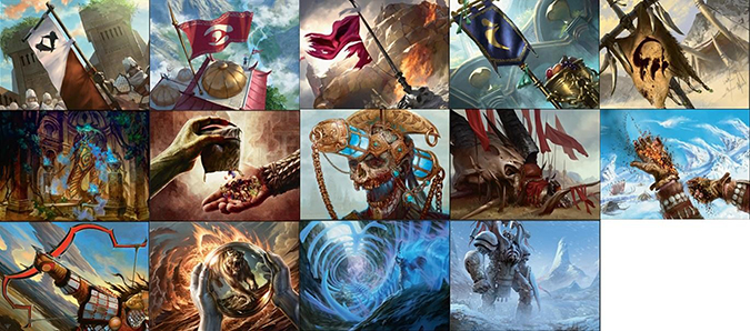
Artifacts
Yes, the Banners all represent aspects of their three colors . . . other than the Temur, who don’t care about that. Even that makes sense.
There isn’t a lot in the colorless cards, but two major artworks are foreshadowing future sets, trying to set up the storyline.
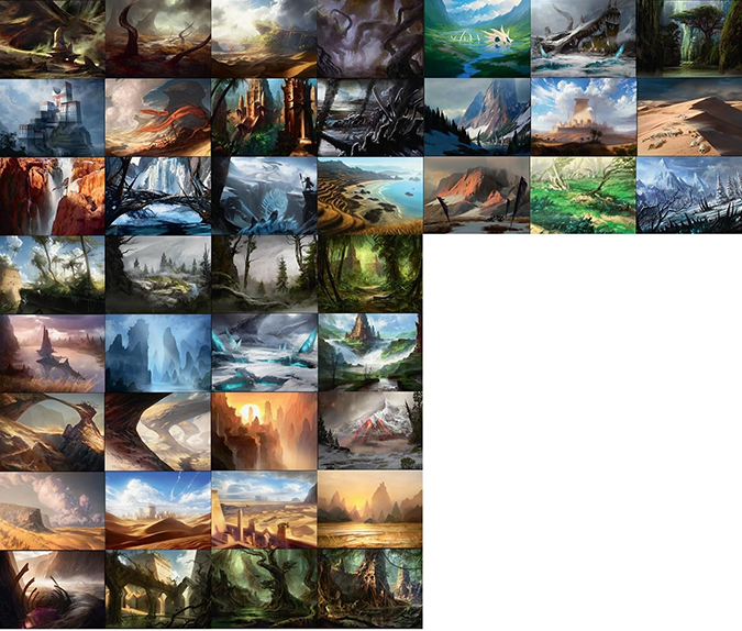
Lands
I think the lands had a printing problem. The darker cards are far too dark, and the brighter cards look to be right out of Lorwyn. The framing elements make some of the landscapes entirely too dark.
Some of the basic lands hit on the clans so perfectly, and others just show generic scenes. We’ve been a bit spoiled with Return to Ravnica so close in our minds, where every site aligned to a guild rather obviously. Theros had some of this, but folks didn’t differentiate or care much about the city-states from my perspective. They were a neat idea, but they didn’t stick all that well.
Abzan
These are tough guys with sand and beasts of burden. This is perfectly shown. Look at the variety of art styles and depictions—from Steve Belledin’s troops to Matt Stewart, who gives us a full frontal elephant, we see how this clan organizes for battle.
What we aren’t able to see is how they live—other than that they garden atop buildings like the Hanging Gardens of Babylon.

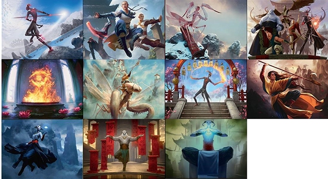
Jeskai
Since Jeskai is so focused on internal insight, showing mid-battle scenes really is a missed opportunity to give insight into their lives. Maybe with time and the style guide, we can see actual training, actual sleeping quarters, and the monastic life a little more. I was really looking forward to seeing how art descriptions would showcase their mountainous lives. That’s just wishful thinking for the first set, right?
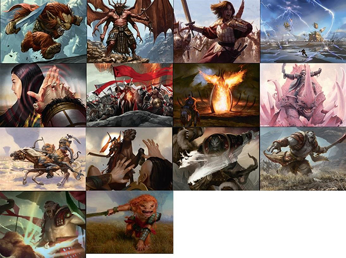
Mardu
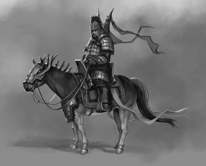
Mardu has the highest number of cards dedicated to its clan. Since this is More than Mongolia and the Mardu Hordes are basically Mongolians 101, I can roll with that. I love the emphasis on their armor, as though that alone signifies who they are. Red-aligned cards show the armor prominently, and it’s among the things Daarken had to majorly change with the new Sarkhan concept.
Sultai
I’m seeing a lot of nagas and rakshasas, but not much else out of Sultai. Yes, humans are there, but they’re just zombies. That feels tacked on to some degree. Remove all the humans, then, if nagas don’t trust or think them useful. Not all clans need the weak human flesh. When you have some cat demons, why even have humans? Are they to clean up tiger poop? Maybe zombies are bad with pooper scoopers.

Temur
As a Minnesotan, I love me some Temur. When we’re out in the woods and your large friend Bjorn has snow in his beard, he’s a half-step transformation away from a yeti, giant bear, or ogre. I love their usage of bears everywhere in their imagery, but that balances out with the oddly-placed fire. Yes, fire is needed to keep warm, but why not fully embrace the cold? I mean, people make clones of themselves by sealing themselves in ice for cripes’ sake.

My Utterly Subjective Top Four Artworks

Mardu Heart-Piercer by Karl Kopinski
I worked on Warhammer Fantasy and Warhammer 40,000, and those Games Workshop books have so much slush art from the 1980s and 1990s that you begin to see a style emerge. Among the few artists, Karl is frickin’ everywhere in there. He was able to give soldiers and individuals their own places in a group or army. In this image above, he stripped away all the other aspects and just painted—traditionally, mind you—a perfect Tarkir image. This is a Mongolian, Magic-style. It’s hard to tell where the Ottoman Turk or Mongolian ends and the collectible card game begins. This should be a very, very expensive artwork due to its iconic nature and flawlessness in focus. The lighting on the helmet alone is noteworthy. This is a new standard; traditional artworks are back.
Disowned Ancestor by Zack Stella

That smoke is incredibly rendered. Zack keeps leveling up—I swear to god—every set. He’s also integrating style-guide iconographic bits, as Steve Argyle started to do, bringing an ordinary artwork into something more meaningful. You build a fan base with Easter eggs and winks and nods to the viewers. Great work.
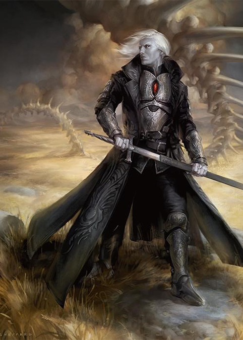
Sorin, Solemn Visitor by Cynthia Sheppard
- Shoes? They’re on point.
- Hair? It’s fly.
- Armor? There’s more enamel and etching than you can shake a stick at.
- Cynthia? She’s not effin’ around anymore.
I find Planeswalker imagery generally better than average, but at this point, with a few dozen to look at, what brings them over the top is how they bring the narrative forward and improve upon an established figure concept. Does a new image add more detail? Does it do all the things? I guess she said so, yes.
Now the real test comes. This one was great, but will she get another one? I hope so.
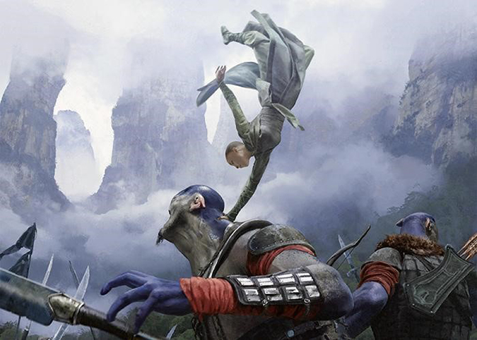
Singing Bell Strike by Chase Stone
There is no blur. I remember a small storyline point in Dragonball when Goku no longer teleported—he was just that fast. The cartoon no longer showed blurs around his movement, they just showed him in the new location. That was a stupidly clever move by the animators.
This is the most hyper-real image I’ve ever seen in Magic outside of Henry G. Higgenbotham’s still-life photographs he took that became card art! What’s so fantastic is the restraint Chase used. There is no blurring of legs to show movement. We are able to see some Face Off–level makeup and design work with an expertly-created figure showing Jeskai’s utter grace. Boy, asking an artist to show grace—on a Magic card—and not cheat is damn hard. The slight upturn of the creature’s head to show surprise is just incredible. That’s A+ work.
Thanks for reading. If you see an artwork and wonder if it’s digital, or if you really just want a print of it, I’m always online to help you out. And no, in case you’re wondering, the original painted artwork you want in this set is probably already sold. But I’d be happy to ask again for you!
We’ll talk original art soon. There is much to discuss that has happened since Illuxcon in the original-art market.
-Mike