This week, it’s the downtime for many story and art loving players, as Kaladesh is out and only the Magic Story is left to tell.
During this initial recharge, I figured it a good time to dive into some art. I can’t give every artwork in an art review its due diligence and neither should I write a novel that no one would read. Instead, a short fireside chat with a few artists, strictly talking about Kaladesh, should illuminate a little more from their perspective. The artists are:
 |  |
| Lius Lasahido | Darek Zabrocki |
 |  |
| Jason Rainville | Winona Nelson |
A big thanks to each of them for taking time out of their day to have a little chat. Enjoy the mini glimpses into the plane of Kaladesh from their eyes!
Lius Lasahido
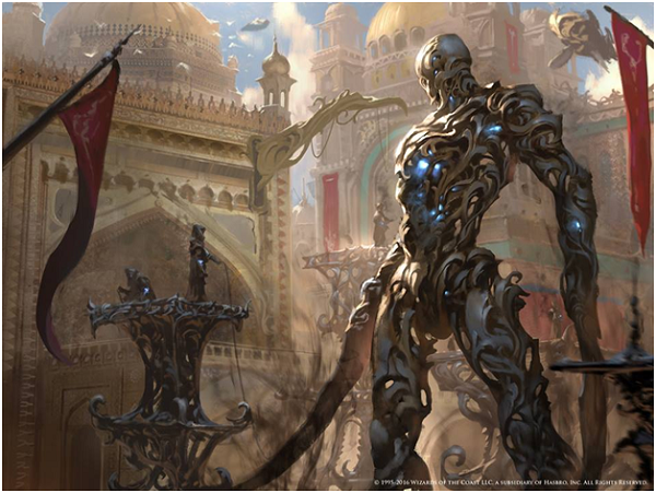
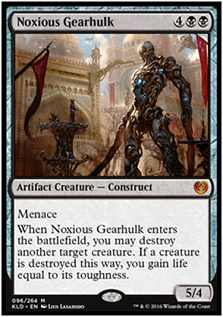
Noxious Gearhulk by Lius Lasahido
Hello Lius. What was the first thing that came into your mind after reading the art description?
First, I didn't expect to get this artifact creature. I was very excited when I first read the brief, since this creature is one of the important cards in Kaladesh. Of course that would be the first thing came up in my mind that time, which is the character. I was thinking of the Pacific Rim giant robot with beautiful craftsmanship of Kaladesh.
Whoa, wait up now. Pacific Rim?! Did your research into making him use
Pacific Rim work at all?
The setting and guideline were very well explained and created, so it was kind of fluid for me to create the mood of the artwork. I actually took the impression when I watched the Pacific Rim movie, like how grand the angle and the movie scene were. So it kind of worked for me.
I started with the lighting at the rough color stage, because lighting is very important to make a precise silhouette of the image. I always start with the main character, as it is the main focus. Here are the sketches.
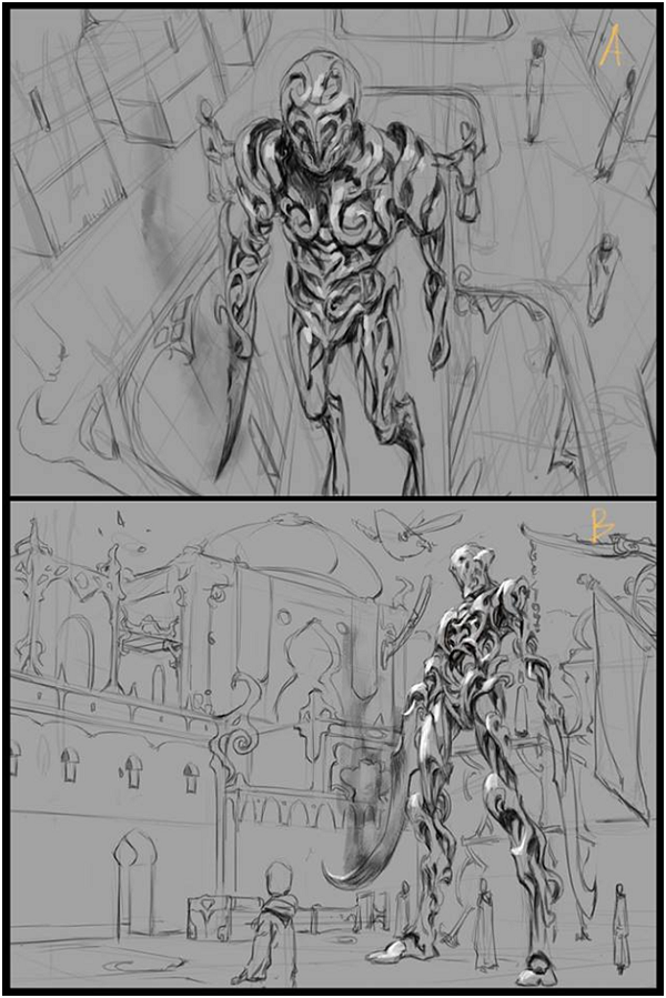
That was also with the aid of the art director. She gave me the mandate to make the Gearhulk look magnificent. Cynthia suggested to zoom in and make the gearhulk bigger.
I'm curious if you started big and then filled in the background, or background first
After I zoomed in, there was an empty space on the foreground
Did you elaborate the background first or add the statue holding guy first?
The background first, the small aetherborn came up later.
I was also inspired by the art of Craig Mullins for this artwork, as you can see:
I have always been inspired by his works actually!
I also really thank the team who made the guidelines as they did a great job. It was very easy to understand the style guide.
 |  |
 |  |
Winona Nelson
Hello Winona!
Let’s talk Kaladesh. Of your commissions, is there a place you went to look first for reference outside of the style guide?
I looked at Indian and Asian clothes for inspiration, laces that use different cuts and drapery from Western fantasy type clothes. One of the tough things about Kaladesh was the use of sort of iridescent, patterned fabrics and fabrics with an ombre dye (a gradient from one color to another). And latticed metal armor? There aren't many costume choices you could think of that would be more challenging to paint.
Propellor Pioneer by Winona Nelson
The backgrounds were interesting as well, because they wanted visual evidence of the power of aether, shaping everything from rocks to clouds. We had to sneak spirals and swirls anywhere we could.
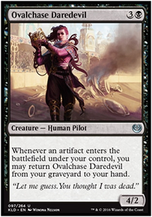
Ovalchase Daredevil, cripes. This must have a story to it. It just oozes narrative!
Ovalchase Daredevil was such a fun one to paint. The narrative wasn't anything more than what's in the card text, just a driver who emerges from a crash unscathed, but the assignment just really resonated for me I guess. I love painting characters and getting a chance to tell the story in their facial expressions and body language. That's not Kaladesh specific but just something I always love to do.

Ovalchase Daredevil by Winona Nelson
Anything you added to her story of sorts?
Well, the assignment recalled a sketch I'd done for a personal piece a while back but never got around to finishing, of a lady knight removing her helmet after battle. I reused the pose, so I guess there's a bit of influence from that, a fighter's confidence maybe. She's used to life-threatening situations.
And are any traditional for us to see at Illuxcon?
All the Kaladesh work I did was digital, most of my recent things are because I've been travelling a whole lot and it's the only way I can get enough working time in. The traditionally painted stuff is mostly personal pieces these days.
Then maybe, what made Kaladesh feel the most unique to create art for?
For some of the Kaladesh characters I looked at Japanese construction workers' overalls. Have you seen what construction workers wear there? They look amazing
Just Google image search. They're so badass

Image found via ameliemarieintokyo.com
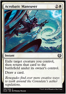
Acrobatic Maneuver by Winona Nelson
Some of the tops were inspired by steampunk costumes. There's definitely a steampunk flavor to Kaladesh, leaning more opulent
 |  |
 |  |
Jason Rainville
Jason! Good to catch up with you. You got a doozy here.
What did you think when you got that in your inbox?
Well, Kaladesh was initially a really exciting plane to explore, I had did some research and work on Mughal architecture before and loved it, so I was looking forward to bringing what little I knew to Kaladesh.
Wait, what? You already had research under you? How did you go about looking for Kaladesh reference?
The research and work was actually for *another* high-medieval/fantasy-indian world called Shatterlight, which was a setting in the diceless rpg Lords of Gossamer and Shadow. Lots of fun getting to know the ins and outs, the layered towers, minarets, forts all in lovely rich dun and crimson.
That is so cool. Is any of that art or imagery public?
Absolutely, check it out:
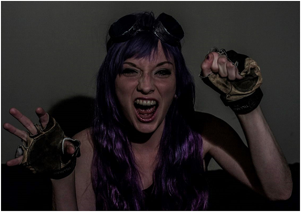
Moving back to Deadlock Trap, was that the first sketch, looking through the porthole in the door?
The sketch for this one was actually the simplest; the brief called for a view of the planeswalkers through a small window in an underground cell. I tried a couple different versions on paper (usually I do thumbnails numbering in the twenties) but it was clear that the most effective was directly from the front. I made it nice and close-up as I don't usually get to paint detailed portraits.

Sad, because on this is real nice of the two of them. Very expressive!
Yeah! And rage! It's always more fun for both the artist and the viewer when there's a lot of emotion in the scene. It always engages the viewer more,
As an addition; i tried to sneak some of what I did in Shatterlight into Kaladesh. So the ship between the two minarets as a docking area, some of the ship design. Felt it was a little secret homage to Steve Russel who gave me my first job.
So, background research was done for you, which is great. What next? Did you have people stand in? Ask for better images of Nissa's face?
Fun fact; 95% of all the people you see in every illustration I paint was modeled by me regardless of body-type or gender. The other 4% is me winging it, and in this case, the 1%, I got in contact with a photographer friend from college, Patrick Gervais. I was extremely careful to hide what this was all for, but in the end he was able to provide some photos for me of (likely confused) models screaming at the camera
Ok that's hilarious.
You use yourself as reference, which I've seen a few pictures of.
If a new artist were to do the same, anything they should keep in mind?
It's a guide. It is extremely helpful, but unless you capture in that photo EXACTLY what you mean to put to paint or pixels, treat it as an augmentation of your own knowledge and ability. The set-up is very important as well; place the camera where the station point (view point) in the painting will be, get the lighting from the right direction, wear and hold anything and everything that is analogous to what the character will be using (bed sheets for robes, I'm telling you) and use whatever you can from that reference to aid, not dictate.
Fake armor is what I see with like, a trash can shield for Ryan Pancoast and it makes me laugh.
Absolutely! There are some real snazzy pics of me holding a broken cabinet door as a shield.
One day we'll see those in the Rainville Kickstarter as unlockable levels.
The highest level will be the pics of me in my underwear biting a leather belt. I swear to god, I was trying to imagine myself as a large deadly troll, but really, I do anything to help the image.
One last thing on reference and it being a guide; in this case it's not the best example. It was just because the pics were good enough that I was able to follow them quite closely for Chandra, at least.
How so?
Well for this one, the model portraying Chandra was close enough to what I had for my original sketch that I was able to more or less copy it from observation. She had some gloves on (my stipulation) that similarly worked, so instead of interpreting the reference I was able to use it almost directly. Very helpful!
From Patrick Gervais:
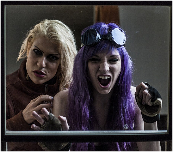
Those poor ladies.
Below is a gif that Jason so wonderfully provided so you can see the process.

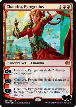
Your other image of Chandra, new Chandra I know we've discussed her previously but anything relevant to Deadlock Trap that connects to her?
Just the new details on her costume. I'm not aware of anything else that might be connected. She's obviously a bit more chill in her standalone image.
Was it at least fun to paint another Chandra?
Absolutely. I had a great time when I first painted her for Zendikar, and Deadlock Trap was probably the most fun I had in Kaladesh. Painting emotion and some great reference always feels nice!
 |  |  |
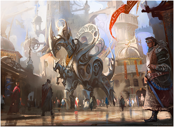
Darek Zabrocki
Iron League Steed, Lawless Broker, Start Your Engines, Make Obsolete, these are new cards from you in Kaladesh. All of them have architecture in them. How did you go about finding good real world reference to use for them?
I looked at middle eastern architecture. It is impressive and super inspiring stuff to see places like Damascus and how they were thought through in terms of architectural aspects. I would love to visit those places, such a shame it's not possible anymore . . .
Middle eastern is realllllly broad. any cities or time periods in particular?
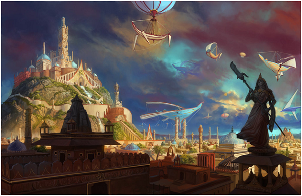
The architecture of Syria was awesome; even from a couple years ago! It's all at war now unfortunately. I find it cool in Morocco too, as well as India, especially old temples are interesting.
Almost like using Syrian reference because they're struggling, keeps that culture alive in a way, you know?
It’s awesome, yeah.
Your usage of strong light vs. dark well, light, gives a ton of shadows and reflected light. How did you go about that decision? It feels very . . . Kaladesh
I love playing with strong light and deep shadows. It was quite natural for me and I found it very relaxing. Happy it fit well into that world!
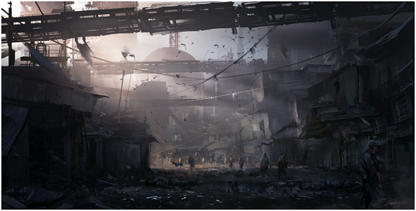
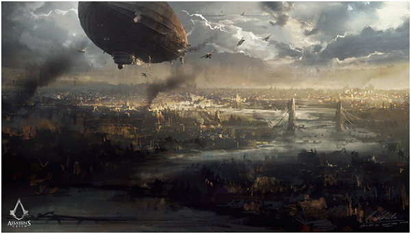
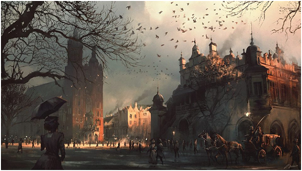
You like playing with light, oh I know. Any example I could include to showcase you going all in on it from another illustration or personal work?
Yeah!
I received a few examples that show his strong usage of light work, see below:
How did you infuse India into your illustrations? Was architecture the main way to do so?
I think architecture plus features like patterns on clothes, on paved ways. It all adds that extra sparkle that feature some type of oriental feel, you know? I love digging and finding new ways to improve believability of place, and keep features visible or even some of them hidden to keep the viewer interested in the piece.
Go on, show me. did you hide anything in there, say in Lawless Broker?

Lawless Broker by Darek Zabrocki
Yes!
Small patterns on clothes but not only on foreground characters but also those in the background. Even colors! Some of them suggest the style. If you look closer at the top of the doors, you can clearly see influences of styles, the same with their ornamental dagger
Like, curved doorways?
Yes, the vault itself. Of course. I did it suggestively But I saw they have patterns themselves. I always try to diversify them so not all patterns were the same. They have a similar feeling.
Did you find some reference or inspiration there?
I was looking through oriental and indian patterns, textures really, on textures.com, to see how the patterns can fold together. And they gave me inspiration for doing it that way. It’s pretty organic, not at all mechanical. It’s very rooted to nature in Kaladesh.
Is there anything you needed to fix to keep an image Kaladesh feeling?
I think on Lawless Broker I had to dig and research more for those patterns! I remember it lacked that and the epic richness of the world. So it actually dragged me to more research.
More research *can* be fun but that seems . . . tiring. But it’s good for the art!
It is. It makes you more aware and you evolve not only as an artist but also as a person. It’s kind of concept art research-So an everyday habit for me. Ha!
Iron League Steed by Darek Zabrocki
Darek also mentioned that he would love to visit the United States in the spring or summer of 2017, so if you’re a tournament organizer wanting this Polish artist, he’d love to be invited!
 |  |
 |  |
Thanks for stopping by today. Look closer at these four artists, they’re phenomenal.
— Mike