The annual Commander sets provide Vorthos with two fantastic things: nostalgic depictions to be shown, like Feldon of the Third Path, and mini glimpses into planes we currently aren’t visiting in a set, such as with Ezuri, Claw of Progress
Today, I’m adding a third thing: a place for slush art to be used.
I’ve waited a little longer than normal to write this out of a test to see how fast artists write posts on their art, to their blogs, and to various social-media channels. The sheer number of artists who didn’t know their art was being printed is far beyond nonzero, and even when I talked to many of them, they mentioned their art was years old in many cases. And that’s okay!
From 1993 to 2009 (Limited Edition Beta through Tenth Edition), Magic’s core set was all reprinted cards. There were no new cards directly in the core set—they had previous iterations in expansion sets. For example, Blood Moon was in Eighth Edition and Ninth Edition but had a precedent in The Dark. While the art changed, new cards didn’t show up in core sets until Magic 2010. This year, 2015, was our last core set in Magic Origins. Stories like that of Baneslayer Angel being a slush art piece of Serra Angel—lying around in a folder until an Angel came along worthy of the art—ends this year. What’s slush art, you ask?
Slush art is art that is commissioned and bought by a company but not used for a variety of reasons. It sits in a folder—the slush folder—until a proper usage is found.
You see, slush art has fewer and fewer houses and definitely is harder to find a home for without a core set. That is true—unless you think of supplemental products like Commander, Conspiracy, and Modern Masters series. Whenever a new product needs art, you make a list and commission the art, and then the weird things happen. When a card is cut for being over or underpowered, that artwork then has no home. Sometimes, it can be switched to another card in the set. If not, it goes into the slush-art pile. There exist times when an artwork is good but not great. The art is still bought, but it can’t be used for myriad reasons, and that artwork goes into the slush-art pile. Card designers look through this folder for ideas for cards, thus saving a little money on the art budget and putting an artist’s work out in the open. Since Wizards owns the slush art, the artist isn’t supposed to showcase the artwork or sell the original due to the nondisclosure agreement. Now, if the art isn’t up to par or doesn’t fit at all, the artist can be paid a kill fee and Wizards doesn’t get the artwork. The artist then retains all copyright of the art and can make play mats or use it however he or she would like. Normally, you really don’t want to be paid kill fees because they’re significantly lower than the normal rate.
Sometimes, slush-art pools have great art that was cut for weird reasons, and you don’t want to waste it on just some random Angel when you have a Baneslayer Angel–amazing level of art.
That said, this Commander (2015 Edition) set is loaded with slush art because Commander sets are perfect for homeless artworks to find a niche that works, and that allows for any plane to be revisited and yet still make sense to a player buying the product. To them, it’s new art anyway. And you know, most of it is still very good art. After having worked in a gaming company with an abundance of older art, there are always ways to use it, but on the whole, there’s a reason it’s there. In a top-to-bottom flavorful set, they can stand out like a sore thumb. In a weird supplemental conglomeration, like the Commander preconstructed decks, they’re utterly perfect.
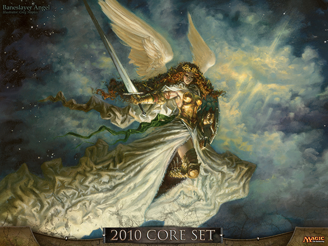
Baneslayer Angel by Greg Staples
Let’s dive into the art—that’s what we’re here for, right?
There is no particular order in which they are listed. It’s just what I could source from my relationships with artists and finding those who posted their art.
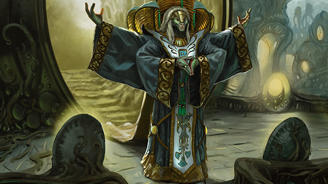
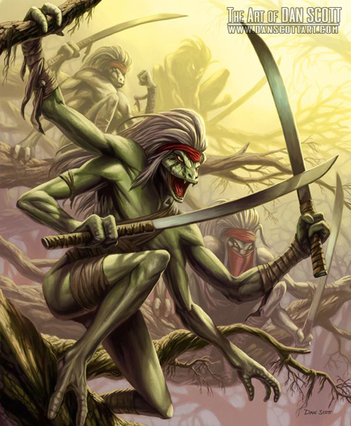
Kaseto, Orochi Archmage | Art by Aaron Miller
Nostalgia is something Magic can finally do with ease. Originally, we just had one plane, Dominaria, and each set focused on a few islands of the plane. Now we have entire planes we can visit fully with a block or we can see little snippets back into what’s going on via supplemental sets, such as with Commander. We haven’t seen a full plane revisited using a supplemental set like Commander or Conspiracy or Modern Masters yet, but it easily can.
As for Aaron’s Snake Wizard here, it’s one of his that isn’t traditionally painted, but it retains a lot of his ability to make digital look like paint. The cloth of the robe and the background light look like soft mixing of watercolors and acrylic paint, but then you see the stairs behind the figure and see the digital brushstrokes. It’s a delightfully simple scene, but one of high attention to detail on the robes and odd lighting considerations with the clamshell lights projecting toward the figure and a backlight. It’s a lot of construction for a simple scene to be simple and yet done right. Traditional painters use reference and play with maquettes to make sure the lighting in the scene is actually correct. I know Aaron uses them for his paintings. They’re normally little clay sculpture that you can play with flashlights. I hope he’ll sell another one soon—people sure were interested in the last one, and that was for a common card that wasn’t a legendary Snake Wizard!
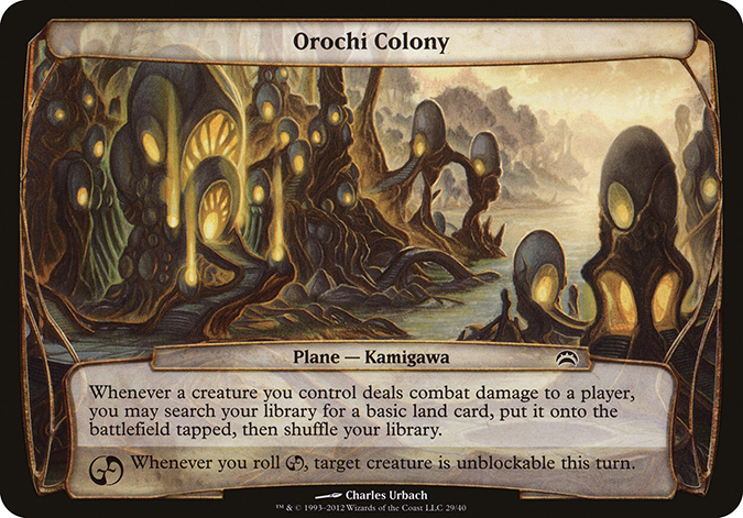
Touching on one thing in the background—one of my favorite images from Planechase—is the Orochi Colony by Charles Urbach. It’s just a conceptual knockout, showing living spaces as eggs. By Aaron including them, it gives you a second confirmation that this is indeed Kamigawa.

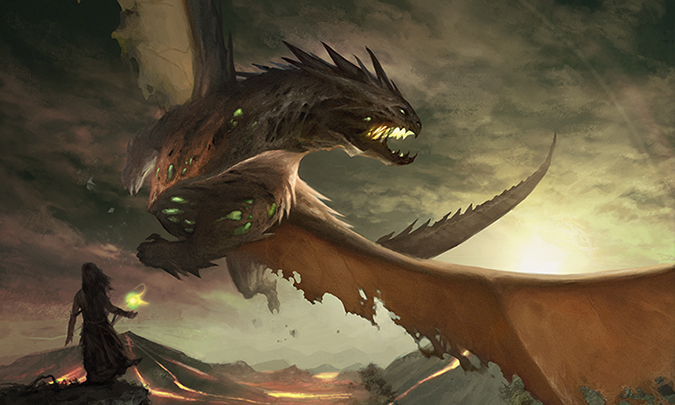
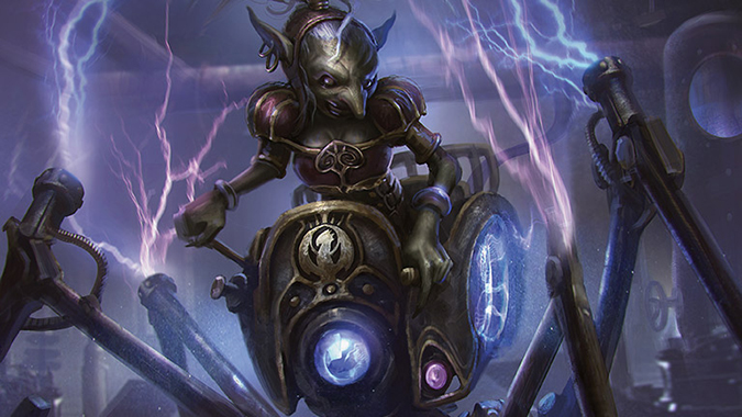
Ezuri, Claw of Progress | Art by James Ryman
 | 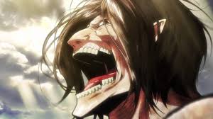 |
Yes, it’s Eren Yeager when he turns into a titan from Attack on Titan. The visual iconographic element simply cannot be said to be a coincidence. And yes, I’m excited about the new live-action movie, too.
As for Ezuri, he’s not green-aligned anymore—and barely an elf. If he loses his elven ears, he bears zero resemblance to his former self, or even his original race. Yes, the hair helps, but with metallic humans of Mirrodin like Lifesmith possibly having dreadlocks or longer hair, you need something to show this as elf other than being in the Tangle forests of New Phyrexia.
I like the oversized hands and exaggerated scale of forearms and torso to show just how radical a transformation becomes after being compleated. They barely keep anything from their original forms . . . other than a few visual cues to help you, the player, understand who the hell the character is.
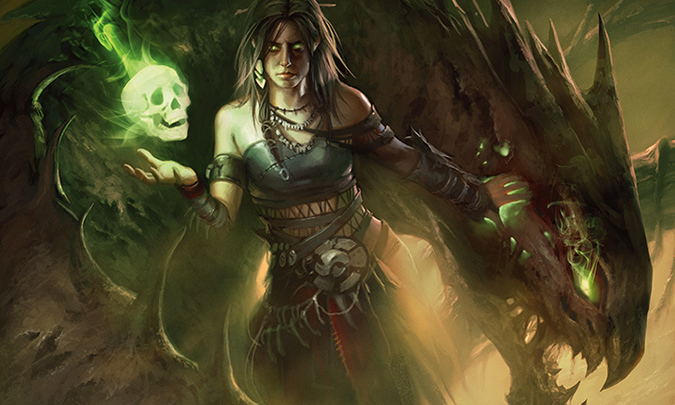
Meren of Clan Nel Toth | Art by Mark Winters
I love his depictions of women made for Magic. The costuming is doable and interesting. Her hair is interesting and not seen on card art yet. To boot, he made us all think this was a Deathrite Shaman as a woman. He gave us a nod and a wink, and I love seeing artists understand what players are looking for.
I may be sucking my teeth with the green Photoshop smoke wisps on the skull and dragon’s eye, as I think they’re amateurish, but they help to add to a depiction. I think they lack reference and are added quickly, taking away from the high quality of the rest of the piece. Go the Kev Walker route: Remove things if you don’t need them.
One question to note on the costuming: Is this a bare leg, denoting a loincloth, or not? I can’t quite tell. Sound off, and we can hope to find out!

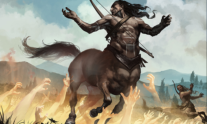
Grasp of Fate | Art by Tomasz Jedruszek
Visual iconography shows us rules for any digital illustration. Once you look at enough artwork, you can see trample, first strike and other mechanical elements. It’s hard for artists to turn his or her brains off, especially if he or she is a player of the game. In this piece, exiling this centaur is shown by an ethereal body. He’s see-through.
When an artist shows an uncommon effect, more often, the art description shows the magic removing the creature. Often, the creature distorts or warps “out of reality,” whereas in any exiling, the creature fades out or becomes transparent instead. It’s a minor difference, and while never universal, looking for the visual cue, you’ll find it more often than you think.
The gold/white hands may appear religious in nature to you, like pulling from the underworld, but the hands are bright in color, not grayish, as they would appear in Dante’s Inferno or any standard B-movie zombie thriller.
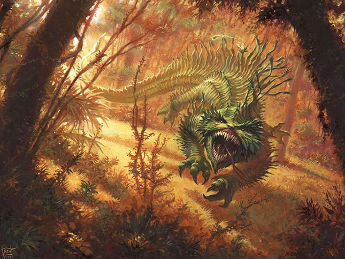
Scourge of Nel Toth | Art by Mark Winters
Oh, that’s the dragon. Cool.
The green poking through the dragon’s stomach, showing the recycling magic of Golgari, is a fun touch. It is a zombie dragon, after all.
How artists show figures with dragons radically differs. Normally, they’re barely in the frame, such as with Mark’s above and Todd’s below. It wastes space in the card frame to include them as significant. Aaron and Chris below use the figures to illustrate a more complete scene and give you scale. It’s a stylistic choice made at the sketch stage, and it’s just interesting to see.
As for Dragonmaster Outcast, notice how the figure is the focus with a dragon overhead, and in Scourge of Nel Toth, the opposite is true. But in the case of Winters’s work above, by naming it “of Nel Toth” and showing the green circle glowing on the figure, we can place that person as Meren. That’s great storytelling in such a tiny space. I hope more legendary creatures or known-by-costuming figures could be in dragon depictions that might have dozens to hundreds of members, such as a certain type of soldier, goblin, or undead.


Daxos the Returned | Art by Adam Paquette
Do you want nostalgia, but the narrative needs an update? Then Daxos covers both aspects for you, dear Vorthos.
“Finga guns” here is giving the blessing signal that’s fifteen-hundred years old at least, for Christian iconography. It’s the question I’ve been asked about a ton on Twitter, and while the symbol is known, why Paquette either needed to show it in the art description or chose to use it is unknown.
The enchantment creatures lend well to Paquette’s brushwork, exploding the mind of the spirits, keeping them humanoid but unknown whether to be a satyr or human. Notice also that he chose to revisit the ruined temple the background of Daxos and the token’s artwork. They tie to each other. Normally, traditional painters can do this to save paint. They do them at the same time, such as with Jim Pavelec and Dragon Roost. Adam Paquette works digitally, but he still has some serious art chops, as I wrote about in an article comparing him to the famous Hudson River School group of painters in the mid-1800s.
Daxos’s tattoos also look fantastic because normal digital painters don’t examine weathered skin and a light source on them. They’re almost always too bright because digital illustrators create the tattoos after creating the figure, not during, so they “glow” instead of looking natural. Imagine painting tempera paint on your skin as compared to showing a tattoo over a number of years; it’s the same sort of feeling.
In short, Adam Paquette is good at artmaking.
 |  |
Basilica of Sant'Apollinare Nuovo in Ravenna, Italy: "Christ surrounded by angels and saints". Mosaic of a Ravennate italian-byzantine workshop, completed within 526 AD by the so-called "Master of Sant'Apollinare" | |

Mazirek, Kraul Death Priest | Art by Mathias Kollros
Super-gross.
This is a Kraul, a weird bug thing of the Golgari guild introduced to us in the second Ravnica block. I totally forgot about this type of creature.
Mathias has a strong grasp of color in creature design, as he has been making covers for Cthulhu-related projects for years. Those tend to have greens and purples among the other integration of colors into those eldritch creatures. It serves him well in making a bug look to be integrated into the ground so seamlessly. It belongs in this space of mushrooms. Think of the Alien movie series egg rooms—everything is connected visually, from slime to the correct colors. The backlit insect here looks fantastic.

Bastion Protector | Art by Victor A. Minguez
While the Women Fighters in Reasonable Armor blog hasn’t been updated in a while, if it were, this piece would be included. Victor shows us a likeness of Maisie Williams, who is Arya in the Game of Thrones TV series. What I see is a badass warrior woman in armor that makes sense and has filigree and ornamentation—which I’ve suggested as a way to show a woman in armor—and there’s beautiful usages of gold throughout the piece to connect with the mana color of white, purity, and the light source.
I want Victor to immediately be on anything Bant in the future, as he shows he understands functional armor by his usages of rivets and leather strapping mixed with buckles, just like real armor. He’s studied reference well, and I imagine if he received a Planeswalker or a group of soldiers pivotal to a set, he would create iconic cosplay worthy artworks that would be loved for years.
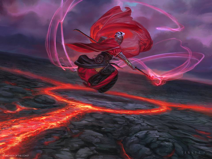
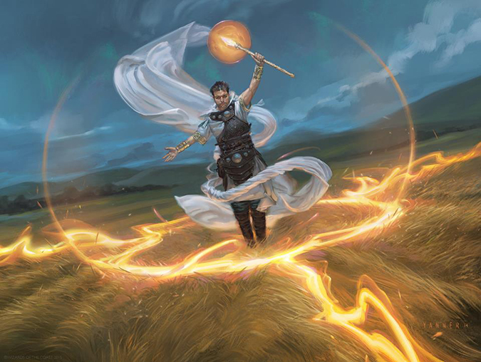
Fiery Confluence | Art by Kieren Yanner
Kieren received a full cycle of humans for his confluences. They’re all to be played in various aspects in Commander for a long, long time. I’m sure he’ll love signing them in his new coffee shop as Magic players visit him during the Sunday live-drawing sessions.
They remind me of Donato Giancola’s Seer cycle in Urza’s Destiny in terms of costuming, plane-neutral depictions, and variation of humans. I wish he would’ve had more women, but in cycles, we as the player base will always ask for that. Older women rarely have a space in a cycle, and while the Fiery Confluence could be construed as such, changing Mom to a young mother instead still stings a bit.
The paintings are all good to great. If these were traditionally painted, a pair would be picked up within a day, no question. They all look like novel covers—for every single one, we can imagine a full story about them and their families and a story that makes the magic in their life and their world.
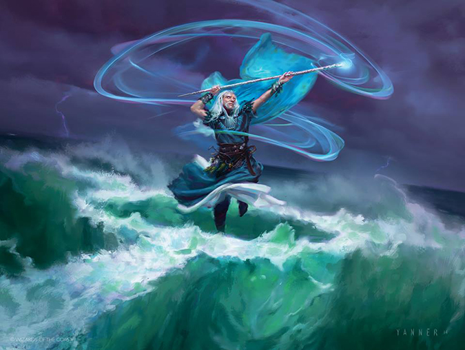
Mystic Confluence | Art by Kieren Yanner
That’s incredibly great-looking water.
Righteous Convergence | Art by Kieren Yanner
The figure looks like a likeness, and the cloth is airy—impeccable created.
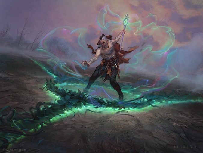
Verdant Confluence | Art by Kieren Yanner
Those colors look so wrong, and yet, they’re just so right. Pinks and greens can fight in fantasy painting, making a 1988 third-rate cover so easily. Here? This shit right here? This sucks me in. And I wanna celebrate it.

Wretched Confluence | Art by Kieran Yanner
That’s interesting as a concept. It’s a dug circle with zombies that’s an iconic depiction and one likely to be copied in another game. Just wait; you’ll see this again.

Shielded by Faith | Art by David Palumbo
Painted fire looks great, doesn’t it? Yes, yes it does.
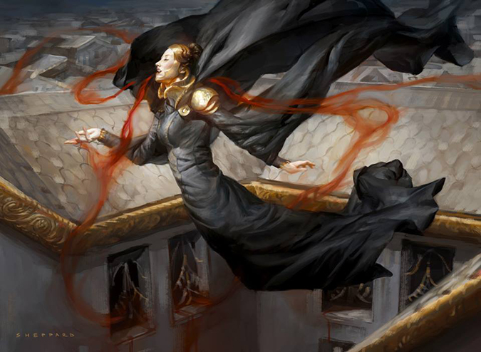
Thief of Blood | Art by Cynthia Sheppard
My wife Emily says I have an art crush on Cynthia’s work, and it finally makes sense to me why. Every few years, there’s a highly charismatic, incredibly skilled woman who enters Magic’s ranks of artists and then transcends above the noise to the fine-art world: Imaginative Realism.
Cynthia is the present-day Rebecca Guay.
It took me a while to realize it, and I am enjoying an award-winning artist sticking with our little game by becoming an art director, guaranteeing us her insight, perspective, and incredible imagery for years to come.
Magic’s art is better than ever before; you just have to understand that while you loved the whimsy of the Foglios in the mid-1990s, they weren’t winning gold awards by art annual books and being lauded by peers. That’s new. Cynthia is doing that.
Also, this is a nice self-portrait.
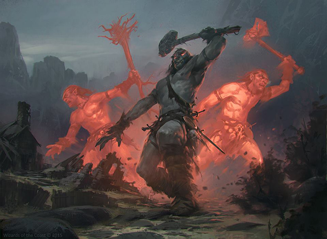
Warchief Giant | Art by S?awomir Maniak
The middle giant is great, the left giant is acceptable, and the right giant looks rushed.
This looks like a piece finished from a speed paint that was turned in and then sat in the slush-art pile because it couldn’t be used in standalone set for whatever reason.
It’s like a donut: It tops out at fine.
Caller of the Pack | Art by Ryan Yee
I asked Ryan for this image, and he was hesitant to send it to me. That’s understandable, as this piece isn’t a “duh-obvious” goblin standing on some dirt. You need to stare at this piece for a minute. Breathe it in.
. . .
There are five elements of note to this piece. There are two ghostly apparition beasts, which are obvious. There is a central beast, and do you see that tiny carcass? That’s a deer.
I like ghostly creatures in Magic that aren’t spirits or ghosts. We had plenty our share on Innistrad. The snapping jaws of this beast give me flashbacks to Castlevania for some reason. I don’t recall an exact instance of a ghostly beast, but I see some warg, I see some wolf, I see an at-first-glance ambiguous creature with a fun triplicate that rewards me for looking deeper. I can dig it.

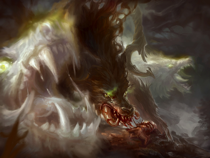
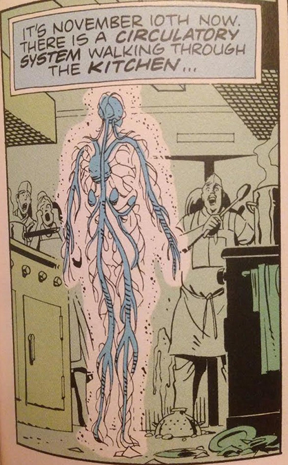
Rite of the Raging Storm | Art by Svetlin Velinov
I can’t unsee Dr. Manhattan here being reconstructed from The Watchmen movie. The graphic novel looks different. In case your hipster friend you show this article to asks, I included the original depiction as well below.
I like the arrangement of enchantment to creature, as you can see sketches would change the meaning of the image simply by chopping off the feet and darkening the humans to make the elemental stand out more in the token. Compare this to keeping the mages in focus in the enchantment, forcing the focus to bounce around, thus, an enchantment.
This usage of electricity isn’t a lazy Photoshop trick found on YouTube. Each line is painted digitally, with variation of thickness, mindful application of the overlay in blue, and radiating the lightning away from the center (distant) figure, giving the piece more depth.
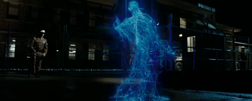
Image gif via The Watchmen film by Warner Bros. Pictures

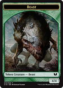
Ezuri's Predation | Art by Svetlin Velinov
Look at the difference between Ryman’s version of Ezuri and Velinov’s! Artistic styles show what must be shown like the knee spikes, the Ironman chest circle, pointed ears, and hand compleation by Phyrexians, but the exaggeration isn’t there. This is a quiet piece despite the impending beasts attacking us, the viewer. It’s calm and planned, as if executed many times before.
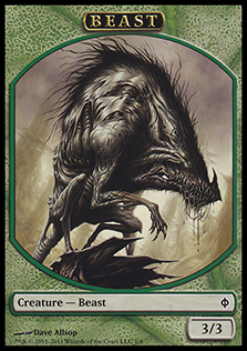
I like how Velinov took direction from Dave Allsop’s concept work and created a more Phyrexianized, meaner, and stronger beast. I love that direction of showing us insight into a plane while also giving us perspective into how the environment is changing. The forests are becoming more feral, with a renegade elf injecting himself into Vorinclex’s ecosystem like a cancer.
 |  |

Thought Vessel | Art by RK Post
This piece is almost four years old. It’s slush art and has sat in the unused-art folder, waiting for its time to be used. It’s a natural part of any game creation that you will have bought art that sits unused. Commander doesn’t need an exact plane, so this Commander staple is also unconnected to a plane. It’ll be played for years, and it’s a nice little cherry for RK to sign from now until forever, as the effect is incredibly undercosted and an auto-include in nearly every deck.
I just like the different textures, as I’m unable to place if these are metal, mineral, plastic, or what. They look . . . magical in nature, and I can’t place it. That rather makes sense considering it’s an artifact object made in a fantasy world.
Oh I know, it reminds of the mobile game The Room, as if it is supposed to open in weird ways, showing us new runes, glyphs, and puzzles to discover its artifact secrets. As though it were a few years old, I’m now projecting a contemporary meaning onto something unintended. Welcome to analyzing art.
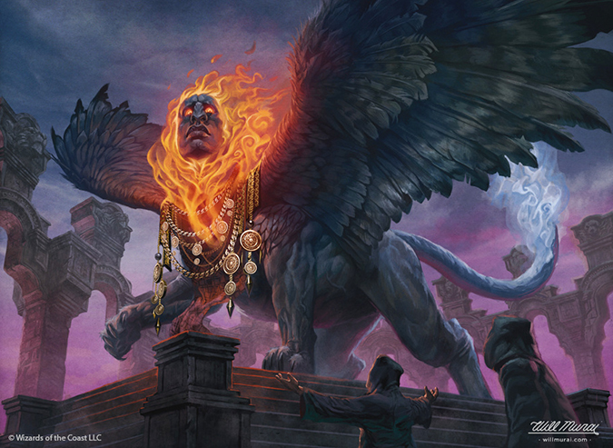
Arjun, the Shifting Flame | Art by Will Murai
I love purples in Magic paintings.
I like when artists play with magical elements of primary colors. Will has been slotted in as the “guy who can make white-aligned soldiers, warriors, and humans of any kind.” It’s nice to see him have an odd, out-of-the-box commission. I enjoy the face of his sphinx. It’s emotionless, like most sphinxes in Magic, but it also isn’t a white Anglo-Saxon face. It’s more actual Egyptian. I’ve visited the British Museum a few times, and after seeing our boy Amenhotep also have sculptures that feel similar, I feel Will was trying to inject some allusions to representation into this mythical creature. I like that. Let’s see more of that and celebrate that.

Red granite statue of Amenhotep III, 1350 BC, British Museum
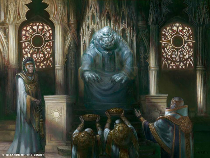
Karlov of the Ghost Council | Art by Volkan Baga
Ant and I argued in a Snack Time with Mike and Ant podcast episode, before this was spoiled, about who made it. I argued it could be Baga or Steven Belledin. They’re both traditional painters, but the Orzhov symbols on the windows were what tripped me up. They don’t fit the aesthetic of the lighting or how stained glass interacts with a room. Baga is German; he can literally walk into a church in any nearby city to study it, but stained glass is rarely, if ever, black.
Baga’s work is characteristic with his usage of light and figural work. He looks like himself, and his apprenticeship under Donato Giancola, a living master, shows through every major painting he receives as a commission. Painting delicate golden texture, cloth, and marble all interact differently, but he then adds a ghost to the scene, and it feels incorporated into his view of the world of Ravnica. I’m not an Orzhov person, but if I were, this is a snap-buy painting.
It’s a beautiful piece, and its original sold in hours on the MTG Art Exchange Facebook group. I’d check out the group if you’re interested in buying original art.
Bloodspore Thrinax | Art by Ralph Horsley
Ralph doesn’t get many beasts working for Magic—he’s only gotten Terra Ravager and this feisty little guy. What is showing through is his work on Wildborn, makin’ just beautiful paintings of landscape scenes. This state-park camp scene has great fauna that he filled with a little guy defending his weird Jund forest.
Thrinaxes aren’t super-well-defined other than they’re beasts that make Saproling tokens. They aren’t even mentioned in the Planeswalker’s Guide to Alara book despite being a rather played and reprinted card. Maybe for the next go around to Alara, we’ll learn more of this weird creature. In the meantime, we can look at the spines of the different versions artists defined to see how creature turns to plant via stylistic interpretation.

Kalemne's Captain | Art by Tomasz Jedruszek
That’s a big giant. Why is that fence there? Is that column flying at us? Are there two columns flying at us? Is that Nyx being exploded in the temple? Are this captain and Kalemne both women? Yes? Okay then.
I see the mountain in the background absolutely needed to balance out the giant; this is established. Giants in any plains make zero sense—there’s nowhere to hide. A Magic thing dealing with giants appears and also shows that they aren’t abundantly rare. (If there aren’t mountains or areas to hide out, they’d be killed pretty quickly, as you can see them a mile away.) The inclusion of mountains forces us to look down instead of up.
I like this piece. It’s very memorable from a great art description destroying a temple and feels like Theros simply by color palette.
But slow down, art lens, and let me get this right. This Giant is a 5/5 that can become an 8/8. Using Justin Treadway’s trusty size-comparison chart, she starts as a Baneslayer Angel and grows to a Lorthos, the Tidemaker. That’s pretty big and clearly able to annihilate artifacts and enchantments with ease.
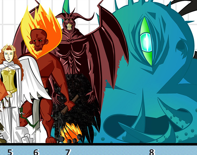
Justin’s full-sized chart found on his blog, here.
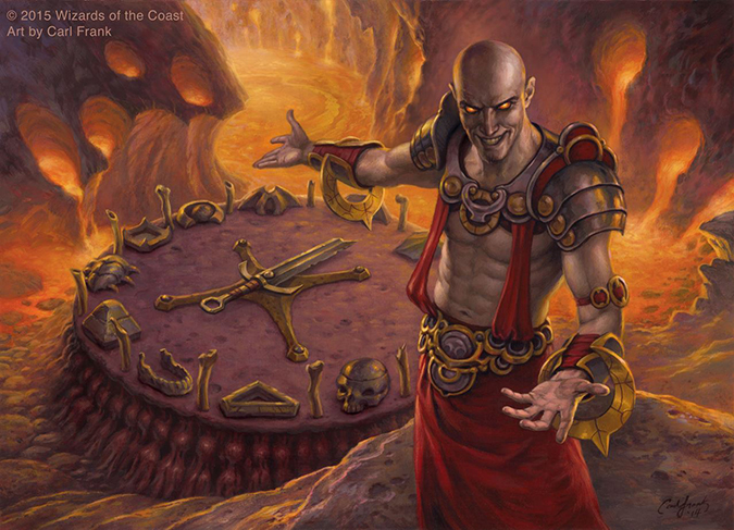
Magus of the Wheel | Art by Carl Frank
This is another of the original paintings that sold on the MTG Art Exchange Facebook group. The final painting differs from the card in that the objects are slightly a difference size on the dais, but if you ever collect original art, you’ll see this happens quite often.
This looks like an artwork from Time Spiral block—Shiv perhaps. No, I don’t think that because of the subject matter that isn’t plane-specific, but rather, look at the lighting. It just looks like it’s from that era. So where is the light source?
- Is it upper-right, indicated due to his shiny head?
- Is there light in front of him, as evidenced by both biceps being lit?
- How bright is the fire behind him, as shown by an eighth of his abdominal muscles being lit?
- How is his head lit while his shoulder-plate armor is not? Is it only reflected light?
- How is the sword laid on the ground all lit in the same light?
This is what happens when you don’t use a maquette or paint without identifying light sources.
This is one of many things that differentiate 2006 art from 2015 art in Magic.
These days, artists of Magic are drawing from life more and with more plain-air studies, and by doing so, they are controlling the mood of the piece better. This makes for better art and, technically, superior art to what you think is great art from the 1990s. See below for how significant identifying light sources can affect a figure. The entire mood of a face can change simply by showing different light sources:

Image via rigneygraphics.com

Boros Signet | Art by Mike Sass
Ah, this is another of the not-new-but-you’ve-seen-this-art-before pieces. I really enjoy how deconstructing this piece can improve the scene by addition. If you remove the doves, it’s a boring scene of two soldiers. If you remove the soldiers, this no longer reads as on the ground—it could be high in a stronghold or even an exterior of a guildhall. By removing both, this can be a vault, barracks, mess hall, weapons hold, or a variety of other things. This was designated right away into being a signet, a way to funnel mana into the colors you need, but it could’ve been bought as a slush-art piece and used for a hundred things.
It shows great, simplistic use of a ray of light. This could be great to see at sketch stage to understand the construction.
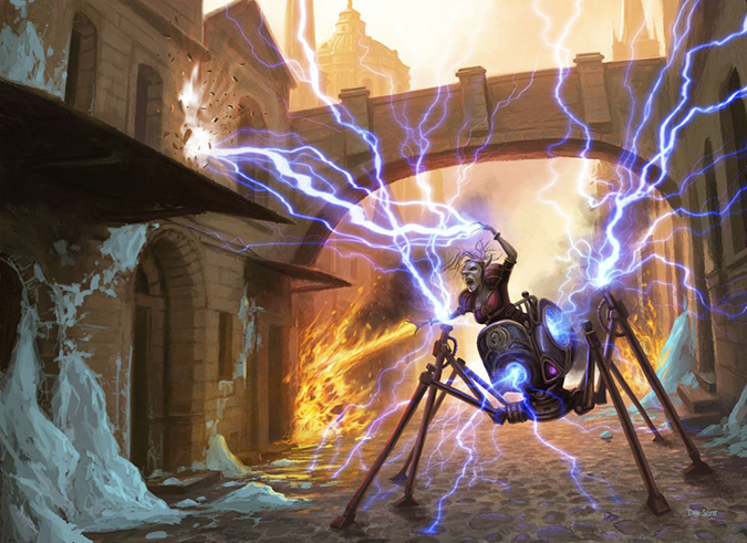
Mizzix's Mastery | Art by Dan Scott
Okay, what’s going on here? This little woman goblin is shooting lightning out her contraption and shooting fire from her hands, and there’s snow on the ground. I think that’s snow. Maybe it’s ice. Is that creation an allusion to the Dungeons & Dragons drider or the BT-16 droid from Return of the Jedi?

BT-16 Images found on starwars.wikia.com
It’s just a lot to take in from a little scene. This is an art description asking for a lot of things. Artists don’t write them, they just try to achieve all the elements at sketch stage, like a potter with a wheel that is spinning the clay wildly. Control it, and you have a badass pot. Lose control, and you make a mess on the floor, and no naked ghosts will help you make a new one. Thank god Dan is a good artist and can fit everything in.
I still don’t understand the snow though. Ravnica doesn’t appear to have a cold season. We only see seasons on Innistrad showing Kessig’s seasons on basic lands, or with Ice Age and Coldsnap.
Gigantoplasm | Art by Kev Walker
Ant loves this piece. Want to hear him talk about it? We discussed it at the beginning of our last Snack Time with Mike and Ant podcast episode: “Commander 2015 and So Hype.”
I like the placement of three figures that don’t look awkward at card size.
Seal of the Guildpact | Art by Franz Vohwinkel
I saw this painting up close at Grand Prix SeaTac, and it’s utterly stunning. It was bought almost immediately, as Franz works traditionally, and I’m happy it finally found a home in a card.
Mechanically, it shows that the medallion cycle is undercosted at 2 mana to make a card cost 1 less to cast. On a gamer Vorthos level, the color-reducing of costs fits directly into flavorful deck-building. This card, then, allows any combination of guild or color to be used as a justifying element for that flavorful deck-builder you may know.
I didn’t ask Franz why the Izzet is highlighted; I assume the reason is it’s in the Izzet deck—I guess. If you see him at an event, ask him. He’s rather mindful for things like this. That and hearing something in depth detailed with his German accent is always delightful.

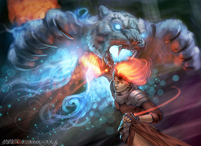
Illusionary Ambusher | Art by Steve Argyle
We’re lucky to gain some insight into what Steve was thinking on this piece with a recent blog post.
I couldn’t quite tell if the illusion was basic in some type of water, wind, or ice magic, but it’s all irrelevant in the end. It’s a great cat face, a strongly influenced Legend of the Five Rings figure, and a great little sketch that didn’t see print! Steve does try to include as many Easter eggs, in-game expansion of Planeswalkers, and additional explanations as possible. I always love that. It’s never just a painting and a shrug. It’s delightful.
 |  |
This token has been used for years on Magic Online from Ravnica block for the Hunted Dragon card. They just had never made it into a token.
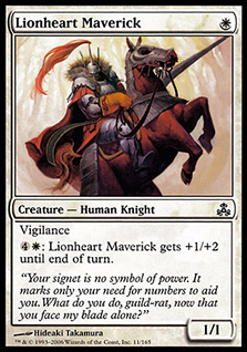
I love the oversized hood on his token; I always have. Those tiny brushstrokes still show up fantastic at card size and at blown-up-enormous size.
I never quite understood the feathers in the painting. I also haven’t understood why Lionheart Maverick is the same armored character at 1/1 and seemingly unrelated. These seem to be development changes that didn’t quite work out. Something happened here, and they don’t fit. It’s a cold case from Magic’s history. Someone ask Blogatog, Mark Rosewater’s blog, what’s up with these. If you find out, I have a shiny booster to send you through the mail.
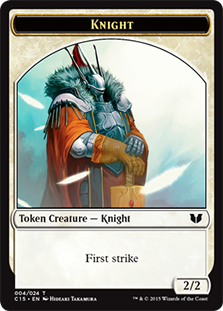
Knight token | Art by Hideaki Takamura
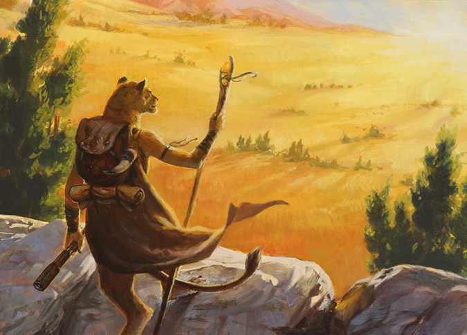
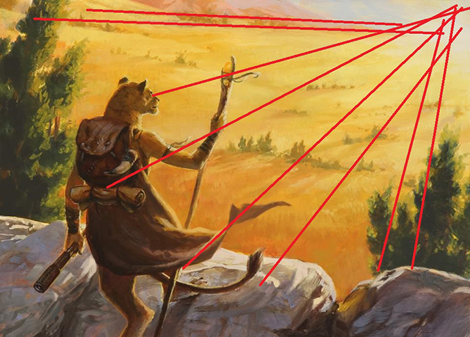
Oreskos Explorer | Art by Winona Nelson
While seemingly an unassuming card commission, this card will be incredibly popular for years to come. White has few land tutors that fetch dual lands, and Commander cards like this will make must-include lists for years. It’s a unique ability in a color with few card-draw abilities. Add to that fact that it’s traditionally painted, and players will want this card signed for years.
I love the east-horizon vanishing point, as showcased below. It’s just a little extra flavor for you if you’ve studied just a smidgen of constructing a scene and want to see some more of Theros’s countryside.
Snake token | Art by Dan Scott
This is another of the Magic Online tokens that never saw print until now. It’s the token for Orochi Eggwatcher and was originally in Champions of Kamigawa.
This is some of Dan’s early Magic work, and he had a tight control of scenes by showing the figures more and more in focus. There was no need to make ten snake warriors in the trees, despite many efforts in the past that mechanically tied art to the card. Thank god they didn’t go that route, and kudos to the design team for including tokens of cards that players definitely need in their deck.
Snake token | Art by Christopher Moeller
The last of the new tokens that have had art before, in this case by Patagia Viper, comes into fruition. Chris Moeller has sold most of his originals, but in case you’re interested in this or more and talk to his local comic-book shop and friend Tom at Fanfare, who sells some of his art. If you had been reading my articles years ago, you might’ve picked up a deal from him.
It’s a great-looking snake, and the green-blue nature of it isn’t hitting you over the head.

Great Oak Guardian by Steve Belledin
There isn’t a more delightful five to ten minutes with each set release than reading Steve Belledin’s blog. I’ll let you dive into his post on Great Oak Guardian, but notable are two things:
- He made this five years ago.
- He actually likes this painting.
You’ll learn Steve is super-, super-harsh on himself about his work. You’ll also learn how wonderful it is for an artist to discuss each of his or her works in detail. The problem in this case is it was five years ago.
Regardless of Steve’s memory, the background leaves in this are so delicately painted—you look in front and then behind when you see just how intentionally Steve used an abundant amount of shadow on the treefolk to keep focus forward. I bet his reference was mega-fun to play with: a tree holding a giant boulder, preparing to lob it at a nearby foe.

Broodbirth Viper by Mathias Kollros
You missed the boat too, didn’t you? I love seeing larger images than just at card size because of the amount of detail and scale you pick up on by visiting artist websites.
How fun is the viper to the right? It feels so Kamigawa and Eastern influences by the wisps of smoke and the arch making an S shape. I’ve often said there are levels to making card-sized images, and you can tell by subject matter.
- Level one is being able to place a singular figure in space.
- Level two is painting two figures in a space.
- Level three is painting two figures interacting in a space (fighting perhaps).
- Level four is painting a figure on a horse.
- Level five is painting two figures, with one on a horse, interacting in a space.
- Level six is many horses, with figures, in a space, all interacting.
In short, horses are hard to paint, as people always think they know what they look like but have no idea unless they draw from reference. How does that relate to our viper here?
Painting three vipers that don’t fight for a focus, in a space with depth, while seamlessly explaining a difficult game mechanic, while still looking incredible as a standalone image, is on that level-5-or-6 area.
Corpse Augur by Scott M Fischer
You may not know this, but Scott Fischer was a tour de force in the late 1990s and early 2000s for Magic. His paintings were gigantic for gaming art at the time and won numerous awards. If you dig into Original Magic Art’s Spectrum list, you see his work everywhere.
This image really stands out for me in this set because, to the untrained eye, this is just a nice-looking necromancer. It’s such a free association of celebration. You can see Scott smiling as he worked his underpainting, using sound reference and honed lighting while embracing all the bloating excess that digital images can offer you, from glowing orbs and movement of layers to ethereal qualities that a necromancer would possess. This image defines a fusion of expertise. He intricately arranged it to give you a logical image that Magic would desire, and he controls your interaction with it, from a long vertical line of his scythe to an x-axis of his hand, giving you a surprise delight in the ruins behind him and then a surprise with the glowing orb within the ribcage, only to look up at the figure’s face, who knows you’re staring at him.
Those faced with the onerous task of finding one image that is quintessentially Scott Fischer of today needn’t look much further than this Corpse Augur, a slush artwork that once again had life breathed into it in our set. We’re lucky to see this; it’s exceptional.

Awaken the Sky Tyrant by Adam Paquette
It’s amazing that someone in full plate armor, near an active volcano, would still be wearing armor, right? It sure would be hot. It begs the question that the former creative director, Brady Dommermuth, would ask from time to time on the other forum message boards. He’d ask, “How much realism do you want in your fantasy?” It goes from the logical to the questionable rather quickly.
Do you want soldiers to always have helmets? Why should warriors ever have shields considering mages exist? Would women mages be considered witches and hunted down, and thus, should they be rarer? We want all humans represented, but with a medieval society, should we omit racism?
These are hard world-building questions to ask, and they having definitive answers to them in style guides to help artists immensely on what is kosher and what straddles the line.
Anya, Merciless Angel by Alisa Lee
There’s something strangely optimistic about this artist. I see proportion issues with the elbow, length of the swords, and even the lighting on the wings, but at card size, there is something strangely balanced about this piece. It’s as if I’m supposed to look at her white, hollow eyes and then step back at the greater depiction of a virtuous angel of war.
The art directors of Magic see something with this new artist Alisa Lee. She has no social-media presence online yet, but how she is accepted by the Magic community matters little to me. I care about the art alone, and her design feels fresh. She has bare skin, and the boob plate is there, but it’s not distracting. Her helmet feels new to me. There is something old, yet new about this, as if Ravnica has a missing artwork in it of Feather, the storyline Boros angel who never had a card. This acknowledges it, and yet, you yearn for more, learning that Anya is not that character but appeases some semblance of the fandom looking for red-white angels. It’s a good artwork, something I could see in a slush folder of an uncommon angel you’d play in a Ravnica set, but it actually is noticed if it’s a legendary Angel in a Commander set. Frankly, I think it’s in a better place here.

Kalemne, Disciple of Iroas by Jason Chan
Cool:
- A black woman who’s also a giant. That seems cool.
- Great usage of foreshortening to show scale. That’s cool
- Some actual black hair again, it’s not just a Jason Rainvile thing. That’s super-cool.
- Are capes still cool? Hell yeah, they’re cool.
- Is that a scale-size sword for a giant? It’s cool to make it not a gigantor longsword and, thus, believable.
Not so cool:
- Boob plate and midriff on yet another woman warrior. That seems uncool.
Mizzix of the Izmagnus by Cliff Childs
I’m trying to like this piece and find something I can celebrate about it. I really don’t like it. This is slush art that could’ve stayed in the slush folder. Here’s why:
- Without the Izzet symbol, this looks like World of Warcraft or a generic Kickstarter TCG.
- The only area that looks to the polish level of Magic art in 2015 is the Izzet symbol.
- Speaking of, why would the Izzet even care to add ornamentation to something that will probably blow up anyway? That’s a flavor-breaking inclusion.
- The distortion effect coming on either side of the contraption is interesting, but it looks to have been abandoned in favor of lightning effects.
- The lightning is amateurish usage of a Photoshop blur tool.
- The figure’s left forearm is so not proportional to the other arm.
- Goblin boobs? Sure, why the fuck not. Ship it. Whatever.

Meteor Blast by Mike Sass
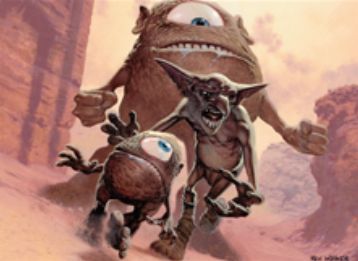
For every old-school player complaining about how “everything is digital now,” I dare you to look at an artwork that captures the spirit of old-school Magic art as well as Meteor Blast does. Forget that this artwork somehow takes a simplistic art description (people running from meteors) and layers it into a menacing chorus that fits eerily well into the overall pantheon of old Magic-art inclusions.
Looking at the details, such as the knee jumping out on the left side of the work, reveals a sophisticated composition winking at you as the viewer. It waxes almost nostalgic for the 1990s depictions of Magic art. Sass uses obvious real people as the figures, showcasing that he understands reference, but he also crescendos into encouragement for the next generation of artists to use traditional painting. He urges to not forget the humble beginnings of the fantasy-card-game genre with lazy layering Photoshop techniques and the sameness that digital speed-painting creates. It’s a cautionary tale that great depictions can still be created traditionally and kept fresh if you use reference and understand those who came before you.
I get what he did there—very clever.
There are other images that are new to us from Commander (2015 Edition), but unfortunately, larger images could not be easily sourced for those. Such is life sometimes.
It’s an interesting set with two major cycles receiving new art and a ton of slush art finally having its place. It’s a sad time knowing that the core sets are finally gone, moving us from avenues for art being used to infrequent outliers finally gaining their homes. It’s a longer article for me to write—one on artworks that languish on shelves—but that isn’t for today.
I hope you learned a thing or two about some artworks and celebrate some of the triumphs of this set.
Until next time,
-Mike