


There are a lot of new pieces of artwork in Magic 2014 with a few new themes that will be influencing the visual style of Magic for some time. I decided to go through all the new art instead of just picking and choosing. Musing will ensue, knowledge will be shared, and fun will be had. Art info will flow in . . . I hope.
A couple of big points:
- There was a massive overhaul on the style guide on armor for women. Okay, guys, we get it and appreciate it. Just so you know, it is okay for some women to show their bodies. Women do that sometimes. Overall, A− work.
- Wizards, can you urge artists to post art on their blogs, websites, or social media pages upon release? It’s great for community-building to urge them to show their greatness, it’s cheap advertising for you, and it helps us Vorthos folk enjoy the art. Post it on your blog ASAP! Tumblr is full of Vorthoses who love the art. Give it to them! Maybe a list e-mail would work.
- Black cards are all very, very dark. It might help drafting, but they swim too much together in the set.
- The plane M14 is on is supposedly Shandalar, but you’ll notice a bunch of other locales represented. I don’t feel this is a bad thing, just something to be mindful of in the future.
- Good god, there’s a lot of purple in the set. Seriously, count the pieces with it.
Onto the art!
(I’m going to keep the Slivers as a grouping at the end. It’s easier for both of us, and you’ll see why.)
White
Ajani's Chosen by Wayne Reynolds
Traditionally, Wayne knows how to make them cats. Since he did Wild Nacatl, it’s smart to commission him again. When you have someone of Wayne’s skill, you don’t need to hammer much home—he just knows what to do, and you’re off to the races. One thing that really stands out in this piece is the eye paint. It represents Ajani, of course—due to him missing his left eye—but notice all three. Either Wayne very intentionally made them less integrated or they were a last-minute fix. I’ll let you choose which one it is.
Hayes has really been improving the last couple years in the Wizards spotlight. I’ve heard many collectors now wishing to acquire his work “cheap” before he “hits it big,” whatever that means.
This piece, despite it having a strong composition, has a few elements that were not created at his normal quality, thus create a jarring image. The right arm proportions are a little off, and the foreshortening isn’t quite perfect in a bunch of areas. I’ve had proportions issues before, but that’s normally with someone working digitally, not traditionally. It’s much harder to change, obviously, but not because of the paint. It’s because the artist is less comfortable making a change in Photoshop because redoing oils takes time, effort, and a bruised ego.
Again, like Wayne’s eye paint, are the foreground feathers added at the last minute and therefore not integrated into the same light source or are they intentionally made to stand out, to hammer the concept that an Angel's Feather equals life-gain.
Archangel of Thune by James Ryman
James has a very strong grasp of the subtleties of faces, of emotion. I recall seeing a ton of emotion showing imagery from Disney and Pixar artists—things like in this storyboarding, emotional little group of sketches by Ron Doucet, an animator:
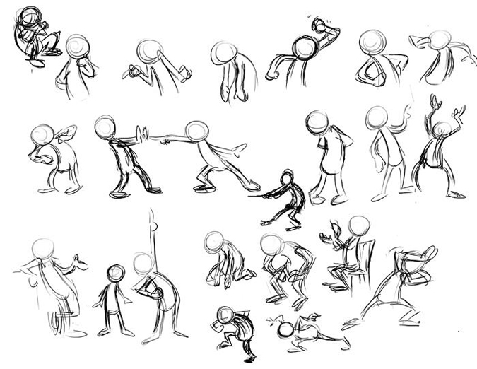
Ryman understands this and often has to use some restraint in MTG cards. If you go too over-the-top, it’s a cartoon caricature. If you go too far, you allow for images to be open for interpretation—as with Triumph of Ferocity. If you keep scenes simple like Memoricide or Archange of Thune, it creates a tight image.
I just have two unanswered questions:
Why is the sword bent?
Why are all of his pieces so dark? Shouldn’t there be more light than just at the edges, especially with a glowing sword? I’m just saying.
Banisher Priest by Willian Murai
Murai came in swinging in Ravnica block, illustrating a few Commander cards in Simic and then settling into a neat composition focus.
Other than Blustersquall, he’s has some very strong pieces.
The simplistic background with ornate detailing feels like Kev Walker’s art. He’s definitely creates in a Brazilian school style, with plump cheeks, sometimes the 1980s, side-of-van murals, and strong usage of colors. Check out his portfolio to see more of what I mean.
Some joint proportions, especially in forearm proportions, look a little off, but at card size, they’re impossible to see. On the play mat, though . . . they do pop up.
Future artists, keep in mind that your art will primarily be tiny but occasionally larger in marketing or tertiary products. Blow that baby up to four hundred percent, take a step or two back from your computer or easel, and look. I like looking at things upside-down to see oddities, but do whatever works for you.
Blessing by Jason A. Engle
I own the original art of Blessing, so it’s nice on a personal level to see the card being reprinted. I’ve met Jason a bunch of times, and he’s just a very friendly guy. It’s very interesting in talking about the process of making a piece and, more importantly, of making prints. I love hearing how each artist optimizes his or her own convention tables, and I found him very warm. It has been pleasant.
As for the Blessing, check out his blog, where he briefly wrote about it here. I love seeing sketches! You can see some of the digital changes, such as the greater emphasis on the warrior being injured or in battle or the angel being barefoot in the final.
Jason pushed the wings into stylized feathers wrapping around the character, and I don’t feel that they’re distracting. Do them too fast, and it looks like student work, a hot damn mess. Do them too detailed, and they fight for focus.
By doing it this way, it makes me think that I, as a planeswalker (player), have to ask an angel for the blessing, and then I pump the mana into the blessed warrior. I love me some good visual storytelling.
So, that’s what Benalia looks like now. Good to know that it isn’t destroyed. Cool.
I love the old-school reprint with a new art, even with the turquoise. My brother Rob used to get clothing from my aunt living near Nike headquarters, and he’d always have turquoise gear. Granted, it was the early 90s, but he still grabs a shirt when she sees one.
Look close at the fence behind him. It bends. Why would it do that? Well, it’s to establish perspective and a vanishing point—or it’s just wrong from a change. You’ll see that a lot in illustrated card art; you just can’t tell or know, but you’ll tilt your head to the side, giving a dog’s, “Baroo?” sort of look. It’s a decent card art for a Limited-fodder card.
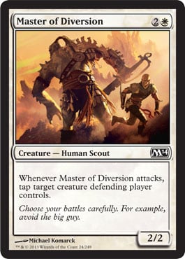
After he did Righteous Blow, let’s just give him all the white combat tricks.
I really appreciate the art description tying in directly to the card design. Obviously, someone will be attacking with a few creatures and having to choose. Having an exalted dragon is ideal, but white is better to depict on the ground, you know? Clint shows the normal usage of the card, not the Evan Erwin, magical-Christmas-land version.
Granted, the prism effect of a sunray/flare, connecting angels/religion to combat is white’s jam, and it’s very clear here. I like that.

Quick notes:
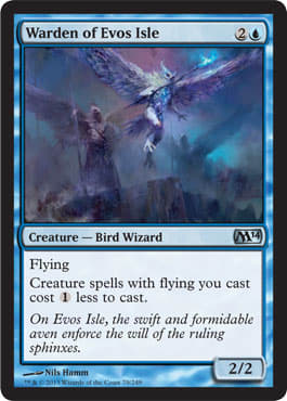
- Erica almost has Nils Hamm’s color palate in this piece’s wings.
- It’s hard to tell the charging aspect in the card. Is it diving? Charging?
- Where is this griffin? Seriously. Where is it? Ravnica?
- I like the beefier shoulders of the Griffin. It almost has a bulldog’s bulk. It really looks great.
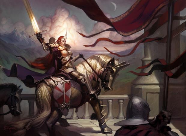
Dawnstrike Paladin by Tyler Jacobson
It’s a woman in reasonable armor! Finally. Kudos, Tyler.
I want this image to be a panorama. Jeremy Jarvis, can you do that sometime? Can you make four images in a single role, Bayeux-tapestry style? I would pay American currency in large amounts for that.
Per the image, the big brushstrokes are cool; I like that. In case you didn’t know, Tyler sketches on paper and then creates it digitally.
It’s an image with a lot of order: horse, woman warrior, soldier peeking in, solid pillar, clouds to cover top third, and so on. Everything has considerable weight, and you start from the warrior woman and go around, checking out all the “stops” in the piece.
This would make a helluva miniature sculpture.

Were I David for this piece, I’d sketch a hundred different options. The options of prayer, looking to the skies, and so on are immensely open-ended. Maybe Jarvis just wanted an over-the-shoulder shot, but I can’t imagine he’d turn down awesome. Hope David tried all the ways.
I’m just saying, if you have fifteen creatures to tap, do you really need 4/4 Angels? Okay, Timmy, maybe you do, but it feels like overkill to me. I like the massive battle idea—don’t we all—but the micro story of two soldiers about to be whooped by ogres and then praying for aid speaks a lot more to the top-deck, windmill-slam nature of the card and could do some visual storytelling a little better.
The actual art is great. David’s no scrub. From the Jesus cloud rays to angels to the figure, everything fits into the scene and does so incredibly well.
I, being a Muppet, didn’t play this card at the prerelease. I forgot it was in my pool. Face-palm!
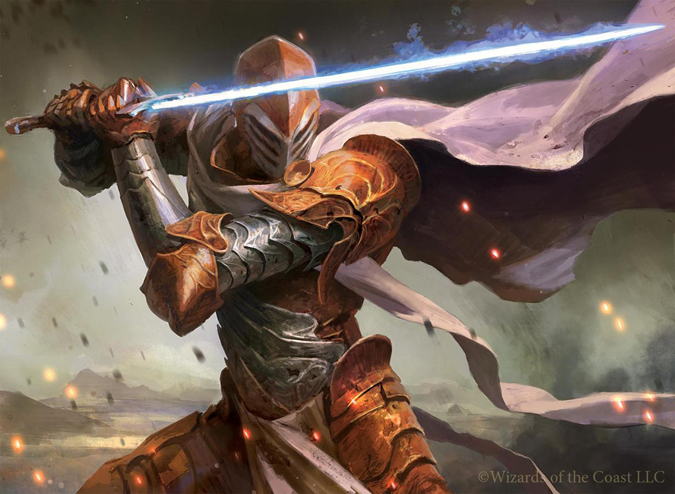
Fiendslayer Paladin by Wesley Burt
Yes, yes, the lightsaber. Tumblr has been loving the memes created by it.
Man, is this paladin looking at an opponent’s feet? (Look at the helmet’s open slits.)
I love the treatment on the armor. The left shoulder looks odd, with the upper arm being too long, but it’s not.
This is just a really well-done piece. If this hits any amount of Modern play, Wesley hit a pretty good revenue stream from prints.
Imposing Sovereign by Scott M. Fischer
Scott’s been posting art on his Facebook page. It’s very cool to check out little tidbits artists say about pieces. For example, for this work, he mentions how “loose” it is. Compared to a tight image, he used larger brush strokes. Check out Greg Manchess’s helmets for loosey-goosey works.
Scott’s so damn good. Biscuits. There is a lot going on in this piece, from the lace on the sovereign to the old men in the back to the expert usage of fabric. He used the program Alchemy to create some of that detail while staying loose. I haven’t tried it out yet, but I’ve heard it’s fun for graphical elements.
Sometimes you get Eldrazi, and sometimes you get all-star Limited commons. I recall doing this, and yes, sometimes it’s to give a bigger-name artist just something, something to keep him or her in a set. Other times, perhaps a request was made: “Can I not make a monster this set? I’d love to illustrate some people.” That also happens a lot.
One should never be angry of the commission, but a very real economic incentive lies in what you receive. If you do a common, you probably won’t sell many prints of it, and your fifty artist proofs will never sell at $5 each. You lower them to $3 each, and they still might sit a while. Whereas if you’re Ryan Barger, illustrating the new Tarmogoyf is like making another $5,000 (50 × $100) just in artist proofs. It’s a big deal at the upper echelon, but with mythics, it could be awesome or terrible. It’s impossible to know.
What are some surefire wins for print sales? Planeswalkers, legendary creatures, rare lands, and red burn spells are all great.
As for the actual art, Komarck is pretty great with light, but he shines more in the twilight. He’s made some stupidly amazing pieces with deep greens and blues to show light during the night.
Path of Bravery by Chris Rahn
Chris understands online marketing for an artist. He sold the Magic Online Cube Black Lotus original for well over $15,000 on eBay. Part of that is because it was a Black Lotus, and part of it is because Chris is always up on posting about his art. This piece, Path of Bravery, was blogged about within a day or two of the full image gallery coming out. Great work.
Chris is establishing himself into the upper echelon of Magic artists like the Justin Sweets of the world. Once you move from the 8”×10” traditional and into the 14”×18” as with this work, you can no doubt sell the image for more. He mentions on his blog that it made him think of Frank Frazetta, and frankly, I agree with him. The color of the dragon especially!
Check out Frazetta’s Death Dealer for what I mean:
Rahn’s good. This piece will be incredible on a play mat.

Jaime has my commander’s art in Uril, the Miststalker. He’s normally a pretty loose painter using those big brush strokes. Check his process on his blog. He understands how lines push our eyes into and out of the image. In doing this, he uses shapes. Look at this angel he made for M14 as two triangles. This is definitely intentionally cropped to show a bottom-left-to-top-right eye-pushing technique. By doing this, it makes the figure—creature, whatever—seem larger, more important, and impressive.
This is a tight depiction, and I want to see him write about it more on his blog.
Again, this is a woman in reasonable armor. Where is the half-naked angel? She’s totally armored in war regalia. That’s pretty impressive to see how quickly a core set can change to player demands and interests.

Sure, it’s a Limited card.
Yes, it looks like a chain, possibly a card that dealt with another ability like a Pacifism effect.
His detail of the clothing is fantastic, almost Warhammer-ornate. More elaborate than most clerics we’ve seen—that’s for sure.
The crop fits just perfect. One millimeter more, and it would be too much. It all fits to get the bottom of his robe in. Great AD work.
This is a great time for you to check out James Ryman’s blog on his Legend of the Cryptids and Galaxy Saga work. Very impressive stuff.
Swanland isn’t a restrained artist. Dude loves putting all sorts of magical effects, swirls, and such all up in his pieces.
His brushstrokes do that. Fast movements of the Wacom pen (digital tablet) and tightening of figures bring that effect. It’s like many wizards in old-school cut scenes who have stuff floating all around them. I like seeing it in spells, having a central character, and having all hell break loose. As Magic has a lot of mechanics that “do” something, it fits incredibly well. Think of siphoning spells or gaining energy from others—it’s incredibly visual. He excels at that.
Raymond did a different perspective perfect, and I hope he receives some more boom-boom cards to illustrate in the future.
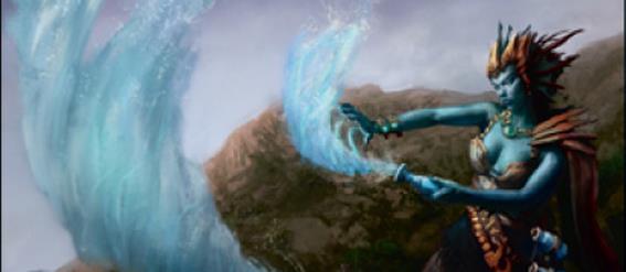
Blue

We, as the community, need a high-resolution version of this image.
It’s just too hard to see at card size. I feel many leviathan-esque images struggle with this; it’s why they include boats and birds to show size: a “hans” to show how big something actually is.
It’s a big monster—cool. It’s well done; we’ve seen similar examples also done well.
Dismiss into Dream by Sam Wolfe Connelly
My boy John Dale Beety is all in favor of Sam’s work.
I think a conceptual-type guy like Sam needs to have a home in Magic. We have Nils Hamm doing the loosest images out there, we have hyperrealism, and we need abstracted imagery. Some people really, really love the images that are interpreted. Sam isn’t a ten-image-illustrator in a set on average, but I hope he receives a few more in the future. His low numbers in the last couple sets makes me wonder if he was commissioned more as tests and only a few stuck. That’s part of working with people out of the box, outside the brand. You have to keep things fresh, but chances can slow down the process, forcing recommissions or handholding. Or . . . maybe Jeremy Jarvis is a crazy wizard, slowly working him into the brand, as to not fire up alumni players as Slivers have done . . . which we’ll get to.
Sam, keep up the good work. Very well done. Almost looks like a watercolor with Photoshop touchups. Love it.
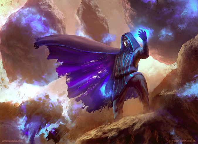
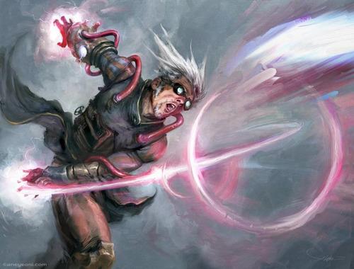
Elite Arcanist by James Zapata
If purple became a color, this would be its version of Jace. This is a great, epic character study for comparisons to Jace.
The figure isn’t legendary, has no flavor text, and isn’t named. Zapata doesn’t elaborate on his DeviantArt page either. That’s impressive considering the art is begging to have purpose.
Zapata’s use of broken-down robes with purple is something I haven’t quite seen before. A little history lesson for you on the color purple is needed. Purple was the regal color and outright banned to be worn by non-royalty. The dye was expensive and held for kings. Germany has a lot of cool little tidbits about a “King’s Brewer”—or a tailor who only worked for the king. They were given extra protection, had cooler logos, and a ton of prestige. Whenever there’s a time-traveling movie, like Timeline or A Connecticut Yankee in King Arthur's Court, look for the color purple. If you see it anywhere on the characters, they should be questioned, arrested, and often fined. (“It’s just a movie, Mike.” I know, I know. But I’m just saying.)

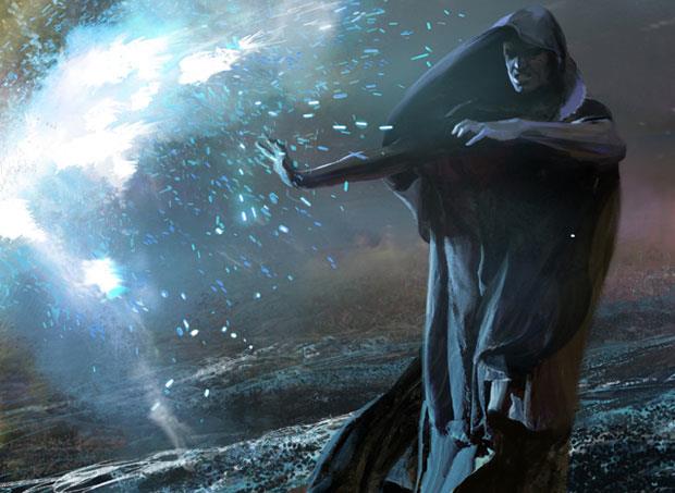
Andrew’s one of the artists who has made a bunch of the online planeswalker comics. I love his stuff.
A conceptual piece by Andrew Robinson? Absolutely! Check his Gatherer works. There’s some figure work such as Thada Adel, Acquisitor, sure, but there’s a ton of really interesting work showing Magic.
I keep thinking about the game Portal. It is kind of hard not to.
Mathias is an exceptional artist.
This is not amazing artwork.
Why?
Well, the main reasons you’ll see amazing people turn in works that aren’t incredible are commission price and prominence of the image.
A cover compared to a Magic card is usually some amount of money compared to twice that much at worst and three to four times more common.
When you have less prominence, you don’t have to include all the things to impress someone to buy a book or product. The goal here is to make this card immediately recognizable, make it cool, and hit the art description. It does the three things, but the “what if?” will stick with you. Is it a punt? No. It’s acceptable, and that’s about it. I hate to say it, but “it is what it is,” a fantasy-commissioned illustration—nothing more, nothing less.

Jace's Mindseeker by Greg Staples
Ignore the red-orange at the bottom—that’s from the background patter of the WotC mothership. That was added later.
Is that eel coming out of his robe?
Does that eel look a bit like a dinosaur? (Look at the bottom of the eel’s face; it’s wrinkly, yo.)
If none-more-black is Garruk’s new planeswalker promo, is this none-more-blue?
Didn’t we move away from certain-colored cards being the same color?
In any case, Greg Staples painted a pretty nice eel.
Were I an Island-playing man, I’d actually consider buying this. Jace images are rare in traditional forms, and Greg Staples is a pretty established artist.
I like his depiction of Jace as more shadowy, shifty even, compared to the friendlier Jace depictions we’ve seen. Jace’s goal is for us to forget what he looks like, and Greg nailed that.
I would’ve loved a few more colors, as I’m ever-aware of colorblind people and how they play the game, but the image is solid, the movement is great, and I hope these planeswalker spell cards keep being made. They’ve very flavorfully impactful.
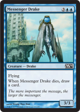
Oh, how I want this to zoom out so bad. That sure looks like the Shandalar Microprose blue mage tower. Perhaps it isn’t, but artists are becoming better at researching the game and playing it. A lot of folks now understand the flavor better.
It’s super-odd to not see the underside of the drake; it’s how we see the difference between drakes and dragons. (Drakes don’t have hands—their hands/hooks connect to their wings like bats. Oddly, that’s also like wyverns, which are now considered drakes.)
A great art description is present: When a drake dies, a wizard receives something. How about actually something? Boom, done. Great work.
Yeong-Hao and a friend are the ones who made the free iPhone/iPad/Android game called Blendoku that teaches people color. I’m crazy-addicted to it. It’s free; check it out. It’s like Bubble Burster except there isn’t an impossible level. I have yet to beat it, but I do enjoy it when I’m waiting for things because playing super wizard/ninja game isn’t always appropriate. I’m just saying it isn’t for under-three-minute gaming sessions.
Remember that this is the same artist who went by L.A. Williams in the past.
He’s a super-nice guy and finally won a Spectrum award this past year.
This piece fits that blue-gets-abstract-and-conceptual-artworks idea pretty much perfectly. It’s simple and to the point.
Allen is known now as a masterful artist working in black and white pencils. Jim Pavelec would be a comparable.
Quicken by Aleksi Briclot
I’m really underwhelmed by this piece. Aleksi made planeswalkers—a bunch of them! The right hand of the pieces just looks unfinished.
Yes, I realize that the effect is to flesh out the figure and then let the magic happen, but just look! What’s going on?

How is this finished? I’m totally serious. This looks like he called it in, trying to make digital look painterlier.
Aleksi had only one card in the set. I hope he didn’t have health problems during this. I think of something seriously wrong whenever I see something out of the ordinary.
Maybe he was loaded up for Theros block and needed one more.

The differences between lizard, dragon, drake, and dinosaur heads are so very close that they can be interchanged very, very easily.
I like Todd Lockwood’s book on the Natural History of Dragons as the baseline for what a dragon is, but like all art, there exist only guidelines and never rules.
Scott’s drake appears to fit into Duels of the Planeswalkers perhaps or MTG Tactics with its very digital design. What does that mean? Colors are tough; they don’t gradiate or have a lot of depth. As you apply paint to a canvas, you build upon it. Red isn’t just red, it’s red plus some yellow plus, plus, plus. In Photoshop or Painter, you can do this, too, but to a lesser level, as you don’t get the shadows from actually building paint up on the surface.
I’m okay with a few Chou/Chase Stone sort of pieces in Magic. The game absolutely needs digital pieces. They’re clear, and in Limited cards, such as this 1/3 flyer, you want them instantly recognizable, which is what they are.
Spell Blast by Jaime Jones
From the archive! In addition to Blessing, boom, we get Spell Blast back. Now I just need Power Sink to pick up another image for my collection.
Countering a spell . . . how do we keep this fresh? Ever a tough question and one of the flavor text examples on the flavor text team test.
It’s way harder than you think considering there are dozens and dozens of TCGs that all have these effects.
To counteract thinking too hard about it, just find a quality artist to focus in on the character first, and then add the effect. Often, too much focus on the effect makes it seem like a spell, confusing it visually with other cards.
Jaime did great in making a shadowy figure that hits the cliché but doesn’t just sit in the boxed definition. (Is that gray skin on him? Or is that just the blue glow?) That gets my Vorthos sense tingling. Things like that make me think of the movie 300 with the creepy dudes and their oracle. Shudder! If that’s a Theros tie-in, oh biscuits: +40 Vorthos points.
Tidebinder Mage by John Severin Brassell
For his second image in Magic ever, having a Modern- and Legacy-playable card is pretty damn cool. He’ll be signing these forever.
Remember how I said M14 worked on appropriately armored women? Well, this is the new anecdote in the set.
Sorry for the poor quality; it’s better than the tiny card size, though.
I love the tube of magic coming out, pushing the idea that things help mages and planeswalkers don’t need trinkets for spells. It’s a small distinguishing factor, but nice to see in card form.
It’s a micely rendered merfolk I assume from a great reference image.
Hope Jarvis keeps using him; he looks to do some great things if given the chance.
If you know someone who works at the Sespe Condor Sanctuary in California for the California Condors, please buy this original artwork for them. If I recall correctly, Alex’s pieces aren’t outlandishly expensive, and this isn’t a planeswalker. It’s just a common that’ll be used exclusively in Limited.
They look like goofy vultures, begging the question on his reference imagery. A cursory search on Google didn’t find anything similar. After doing so, I noticed the skull at his feet. How large is this bird!? A 2/1 appears to be gigantic but not the size of a roc. (The most tragic failing of the reserved list, in my humble opinion, is the ![]()
![]() 3/3 flying Bird. That would be such a great core-set card. Oh well.)
3/3 flying Bird. That would be such a great core-set card. Oh well.)
Working loose, you can still have detail and have a scene. I think a lot of folks think he’s just the big brushstrokes, Baleful Strix and Thragrusk, sort of artist. Not so. His work on Cairn Wanderer shows that he can tighten but has moved into a distinctive style over the past few years. I think it’s great for him. People now look for his art, not unlike Terese or the Foglio back in the day. You expect the “other artist” to be in there.
As this card will be looked for a lot in Limited play, it’s great that he hit the concept perfectly while keeping his style present. I also love how much purple he uses. We never see that color enough. It’s always the greens and blues.

I’ll group the bottom Magic Online avatar image below with this. Did Min Yum create it? I don’t think so, but y’all should see it.
It’s interesting to see a sphinx be shadowy. They’re elusive, rare creatures, sure, but I want to see its feet!
The horns are reminiscent of Fallen Ideal, which is reminiscent of Fallen Angel, which I guess is a horror trope for demons and such. Apparently, it’s also for sphinxes.
There’s an odd usage of lighting in this piece: The face is lit, moonlight behind with no torches or secondary light source. It’s a head-scratcher, but we are able to see its face because of it, so a practical element that’s needed is probably the reason.
The avatar is more . . . traditional RPG work like the Blizzard brands. It’s more mainstream, if you will.

I nominate this card to be used in a meme. I know that’s illegal and against the point of a meme, but “swag” and “YOLO” definitely would fit here. Also, I love that awkward zombie in the lower-right—just so awkward.
The “during” card effect is great, but . . . what is giving it flying? A Zephyr Sprite? A talking Zephyr Falcon?
I’m happy to see Prescott back in the game again. I still think his diptych, original-art lands from Shadowmoor are some of the best out there. Think they sold, but they might be worth checking into.
Black

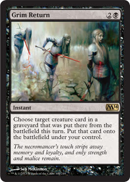
I’m sorry; I played this a dozen or so times at the prerelease, and I kept thinking the trees were the spirit. From a quick glance, there are two figures: transparent spirit and tree. The tree sticks out more when you’re glancing at it.
Kev really focuses on figures. Check his cards from the past year. He does backgrounds, yes, but they are very secondary to the concept. That’s masterful work, not lazy composing. I think the difference in this image is that a background can be hazy/blurred out, and with the spirit needing that, the focus is fighting. It’s not necessarily wrong, but it takes longer than a fraction of a second to see the spirit. Cropping in tighter might have fixed that a little better—that or maybe I don’t look at the cards that closely anymore. Maybe.

Franz, that’s great work making the sword the focus.
I can clearly pick this foil up in my Commander game and immediately know it’s Franz’s work and my Equipment is now worthless for me to use.
This is another piece I want to see a high-resolution image of as soon as possible. Franz works traditionally, and I hope to see this piece up close in the near future. I have too many questions to ask such as, “Are those arrows? What’s going on with the figure’s limbs?” I go straight to the sword, ignoring the rest other than that he had a bad time. I’m intrigued by a glowing effect like everyone is; it forces you to focus, but what else is going on? (Vorthos always wants to know the full story, and knowing Franz, he’ll have a little summary of what he had in mind. We’ll circle back to that in the coming months.)

Huh.
I’m not really sure what to say about this piece.
I’m not sure if it’s influenced by something I can’t trace back to in my mind. (I’ve had my share of concussions.)
Perhaps I see a strong Diablo necromancer situation going on with the giant skull.
The magic in front is the Reading Rainbow semicircle that Jace, the Mind Sculptor made famous is in full effect.
In any case, I feel I’ve seen this image before, but yet it’s new.
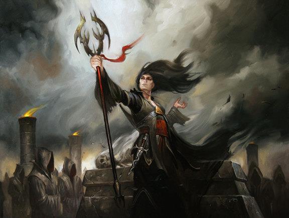
It’s a core-set win. Make art approachable and comfortable, but don’t go off the deep end of weird. It’s very black, but unique and memorable.
I’m covering this at the bottom of my article. Christ, this is good.
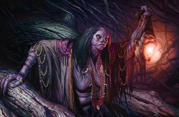
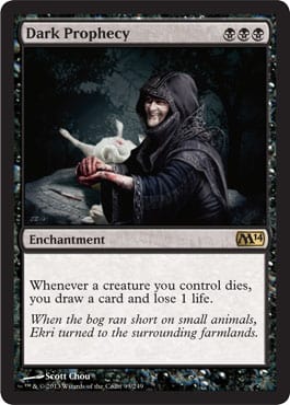
Bogbrew Witch by Eric Deschamps
BABA YAGA! I’m not sure why I immediately went to the Eastern European folklore witch, but biscuits was that visceral.
The elongated limbs made me think of Baba Yaga’s hut, which has chicken legs—odd, I know.
Eric got an awesome commission for M14: Make a live-the-dream Limited combo with a witch, a newt, and a cauldron.
I’m happy they do this still. In Magic 2012, they gave John Avon the Crown of Empires, Scepter of Empires, and Throne of Empires to do a similar thing. One of my favorite things do to back in my scouting days was cast the necessary pieces to bring Spirit of the Night out for cheap. It’s seriously awesome. At my prerelease, one guy had the combo with two Newts and didn’t play with it! It was quite sad.
As for the art, Eric’s great, showing imagination with costuming elements. I’m happy they used the Witch instead of Hag here, despite her appearance. This could’ve been just as easily a witch in the woods with a big ol’ chest and a hideous face. Eric committed to the anatomy, and it doesn’t break the flavor. Also, notice the purple? I like the contrast of the purple and the lantern, pushing your eye left to right via dark to light color alone!

This top-down design is straightforward, and Jesper delivers. He doesn’t need his hand held. He’ll make you a guy, put a corpse on said guy, and it’ll be good to print. There won’t be revisions or other shenanigans. Being reliable trumps being sometimes amazing. Being amazing when you have the time is what Jesper can do. Just give him longer than a few weeks, and he’ll give you gold. Don’t have a few weeks? No worries, he’ll still give you something usable without a problem.
Okay, a wild animal was killed—cool. Why can’t it be a pet? It is a black mage after all.
Scott’s work here feels like John Stanko. That hyperrealism? (Meaning very, very real.)
Not much else to say here.
Yes, the joke about the card being tongue-in-cheek about the Cockatrice program is pretty good.
However, names change a lot, and top-down design was probably chosen early. I hope a Creative member saw the opportunity, lol’d, and chose that flavor text.
Purple? Yes. I need a purple hash-mark chart at this point.
This is more what I think about Kev Walker: solid thing in foreground, assumed background, looks good, print it. The usage of green and blue on the wings is just wonderful. Artists, when making a fantastical monster, add some color! Even at night, color will show up.
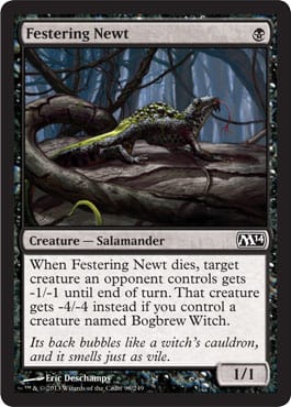
Yup, that’s a newt.
Every time I see these connecting combo cards, I wish for unifying elements like color or a background setting.
It’s still a pretty good newt I guess. I don’t pick up that many of them, but I assume this is what they are. So . . . successful.
I know the foil looks pretty great with the green on his back glowing.
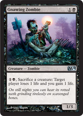
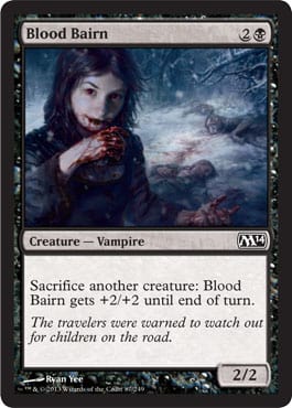
How does a creature I sacrifice to my zombie hurt my opponent?
Huh?
This card makes no sense to me from a design perspective. Does eating hurt my opponent? Does the zombie allow me, a planeswalker, to do special magical abilities that give me power, though I’m not eating or being sacrificed? It’s a bit clunky to see gnawing really just mean scavenge and not eat, consume, or do anything. He enables an ability . . . that he’s part of . . . or something. I’m confused.
The art is wonderful; it has a very jovial mood with the odd, juxtaposed green and purple. (Ding!) Feels like one of those Garbage Pail Kids cards from the 1980s showing macabre puns. What’s on the sign? Maybe some sort of cruel joke. All we need for humor here is to have a necromancer eating ribs next to him.
#Purple
I’m covering this at the bottom of my article. It’s because it’s good.
Lifebane Zombie by Min Yum
It was a great idea for a homage from the promo Grave Death showing great shadows. Yes, I know it wasn’t intentional or even part of it, but the connection between a staple black card (at the time) and a possible all-star is not lost on me.
I just wish more black cards weren’t so shadowy and mysterious. I get it: Black is dark. Light grey streaks in the background also aren’t working for me. It just feels too rushed. With a figure that just is a dark blob against gray lines, stellar art isn’t the first thing I see. With no action and the mood being the default “foreboding” or “moody,” we need something more.
P.S. Is that blonde hair? Is that an elf? We need some flavor text saying what in the Sam Hill is going on.
Min Yum and Doug, can you cover this guy’s story? What’s going on here?

I see what you did there: He’s wearing Liliana’s crown. Clever. Doesn’t really make sense, but scantily-clad woman with black hair and debts to pay to demons is hard to depict. Flavor text would really help here, but the deathtouch reminder text is needed in a core set.
Could this be an Ogre or Giant subtype as well? That torso is enormous.
I love Karl’s depictions of musculature. He always does such great highlights—always in the right spots and helpful, not distracting.
#Purple

Zack came into this came swinging—Modern Master’s, a judge promo, and right into the core set.
His Show and Tell image is amazing. This one, well, I can’t see the wurm! It’s too damn dark.
It’s colored in an interesting way: green and . . . orange? What? Let us see it. Whip it into Photoshop or send that baby back; get us some color! Black can have lighter-colored cards, too—no worries about that.
I love the element of pushing the figure to the top of the frame, showing how enormous the wurm is in comparison. I think more folks should definitely think about that, not only in terms of size, but what it means to push someone against the edge. I know art directors like bleed on the edges, sure, but it’s something to look into.

Frickin’ minotaur. Yes!
I love built-in connective artworks. It’s the reason I buy panorama lands. I do it for the continuity and the Easter-egg hunt. Wizards, please keep doing that; it’s great fun for us Vorthos folk. Karl grabbed both and decided to zoom in on one (coming) and zoom out on this one. Great decision to keep it simple and say very little as all the minotaurs are coming. Theros, the Greek-themed set, is right around the corner, and seeing some early minotaurs is flavorfully delicious.
Wish he’d post a high-resolution image of it. To find it, I’d follow his Facebook page. He posts a lot of Warhammer pieces. He worked for Games Workshop, but there’s a bunch of Magic in there all the time.
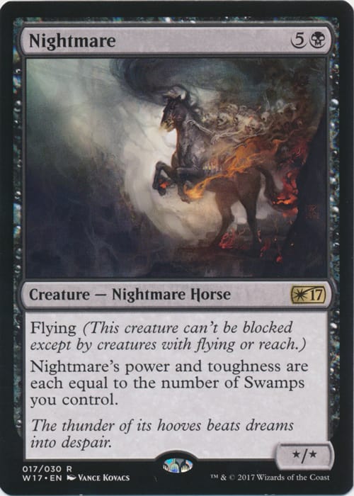
Here’s another Alpha card back in the game!
Nightmare is a great card for Limited and for those mono-black casual players, which is what a core set is great for doing.
The art is fitting but rather confusing next to the butchered subtype line. Duh, it’s a Nightmare, but it’s also a Horse? Undead horse? Spirit horse? What? It’s not the artist’s fault, but it’s surely going to be confusing to new players—guaranteed.
I do wish Vance would’ve used more of the space in the art area. It’s small enough; why use less of it? In any case, it’s now a card, and the iconic status is long-gone for this Horse.
This looks like a novel cover. Michael could certainly do that, and I would love a juicy story saying how this is the canceled cover for the Liliana book that was never published. Speaking of that, I hope Wizards releases something on that eventually. Maybe it’ll be leaked one day. Though the longer time goes on, fewer leaks happen of other sets. Think about how many style guides are created and how many actually make it out into the public.
Michael, thank you for not giving us a gratuitous crotch shot. Thanks for that.
I hope hundreds of alterists make Liliana Jewish for being lifted atop a “chair” of zombies. She is supposed to be Middle Eastern . . .
Solid image. Any of the planeswalker abilities or creatures have to look solid. Notice the stronger roster of “named” cards in the core set. It’s noticeable.
#Purple
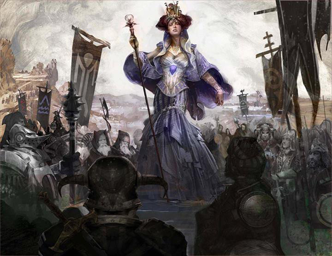
Shadowborn Apostle by Lucas Graciano
It’s the preview art—oh yes.
I love his oil work in pushing paint for motion. Of course, this piece sold from his Etsy store.
Those cultists in the back are mighty stiff considering how flamboyant this apostle is to be disintegrated. All’s well; the demon is coming up next.
Nothing has costed 6 black mana yet. Interesting to note.
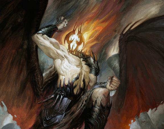
Shadowborn Demon by Lucas Graciano
It’s so, so close to being an incredible, incredible artwork. The face. The face makes it move from, “Holy crap; Lucas is amazing,” into, “Oh, well, that’s a nice illustration.” The anatomy is fun, with over-stylized muscles and human-like features. Even the cloak works. It’s just that the face is such a central feature of the piece, being all headless-horseman-pumpkin-on-fire, but remove the head with your finger, and look at the rest.
It’s such a big opportunity for another illustration to sneak into fine-art territory just to be squelched by an art description.
Please give John Stanko more people. Innistrad humans? Swashbucklers? Those are his jams, day in and day out.
I hope John can receive a pile of illustrations in a future set again as he did in Innistrad block. He really gave sideburns, cornered hats, and the bravery of man a good pillar to lean upon for set aesthetics.
This is digital, and when he prints out a digital piece on canvas and then paints over the top traditionally, he makes an “original” to be sold only once. This piece seems less finished, less painterly done because, well, was his heart in it? Did he love it? Is it a weird commission or did Jarvis throw him a bone just to help bring some money in, knowing that he had a hole and that reliable John could make it happen? Again, I’m not sure.

Dynamic angle is dynamic.
Flip this upright, and you’ll see why; it’s just kind of meh. Sometimes, hours are spent cropping in, turning, flipping the image in any way possible to obtain a little more motion in the piece. It’s a gray area, but the impact is enormous. If you’ve seen some stiff artworks with a dude standing there, you know what I mean. Benalish Hero, for example, is super-stiff because there were no precedents before it.
Despite the minotaur being very dead, Karl gave him pants. They look like pants. I need a high-res image to argue they aren’t pants. Logically, were a man-eating minotaur to be in a maze, would he even wear a loincloth? C’mon now.
Wow, does this look like a piece from the Castlevania franchise. Perhaps the elaborate boots and triple candles pushes– Yeah, it’s the candles. I can’t unsee it now. I keep thinking how terrible the Nintendo 64 Castlevania is to play. It’s horrid. Play the Nintendo DS games, though—oh biscuits are they are incredible. Play those however you can!
Back to the art. This piece feels a bit more safe than some of the Innistrad vampires. It’s not sterile; it just doesn’t tell a story. Yes, all vampires like to kill people to stay alive. How does he do it, though? Why doesn’t he clean them up? Aren’t vampires basically OCD, sleeping in a box, getting all particular about their purple velvet shirts and such? Hire a housekeeper, homie. Core sets remove a lot of context, which is unfortunate, but perhaps more artist interviews and insight from the creative team could fill out characters, even in the core set.
His bald head reminds me of Pete Venters’s Baron Sengir and, well, Pete’s bald head, too. Sorry, Pete.
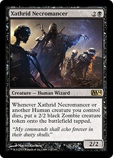
We need a .gif of this because this is Duels of the Planeswalkers cut-scene material. Maybe the separated figures allows for better Adobe After Effects movements we’ve been seeing.
Maciej is incredible at Sci-Fi work—good gravy. This piece could be the next step in Magic’s art direction, that higher digital imagery where layers as figures are very much removable. (It’s nearly impossible for oil paintings in most cases.) It’s a fun card, but the art isn’t that inventive or outside the box much at all.
That’s it for today! Biscuits, that was a lot.
Tomorrow, we’ll cover red, green, artifacts, lands, Slivers, and the Top 5 artworks!
See you soon!


