


BEST DAY OF THE WEEK.
Vorthos Wednesday.
You already know what that is.
This week, we’ll talk of Vorthos appreciation of the game outside the game. The game is business, and the winner gets market share.
With the seeming surge of clipart and stock logos, even contests for logos, the quality of branding for new companies is taking a turn for the worse. I’m not sure why Magic: The Gathering blogs, stores, and websites have not looked more closely at the faces of their companies. A logo is not a five-hundred-piece sticker campaign. It looks as though people had $50 to spend at fiverr.com. This is not to say that all companies are ignoring their logos, but none of the third-party companies that deal in Magic cards were founded prior to 2000. If one from that time period is still going, it isn’t largely relevant, sadly.
It’s not like information isn’t out there. Google “What does your logo say about you?” There are thousands of hits with information running the gamut from insightful to downright misleading.
Your logo is the visual signature for your business. You should be prominently showcasing your logo on every form of communication that potential users and consumers see. Your logo should be memorable, and evoke emotions reflecting the personality of your company. There is a reason StarCityGames sells its tee-shirts to outsiders. When you see yet another MTGMom sticker on a Top 8 finisher or on a personality’s goods, do you think, “Well, that’s an oddly placed sticker”—or do you think about her services (or cupcakes)?
The logo is the first impression, not just of who a company is, but how trustworthy it is, and in turn, how much a consumer will trust its services. When I see that MTGMom sticker, I think “useful” and “cupcakes.” The website is very consistent in branding. When she doesn’t have cupcakes, people get upset because that is built-up brand equity.
A strong logo, like a handsome face, does not tell you what’s inside; rather, it is a strong distinction among the masses, despite impersonation.
I’m going to give you some tips, go through a large number of MTG logos, and give insight into their mission, vision, brand, and resonance from the logo itself.
Let’s go.
Four Brief Tips for Creating (or Recreating) a Logo
1. Be consistent.
If you don’t have logo standards, copyright information, or contact information for how to obtain these things, you’re missing out on an opportunity. This information goes in your “about” section on your website.
Have a designer create a logo standards manual, which indicates the exact specifications of the logo image, size, font, placement, and colors. Don’t reproduce your logo without adhering to these guidelines. Ever. I saw a plethora of brands that differ from Facebook to Twitter to their site itself.
For example, pertinent to Vorthos: What is Magic’s marquee creature now?
It used to be a Hurloon Minotaur. The brand managers work on issues like this on a daily basis. Also, Matt Cavotta, a creative director, works on holistic similarity across the products, cards, graphic design, and brand to have a connective tissue that speaks “Magic” from the first-intro-pack player to the alumnus coming back into the game.
2. Use your mission to inform your logo.
You showcase interesting Magic articles and/or sell Magic cards. That’s neat, but it doesn’t tell me anything about who you are.
The mission of your logo is to convey the values and goals of your company. (Your main goal is to make money, which doesn’t need to be conveyed.) Make sure any key information about your brand is clearly established before venturing out to acquire a new logo. You must have a strong association between your brand and your logo. Remember, it is only one piece of your branding strategy, but it is the most visible. Your logo should reflect professionalism and growth no matter how small your company is.
Are you fun, exciting, and professional?
Are you clean, corporate, and trendy?
Are you fast, fun, and friendly?
If you are designing your logo in-house to save money, be sure to market-test your efforts.
Make sure that the logo you select is not dated but can be used effectively every year. I don’t recommend making your own logo, but some places may not have the budget to hire an agency to be truly innovative.
3. Use color to communicate.
Most of you understand that colors matter to viewers and some of the psychology behind it, but why don’t you use this research? Your color scheme sends messages about your brand and should be selected accordingly. Purple suggests wealth, while dark blue has an air of authority and white a sense of purity. Your designer will recommend colors that reflect your image. Be very vigilant of color schemes. Change the color to turquoise, and you might be a half-step from a Miami Vice them.
View the logo in black-and-white. If it doesn’t change, you’re good to go. Color hides imperfections and resonates differently.
Is using the five colors of Magic really needed on your logo? Isn’t that assumed? If they add a sixth color, what will you do?
4. Carefully consider whether you need to rebrand.
If you change your logo, you lose brand equity built up. Our own site here at GatheringMagic is working on a clean, new transition, but must be hypervigilant about moving too fast from the merger. I’ll return to rebranding in a future article. The only lasting advice I need to instill is that it should not be taken lightly at any step of the project.
Some major brands have had a variety of rebranding campaigns:

They’ve changed a lot. Their most recent change has been beaten to death by cartoonists.
Others haven’t needed to change their logo:
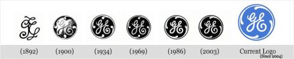
General Electric is General Electric. It’s broad enough but has over a hundred years of equity built up to rest upon.
Logo Analysis
I’m going to use MasterCard as an A+ template for the rest of this article. It will serve as a prominent example of a logo done correctly. This is not a perfect system, but I’m one man. A full audit takes an entire team of creatives.
MasterCard
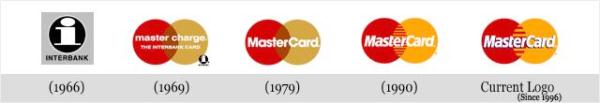
This shows the evolution over time, with the template being the earliest logo and the right side being what we see today.
Whenever you create a logo, blur it out, take ten steps back, and change the scheme into black-and-white. If you get the same resonance, you win.
Logos get mere seconds for brand resonance. I gave each logo no more than five seconds, and my comments are largely first impressions with just the logo. My prior knowledge is not taken into consideration, but a Magic player will be familiar with many Magic tropes, like the five colors and StarCityGames Opens, for example. After that initial five seconds, you’ll see how the brand emerges as I dig into what they represent.
Apologies for using screenshots and low-resolution JPGs. Even many Facebook profiles had low-resolution images. That’s an issue that is easily fixed. Make it easy for users to link to your website by allowing us to use quality imagery in our articles. I want to promote the community, but if you don’t make it easy for people, what should I do? Help me out here.
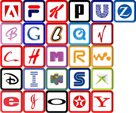
We’ll go alphabetically for speed of searching. Many, many sites were omitted. I had a list of a few hundred that I culled into a manageable list. Apologies for those companies that didn’t make the list. As @FrankLepore has stated with regard to gaining followers on Twitter: “Be more relevant.”
ABU Games
I like how ABU means Alpha/Beta/Unlimited, but I assume that ABU was already a company, and they deal in games; thus the addition.
Their script is strong. If I saw the A by itself, it would be familiar, but I wouldn’t be able to place it. USE IT! It’s unique. Compare it to the scripts in the A-through-Z list above. If we were to do it in Magic games, the A would really stand out.


Contrasting colors work well on logos because they retain identity.
I’m not crazy about their click-through banner—the bottom logo beneath the main shield.
I think talking about the first three sets creates a sense of professionalism and longevity.

Their old logo.
I did some digging and found out that the site went online eight years ago. They came into the market and hit the ground running fast. Good for them. A real statistical analysis should be done on how long third-party Magic companies last. Are there any online sites prior to 2000 still around? Clearly, the Internet wasn’t widely available for commerce in 1993, but has a brand endured? A future topic has been noted.
Blackborder.com
I assume the sunglasses man with his tongue sticking out is the logo. Shouldn’t the green be outlined in black? Could the logo incorporate a Magic card itself, a black-bordered one? Something to think about.
I use their condition guide as my go-to chart for trading with people. It’s thorough and it has percentage differences for value depending on condition. It isn’t definitive—what could be?—but it’s a great resource.
I also use their price guide to see what the top ten cards are in each set. It’s amazing to look back at Homelands or Invasion, seeing the drop-off in cost. The most interesting thing is to see when the cards all sit at roughly the same price. That’s where the wiggle room in value is for trading. It’s not the most smart-phone-friendly application, but I’m sure they’re working on it.


Can you rotate the logo in your head?
I can’t seem to do it.
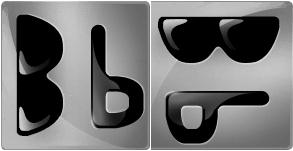
I keep seeing a person, yes, but a zombie with sunglasses.

This sideways Bb would make for a great iPhone/Android button for loading the application.
I think it works, but I’m not sure how a pricing guide connects to black-bordered cards. That’s kind of confusing, as base sets are no longer white-border. Having black-bordered cards is preferable for pimping out Legacy/Vintage/Commander decks rather than the lower-value white-bordered stuff you have in your binder.
Cardhaus
Where to start with Cardhaus?
It’s a card house with the German word for “house.” Is it a German site? Does another “Card House” exist, so they had to differentiate themselves? Did they add the “Games” to make sure they weren’t copying the other brand?
Who is this woman? Is she relevant to card games? If so, what game?

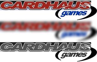
The anime girl is a mascot for the business. I’m not an anime fan, making the character less meaningful to me and making me wonder what CCG has anime women. It makes me pause and think. That appears to be effective, which blocks the first reaction of “card plus games,” making me feel a level of redundancy.
The outer border helps with a fleeting glance across the name, but the black border behind it prevents faster retention. A focus group would be able to clear that up pretty quickly. It’s an easy fix.
The different versions from the website and Facebook I don’t see as a problem, though the circular Facebook logo could use the same font script. It would be more consistent and freshen up the look of the circular text. (The text looks old in the circle.)
I think the circle on the banner could be used more. It looks like a football and could be incorporated into buttons or clickable things that would resonate with users, but that’s only a suggestion.
CCGHouse
Well, they spelled “house” in English. That’s good.
I love how they incorporate the old Magic: The Gathering logo into their script.
The horizontal nature of the logo may limit it in product placement, but a simple retool could fix that issue, I think.


The choice to use the Magic-logo blue was probably made during the mad dash to create CCGs. It was a bubble that burst. I have piles of random other CCGs like Wyvern, X-Files, and Netrunner. The blue might be outdated, but it isn’t distracting yet. It brings about a “did you know” moment with other players. If I were the marketing or brand guy there, I’d be very vigilant about the perception of the logo.

When I changed this to grayscale, I noticed something. The black button (doorknob?) can look purple under different monitor settings. New-logo designers: Use a jet black whenever you create a logo.
The Magic: The Gathering is strongest in this logo from a resonance standpoint, but the offerings are unknown. They do sell original art, singles, and a variety of other jazz. Is that important? I’m not sure. Their mission was not immediately apparent.
ChannelFireball
Despite the fireball looking like an angry cheese ball, the logo is effective.
It states that the site/brand is a channel, one to be tuned into, and it has something to do with fireballs. As fireballs really only deal with wizardry, you can assume this means something close to what you’re looking for.
If you add the recent success that ChannelFireball pros have been having at the top tables, and the consistency of seeing the logo in Top 8 pictures everywhere, the logo is hitting full brand resonance with the community.
 |  |
That said, I don’t read ChannelFireball’s articles.
I know I should; David Ochoa is my favorite pro because he’s a dichotomy of battling evil and Squidward looking mute in matches.
The only question I have is: If their pros get into a slump, and the screaming fireball isn’t seen weekly, will the brand endure as a top-tier site? I don’t know. What I do know is that screaming fireballs can’t leave their logo. It will be resonant forever. The fireball can change a little, but it should be similar. It isn’t GE, but the fireball logo is very fitting for our community.
Collector’s Cache
Does a clipart treasure chest express professionalism? Does it connote a freshness or is it an old cliché?
Should I visit this once a month? Should I only go to this site when I have a hoard to rid myself of?
I get that they needed a logo, but frankly, it’s a punt. Will this logo last forever?
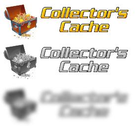
A quick glance or blurred image totally loses the focus of the viewer. It’s a box and text. Granted, a treasure chest will make you inquisitive, wondering what the “cache” is, but the subtlety is slapping you in the face. Yes, I get it: Cache = depository of good things, like a treasure chest! Neat!
Even FNM players build up large stores of cards as new sets come out. Playing into the new normal, the logo could connect to the majority of users who all have “caches” in their closets, out of sight. (Future topic—write that down, Mike.) An agency branding team could easily make that connection. Reach out into your connections/network and ask them to analyze your brand. You’d be surprised how eager Magic players are to provide constructive input on Twitter. There are only a few trolls as of now, in case you’re curious.
Also, I hope these guys get their Power 9 back that was stolen at GenCon (TheftCon) 2011. I really hope justice is served.
CoolStuffInc
CoolStuffInc is GatheringMagic’s parent company but it isn’t exempt from my analysis. I see their logo every day in a banner at the top of the GatheringMagic page and when I buy board games. (Seriously, their board-game prices are crazy low.)

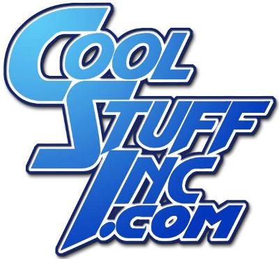

The cool blue color works with the name, clearly, and the outline can be seen from a distance, despite being blurred. Notice how when the logo changes to horizontal, the script remains the same. What does change is the gradient of dark blue to light blue. It works cleanly and is a variation that every style guide should have.
When it loses the blue color scheme, the logo is still clear, as the gradient color allows for something other than flat gray or black.
Despite my obvious bias toward them, seeing this on a page doesn’t really tell a viewer anything. Are games cool? Is Magic cool? Wat? Their various side projects like GatheringMagic help that to some extent, though. I could see this model working for a Troll and Toad as well. Do trolls like games? Toads? It’s similar, but is has a fantasy flavor to get people on the right track. The concept of “cool stuff” is not as clear-cut from the onset.
Eye of the Vortex
Is this a game? Does the game involve a vortex? Will ships go into this maelstrom? Is a singularity involved? How does this connect to collectible/trading card games? When you remove the context, this logo doesn’t mean much. If it had 80% of the market share, it could be called “Cheese Watermelons,” and people would understand. Think of The Oatmeal online. Any savvy web user knows that it’s a humor site, but without popular knowledge, it also means nothing.
Keep this in mind, because I’m wicked confused. Confusion can make consumers remember the brand, but more likely it will create a negative experience, as they were duped into looking deeper into it.


Gaming Etc.
This is a Magic: The Gathering site. Oh, they may sell eight different brands from HeroClix to True Dungeon, but from their logo, I assume their focus and efforts are on one brand. Does focusing so much affect their sales? Magic is a juggernaut with invisibility in the collectible market.

I’d like to know why the colors are not fully saturated. Is there a copyright issue like International Klein Blue? I’m just curious because that blue is sky blue and that black looks like gray to me. (Grey to the Brits in the audience.)
GatheringGround
Why do they have two logos?
Yes, I understand that it is the same script, but why deviate?

AND

The color scheme is consistent, which is good, but the different logos are troublesome.
If they simply omitted the castle and the line beneath the banner, they’d have a consistent logo to reuse. Boom. Done.
This is one of many sites that use the Magic: The Gathering brand. Cheese: The Game would communicate to many players that the company is related to MTG. Simply put, it’s clever, but it’s lazy branding. If the game goes under, so will the brand leaning against MTG. Keep that in mind.
Inkwell Looter
I know the Inkwell Looter quite well from his clever creations on Twitter.
His work speaks louder than his brand, but he needs to firm up his logo for increased branding.
When you see a token of his during a tournament, it’s instantly recognizable to people in the know, but what about to new players? A logo in the corner of a token will drive traffic; a QR code is cheesy, and website information doesn’t seem professional. If the new player has a smart phone, he or she will Google “Inkwell Looter” and it will show up.
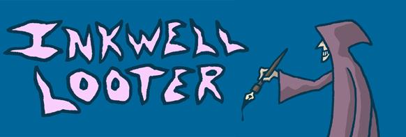

Despite Inkwell Looter’s pieces being on the Magic mothership, and StarCityGames using his designs, the logo does not confer that professionalism, and acceptance from the community. He’s really needed in the community and I wish him continued success.
He’s too large for a blog and I hope that as he continues to grow, his website will have a full rebranding effort. I look forward to that day.
Klug Alters
I’m a fan of Eric Klug.
I think his work is witty and needed in this community. Also, his commission rate is very low.
The work stands by itself, but what signifies his work? Is it the superheroes? Is it the strongly created cards? Is it this Black Lotus?
His logo is just a script of his last name plus the word “alters.”


Eric Klug needs a logo.
Is the Black Lotus alter worth keeping forever as the face of his professionalism? No.
I don’t think that the Lotus is his crowning achievement. It is very strong, but it is not his masterpiece. His studies into historical art masters were only a few members long.
His best is yet to come, and it will melt your face off.
His logo just needs a little love.
Legion Games
One of my local stores is a nationally recognized company due to their tournament organizing. I still prefer Misty Mountain Games, but I’m slowly converting to their new brand.
This logo aids in instant brand recognition. The legionnaire helmet is unique and can be unobtrusively added to products.
Yes, it does feel more like a banner than a tightly designed logo, but it conveys everything they want it to. They’re a gaming store; the products below are generic. It could be confused with a small startup company with each logo corresponding to a specific brand, but that brand confusion would likely only happen to international users visiting a tournament they’ve organized.
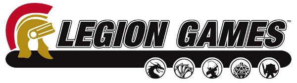

Do notice that after blurring, the “Legion Games” name is still clear. Collegiate logos have the same outer line-art to aid that. I added the outer line to my Gopher block “M” tattoo to aid in seeing the image from a distance. My jersey in college had cutouts in the shoulder blade area, creating a space that sprinters would adorn with their university logos.

Lotus Vault
The name is catchy, and it gets to the point.
The issue is: What is the vault? Do they sell cards? Store cards? What is being unlocked? It takes a few seconds to understand what the site is, but that should be instantaneous.
The Lotus name is a bit overused since branding was beat to death in the late 1990s with “Lotus” everything, tapping into the cost of owning a Black Lotus and the experience of being around since the original Lotus was around.

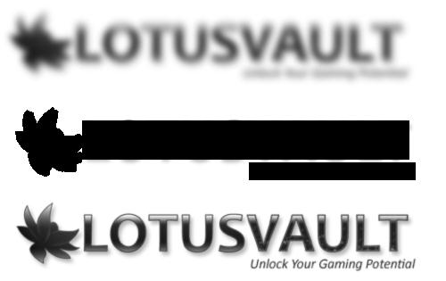
Look at how much information is lost when the logo is changed to grayscale or blurred. “Lotus” and “vault” jumble together immediately. This is a struggle for any color-blind person and can pose a problem for fast retention, considering people already need a few seconds to parse its meaning from the tagline.
Magic Workstation
Please.
Just update your logo.

Clipart + Italicized generic font = Forgettable logo.
It has so much to work with. A cheap new logo would be better than mere clipart. If they need some help, I’m sure a community member would be happy to help them for a reasonable price.
I love the product, as it is very useful. I just think it just needs to enter the twenty-first century.
Side note: I’m always unsure of how it sidesteps legal action. Can someone explain that to me?
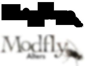
Modfly Alters
I saw this altering artist from a link on Twitter.
It’s a designed logo, which is nice, but does it convey forward-thinking, professional altering?
When you remove the altered card next to the artist, can it stand by itself?
If I see this logo at a convention, it isn’t quite memorable enough for me to memorize it.
I believe it can get there, but it needs a little TLC.

MTG Chicago
I have no idea what this logo is supposed to explain.
Is this a store? Is this a group of gamers who play in Chicago?

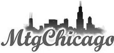
The color scheme is a bit reminiscent of the early Star City Games logo, and leaning on their brand could help, but when it changes to grayscale, that entire theme is gone. I won’t use the black block because the cityscape itself will draw people in. Tourism departments know that cityscapes create a positive brand experience. It’s similar to knowing your area code as a badge of pride. Our 612/651 area codes represent more than just areas, they represent Minneapolis and its suburbs versus St. Paul and theirs. It’s the blonde sister versus the brunette. Both are nice, but you have to choose one.
This is a logo that could desperately use a tagline. The tagline could be removed when making products, but in the marketplace, I have no idea what they represent other than a Wizards of the Coast brand and a city.
Also, does the logo need the entire (relevant) skyline? Is the Sears Tower enough? Thoughts to ponder.
Pojo.com
I came across Pojo because it reminded me of the Dojo from back in the day.
The banner is clever, but I’m not sure what their tagline means. Are they advocating for the game outside of the game? Is this a Vorthos site?
What’s up with the star? What does that mean?
Why are all of the cards from old-school Magic? Is this a dead site?

If you take the logo by itself, it doesn’t tell much about the site’s mission. I assume the mission is to talk about the game behind the game—it’s hard to tell—but how does Pojo with a star explain that? If you remove the red/orange coloring, this logo could represent anything. It could be an online poker site or an abbreviation of a pop star.
#confused.
PowerNine.com
PowerNine.com is the sourcing company for my local game shop, Universe Games. (It was Chaos Games for a while, then changed. Long story.)
I should have taken pictures of dealer booths at Grand Prix: Kansas City and GenCon to show how striking logos are next to each other. Dan Bock, the owner of PowerNine.com, is always there, making that paper.
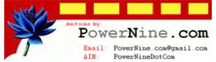
By changing this to gray, it appears to be Windows 95 clipart. If I blur it, it’s a business card.
Dan had the picture of a question mark made out of Black Lotuses at one time, but is the most expensive card in Magic the best logo? I can’t answer that.
I also can’t answer how a blog, compared to an eBay store, compared to a brick-and-mortar store, compared to an online store differ and should differ in terms of logos.
I see Dan Bock’s smiling face as their first touchpoint. It’s not their logo; it’s not any semblance of a brand other than an owner’s personality.
Quiet Speculation
The tagline is absolutely perfect as an addition to the first impression that a logo should create. I don’t know how I will learn to trade for profit, but this brand will tell me how. It’s very, very clear.
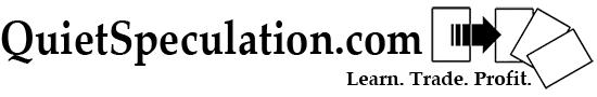
I won’t break down the logo from a distance because the mission should inform the brand, which informs the logo. How does a tapping card result in trying to get additional value? Why are there four cards and not three, like the tagline?
The Magic community and thus market has made each site dedicate a column to finance, and the QS team took a column and made it into an entire site. This means that no precedent exists to inform a full branding effort. They’re in uncharted waters, and adding a thought bubble and a dollar sign isn’t exactly wise.
Obtaining the original art and then contacting John Avon for its rights and reproductions would be awesome. It’s an obvious business expense: marketing costs. Having a short “about me” explaining why the name and card were chosen would show a little more insight into the brand, as it showcases how they come to decisions. I’d look into it.
Red Site Wins
Though RSW doesn’t have a logo, they have a banner, but since they’ve been in a lot of Magic discussions and circles lately, I simply want to encourage them to create a logo, a brand identity, and think strategically about their place in the market.

This could be any card, really. Red Deck Wins is a loved deck that has a lot of artworks. Pick a piece, church it up, and make your blog into a website. You’re in high-level conversations, but people are taking your topics off your site. The click-through rate is high, but do people remember your brand? (They can’t remember your logo, because you don’t have one yet.) Have a conversation internally, then get a focus group and get hustling.
StarCityGames
Oh, boy.
The gorilla in the room.
GatheringMagic doesn’t have a good traffic record working with SCG. (Link obviously omitted.) But we can understand that when one site does well, the community benefits. More water raises all the boats and such.
I like their logos. Let me rephrase that. I like their newest logo.
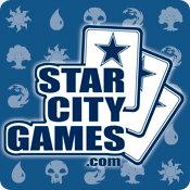


A deviation from the logo. Perhaps the brand can withstand on its own, like Evan’s Magic Show. With such a large site, mini-brands will inevitably emerge.
I do find it odd—considering how strongly designed their logo is, down to the retention of the logo’s elements of keeping the starred cards—that the old logo can still be found on their website:

This is a brand no-no.
Their brand equity is quite robust. Why would they retain an outdated logo?
It also prohibits having “vintage” swag coming back onto the market. If it’s still there, having a 2008 version of the logo on a shirt or long box isn’t that cool. A brand manager would likely bring it up in a meeting. Be consistent. Deviation is fine, but only in the current iteration.
That outer border, yet again, makes a quick glance over their logo into an “Oh, SCG, got it” experience. The border isn’t MasterCard—if you fully black it out, the brand isn’t seen through it—but I’m being overly critical. It works for them. When your brand is that huge, if people can see and retain it from a distance, you’ve already won the resonance war.
TCGPlayer
The color is very vital to their logo, as many who learn of the site will already know what a TCG is. Does a lightning bolt tell that to people who don’t know? I’m not sure.

It’s clean and colorful. It’s safe, but it doesn’t feel stale to me.
I do wonder if people wonder how TCG compares to CCG and if CCGPlayer is a better or worse site. (It’s currently for sale.) That might be a good site for them to pick up for redirects. It’s a minor change, but if they can pick it up cheap, maybe place an ad there with their logo, traffic would be worth the up-front cost.
Troll and Toad
Since 2003, Troll and Toad has been a giant leader in selling games, and their brand tells you how to write “Troll and Toad” into a URL. There is no confusion there. Compare their logo to “trollandtoad.com”. It runs together, and a clever designer fixed that problem. I’m not sure if a troll and a toad sell more product (Wind in the Willows and The Hobbit references?), but they stick to their brand. Trying to find the old logo images was a struggle, and that’s a good thing for their rebranding campaign.


Walking the convention hallways at GenCon had me constantly looking down at the trolls and toads attached to the ground. It was a clever way to drive traffic that used a subtle device. I’m sure we’ll see more foot-traffic devices in the future. Could a store contact the neighboring hotel and pay a fee to add guerilla marketing techniques all over the hotel? At the bottom of the pool? In the elevators? There’s definitely a market there and a happy medium for consumers, and I’m excited to see some innovation in the future.
They had a giant rebranding effort, and I feel it was successful.
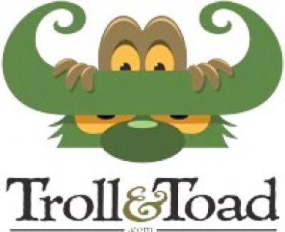


These logos all representing T&T and all felt smart, but they didn’t feel like a corporate logo.
Did the older logos convey the mission better? I’m not sure, but the new logos do have a strong level of consistency, especially when a team of buyers is flying all around the country and needs a unified front.
Vorthosian Inquisition
I enjoy this comic when it goes live. (Spoiler alert: It’s rarely updated.) Does that mean they don’t need a logo? Well, they took the time to make one, so I’d assume they need one.
The Vorthos is prominently displayed.
To a person unaware of what a Vorthos is, this appears to be a nerdy-looking guy examining a novel. Perhaps it’s a book review or critique site for Magic: The Gathering. A common gripe among Vorthoses is continuity, and the magnifying glass helps that. It doesn’t portray the anger that Vorthos will create from changing continuity, but that message is very hard to portray in a singular static image.
The person here helps a lot more than the name itself. There is still a barrier for people who don’t know what or who a Vorthos is, but it’s a niche brand; it doesn’t need to have a mass audience.
I think it works.


One thing that could be churched up is the color scheme. It gets lost and seems superfluous when the image changes to grayscale.
Now, I realize that some of you may disagree with my analysis, and some of you may nod and shrug. The best outcome here is a thoughtful “hmm” from readers, but examining the ways brands try to set themselves apart is an eye-opening experience. I hope you’ve enjoyed taking stock of the sites.
Regardless, every brand needs an audit on an annual basis. It can be an hour-long meeting with pictures of conventions and products, but the process of “reevaluating” is invaluable. You see how people interact with your logo, the first touchpoint of your brand, the “face” of your company. Is your mission showing in your logo? Reassess. It really focuses how you market yourselves.
Perhaps I’ll write another in a year, and we’ll see what’s changed (and make the list more exhaustive).
If you wish to elaborate, disagree, or discuss, speak your mind in the box below. My fiancée told me that this article could potentially cause a firestorm, but I’ve a hydroblast at the ready.


