I'm Vorthos Mike. I talk about art and today, I'll help you see the art perhaps a little better.
The saying is a picture is worth a thousand words. Images allow us a snapshot of a scene, able to communicate an immense amount of narrative with a glance. We are surrounded by visual transmissions, but how can we begin to make sense out of the onslaught of imagery? How do images communicate together with the name, mechanic and flavor text to create a whole? This article is an introduction to deconstructing an image.
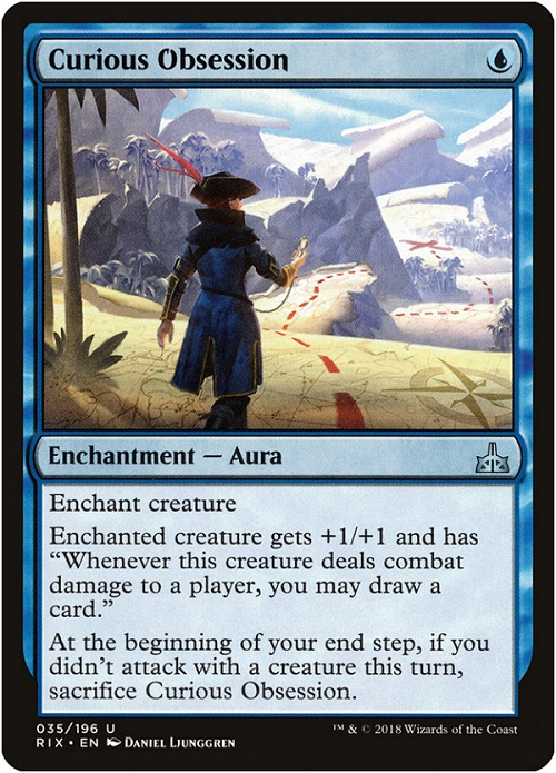
Today, I want to talk about Curious Obsession and how to break it down to the core art components.
Setting a Stage for Symbols
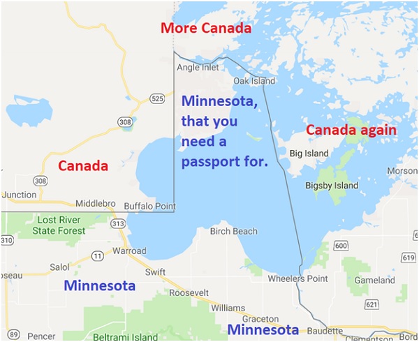
What does a map mean?
Surely, the old-fashioned creation of finding your way depends now wholly on context. A map of the full United States of America shows borders, perhaps topography or roads, where land masses align next to each other, and whatever this Northwest Angle thing is atop Minnesota.
Maps also can mean representations. They are global, they are communities, they are the many, and the encompassing.
The United Nations logo is a map, yet it doesn't show a destination, but rather what a map symbolizes. It is everywhere we as humans can live and all the conflict, peace, and comfort that can be found atop our pale blue dot of a planet.

To understand the difference, Magic uses art descriptions to shift between a symbol vs. an item. How players talk about this is whether a Magic artwork is "conceptual" or not.
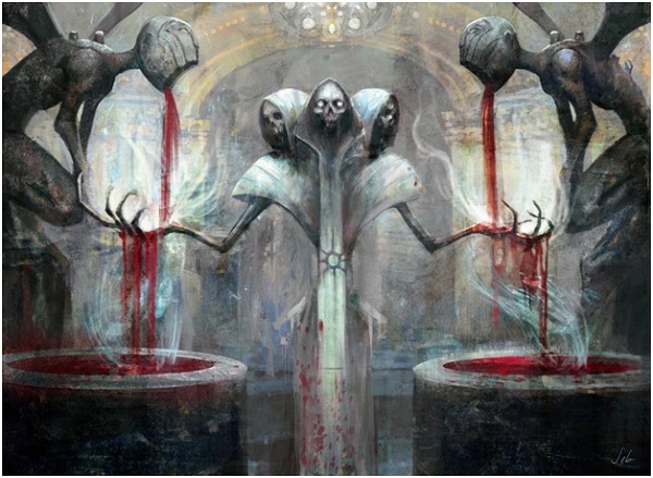
The image below, Debt to the Deathless by Seb McKinnon, isn't showing a debt. It's a conceptual piece that represents, Each opponent loses two times X life. You gain life equal to the life lost this way. There is no battle, no life being lost, and whatever X life represents. What we do understand that it's on Ravnica, it deals with the interplay between life, death and a church. All of that visual information isn't all immediately known from the image to all players, but we do see a vital role the Orzhov Ravnica guild plays in stretching life.
The audience or viewer creates a connection, one that artists can shape into what has, is, or will happen in an image. Seeing a skeleton in a church would memento mori, an object serving as a reminder of death. In a religious setting, it shows that only faith will allow you to endure, as your corporeal human flesh and bone will age and wither.
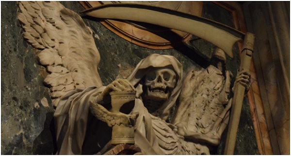
A fantastic Momento Mori in San Pietro in Vincoli, of the tome of Cardinal Cinzio Aldobrandini tomb, photo by myself
Churches and paintings love playing with symbols. When two symbols are near each other, we call that anchoring, lending meaning to one another. Notice the skeleton? Yes, we know, momento mori, but to reinforce the point, he's holding an hourglass to symbolize that you're short on time, on life. Humans don't live very long compared to the kingdom of heaven so you best repent and get your earthly business in order.
More on anchoring, if you ever see a pineapple with a skull on a table? Pineapples were very difficult to buy and expensive in medieval Europe, so having one showed ridiculous wealth. Putting a skull next to it alludes to earthly wealth being useless in death and in heaven, but also a citation to Matthew 19:24. "Again I tell you, it is easier for a camel to pass through the eye of a needle than for a rich man to enter the kingdom of God." The one image uses the other to tell a narrative, in short.
Let us add today's image and start "reading" what it has to say.
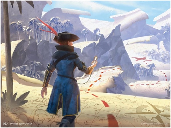
Curious Obsession by Daniel Ljunggren
1. Visual narrative --What makes this figure interested in walking along the dotted line? Why is she wearing a hat? How did she get here? The answers to these questions are not so important as the fact that the viewer is asking them. Card artwork that tells a story engages us as viewers. This engagement is called a visual narrative.
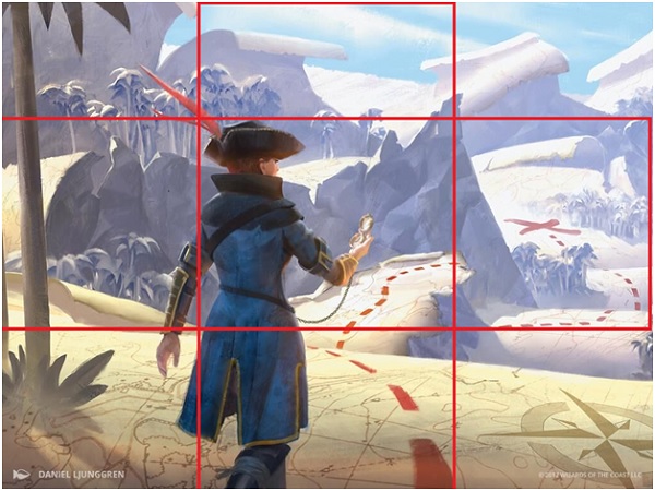
2. Rule of thirds -- If you were to cut this image into nine equal parts, then the figure is not quite centered, but rather slightly to the left. This pushes our eye to the right, creating a tension that intrigues us to see what the figure is looking at, the X. By showing us her back as she is looking outward, this isn't a creature being depicted, but rather the action that the figure is doing, thus, a spell in Magic: The Gathering.
3. Color -- The color scheme that artist Daniel Ljunggren chose is effective in his application. He chose a yellowish map to contrast the red dotted line, making it pop, exciting our eye to follow its path. The adding of white, or a tint, is in the top third, telling us to look at the more saturated bottom third first, and then work our way back upward. The lightless is less eye catching, the same reason pop art was so flashy, and STOP signs are so saturated red. You can't not see them first.
4. Symbol -- This artwork from Rivals of Ixalan is not literal; it is conceptual and feels whimsical. As outlined in my article on the subject matter, whimsy is silliness mixed with optimism, which fits her overall goal. The map is her seeking a treasure, yes, but the "map" isn't a literal map the dueling player is holding to follow. It's an analogy.
Art Description Insight
When looking at an image, always know that Magic: The Gathering artworks all have roles to fill, that is, they have art descriptions written by the Creative Team, Jenna Hellands, Doug Beyer, Kelly Digges, Ari Levitch, or James Wyatt, with help from the art directors Cynthia Sheppard, Dawn Murin and new to the team, Taylor Ingvarsson.
 Talking to Daniel briefly on what was needed and what he imagined, he had this to say:
The two main requirements were that the landscape should be a treasure map, and that the main character should be holding a compass. I had a bunch of outfit references for the character to draw inspiration from, but the look of the landscape and the composition, lighting and colours was pretty much up to me. Just like with Trail of Evidence this piece was fun and challenging, mixing the assumed 'realism' with the abstract.
Moving Curious Obsession out of our current observations, let us look to a precedent for perhaps a little more background knowledge on what we see.
Precedent Information
Connoisseurship could tell us that an artist has done something similar to this. That would lead you to only a year and change ago, when we were graced with Trail of Evidence, also by Daniel Ljunggren. While some artists are told in descriptions to refer to others, here the art directors found an artist that can deliver and called him up again. Trail of Evidence was an immediate art hit, giving us a pseudo-Story Spotlight showing the Drownyard Temple.
The precedent also gives us the ideal stage to compare and contrast, the Heinrich Wölfflin model of using objective classifying principles to understand. To see what is and what isn't, we need something closest to the image we are to examine.
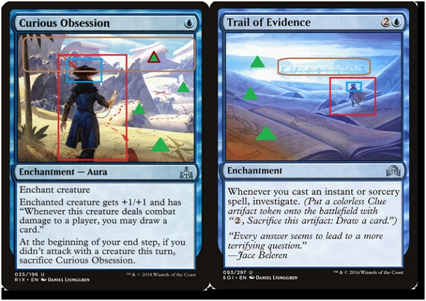
What's inside the red:
Notice the similar figure facing a distant thing, urging us to also look at what they are observing. This is a two-dimensional image that begs us to look deeper into it.
Green triangles:
The green triangles show us the foreground, midground and background spaces in Trail of Evidence. Curious Obsession gives a fourth distance, the far distance. Having them pulls us into the image and allow us to see the journey that is before the figure and us, the player utilizing the card.
What's inside the brown:
In both images, we see a distant background. We had a physical location with the first iteration in Shadows Over Innistrad and conceptual pages of books. Rivals of Ixalan creates a fully immersive conceptual work, giving us "mountains" of symbolic parchment for maps. They are sand dunes, and yet, with a closer look, you see the whimsical nature of the art description.
What's inside the blue:
The figures both wearing hats and both being slightly androgynous is not lost on me. While the Curious Obsession has the hourglass figure of a woman, the Innistrad soldier is impossible to tell. We are to know that yes, there are indeed woman pirates, and it's not just the legendary named pirate captains like Kari Zev or Admiral Beckett Brass, but all manners of women pirates.
In Game Visual Knowledge
In Ant Tessitore's seminal Vorthos 2015 article, he explains that Vorthos is more than simply someone who plays Magic: The Gathering and enjoys the beauty of the game. He outlined five types of Vorthos and one of them is relevant here today, the Gamer.
The Gamer Vorthos are those who enjoy top-down mechanics and resonant fantasy flavor in their games. This card is interesting with the art alone, and when we add the mechanics and the name, we get a fully fleshed out flavorful concept. The deck and the spells cast tell a story, an experience of a spellcaster in an actual duel.
As we return to Curious Obsession, the figure is conceptually portrayed by the ongoing quest, which is clear. The creature gaining this aura will become larger (+1/+1) and move closer to the treasure, which is represented by drawing cards out of their library, searching for the ideal card, the ideal win condition, represented by the X on the map.
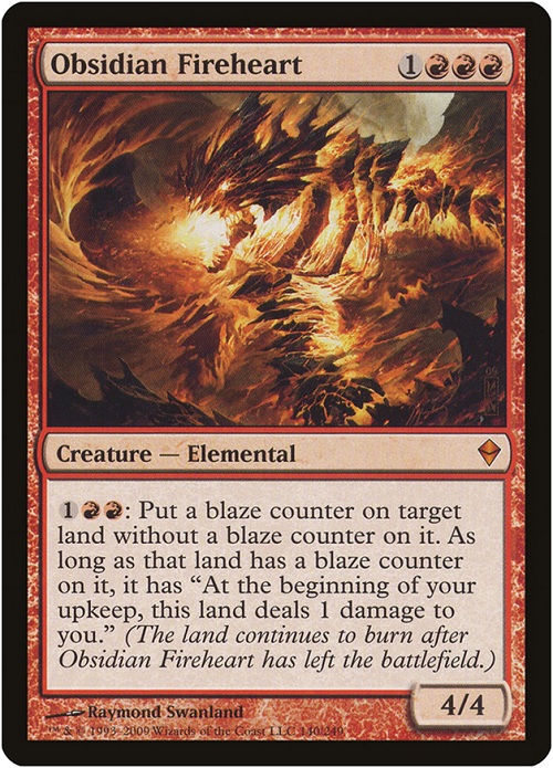
The card name Curious Obsession alludes to, then confirms in the rules text that when the obsession ends, so too does the dotted line that brings us closer to our goal. This is a new art description that ties mechanics of a card to a flavorful name and artwork, without needing a flavor text line to explain anything. This is streamlined, cleaner and doesn't need the Obsidian Fireheart flavorful fusion of reminder text of "continues to burn."
 It's by far one of the standout art descriptions, created by a stellar artist, creating a flavorful experience in an uncommon that is not a good card for constructed playability. Often the best flavorful, Vorthos cards are commons and uncommons that don't see a ton of play.
We are able to get a narrative from a pirate's perspective, seeing a conceptual landscape unencumbered by any foes or barriers, single-minded toward a goal. Adding insight into how the game is played in a singular fusion is a seminar example of the creative team, design team and development team all working together in unison to create a top-down card that is flavorful, functional and beautiful. This card can't swap out a merfolk seeking to protect their prize or a vampire searching for a cure to their curse. It's obsessive, a bit absurd and temporary, exactly what a pirate represents.
This is a flavor gem and will be held up for years to come as a near perfect example of a flavorful masterpiece in a mere uncommon card that many people will overlook. I hope you take a closer look, examine its art and gain a deeper appreciation for its skilled dedication to the concept.
-- Vorthos Mike