


My first thought when I saw the announcement of the app was, “It’s about &*#%ing time; I’ve talked to them about this a couple times over the last three years.” So, I wasn’t sure what to expect, but I welcomed them to the Magic-related-app arena.
I’ve done this review from my point of view as a programmer, and more specifically, as a programmer who enjoys writing iOS apps. Most of my comments are geared toward usability and performance and are based on spending a couple hours working through the various areas of the app and noticing things that I think could be done better.
I’m going to work my way through the app, in roughly the reverse order of the main menu screen.
Store Locator
This has so much potential. Your device most likely knows where you are and has Google Maps integration built in. I figured this would pull up a map, flag nearby shops and events, let you enter a different location (e.g., if you’re traveling and want to find an FNM where you’ll be staying), and let you pull up information on the shops/venues.
Alas, all it does is switch you to the web browser and open the store locator page of the WotC site. So disappointing. You even have to go to the app menu and manually reenter the toolbox app afterward. I can’t help but wonder if this was added at the last minute to fill out the main menu.
Content Update
Well, we all need wallpapers. And here we can download a whopping two of them. A little underwhelming, but I assume (well, more like “hope”) that over time, much of the Wallpaper of the Week collection will be made available here.
This would also be where we’ll go in the future to download (read: buy) new sets of cards for the deck-builder.
News (a.k.a. DailyMTG)
This is the one feature I thought would make me want to allocate space on my phone for the app. This is the one feature of the StarCityGames mobile app that I actually use and like.
Again, I was somewhat disappointed.
First of all, when you open an article, it uses about two thirds of the screen width.

Double-tapping to zoom so as to fit the screen width fixes that, but it should not be required. Even using the full width, the text is still quite small. That’s not uncommon, and my usual approach is to rotate my phone to view a wider screen (and larger text). Unfortunately, the app doesn’t support rotation. I agree with that decision in the rest of the app, but it would have been useful to get the extra width for reading articles.
While links to other articles and card popups work, they don’t seem to be highlighted. This isn’t a huge issue, but it is a shortcoming. When you pop up a card, it’s small. You can double-tap the card to zoom it to full screen, but when you double-tap again to go back to the article, it shrinks back to original size. Annoying, but not overly serious. Double-tapping inline card images behaves the same way.
 |
 |
 |
If you single-tap a card image, you are taken to the Gatherer page for that card. I find it odd that the built-in card viewer wasn’t used instead, but at least it doesn’t take you out of the app (which begs the question of why the store locater does).
Finally, if you tap a link to a previous article (for example, reading this week’s Making Magic and tapping on the link to last week’s [Part 1 of the Dark Ascension overview]), you are taken to a view of the article on the DailyMTG site. At least it stays in the app.

This is a good first try at it, and it shouldn’t take too much to evolve it into the preferred way to read DailyMTG content, especially if and when a native iPad version is released.
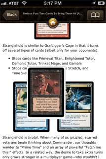
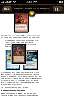
Card Search and Deck-builder
I’m doing these together because they are closely connected.
Deck-building and card reference is tough on a mobile device. There are over thirteen thousand unique cards to deal with. Dealing with that much data on a mobile device can be cumbersome and slow without some sleight of hand.
So, it’s not overly surprising that the card search is painfully slow. The search is incremental as you type, which is cool, but it is also the main reason for the slowness. I trust that future versions will improve the situation. Also, an index on the side (as most apps use when presenting a long sorted list) would make the list easier to deal with.
One thing that seemed odd in an unlike-the-usual-behavior-of-an-iOS-app way is how the subtype selector pops up when you’ve chosen a type. It just feels odd.
Adding cards to a deck is painful because of the number of taps it takes, coupled with the sluggishness of the card search. When you start from a deck and try to add cards to it, the last step is still choosing what deck you want to add the card to . . . even though you started out in that deck. Sorry, but that’s just plain sloppy.
When I saw the screenshot of the sample hand viewer, I thought, “Oh, nice use of the carousel.” Instead, it’s something that’s almost, but not quite, entirely unlike Apple's carousel. Also, this is another screen in which being able to switch to landscape mode would be useful.
Players
Overall, this is fairly good. One flaw is the Commander list. When you ask to choose a player’s Commander, you are presented a full alphabetical list of all legendary creatures. No search. No alphabetic index on the right-hand side. It’s a big list to scroll though (notice the size of the scroll thumb). This seems to be a theme. Once more: mostly annoying, but not a serious flaw. That said, Zur the Enchanter is a hell of a commander. One other thing: There’s no enforcement of the banned Commander list, and I could happily set my commander to Braids, Cabal Minion.

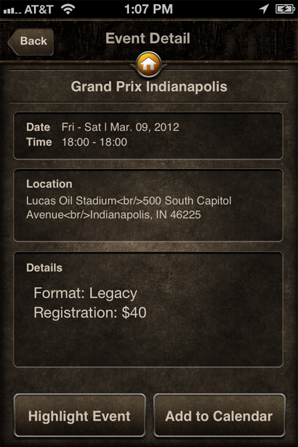
Events
This section has good potential—it can add events to your calendar, which could be marginally handy. But then again, there’s MtgMom if you want event schedules.
So, I pulled up the info on GP: Indy. Two things immediately caught my eye:
- The date and time were wrong. It claimed the event ran Friday 6:00 P.M. to Saturday 6:00 P.M.
- There were HTML tags in the event location pane.
I’m sorry, but this is just sloppy and shows a lack of attention to detail and/or a lack of testing.
Life Tracker
Now I see where the money was spent. This section of the app is really quite nicely done, and it’s probably the only part of the app really worth using in this version.
The visuals are beautiful, and operation is smooth. Nice touches are the pulsing of the values as you change them the reddening of the life and poison values as they approach lethal . . . and the sweet cracked-glass effect when lethal is reached (ignoring “You can’t lose due to . . . ” effects).
One thing that I think is missing is best-of tracking for matches. This is a feature that I find very useful in the SCG app and my own.
While the life tracker is sweet, the dice roller is, honestly, among the lamest I’ve seen. Did they even look at TCG Buddy?
Summary
- There is unresponsiveness and sluggishness throughout most of the app.
- The interface is snazzy and generally quite clean, but there are places where standard iOS controls are used, and it looks very discordant.
- The screen changes look like they transition faintly through the main menu screen, giving it a pulsing, slow-as-molasses feel.
- Most of the UI and graphics are slick and nicely done, but the set icons are awful—low res (i.e. pixelated on a retina display) and anti-aliased for a white background, which results in a white halo effect. Come on, folks; they’re your images. How hard would it be to remake them for a transparent background (hint: that’d be a good approach in general).
- Glaringly missing is any access to PWP information.
- The life tracker is overall very nice. The rest of the app is somewhat half-baked and needs much more work to bring it up to par. It looks to me like a classic case of “everything but the kitchen sink," which is not the way to build an iOS app.
This is currently far from being "The One App" that you need as a Magic player. It's a good life tracker, but the card-browsing and deck-building aspects verge on being laughable. The article reader is a poor attempt at slamming web content onto a mobile device, and the store locator looks to be an eleventh-hour addition in an attempt to fill in the home screen. I'll stick with Decked for deck-building tools, Gatherer for card browsing (or maybe finish my card reference app), MagicTheGathering.com for reading DailyMTG, and MTGMom.com for event info.
While this initial version of the Toolbox was disappointing, I’m looking forward to seeing where Wizards of the Coast takes it in future versions.