


How are we to choose the top 5 artworks of 2022 for Magic: the Gathering when:
- 2022 created more new art for the Magic brand than any other single year.
- If you can actually remember most of the art of the year, you're ahead of most. I found easily a dozen tokens I had never seen before in researching this.
- We don't even know what best means. Most beautiful? Most liked on Twitter? Most innovative? Best technical creation?
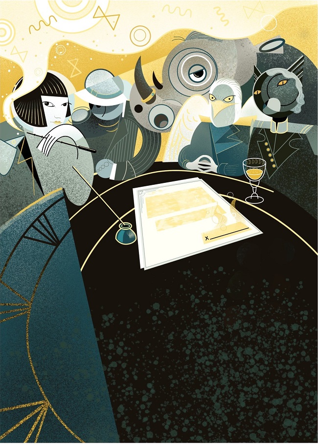
Brokers Ascendancy by Shawn Pagels
We enjoy art, we like art that appeals to us.
But we are not asking the simple question - what art do you or I think is best - we are asking the hard. What are the best of the year, not necessarily which do I like the most.
What is the most transcendent beyond the card, created at a high technical level, and means something more than itself.
Art itself is not necessarily positive, joyful.
Art can be intentionally, deliberately hurtful.
Art can make you think about or consider things that you would rather not.
But if it evokes an emotion in you, then it is Art.
Let us seek out the best Art.
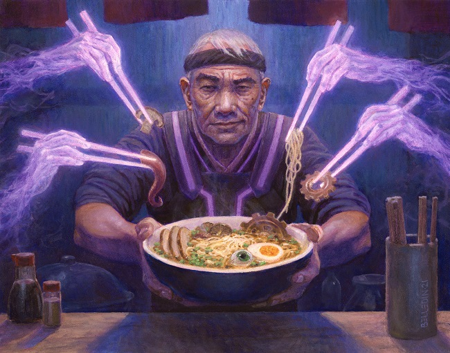
Dockside Chef by Steven Belledin
Though, an inescapable fact of all Magic art is that it is a commission.
This part feeds the creative process. This art must be be made day in, day out to feed new cards, new sets. All art for Magic is at base level good. They can be selective, and are, and by making them a higher tier pushes quality upward. (Pay that is better than the overwhelming majority of the market helps a lot, and even that could be a lot higher.)
Whether this fact motivates the artists to form an item of monetary value, a painting which can be sold to feed their family, or to elevate the art from card shorthand visual cue, the vast amount of art makes sifting to find the gems in the river with an ever-stronger current shockingly difficult.
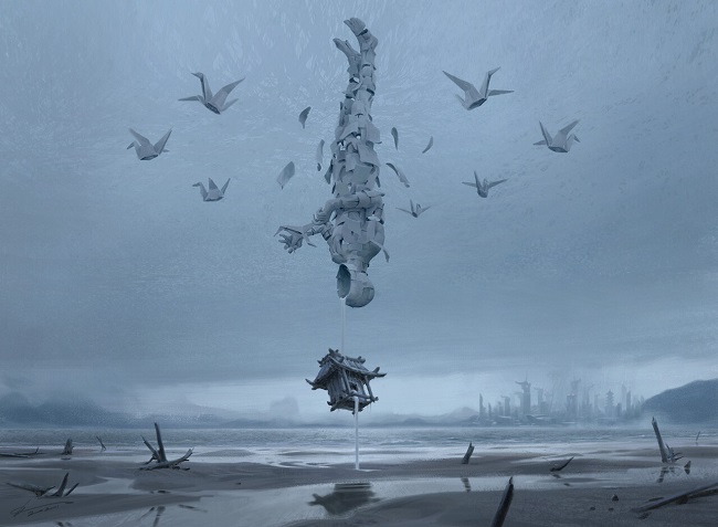
Go-Shintai of Lost Wisdom by Johannes Voss
I have written a few "best of" articles like in 2020 which served a purpose to inform Chesley judges, choosing a best gaming illustration, making sure Magic was at the very least, at the table. How successful it was is a bit irrelevant, but Magic winning awards is important.
By celebrating the top, it attracts more skill, greater untapped talent who may not know the game, may not play the game in their country like soon to be South Korea.
We want the game pieces to be more, and the more focus, the more art submissions for awards, the more Surgical Extractions and Cartographers we agree upon, the overall better the game will become.
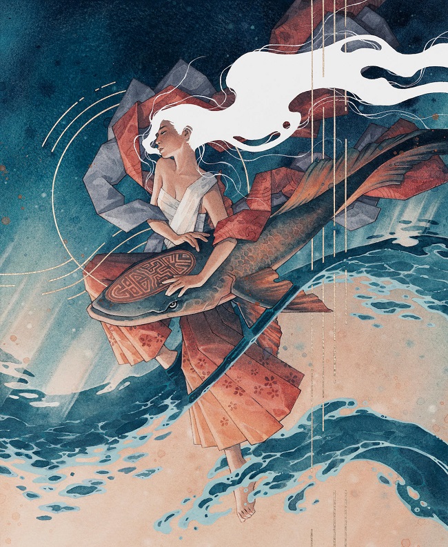
Mystic Remora by kelogsloops
Art, again, is not arbitrary on which is best. The Greek quote, remastered on Dominaria countless times, is not actually apt here.
-Benjamin Franklin, Poor Richard's Almanack, 1741
There will always be a challenge to traditional old school conceptions of Magic art from the shock of the new, and tensions around the appropriateness of our understanding. Every reprint should beg the question of was it necessary, is this needed? Does this improve the new? Do I like the old or the new, a former quiz that Josh Krause used to conduct on his OriginalMagicArt page. We have bias and we must confront it when looking for the best.
 |  |
We cannot argue that you don't feel like the boiling point of water is correct. It just is. Art does have some parameters that are more rubric based toward a good/better/best. Beauty, ideals, and hideousness are outside science, but being able to rate is made from experience.
The deeper the experience, the more we can see when someone is hiding feet because they can't paint them well.
We have no choice but to assign significance and meaning to what we find of value and wish to share with our fellow players, friends, and folks visiting our homes seeing a print on our wall from your recent MagicCon visit.
Because of our own perceptions, and our own realities, any debate on best art will be inconclusive at best, and disrespectful at worst. If we're sitting at a solid 18 wisdom, we will listen to each other's top 5 and sometimes with a slight smile, celebrate the diversity and plethora of Magic art such that we have the options to customize and make decks and our experiences our own.
Let your smugness fade for a minute and take a walk with me through the forest.
Animar, Soul of Elements by Filip Burburan
I have argued for years that in Magic, everything is good. The standard is good. Your goal is to find the great, and if we're lucky, a few transcendent works each year.
Plains by Johannes Voss
My Top 5, in No Particular Order
Whenever you get an email from a Wizards art director for a reprint, you have homework to do.
When it is a played reprinted card, that was banned, and still commands your full attention when you see it hit the battlefield, you cannot phone in your assignment.
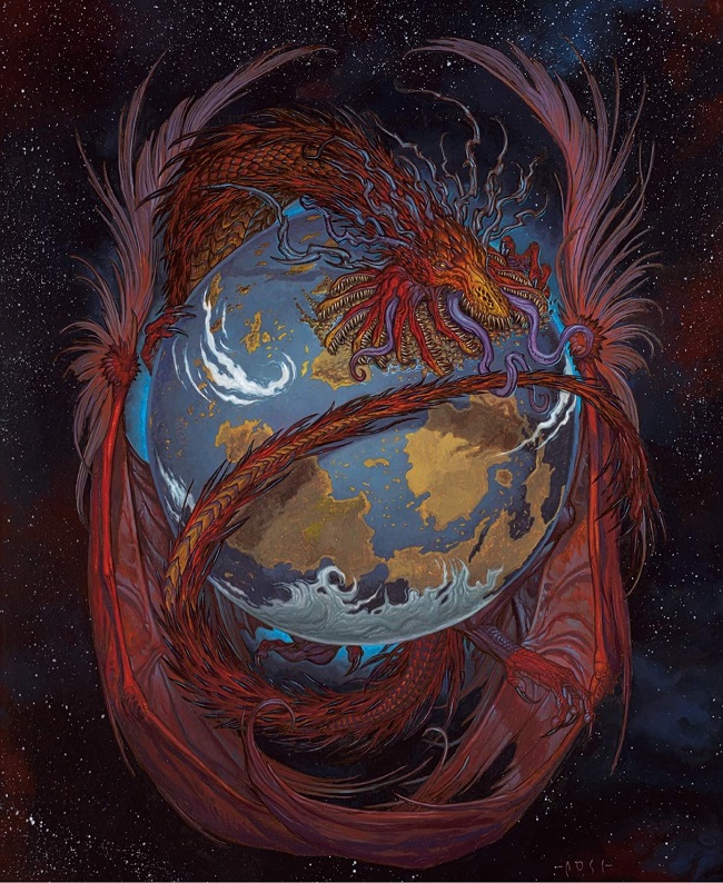
RK Post brought decades of experience here, and it's shockingly strong.
Some quick notes:
- The dotted background that reminds you of airbrushed background of the 1990s, yet updated to 2022? Fun.
- Dragon anatomy in full display, yet contorted like Covetous Dragon, Avatar of Fury, and Emissary of Hope. The wings to hands to each curl and turn of the creature begs you to look at it and we weep that this was not a full-art creation.
- The full Dominaria globe, painted exactly from reference, calling back to his days in house working for Wizards? Chef's kiss.
It is a masterpiece work.
A draw card spell has a considerable runway on how to write an art description.
The "aha moment" has been shown hundreds of times already. How do you make this fresh?
Making it conceptual sure makes things feel new.
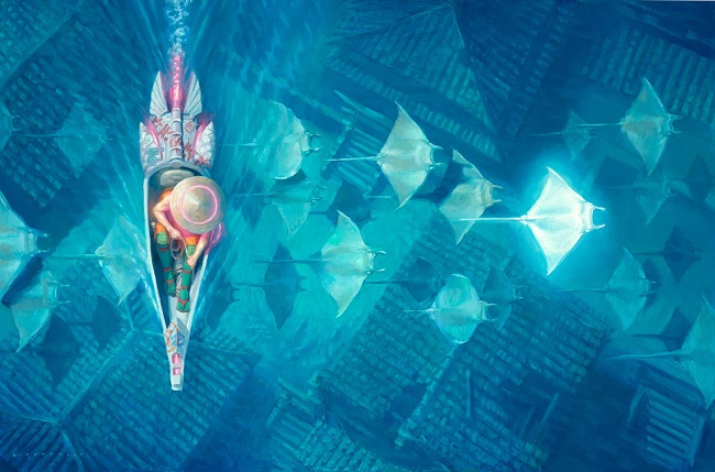
But you gave it to an imaginative realism painter, Ryan Pancoast. How do you show learning or remembering something and ground it in reality? What about fish?
- Manta rays.
- Fundamental depictions of showing a culture.
- Add in architecture.
- Make sure water is there.
Of course.
Tying into fish and therefore the merfolk tribe is very clever.
Choosing a manta ray instead is inspired.
They're underwater, and Ryan chose a hard-mode perspective of showing it from above.
To keep it on Kamigawa, Ryan showed the rooftops, anchoring them with a futuristic boat, showing a fusion of old Kamigawa and new just by a person in a boat.
The person in a boat alone in 1/6 of the image shows everything about Kamigawa: Neon Dynasty that we need. It is a world where Magic meets technology. It's the literal tagline, and he just weaved it into the image.
Ryan spoke on it:
The blue-green of the water is VERY hard to reproduce, and looks slightly different in changing light temperatures. I think the original has a slightly more green-ish tint than I was able to reproduce digitally or in print.
This job was a lot of fun because it was so different from my usual assignments. I rarely get art descriptions that allow for abstraction, and from the start I had a clear idea of the painting in my head. The sunken older buildings were optional but honestly, there was no way I was leaving them out. They add so much storytelling and I was glad the creative team, lead by art director Zack Stella, thought of that idea."
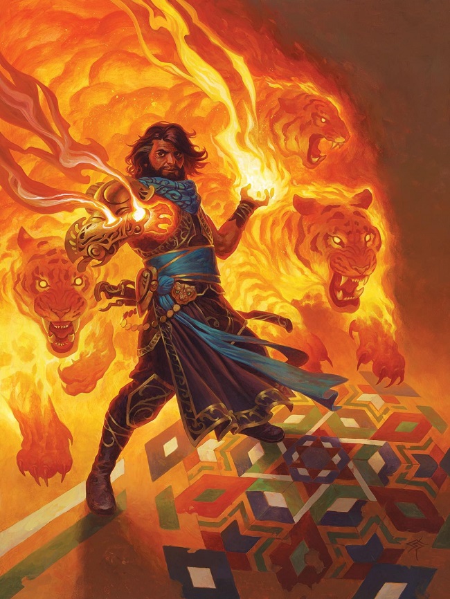
When Kaladesh came out, it was known as the ultimate set for intricacy, for opulence and ever asking for more detail. Artists noodled on this set more than any more in recent history - working on rendering, rendering to add more.
Steve takes the approach of the set, achieves, and goes deeper to add more cultural nuance that Shivam had hoped for.
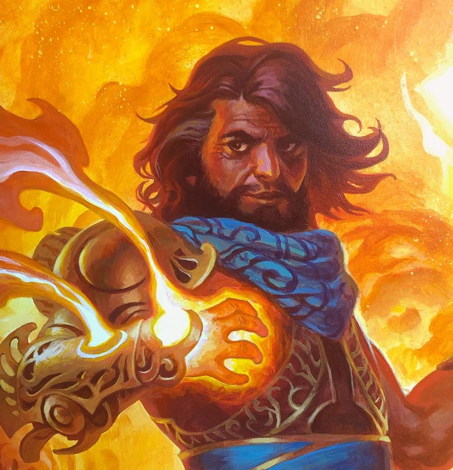
- The tigers weaved into the fire? Good.
- The character, including his hair? Great.
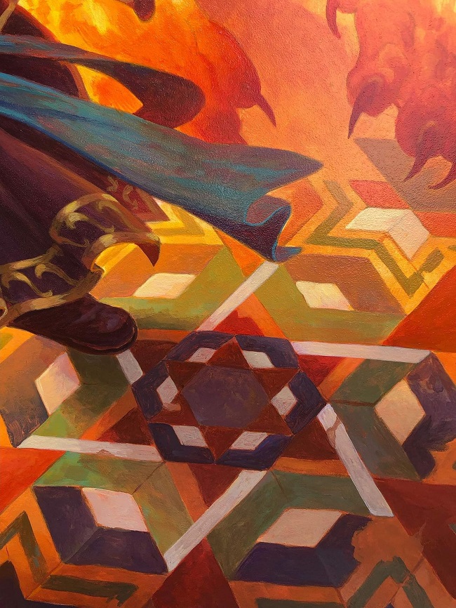
- The rangoli on the ground? GREAT.
 |
 |
Steve wrote on the work:
I also was feeling kinda graphic design-y so as a counter to the organic nature of his costuming and the flaming tigers, I went with a hard geometric pattern on the ground. This was one of those rare paintings that came together quickly and smoothly and also turned out to be one of my favorites."
With over 15 works from Chris this year, I enjoyed all of his legendaries, from the incredible Ao, the Dawn Sky to Sheoldred, the Apocalypse, but this card I can't get past.
That lighting and value control is just absurd strong on a mere common. To put this level of effort into a card that is only in limited is what separates Chris Rahn from many artists. He goes hard on every piece of art, every time and he does not need to.
Why I mention this is because of the secondary market for paintings. If you have a legendary creature, a planeswalker etc. there tends to be a higher floor of how much the painting will sell for at auction. Therefore, if you get three cards, you should spend more time on the best card as it pays you to do so. Chris goes hard on all of them. Inspiring.
Artists often talk of their average creation, their normal day in and day out quality. Chris's is always high. When you look for examples, you find them, like our kami here, a masterwork of light studies in a dimly lit room with fur that not only feels appropriate, it's technically on a high level, correct, and superbly painted to be legible at a tiny size.
Chris spoke on it:
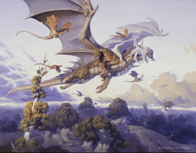
Rith, Liberated Primeval by Victor Adame Minguez
There had to be a dragon for one of the best.
People often look to dragons for the best art, because of the card ability. What also happens is that artists go extra hard on dragons because of that raised focus. Victor did it on a revisit for a boomer level commander that barely sees play, yet brings his S+ tier game to show a dragon primordial, what Rith always was, but wasn't that clear.
Victor's palette is evolving, improving, and his creme colored transitions are becoming his stamp, his skill set. Subtlety is shockingly hard to do normally, and in a 2" x 3" text box, shockingly hard to make work.
He had pieces that announced his transition from being an only digital artist.
He had works that showed quality.
He delivered an utter masterpiece this year and we marvel that he's still working in our little niche of Magic art until he goes on to bigger and better things.
We are lucky to have him.
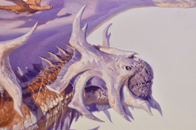
A little close up of the face and all its fun details:
Happy new year!
Vorthos Mike