


Two years from now, someone will find this article and see it was published over a month after Modern Horizons was fully previewed, and they may wonder what happened.
The past few months have been one continuous preview season, with minimal time to reflect on the art of Modern Horizons down to the common level. Art from both Modern Horizons and Core Set 2020 is still being released by artists unsure which of their works are off their non-disclosure agreement. We have also already had San Diego Comic Con, where Throne of Eldraine was previewed with lots of new art.
Overwhelmed. That has been the mood of the summer.
New art is still being revealed and people are still finding nuance and Easter eggs to explain. Modern Horizons is allowing even a first time viewer to find fun examples of planned nostalgia nods.
Summer 2019 follows years of build up to War of the Spark, effectively ending Nicol Bolas's multiple block, and year, spanning plot. We are in a story pause, a moment when past, present, and potentially future can all be examined simultaneously. This allowed for a fixed Time Spiral nostalgia bomb with Modern Horizons. Whoever realized this at Wizards of the Coast should be commended, as it would have taken a great strategic perspective.
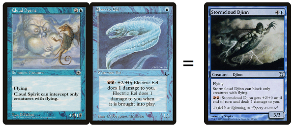
As a reminder, Time Spiral was a previous block of three Magic sets, Time Spiral, Planar Chaos and Future Sight, designed to be homages to the past, giving enfranchised players a delightful experience. The problem was that even the enfranchised players missed some nods to the past, and it became entirely unapproachable to new players who had to play the block because it was in Standard. One example was Stormcloud Djinn. It's neat, but few players were excited to see a new Electric Eel. I thought it was cool though and that card was amazing in draft.
Modern Horizons is not a Standard-legal set and allowed for more of a pinpoint application of nostalgia as compared to a mallet to hammer home the, "you got it, right?" This go around, Wizards was very successful And we're still finding their clues.
The fan service of finally giving both Yawgmoth and Urza cards was celebrated instead of groan-inducing. They started emptying the bag of eventually must do concepts, like Feather in the previous set, and now Urza and Yawgmoth, while releasing pressure on some key cards needing reprints. This is a good thing.
They didn't have to go that hard on using so much new art, though.
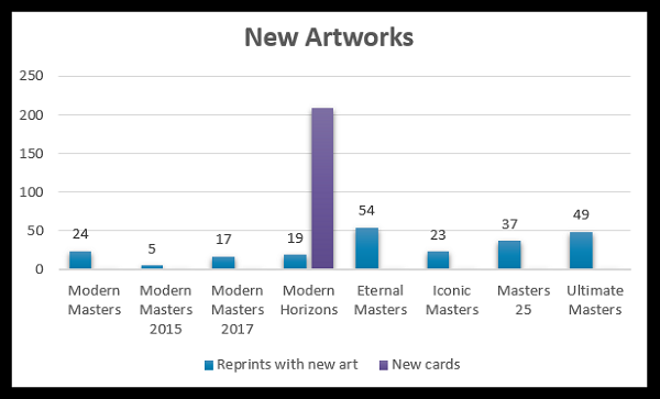
The first topic must be the sheer quantity of new art. This is an all time new high compared to the Masters sets. This product is not a Masters set, but a Masters set is the closest analogue to the play experience of nostalgia mixed with new art we have experienced. Modern Horizons is not entirely reprints, and that mind shift of reprinted cards plus considerable new cards exponentially increased player enjoyment of the set. You assume there would be new cards and new art, but over 200 is just absurd level good.
I will admit, I heard rumblings more art than ever needed to be produced on an annual basis and it didn't quite register . This was the first real product I was shocked by how much new art was created.
Art director jobs at Wizards of the Coast are very coveted, very difficult positions to even apply for. In the past year I've seen more than a handful posted and now I understand why. They are making more cards, more commissions, and require a larger team to do so. Magic artist Zack Stella just announced that he will be an art director starting in September 2019.
Besides Zack, there are a few other changes internally. A familiar face has taken the mantle of Design Manager: one of Magic's first artists, and a former art director, Sandra Everingham. Sandra is the artist of my favorite artwork I own and I had to take a few minutes to ask a couple questions.
Hello Sandra, this is wonderful. You're back! So, this begs the question: what brought you back?
My favorite part of any management job I've had was helping my team work through creative and interpersonal issues. So, I went through the ICF (International Coaching Federation) program a couple years ago and at one point thought I wanted to build a business coaching Creatives within the game and tech industries. Eventually, I realized I didn't want to go the entrepreneurial route, so I took a break from coaching clients and settled into the possibility that would not be a part of my career.
Then a good friend of mine, who is an art director, shot me a text, "I think you'd be great at this," along with the job posting for the Design Manager position. This position focuses on the Worldbuilding team, consisting of art directors, game designers, graphic designers and concept artists. Along with balancing workloads and a ton of meetings, a portion of my time is, COACHING CREATIVES - and I love it. I work with them on the aspects of their creative and career development and how they want to grow. I think they know they have someone who has their back - I truly care how fulfilled and happy they feel in their work.
I'm still catching myself in disbelief as I never would have foreseen I'd be back 23 years later.
What feels the same at Wizards, and what's radically different?
Hasbro, of course, brought a more corporate lens to everything but I've worked at Microsoft, EA, WizKids, and Wunderman so it's an environment I'm comfortable navigating. What trips me out the most is seeing Tom Wänerstrand, Jefferson Dunlap, and Mark Rosewater in the office - but we're all just a smidge older now.
Can you offer a few pieces of advice for players new to the world of Magic art?
Welcome back Sandra.
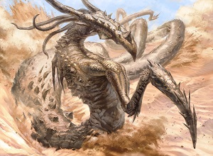
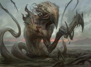
Slivers, They're Back
They look awesome. Let us take a few minutes and look at them without any context or information.
 |  |
 |  |
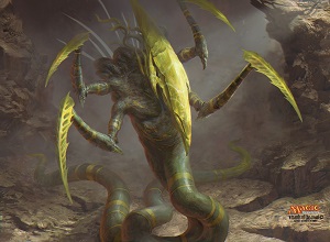 | 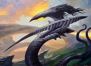 |
From Left to Right, Top to Bottom:
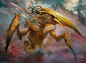
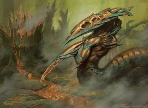
- Bladeback Sliver by Svetlin Velinov - Digital
- Tempered Sliver by Mitchell Malloy - Digital
- Enduring Sliver by Josh Hass - Digital
- Dregscape Sliver by Zack Stella - Digital
- Spiteful Sliver by Johann Bodin - Digital
- Lancer Sliver by Lucas Graciano - Oil on Masonite, 14x18"
I wrote about the Magic 2014 slivers back in 2013, and came to the conclusion that it was a decent design decision, but failed to take art nostalgia into consideration, forcing the folks who create the art to adapt. They had to Tim Gunn make it work.
Arguments internally and from PR at Wizards were about you control vs. all slivers, and most players were complaining about the art. The non-global nature was logical and there was minimal outrage. The art is what had people confused.
Six years later, and the art description issue has been fixed. They're both familiar with the single claw/spike, yet they have the tentacle headpieces introduced in the core set, reintroduced here. I think it's a nice touch fusing both into something slightly new.
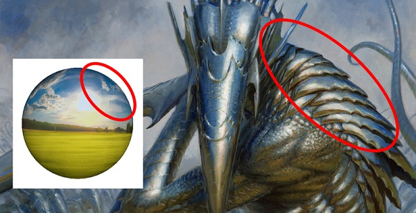
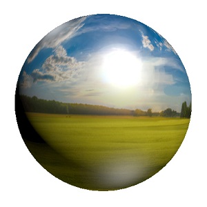
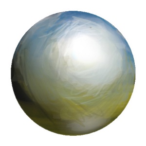
I must mention Steve Belledin's stellar writing during this time. He normally writes on his blog, Push and Pull, yet submitted a long post to Muddy Colors, a collaborative blog by a variety of major artists in our Imaginative Realism industry. He talked about painting metal using a Christmas ornament, then places a scene into Adobe Photoshop with the spherize tool to show reference. You can see his exact idea in a finalized application, then the reference orbs below. It's mind blowing seeing something that doesn't exist evolve from reference into a believable, logical application.
 |  |
Time Spiral Art
Let's touch on a few quick examples of topical references from the past.
Pondering Mage's globes are what you first see. The second thing you see connected are the stars in the background, and if you haven't seen the face in Ponder yet, hopefully new players will now.
Mons Johnson now has a card.
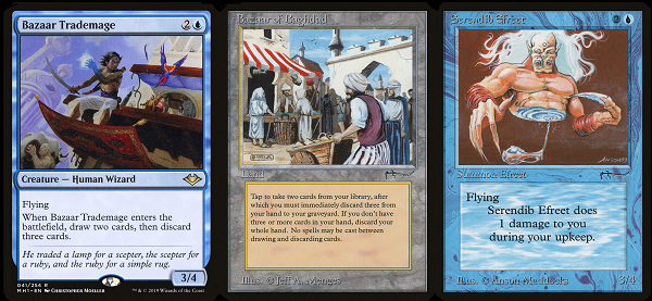
And our Tribute Mage is seeking what she should, a two-card combo with Thopter Foundry and Sword of the Meek.
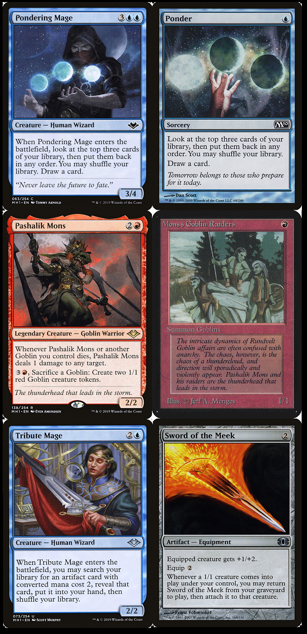
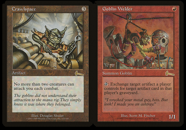
I'd like to also point out how fun Jehan's little goblin is here.
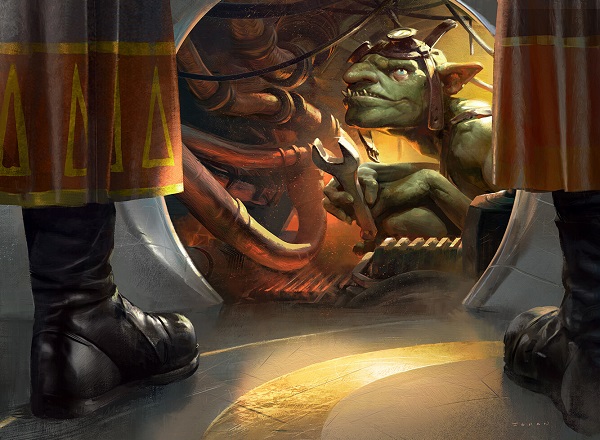
His mechanic is Goblin Welder, but that is absolutely the little gobbo in Crawlspace. Nice art homage there.
Unused Artworks Find a Home
Remember that Christopher Moeller was retired from Magic? That's technically true, though he had a few unused works, slush art that is, which could still find a home. This lovely illustration of a man atop a flying carpet found a home in Modern Horizons.
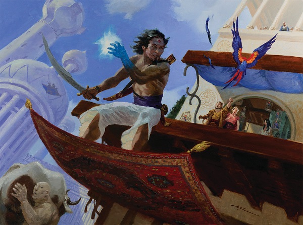
It of course, is a mix of two cards, both powerhouses from the past.
It is technically similar to Fettergeist, Illusionary Servant, Riptide Chimera, Stitched Drake, and Wormfang Drake, a concept of 3-drop 3/4 with a drawback. Here, we see a strictly positive card, dumping lands in your hand in draft for better cards. It also fuels flashback and threshold. I think it's lovely and I'm happy to see Moeller's work in a set again. And yes, he paints large and at the time of this article, it is still for sale, but not for long.
Fountain of Ichor is from What now?
Modern Horizons didn't just provide a home for unused art from the long past. A couple more recent pieces waiting for their time to shine found a home as well. Fountain of Ichor was made for Ixalan, likely in the slush art pile, like many unused masterpiece cards reassigned or still waiting for the right set. Wizards editor Del Laugel mentioned the other side we already know, because we've seen it before, with an appearance from Shivam Bhatt's MTG Twitter account:
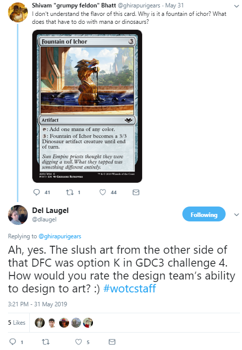
The Great Designer Search 4 had this listed, the "front" side of the oil made from dinosaurs gag:
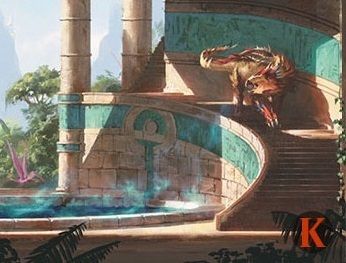
Moving on to other art, Wayne Reynolds found his mountaineer in the set.
This was originally painted in 2010 and was previously unreleased. I am happy to hear that news for Wayne. It's a lovely little illustration.
One More Again
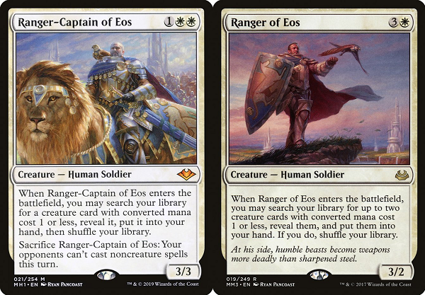
If there is one bit of fanservice celebrated by enfranchised players it's a highly played card reprinted with new art by the same artist. If the artist has also improved their skill, it's a dream come true.
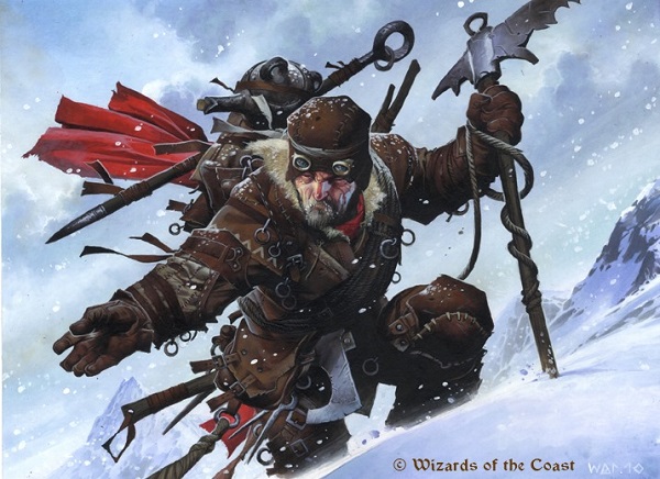
Coming in a close second to that is an artist getting to paint a character again, showing not only the artist's, but also the character's growth. Ryan Pancoast, who is having a MVP level year, painted his Ranger of Eos in a promoted role:
We see everything taken to 11 here from medals and adornment to light reference, additional characters, and fur. It is very well done.
Better than Good
In every "review," I like to call out a few artworks that caught my eye. With so many new pieces, having a full look and overview is just too much for comprehension. A few highlights are a snack, a treat that should encourage people to go back and look over cards from the past. They should find the fun that is Steve Prescott and Warteye Witch. They shouldn't miss the lands of course, but they may miss the masterful strokes on the elephant's trunk on Trumpeting Herd by Lars Grant-West. I know Seb McKinnon's seven cards have been discussed at length already, from my own preview card, String of Disappearances, to Answered Prayers and Soulherder that look both like nostalgia and a new normal at the same time. This section is not for those. You already know about those.
This is for things you need to look closer at that you haven't yet.
Let's go.
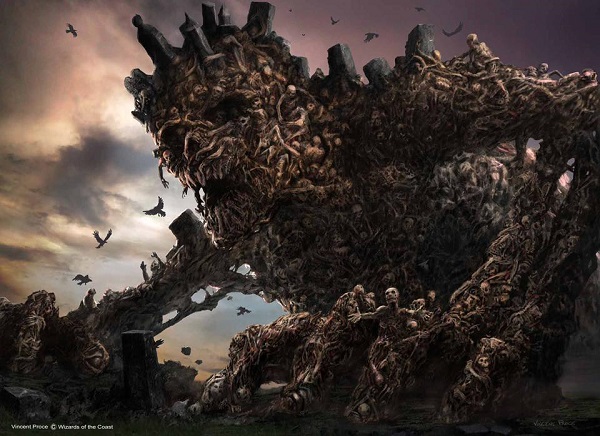
Vincent knows the scary.
He knows how to make creatures into form. His work with Chainer's Torment, Barrier of Bones, Scythe Specter, and Corpsejack Menace should tell you.
And if you have seen his Diregraf Colossus or Maw of the Mire, you should know he's a short phone call away every time they need this concept executed at the level of artistry movie directors want for concept art. It's fresh, it's new, and it's flawlessly done.
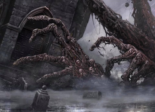
Crop of Maw of the Mire by Vincent Proce, digital
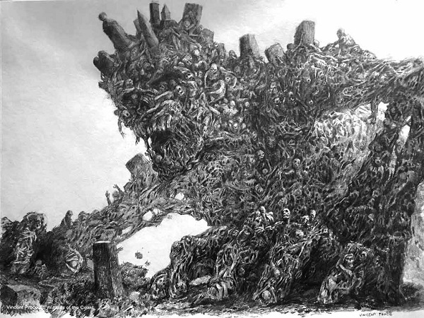
His work on plotting how a group of undead looks and feels was perfected with Diregraf Colossus on paper:

Sketch of Diregraf Colossus by Vincent Proce, pencil on paper
You can see his learnings fully on display in Hogaak below. This is pencil on paper and he's a digital artist. It's unreal good.
I just hope we can keep Vincent around for as long as possible. Guillermo del Toro doesn't need a concept artist every week.
Great work Vincent.
Who doesn't love a good process gif?
Notice how strong the visual concept was in Mitchell's mind right at sketch stage. The gif is largely just technical refinements, soft touches to go from good to great.
It's also infuriating how easy this looks to do.

With a full seven commissions in Modern Horizons, Randy has reached the ability to work fast. Even so, he found some time to add just that extra touch of polish. Often what makes Magic art stand out is the reference. Things like clouds, skin, drapery folds and lighting are low hanging feedback points, but easy to say. Here, we see Randy added some lighting underneath the character's chin in orange, while making it believable and lit correct for a black man compared to a white man with darkened skin. He has natural hair and he sits in front of a lovely painted sky. Randy's doing some big things and finally getting noticed for it. I'm happy for him.

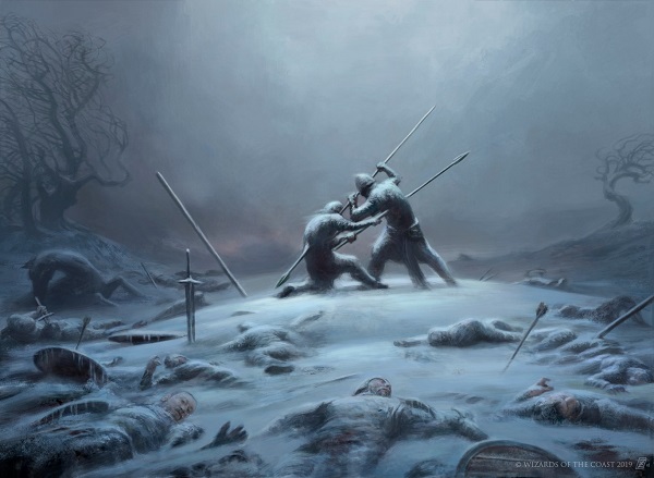
If François Auguste René Rodin had his Gates of Hell open, this is what would emerge. We can all name The Devil's Advocate and its moving wall of sculpture, but here we see a more thematic entryway, with something moving toward us.
We see no setting, no backdrop or plane. A set independent of story can allow for open-ended art descriptions, allowing artists to flex the concept into masterful work. Mitchell here even adds webbing, asking real deep Vorthos fans if this is an Eldrazi idea. Perhaps a trapdoor, a nod to Zendikar and what may happen next.
Also to note is that the figures are stone, of marble color. Were these flesh tones, it makes it feel more real, more PG-13 instead of approachable as art. Subtle, but imagine the scene more fleshy. It changes everything. The shaded down black vs. white is utterly perfect here.
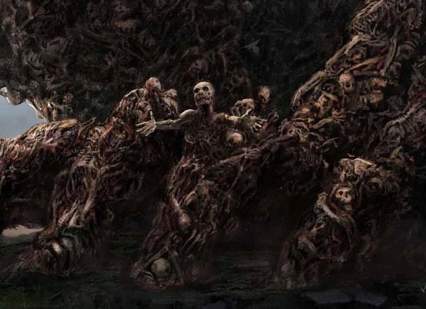
It's quiet and everyone is fatigued.
The final battle wages on as a champion will not fail this day.
It's cold.
Bitterly.
Cold.
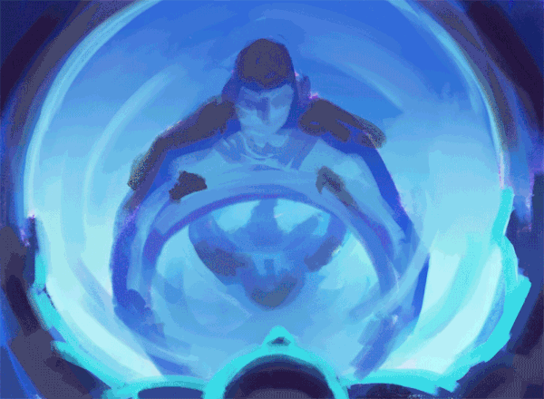
Enjoy your trip to Wizards, Zack. Let us hope you can give us more artworks that move us in the years to come.
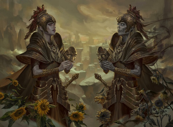
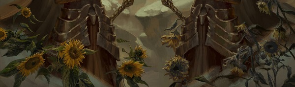
Yes, Livia is good.
Look at the still life. Remember how I said Magic is just that next level up? An art description from a smaller brand can't add secondary allusions to a piece for dramatic effect. They also can't have an artist execute the idea with ease. Her effort to show sunflowers is so seamless, you have to look twice to see it.
Finally, I can't understand how this is not a photograph.
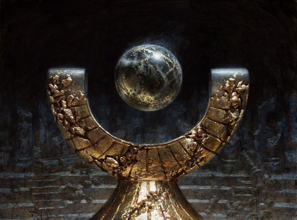
I am beyond belief that a human painted this. I had to pay $5 to unlock his thoughts just to be sure that he did not pull a fast one on us.
Then I saw a close up:
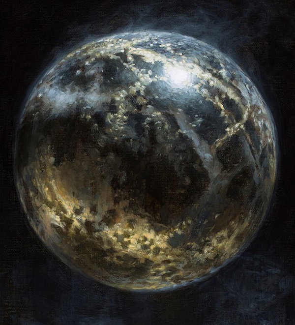
Ryan added ever so slight smoke wafting off the orb. This is not made with a 1/2" chip hog hair paint brush. This is basically done by needlepoint, slowly building color atop a sketch, and adding detail for hours past what is reasonable, logical, and much less needed.
I haven't made a "top x" list of Magic Art public, and while I let out a few pieces that are shockingly good, I dislike lists because it creates squabbles at the margins.
I also find it hard to not believe this is one of Magic's best paintings ever. It may not be your favorite painting, but it is on a technical level that surpasses most. By slowing down, taking fewer commissions, it has allowed Ryan to add more focus, more effort to each piece. Usually that means a horse looks correct. It never means you think a jpg is a photograph with some photoshop atop it.
The card has not found a home yet, but like all potential "free spells," they tend to in time. It's a plant for the future, and what a surprise and delight it will have for fans that are not even born yet.
The set is a hit. Players are hoarding valuable boxes and the vorthos fans are celebrating it. I'm working tirelessly to get more art out in the open from the set and I encourage you to follow along on Twitter to see it. I always cite and link people to artist pages if they aren't on Twitter, and retweet if they are. We should promote their efforts, not take that for our own if they are already there.
-Vorthos Mike