


Now that Avacyn Restored has been completely spoiled, we have a lot of new cards to look at and think about. If you’ve read Mark Rosewater’s preview column about Temporal Mastery and the new Miracle mechanic, you’re probably excited about drawing a sweet spell at just the right time to turn the tide of the game in your favor. After all, who doesn’t want to take another turn for ![]()
![]() , hide an opponent’s threat at the bottom of his library for
, hide an opponent’s threat at the bottom of his library for ![]() , or cast a 5-damage Lightning Bolt?
, or cast a 5-damage Lightning Bolt?
The miracle cards have some sweet effects, and they can be cast super-cheap if you draw them at the right time. So, how awful would you feel if you could have cast Wheel of Fortune, but you missed the trigger, and now it’s a 5-mana dead draw? Lucky for us, Wizards have added some visual cues to make sure we know if something miraculous should happen.
In the Beginning
 Before we get into what sets miracle cards apart, I’d like to give some context for our discussion by taking a look at the history of the frame on Magic cards. They’ve undergone a handful of changes since Magic began back in 1993, but for the most part, they have stayed pretty constant over time.
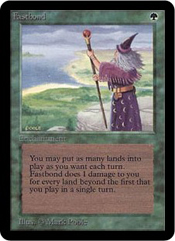
 The primary function of the frame is to visually represent a card’s color—this lets us quickly sort through piles of cards and helps define each color’s identity. Take this Alpha edition Fastbond, for example. The green border is full of mottled shadows—just like the shadowed ground of a thick forest. The text box also looks like a piece of unfinished parchment or like a block of wood. Before we even read one word of text, we get the feeling that green cards represent connections to nature—things that are raw and organic.
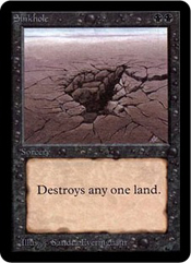
Similarly, we get a sense from the black, bubble-filled frame of Sinkhole and the text box that’s worn and rough around the edges that black cards are about erosion and decay. Though these qualities are only a portion of black’s cut of the color pie, it makes a pretty faithful first impression.
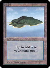
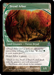
 Blue’s wispy, wavy frame reminds us of water and air currents and hints at blue’s shifting, ethereal ways. Artifacts have a simple frame that looks like carved stone and has a gemlike text box—fitting for all the statues and jewelry imbued with magic power. White cards look like a soft field of grains covered in a text box of lace. This gives us a sense of purity and religious overtones, and I suppose it’s pretty hard to convey the idea of justice through just a card frame, so maybe this is about the best we can expect. The frames of land cards are generic enough to let the artwork and text box define the setting, and their brownish-gray borders are different enough than the artifacts’ that they aren’t easily confused.
 The least flavorful Alpha card frames belong to red. The frame appears to be made of smooth red stone, but that hardly conveys a good sense of red’s passionate nature, its tendencies to blow things up, or even a mountain setting. The upside of this lack of defining characteristics is the great readability of old red cards. The text box and frame are uncluttered with texture, and the colors are light enough to let the black rules text stand out—even on cards with a lot of tiny text (compare the red Rock Hydra to the blue Vesuvan Doppelganger).
Finally, I’d like to point out the first example of unconventional card frames: the cycle of dual lands. They had the same stony gray border as regular lands, but they employed an awkward alternating-color text box to help remind us they weren’t basic. No cards since the Dual lands have had text boxes quite like these—newer lands that produce multiple colors of mana employ a gradient between the two colors or a neutral-colored text box.
 |  |  |  |
Eighth Edition
 |  |  |  |
Aside from a couple of tweaks to the color saturation and contrast of printing, the frames from Alpha didn’t change too much for the next ten years of Magic. Wizards added some more copyright text at the bottom in addition to expansion symbols in the frame, but the cards looked mostly like they always had. With the release of Eighth Edition, however, the basic layout of the cards changed drastically.
Green lost its wood block, black lost its decaying scroll, blue lost some of its waves, white lost its lace, artifacts lost their gem-looking text box, and all the cards gained an off-white smooth text box with just a hint of color. Furthermore, the border were split into a few different regions—the card name and cost received their own bar, as did the card types and expansion symbol, each with a slightly lighter uniform background. Borders of color separated these new bars from the outer frame, the only new-frame region with significant texture.
You can read about the reasoning behind these changes and get an idea of the community backlash that ensued (does “This change will ruin Magic—I’m quitting for good,” sound familiar?) here. The basic reason is that they wanted modern cards to have more room for the important stuff like art, names, and rules text, while making the text easier to read.
The only place where I feel Wizards actually messed up with this change was the copyright and artist information at the bottom of modern red cards—it’s much more difficult to read than on all the other colors. Red moved from being the most readable to the least, and the text is much smaller than it used to be.
 |  |  |  |
Time Spiral
 During Time Spiral block in 2006 and 2007, Wizards did some experimenting with card frames. For Time Spiral, they reprinted one hundred twenty-one timeshifted cards from past sets using tweaked versions of the old frames. In Planar Chaos, they printed forty-five new timeshifted cards—versions of iconic old cards in different colors. None of the multicolored cards, nor the single land (Urborg, Tomb of Yawgmoth), had been timeshifted. As a visual cue, the frame of each of these timeshifted cards was modified from the regular modern frame. The colors were darker, and the borders and text boxes each had a new texture. For example, green timeshifted cards had a leaf border and a tree-ring text box. Overall, these changes to the card frame were fairly tame.
 The final set in Time Spiral block, Future Sight, contained cards with the most radically changed card frames Magic had ever seen and the most radical it has seen since. These eighty-one cards did away with the rectangular frame, moved the mana cost, added an icon to indicate the card’s type, and let the art touch the black border. A cycle of vanilla creatures were lucky enough to be presented as full art cards. These timeshifted cards also marked Wizards’s first foray into using transparency effects on card borders. Pretty much the only thing that stayed the same about the frame design was the texture used in the background.
 Though most of these changes to the frame design served just to highlight the wackiness of the potential future of Magic, in at least one case, the odd-looking frame served as a visual reminder of an important card mechanic. Ghostfire, though it has
 ![]() in its mana cost, is a colorless spell (handy for getting rid of Kor Firewalkers and such), and its frame is translucent to help players immediately see that this is no ordinary burn spell.
in its mana cost, is a colorless spell (handy for getting rid of Kor Firewalkers and such), and its frame is translucent to help players immediately see that this is no ordinary burn spell.
 Riffing on the wackiness of Future Sight’s frames, Wizards has been slipping subtle tweaks into the card frames ever since. With the introduction of the planeswalker card type in Lorwyn, we finally saw artwork that escaped the boundaries of the frame and spilled over. This visual bleeding has occurred on every planeswalker card except for Nissa Revane in Zendikar. Another treat on the planeswalker cards is that each of them is secretly full-art—the catch is that half of the art is partially hidden behind rules text. The planeswalkers also take advantage of those beautiful curved lines dividing the artwork from the outer frame—this helps us feel that they’re special even if we’re not consciously sure why.
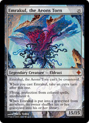 The story of Rise of the Eldrazi was centered around a group of epically large colorless monsters who brought some epically big colorless spells along with them. To represent these colorless monstrosities, Wizards pulled out the old Ghostfire playbook and gave the Eldrazi transparent frames. Emrakul is such a badass that it is the frame. It’s hard not to be impressed by a fatty that’s too big to be contained by a measly art box.
More recently, we’ve had some wacky new cards introduced: the double-faced cards of Innistrad and Dark Ascension. With the exception of their night sides’ nonexistent mana costs (replaced by a color identity dot in the middle) and a little arrow pointing from the day to the night side, these cards didn’t introduce any new card-frame design. On the day side, we see the modern frame, and on the night side, we see the Planar Chaos timeshifted frame without any texture in the text box. Wizards probably felt that two faces was strange enough and that adding a new frame might be too much all at once.
The Future Is Now
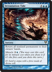
 The next tweak to the modern card frame is as close as your nearest Avacyn Restored spoiler. There are eleven miracle cards in the new set: three each in red, white, and blue, and two in green (sorry, none for black). Each color has one miracle at uncommon, one at rare, and one at mythic rare—except green’s mythic miracle is missing.
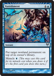
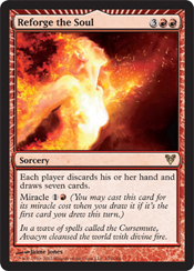
Miracle cards have frames that are less of a radical departure from the norm and more of a bold refinement. Looking at the bottom half of the cards, we see they’re completely unchanged. Wizards showed quite a bit of restraint by only adding rays of lighter color to the colored border and adding a triangular notch to the top of the card-name/cost bar.
Following the tradition of giving more focus to the artwork, the rays draw our eyes into the center of the art, and presumably the triangular notch pointing up is meant to remind us to look to the heavens and thank Avacyn for her timely blessing. Alternatively, the notch indicating the top reminds us of the sweet top-deck we just made (since it’s at the top of the card), so we should play it right now.
Come to think of it, it seems the emphasis of the rays and the notch is at the opposite end of the card from the rules text explaining what to do with the card—when I look at a miracle card, I spend more time looking at the sweet art before my gaze wanders down to the text. I suppose it would have looked really strange for the rays to point toward the center of the rules text.
 |  |  |  |
In the context of past changes we’ve seen to Magic card frames, the miracle cards don’t make a huge splash—about ten percent of the area of the cards is affected, and we don’t lose anything except a bit of colored texture border. I like the emphasis placed on the art by these tweaks, but I’m not sure how well it will serve the purpose of helping players cast the spells at the right time . . . but I hope they work as intended for you.