


I was planning on giving Magic 2013 a break—I’ve talked about it a lot recently—but an idea struck me as I was looking through the full visual spoiler in preparation for the prerelease, and I didn’t want to let it lie forgotten in the closet like an old lover’s tee shirt.
What is it? It’s a Vorthos look at cards reprinted in Magic 2013.
I’m going to be taking a look at the cards in Magic 2013 that have seen different iterations over the years, and I’ll talk about what works and what doesn’t with each of them. There are a lot of reprints—I ended up with two articles as is—so I’m going to be cutting some. If one of your favorites didn’t make it, don’t hesitate to let me know. Finally, I’m also going to ask which of the versions you prefer. I want to hear what you think.
Got it? Good. We have a lot to talk about, so let’s get to it!
Arms Dealer
[poll id=167]
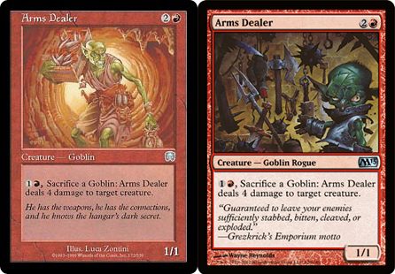
We start off with two well-done versions. Each shows a goblin (who else would carry all of those explosives on themselves?) with a whole bunch of weapons just like any good arms dealer. That said, there are some differences if we look hard enough.
We have light drawing our eye to the important bits on both, but the focus is laid out differently. In the Mercadian Masques version, the figure stands alone—his goods on his person—in the center of the frame, outlined by the cave’s entrance. In the Magic 2013 version, the figure stands in the light, but he’s off to the side while his wares on the wall take up most of the composition.
I like both, but if I had to pick one, I’d go with Wayne Reynolds’s version. The Masques version is on equal footing when it comes to art, but its flavor text only makes sense if you know the story of Mercadia. As MaRo would say, the devil is in the details.
Battle of Wits
[poll id=168]
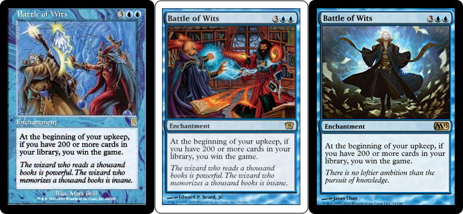
It didn’t take long to see a little variety between versions. The earlier two versions are almost identical (they probably had the same art description), but the newest one is a big step in an alternate direction.
The first two are symmetrical—mainly due to the two figures—and show exactly what is expected: a battle. They even wear different-colored clothing, amplifying the effect. Unfortunately, they also show the two figures actually fighting with magic. I guess that could be mental, but that’s asking a lot of the viewer.
Magic 2013’s version shows the mental aspect much better, focusing on the lone figure (the curve of floating papers does a lot, as does the light once again) with some sort of light emanating from the upper half of his body. But where’s the battle?
Can a single card contain all of these elements at such a small scale? I think it’s possible, but we’ll have to wait a couple of years to see. For now, I’ll satisfy myself with the Ninth Edition version, but I won’t be happy about it.
Clock of Omens
[poll id=169]
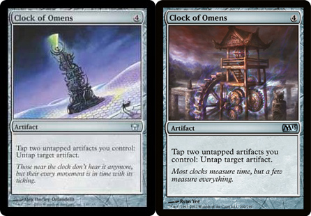
Quick quiz: Which of these two is more symmetrical? If you said the Magic 2013 version, you’d be wrong.
That big gear on the new art gives the card a great asymmetrical feel while maintaining the focus front and center. I really enjoy how it helps to fix your eye on the clock’s innards, making you wonder what makes it so arcane.
As for the Fifth Dawn version, I really love the layout. It’s simple, it’s beautiful, and most importantly, it works well. The flavor text is also a hit. It creates an awesome visual/scene, whereas Magic 2013’s falls a bit flat.
I have to go with the original here, but I wish there were a way to show the awesome details of the Magic 2013 clock in the same scene.
Clone
[poll id=170]
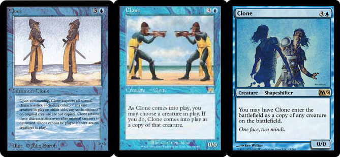
We’re back to some very similar cards. Interestingly, Onslaught’s version is an obvious homage—the characters having the same clothing and sword—and the setting is nearly identical. (That bit of island or peninsula on the right is gone.)
I like how the first two work together, almost showing a progression, and I would’ve loved to see a third. Alas, Magic 2013’s version appeared in Ninth Edition, and we’ve had it ever since.
The first two are incredibly straightforward, but what draws me to the newest version is the forming of the clone in the bottom left. That and the character’s reaction really gets my imagination working on what it would be like to summon one of these on the battlefield. The flavor text is also gold, saying a ton in very few words.
Door to Nothingness
[poll id=171]
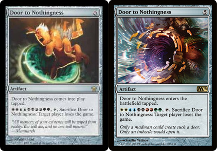
Well, here’s an interesting juxtaposition: two cards that have identical subjects—a figure and a circular door of sorts—but say two very different things.
The original is fun because we get to see what happens when someone falls in. Magic 2013’s leaves us with a few questions. What is this guy pointing the Door at? Will he be sucked in, too? How the heck is he able to hold onto it?
The new art clearly focuses on the door and would be my pick if they were hanging in a museum, but I think the original is slightly better executed at this scale. There are fewer distracting colors, and we know what’s going on. I like the newer flavor text, though.
Duress
[poll id=172]
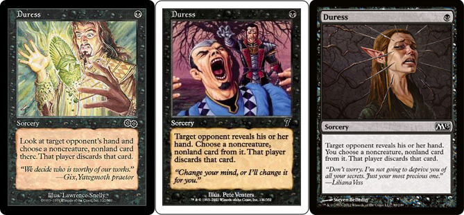
The original here is just plain confusing. It looks to me as though the subject is having an object in his possession destroyed (the flavor text supports this). I guess it’s a possible interpretation, but it doesn’t work with the modern idea of your hand being your conscious mind.
The Seventh Edition art clearly expresses the card’s function and does it in a great way. It looks like a window into another place, catching the characters at just the right (wrong?) time. The victim’s hands help a lot with this. That’s one of the techniques that made Innistrad art so great. Also, notice the placement of the attacker’s hand over the tree. Great effect, Pete Venters!
The newest art is another effective piece, and it really simplifies everything. All in all, I could see either of the two newest being used in the future—Wizards obviously favors the Magic 2013 version—but my pick would have to be the Seventh Edition art for its subtle methods.
Essence Drain
[poll id=173]
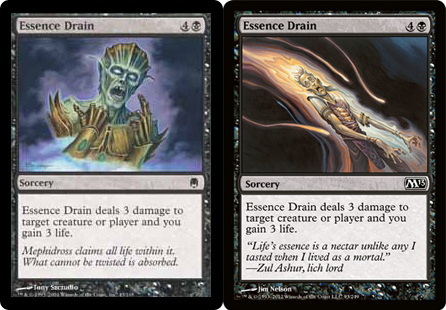
Two similar methods of portraying the same basic scene. I’d take Magic 2013’s version every time because of the angular path—top-left to bottom-right—your eye takes. Portraits are boring.
Fervor
[poll id=174]
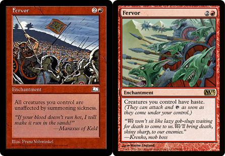
The Weatherlight version’s art shows the scene of battle, and Magic 2013’s version shows a close-up of a goblin charge. Neither has a great focus, though Magic 2013’s certainly pushes you to the left and toward the assumed enemy.
The original has a human and goblin in combat, but that aspect is lost amid the rest of the work. The one saving grace is the flavor text, portraying a good image of someone caught in the heat of battle. A decent piece if you want to show a skirmish at a larger size, but Magic 2013’s version is the clear favorite on a Magic card.
Fog
[poll id=175]
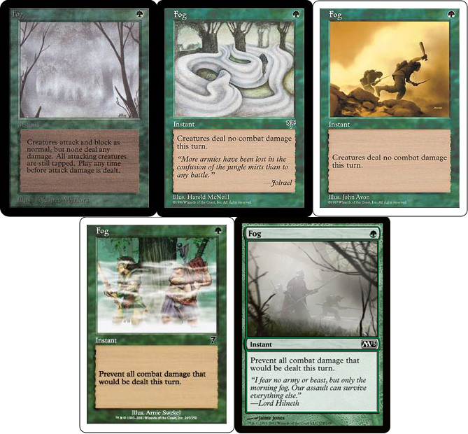
Fog has been in a lot of sets, but graciously enough, we get to see a wide variety of approaches.
The original was great, emphasizing the fog and framing the scene with branches on either side. Mirage’s version took the emphasis further, abstracting the fog and its movements through a wood. Fifth Edition was the first time we saw a real taste of the mechanic at work in the art (Limited Edition Alpha’s distant figures could be a caravan for all we know), with figures diving into blindness. Seventh Edition’s wasn’t much different. In Magic 2013, we complete the circle, coming back to Alpha’s fog-centric art, tree branches and all. This time, we get an upgrade in closer figures that clearly show what’s going on.
If just the art were hanging on a wall, it’d be a close pick between Alpha and Mirage, but when the card is looked at as a whole, Magic 2013’s wins it for me.
Fog Bank
[poll id=176]
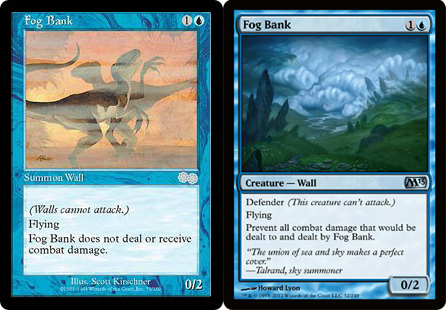
Maybe it’s because we just looked at Fog, but Urza’s Saga’s version would work just fine on Fog. Magic 2013’s art zooms out, giving us a clear (bad pun!) view of what the card actually is.
The original isn’t helped by the confusing blending of figures, but I think the newer version is the clear winner. It’s a creature, and what it is is much more important than what it does.
Intrepid Hero
[poll id=177]
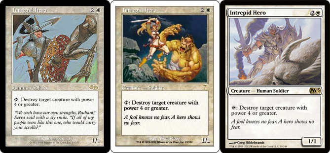
I like the original. Not only does it have a great visual—drawing your eye to the shield, his face and spear, then the leg, and back to the shield again—but the style feels classic. Like something you’d see in The Once and Future King if there were mechanical beasts in King Arthur’s story.
There’s nothing inherently wrong with the Seventh Edition art; it’s a solid piece from an artistic point of view, but it falls flat for me. If anything, it makes me think of ThunderCats.
The newer art isn’t bad, but whether it’s the beast in the foreground or the smoke in the background, something makes it feel just a bit too crowded for me. I know why the creature is so big; it just bothers me.
Merfolk of the Pearl Trident
[poll id=178]
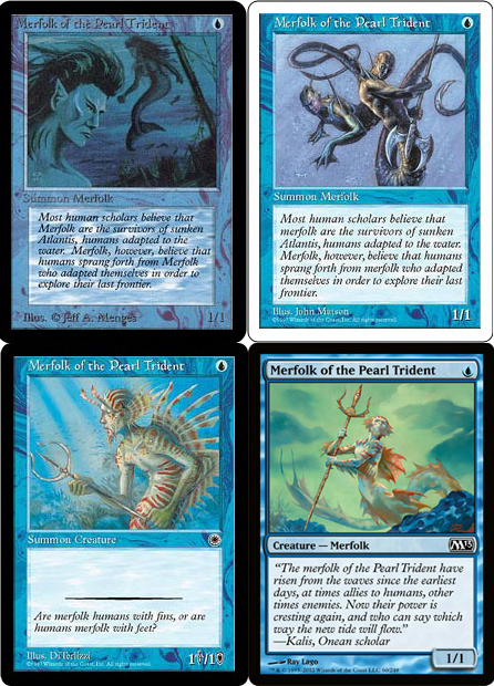
I find the progression across these pretty awesome, and it’s not something you’d see without putting them next to each other. From mermaid look-alike to the current iteration, you see clear changes each step of the way. Put a Lorwyn/Shadowmoor-block merfolk at the end, and you’d have a great look at how Wizards of the Coast has evolved their concept of merfolk in the multiverse over twenty years.
Another detail is that of WotC’s attempt to make numbers matter in the art. There’s only a two-month difference between Fifth Edition’s and Portal’s release, but there was an obvious change in policy at that time.
Oh, right! I’m supposed to choose one. Maybe it’s the progression, but I think Magic 2013’s—debuted in Seventh Edition—is the best yet. There’s a simplicity and beauty that’s attractive in the original, though, which is something that I find a lot in Alpha’s art.
Mind Rot
[poll id=179]
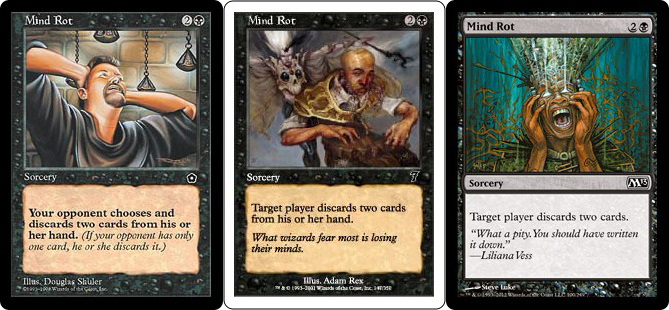
The first two come across as pretty weak. The expression in the original looks more like a headache than someone losing his mind. In painting, as in many art forms, exaggeration is important.
The second might be some sort of dream or vision, but there’s nothing concerning the character’s mind. Someone dropped the ball.
Magic 2013’s artwork covers the deficiencies of the earlier works and is my easy pick. I guess that’s why they’ve been using it in every core set since Eighth Edition, and it has been around even longer.
Mutilate
[poll id=180]
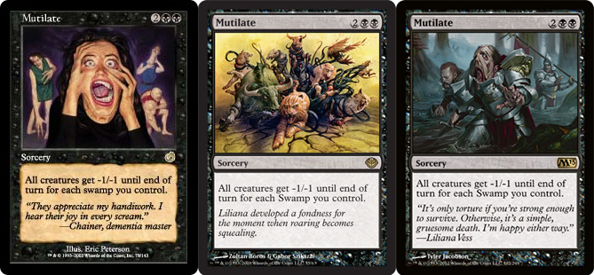
I love Torment’s Mutilate. We see a variety of mutilations all without the use of knives or physical violence, yet it’s gruesome all the same. The focus on the figure in the fore precluding the discovery of additional bodies in agony really adds to the feeling.
The version from Duel Decks: Garruk vs. Liliana is an interesting departure. Instead of showing the actual mutilation, we see a variety of animals being pulled in by vines or tentacles just before the act. I’m glad to have seen it, but I find it to be the weakest of the three.
Magic 2013’s goes back to the spell’s effect. The setting is well done, and seeing the face melt is creepy, but it just doesn’t have the impact Torment’s does. I have to go with the original here.
All for Now
I’ve said enough. Come back next week when I talk about the other half, and be sure to share your opinions again!