


Welcome back! Last week’s results were spectacular, and I’m looking forward to seeing what you guys pick this time around. Let’s get to it!
Naturalize
[poll id="182"]
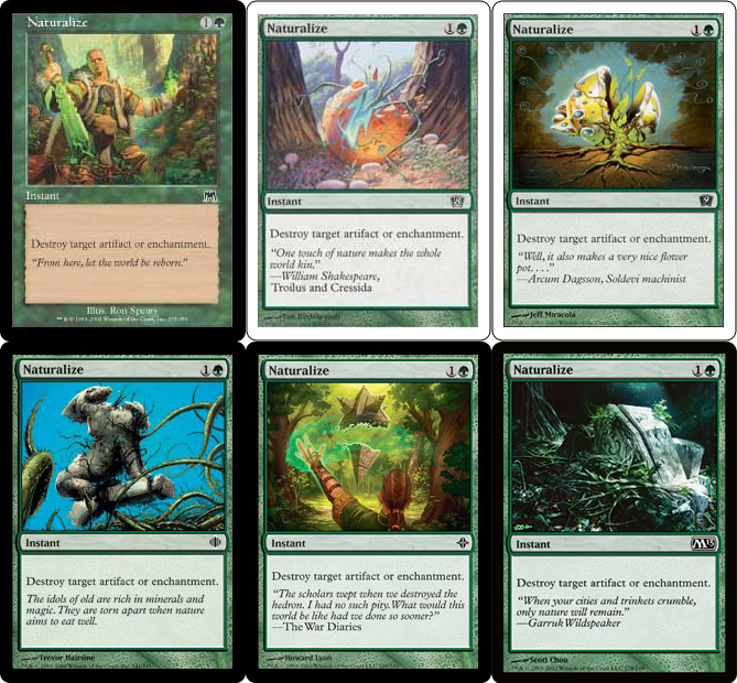
We start off with a doozy. Naturalize hasn’t been around as long as half the cards on this list, but thanks to block-specific art being commissioned, it’s seen multiple iterations over the years.
I enjoy Ron Spear’s use of green on the sword and Kamahl’s hand in Onslaught—it really keeps the image from being overbalanced to the left. I’ve never been sure about the “classic” Naturalize art from Eighth Edition. On one hand, I like that nature is birthed from the synthetic, but I dislike that it resembles an egg. The Ninth Edition version takes out everything I like from the previous version and leaves the undesirable.
The Shards of Alara art hits the right flavor. Is it ironic that the artifact in question is a tribute to Naya’s giant beasts? Rise of Eldrazi seems like a weak brother to Alara’s. Sure, a planeswalker is casting this spell, but I’d rather see nature take its course. Onslaught’s version satisfies both; why can’t this? Finally, Magic 2013’s art is a better executed version of Alara’s.
All in all, I don’t feel that any of them is too horrible beyond Ninth Edition’s, but I’d have to say Onslaught’s and Magic 2013’s art are the cream of the crop with Magic 2013 as my pick. I can’t end this without mentioning the progression of Onslaught’s trees into Eighth, and Eighth’s egg into Ninth. All right, done!
Oblivion Ring
[poll id="183"]
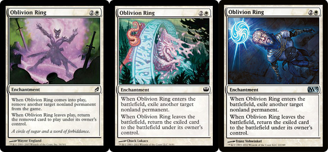
All three are fairly strong, and all of them take the card name quite literally.
Lorwyn’s version is the only one with flavor text, which isn’t half bad. The art is central, focused, and strong. I wonder what that powder is. Is it Auntie’s?
I find it odd that the Duel Decks version is the only one not block-specific but has a much lower print run. Sure, the other two don’t feature prominent characters or symbols as Naturalize did above, but Lorwyn’s Elementals and Esper are still quite recognizable. Aside from that, I enjoy seeing the dragon in the process of being sent to oblivion and the writing on the ring. Is that the one true ring?
Magic 2013’s is simple and well done. Nothing flashy is going on, but the figure posed from corner to corner really gets your eye roving all around.
My pick would have to be the Duel Decks version out of personal taste, but the other two are stronger works of art.
Pacifism
[poll id="184"]
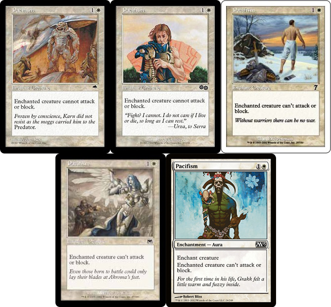
The Tempest version is spectacular if you understand Karn’s story. Great all around, and the art style—though typical of Rath block—hasn’t been seen too often in the rest of Magic’s history. Urza’s Saga’s art leaves me a bit confused. Who is that in the armor? It almost looks like Hanna, but then why isn’t she referenced in the flavor text?
Seventh Edition did a great job with Pacifism—the artwork is well done, and the flavor text fits right in—so why hasn’t it been seen since? It just doesn’t feel like Magic. It’s a great example of pacifism as a concept, but it belongs in the real world.
Onslaught’s is another confusing one. It’s probably someone Akroma converted to her cause after Ixidor disappeared (supported by flavor text), but then why is she turning away from him? Shouldn’t she be greeting him?
Finally, Magic 2013’s—which is also the original from Mirage—is fantastic. Every time I see it, I can’t help but smile at the deer and flowers at the bottom. The original flavor text—Has any other flavor text lasted this long?—only amplifies the greatness.
My pick is Tempest’s despite the feeling that the original is a superior Magic card. What can I say? I’m a story junkie.
Phyrexian Hulk
[poll id="185"]
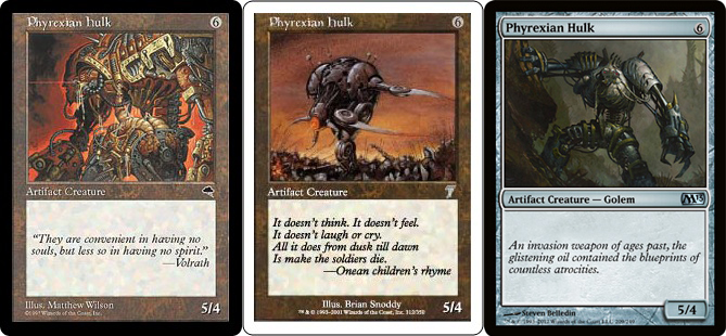
Tempest’s version is the classic card, covering over half of the card’s printings. We’re zoomed in close, making it appear larger and more intimidating. The backlighting of red also helps to amplify thoughts of power and danger.
I’m not quite sure what they were thinking with Seventh Edition. While it’s an interesting card when looked at as a whole, the art is uninspiring, and the flavor has nothing to do with Phyrexia.
A decent follow-up to Tempest, it loses a lot by being shown farther away and standing still. Sure, when I spend more time looking at it, I get the idea he’s readying to come after me, but a quick glance doesn’t convey that, and that’s important on a Magic card.
I have to go with the Tempest version here, but I’m not satisfied. I hope they commission new art next time they print this.
Primal Clay
[poll id="186"]
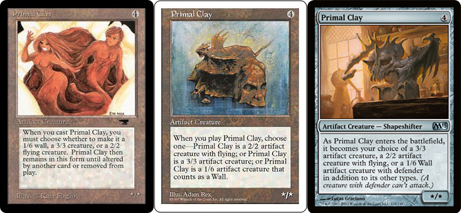
Well, that was preemptive.
The original was cute and would’ve worked in a setting other than Magic. One of many cards based on real-world influences during the game’s infancy.
The other two were covered fairly well by last week’s Arcana and are trying to do similar things. My ultimate pick would be Magic 2013’s, thanks to the better execution. As we’re continually seeing, Magic art has come a long way.
Quirion Dryad
[poll id="187"]

I like the idea of a Dryad slinging a magical whip made from vines, but I have no idea what that has to do with this card or the flavor text.
Magic 2013’s does a little better, and the art is beautiful on its own. I just keep wishing there was a way of showing the mechanic within the art. (Side note: Wizards purposefully avoids attempting to show game mechanics on every single card, and for good reason. On a card like this, however, I believe it would make the overall card stronger.) Even if we just changed the floating lights to represent the other four colors—they’re close as it is—I’d be happier.
Both are pieces of art I’d like to see on a wall, but at least Magic 2013’s works with the card. I guess I’ll have to be satisfied with that for now.
Ravenous Rats
[poll id="188"]
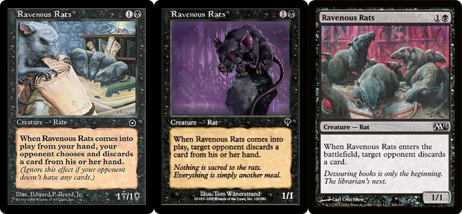
Portal’s art is great. We have rats eating knowledge (scrolls) like crazy and even a foreground and background. You don’t see that done successfully on Magic cards too often.
Invasion’s is a bit of a flop for me. The rat looks great—and quite ravenous—but just showing a hungry rat isn’t enough to distinguish it from other Magic cards. The flavor text is a nice addition, though.
In Magic 2013, we’re given the original art. Another solid contribution, it’s similar to Portal’s, but with a slightly different setting and feel. We’re also upgraded with much better flavor text than the original, wordy piece in Urza’s Destiny (it also had Invasion’s flavor text for a number of years).
I think Wizards is right for reprinting the original art. It’s a bit darker than Portal’s and resonates better with Magic flavor. With that said, my pick is Portal’s because I’m a sucker for that classic fantasy feel.
Serra Angel
[poll id="189"]
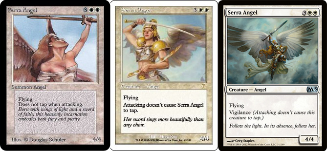
Though it’s been around forever, Serra Angel has been graced with iconic art. I’m really curious to see which one you choose.
The original is one of Magic’s most well-known pieces, and there are still calls to bring back Douglas Schuler’s art each time the core set rolls around.
Seventh Edition’s art seems like a modern imagining of the original—zoomed in, minimal armor, and very feminine despite the swords. Stuck in the middle of Serra Angel’s history, it’s most likely the least popular of the three.
The newest art is epic. We see giant wings spread across the frame, long, golden hair, flowing robes, immaculate armor, and a gleaming sword. It’s a great piece in my mind and a worthy successor to the original.
I have to go with the original, not because of its firm place in Magic history, but because very few Magic cards show such grace with only a portrait.
Stuffy Doll
[poll id="190"]
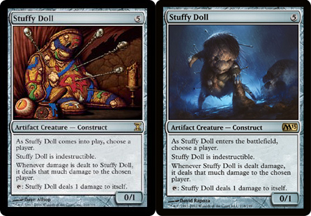
Well, here’s a switch. We went from amusing and cute, in a very odd sort of way, to creepy and dark. I’m not sure if it was intentional, but I enjoy the pins making an appearance in the new art.
My choice would be Time Spiral’s version because it does a lot more than just hit you. The candle, eyeball, pins, and even the paint all give the air of preparation for revenge and avarice. I also enjoy the hint that this doll is being used as a tool by someone else, whereas Magic 2013’s art suggests the actual doll is exacting revenge.
Tormod's Crypt
[poll id="191"]
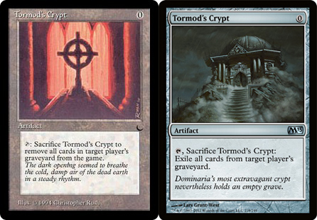
Both works are straight forward and simple. Heck, the original could be the interior of the newer piece for all we know.
The newer text is really ugly with the “nevertheless” in there. Take it out, and you might be onto something. Of course, the original isn’t perfect either; it succumbs to the classic thought that more adjectives make things better. As it is, I’d choose the original as the less egregious, despite the less refined art.
Unsummon
[poll id="192"]
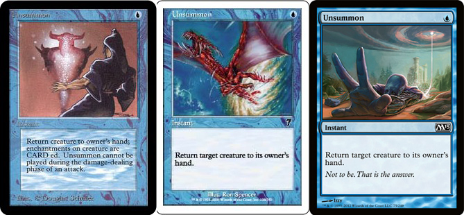
For three cards that show nearly identical acts, these three are quite different. Unsummon is probably the best example in Magic 2013 of how far Magic art has come.
Alpha’s is simple and straightforward with no real imagination—no offense meant toward Douglas Schuler; he’s high on my list of original artists. Seventh Edition’s goes a little further, showing a drake caught while in the middle of an act—a much more realistic depiction. Magic 2013’s—originally from Conflux—evokes desperation and dread all while showing a larger setting.
While all three pieces of Unsummon hold special places in my heart, the clear pick is Magic 2013. I just wish there was better flavor text.
Volcanic Geyser
[poll id="193"]
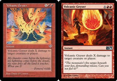
Another card showing Creative’s shift in how they want the art to portray spells. The original artwork shows a creature—Volcanic Dragon?—taking the brunt end of the spell. Magic 2013’s show a mage or ’walker actually taking control of the spell.
While I love the original artwork, it’s really hurt by the directionless attack of the volcano. The newer art does a great job of showing a volcano being used as a weapon. The front-and-center view of a fireball really helps to bring home what’s about to happen. Magic 2013 is my pick, but the original flavor text is cute.
Wall of Fire
[poll id="194"]
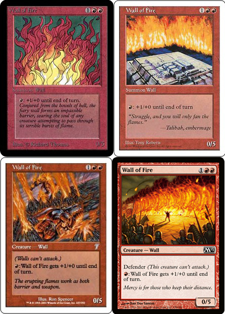
Another abstract painting by a different artist—Richard Thomas—Alpha’s Wall of Fire is simple but tantalizing. I want to see a 3D alter of this one day. Where Alpha’s is simple, Fifth Edition’s is complex. Scale is lost, which is not helping matters. Is that a city? A part of a maze? I’m not sure, but it makes me think more of Dungeons & Dragons rather than Magic.
I like how Ron Spencer is attempting to show why there is a wall of fire (mini-geysers), but the actual execution in Seventh Edition falls flat. Too much attention is drawn to the dead body. Magic 2013 shows off the best iteration of Wall of Fire so far. I wouldn’t mind seeing another attempt at it, but I hope whoever does it sticks to showing context like Dan Don Santos does with the army.
Alpha’s art holds a special place in my heart thanks to my playing with it for so long, and for that, it gets my pick.
Wind Drake
[poll id="195"]
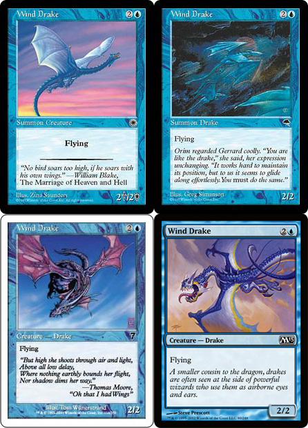
While it’s not my favorite piece, I love the colors in the original Wind Drake. There’s just enough pink and yellow to let us imagine a beautiful sunset and this drake soaring high above it.
Tempest’s is a piece I would want on my walls in a heartbeat, but it has a hard time at the scale of a Magic card. That said, I love Rebecca Guay, and Greg Simanson’s style isn’t too far off. A lot of his cards are ones I remember from my childhood thanks to the art.
Seventh Edition’s is a well-done piece of art, but doesn’t do all that much for me. The purple wings do a lot and are probably the best part of this.
I’m not quite sure what to say about the Magic 2013 version. There’s nothing here that attracts me, and the actual drake feels very out of place. Maybe there’s a plane for him someone in the multiverse, but we have yet to explore it.
I’ll take the flavor text of any of these, but my pick has to be Tempest’s for the art. This is the only card for which I feel that the art has become progressively worse. I know some of you will disagree, but that feeling is probably a big reason that I don’t draft Wind Drake all that much these days. (I’m not kidding.)
Cleaning Up
That was a blast. I hope you enjoyed this look back at older cards as much as I did.
It’s really interesting to see how a number of the cards that have been printed over a large portion of Magic’s history have often gone back to the original art (Mind Rot, Pacifism, Ravenous Rats, and friends). A few (Mogg Flunkies, Rancor, Rewind, and Revive) have not been changed all despite more than ten years passing.
I was a bit disappointed to see only two cards—Clock of Omens and Clone—have an older version with a higher percentage than the Magic 2013 version in last week’s polls. I can certainly understand why—Magic art in general has come a long way—but I had secretly hoped to see a few more of the “classics” win out.
I’ll talk more on those and this week’s results in the future. I’ve tortured our editor enough. If I’m not careful, he might start cutting my articles off halfway through.


