


When viewing paintings on the web, I try to keep in mind that the actual works, experienced in person, might surprise me, astonish me, or disappoint me. Fate Reforged is a middle set, and as such, the art is not normally the most stellar or impressive. This time around, it’s a set of tests and deviations. Some of the changes made in this set visually are logical, many are absurd, and no longer is the art safe. This is a good thing.
Mark Poole is back, as are Izzy and Dave Kendall. A ton of new artists are added to the fold. Visually, this middle set is far from marginal—and this is an art set review.
The New New
Who the hell are all of these new artists? There are a bunch of new artists, a considerably higher number than the normal number per set, and our friends over at OriginalMagicArt.com will be covering them shortly. Check them out—they have some great content. I’d like to add two notes on two new people:
Lake Hurwitz
Lake is a super-strong artist whom I worked with on an ArtOrder challenge not so long ago. That image is below, and frankly, looking back, he should have been the winner. It’s a fantastic image. He’s also been working in the gaming industry for some time, working on smaller trading card games and then Dungeons & Dragons before Magic. I look forward to seeing his hustle. If you wanted a play mat made, he’s now on the list with Zack Stella and the new crop of artists who are making established artists crap their pants because these young bucks are incredibly strong.

Lius Lasahido
I worked with Lius briefly when I was an art director. He worked (still works?) with the Caravan Studio based out of Jakarta, Indonesia. They are really hardworking artists, and if I were needing a play mat made but couldn’t afford a Magic artist with one hundred or more illustrations, I’d call them up. They’re utterly fantastic, and others in the studio, such as Erfian Asafat, may break into Magic soon. The studio concept isn’t new—it’s actually how Redslap Studio in Britain gave us Dom, D. Alexander Gregory, and Jock in the mid-1990s.
 |  |  |
Magic Art Rules
I call them rules, but you may call them tropes or characteristics of art descriptions. Every set has them because Magic’s art is made by art descriptions written by the creative team internally. Color, location, action, focus, and mood that make up the art description act as rules. While these are more guidelines to artists than constraints, artists don’t often deviate that much because a style guide reinforces the references—and because of the risk of being bumped off Magic. It doesn’t keep things stale but rather, branded, and aligned.
In this set, it seems, some scenes are very simple, focused with one figure, and others are just hot messes of figures everywhere in battle.
Normally, middle sets have art of the first set as leftovers, leaving it as a semi-strong visual set but nothing that is its own, defined, or unique. This set is different in that aspect. There are numerous risks, tests, deviations, and misses in this set. Something is different about the art directors, the art descriptions, and the look and feel of this set. It isn’t cohesive looking or feeling. “Let’s try a hundred things and see what sticks.” That could be the visual theme. While the art is all incredibly good, it doesn’t easily fit together as a set.
Tasigur, the Golden Fang by Chris Rahn (The original art is already sold.)
As another example, this image is a close-up that has nothing to do with the card concept. Usually, tap effects are dealt with ice, meaning Temur, but a Sultai depiction was used so . . . hypnosis was the concept. That’s wicked-hard to show because a bewitched person perhaps has anime spirals above his or her head or something in his or her eyes. This is uncommon as an art description.

Additionally, colors are incredibly defined with Khans of Tarkir and various tribes in Magic. Can we can see super-dark or super light? How about monochromatic? Wait, what? One color? One?
We can look back one set and see Dave Kendall make a similar scene except in more style-guide colors of Abzan. I like pieces with either chromatic or utterly muted color palettes like Wind Spirit’s. A fun example of Nils Hamm getting the thumbs up to go nuts with an idea!
 |  |  |
Do you like brushstrokes? Paint an orc warrior in Abzan armor, and make it pretty, Dave. Dave will give it to you in Merciless Executioner. That’s paint, you guys. It definitely gives the Abzan khanate, based in solidifying itself, to feel stronger by using brush strokes that feel like bricks, like weathered fortifications.

 |  |
Do you want diversity? Magic asks for diverse characters but doesn't always demand them. Artists can add people however they’d like, and in this set, artists are choosing a greater variety of characters because every grouping of people is mixed—there is no white-person tribe or mages of color. They’re just integrated. From black characters to women of all types, it has it, and when you ask great artists like Chris Rahn to make art, they’ll just naturally add it by themselves. I wish art descriptions would ask for it more, as black women are incredibly underrepresented, and in time, I hope they keep pushing their art descriptions.

These two artworks are also by really stellar artists. You can see how lights and shadows aren’t simply made by adding more black or white paint. The examples shown demonstrate how color is used to create light, shadow, and contrast you wouldn’t normally think of at first glance.
Noting the details (more on that soon), such as the way they handle skin color, light and shadow, line, texture, and shape will immerse you in the artwork and also Tarkir itself. To learn more, you need to start following David Rojas, who runs the @TheArtofMTG Twitter account. He posts medium to large Magic art images directly from artists. He’s a must-follow.
MAGIC HAS LOST ALL ITS WHIMSY. THERE IS NO MORE FUN.
Foglio fans, tip your fedoras to the creative team for asking for fun in this art description. It’s back, you guys. Make sure you let the creative team and Mark Rosewater know that you want humor if that’s your thing.

Is That a Gun?
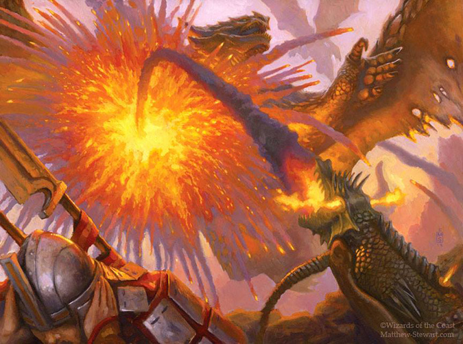
Pyrotechnics by Matt Stewart
Some of you may remember Question #17 on the usage of guns and Mark’s response to a Western World and guns, yet we see an arquebus, a medieval cannon/gun-type of thing being used by Mardu. I don’t find it weird to see gun—they sneak into the art every now and then, most notably from reprints of the Portal Second Age set.
 |  |  |
 |  |  |
Though guns sneak into more current art as well, it’s generally only in red. Guns can exist, but they are generally randomized, unsafe, and more of an explosion pointed in one direction than a handgun.
 |  |
I find it odder to see the device that hits the creature in an artwork:
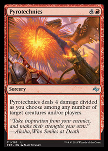 |  |
Normally, we see only the effect, the drake being hit—not the way it was fired. That’s a new art description because the “thing gets hit by red” has been written so many times it’s almost a trope. (One day, I’ll update the Magic page on TVTropes.) I assume the reason is that Matt Stewart is a better artist than you or I. He’s better than average.
 |  |  |
 |  |
See What I Did There?
I love Easter eggs, details artists hide in their artworks. Often, these are things slipped by art directors as signatures or additional aspects that fans who crave a nod and a wink from the artist will notice. I always look for them in art, as artists who actually play Magic begin to understand interactions between cards and combos. What people generally don’t see are out-of-game references or allusions to pop culture and similar games.
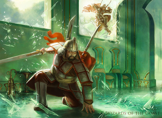
For example, I see the Shadow of the Colossus reference in Pressure Point by Chase Stone:
Image via diehardgamefan.com
I loved that game something fierce. It’s also considered one of the few video games considered unequivocally art. I would agree on that front. Despite the Playstation 2 graphics, it’s a deeply moving experience. It feels like a Zelda game that is comprised of only boss fights and a focus on landscape environments.
Moving onward, Zack Stella, who’s blowing like I thought he would, has leveled up, again. I mentioned earlier how he understands references, and as Khans of Tarkir is an Ottoman Turk set, Zack added references from across the empire. (Mongolians became the Ottoman Empire when it became massive.)
So, let’s check of the boxes:
- Is the khanate clear? It’s visibly Abzan due to scale armor and buildings, so yes.
- Does the character look to fit into Tarkir? You bet. Sexy men with beards equal Tarkir.

Image via reddit
- Is he using reference? Hell yes. If you have ever visited a European cathedral, what you don’t realize is how often they have to be repaired and fixed. Is Zack telling us that a building is being built or repaired? With all those dragon attacks, I would assume there is constant repair needed.

Also, see that faceplate mask? Yeah, we’ve seen that before. Good work, Zack.

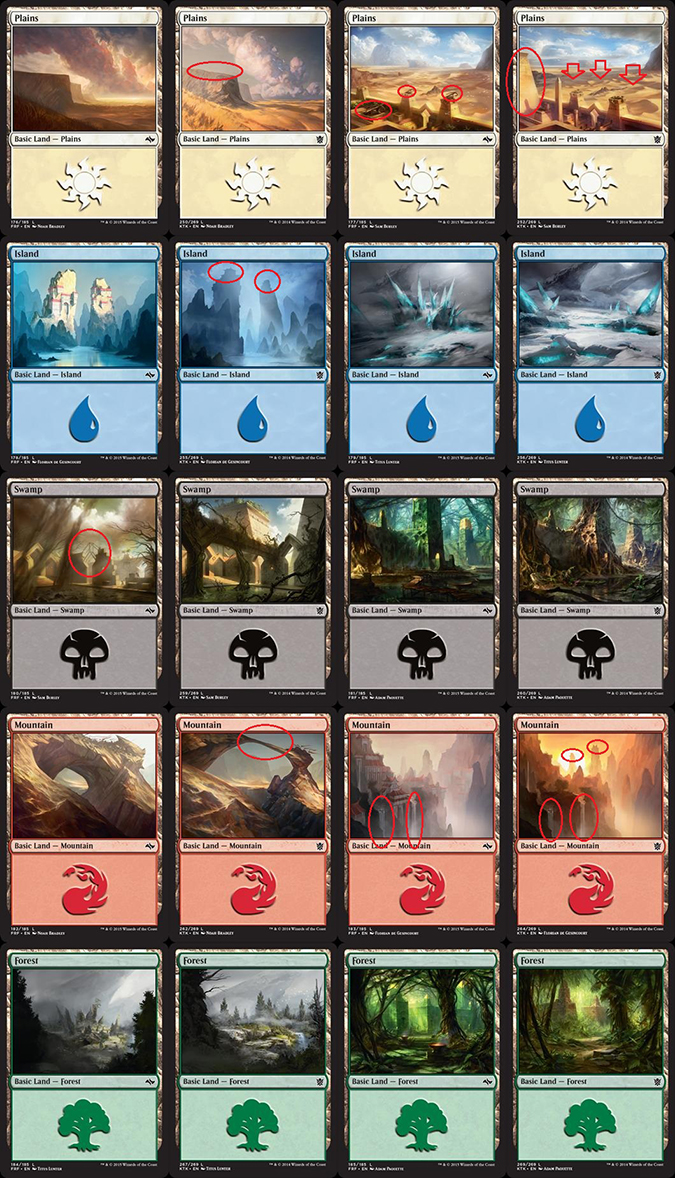
I think everyone has seen the lands as the before/after images as posted on reddit. I’m reposting as archival more than anything in case someone deletes the reddit thread. In short, these are the changes:
RhysticStudywrote this:
- The Mardu lands had erosion.
- The Abzan city has been built up.
- The Sultai desperately need to bring back their old gardener as a zombie (it’s overgrown).
- The Temur lands have barely changed.
- The Jeskai lands . . . are those monasteries looking worse for wear or are they just covered in more fog?
A Couple Things to Add
The plains show similar weather patterns, as noted by the clouds and sand dunes. The lack of intense weathering on the plateau and the removal of the ballistae strike me as odd. Considering the mountains are so wind-eroded, the plateau is nearly identical. Also, if people are attacking Abzan villages, why remove the ballistae? Wouldn’t the top of towers still be useful for defenses? Given the fact that there are no dragons, it makes no sense to just utterly remove them and replace them with nothing.
The islands and the mountains of Jeskai show me one thing: The temples have moved to atop the buttes and mountaintops. I wonder if the reason is that they’re more adept, that there are fewer of them, or that they were forced onto higher parts of the mountains for safety. It’s harder to surprise a monastery with a better defensive position of course.
I find it incredibly strange that the waterfalls have the exact same path, considering a thousand years of erosion have occurred. I live in Minnesota, and since we have nearly fifteen thousand lakes due to glaciers, we keep our waters in high regard. Every Boy Scout learns about conservation pretty quick. To explain what I mean, water changes its path very, very quickly with any environmental change, and these waterfalls haven’t changed in a thousand years—really?

Also really wonderful is the wood frame in the Swamp depiction from Khans of Tarkir. Most medieval buildings were of solid stone or sandstone. Making a frame internally with wood or iron looked a lot different than this unless it’s concrete. Must’ve been an art-description request.
These before/after images have happened a bunch of times, most notably with the basic lands changing in Avacyn Restored and the Guildgates of Ravnica. Some of my favorite basic lands are those from Kessig in Innistrad.
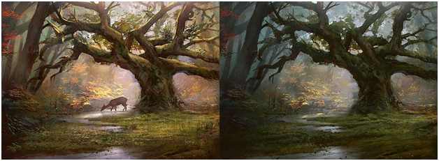
Forest by Jung Park

Simic Guildgate by Svetlin Velinov
The piece of Next Set Previewed in a Current Card goes to Hewed Stone Retainers. Reddit user Zenjibuji made a rather astute observation on these Golems. I saw them, and immediately, I realized that they have storyline implications. We’ll see in Dragons of Tarkir what they’re all about. Most notably, the Mongolian/Ottoman Turk example of Tarkir is changed as now a fully Japanese influence has been demonstrated:

Also on the I-see-you is that Steve Argyle is fully back in Khans of Tarkir. Since he wasn’t in Theros block at all (same with Izzy), I’ve looked closer at his art this go-around. I noticed his characteristic usage of water. In the future, when you see that type of water, flattery or copying may be happening to Steve. Fun to see that!
 | 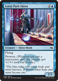 |

Also, via a fan Tumblr on Lotus Path Djinn, Steve can be seen flexing his referential treatment of working on L5R:
Good Is Easy, Great Is Below
My high-school basketball and football coach Daryl Oja would tell me that anyone can be good at anything. You don’t need physical talent to be good at a sport, and likewise, anyone can be considered good at playing the piano or even playing Magic. With time and effort, anyone can be good. To become great, it takes a lot more time and experience and a pretty large dollop of talent. These artworks have hit the great threshold.
Looking at artwork up close can be an inspirational experience for both an artist and a fellow Vorthos, lovers of the art. I have a subjective opinion, but as such, I’ll explain why I think these are the standout artworks of Fate Reforged.
Mardu Strike Leader by Jason Rainville
Upon seeing this image, I can place it immediately. The armor is Mardu, the green walls are Sultai, and the action is Mardu-esque. This image has all aspects of an active scene, with the ability to be cropped down to a single figure if need be. Very rarely do you naturally gain options through playtesting—the development teams changes a card last minute. I’d also like to think the figure jumping through the window is a woman, slowly turning the tide to have inclusion and representation naturally without forcing an Amazon tribe or an “all-Asian looking tribe” to be forced through art descriptions. It’s a solid little image and showcases Mardu doing Mardu things. Great work.
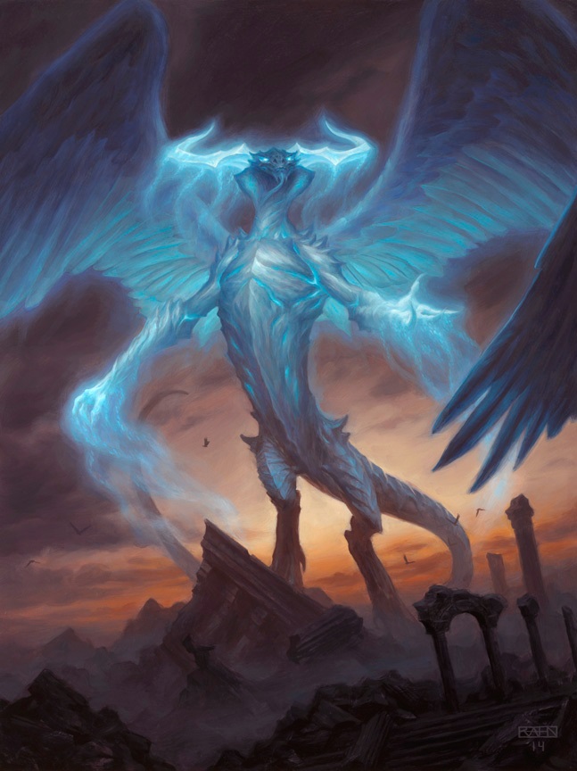
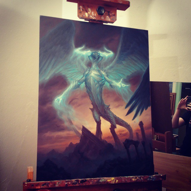
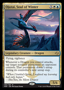
Ojutai, Soul of Winter by Chase Stone
I’ve really been liking what Chase has been doing as of late. I loved his Singing Bell Strike, and in this image, you can remove the dragon and still have an early-morning sunrise with a small rainstorm and beautifully rendered mountains. Add in the dragon, which reflects the lithe, flexible Jeskai, and from a quick glance, I can place it. I’d love to see his digital brushstrokes on the feathered wing, and I hope we are able to soon!

Hero’s Blade by Aaron Miller
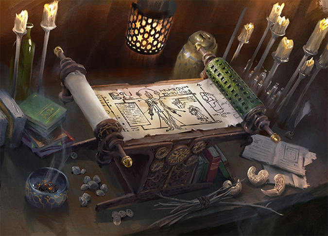
Scroll of the Masters by Lake Hurwitz
I am lumping these two together because they show similar scenes with a digital versus a traditional approach. Aaron uses larger brushstrokes to show a lot of items and tightens up with a detail is needed. Lake also uses a similar approach in the candles. I won’t show ones from the past done poorly, but having two really fantastic artifacts that are complex scenes, in one set, really well made, is a welcome change. Each of these could be zoomed out, and I’d love to see the rest of the room, even the person who is in charge of each artifact!
Digital painting, what can make it look so . . . fake and plastic-like is the exacting detail in silly-high resolution. Painting has a brush stroke, whereas digital painting doesn’t have to have rough strokes ever—unless you’re trained in painting and want that effect!

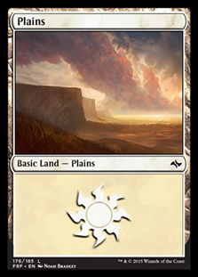
Plains by Noah Bradley
Noah knows to paint stark lighting with strong shadows. Much travel to Iceland and now to Australia gives him access to plain-air painting with landscapes fitting of a fantasy game. It’s great.
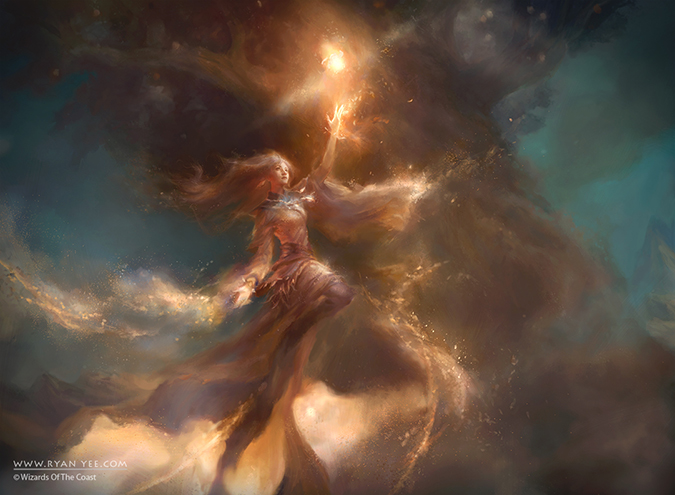
Fruit of the First Tree by Ryan Yee
I feel when I see this image. Not unlike an anime concept artwork, this piece shows uninhibited magic being conducted. While it doesn’t “feel” like Tarkir, it feels like Magic of old, an independent image that is strongly evocative. Terese Nielsen makes images that often break the mold, and this pieces by Yee brings the unbridled-magic effects back to the forefront instead of a lightning bolt striking a drake or a goblin on fire. This image isn’t influenced by branding, and I’m happy to see the creative team not feel it necessary to have a set fully conform to a standard because awesome imagery like this may be excluded then.
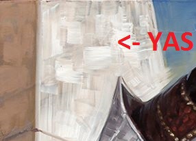
Ugin, the Spirit Dragon by Chris Rahn
Seeing the art as a painting changes your perception of the piece and really gives you a grander feel that, “Yes, this is a great art, too—this should be in a fantasy art museum.” This image serves as the example when I tell people that visiting art up close versus online is comparable to chatting on Facebook versus sharing a beer with a friend. There is an intimacy and remembrance that occurs with art in person. Chris will eBay this work, and he deserves every thousand he earns on it.
 |  |  |
 |  |  |
Keep looking at that art. You’ll get to see it up close soon.
-Mike