


Look past the “Eldrazi homogeneity” aimed at trope-loving new players, and you’ll see some confident, acute, and downright heartwarming paintings.
Today, we take an art director’s view of Zendikar. A returned plane has much to offer a play experience in terms of nostalgia, and some of the premises of the original can be recycled to the delight of players. Eldrazi are one of Magic’s big bads, and as such, they are easy surface pieces of a set to reintroduce.
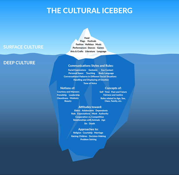
I came across this cultural iceberg at work, and it explains the overt versus covert aspects I think are relevant when returning to a set.
When you see a new set, especially a returned plane, you will immediately see the landscape, flags, clothing, and race of humans there. These indicating factors are the first thing that makes them unique. Planes can be quickly referenced, and Zendikar is no different. It’s the land world with slimy Eldrazi. This is in comparison to the metal world of Mirrodin, with or without corruption, More than Mongolian with Tarkir, or even a city-covering plane in Ravnica. You know it when you see it.
It’s much easier in Scars of Mirrodin to know what set it is by the corruption by the Phyrexians than it is, say, Ravnica to Return to Ravnica in terms of visual identity. The tribes and subsects of creatures aren’t that different in the latter case. Zendikar also struggles with this. It’s a plane based on landscape, and all aspects after that are secondary.
What an art director needs to do is convey all the things below the water to a consistent whole while keeping the plane fresh and unique enough. It needs not be the same yet different, as nostalgia will work in a design’s favor, not to its detriment. We don’t gain all the insight into attitudes, communication styles, or life approaches to everyday life because we’re in a war. The world is built and explained in the style guides the artists and freelance writers receive, but sadly, we don’t see much of that in the cards. We only see the devastation.
And then they reintroduced Allies. Allies on Zendikar do all of these things, across a variety of races, and that is the largest problem to Battle for Zendikar.
Recycled Premise
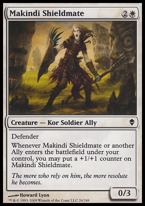
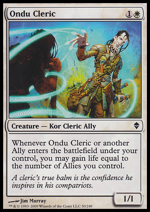
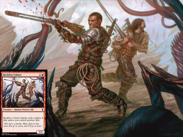
The art does not help you understand what is or is not an Ally via visual cues. That is an art-direction problem that is to be brought up with the testing—that is, development—team. Plenty of folks have noticed this. What they’ve forgotten is that Allies have never looked similar. They’ve always been digital to traditionally painted, from loose, large brushstrokes to tight, thin angular lines. It’s always been visually inconsistent.
 |  |  |
 |  |  |
Why we never got it confused was that only one humanoid in Zendikar wasn’t an Ally. This guy:
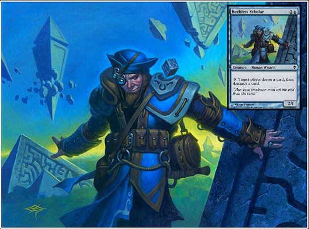
To add in that differentiation, we had creatures that weren’t confused or in the final set; Rise of the Eldrazi level up creatures looked nothing like other cards, keeping them unique.
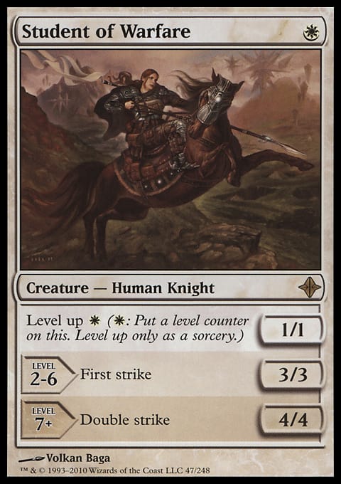 |  |  |
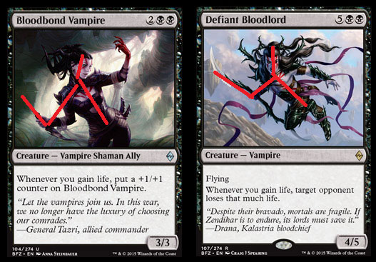
These two, while they have different casting costs and power and toughness, in an instant, are hard to tell apart.
How does this happen?
Magic used to only have one to two art directors working on a set. It was much easier to see visual consistency and correct cards that will affect play by near identical cards. This creates feel-bads, experiences that don’t delight by surprise, but befuddle and anger from a misplay that could be avoided. When there’re a lot of cooks in the kitchen, art can look eerily all too similar with a style guide reinforcing a visual aesthetic that regresses to the mean.
Or maybe this visual mimicry is from the development team, needed as final changes to balance the Limited environment and no one called in an art director to say, “Hey, does this look kosher?”
Don’t Mind Me
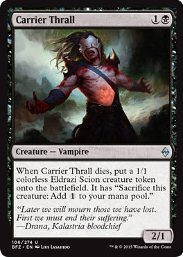
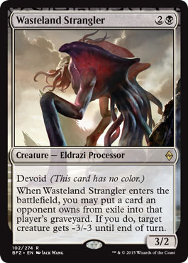
What’s up with vampires? Their being pawns isn’t new, and it’s great to see that consistency still being a theme, with the battle for the vampires still being waged, as noted by the flavor text below. It would be nice to see visually the Eldrazi conquering an entire race on Zendikar, more of the pawn/thrall status. But I also understand the need to showcase the lands, the main aspect of Zendikar.
The white eyes of a “pawn” was abolished in our return trip, and instead, a drone concept of face-hugging was used. The shoulder horns are also oddly much larger in Zendikar 2.0, and there hasn’t been an explanation for why that is. I hope we’ll find out soon.
 |  |
 |  |
Eldritch Horrors, Remember? Get it? Get it?
Brands often weave together more than players realize. The Eldrazi are obviously akin to the Cthulhu mythos of the “Eldritch Horrors” created by author H. P. Lovecraft in the 1900s and made into RPGs, board games, and card games also known as Lovecraftian Horror. Entire lines exist for that intellectual property that is in love with art of green hues.
I find it strange to get back into the well of this property considering Cthulhu on the whole isn’t growing in popularity. Of anything, it’s losing market share.
The Call of Cthulhu LCG, formerly a collectible card game, is no longer being made by Fantasy Flight Games, and yet, Wizards of the Coast is going all in for the nostalgia. It’s not as though SyFy is doing any Cthulhu TV shows or new movies are being made. Perhaps Wizards is above the noise.

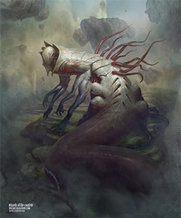
Skyrider Elf by Dan Scott, digital
It’s a strange creature by Dan, but it’s a great Hedron to use as future reference!
Substantial effort goes into ensuring the Eldrazi are colorless and packaged to look and feel like a recent nostalgia product using similar color palettes.
 |  |
The reasons for this are largely matters of convenience. It takes less world-building. A faceless goon can be easily hyped. And it’s easy to showcase a faceless creation without emotion. They aren’t evil, per se, they’re just hungry. Its lack of a face makes us unable to show them sympathy for their hunger—they lack humanity. There is no real-world allusion because they are alien in nature and actuality. They are Cthulhu, except mortal.
Visually, they’re just slimy amoebae, and as such, just like in Melrose High School’s microbiology course, I don’t really care if they live or die. I just need them to be useful for a short amount of time. I’m a bit indifferent to them because I’ve been made accustomed to react to Planeswalkers or people, not monsters and creatures.
They’ve Trained Us, You See
This story is about Planeswalkers teaming up; I couldn’t care less about the Eldrazi themselves.
Others may disagree on the visuals or importance of them, but in a two-set block, they’ll be gone in seemingly months, so I don’t really care either way. Other folks are looking at the nostalgia with a closer eye:
I do not like the new Eldrazi art, it's too detailed and in-focus. A bit too vibrant. #OldMan
— TheProxyGuy (@TheProxyGuy) September 10, 2015
I’m fine with Eldrazi all looking identical. That’s the point because they’re largely all Ulamog’s progeny. I enjoy that. I will admit that the previous iteration had more variance in color, but alas, they also were split amongst three Eldrazi titans. More on the outliers will be an article by Cary soon, so I hear.
What drives me crazy—and the only really thing I’m noticing about the Eldrazi—is the verticality of them to show scale is not showing up on the cards. Most players won’t even realize it. I don’t think this is a lack of commitment to focus on good sketches, but it’s widespread enough for me to definitely notice. The previous time on Zendikar with Eldrazi, these abominations all fit into the card art box.
 |  |
Without the tentacle, this could be Phyrexian with ease.
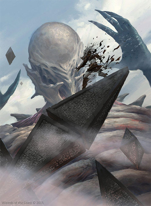
Cropping can get you in serious trouble—or if it’s done well, you get Titan's Presence. Scale is apparent and appropriate with a thirty-degree angle, cropped in close. And even then, look at how much visual information is lost. This is a Friday Night Magic full-art promo, not just a mere uncommon card.
It’s a lovely perspective shift, and the softness, in a digital card, allows depth of field to be apparent, without using a blur filter to tell you that Ulamog is both very large (no scale birds) and he’s able to annihilate from a great distance and with precise accuracy. Considerable visual information is apparent in only a few square inches.
Below the frame, we see even more storytelling. It’s a shame we can’t see more, really. I hope we’ll get an art director’s perspective in the upcoming Zendikar art book. And yes, please buy one. If you buy one, we are sure to get more.

Just Add Land
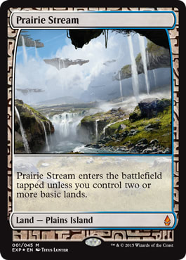
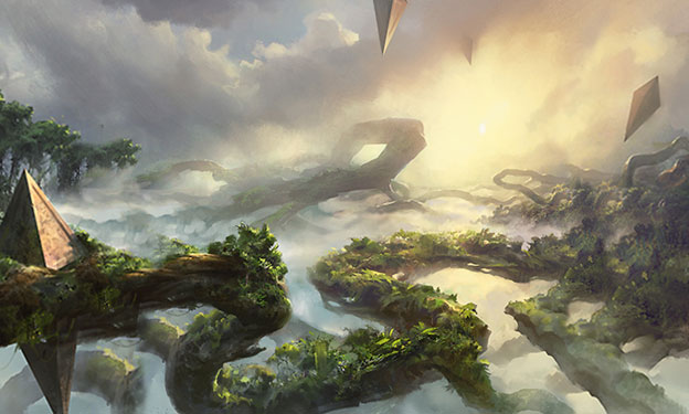
Finally, we reach the meat of Zendikar and their original visual gag itself: It’s a set about land, where it matters. The new lands are mighty pretty, continuing the theme of land as lush visual site, not so much a mana-producing thing. In fact, it’s been a few years since we saw any “mana” actually flow or come from a land. We’re seeing still images and the original intention that it actually does something is no longer explained and rarely shown outside of Commander sets. (Those sets will have rainbow colors or mists serve as this creation, most commonly.)
Just like in the last iteration, a full twenty full-art lands means you probably will miss one or two of them and realize it like four to five years later. I know I’m already not seeing the swamps, and instead, I’m focused in on the islands, which are lovely.

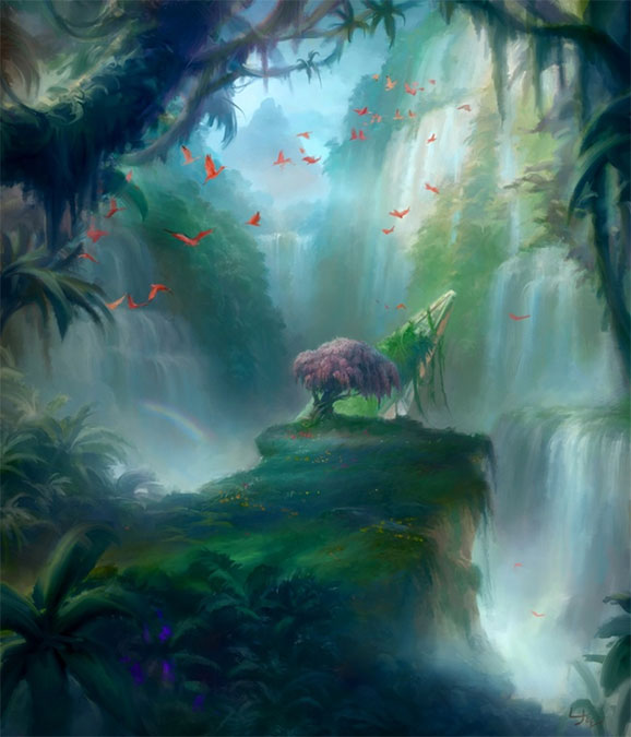
Paquette’s island is just silly. At first look, it’s a nice angular group of floating land with some minor waterfalls. Upon closer inspection, you see how far we are above the ground! You thought a floating bucket was nice, but we’re thousands of feet up (or meters for you international folk), and the main focus is on the singular hedron as we frantically try to find our footing on this floating crying land. The land is trying to separate as far as it can from the ground, from the pain.
The land fights back against the Eldrazi menace, but it also tries to protect itself.

Island by Adam Paquette, digital
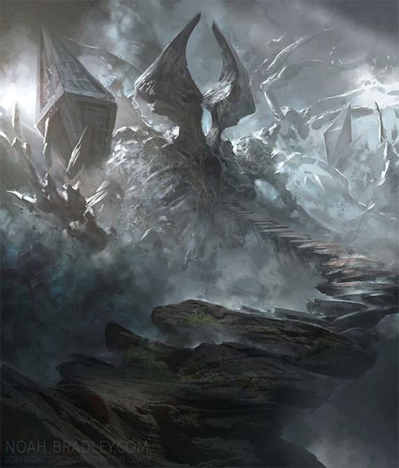
The set is based on a verticality gag—that became most notable to me in Noah’s island. I see a shoreline, sure, but I am drawn upward, as though I’m looking for a waterfall that doesn’t exist. Conceptually, it’s not that different from other concept artists ideas, but Magic also doesn’t normally have this type of freedom anymore either. This was traditionally painted as well, finished in Adobe Photoshop.

Island by Noah Bradley, oil on canvas
If you missed his post on Reddit about them, I urge you to check that out here. I wish more artists showed us making their art, but they are a business. It’s all about finishing a commission fast enough to start on the next one. I’ll get to more on that in a minute.
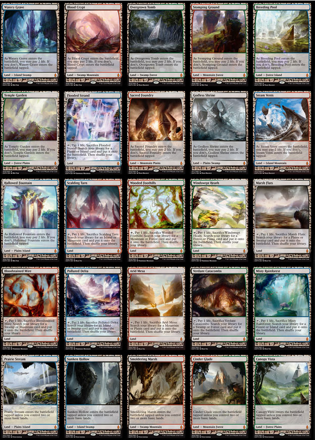
The lands could have dozens of articles on their references, nuance, and importance to the game. What is notable is how few of the expeditions are traditionally painted. In fact, zero are painted. Zero.
Normally, artists who work digitally or traditionally can weigh out if a piece is going to be popular before even beginning on it and then choose a medium depending on whether he or she can sell an original painting in the thousands of dollars. If an artist receives a Planeswalker and he or she can work traditionally, turning down an instant $5,000 or more needs to be weighed against how much more time it will take to paint a large depiction and how many jobs will need to be turned down to make it at the quality level of Magic. That’s the easy example.
If you receive a dragon, generally painting it traditionally is a wise move. The same would go for an angel. What baffles me is why zero traditional painters were given expeditions.
Yes, a digital-only artist will sign these cards until he or she dies, and yes, he or she will gain print sales in mass numbers. Traditional painters, though, benefit the same and receive an immediate four-figure additional payday. Out of twenty-five pieces, why are there no traditional painters? Maybe the next set, Oath of the Gatewatch will have some actual paint. Let’s hope so. It is utterly shocking to me that Raoul Vitale, among dozens of other capable artists, would turn down this commission—or, worse, that they were never asked.
As for the standouts in them, they’re all pretty good, with these three really catching my eye:
Godless Shrine by Noah Bradley, digital
 One of my favorite TSR Dungeons & Dragons supplements was Dead Gods. I loved the idea of a deity that perished and could be reincarnated by being remembered and worshipped again. It’s also written by Monte Cook, one of D&D’s better employees, in my humble opinion. I see that in Noah’s Godless Shrine, with a giant statue, lost to time on who it is. In a few years, when Ula, Emeria, and Cosi are distant memories, new players will only know the Eldrazi, just like Mirrodin will always be metal world, but the story with Karn and Memnarch is lost to the Phyrexians that are now there. This artwork will be a flavorful gem to that storyline Vorthos, eager to explain this entire backstory from a high-valued foil card that Noah made.
It also has a 1980s bad-guy-fortress trope to it, which, when mixed with nostalgia and Noah’s love of lighting, creates a must-examine-closely narrative work.
Misty Rainforest by Ryan Yee, digital
Ryan’s rainforest could not be farther from Noah’s shrine. We don’t immediately see a hedron here—there are scale birds and a lighter palette. It is Magic, but it doesn’t feel like the myriad other depictions of Zendikar. It’s a mana-rich world, and he gives us what we’re looking for.
This will sell a lot of prints for many, many years. This card also begs to be completed from a singleton copy into a play set due to both the Legacy and Vintage formats dealing with blue and green cards, most notably decks with Tarmogoyf.
The subtle rainbows give us a juxtaposition of Zendikar as idyllic, despite it being devastated by the Eldrazi. This is the calm plane, not one of traps, made for adventurers and filled with giant, aggressive beasts. I see his nod to Mark Poole’s “original” Tropical Island, which later became Birds of Paradise. That G/U-mana-producing land, compared to Misty Rainforest, which fetches a blue-generating or green-generating land, was given new artwork, and those Birds make an appearance in Ryan’s work.
That sort of Easter egg isn’t often included! Kudos to Ryan for making the connection.

Whether you call them bofa lands, company lands, double-check lands, or BFZ Lands, they all feel a bit “fine” visually to me. I nearly lost my mind when the Magic 2010 check lands came out, but they didn’t have the right subtype for me to rave about.
 |  |  |
 |  |
These are the same except pushed one peg farther, with an ability to be fetched. As such, art has to be radically different as to not show confusion—which they have done, and also be independent of the storyline as they need to be reprinted. They have hedrons, but new versions could be iterations with merely removing them.
Like below, we have giant tendrils or vines moving across the sky so numerous that it builds a net you can walk over, and it probably has soil on it. That’s a new concept to Magic. Add some Paquette, and you have a B-movie script with a singular scene.
It’s simple, but done with expert efficiency. Notice how few brushstrokes are on the hedron, and yet, you know it’s a hedron with writing all over it. He pulled back more than most digital artists, but using larger brushes and letting his painting background elicit mood instead of high glossy detail. It stands out compared to the hyper-realistic Eldrazi, who have everything shown save sweat on their rippling tentacles.
Canopy Vista by Adam Paquette, digital
Diverse Perspectives
You will notice a plummet of diverse-looking humans from Magic Origins to Battle for Zendikar from high teens to single digits. This is not a lack of commitment to diversity, but rather an uptick. There just aren’t that many human cards in Battle for Zendikar, and the ones that have multiple characters often have a diverse character. (Zendikar 1.0 also didn’t have that many humans, if you look back.) This is an intentional art description addition by art directors, and we, as the player base, see it and acknowledge it.


Up Close and Personal
I saw this and had to share it in this little column. Lake Hurwitz posted a little snippet into his piece on his Instagram. You should follow more artists on Instagram. It consists of more sketches and interesting line work compared to nude drawings. They largely stay pretty safe for work. Perhaps we’ll revisit a list of who has them and call it “social-media artists” or something of that sort.
Also, when these post, you have a few Vorthoses who pick up on architecture, such as Ant and Cary, mentioning how Crypt of Agadeem and March from the Tomb are the same place.
Had a good catch by Ant and Cary, two of my fellow Vorthoses here.
@mtgartgallery @lake_demonui @VorthosMike What do you think @Vronos , are they coming out of Agadeem? pic.twitter.com/RaVc5muDtw
— Ant Tessitore (@AntMTG) September 14, 2015

March from the Tomb by Lake Hurwitz
Art Gems to Note
The gratifying surprise of this year’s fall set, though, is how much good painting, figurative and abstract, is on truly marginal cards. Mythic rares are never going to be the place to go to see the entire terrain of fantastic art, but you can assume a Planeswalker will be tremendously strong. If traditional painting is only favored by artists making “money” or highly-playable cards, and basically a few oligarch collectors favor the former with a short list of artists making silly money, some artists are still doing tremendous work, toiling in the trenches to keep their places in Magic. At least we mere Vorthoses, art lovers really, can have something to look at while playing in our $14 Drafts.

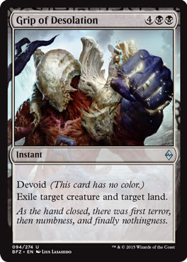
Catching the eye is Lius Lasahido, a thirty-two-year-old artist from Jakarta, Indonesia whom I had the pleasure to work with a few years ago when he worked for Caravan Studio. He has a pretty broad ability to digitally arrange a softness of color and yet maintain a simple arrangement of hard edges and intense forms.
His work in Grip of Desolation could be as simplistic as my inset below, but he’s signaling the art director that he’s ready for a real commission. This happens in every trading card game. People like Todd Lockwood and artists from his era stay awake at night, looking at young artists nipping at their heels, waiting for chances to supplant them. Lius, you’re ready for a Planeswalker.
 |  |
 |
| Original painting still available: 12" × 16" inches, oil on panel, $1,300 |
This set attempts to crack that tough façade a bit, to expose Zendikar’s landscapes amidst the hyper-real Eldrazi, with their gray mist and slimy exteriors. To that end, it includes a little-known group of paintings of small, colorful figures that represent beings and creatures of Zendikar.
Palumbo’s artwork itself progresses from realistic studies of fantastical realistic figures in more abstract interpretations of the setting, which is interesting, especially in the context of his larger body of work as an artist and Zendikar’s current quagmire.
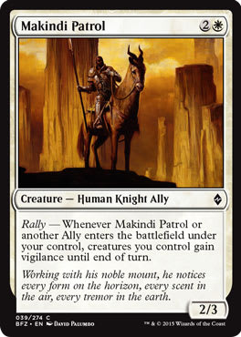
The painting, Makindi Patrol, seems much more like the work of an artist interested in making a piece of Imaginative Realism (the fine art term for sci-fi/fantasy art) and divorcing the figure from its cultural, spiritual, and set significance. This card is largely insignificant in the overall valuation of the game, being playable only in Limited formats.
That limitation is actually its significance. While I am no expert in southwest native iconography and the appropriations thereof, I am uncertain where this artworks sits sans its card, but I am seeing a black character who will be seen by millions of players many, many times. I am happy to see representations of diverse Zendikar figures who don’t feel fully integrated into Battle for Zendikar but yet will be integral in the Limited format. This card, a diverse individual, will be seen more than a mythic rare character by actual players. It adds to the initiative that Magic is actually pushing for diverse characters, instead of just asking for a wide range. It’s active versus passive.
By utilizing a few cards to show Zendikari life, that will be used often in both the Draft and sealed Limited formats, Magic is pushing the industry forward. And you aren’t even noticing it. It’s just the new normal.
Some of my favorite work was located in this portion of quiet art of the set, a hallmark of every set Jeremy Jarvis works on. In Oracle of Dust, Jason Rainville makes use of serenity with breaking waves to capture an intimate moment with our Eldrazi figure. His brushwork takes what would be a fairly typical post battle scene to a completely different level.
This image is pure opera.
It frightens in its tranquility.
Guiding them and, at times, unnerving them.
Thus far, almost seven hundred people have liked Jason’s image posted on his Facebook page.
The essential nature of Jason, if not the full reason for my mind blowing admiration on levels with Cynthia’s brilliance, is established right from the start. Jason is a searcher, hungry for change, with a literate mind and a penchant for not realizing that he’s hitting home runs on junior varsity cards.


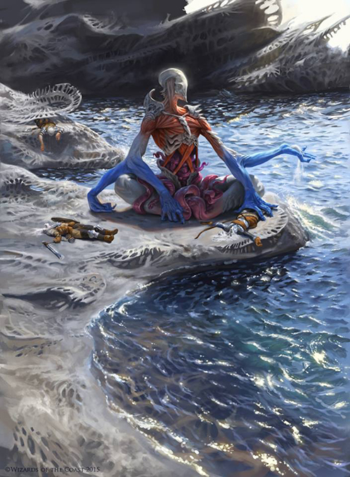
This Drowner of Hope by Tomasz Jedruszek weaves in and out from Magic to Cthulhu, leaving you a sense that all that is old is new. This feels similar to 1990s top-down constructed games like Grand Theft Auto, and bringing that odd perspective to a game that doesn’t need a giant rectangular narrative. It need simplistic depictions, often sans backgrounds like Kev Walker’s work.
While the art description probably had water Eldrazi attacking the Zendikari people in their tents, notice the muted color palette and adding only subtle blues on the invaders to show the otherworldliness to an otherwise idyllic depiction of a scenic camp overlooking the mini island camp. Using larger brushstrokes, he muted the scene, allowing the water refraction to be very visible, taking you from in focus on the figures and “things” to the landscape painting and then back to the scene at hand.
Tomasz is invested in applying a very common depiction on Zendikar, and with anything Cthulhu, someone observes a horror clearly going to overtake a colleague, friend, or family member. We, as the viewer, come to the logical conclusion that our scout is consumed with dread because they are next. Even poor Pandora still had hope.
 |  |
“None of the artworks you highlighted are on playable cards.”
You are correct.
Battle for Zendikar has many beautiful and moving depictions, showcasing the strength of a proud people, but it also can be more than a little tired in its homogeneity of the same Eldrazi creature, seemingly over and over again, despite the artist and art directors’ best efforts. Its ending not only neglects to deal with a mere singular Eldrazi titan, but seems just a little too neat all around.
And yet, the artists from the top to the bottom deftly manage to dance around the problems of the set. Along the way, we’re forced to swallow yet another pill of recent nostalgia, but discover aspects of paintings that keep our interest level high of this no longer bizarre plane with familiar monsters.
-Mike