


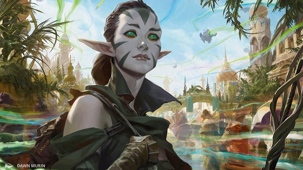
The newest Magic expansion set, Kaladesh, has the most layers of any contemporary gaming set of visual culture to unpack. I hope my art review touches on some of the many aspects of the set and encourages discussion. I can’t cover everything, without a deeper understanding or an art director to walk us through it, I can only describe the shadows on the wall, not what is creating them.
We will be talking about this set for years to come in terms of precedent. To say it quickly and for you to keep in mind as you read this review, I like this set and what it says about the future of gaming. I have that bias with me, in that I like gaming to reflect society, give deeper meaning and have progressive depictions of humanity. The set delivers on this, though no set is perfect.

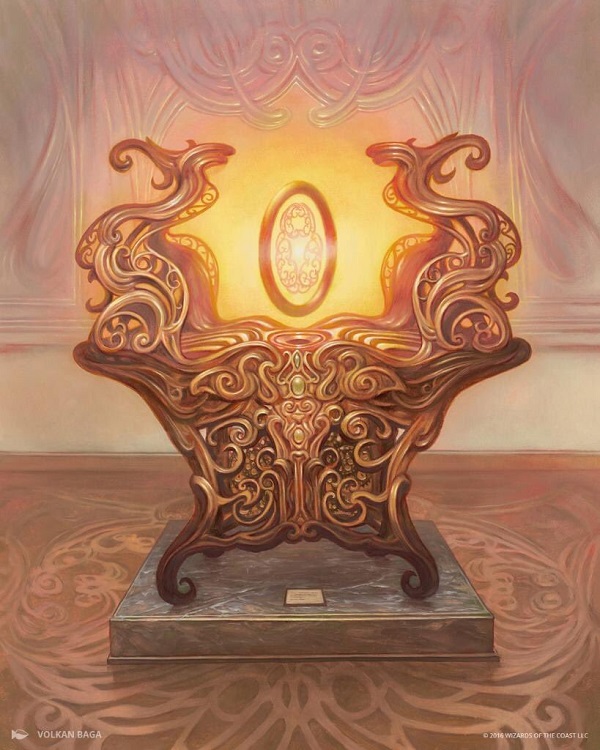
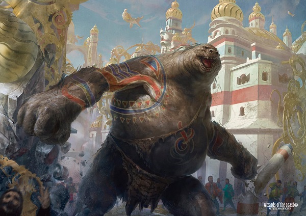
Aetherflux Reservoir by Cliff Childs
In order for me to analyze Kaladesh, I need to cover some background on what should be understood from previous sets that build the foundation for what I’m seeing. In a playing card game, building from the basis of Dungeons and Dragons and pushing the boundaries of the entire genre of trading card games, Magic has all options being possible. To understand Kaladesh, you must ask yourself a singular question:
How much realism do you want in your fantasy?

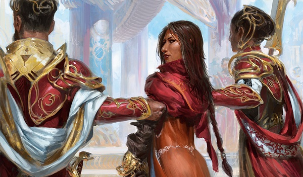
Live Fast by Ryan Yee
These are great images that evoke a story, yes. What’s most impressive is the art description that asked for them. Ryan’s a great artist but he didn’t invent the live, laugh, love, lose narrative here.
Die Young by Ryan Yee
We as humans experience our reality through our senses, and pertaining to today’s column, it’s all about sight. With the two images, even at card size, swapping blues and browns of water and trees of vitality and life for black and gray gives us foreshadowing. This Aetherborn will soon die and the top right light source forecasts his demise. From top left of the Forever Young to top right of death, we see a full circle. We can immediately and viscerally see what is happening without the card, card frame, names or flavor text.

Our understanding of our external world is gained through information obtained through our sensory organs, observations and facts we know. Our perception is our reality and changes as new information, theory or fact is introduced. Magic has shown death thousands of ways but very few that make you feel for the afflicted. This is new.
Fantasy differs from reality as it can, and often does, conflict with our sensory organs as we cannot experience it but rather we must imagine it. Fantasy conflicts with facts. It fights reality as our previous experiences find logical analogies to life trying to explain the dissonance.
Kaladesh is a set that sits in the gray area of how far to realism or fantasy it was to be located. The shortened creation time of the set forces our reality to fill in the gaps and make sense of the recognizable culture we find allusions to that were not necessarily intended. If you recall, origins had ten planes in it: Vryn, Dominaria, Ravnica, Innistrad, Zendikar, Lorwyn, Theros, Bant of Alara, Regatha, and Kaladesh.

Instead of a core set, which was largely reprints or a singleton plane like Shandalar, ten planes needed defining, including three brand new ones in Vryn, Regatha, and Kaladesh. From a workload standpoint, they were given triple the amount of work piled atop another whole plane, as things moved from three sets to two in a block. The amount of world-building needed in a very short amount of time was absurd.
And despite the Magic R&D team having little to no time, they still delivered beautiful artworks. If they hit some culture, honestly, it’s a bonus considering the timeline. When we see rats here, it’s cute, it just won’t be perfect Indian tiles, derived from a single place in India. That’s research time they didn’t have.
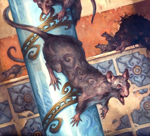
Thriving Rats by Tom Babbey
Real vs. Imaginative Realism vs. Fantasy
If Kaladesh is the middle of this scale, and Portal Three Kingdoms is full reality, Ravnica is fully fantasy and Tarkir is the farthest that a Magic set can be pushed in reality where the world building maintains its integrity. What do I mean by that?
What was Portal Three Kingdoms?
Portal Three Kingdoms or P3K was an introductory set that was flavorfully built around the Chinese epic story of the Three Kingdoms surrounding a two-hundred year period of history There is no magical elements in the set, with horsemanship being a believable evasion mechanic.
 |  |
What is Ravnica?
Ravnica is the city of Sigil from Dungeons and Dragons. The plane/planet/world of all urban environments denotes Magic’s arguably most popular plane filled with guilds. It is based on more Eastern European culture and architecture, especially the Slavic countries Czech Republic, Serbia, Slovakia, Croatia, and Slovenia. John Beety wrote about naming conventions some time ago.
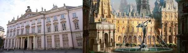
Primate's palace via www.tripadvisor.com.au /Hallowed Fountain by Rob Alexander
What is Innistrad?
Innistrad is Prussia. The only thing I know about Prussia is military strategy copied for the American Revolution and it roughly is Germany with bits of Poland on the Baltic Sea. It’s German influenced but still Renaissance feeling. You see it more than you feel it, which shows in the architecture. Iconic German cultural traditions like Oktoberfest, Kindlifresserbrunnen, Der Struwwelpeter or even Grimm fairy tales were out, despite being very easily integratable had someone from the German Magic community been involved. They used Americanized German tropes, more common to the Disney universe to show allusion and allegory.

Gavony Township by Peter Mohrbacher/Fachwerk home via community.ricksteves.com
What is Tarkir?
The plane of Tarkir is the Mongolian empire, eloquently explained as “More than Mongolia” in an article I wrote in 2014. Mongolia is an area, yes, but the set was based on the Mongolian Empire, which ranged from China to the Ukraine and everything in between. Note that India was not included in most maps of the Mongolian empire. Those mountains aren’t exactly easy to traverse.

Image via a wiki
What is Kaladesh?
Kaladesh is a steampunk and inventor’s set using India as the inspiration to draw from. It is a “bottom up” set, meaning the mechanics are what make the set, and the flavor, the story and lore are built second in this type of designed set. Mark Rosewater, on his Blogatog Tumblr site, explained that Kaladesh could only be built by the bottom up because Indian culture is not well versed enough in the current Magic community to work for the vast majority of players. I don’t want him to be right in this, but he invariable is correct.

While Kaladesh can show the normal Magic representation of different genders having visibility as well as races being shown, the deep ties, the tie to culture, could not be done due to the audience not being acquainted enough. (They also had minimal time, but that’s a bit harder to state in the public, which is fair.) We’ll see strong, badass women are present as are beautiful things as well as serious fantasy and whimsical, cute things. Sets these days all have aggressive, loud and quiet cards mixed together to make a cohesive whole.
I could go on to directly talking about only individual artworks but that isn’t what I’m doing today. Instead, I took time out of my and Magic’s only artist of Indian descent, Sidharth (Sid) Chaturvedi’s day to talk about this set, he had this to say:
"It really was a pleasant surprise to open a brief that says this set is styled after India, because you don't see that at all. It's usually been lost in ‘East,’ the way that fantasy settings had the ‘African’ faction and ‘Asian’ faction for a long time. So the Indian stuff is just a visual setting for their other ideas, but it's very much a start."
Are his depictions in Kaladesh African or Asian? Look for yourself.
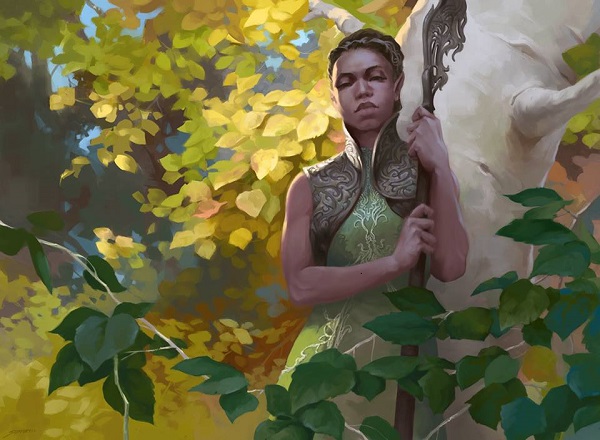
Wild Wanderer by Sidharth Chaturvedi
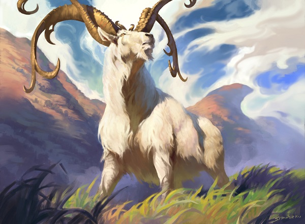
Thriving Ibex by Sidharth Chaturvedi
They don’t look like Magic exactly, but they are a new set. They shouldn’t look like Lorwyn, Dominaria or Mirrodin. I worked with Sid quite a bit back in the day and while his digital work is at an incredibly high level, you should see his oil paintings. He’ll get those up to Magic standards soon and you will want them.
Back to Kaladesh’s visual style. It’s a set of swirls.
It’s opulence with an order. The set is faberge eggs with overlaid steampunk and removing the normal Victorian steampunk vibe. I’m happy they aren’t using a normal steampunk 1800s Victorian lens, as colonialism with the British could be Indian, but a celebration of culture would be near impossible for world-building. It’s fantasy with a real-world basis. The art directors even had to keep artists from making too much metal, too much curving opulence.

Faberge egg via natedsanders.com
I want to touch on the perception of the set as the current order of previewing a set created a few hiccups in terms of unraveling the world building efforts and culture of Kaladesh.
To explain, the below graphic is the complete set, with mythic rares on the left, going into rares, uncommons, commons and finally basic lands on the right. What is shown first in preview card articles to build hype to the set is the box in yellow. The box in red are the uncommons and commons that you are more likely to play in the limited format of booster draft.

The cards in red have to look different from each other and give a more honest look into the plane as to prevent confusion in drafting from similar looking cards. This creates a problem as “what” the set looks like is now how a set is previewed and released. What we see first previewed is not what the set actually looks like.
When a set is released, there will invariably be a few cards that aren’t previewed. Upon reading this tweet, it begs more discussion. With this set, discussion was definitely had.

Shivam Bhatt, in case you don’t know who he is, is arguably the Magic community’s most influential person of Indian descent and must be covered as his analyses cannot be ignored. We’re talking visual culture, and he knows it because he’s lived it.
Lionel Shriver, who wore a sombrero to a literary conference and debated that no writer can write fiction, said cultural appropriation is a passing fad, but she rang dangerously close to the Internet free speech culture of who can and who can’t talk about culture. Gaming needs to create fiction. They must create, innovate, and borrow from living cultures while still being respectful of source material of underrepresented communities. They can’t be tone deaf as they have the power to create, to be heard, and influence contemporary culture. To create what is fantasy and what is reality is power, and the powerless have fewer ways to see themselves in it.
While I am going to liberally quote and cite Mr. Shivam Bhatt, know that I do so out of a desire to archive the visual culture of Kaladesh. His perception is incredible from a world-building and learning perspective.
https://twitter.com/ErikLinden/status/774029447146070017
Shivam wrote a seminal post last summer discussing Magic Origins. On Chandra, colonialism, and race, was shared and widely read. Origins was the first set to show a snapshot into Kaladesh, Chandra Nalaar’s home plane and he wrote:
“I totally love the steampunk aesthetic, but it’s really hard to separate that from the aspects of colonialism and othering that go along with it. And then add that to the fact that you’ve basically got all pale white people in the art that came with Chandra’s story, and that everyone has Indian names and onion domes, and it’s all very Disneyfied Mughal India, and you start to get the feeling of erasure. Or at least I do. Here it is, my dream setting, an Indian plane in MtG with awesome gears and steam and the whole thing, and indian names and indian cultural references . . . and no Indians. And the plane is full of engineers!!”
While it was premature, written before the full set was released and followed up by another post, it sparked countless responses that encouraged players to analyze the visual culture of Magic. Doug Beyer, creative designer, even said, just wait please. For all the care the creative team took in writing The Truth of Names regarding Alesha, Who Smiles at Death, the first trans character, it did seem a bit odd that the reintroduction of Chandra, on an Indian inspired plane, was pretty caucasian looking herself and the characters around her don’t generally match her.
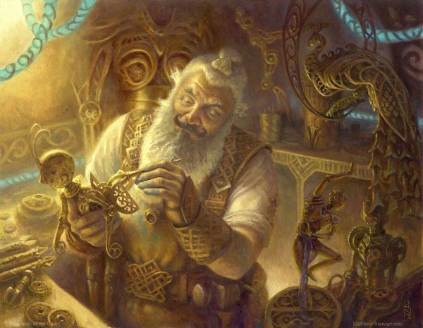
Master Trinketeer by Matt Stewart
Flash forward to August 2016, and we see a spectacular introduction to Kaya, Ghost Assassin from Monique Jones who was hired as a consultant working with Kelly Digges. Wizards celebrated the storytelling and gave an honest look behind Oz’s curtain. The community has near universally adored Kaya and the commitment to a diverse planeswalker.
And Kaladesh has consultants. The hype train for progressive, nuanced world-building with creation of inspired culture and handled with care is an expectation I had as well. Then, the set came out. It was good, not great.
Shivam started writing everywhere and asking questions. Boy did he get them:
“At Pax, Jeremy Jarvis told me Kaladesh design started halfway through origins, and that first year they didn’t have a ton of resources to work on the set.”
Shivam wrote on it again in Kaladesh, you break my heart.
“About four years ago at the Theros party at pax, I asked Magic head designer Mark Rosewater if we’d ever see an Indian themed set. He said they’d never make a top down set because the tropes weren’t understood by the masses, and folks wouldn’t get it, because it lacked resonance. 4,000 years of culture, but ok. He said if they did it, it would be a bottom up set with an Indian overlay.”
The set slowly revealed itself and we saw some themes emerge. It was a bottom up set of invention, and many of us expected, well, more India.


Skywhaler's Shot by Chris Rallis
“And look at all the consultants listed on the credits sheet, and all of the effort that went into creating the single character of Kaya. Heck, they even spoke to an expert about getting the details right. Kaladesh was going to be amazing, rich, and nuanced with Indian texture run through a magic lens.”
They did have consultants. Later, we found out they weren’t consultants in terms of historians, anthropologists or Indian culture consultants, no. They were Wizards employees in various departments who gave some insight, that’s it.

Narset is neuro-atypical. Alesha is trans. Kaya was created with depth. The next big representation push had Saheeli, a woman of color planeswalker on her home plane and yet Kaladesh:
“...was an amazing anime, but it was not Indian. Or even India. All of those buildings and clothing styles were Persian, not Indian. And over and over I was told ‘We didn’t want to offend anyone. We didn’t want to step on real beliefs, or real cultural influences, or do anything to make anyone mad.’ So no four armed Vedalken or elephant headed Loxodon or gods. Fine. But then they kept going. No snakes. No monkeys. No rakshasas, no Indian birds, no cultural markers of any kind at all. Literally just the skin.”
An aside is the curious choice is the selection of gremlins being recreated for Kaladesh. In the set, they’re basically rust monsters, one of the most obnoxious creatures in Dungeons and Dragons, who eat magic or in this case, consume aether.
Demolish by Steve Belledin
The original 1994 design was created as a Phyrexian creature and only uses twice in Magic’s history. Foreshadowing to a future Kaladesh swarmed with Phyrexians is speculation on easy mode and could be one of the explanations why the more common monkey or ape creature were not used. I wholly agree with Shivam here; why aren’t there monkeys? The two most notable designs that enfranchised players would know is the Vintage card and the comical artwork below.
 |  |
The omission of monkeys from Kaladesh I argue is an oversight but no one’s fault. As daily life in India has an abundance of monkeys, building a bottom up set utilizing India and not including them with a Magic precedent is rather odd. More notable is that the bandar, or Kaladeshian cat monkey, already exists. So, we have a Magic creature not used in its established design space and instead recreating a creature type long dead. The set has both examples and their choices seem odd without the ability to see Aether Revolt to understand why. I get that little time was had to create the plane, as the sets shifted from three sets in a block to two, with Origins being world-building for so many sets in a summer set.
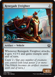
Perhaps making monkeys was one of the areas the creative consultants explained to not use, like tigers too, just as people hanging off trains like in India could be interpreted negatively instead of closer to reality and a nugget of realism in our fantasy game. (Though, in this case, Izzy killed it, integrating an elephant into the piece in a subtle way, fusing two very normal motifs with one piece. Take a look at a higher resolution image below, and then read what Jay has to say on it on Tumblr.:
Renegade Freighter by Izzy
On a sidenote from Izzy, I caught up with him briefly and he gave a quick quote: “I try super hard to get cultures into my work. It's hugely important to me.” It shows. Check out Fairgrounds Warden below. If that doesn’t say Kaladesh through inventions set in India, I don’t know what else Izzy could’ve done. It’s so stellar. Even the hair is on point.
Fairgrounds Warden by Izzy
But, the fact that bandar and gremlins exist looks like one was chosen late and the previous examples weren’t removed. This is a fantasy game, why have both?
- I see Kaladesh as a setting using India as a basis to build fantasy upon.
- I see Kaladesh as potential to draw from a living culture and add Magic to it. How much is added is a discussion of how much fantasy should be in their realism and the thesis of this entire art review. It’s there, you just have to look for it.
Attune with Aether by Wesley Burt
I have a lot of questions, but after a lot of discussion with Vorthos colleagues and known associates on how to explain this part, they gave me some insight for a more ideal state whenever using a real culture as a gaming setting. Inevitably, intersections will occur. Three things, amongst many, should have been fulfilled for it to work:
- Representing marginalized and/or underrepresented groups
- Respectfully adapting the culture
- Ensure the culture connects to the fantasy setting
Having all three is a success and we haven’t seen Wizards successfully deliver all three aspects yet. There’s also the fact that other gaming companies aren’t even in the same stratosphere to even discuss the level of world-building that everyone could see themselves in a game and they are also awesome in the game. (If Wizards is hitting ?, other places are lucky to get 1/3.) Check RPG books the next time you’re in a gaming store that have no characters of color, I’ll let them remain nameless.
Magic struggled at #1 in its early years, Kamigawa failed at #2, and Kaladesh struggles with #3. It’s hard to see because some artists knew what to paint and how to do it. Ryan Pancoast painted his Indian wife below and you better believe her clothing is perfect. Oh, and the pose? It’s perfect as it represents an offering to a deity. Shivam explains it better than I could in a response to Mark Rosewater posting it on Tumblr:

Inventor's Apprentice by Ryan Pancoast
The $10 gumroad tutorial video on how he painted this, top to bottom is well worth your time.
The set is so close, it’s so close to taking a full bottom up theme and weaving in a culture. We’re spoiled as Kaya and Narset were made so well, and the collaboration with Monique Jones has been stellar from both a creation standpoint and accessibility to an entire gaming community.
At the Planeswalker level, Wizards has figured it out. Saheeli? Perfectly made and Monique, again, wholly agrees. She’s been on an utter tear, writing really great PR stories for Magic, breaking down the barrier that Magic is “white people stuff” and showing examples of where it is succeeding. Wizards is the best large gaming company for trading card games in terms of representation, the final step is weaving in culture. When they are given the time, they’ll succeed there too.
Saheeli Rai by Will Murai
The metal pupper in front is not lost on me. I’d pet it.
Masterpiece Artworks
As a concept, the new rarity of cards is great for set pricing, the health of the game and some artists sold original paintings for ludicrous amounts of money including Sol Ring on the Facebook MTG Art Exchange group for $17,100.
While that’s stellar for the Volkan Baga or Chris Rahns of the world, are masterpieces that fantastic? Are the artworks that good? Will the art quality of them remain high?

Sword of Light and Shadow by Matt Stewart
Sol Ring by Volkan Baga
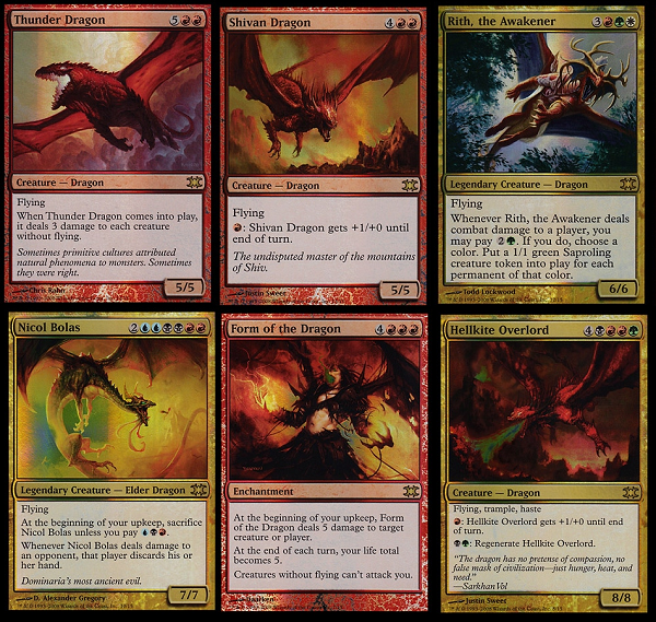
In trying to find a comparable, the closest thing in Magic’s history was the first printing of From the Vault: Dragons. Omitting the other cards, I would focus on the six new card artworks. Justin Sweet has a huge following, and his paintings sold off the market and near immediately. Chris Rahn’s first commission to Magic was Thunder Dragon. Not a bad start to break into the game with an iconic creature. Todd Lockwood’s dragon also sold though this was 2008. Was this art expensive? It was more than the $100-300 card art that could be purchased at Grand Prix events and conventions. It just didn’t seem that odd when it was $600/$1000 or $1500 because of its iconic nature as a dragon, it should’ve sold for more.
At the second printing of From the Vault, like the new Masterpieces, Wizards overcorrected by making bigger improvements to the set. There were rarer, better cards. Up until Conspiracy Take the Crown, this version of Berserk was worth more than the Unlimited version because it was foil. It’s hard to say if the Tinker, Berserk or Goblin Lackey is up to a Sol Ring level masterpiece, but definitely a Sword of so and so in comparables. The art market just wasn’t ready yet in our niche.
I think masterpieces are going to go the route of from the vault cards except they will be harder to reprint. In addition, I think the artworks are good but they are not great. If there is a commission that is guaranteed to be valuable, it’s a masterpiece card. There truly is zero excuse for, “I didn’t know if this card would be liked or played by characters a lot.” It’s built into the art description that artists will naturally work harder on the commission due to the status, not unlike a rare card, mythic card or previous expedition rare card.
To make an iconic artwork in Magic a few things need to be fulfilled:
- The card needs to be very playable and played often.
- The card needs to have been reprinted.
- If multiple versions exist, the one with the “best” art.
Masterpieces do not fit any of these traditional aspects of pushing a Magic card to iconic status or pushing an original artwork of the card to skyrocket in price. They are hard to reprint, their rarity is such that not a ton of people will see them and in the future, the art won’t rise in prominence. Artists should be selling this art immediately as it won’t rise in value as exponentially in time. That said, with so many artists selling at the same time, the overall price being realized at auction feels high, though the competition is keeping a ceiling on prices. My advice is if an artist gets one to sell it immediately on the most public outlet they can. The first few masterpieces are sky high in cost, with future ones, especially Belledin level incredible art like below, will be cheaper to attain. Some collectors have already noticed.
https://twitter.com/kevinklaes/status/776647608366460929?refsrc=email&s=11

Sword of Feast and Famine by Steve Belledin
I did a tweet on the traditional artists who didn’t get a masterpiece in the first wave.
https://twitter.com/VorthosMike/status/775441595139182592
As masterpieces will be in every set, the Steve Prescotts and Mark Zugs of the world should get one one of these lucky commissions. Though when a brand new artist like Kirsten Zirngibl paints even an ornate rug this delicately, creating a lovely inventor’s fair artwork, even I can attest that no matter the artist or medium, masterpiece quality will always be above average.
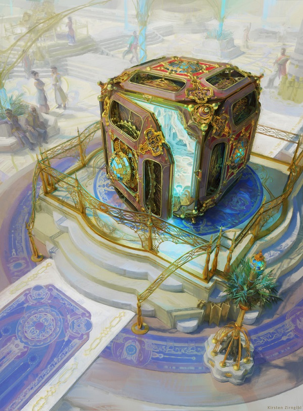
Mana Vault by Kirsten Zirngibl
On a personal note, I hope masterpieces keep their traditional art numbers high. While digital artists can sell their playmat or a limited edition lithograph at a higher price point, the vertical nature of the commission is hard for playmats to sell easily, even with stellar artists like Ryan Yee who made Misty Rainforest as a vertical playmat. Those were beautiful, sure, though the profit incentive is absurd for those who work in traditional paint.
Lightning Round Art
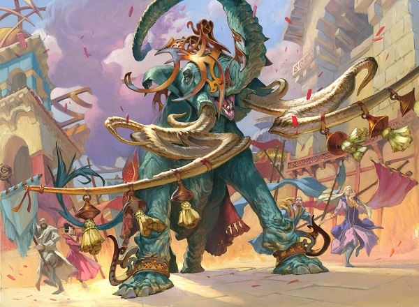
Fairgrounds Trumpeter By Jesper Ejsing
Check out that reflected light from the slight purples in the elephant’s shadow, to the tusks hitting the light just perfectly. Jesper is known for bright colors and he delivers masterfully. He even has his oft-used purple mixed into the clouds and figure in the right front. It’s a lovely, lovely piece.
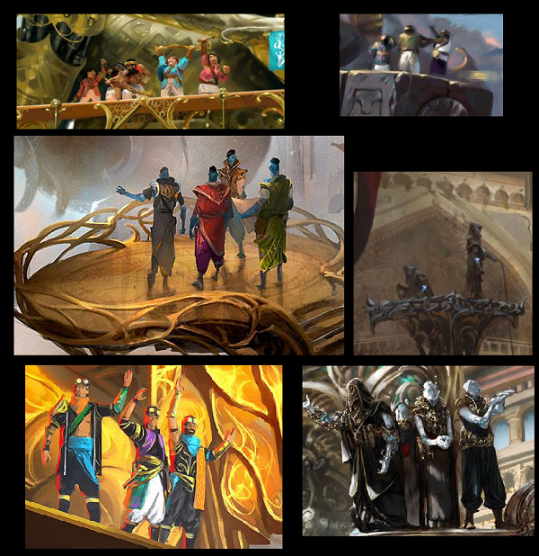
The representative factions in front of their gearhulks. Fun, huh?
Wait, there’s another one?
Check out Accomplished Automaton below. Was it probably supposed to be made as a gearhulk and changed in development? Were the automatons supposed to have more agency as a tribe of Kaladesh? Or, is the little guy on the shoulder just cute, imitating the gearhulks, a robot fanboy, as it were? I hope all of the things.
The parts of the robots are all very complicated and I like the treatment Daarken has from filigree, to powder to aether. It all feels natural at card size.

Accomplished Automaton by Daarken
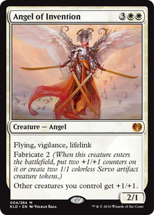 | 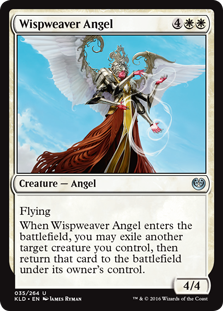 |
Angel of Invention by Volkan Baga and Wispweaver Angel by James Ryman
All throughout Kaladesh, religion is absent from most of the card artworks except for the angels. I haven’t understood how some parts of Indian culture were taboo to cover, yet mixing aspects of Indian deities was given the green light.
As explained earlier, India was not the basis for the set, it was a bottom up set, not top down as tropes and culture aren’t as well known. So, we can see some effort into iconography utilized, adapted to Magic like multiple arms on angels, like some Hindu deities. The multiple arms aren’t necessary literal like Magic’s Hundred-Handed One but rather, symbolic to mean they are everywhere at the same time. If an aspect of religion was to take iconography and adapt say, that concept of omnipresence and adapt it to a keyword like vigilance, that’s stellar world-building. I’m also not Hindu, so from my perspective, it’s delicate but omitting infusing religion into a set in a culture where religion is rather visible. It’s odd.
Try describing medieval France without mentioning cathedral building. Pilgrimages, taxes, worship and cities and culture were all based on their religion. Removing religion from India doesn’t give you an immense amount of material because it’s so prevalent in their daily life. It’s safer and without many examples in Magic using living cultures, I can understand why they were gun shy. Innistrad had Frankenstein’s monster and the Fly as tropes instead of using Grimm.
As a sidenote, Angel of Invention sold for $6100 on the MTG Art Exchange Facebook group.
The angels were spectacularly created on a technical level, it’s just the symbols and iconographic elements mean more than they appear.
We see this concept of meaning reused in a different way with Armorcraft Judge by David Palumbo.

Look at the size of his brushstrokes. It’s a beautiful traditional painting when you see a larger depiction of it instead of a 2x3” card art box. His usages of soft browns keep the invention/steampunk feel, mixed into a set with gold filigree to give us a rough Indian inspired set. When you see the colored powder on the rhino here, I immediately think of those 5k races, the “color runs” people do here in America. Yes, the concept is appropriated from the Hindu festival Holi. Is it cultural appropriation? Let’s examine.

Armorcraft Judge by Dave Palumbo
Kaladesh has an inventor's fair, and from this flavor text, there are other judged categories. From looking at just the artwork David painted, what do we see?
A guard of some sort is on a rhino, and is fully armored in very stylized armor. The flavor text also calls out the different, more elaborate armor which makes sense for a judge of the armor category. Look at Captured by the Consulate shows the armor of the rest of the consulate members, it’s lighter.
Captured by the Consulate by Tyler Jacobson
- The characters are on the plane of Kaladesh and they in a less formal area outside compared to inside a building with the Kaladesh Invention masterpieces.
- Presumably those are inventors who surround the central character.
- This person is uncommon and/or has power that is recognized, as evidenced by the front right characters looking up and at her. Her being a judge confirms the scene to her title.
- Look at how natural the pigment on the rhino looks. It’s expertly applied and resembles the powder from the Holi festival.
If this adding pigment is all we see of it, it’s more of a limited use of appreciation of Indian art. Most players will not find it even relevant to note and the ones that do will try to see the flavorful justification in doing so. Is this day the Holi day and there is judging after, where a judge can’t go home to wash her rhino? These are good things I believe, in the end, as we cannot hear directly from art description writers on their actual intent in keeping the aspect in.

Commencement of Festivities by Zack Stella
This is one of the better images in the entire set. It’s a shame that it’s only a Fog effect used in limited. Though, recall when I mentioned what the set actually looks like? This is also what I mean.
Is this India? It sure looks like it.
Is this a celebration of their culture? You bet.
Is the image technically well created? Zack Stella doesn’t mess around, it’s good.
Have we seen images like this before? Absolutely, see below.
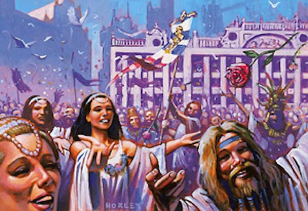
Festival of the Guildpact by Alex Horley-Orlandelli
I don’t have much to say about it other than I’m happy it made it in.
Two Images via Woelfflin
Heinrich Woelfflin is relevant to this art review in a quick summary simply to set up how we’ll look at a few pieces in the set. He was really the world’s first art history professor, art historian really, and his book Principles of Art History. He explained how to look at art by comparison because he was fascinated how one could have totally different reactions to the same painting or the same artist. Our perceptions are our own reality but comparing and contrasting two works next to each other can illuminate. Reddit and Tumblr users love finding these hidden things, the story and foundation behind each artwork like finding similar poses or easter eggs.
You now know why art history professors put up two images next to each other. Let it be the guide for you as we look at a few selections of Kaladesh’s art.
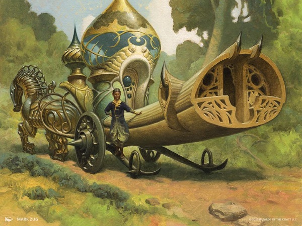
Cultivator's Caravan by Mark Zug
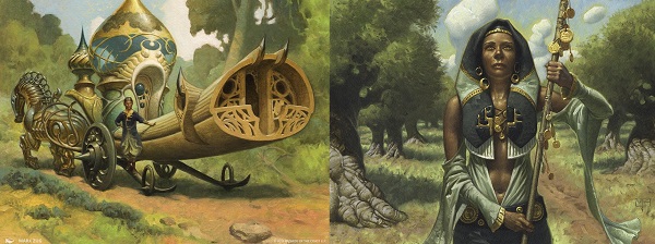
Noble Hierarch by Mark Zug
Add Mark Zug to the list of artists you should recognize immediately upon seeing. If the oil paint wasn’t the first guess on who made this, surely the palette of soft browns should narrow it down. The color on his Noble Hierarch’s clothing, especially the arm sleeves look directly linked to the structure on the caravan. These sort of connections are fun for Magic as you recognize styles. To learn more about styles, I recommend The Magic Man Sam’s YouTube channel. He has covered Kev Walker, Volkan Baga and Wayne Reynolds already with more to come. He has an approachable perspective into teaching you how artists differentiate themselves and they’re all short, right around 5ish minutes.
To go the next level down, I would look at the roads Mark paints. Notice Zug’s treatment of soft treading on the dirt roads in both examples, not cut deep into the earth like more used roads like the Oregon Trail below. You can’t unsee it now right? Let’s move on.

Wheel tracks on the precise alignment of the Oregon Trail at California Hill, via 360panos.com
 | 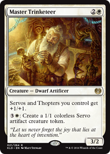 |
Ceremonious Rejection by Chris Rahn and Master Trinketeer by Matt Stewart
Both of these images tackle the usage of light and yet, we are shown fantasy in minimal elements, keeping us from distraction to the overall composition.
The focus of each piece, or the thing you ought to memorize for gameplay is the tinkerer himself, or the action of the hand by the vedalken. Both depictions are humanoids in the central frame, doing something relevant to their game mechanic. Only one though, is focused on the mechanic, not the being itself. Back in the day, we would see the focus shift most prominently on drakes getting hit by spells. They were everywhere to not confuse that the card is not a drake or dragon, but instead a spell.
 |  |
The light is what is most easily shown in Chris Rahn’s saturation of color in the foreground, with a lit pedestal. The background’s colors are muted, a tint or two softer and lighter as to trick your eye in seeing them as hazy and farther away.
Stewart does the same, except with a more uniform palette, you see the white of the man’s beard and shirt, in bright light coming from the top left, presumably a window. His location is a workshop of sorts, likely below the ground in a basement, as having a window that high wouldn’t make sense. He’s the shoe tailor, the small one-man business you knew in college that would fix broken purses, heels and zippers. Every college town has that guy and here he is, breathing life into another automation that just needs a little tinkering.
On light, notice the aether blue in both pieces. Whereas in Stewart’s, the aether is muted, hidden in the background. Upon searching for it, you notice the metal peacock fully, the large hammer on his belt when things go awry and the cramped nature of his space. Looking for that iridescent blue Ceremonious Rejection, and it’s front and center, even illuminated by the card frame, which feels intentional.
These are both masterfully painted, artists at the top of the trading card game industry, polishing their craft by looking at contemporaries. You don’t think Matt sees the application of wrinkles on the Vedalken’s face done with so little effort? You doubt Rahn sees the soft reflection of the master’s shirt, showing the dust in the air and reflecting the light off of it? This is how to keep artists hungry, giving them hard commissions, pushing for excellence and then having friends trying to outdo each other.
Stellar work all around.


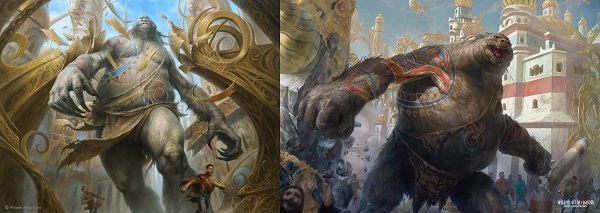
Giant Spectacle by Johann Bodin and Wayward Giant by Filip Burburan
Which one is the giant and which one is the aura?
Art descriptions don’t often have modular creations, that being, “this could be a creature or a spell.” It can create a ton of confusion for the artist. Instead, artists could be given the same art description, or one very close, and how they shake out will inevitably have one being more spell like. With these, I can’t really differentiate which one is that. They could interchange and I’d be fine either way.
Looking at them closer, with references directly out of the style guide for the skin painted in pigment, I do wonder if they were supposed to be intro deck cards. As one is a promo and the other is the in pack version, they would be the same scene. Bodin’s is digital and Burburan’s is traditionally painted, creating a moot point for medium. They’re both well versed painters, using light on a giant subject, showing fear in the subjects below, both to great effect. Both have giants going through public areas breaking things.
 |  |
We need to ask ourselves how closely the artists solved the same riddle. We should not be misled that they could very well be the same creature, painted twice. Unlike a spell, like above, to highlight a color with the frame, both of these depictions look and feel Red.
I would not be able to pick these apart so closely without putting them side to side. This is why Woelfflin advocated for it in analyzing art. It works.


Prior to the core set of Magic Origins, basic lands in core sets all kind of looked the same. You couldn’t really tell one from another because they were all Dominaria. Some are better than others, some have a greater sense of place than others. Expansion set basic lands
Not too often can we look at landscapes from a Magic set and immediately know what plane it is by sight alone. Sure, Lorwyn and Shadowmoor blocks had brighter, pastel even, colors but they don’t say the set. Mirrodin had metal everywhere but it wasn’t metal to differentiate from other sets, it was metallic because it simply was Mirrodin.
Below, we see the new normal of the paradigm shift. Zendikar basic lands look like Zendikar due to their odd physics and also the first great example of making a basic land all contained and visually identifiable at a moment's notice. These new basic lands show the characteristic swirl pattern of Kaladesh, showing the infusion of aether onto the plane, we can now know.
I welcome the addition and while that point could’ve been said in a paragraph, I needed a reason to show the full art here as both are beautiful.
Flowers in Johannes’s island, an archipelago or delta with flowers is a nice touch. He also made the aether in the sky light up the sky and reflect light off the water. This would make a perfect playmat.

Island by Johannes Voss
The plains has both a maze like quality, with a hillside that seems to frame the scene. The agricultural fields are shown below, with aether impacting the bushes. It looks like nothing else in the game.
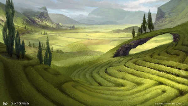
Plains by Clint Cearley
To summarize Kaladesh, you have to know three things:
- The set is India inspired, it is not India. It is a “bottom up” set, meaning the mechanics trump the setting. It is steampunk, India. It is not India, with steampunk occurring.
- The world building efforts were severely shortened, making deeper cultural connections, homages and research all limited.
- The artists, being guided by the best art directors in the trading card market delivered dozens of beautiful artworks.
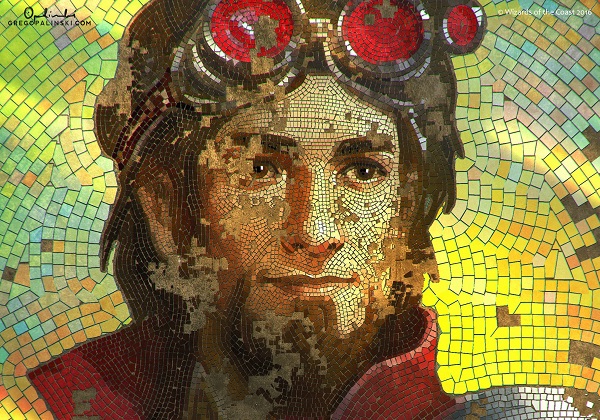
Crop of Lost Legacy by Greg Opalinksi
I have high hopes for a return trip to Kaladesh. It will be a delight to see artists and world builders have time to dig in deeper to Indian and Hindu culture. I have faith this is just the start of our look into the world. We haven’t even seen the art book yet and we have a revolution to undertake. It won’t be easy and the art will have allegories in bountiful amounts. I can’t wait.
-Mike
P.S. A note for the ruling government, when you remove revolutionaries in a public manner, it usually creates a larger rebellion.