


With over 6000 artworks printed in 2023, and over 3800 of them brand new artworks, this is becoming ever more difficult each year. Last year was the deepest pool ever, and this year dwarfs it.
With over 3800 unique illustrations, even with me taking ten seconds per image, this result in over nine hours of just observation at card size images. Actually seeking out thousands of large enough jpgs is not a feasible operation. This is the final year I write this. Next year will require a full committee due to the sheer scale.
To help clarify this point, the amount of new Magic art fills a museum.
We need to really understand that the ramp up of sets and illustrations has made Magic in a league of its own commissioning art. Only when we compare to the rate of the Catholic Church at its height, can viewers really understand the scale.
There are ways to lower the amount of art to look at, like omitting Doctor Who, and The Lord of the Rings, but those cross productional sets are integral to seeing how the brand expands and contracts to fit. Secret Lair does it seamlessly now. (Of which, I think the City Styles felt the best to me in the past year. It's fashion notebook art, made into a secret lair, that also ties into a cosplay zeitgeist of everyday character clothing options).
I wanted to find not things I liked - because I'm not Jay Anelli and I need to end the article - I wanted to find technically strong illustrations. By technical I mean anatomy is intentional and when rules are broken, they were for intentional reasons. Skithiryx shown below is an example of that. Instead, artworks that are hard to paint help understand an objective good, better, and best in terms of technical quality.
The old example of a prompt where two people are talking to each other, and one is seated on a horse, is hard. You need reference to paint a horse, a shockingly difficult animal, you need to understand light sources, shadow, and composition to make the simple task believable. I looked for pieces akin to this prompt - hard to paint, somehow they excelled at it, and it exists to tell you something. There is both narrative and story, it says both "I represent a game piece" and also, "I am showing you a narrative, come pick up the clues and pieces to understand what's going on." Additionally, fresh, new perspective, after tens of thousands of Magic cards have been created I always seek out.
With generative artificial intelligence being so commonplace, it has become hard to count some styles as unique, as they were the basis and de facto default for fantasy AI art. Difficult the task, when Greg Rutkowski went from unique, to commonplace.
I start at the shorthand - finding what exceptional artists had made in the year and see if there are any standouts upon first glance. From there, I expand to about 50 works, then enter in Scryfall and engage in each work.
RK Post's Worldgorger Dragon was already mentioned last year, previewed before 2022 was out, and came out in 2023. It's a goodie, check it out.
Without further preamble, let's check out some art!
I will make it easier this year than ever before.
The top artworks of the year is not even a list. Everyone else is fighting for second.
1. Storm the Seedcore by Jason Rainville
Storm the Seedcore by Jason Rainville
It has been explained, discussed, satirized, and even Cook and Becker with their licensed art prints already lists it alongside Jace, the Mind Sculptor and Black Lotus.
It brought a whole discussion for weeks on the pay rate of Magic card illustrations.
I personally love the drapery. Cloth never gets the love it should of being so fundamental to art history, yet often omitted for being extraneous and difficult. I love seeing it applied with a strong mastery of reference.
Storm the Seedcore is the best artwork of the year.
Moving on to more standout works of the year, we head to...
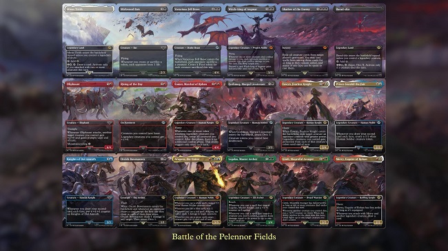
Lord of the Rings Polyptychs
All of the images that Magic art directors chose to make in 4-18 panel polyptychs are exceptional. Panorama tends to mean horizontally connected, yet these are in all directions, having many folds, from the direct translation. From Marta Nael and Martina Fackova making four-panel ones, to Colin Boyer and Kieran Yanner making six-panel ones, to Matt Stewart, Livia Prima, Campbell White and Dave Rapoza making their groups of nine, one stands alone.
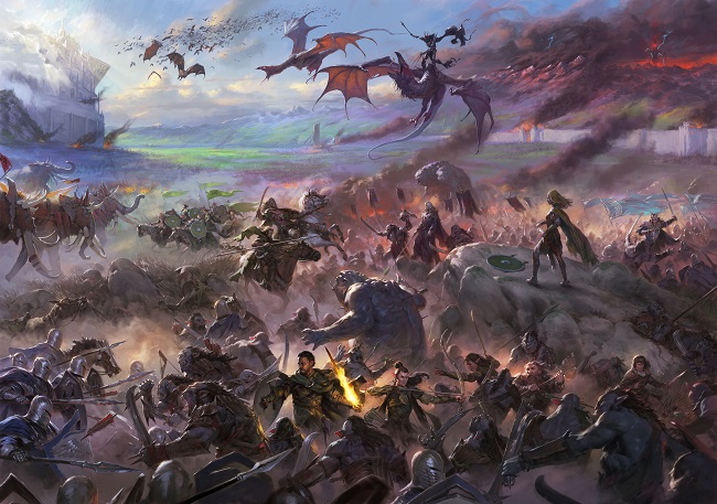
The Battle of Pelennor Fields by Tyler Jacobson
Digital
God, it's busy.
It's a battlefield.
It should be busy.
The eighteen cards took up most of Tyler's 2021 commission schedule.
We have had humble beginnings of Magic card art back in Alpha being on a connected page. Lands have been diptychs to full panoramas of four card artworks. This level was unheard of, unfathomable. Of course, digital paintings can be as large or as small as you'd like, but that wasn't the limitation.
When commissioning artworks, especially on a higher tier game like Magic, art directors can't simply pick the person they wish to work with them on a particular piece. Often, the artist is just busy with another project and you have to choose - can you wait for them, or will you have to look for someone else? While having some folks always pick up the call, these days, often a fellow Magic art director is working with them on a work! Having Tyler both be available, and interested in, and consuming much of his year is a seriously tall ask. He being a former inside the door employee on the creative team probably helped.
The work is massive, the technique to make it both legible for each card while still working as an overall image is unprecedented. Great work on it, it set the tone and vastness of the ambitious crossover set.
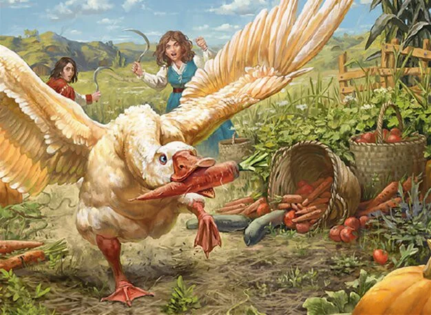
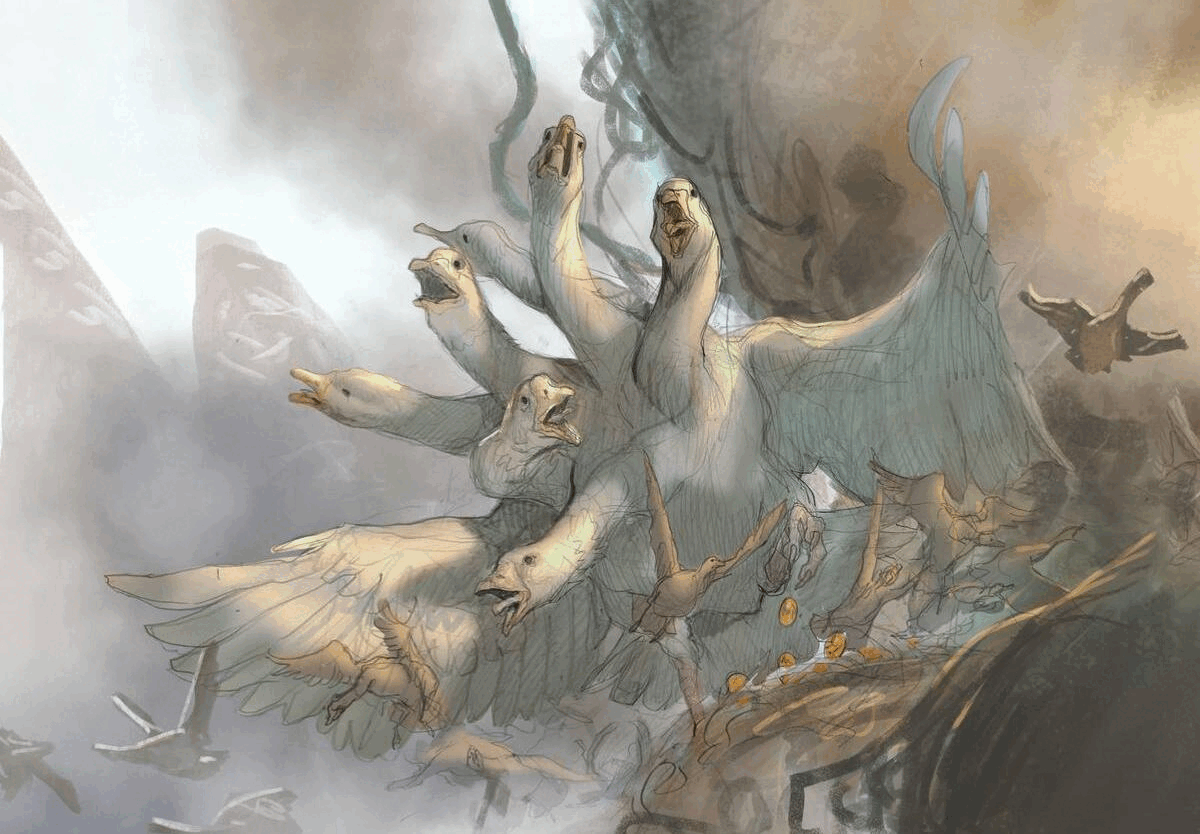
As long as we are on Lord of the Rings, this goose is the exact among hobbit whimsy I love seeing in the set. Wacky is nice for the un- sets but having the quiet amid the noise was one of former art director Jeremy Jarvis's signatures in each set. I'm happy to see the tactic still being employed.
The hobbits themselves are the slowing down of a narrative. They don't always need to be happy or sad, but it balances the enormity of the story, of our memories of the sweepingly large films, to some farmers dealing with a thieving goose.
It's also masterfully composed to be a full story in two inch by three inch art box. We can see the farmers have weapons drawn because they've been chasing the goose for a while already. The vegetable baskets are tipped over, showing that the goose has obtained a few food tokens and is hurrying to make more chaos happen. It could be the story of a game of Magic itself, a full cinematic in one image with a dopey goose.
Valera has a strong storytelling streak with Savvy Hunter and Penumbra Bobcat, among the many, being great to analyze. Will she get a future story spotlight artist because of this skill? Let us hope so.
The digital paint brush effect is applied masterfully here.
Keeping a palette midtone.
Making the big ol chunks of paint do the work for you.
His works stand out, especially as The Lord of the Rings had 100% digital artworks. I like being fooled and I like when friends are fooled. It brings a little insider knowledge, a little nod and wink for knowing the application.
His Barrow-Downs (Bojuka Bog) and The Shire are also quite good. I hope he gets a lot more land artworks like this in the future. If they could be full art promos for store events? Bring me to Evan Erwin Magical Christmasland faster please.
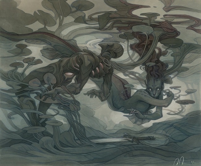
The first depiction of Emry had Livia Prima show us her from a human's perspective, on the shore.
Here, Wylie brings us underwater, and we're now in Wylie's world.
We don't just get the final product, here, Wylie shows us the mechanic happening in real time, in a card box 2" x 3", and it's clear to see.
Her command of a composition that reads both large and small is well done.
Doing so with a limited palette, is absurdly skilled.
There is no bright halo around the word she's to pick up, yet we can see it.
We know they're underwater with a minimal amount of cues, which is both reinforced by the limited use of color and the lily pad vines we see. Any time we get references to lotus flowers we players like that. She does it quietly, because the mechanic itself? You don't sacrifice that card to get an artifact back. But you sure do sacrifice a Solemn Simulacrum to get a Sword of X and Y back, and you do it in Cube any time you can! A perfect art description, with an artist who told the story with ease. It's one of the best this year.
What caught my eye of visually striking was the idea of the storybook alternate artworks in Wilds of Eldraine. Now, the curator in me is disappointed by how few original paintings there are in the set, but the art sure stands out. Amongst them, one that is exceptional is by Harry Conway. He would've been a dart throw off the target in years past, though today, he's not only a half step off from Magic's Tyler Jacobson-esque core, he's also a half step from Secret Lair.
The Eldraine bonus sheet style is based on Mary Blair and Disney concept artworks of the early 20th century. Those in turn are based on largely Germanic fairy tales told to children, sanitized for a more puritanical American audience. (And yes, I get the similarity to the Harry Potter Deathly Hallows mini animated story within the movie, which itself based on...you get the point.) Harry brings us back to the origins here. Yes, most kids in those stories who misbehave get baked into pies. And life was a bit bleak in a lot of stories because well, it was.
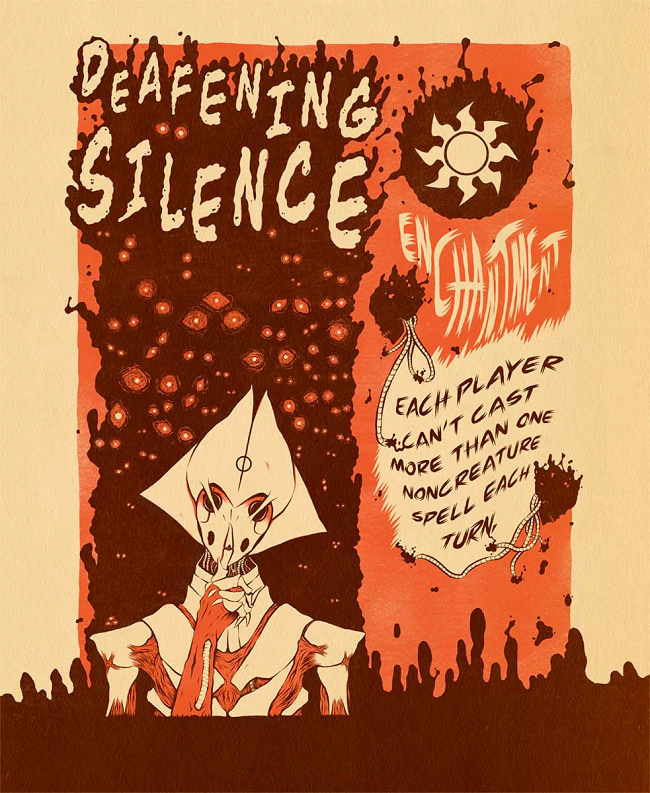
Deafening Silence by Rope Arrow (Tyler Day)
Just as I hand waved off a lot of the secret lair works, I saw this piece and stopped in my tracks.
This doesn't feel at all like something I have seen.
The separation of sides feels like an adventure card with the page turn, but it isn't.
It's aligned to a Saga card orientation, but it isn't overt in showing you.
It feels like many of the screenprint adjacent secret lairs, but the focus is tight, clear. It's an honest to god screenprint and it's not trying to be something else.
Screenprints have a layering necessity. Look at the phyrexian's eyes and imagine how could you apply paint there and have it not overlap? That's a masterful screen-printing technique.
This feels like how the Magic set for beginners, Portal, felt to open in the 1990s. It was clear, simple, and straightforward. It still adds some personal flavor too, using typefacing and a Phyrexian to get the point across. Making it orange and brown into a White Phyrexian-aligned card is a neat deviation from the norm when we saw White porcelain and Red for all of Elesh Norn's faction.
The concept was so strong, we have seen fan artists and alterists copy this 60/40% split. Exceptional work.

The Goose Mother by Jesper Ejsing
Jesper had a fantastic year. His Lord Skitter, Sewer King is a fellow standout on the year, with the goose mom trump(et)ing it.
Jesper worked on the concept art push and it was the one work he was insistent on getting. He spoke on it over at Muddy Colors.
It's already a mini figure, a character for the D&D settings using Magic as reference, and a fan favorite.
A lot of the best of the year I looked for were artworks that people immediately felt something. The goose hydra was the easiest using that criteria. It's fun, they're mean and scary, and it's painted excellently.

With Kekai (kay-kai) nearing in on 100 card art illustrations for Magic, normally folks find a lane and you expect their style.
And then he broke out a high contrast Sumi-e drawing style that is entirely on brand, with no reference to it in his portfolio.
He even added paper because they wanted more.
That chest piece alone, quite literally, a part of the work, is the best concept art to final Magic card art of the year. It is sheer thought to paper. The sharp blades are Phyrexia as mood, as emotive quality.
I love the high contrast deep black on white, for a Black Magic card, traditionally made.
When you bring up a Magic art show to a museum curator, you bring the Ryan Pancoasts, you bring the Rebeccay Guay, and you bring some ink. I'd bring this work and have a card next to it showing how illustration takes the media and uses it as an instantly recognizable game piece, using an ancient traditional style. It sets the stage for a meeting like that, not that I'm speaking from experience on that.
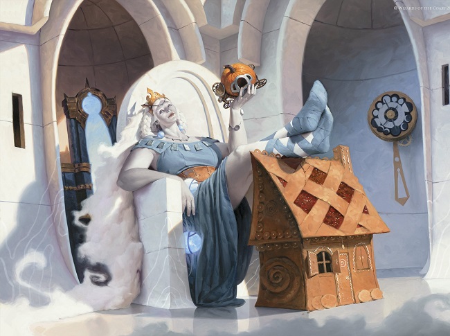
Victor has the spotlight.
He's burning white hot right now.
Everything he touches is both expertly painted and thoughtfully proposed. While I liked a lot of his work this past year, this has me staring at all the playfulness with size comparisons. This is the work in the museum that makes you pause. She's sitting on an ottoman chair, no wait it's a house, no it's a gingerbread house. It's a scale gingerbread house as she's holding a pumpkin chariot from Cinderella's story. This work draws you in.
I argued with myself, wondering if there were characters people celebrated in 2023 and this came to mind. Goldberry, River-Daughter was another, showcasing some thick thighs for once, busy from saving all these lives. I love to see it show up on a variety of characters and this giant will be seen for all time, for all adventure cards now and going forward.
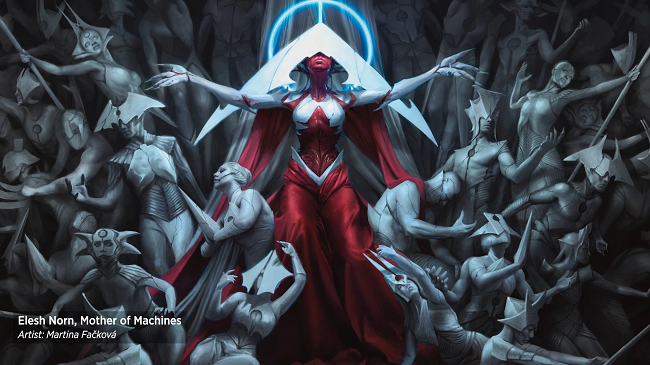
The Elesh Norn character is part couture and part unrealistic concept artwork that somehow made it into reality. As such, the art for her tends to be quite strong because it's fun. It's unusual. Five different artists created this character in one set. There are twelve different versions of cards from those five artworks.
Martina made the version that feels more grounded, the most real of the bunch, the most Magic in terms of brand. Variations and conceptual works are to inform the accepted final. This feels like the final. And while I loved fellow Elesh Norn depictions that were other cards and on marketing art, the white statues here touch on something more.
Since the invention of carving high relief statues from stone, this alludes to a greater art history homage. Frilled Cave Wurm by Aaron Miller had it as well this year being inspired by the Raft of the Medusa by Géricault.
Every time we see these strong ties to art historical items, like The Great Wave off Kanagawa for Rampant Growth, the stage is set for a great work.
This is equal parts throne and Parthenon sculpture. The infusion of red into the work follows the style guide of the set asking for the porcelain white to be aided by red, while also giving us a stronger focal character.
-VorthosMike