


Hello folks!
I hope your day is going well!
Today I have a special treat for you! Today I want to look at the various images smashed together by one of our fellow writers here at CSI.com. Next week is his 50th birthday, and as a special happy birthday gift for him, I wanted to create this review of some of his images that I really enjoy.
For those who may not know, as a part of Stephen's Commander column here at CSI, he uses a classic art image, and then layers into it a piece of Magic. I asked him how long it takes to make one, and he told me between 30 and 90 minutes based on the nature of the piece. These are banners that he has created for his works, and there are around 150 different ones.
For today's list of my favorites, I've reviewed every single one and spent at least a minute with it. I want to live with the details of a piece, and to see where Stephen Johnson went with it.
As a reminder, all of the rankings I'll be doing for you is from the eye of a fan, not a trained critic. I'm not trained, nor have I taken classes, in art theory, history or criticism.
Now, I do want to give you my own biases up front. I prefer a piece where the Magic art has been married well with the older ones, and often where you don't see it at first. But then there's that moment, and the piece changes forever for you. The problem with combining these seamlessly is that you are marrying different ways of creating a piece, using different media, trying to find pieces that match color palettes, and more. Imagine combining an old 15th century high profile oil piece from the Italian renaissance with a 2015 piece of Magic art. Or doing the same with an 18th century watercolor.
All credit to Johnson for merging these images well. In particular, my #1 choice Is just... amazingly well done and perfectly attuned two styles and could not have been done better.
With those biases stated, ready?
Let's go!
15. Washington Crossing the Delaware by Emanuel Leutze; Selvala, Explorer Returned by Tyler Jacobson
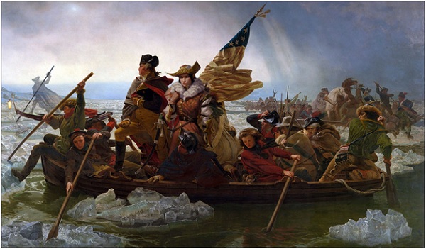
Let's begin with a painting and work that most of our readers in America will be familiar with - the Crossing of the Delaware. It has the colors and vibrancy and more and is a key part of the Myth of Washington.
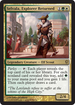
Of course, we have the addition of Selvala, Explorer Returned that adds a fun character on the boat. Her fleshed out clothes don't seem out of place. Her colors match, and the media doesn't seem to be mismatched.
But that's not all. Did you see it? Nope? There is another addition to this art that's uncredited. Go back and check.
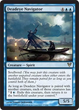
It's Deadeye Navigator. Adding that in on the back end uncredited is cool as a fun way to slide in something you may not be looking for, and thus won't notice. I enjoy the subtlety of this piece.
14. The Harem in a Kiosk by Jean-Leon Gerome; Pristine Skywise (Promo) by Adam Paquette

On the other hand, subtlety is the opposite of what this piece is going for. Here you have the guard at calm repose looking at you as well as the far-off scene. The colors and art are gorgeous, and then we have the big giant Dragon in the upper corner, providing a fun, fantasy feel to the scene.
Now let me show you what was done by Johnson. I wasn't familiar with Harem in a Kiosk, so I looked it up.

What I want to do is show off how Stephen can modify the initial piece to make it fit. He's not merely adding a Dragon in the corner and calling it a day. Or removing something to make it fit. Nope! He changes the colors of the original piece to have them mesh and flow with the Pristine Skywise image better. See how just the little change of the colors can really change the nature of a piece life this?
13. The Voyage of Life: Youth by Thomas Cole; Doomsday by Noah Bradley
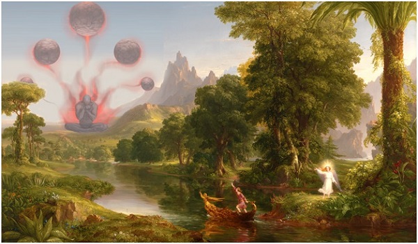
The Voyage of Life: Youth is gorgeous. It's dense with life and color and imagery. The lush trees, the dense water, and many more. It's clearly a symbolic piece, but one that I think suits the world building perfectly. For those reasons, it already feels like a fantastic piece, and this is suitable for splicing in some art.
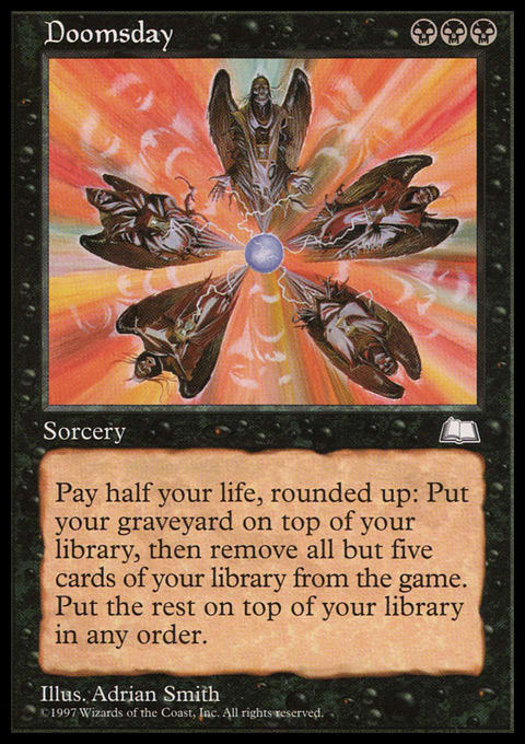
We're taking the M25 version of Doomsday's art and changing it significantly into the destination of the Voyage of Life. Death is the end of all of us. It actually darkens the mood of the piece. Initially, the characters are moving to a far-off White building that can barely be made out. It seems happy. Now?
12. Niagara by Frederic David Church; Flood of Tears by Adam Paquette
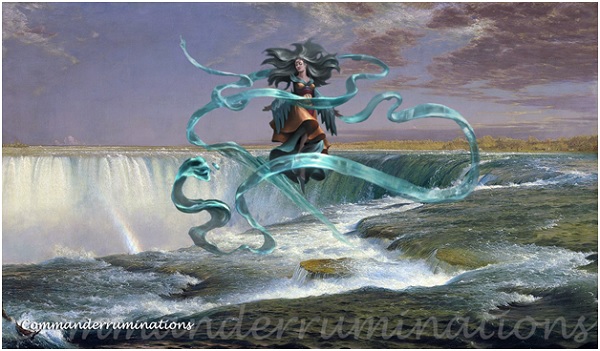
Frederic David Church's Niagara has long been considered the best of the Niagara interpretations by far.
This is what art historian David Huntington said of this work:
Church presented his fellow-men with the "soul" and "spirit" of Niagara, this "most suggestive" of nature's spectacles: this archetype of the universe. Niagara is the substance of a great American metaphor; indeed, for its original viewers, a certain something more than a metaphor.... Nature and its Bible, the Science of Design, would unfold the transcendent truth of the universe to the New Chosen People in the New World. Nature in the Era of Manifest Destiny was prophecy, and Church as the "interpreter" of Niagara was therefore painting as American prophet.
American prophet. Archetype of the universe. Great ways of considering Church. And as you can see, the water and colors are lush, and this was the best of the paintings of America's great falls. Now you have on top the Flood of Tears by Paquette, which seems almost Kamigawan in its flowing nature and magical shawl-banner. Stephen Johnson splices them together seemingly effortlessly, although I doubt it was anything but.
11. Death on the Pale Horse by Benjamin West; Animate Dead by Bastien L. Deharme

Given the dense scene and imagery, Benjamin West's painting has a powerful symbolic, and visceral feel to it. The area where Stephen Johnson added the Animate Dead art didn't have another image, and was mostly water, rocks, and such. Therefore, it was a useful space already built for the addition of something being added, in this case, your Animate Dead dark image. This also adds another metaphorical angle to the piece. Things die. But they may also rise again. I think Johnson chose Death on a Pale Horse well as a suitable marriage for an undead dork. Good job!
10. Fishermen at Sea by JMW Turner; Brainstorm by Chris Rahn

Hello lightning. Here we are adding in the spooky cloud and electric discharge from Brainstorm to the late night image.

Here's the original. Note that in the original art the ship's storm--tossed seas are higher in the painting, but by zooming in, Johnson changes the focus of the piece, and thus what's important to him in this iteration. This is a powerful storm-tossed piece that makes the water look as if it is dripping off the painting. By turning the waves into a lightning discharge and storm, Johnson adds a powerful sense of danger to the piece. Enjoy it!
9. Times of Day: The Morning by Caspar David Friedrich; Fblthp, The Lost by Jesper Ejsing

Dawwww. So cute! Fblthp is like the Waldo of Magic art and concepts. I think it would be pretty cool to have a bunch of Fblthp's added to all sorts of other famous art. Here you have him running away in the steaming morning fog-mists of the mountains, which happen a lot, by the by. I really enjoy a fog-cursed morning in the Appalachian Hills of Morgantown, West Virginia. It's so pretty! And the same is true here with the fog-drenched trees and such hinting at the gorgeous conifer forest underneath. Nature is so beautiful!
Now Stephen Johnson is changing the scale of this piece. Here, because the foreground of the piece has a large, creature we know is small, those trees look very close, and small.
But, here's the original:

Here, the perspective piece is a boat and a person on it who's tiny. See how far away and majestic the trees become with this one change? They now stand as silent uncaring sentinels. The entire mood of the piece shifts unconsciously. That's cool to see.
8. The Stages of Life by Caspar David Friedrich; Urza, Lord High Artificer by Grzegorz Rutkowski
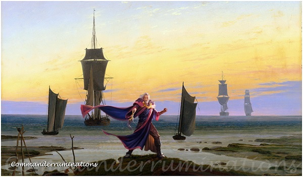
Here's a nice looking Urza! Who doesn't like a fun Urza leading a landing of ships for the world. With your Urza dead and center and framing the painting, you are placing this scene firmly into the world of the fantastic. But that's not a bad thing.
7. Landscape with Waterfall by Jacob Van Ruisdael; Golos, Tireless Pilgrim by Joseph Meehan

Golos goes everywhere. He's a pilgrim, and he'll never ever be any good. He's a pilgrim 'cause he never ever does what he should. just because he doesn't go what everybody else goes, that's no reason why I can't give him all my love. He's always good to me, always treats me tenderly.
And the Pilgrim moves across the lands. I enjoy the landscape of Van Ruisdael here, with the trees in the fore and background, the foaming water, and more. The details leap off the painting and beyond. Golos walks through it. He's there, and lots of other places too. So where next, oh Golos my pilgrim?
6. View of Haarlem with Bleaching Fields by Jacob Van Ruisdael; Pillage by Jesper Ejsing

I spent some time reviewing both the art of Pillage as well as View. My goal here was to see what may have been modified for this fusion piece. As someone who's number one strength in Strengths Quest is context, I really enjoy how things came to be. What were the parts used to put them together? In this case, the art shows that only the Pillage character was added, and some fires and distance in the back. That's it. I really like how the Pillage character was reversed and sent off to the side to frame the painting's focus on the newly burning building. We are also focused in on a different section of the painting.
5. Renaissance Interior by Bartholomeus van Bassen; Earl of Squirrel by Milivoj Ceran
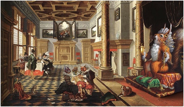
I don't need every piece to take itself seriously. It can just be a fun piece too! Our good Earl of Squirrel is a useful way to pay an homage to the setting in a way that'll make you smile. If you look, you may notice some squirrelage outside of the Earl proper.
I get a sense of that this piece is lampooning the puffery of this period of European history, with their silly poofy clothing and giant wigs and huge dresses and more, this was an era that was really full of itself. Nothing could demonstrate the over-stuffiness of the era more than an image of a squirrel dressed and taking itself seriously as an Earl.
Whether or not Stephen Johnson may have meant that lampooning by combining these two pieces is something I'd love to find out! (As a fan of much of the core ideas of la morted' auteur theory, I still would claim that even if it wasn't meant, it's very much there).
4. The Windmill at WijkBijDuurstede by Jacob Van Ruisdael; Seal Away by Joseph Meehan
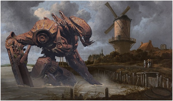
The coloration on Seal Away works perfectly as a bruised and broken rusted out construct on the beach. The colors are a strong wash and really blend to make this a powerful piece. I also like how the folks over on the shore are looking out at the Sealed Away monstrosity. The windmill and village frame the scene nicely and give it a solid sense of being grounded.
3. An Evening in Arcadia by Thomas Cole; Memorial to Unity by Cliff Childs
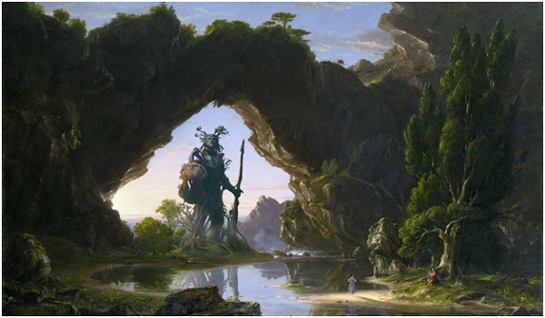
I really enjoy the arch and such here in the Evening art. It reminds me of the Natural Bridge in Virginia near Foamhenge. (Yes, Foamhenge is a real thing - https://www.atlasobscura.com/places/foamhengeyou are welcome) The little shock of color from the far away lady does a great job of accenting the size and majesty of the place. Know what else does? The giant statue in the background! Compare it to the tiny lady in the foreground and you can see how big it must be. The colors blend nicely. If I were to put this on my wall in my office, I don't think anyone would notice the mixed media or think anything was off. That's how nicely this piece was pulled off.
2. Orlando Furioso illustration by Gustav Dore; Jace, Cunning Castaway by Keiran Yanner

Hello Jace fans! I can't imagine how hard it was to take Jace and make him black and white and grained to fit him into this scene. That seems incredibly meticulous. And yet here it is, done quite well too. Buff Jace was also a smart choice, because you can see the characters clothing choice are not dissimilar to the other figure. This is also one of the few black and whites that we have in the series, and Stephen Johnson did a solid job with it.
Ready for my favorite?
1. The Triumph of Death by Pietr Bruegel the Elder; Lord of the Accursed by Grzegorz Rutkowski
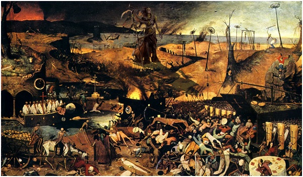
I am not super familiar with the Lord of the Accursed's art and had to look it up. I could not tell from this combined piece where the Triumph of Death ended, and the Lord began. It's the shadowy Death in the back. Given that the art perfectly represents the medieval view of that character, it suits this painting incredibly well. Now that I've seen it, it's perfect. How could this painting not have a giant figure of death in the back looking over everything silently? This is the one piece that is, to my mind, improved by adding magic art. Great job, Stephen!
And there we are! I hope that you enjoyed my trek into Stephen Johnson's 150 or so banners he made for his columns here at CSI! Have you seen his art or read his columns? What are your favorites?
Thanks for your time! I hope you enjoyed today's article, and please join me in wishing Stephen a happy 50th Birthday!