


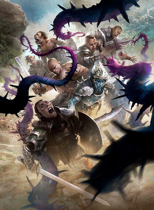
Our dreadful 2016 has finally ended and, as we do, we’re left looking for top ten album lists and acknowledgement that some good did, indeed, occur. I went to my art reviews of the various sets and remembered that I always have a gap in what I cover. I rarely, if ever, am able to include promotional artworks, as getting a higher resolution image in time is near impossible for me.
While I wish I had a good answer for saying what makes a good promotional artwork, often artists receive a promotional artwork as testing ground. The turnaround for art is measured in weeks and with a new artist joining the fray, you can never know how much feedback or coaching will be involved. Promo artworks give extra time, if need be, and if they are not up to snuff, often can be reused as slush art much easier than a needed limited common that is on a deadline.
With FNM promos being arguably marginal as of late, normally they were marquee cards to sell prints of. They were improvements on staple cards and they were unique. When they print them as marginal cards, artists suffer financially. Print sales are down across the entire niche and this surely doesn’t help. But how do they look?
I went into the bag of artworks I keep in a folder on my desktop trying to find some commonalities and after numerous requests and emails, I found some high resolution art. Enjoy the review!
Friday Night Magic (FNM) Promos
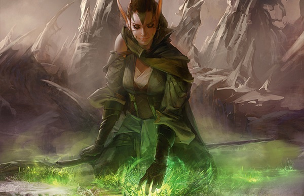
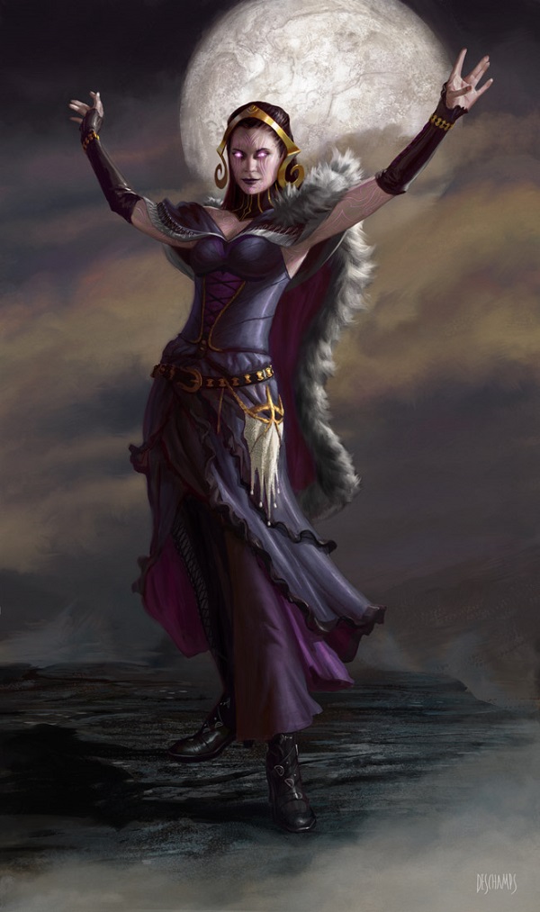
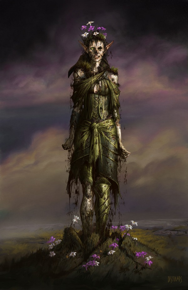
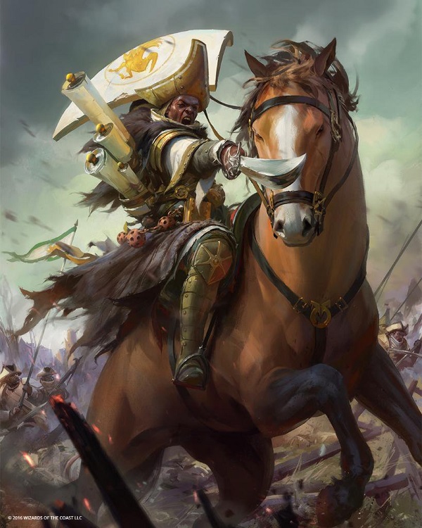
Nissa's Pilgrimage by Christine Choi
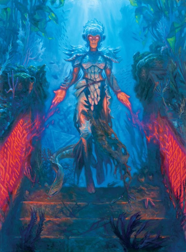
Digital brushstrokes can be as large or as seamless as you wish them to be. Christine here chooses large in the background, akin to a traditional brush, with tighter on the figure to show us focus. By having a top left light, splitting the piece in half diagonally, we are pushed to the right and driven down to her hand by color. It’s minor yet very effective. I enjoy the human face with just elongated ears too. It feels more approachable for cosplay.
Note Nissa’s costuming here in a later artwork mentioned.
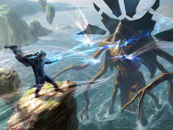
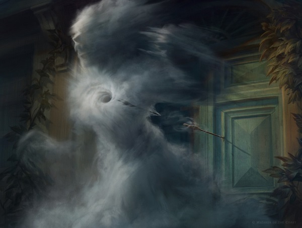
Clash of Wills by Anna Steinbauer
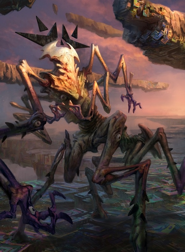
The original artwork to this card is Jace attacking his first mentor, Alhammarret the sphinx, and the promotional card is Jace attacking a lesser foe in an unnamed Kozilek eldrazi.
There’s plenty to digest here. So, you can scan, then stare. Let’s go:
- Anna chose to make the Eldrazi vs. Jace mental magic to be Blue vs. a colorless attack.
- The Eldrazi magic being clear, thus colorless, is a lovely touch that would only really read digitally.
- The matching “hood” of the Eldrazi to Jace is a nice touch to show comparable power.
- Having Jace stand on a floating rock helps to show scale without showing birds.
- The coastline gives the monster scale, as we can see how tall this Eldrazi truly is.
It’s incredibly well done and a good “remake” of a card with a similar character in a different scene.
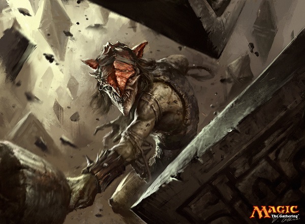
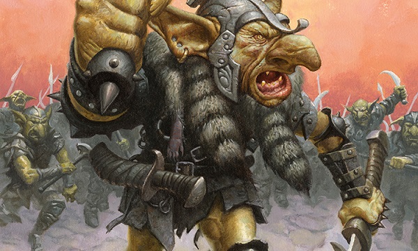
Smash to Smithereens by Darek Zabrocki
As Darek stated on his Art Station profile: “After whole work of working with Wizards they released one of my first MTG cards I made. Many more to come!”
You see, Darek was on site at Wizards, likely doing a concept art push. Wizards brings in people like Wayne Reynolds, Steve Belledin, Christine Choi or Darek here to take ideas and make them real for a style guide. The style guide is then sent to artists who fill out the card art for an upcoming set. As you work on a concept push though, invariably a few cards that are you end up being commissioned to you. Promos are also included here.
Removing the goblin and swapping it with any other character still makes a cool depiction. Darek made a tight scene, framed by known barriers of hedrons, with an arm projecting toward us, the viewer, engaging us in his destruction. My thoughts on digital blur effects are known. What isn’t known is that I love the goblin’s face. It’s a face, yet distorted like an episode of Face Off, forcing us to look and examine it closer. That’s a good thing.
This is a strong addition to a staple sideboard card’s options for players.
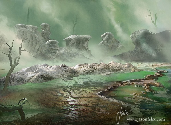
Blighted Fen by Jason Felix
As Jason stated, “Not too often I get assigned a land card, but admit that it was refreshing.”
Amen to that.
Changing the perspective from a top down, slightly fisheye perspective to a side-view makes it feel more of a human’s view. It’s Sam and Frodo’s Dead Marshes, except devoid of all life. The clouded sky to show shadows add some dynamism to the motionless land, as even the swamp gas emitting off can look static without lighting.
Goblin Warchief by Mark Zug
Is this art brand new or is it ten years old?
Does this matter?
I worked at a company that loved their slush art pile, reusing it countless times, remixing it to feel new. Wizards tries whenever possible to not have commissioned art fall into the slush pile of bought art that goes unused. It’s wasteful to the budget. When, “freelance art commissions” is one line in a profit and loss finance sheet, every dollar is scrutinized. By having a Mark Zug, who has been around for years and years, get a rather defaulted looking goblin see print, one can immediately wonder.
The blank background not showing a plane?
Armor and clothing not showing a plane?
Goblin faces that don’t appear to be aligned to a plane?
You should wonder if it’s an old piece.
And also should wonder if an art director is playing with us on purpose, wanting an iconic card to be more open-ended in its placement. Ponder on that. You know they do.
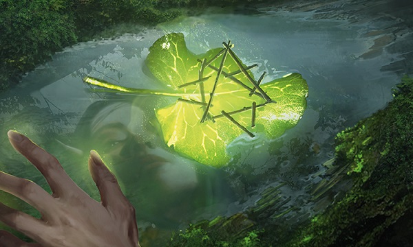
Sylvan Scrying by Christine Choi
This is fun. You really don’t see the elf’s face in the water unless you see a higher resolution image. I saw the longer nails and assumed elf, also due to the original iteration, but couldn’t tell if male or female as elves don’t really care for human’s perspectives on much of anything. (Her eyebrows are feminine, if you’re looking for something definitive.)
I first though the leaf and sticks were the scrying but once I see the larger art, it’s more Lecanomancy to me. Normally that means scrying with a dish of water, though here, it’s small enclosed pond. I’d like to think the leaf isn’t actually there, but rather the sticks and leaf have appeared before the elf, giving her some type of knowledge on a new mana line, thereby giving more access to mana once found or activated. That open-ended concept works great on a promo, while tying to Dominaria because, “Sylvan” is mentioned and where that is on the plane isn’t mentioned. It’s not important.
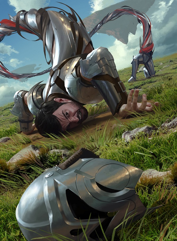
Spatial Contortion by Joseph Meehan
The original depiction was an elf, on Zendikar, being mutated, eldrazified into a horrific version. This depiction goes the opposite route, taking the name to the logical conclusion. We are not to ask how this is happening or why. It is still Zendikar, but the torturous punishment is unclear. It’s whimsical horror, harkening to German fairy tales of nonchalantly being boiled in a giant pot, or twisted like a ribbon in a nonviolent fashion.
How polarizing was this card when this came out? I’ll shift to that gear as it must be mentioned. The figure’s hand looks so real compared to his face that it looks like a paintover. Whether the hand or face is painted over a photograph is irrelevant, what matters is that the average player noticed. Paint overs happen all the time. Most times you just don’t see it. When you’re short on time and you need an ear painted, you can take a photo and paint over it, deleting the photo layer when you’re done. It happens with limbs and small animals constantly in hyperreal mobile games. A last minute expansion or addition is the cause most of the time there. “Oh crap, we need a male rogue, not female.” Someone dresses up in a pose and it’s painted over quickly digitally and the day is saved.
In Magic, artists are generally at a much higher quality and don’t need to resort to tricks that cover up an inadequacy in figure or anatomy painting. The issue is a non-one, as using reference is good painting technique. Last minute changes are inevitable, as is fixing an aspect of a painting you want to look right, whether it’s loose strokes or finely created. It’s fine.
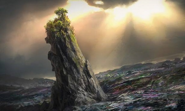
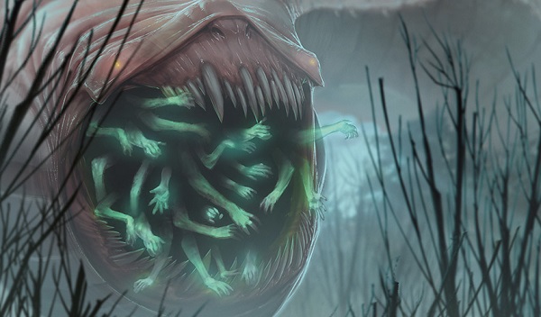
Crumbling Vestige by Jonas De Ro
I still don’t understand this concept on sight.
It’s a wasted land card, the “wastes” which add a colorless bit of mana in game, and visually there is a spot of color to represent mana of any color.
Vestige already can mean disappearing, so it’s a trace of mana that is disappearing and crumbling, yet the colorless mana still exists. The name and art description work if you don’t think about it.
I like the Tower of Pisa lean with the strong cloud cover. It’s a good composition of an oasis atop a butte, but I can’t help but wonder that both art descriptions could’ve chosen different sketches to convey the idea better. Instead of being iconic, it looks like just another mana tower in Magic.
Unlike the original depiction, Svetlin gives us a full story on the story of Zendikar. The merfolk’s armor tells us we’re on Zendikar, with the various races showing us the coalition that Gideon led against the Eldrazi, elegantly only shown through their tendrils, in the purple and blues, means Emrakul. Ulamog had no green and Kozilek had no blue. Visual information gives us layers! As the seven creatures are all going to die, the -2/-2 spell to all works in the image and the full art gives us the grittiness in stark detail. It’s above average and getting to the next level would require a little more placement like a floating island, and polish with the blood spattering. Motion blur is also a thing that exists here too, so I see. It’s good and very close to great.
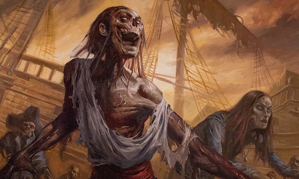
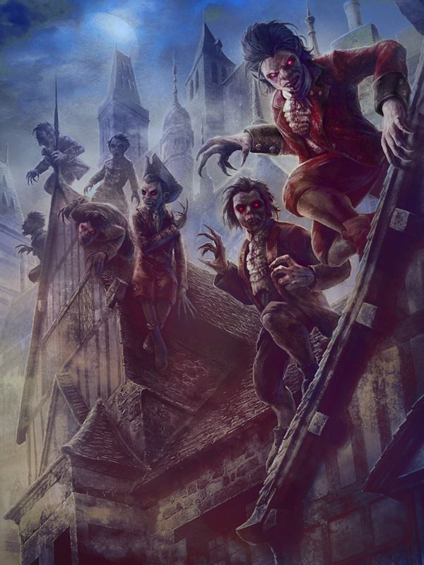
That woman on the right looks rough. Having a more recent zombie is a good addition. It’s a treat after seeing the main zombie, stealing the scene and urging you to look closer like at dead Captain Crunch in the far left or crashed ship, as shown by the tattered sail.
Lucas shows us a bit of his skill with blending colors by just evoking a note with singular brushstrokes, spending more time examining light in the dead center of the work and how the browns are affected, penetrating the dark right cloud to a fully clouded zombie elbow. Changing the zombies to raiders or pirates and it’d still be a dynamic scene due to the moody sky. It still works for the set no matter the content within and that's commendable.
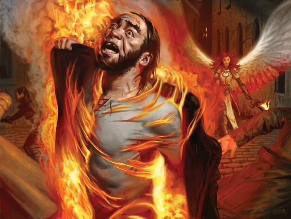
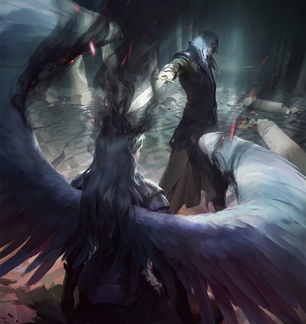
Here’s another example of a good execution but forced into an art description and sketch that is only good, instead of great. The whole story of Innistrad was the corruption of Avacyn’s whole flight of angels. We see hundreds of depictions of torment and a spell’s impact on someone not noteworthy. What made Innistrad’s story progress was to see the madness in the angels and then, why they were driven made by the Eldrazi. Here, we have no hints, no warning that an unseen terror is causing this. It’s just a man on fire, presumably by the angry angel in the background.
Focusing on the angel is not a better solution as that makes a spell look like a creature, but there could be a little more face-time of a nameless (or named?) angel into a spell that was supposed to be marquee during this time. “Terror falls from the skies on blood-spattered wings.” was a tagline and while we can see the wings, there is no other story here. It’s just one raid amongst many. Why not a Kessig raid on remote prayer spot, showing no one escaped the wrath of the renegade angels? Why not showcase somewhere that isn’t a church or a city square? A planet and setting is much more than just locations where legendary creatures and high powered cards are located and I feel this could’ve helped that narrative instead of just repeating what we already knew.
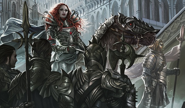
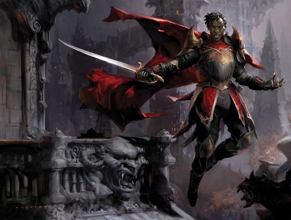
Call the Bloodline by Magali Villeneuve
Yes, that is MJ Scott.
Yes, the light source is behind her and the highlights on the back of the armor of the two foreground figures defies logic.
Sure, the figure on the right does appear like they are wearing a mask.
Did Magali work on Olivia Voldaren exclusively, adding other characters after the fact because it looks like a layer added. This is a spell, not a creature, making a foreground creature confusing for gameplay, despite her looking fantastic.
I enjoy the architectural elements in the background. Perhaps more of them, with Olivia a more minor role, with a squad around or behind her could’ve been a more successful sketch but in the end, no one will look at anything on this artwork other than Olivia’s face and armor. Being a strong artist gives you flexibility and freedom to focus your efforts on what’s important. Staying a strong artist means you’re nervous of nineteen year olds who do both.
Launch Day Promos
Prereleases had just the normal cards with stamps on them, creating effectively a new card, but no new art, as a reminder.
Endbringer by Adam Paquette
Adam painted some cheery bismuth to go along with the many appendaged horror we see before us. It’s almost like a floating Super Mario level after the Eldrazi get their hands and corrupting forces on it. I actually like that idea better than just full depletion like the first set of Ulamog’s presence created.
The hard edges of his limbs give us a comic book styling, made to pop on the page yet give boundaries to the light source. It’s weird, alien, yet it has mass, weight and through his zig-zagged limbs, we see it can move and quite a distance too.
I can’t unsee the phallus as the torso and head though. I can’t ignore it.
Angel of Deliverance by Chris Rahn
What a weird spear. Did she scratch the symbol on the shield herself? She sat cross-legged and just etched it out? With that unwieldy of a weapon? If not her, did she have a squire? A helper?
I can’t unsee actual remnants of fire on the cloth beneath her feet, something we don’t normally get to see. Of course cloth, especially cotton, is impervious to fire on all angels. Why would realism come into play? Whether Chris pushed it or an art director suggested it, the coals, the sparks on that add some needed story to the piece, as other questions could bog down understanding. It’s supposed to be as simple as “fiery angel go,” though in 2016, every image is looked at with scrutiny, examined for any detail which might allude to other things.
The oversized feathers are a nice touch too. I didn’t see them at card size.
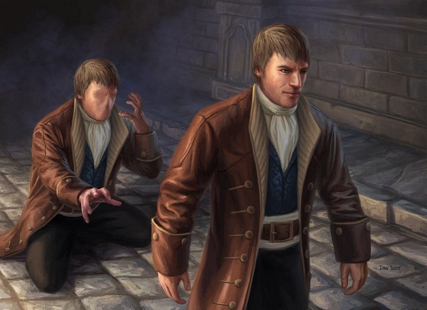
Identity Thief by Dan Scott
When I first started writing, I would get Dan Scott and Steve Belledin confused all the time. Perhaps it’s their treatment of browns and hair and this piece brought me back those six years.
It’s a fun artwork showing really two studies of form: one dynamic, fluid and the other awkward, stiff and otherworldly. Dan painted in that the new identitied human should be awkward because he’s taking on a new persona. It’s not poorly painted, no. It’s intended to look weird. Dan knows how to paint shoulders, but put them away from the body too far, like a human would do, and it looks so wrong, so stiff. Like Men in Black and the bug, things don’t move right because they aren’t. It’s so very minor but really impacts the storytelling. Great work Dan!
The movement and forms in this artworks are the precedent and one of the first images we saw of the entire Kaladesh plane. We were able to see artifice, organic metal, a symmetrical scene and harmony. It’s as if Esper was given rules, math to bend the wildness of etherium. It’s a more beautiful Esper and who better to introduce than the new planeswalker Saheeli Rai.
Despite the variety of aspects, of noise, of color, it still has order. From the purples to the blues, Kaladesh has a color palette and this is an example of how to place a random image — by looking at the color alone.
Gift Box promo
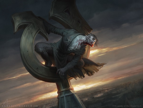
Ravenous Bloodseeker by Anna Steinbauer
Anna received a ton of promotional card art commissions in 2016. This vampire changes the berserker hanging from a cryptolith to another symbol of the new Innistrad, a distorted Avacyn symbol, a corrupted one. It shows the eldrazification affected both flesh and also belief.
I felt this promo was a bird from seeing the fraying of the coat and every time I see the card, I see a bird vampire and can’t unsee it. A 2x3” box is brutal for identification. It also makes utter delight every time a high resolution image is shown. Look at the city below, showing how massive Thraben or a similar city is, complete with a bridge!
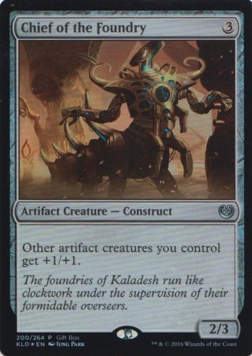
Chief of the Foundry by Jung Park
I don’t have much to say about Jung Park’s rendition of Chief of the Foundry simply due to being unable to find even a jpg online. I do see Aetherworks Marvel in the background, otherwise the construct itself is near identical to the original artifact creature.
Buy a Box Promos
Goblin Dark-Dwellers by Karl Kopinski
What a scene. The blind goblins are lifting up a remnant of a spell, mechanically usable and shown with rope. That’s fun. That isn’t how spells or magic work, by reclaiming a tangible thing, but it’s a spell, it’s not real anyway. There is no right or wrong way to do so, only precedent which can be changed.
I do love complementary colors of blue and orange. Look at that for new and see them pop. I’ll return to them in a minute here.
Elusive Tormentor/Insidious Mist by Anna Steinbauer
The before/after is a perfect upgrade to the original depiction of the vampire to mist trope. I really enjoy the elegant armor as clothing. It reads as enamel or velvet, something elegant yet also exudes her power in both facial pose and hand clasping.
While traditional painting must recreate the same scene meticulously, or choose the same scene at a different time of day like Ryan Pancoast did, digital has a better ability to show a transformation scene in an instant. Adding Anna’s high skill for realism with a playful illusion creates a really improved promotional card against the original.
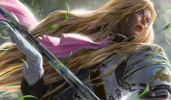
Thalia, Heretic Cathar by Johannes Voss
We sure have seen every angle of Thalia now. From a tight portrait on her face, to her silhouetted form, to both new depictions, including the one here in an idealized form. The hair that both Magali and Johannes depicted is idealized, sure, and it shows a change to her perception. She was a warrior before and now, more of a symbol, an icon, a representation of the push of good over evil. Her hair really gives it away.
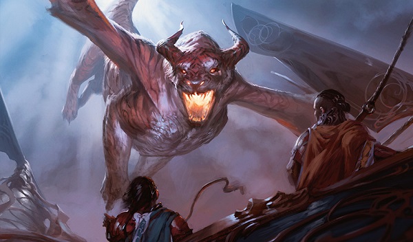
Skyship Stalker by Tyler Jacobson
Not until the new dragon came out, Freejam Regent, did we see that the giant tiger cat/dragon situation would be more than one creature. I figured it was just the Rahn and Jacobson stalker and that was it. I don’t know how I feel about them now.
It’s a fun scene, showing us two figures in some type of flying copter being intercepted by a dragon where hope is utterly lost. Fire is imminent and all the figures can do is freeze in shock and terror, waiting for the inevitable. How hopeless, how serene in their final moments.
Intro Pack Alternate Art Promos
I see three high level art direction decisions here:
- Off center character art
- A balcony sculpture in stone
- A traditionally white character isn’t white
At sketch stage, these aspects all show up. The inclusions can be seen, with the hair and nose show that yes, this is a black vampire. It takes some confidence for those choices to not only be seen but encouraged by the company to widen the range of what is possible to what is celebrated for the future. Cynthia also works really hard to keep her skills fresh, working traditionally to changing sizes of personal works to maintain her eye both as an artist and an art direction. Everything works here.
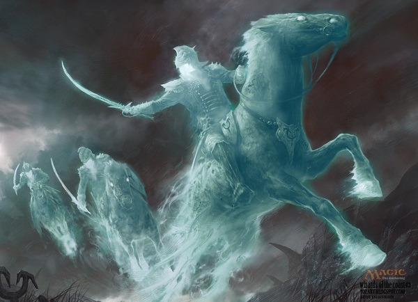
Drogskol Cavalry by Johann Bodin
This is a really interesting depiction of spirits.
I worked on the Dark Ascension set and there was an entire section on spirits in the style guide. The Planeswalker Guide to Innistrad explained on it briefly. Notable is that each color differed in the type of spirit, obviously, from ancestry to attack spells and so on. Concept altering with the Drogskol Cavalry here is that Bodin didn’t quite follow the color depiction of spirits. Look below to see the White spirits being gold/yellowish in color, with some exceptions. Normally the translucent blue or turquoise was associated with the Blue aligned geists or spirits, though no longer uniform.
The details glow well enough for us to see the Avacynian symbols on the horse’s saddle and breast collar. Akin to a duchy or barony of Prussia or Germany, they would have leatherwork or metalwork showing devotional or allegiance on their mounts. It works well here.
Nephalia Moondrakes by Chris Rahn
Drakes in Magic do not have front legs. Normally called a wyvern in Magic, recently the printing of Thunderclap Wyvern reinforces the idea of drake equals it. Personally, I don’t care for the dragon/drake/wurm/wyrm/wyvern situation. They’re all dragons of sorts, with differentiating them only being a mechanic difference for gameplay. Rahn had to make sure the focal dragon had only the correct number of arms, and also smartly obscured in the other silhouettes.
This Innistrad moon is a bit too forced, as it clearly was written into the art description. It’s just so big that we don’t get to see a mountain roost, a peak where they descended from. Rahn gives us placement, how high they’re flying with clouded cover, and that’s all the space he’s really allowed. Art descriptions — what needs to be included gives an artwork place, but it also can limit creativity but omitting something perhaps more interesting. It’s a balance and how illustration had borders, limits, and sketches aren’t as free.
The wings being translucent from reflected light of the moon sure is nice.
As Howard wrote about Isobel and this work, “The brilliant creature has gone on a rampage, taking vengeance on the world for the sorrows caused by evil and corruption.” It was one of the big reveals of an artist deviating from the norm and creating characters and concepts without direction, not unlike the Commander elf by Jesper Ejsing that Sam talked about.
Showing youth in women is really a skill and Howard does it with ease.
Soul Swallower by Izzy
I had some help finding this image and I’m happy I did. What could’ve be seen is now clear. Izzy remvoed the chains on the hands of the souls in the original and instead quieted the scene in the marsh. He showed nostrils, which are horrifying, like lips to a wurm. It adds to the concept creature creation and ups the creepy factor.
Grand Prix Promo
I did a whole interview with Johannes on his take on Stoneforge Mystic back in December of last year, Stoneforge Mystic: An Art Interview. I included a gif to final in that article. Open a new tab on your browser and check it out after you read my article today.
As for revisiting it on a personal level, I struggle with keeping Kor unique in my mind other than the weird catfish barbels on the male chins. I like the wrapping/binding for clothing, as exhibited from some concept art I have below here from Wayne Reynolds.
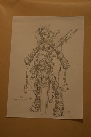 | 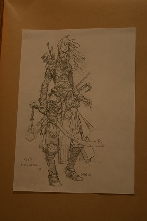 |
I like the new interpretation by Johannes for the character. The blade or weapon, as it were, doesn’t look iconic because it’s so flat and two-dimensional. Alluding to a tournament playable equipment though, has its own complication and fourth-wall breaking fan service. I’m not sure what the solution is to when you have a staple card that does a thing in game be shown exactly as is in the current time, or deviate entirely, keeping the depiction on plane. I tend to like Easter Eggs, maybe with more time and more background could Johannes have added something on his own, like Howard Lyon tends to do. Perhaps that is asking too much from a freelancer. I’m not sure.
San Diego Comic Con Promos 2016
The San Diego Comic Con promos were black on black promos for the last three years, only to change this past summer with zombified Planeswalkers, save for Liliana. The idea is that Liliana, with her zombie army, saved the day on Innistrad because the Eldrazi could not affect zombies and due to overwhelming numbers of zombies and the inability to “kill” them, won the day with the Gatewatch.
It’s an interesting idea to go from “none more black,” though it’s 2016. The Walking Dead series is in what, season 7? 8? Zombies as pop culture phenomenal hasn’t jumped the shark, but it’s a little late for fan service on these promos.
Wizards printed a ton more of these than the previous year, steadily increasing each year, as the subsequent releases on the Hasbro store can attest. They are cool, no question there, but what could they be? They tried to touch on the storyline, though only loosely.
With them released *after* the entire Innistrad storyline, they’re a playful nod and wink to Liliana after the set’s conclusion. They were even after the art book. It’s not like SDCC changes radically each year; it’s in the summer. With that kind of turnaround and smaller print run, why not make it South Park commentary levels of high relevance? Could Planeswalkers be helping a hospital, mirroring Hasbro’s initiative? Could they speak about social justice in an unprecedented political year? Could they be collages, showing the age of the Planeswalkers, connecting to the aging player base, and the journey of collecting Magic?
These are massive decisions and ultimately, they’re just too safe. They’re readable now, as late night cubing at Las Vegas taught me, but at what cost? Their novelty is to connect to a niche of players. Is that worth it? Sure, it’s good at the cost of being safe.
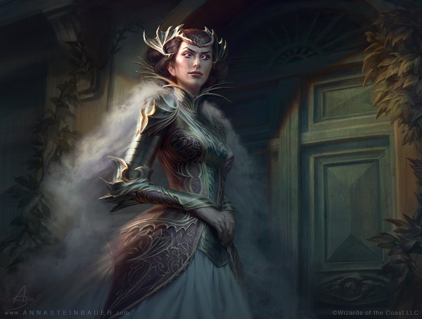
Liliana sure looks less sexualized than previous iterations, huh?
Compared to Liliana of the Veil, with shoulders pushed back to accentuate her chest, this seems considerably quieter both in dress depiction, but also in stance. It’s not inviting, we are not gazing, ogling her, but rather, given a light source on the chain veil and her triumphant pose. She stands in post spell resolution, with the dust moving around her to her will, in front of Innistrad’s moon, holding no swag over her influence and power.
Even her hips and legs don’t exhibit her like Liliana of the Dark Realms. She’s dressed as a Planeswalker, not a concept that doesn’t have weight or feel real. That challenge is much easier said than done, considering the problematic history of Liliana depictions show as precedent.
Eric did a great job on her.
[video width="608" height="940" mp4="http://www.gatheringmagic.com/wp-content/uploads/2017/01/ML_34.mp4"][/video]
Cute, he’s wearing a hand like Jaime Lannister of Game of Thrones, tied around his neck with his own sural weapon. He is killed by his own power.
Let’s not focus on anything other than the raven though. It matters here. Surely the connection to Liliana and the Raven Man, whoever he may be is the easy choice, as the unwanted mentor in her life but is that it?
As Gideon is from Theros originally, is it a Greek mythological symbol? If so, it’s a symbol of prophecy, of good luck for the future. Ravens are not mere carrion feeders or solely bearer of bad things to come. They are a symbol. England has a legend that England would fall if the ravens ever left the Tower of London, despite doing so, which is merely coincidental to the fall of England’s massive world empire. It’s a fascinating read if you want to hear more on Wikipedia about them, but in all likelihood, it’s shorthand for the Raven Man and an inkling of his power.
More depictions of full frontal Jace are a boon to cosplayers. Seeing it dirty is even better. I know artist Dani Hartel has full videos of her dirtying up a cosplay to make it more realistic.
And yes, he’s eating his own brain, using his “mental magic” power against himself. It’s cute.
The burnt skin is nice though I like seeing her components on her dress show damage and wear from too much fire and pressure. Seeing too much of the same high branded depictions don’t really show you how things work on outfits and why they wear them. Having cards show Planeswalker gear is insightful. Showing gear destroyed gives us another angle of depiction. Seeing superheroes die or Superman cut or wounded is a similar move. It makes you really look at the character, not just the idea of them.
Showing a character, keeping them intact, despite losing characteristics can be tough though with a few choices, Chandra still reads as her. In this case, choices were to make for her to still read as visually female:
- Check out the burning away at her waist, to show her belt to shoulder ratio.
- The goggles and bald head, especially with the slightly looking upward definitely read as a woman vs. a male as the baldness point is secondary to “all her hair burnt off.”
- The right leg (her left leg) is totally burned down to the bone, though the silhouete still reads as some flesh is left intact. By minimizing the calf muscle, it reads more female.
She’s a plant. Her power killed her, by burying her alive buried her alive? Maybe? Like a plant? The plant or land becomes a creature, so her? I’m confused but the stiff pose reads as plant, and Nissa is plant. The flowers are a nice touch.
The revisitation of the original iteration of the boob window is interesting. An art director probably missed it. It was a change/covering up forever ago.
Holiday Promo
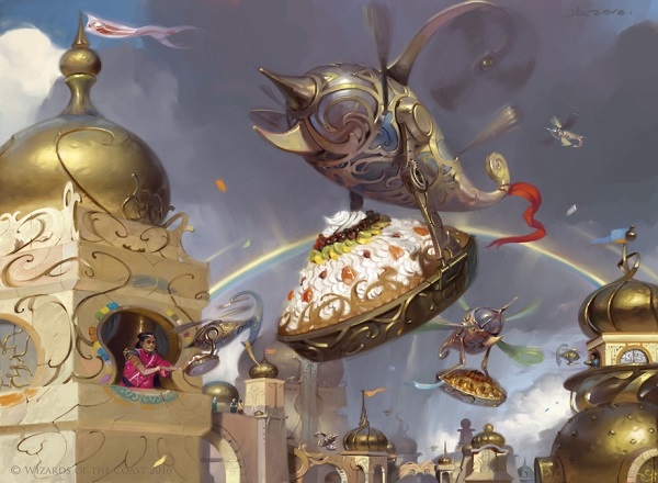
Thopter Pie Network by Victor Adame Minguez
Take a close look at how Victor is using light digital brushstrokes to evoke the sensation of movement without relying on a photoshop blur filter. He took a traditional painting skill and just applied it to the propellers. It looks effortless and clean.
Knowing that Victor’s mother owns a bakery business brings this piece from good to utterly charming.
Game Day Promos
Immolating Glare by Ryan Alexander Lee
The fire as figure with the spellcaster totally in shadow is strongly executed. It isn’t quite fire, as it’s a White spell, so showing “smite” or brilliant, focused sunlight doesn’t have a ton of reference. I like Ryan’s take on the previous iteration, allowing the spell’s effect to be the focus, despite having a figure in the dead center of the piece.
Were this any other plane and were I writing a year end review, this would be an utter gem. Instead, I see this artwork in context. The Eldrazi as otherworldly threat, alien like even, outstayed their welcome in my mind and became tired. Instead of an Eldritch, Lovecraftian horror, they were everywhere, omnipresent and became boring. Instead of Ryan being able to show an utterly surprising spell, destroying a threat multiple times larger than the spellcaster, it’s just another spell to stop one of the millions of Eldrazi. It’s less special. It’s minimized. The art has no impact on that perception either.
We will revisit this image in a few years and see Ryn’s soft back legs, burning out of existence and exceptional usage of holy light off floating rock. This artwork is a triumph, in a setting that makes it ordinary.
Jori En, Ruin Diver by Matt Stewart
Oddly enough, $3100 felt pretty cheap as the public auction as price realized. At 20" x 27”, it is a massive painting, likely because Stewart was told it’s important. It’s one of the Tiny Leaders created three-commander-costed legendary creatures since it was made in 2013, and the timing fits being a promo that they thought was going to be significant.
The art itself is limited in palette, using oranges highlighted with red fire akin to lava in shallow water, narrowing our field of focus, simplifying the scene. I enjoy seeing geometric shapes in artworks, like the triangle here. Sides of the triangle as hedrons overtaken by coral changes the concept of magic being encased within these hedrons. It’s a small change, and not really notable but interesting nonetheless.
Incorrigible Youths by Jason Engle
I’d like to these these youths speak a very accented British, yet are somehow in Germany. They’re hooligans visiting Innistrad and FC Bayern Munich beat their squad by eight goals. Looks like these youths will riot.
Deconstructing this image, I see lovely fachwerk homes, showing age and wear as would be appropriate for a medieval city. Even the putzglas is correct.
The oversized hands add some fun horror to the youths. Making the children oversized helps readability too. The foreshortened house makes it look like some of the youths are massive, though as you look closer, and the three in the background, placement will snap into focus. It was shocking to me at first, reading as incorrect too. Look longer and you’ll see what Jason accomplished.
Anguished Unmaking by Victor Titov
This, is a high concept level of promotional art.
“Show an iconic scene from a different angle,” isn’t a new concept in art. Painters have been asked to show the fall of Rome to religious art from every possible vantage point, from being in the scene, to observing from afar, to a perspective from every figure possible. We just don’t often see it in illustration. Imagine looking over Uncle Sam’s shoulder, seeing who is pointing at, or a Las Meninas view where no one was in the vantage point. I like this. Fan service and reinvention of a scene can be incredibly beautiful, as you can assume aspects of the painting the viewers already know. The bar for what needs to be explained is low, allowing the artwork to breathe, showing more technical skill and process over storytelling. It’s freeing.
I just love the floor.
Unsubstantiate by Svetlin Velinov
I like the digital feeling of watercolor waves of magic in this. The rest he was just trying to do his best to get it passed.
Do you see what he did there?
The sworded horseman surrounded by soldiers with fancy hats? It’s a 18th century allusion to organized war, battles of elegance, mustaches and light brigades. If you want to learn a bit more about war depictions, I wrote a whole article on it in Vorthos Art History: The Art of War.
The scrolls are an odd touch that I don’t quite understand, though I bet in the style guide, there’s a full explanation that these knights were postal service workers or messengers of some variety. It seems too obvious to be unintentional.
Interesting foreshortening on the sword. It’s almost like the art direction saw an intention and urged Victor to go for it. It works. The original doesn’t have as daring a scene, but it’s also at night, showing a deeper mood in the depiction.
This is an image of a “in action” or “as it happens or occurs” scene, compared to a before or after scene, which is mighty hard to convey in spells. Often, you’ll see instants be in this stage.
I like the heavy usage of multiple light sources in this image. Complementary colors of orange and blue have been used for centuries in showing light, most notably with Monet’s Sunrise. Orange suns with soft light with water or hazy blue light look wonderful, as you can see here in Tomasz’s work above.
There’s a couple nitpicky things about this piece, though I more have issue that this card is a Game Day promotional card over how the extended art box was created.
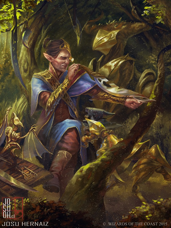
Cultivator of Blades by Josu Hernaiz
Where is this elf?
He has a table, with hanging swords and a ton of items, despite being outside? We have artworks like Acrobatic Maneuver, Skyswirl Harrier and Wildest Dreams, though Kaladesh is largely city based. I see the highly playable cards and iconic images deal with the fair, the city, and not the countryside. Seeing a promo giving us some more insight into the other characters is a delightful addition. We saw a ton of that on the first visit to Innistrad, showing us the Kessig wilderness and hamlets.
I just don’t know what he’s doing. Is he a collector? A woodland blade dealer? Is he buying a blade from a person off camera? He has constructs with him, even a bird construct and he’s examining a blade in the woods? It’s a lovely image, I just look at it and don’t quite understand the scene. I sure do like the digital speckling, like a traditional painting would have though.
Judge Promos 2016
Of the judge foils in 2016, only three have new artworks and one of them was rather difficult to find on the Internet due to being a Chinese artist.
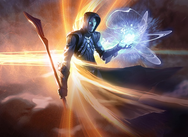
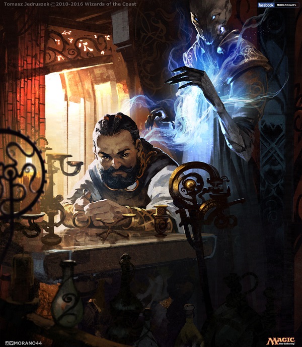
Mana Drain by Mike Bierek
Sure, the art isn’t new but the card is. You’ll notice I don’t review MTGO artworks generally because they aren’t card art.
I understand what this artwork is trying to convey. A left to right orange blast is hitting the back of a Blue mage and the resulting ineffectiveness of the spell splinters away from the figure, and thus (?) creates a blue, magical energy harnessed by his hand. At card size, he has no legs, the staff isn’t needed and looks like the end of a Nimbus 2000 Quidditch broom.
This was the art that was released slightly early and then somehow made its way into those three-pack booster repack things at Target and Walmart. It’s such a shame they snuck in, this is not a marginal piece of art slipped into the mix, no. This is a beautiful painting that a buddy of mine picked up for far cheaper than it should’ve been (sorry Noni) but when leaks occur, that’s how it happens. This art was made a while ago and like all unused (slush) artworks, you never quite know if they will print it. I have one large scale one myself, never knowing if it will be printed.
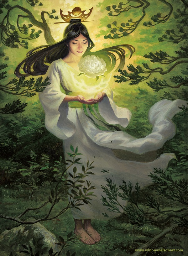
I love limited palettes of colors. With white, green and yellow as the only colors a Green deck fits perfectly with the visual look along with the emotive connotations it brings of plant growth. Life is even emoted through the bent branches, showing us growth and life to align to the mechanic perfectly. The flowy hair adds to the organic nature that the original doesn’t quite have as all aspects aligning to one mechanic - growth of mana and in this case, forests, or plants.
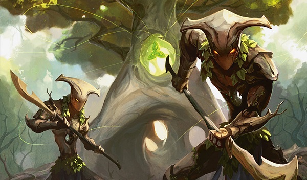
Defense of the Heart by Jack Wang (Jack Wang Lei)
Higher resolution art! This is the first time it’s gotten out.
Notice the hole in the two plant warriors, echoing the tree. At card size, they could be helmets of elves. Larger, you can see the twigs off their forearms and exaggerated waistlines to minimal effect.
Also snapping into being clear is the triforce in the tree. It’s the heart and surely it’s just as powerful.
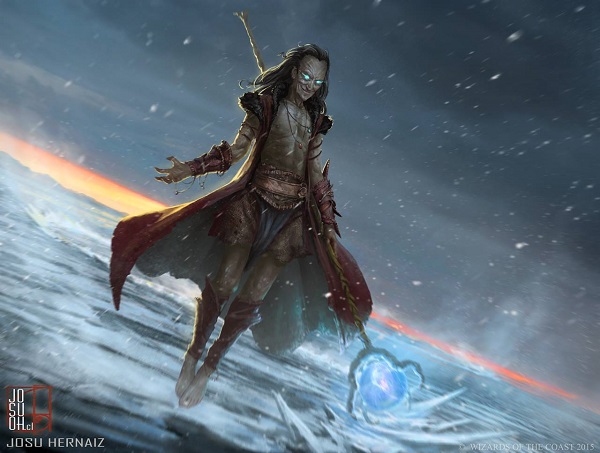
Zur the Enchanter by Josu Hernaiz
The more weathered skin moves the crazy ol’ wizard trope into more closely aligned to a Dungeons and Dragon soon to be lich, which I find Zur to more align toward. The composition shows more of the snow of Coldsnap, emphasizing that Zur has no shirt on and looks unaffected by the chill. He’s also wearing shorts? A short skirt? He’s here to party; it is known.
It’s a lovely new interpretation.
A big thanks to the artists for posting higher resolution art, the art directors for constantly pushing even the most established to polish more and to the fans, for asking for ever better art.
While 2017’s art is starting with Progenitus, I think we’ll be getting some really stellar additions with an Egyptian set. The promotional art possibilities are endless.
— Mike