


This article is a continuation of a discussion on Twitter, an often repeated thought and spurred to action from Magic artist Titus Lunter blogging about looking at art.
"All modern Magic art looks alike."
— April King (@CubeApril) September 1, 2017
Stasis, by Seb McKinnon. ??? pic.twitter.com/hszHNERs94
I wish Phil and Kaja Foglio were still doing Magic art. Magic could do with less photorealism and more 2D imagery. https://t.co/5Rms1jPfbI
— dai_vernon (@dai_vernon) March 10, 2016
Fork in the Road, art by Jung Park pic.twitter.com/H3ZZp4okSs
— Magic: The Gathering (@wizards_magic) June 16, 2016
Am I the only one who misses getting new Magic cards with art by Phil or Kaja Foglio?
— Don Wiggins (@TheSundry) October 19, 2009
The real reason I stopped playing Magic: The Gathering? They stopped with the Quinton Hoover art. Well, and the Phil Foglio art. And the...
— jeffg! (@geedeck) August 30, 2010
Some artist's styles stand out (Seb McKinnon, RK Post) but most just melt into the homogeneousness & make me care less overall re: the art
— Frappiato Maxiato (@bestfortheGOB) April 21, 2017
someone on my feed said that digital art is more unappreciated than traditional but idk about all that but that's due to who I hang out with
— Hoot Hoot (@Owlandish_) November 19, 2015
While taste is subjective, sometimes perception is not reality.
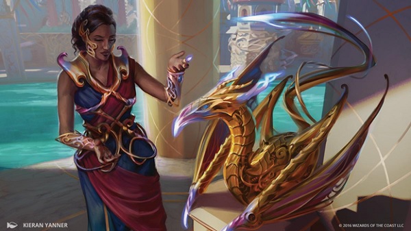
Saheeli's Artistry by Kieran Yanner
Digital
Not all opinions are valued the same, though all opinions are valid. This article attempts to deconstruct why so many Magic players feel so similarly about the visual aesthetic of this trading card game, specifically as an art medium.
Before we dive into the why we feel this way, I have to make a few assumptions, also to define you, the reader.
Assumption 1:
You understand that digital paintings are still paintings and those artists require the same skill and understanding of line, color, composition. There is no photoshop button to finish a background or compose a sketch.
Assumption 2:
You are aware that the art in Magic from 1995 and 2017 looks radically different due to a variety of reasons. There are many changes from then to now.
Assumption 3:
This article is written to be accessible. I have my own lens and biases. Though I am writing it for you, the goal is to reach many viewers with unique perspectives. I have a degree in art history, worked at an art museum, was art director commissioning trading card art and have been writing about Magic art for years. I often struggle with choosing the right voice for the right audience, so consider the author, when reading.
Assumption 4:
Magic has no bad art anymore. Magic used to have some sub-par artworks because gaming art and fantasy/sci-fi illustration in the 1990s allowed marginal art to be acceptable. Evocative emotion trumped realism or alignment and there was nothing comparable to look toward. What other medium or creation had three-hundred unique images? A tarot deck? Nothing compared to how much handheld art was created then. That has changed. Magic's art is good, with some pieces being great.
With those covered...
Why is talking about art so hard?
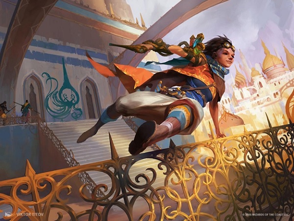
Spontaneous Artist by Viktor Titov
Digital
What makes someone like some art and dislike another?
Why is distilling your gut, your feeling all align to a common statement so often: "All the art looks the same."
Art jargon is hard. Being in the know, to be able to articulate with exacting terms the difference between contemporary and modern art, is a status symbol. As if knowing that changes your appreciation of art, or that club is at all prestigious or has value. It's untrue, but slowing down while looking at art is really the first step that separates an "expert" vs. a feeling. You'll notice from past art reviews, I make a conscious effort to use approachable, conversational language, like how I actually speak in public. It's intentional. It wreaked havoc on my graduate school papers, but it also made art accessible. Degrees aren't needed to see that larger brushstrokes in the background are made to be seen second to the tight, detailed brushstrokes of a legendary creature's face, so you look at that first. Simply slowing down at a larger jpg of piece of art, or giving yourself 30 seconds illuminates, most things missed at the 2"x3" art box on the card.
Art is created to be perceived through our senses and its intention in Magic is to be a visual shorthand for a card, while also having use as advertising to attract people into the game. Artworks you enjoy are what often make your first decks. You probably remember your elf deck or your dragon deck. Sleeves and deck boxes can reflect this years later. Compare this to music, which is intended to be heard. While Magic Man Sam,and Ant Tessitore believe the flavor text to be the drums, the name of the card the bass and the art the guitar solo. What you seek out will be satisfying to you visually, much like a genre of music attracts you with sound.
How this breaks down is that, continuing with the music comparison, if I want to listen to music, I will seek out the branch of art that is created in order to be savored aurally - music. Similarly, if I want to relish imagery, I will search for art which was intended to be visually satisfying. Traditional visual art uses line, color, form, movement, composition, and so on; just as traditional music uses melody, harmony, rhythm, choruses, and polyphony. If I want to listen to music, I'm not going to go sit across from Marina Abramovi? and gaze into her eyes. If I want to relish visual imagery, I'm not going to go read a text by Jenny Holzer, as I could have virtually the same VISUAL experience, only better, by walking around Times Square. But if I want to see another kind of art that isn't visual art or music, I might go to a performance or installation. This, to most of us, seems perfectly obvious. Where it gets confusing is music and conceptual art are properly seen as unique art forms, as different as apples and oranges, but visual art and conceptual art are somehow lumped together as bananas.
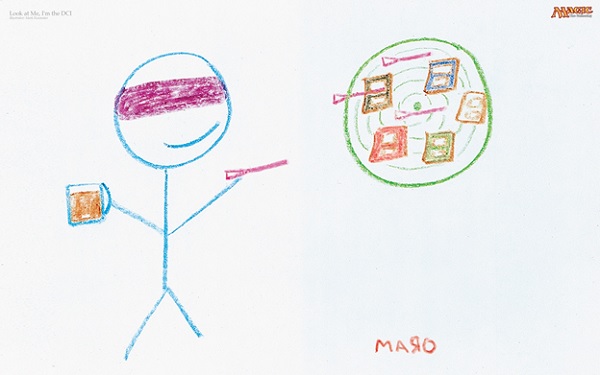
Look at Me, I'm the DCI by Mark Rosewater
Crayon on paper
Core Sets and Dominaria
The reason art from the 1990s all looked so different was because Dominaria had no distinctive look. With only one plane, one world, there was no world building. Even now, with only seeing the card art, I could not tell you what part of Dominaria it takes place. It was everything and nothing. The difference between Odyssey and Invasion, Onslaught and Prophecy, was minimal. They were all the same visually. Minor variations like Torment with a few more Black cards was a big change then. Core sets complicated this because one set, unrelated to any block, would have those everything and nothing depictions.
On the other hand, Core sets made expansions more special. The art felt more diverse because the Core set was largely the same. You were starved for something new and it popped more when it came up. 8th Edition, with the advent of the modern frame, was in 2003. Compare the same cards made up since 1993, a full decade, to the metallic world of Mirrodin. Of course the art will look radically different. One is entirely familiar, expected, and the other is entirely new. The difference now? Core sets no longer exist and when they did, the art changed considerably more often.
While artists changed, the locations never mattered. We were bystanders in someone else's story - the Weatherlight. That never made sense, as we were planeswalkers, mages ourselves. This was not entirely intentional, just the work of a story that barreled through time. The art was random because the world was the same. Despite Rath and different areas of Dominaria visited, the artist roster and style didn't radically change to show the change in location.
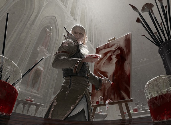
Blood Artist by Johannes Voss
Digital
Style Guides and Jeremy Jarvis
A few years after Mirrodin, Time Spiral block was really the last set of the old guard. It was also the last expansion block on Dominaria. The old art rules and conventions, all culminated to in-game references.
As Time Spiral and Lorwyn gave us physical representations of ourselves as players in the story with planeswalkers, sets too also became cohesive. The block right after Time Spiral? Lorwyn. You can pick up a Lorwyn or Shadowmoor card and most enfranchised players can guess the correct block. Picking out a combat trick or being able to name a life gain instant from Odyssey is what makes the Magiccards.info random art game so incredibly difficult.
While style guides have existed since Urza's Block, and Ravnica and Mirrodin had them, in Lorwyn was when the shift changed. When Omar Rayyan, a living master at Donato Giancola's level, was brought onto the concept art team, our world changed.
Hostility by Omar Rayyan
Watercolor
You see, Omar works in watercolors. He pushes paint too, making a natural shadow from depth of paint. He was radically different than other artists and pushed the world to look like a storybook. With Omar's concepts, Jeremy Jarvis's art direction, and the story team's writing; thus began the modern era of style guides. Allowing artists to emulate a look and feel of a plane diminished an artist's personal style, which is what most players think when they think of Phil Foglio, but what the style guides actually accomplished was enhancing the setting cards were in.
As an artist breaking into Magic, you will get a style guide. The power of that guide to shape an artist's style is immense. You don't want to be one-and-done for the game.
The fandom is large, and using Magic as a stepping stone to larger and greater paying jobs is very much a reality for many. Being comfortable in deviating from the guide is a risk. That confidence comes with time, like Izzy pushing diverse characters like Kess being an older, "chubby" mage. Being comfortable that you won't be fired allows for variety, like Striped Riverwinder by Craig Spearing having thicker outer lines like Quinton Hoover or an older comic book. That phenomenon is real and is a constant for Magic artists. If you have noticed artists citing who their art director was when posting artworks, note that they weren't asked to do that. When one does it though, it appears that it is needed and people align to it. The power of the brand does it on its own.
You don't see all the art anymore
I will lift an entire section out of my Aether Revolt art review to reiterate this point:
Now, nearly every deck you use is mythic rares, rares and only has the occasional common. As most Planeswalkers are digital these days, same with high tier mythics that aren't masterpieces, what players "perceive" to how a set looks is defined by what they use in their constructed decks, not by what a new player and surely not a life gaining instant, would look like. Sets actually look like commons and uncommons and the more enfranchised you become, the farther you are away from that experience. The preview season emphasizes this as well, with a glut of commons and uncommons coming out on the last day, despite some of them filling out the world with depth!
I've written about how my first deck was mono Green, filled with Durkwood Boars, Scaled Wurms and the overpowered Killer Bees.
When we see a new card from a new set, the big, important, constructed cards are previewed. Additionally, no art is shown alongside it. My art reviews, unfortunately, are often the first time larger art jpgs are shown. It is not a norm to see art with a new card, making the variation harder to see at 2"x3" upon first viewing, then moving on to another card. You see it once, compared to dozens of times Core set after Core set.
Limited cards, combat tricks and art by the likes of John Stanko on Innistrad tend to all come out when the full card set is revealed on the Magic: the Gathering mothership. Steve Prescott's 2/2 creatures, who works traditionally also fit in here. Even opening a pack outside a draft or sealed game, notice your behavior the next time you do so:
With filtering through preview season for deck brewers, another swath of players look for an internet deck that has had some success. Those decks then embody the changes to the Standard, Modern and eternal formats by their strongest or most synergistic cards. Seb McKinnon's or Alexander Deruchenko's art may not be seen at all, unless their cards are in good decks.
And that is ok.
High level players have to change the way they "see" the card. The cognitive shortcutting is one of the keys to winning. Art is one cue to rapidly intake the card and only knowing the cards you need to know matters. The regular play pattern doesn't reward goofy risks or using odd cards. It has a linear goal.
And I don't say this to put you on the defensive, but to state a fact. Really think about it. If I asked a player what cards they like that Chris Rahn depicted, most people will say the planeswalkers he's done or the Sword of x and y cycle. Those are great answers, but most won't even remember some of his other great work like Akoum Firebird and that was a mythic. But it wasn't played in any format.
I personally learned from Vintage Artist Constructed to find answers to threats in real time. I didn't know what to expect and studying cards and card art was something new. I had not experienced that elsewhere.
Some digital artists do cut corners
Of course, there are some digital artists who speed up the creative process by using digital effects instead of fully painting out an aspect. When everything can be done or undone, happy little mistakes to evoke a part of a painting is harder to accept. You can paint and repaint fire until it is exactly correct. Artists who don't have a strong grasp of an unfamiliar concept may use effects to compensate for a fundamental that they might not have experienced in painting from life.
Though, the amount of instances of this is much rarer than people believe. How people use larger brushstrokes to show the edge of a painting is the same with traditional and digital painting in execution; it just looks faster in digital because of the uniformity of a stylus brush. When looking at digital it may not "feel" the same, though how it's done doesn't differ significantly from how traditional does it.
Confirmation Bias
We are programmed to seek out art that we already like, and to ignore art that differs, art that we don't like. Everyone has these, they are confirmation biases.
Compositions from left to right seem logical to an American, but to a culture that reads from right to left, it will look awkward and wrong. Seeing a piece outside of our expectation will look jarring to us, yet is hard to explain why.
Likewise, people who believe everything is digital will look for James Ryman, Aleksi Briclot or Greg Opalinksi in a new set, as their styles are similar to what they believe as reality. The tight line digital artworks where you can zoom in hundreds of times and the lines are still clear, like those of Steve Argyle, are a style. It's not the only option, but the artists who thrived in New Phyrexia are still around. They don't change out all artists each set. It's just too hard to train in a new crop, or have enough high quality artists in daytime vs. nighttime worlds, in storybook vs. metallic worlds. That continuity of artists is similar to the Core sets, though they are not the same cards, which is why our perception is not expected.
For every art that some say looks the same digitally, you can find another that doesn't fit that mold. From Raymond Swanland's sharp edges and movement to John Stanko's more traditional style to Vincent Proce's use of darkness and scale, the variation is there if you dig deep enough. You just have to be open to seing it.
Wrapping up
To summarize, having a preference is fine. But why we appear to see everything as the same has reasons. The difference between a Core set and expansion, style guides, how we build decks, and how card are revealed all impact the amount of art we see.
Whether you make a painting in watercolor, use a stylus, make a collage, or paint over photographs you took doesn't matter. What matters is what the artist does with the medium they've chosen. If you don't like New Phyrexia's shiny digital work, that's fine. Not all of us have to enjoy that. To assume all sets are identical is untrue; to say all new sets appear to be on the same plane is correct. That nuance matters a lot to digital and traditional artists.
Art should be consumed like a meal. Instead of arguing what is best, we should be comparing art in a set to see what are triumphs, like a course in a long 300 card set or 300 course meal. In order to do that, we need to drop what we prefer, and engage art directly. Looking at art through the lens of style and execution, instead of a preferred artist or whether it is on a format playable card.
What can we do about it? One thing that will help us see more art is when previews are given, a larger jpg is also given. The Art of Magic books are a step in the right direction but the audience there is limited. Larger art images being readily available will allow, at first sight, to experience art as it was made. That will illuminate more than any training, or time, devoted to a piece. It is my only solution to change perception, as reality will finally be visible.
-Mike
Your intelligent comments are welcomed. And there may already be some interesting ones, furthering the discussion.


