


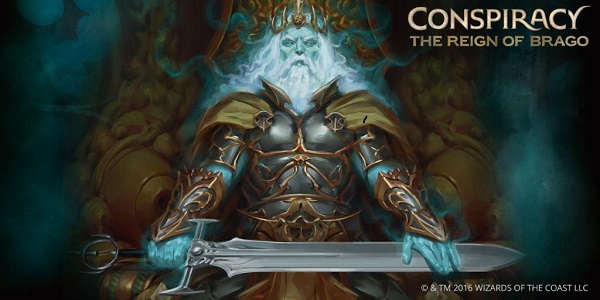
Ok, did everyone else forget that this set had three set names?
Up until writing this behemoth, I entirely forgot that Brago was used to promote this set.
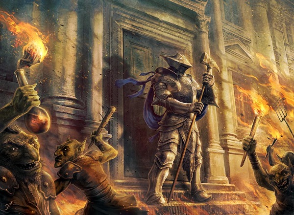
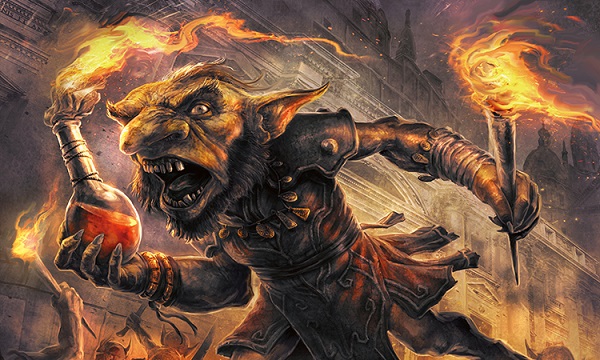
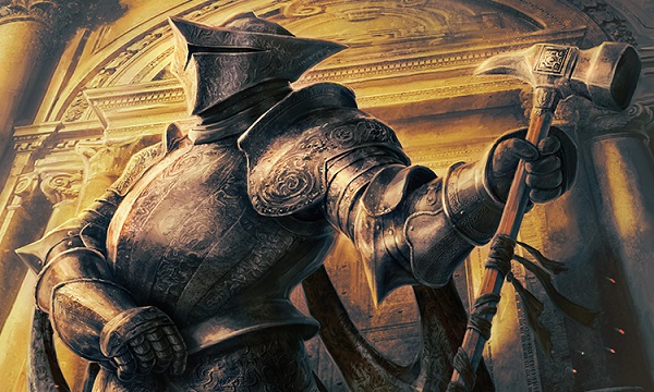
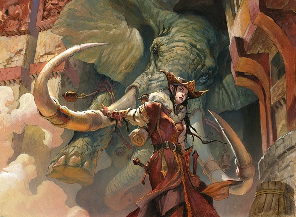
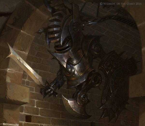
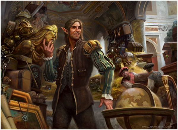
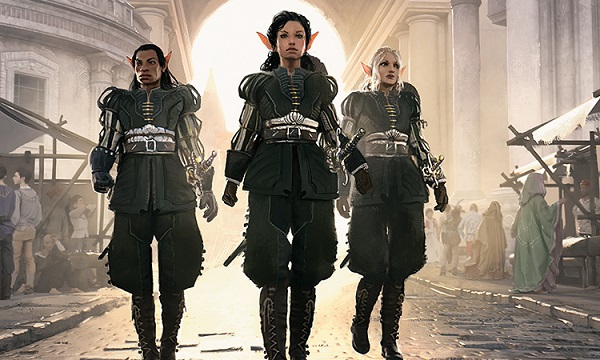
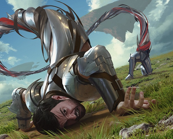
This is a recurring theme in Conspiracy in that a new monarch has come to power and the paint is still wet. Obviously that theme is the ability to become the monarch yourself. Kieran Yanner provided the art for all three preview images shown below:
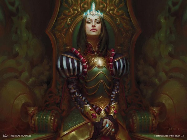
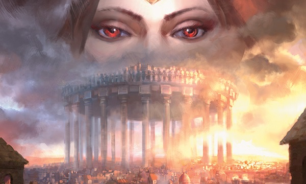
Queen Marchesa by Kieran Yanner
As for Marchesa herself, the monarch of the set I noticed a few things:
Yes, she’s wearing armor.
Yes, she’s young and ambitious.
Sure, she looks like Phoebe Tonkin.
I just like that Kieran painted her crown and rings glowing. They also omitted making a traditional Italian Renaissance portrait by showing an idealized background where the seated person is located.
It’s a nice piece.
And yes, does look like Tonkin.

Image via fullhdpictures.com/
How much realism do you want in your fantasy?
The question that the former creative director, Brady Dommermuth, asked me in jest from the past and it’s the main thing he left with me as I was getting my bearings in writing on Magic art and flavor back in 2011. As I joined a gaming company, and then in writing this review, I cannot shake the thought that the thermometer of what is acceptable changes every two years or so. We have a black Planeswalker and it actually feels late, not innovative. Contemporary culture moves incredibly fast and this set is the penultimate set to diving into the question of how close to Portal Three Kingdoms should a set be. Kaladesh answers that question and I’ll get to that in a few short weeks here.
Keep that question in mind as you see every artwork here — is this realism or fantasy?
The womens set?
In the previous Conspiracy, the main characters, the focus of the marketing was Dack Fayden, the marquee planeswalker, and Brago as a new commander. Sure, Selvala, Explorer Returned and Marchesa, the Black Rose exist in the set, but so does Muzzio, Visionary Architect for minor characters. The set was really male dominated and focused. Conspiracy: Take the Crown flips that on its head.
The main character is Kaya, Ghost Assassin and Marchesa herself. Selvala is still apparent but Muzzio is long gone. Instead we have Leovold as a minor characters and Adriana, Captain of the Guard as even a counterbalance to him. It’s not so much a “women themed set” but rather showing what should’ve been in Conspiracy 1: women soldiers, guards and major characters unapologetic and logical to Magic without forcing them in. It’s a rebalancing of showing you more of the plane and city, not rewriting things. Why is that? These two people:
 |  |
Cynthia Sheppard and Shawn Main
The only constant is Shawn Main is lead designing the set again, but, much has changed. Cynthia Sheppard is now seeing massive improvements alongside Dawn Murin from their efforts as at directors. In case you didn’t know, Dungeons and Dragons was predominantly made up of women art directors for over a decade. Magic has two and they’re both incredible. Look at the art awards, there’s an uptick. Sorry Jarvis, it’s true.
I just wish we had more time to really soak up what it means to have women as main characters in a set. The 15 minutes of screen time was cut to 4 minutes because as I submit this to my editor, Kaladesh is basically out already. As such, we will be finding easter eggs for years. We have had no rest to examine this set at our leisure. I gave myself extra time to look at it because of this very reason.
An Un Set for 2016?
If you weren’t playing Magic back in 1998, you could play the first silver bordered, standalone fun-set. It is so old that Jesper Myrfors was the art director for it. (He art directed Alpha.)
 |  |
Unhinged was the 2004 follow up that I thought I would like because it had an artist-matters theme. Now, I find talking about Vintage Artist Constructed to be annoying because it always includes someone bringing up why silver border cards aren’t allowed.
My personal thoughts aside, Conspiracy is finally what the Un- sets could’ve been, had a few people raised their hands and said, “well, how will people play this with other Magic cards?” The mechanics are what made Un- sets fun to play. I personally thought the art on them was entirely marginal and due to many artists still having originals of it, I lean that I’m not wrong, just biased. (I struggled with the lack of branding, it didn’t look like Magic and anatomy of strongly technically created work was sacrificed.) The art of Conspiracy though? It looks like Renaissance Italy, and, due to the cards being black border, you can use them with anything.
Sure, the draft only cards don’t work in Constructed formats and the Monarch ability may or may not even be used in a major deck but that’s so secondary. These two things make Conspiracy 2 feel like the Un set: mechanics and playfulness.
Mechanics
Voting is a stellar mechanic built for commander, playing traditionally with four players and while it works in the current set, Conspiracy, it can be used in another format. Un sets struggled with that. They were irrelevant right after you drafted it. Sure, you might have one or two silver border cards in your cube but Conspiracy Take the Crown? There are incredible cube worthy cards to include.
Playfulness
What felt forced in the Un- sets as mechanics, like doing the hokey pokey, was a learning lesson in Conspiracy with Regicide. You can have a story moment mixed with interacting during the draft, and still complete a card that makes sense. Not everything has to be an improv show that you can’t leave early. Sometimes the fun is just choosing three unused cards from your draft pool for Volatile Chimera and you get to imagine this 3/2 fire beast turning into a dragon. It’s also a balrog if you look close to the upper left, despite if Mathias has no idea what I was talking about when I pointed it out to him. I do suppose many demons do look alike with horns.
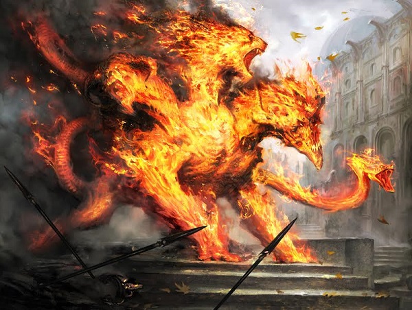
Volatile Chimera by Mathias Kollros
Paliano
The city of Paliano is on the plane of Fiora and is the focus of this set. It’s Italian in inspiration, likely from the late Renaissance by the style of clear glass windows. As easy as “opulent’ is to describe, few backdrops of history would work better than a wealthy Italian city in the late Renaissance. The time period went full in on the setting compared to a previous iteration of a similar visual aesthetic, that being the plane of Mercadian Masques with the city of Mercadia. They even had high city/low city as well.
You can see Paliano’s richer district in the card art for Sovereign’s Realm by Daniel Ljunggren. To say it’s an homage is obvious.
Not at all similar huh?
Though, it’s a bit weird that above ground, all the political trickery is upset by a subterranean lizard. Lobbyists, intrigue, and voting ain’t going to matter when a giant lizard destroys the pillars holding up the city. It feels like a weird oversight.
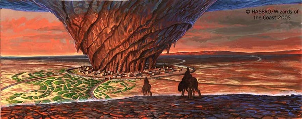
Speaking of over sight, I wish a few more pieces showed us the city from above, like Thermal Glider here, an older masterpiece, and if you’ve the time I wrote an art review on Conspiracy 1 back in 2014 if you also want to take a look at that.
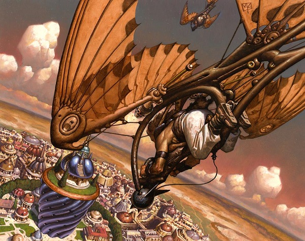
Thermal Glider by Mark Zug
I categorized the art into sections with similar themes and concepts:
- Italian architecture and Paliano
- Deeper references/homages
- Recent monarch change
- Whimsy
- Diversity
You’ll see why I chose each of the concepts. Let’s get into the art!
Italian architecture and Paliano
Hold the Perimeter by Jason A Engle
This card probably made either a scalable amount of goblin tokens or four tokens. Since it’s a multiplayer format and only three goblins are actually made, I wonder if the original card differed. Or there’s just another goblin which I’m assuming isn’t there randomly. It’s an art rule-if the card makes tokens look at the art, it should always match.
It’s rather inventive that goblins, not known for their patience, have a goblin or friend who makes them molotov cocktails. Can you imagine that briefing that has someone say, “no really, you have to break the glass or nothing happens.” You know it’s after a goblin lays it down in front of someone’s door and the rag just burns out, making no explosion. A whole batch wasted. You know some Paliano guy had to help them out. How funny.
Goblin Token by Jason A Engle
Look at this little nugget.
Look at how cute he looks.
An oversized head, like on babies, children’s toys and stuffed animals create a “cute” reaction and it’s comical here, on purpose for this goblin. The chin beard is better shown here than with most other goblins of the plane, it’s nicely one. The arms, if you look closely, are also a bit popeye proportioned, with giant forearms leading to skinny bicep muscles. That’s a style guide pickup likely and something to note for the plane.
Do you wonder if this background is the same for both tokens and the conspiracy artwork, stretched and shifted to work in each? I sure do.
Soldier Token by Jason A Engle
How nice are the filigree details that look so weathered? The helmet echoes the hats of previous Conspiracy sets like Muzzio, and he looks great.
What I can’t ignore is the portal behind him. When you count the pillars and the corbels and frieze and all that stuff, it’s a portal. And boy, it’s rough. A camera angle from the bottom up is really, really difficult. When you ask an artist to do that, they have to paint up someone’s nose and everything distorts quickly because reference is mighty hard to do. I understand that because I’ve done that and asked artists who weren’t ready, to flex their trained eye to try it. A lot failed. Ask Sidharth Chaturvedi about it sometime, I often had to give those over to him instead because he could handle it with ease.
Back to the portal Mike, get to it.
I studied portals in college. Entrances to tombs, church portals and everything in between that signaled architecture, sculpture and painting. It’s a bit unfair for me to go into depth why those arches would never be used as ornamentation, as they aren’t load bearing and also why squeezing the motif above a door or making it obscured would never happen. From France to Italy to Bulgaria, that area is sacred. It was the first thing peasant’s saw upon entering and that space was never glossed over. It told stories, normally religious, but it also had city connections to parables and mottos. It could’ve been something unique to Paliano’s past and instead, we get no insight. That’s a miss for a game giant like Magic.
Hired Heist by Lucas Graciano
The striped shirt really made it Conspiracy, didn’t it? While a circus shares the striped iconography, used sparingly, it’s Italian feeling without having tropes used.
We don’t see full angled pieces that often, making the motion from a traditional painting urge us to see him in motion both to the left and to the bottom left. He’s in a full run from stealing “a card” from the ability, which harkens back to early Magic flavor in that “a deck” is either your memory or a spellbook. The latter is what he’s stealing here. This is a good art description given to a tremendously good artist. While Lucas’s dragons are marquee to his work, and I would argue often better than Todd Lockwood, his ability to show motion in still images is very much a tool in his repertoire. It’s a shame the card isn’t eternally playable because it’s well done.
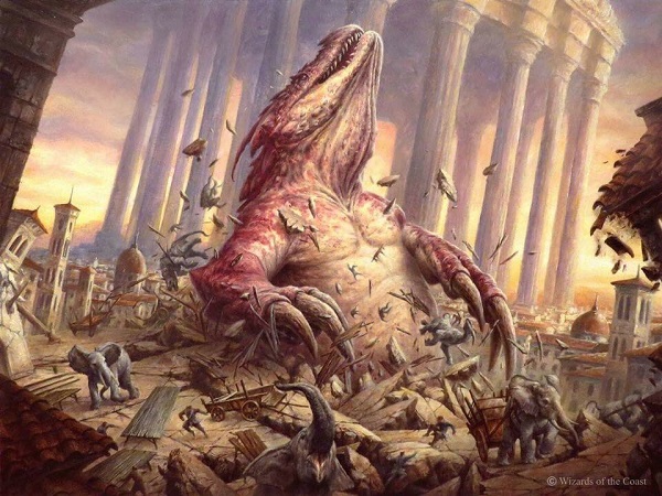
Subterranean Tremors by Filip Burburan
Let’s omit that there is no dust here to settle that argument. You see, there isn’t a clean undercity to Paliano and the Lowlands. There is a construct system of tunnels everywhere down there. It’s far from solid dirt. Check out the Construct token by Adam Paquette in the original Conspiracy to see:
Construct token by Adam Paquette
Yes, the lizard brings up some weird questions like the constant threat underneath the city would make politics moot, no? Wouldn’t they be in constant fear of a giant lizard attacking and be a military preparedness power? Maybe not. Maybe that’s part of the political intrigue — what part of the budget to cut to have anti-lizard catapults or ballistae.
I also love Filip’s traditional paintings. It’s just so fine to see the details like the scale elephants.
Below is also Filip’s work on the token.
I can’t quite tell how tall the Lizard is, though an 8/8 doesn’t always denote size but rather strength. He can’t break the pillars easily, as we can see. The chest plates being reinforced “armor” is also something I see.
He’s also pigeon toed, which is nice.
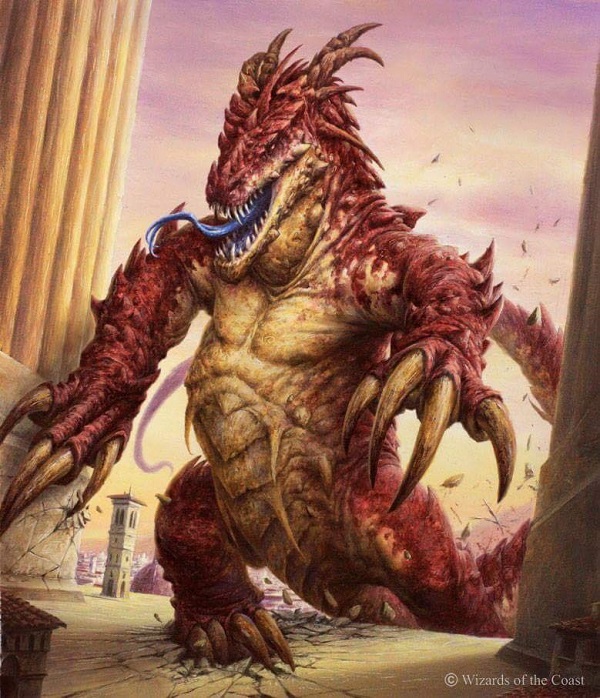
Lizard Token by Filip Burburan
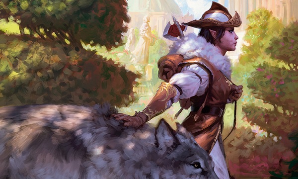
Selvala, Heart of the Wilds by Tyler Jacobson
Yes, I love that Tyler uses larger digital brushstrokes. It makes it feel traditional without the time of paint to dry and well, fumes. He still goes through all the normal traditional thumbnails and process, sure, you can just see the compositions are just a hair better than the average digital painter. In his case, nearly every painting is better.
What are we looking at here. Selvala is filling some negative space made by trees and is depiction one, in having two artists attack if not the same, nearly identical art descriptions. The other is Jesper’s below. What’s different? I’m sure the original Selvala did something with 2/2 wolves compared to 3/3 elephants. The concept was struck, so we see two depictions that are, in essence, the same card but for slightly different purposes. But I’m sure you noticed that too. Of course you did.
I don’t quite understand why Selvala wears white at all, considering she’s out in the wild. That’s an odd character design. We should ask though, how much realism do we want in our fantasy? In this case, less so, which is ok.
The pursed lips and the shape of the axe are slightly odd, but the insight into well-manicured trees and Tyler painting just a beautiful wolf really make it stellar.
The non-used art was used in Summoner's Bond, a beautiful painted piece by Jesper that he still has available, looking for $5000+ for it.
The elephant’s ear is really painted well and yes, his toes are correct. Asian elephants have five toe nails on their front feet. African elephants also have five toenails other than the African bush elephant, which is the big one, who has only four on the front feet. Realism!
Also notable about Jesper’s piece is the architecture. We see Paliano having stucco and marble with the lowlands having more wood depictions, like we see here with plaster, wood and second floor overhangs for chamber pots. For more on second floor buildings and why it’s good to dodge thrown poop, read my art review on Innistrad Architecture, in case you’re curious why.
Summoner's Bond by Jesper Ejsing
Arcane Savant by Chris Rallis
They love their domes.
Beautiful shoulder, covering? here. The ornate details of gold really differentiate Paliano from Ravnica, as the sigils and logos are roughly Italian looking, but could also be French, though also, from the late Renaissance. It’s very beautiful ornamentation from Rallis. Great work!
I don’t love the chin beard like I’m a Fox Racing bro, but I do enjoy the white in his hair. We don’t see enough older men who are gaining silver in their hair, rocking the salt and pepper look. The game’s players are aging man, and representation will change with it.
Adriana's Valor by Lius Lasahido
The name is needed for us, as players, to understand that this is the legendary Adriana, captain of the guard, who is undertaking this feat of indestructibility, as the card describes. The art doesn’t yell that it’s a woman. This is a good thing. I just wrote about the Tumblr, and in 2016, Magic artists just do it. It’s not even a big deal. The plate armor is just armor with only a few motifs that would even tip you off that this is a woman.
This is a state of the game image and the fire is digitally painted, but isn’t using some Photoshop trick off of Youtube. Lius can paint, and if you look at Prescott’s Garbage Fire piece, you can see similar elements. Even still, that horse’s neck might be a tad long and the horse a little skinny considering she’s a formidable 4/4 soldier and unlikely to be 5’3” and petite. The horse needs just a little more girth for any soldier.

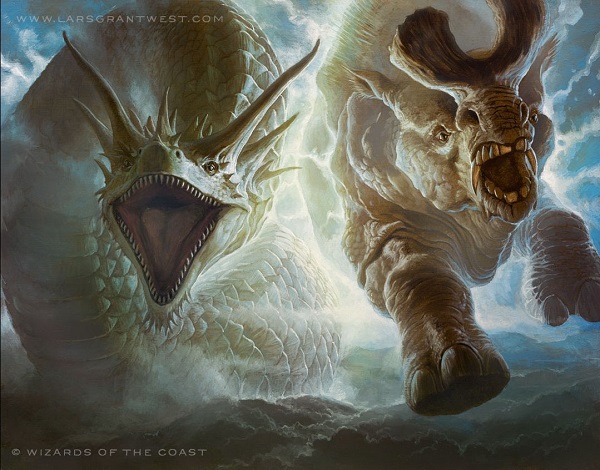
Selvala's Stampede (Nature’s Rage) by Svetlin Velinov
Whimsy is not dead, it just isn’t with one artist all the time like the Foglios were in the 1990s anymore. Look at this group of creatures. Look at them. Check out the size of the front right goblin’s mouth. It’s large for a creature that small and comically huge compared to Selvala. This just looks like Velinov picked a bunch of random pages in the style guide and the art director just had a thumbs up to every one. I love this piece.
The elephants really ground this image, forcing your eye downward and centralized. You don’t even see the city that hides at the vanishing point, where my red lines all meet. It’s a clean, well organized little image.
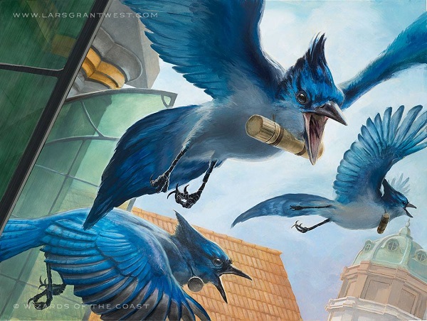
Messenger Jays by Lars Grant-West
Is it a real world animal?
Is Lars busy?
These are the questions you must ask yourself as an art director. Lars knows animal anatomy incredibly well, having worked for a zoo and having tons of skulls in his studio. I tend to always look for how muscles attach to shoulders in his works. These Kansas Jayhawks are all anatomically correct and just look like what the birds should be.
There is some lovely work with Lars if you’re buying original art and don’t have the funds for a marquee card costing $10,000 but you still want some art you can put out in your living room. Lars is that artist. He usually gets the larger animals with Christopher Moeller getting wolves. I own a piece of his in my home and he paints on large canvases. Beautiful stuff.
That dome in the background? Just lovely.
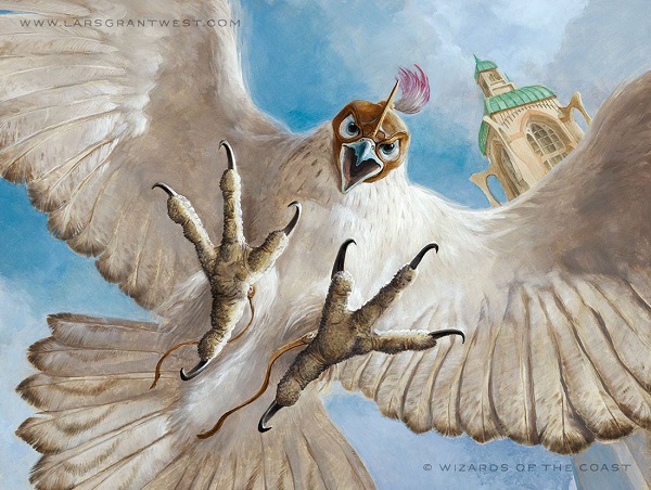
Wings of the Guard by Lars Grant-West
Is it an animal? IS LARS BUSY?
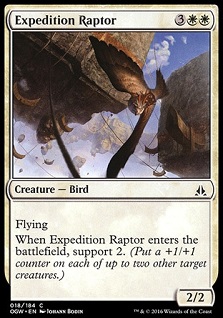
A lovely raptor by the best animal man in the game. The leather cap, opulent buttresses on the tower and the leather foot straps are just minor inclusions to just a fantastic bird of prey traditionally painted.
Notice the background tower? Were this the late 1990s/early 2000s, we never saw placement. It was just a bird or just a beast in the woods. Then, art directors changed.
 |  |
Today, we have exact placements. The animal is set in a plane and you can instantly tell what plane it is. Expedition Raptor? Floating rocks and Kor settlements must mean Zendikar.
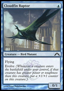
Even a mutant bird is placed, showing us the city of none other than Ravnica. The city is shown in case the obvious Simic creation couldn’t be placed, of course.
 |  |
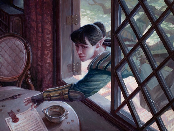
Leovold's Operative by Ryan Pancoast
That’s a real person’s haircut on that elf. I like that touch of realism in fantasy without needing to throw it in our face. What’s comical (to me) about it, is what’s next to it. The clear glass is realistic per today. If you’ve read my reviews on Innistrad in the past, you would’ve known that I’m particular about it because I grew up there. Perfectly clear, smooth glass didn’t exist in the medieval period. They had to spin it, and as such, it was curved. It’s comical to me the question of “how much realism do you want in your fantasy,” and we see Ryan dancing between the two things with ease, showing new glass, a new haircut, with a wax seal and modern upholstery on the edge of the chair. It’s a lovely little piece, even down to the window brackets.
There are some odd things, sure, like a tree on the edge of High City, overlooking the streets below, seemingly hanging over nothing, but it could be there and it makes you wonder her placement. That’s good storytelling, and for Ryan, who meticulously makes paintings which you can see on his gumroad, I think it lovely if you’re the rogue type and like elves.
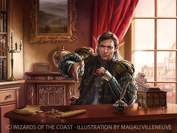
Leovold, Emissary of Trest by Magali Villeneuve
This pale young elf with his finely smug face, is obviously a lover of both greed and his own success. Notice the gold coins on his desk, the lavish surroundings of living a simpler life as the first thing he sees before turning to sit down is a pastoral scene.
The natural light, entering through a perfectly clear glass and likely expensive window, blankets the room in light, allowing us to see the detail of the furniture behind him and the opulence of his study. The objects are all lit for us, the viewer, to see. Highlights and finding the darkest darks are near impossible to find. He seems without a strong emotion, seeming to both enjoy the upcoming deal being struck with his handshake and boredom in this arcane calm of this frozen still life, as evidenced by the quill behind unused yet a scroll unfurled. Such a pensive character is characteristic in Magali’s work such that longingly large elven eyes or a fury of a mother of dragons would carry. They’re often elsewhere, merely participating in the moment due to necessity, not out of choice.
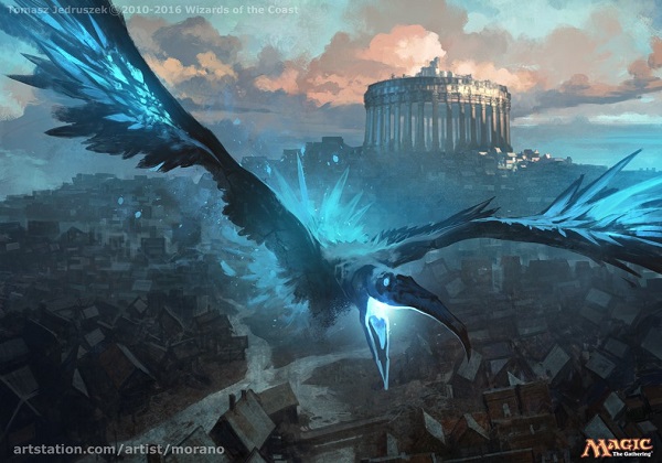
Illusionary Informant by Tomasz Jedruzek
How does this giant city handle its sewage is what I’m thinking about this artwork. Sure, it’s a decent bird with a gigantic wingspan and an oversized head but that’s about it. From this angle, it’s really to show the city.
There are some beautiful clouds that balance the squares of the houses, fluid vs. structural elements of the same work. The bird is really the compositional horizon, making your eye go above it to the sky and High City or below, to the Lowlands. It’s rich and beautiful vs. poor and colorless. He was told to paint a bird and he gave us a socioeconomic perspective of the city. That’s both a great description and an artist pushing the wings to the edge of the frame, giving us the top/bottom view. Is this going to win awards? No, but it’s acceptable and on a conceptual level, it’s quite clever. He just needs an amazing work to really shine, that’s all.
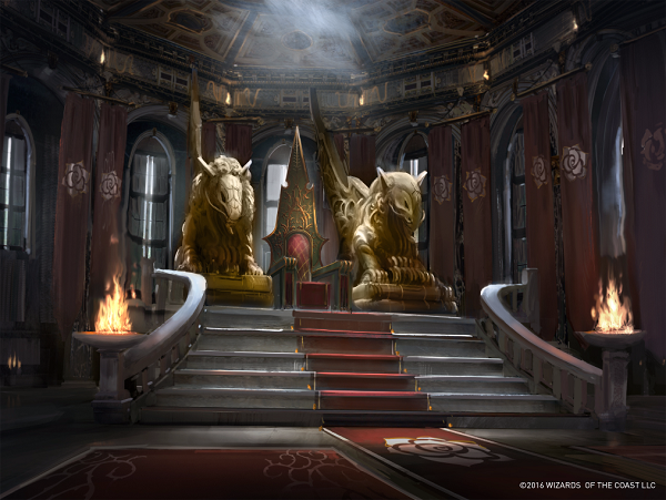
Throne of the High City by Titus Lunter
This art should make you wonder about Marchesa and how long she’s been in power. Check out the throne, it’s green and gold with a leaf motif. That isn’t her crest. Again, the paint is still wet due to the constant coups!
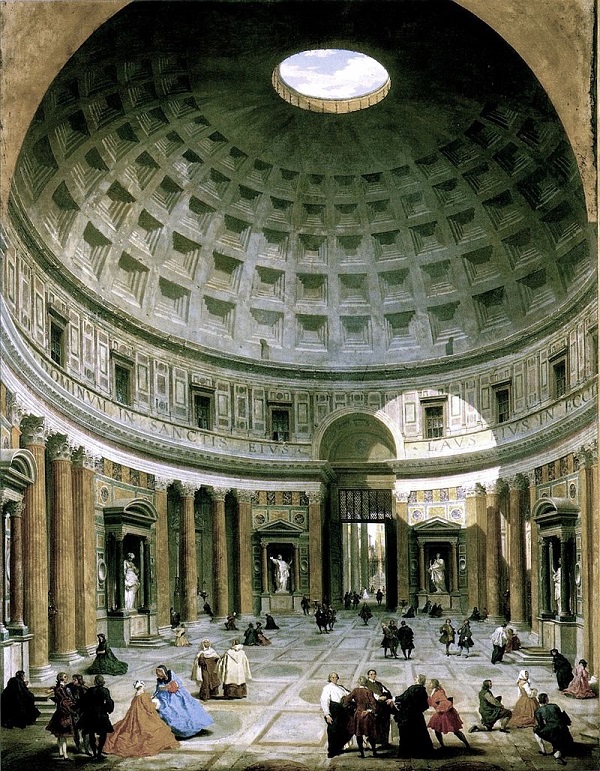
Titus has some lovely mix of soft light through the curtains, from a skylight and two firebowls. It’s a subtle touch to make everything visible and logically explaining why we can see everything. The skylight? It’s more likely an oculus, a hole in the ceiling like they had at the Pantheon in Rome. The lovely depiction by Panini you can see below. Of course Titus would know how to paint a ceiling, right?
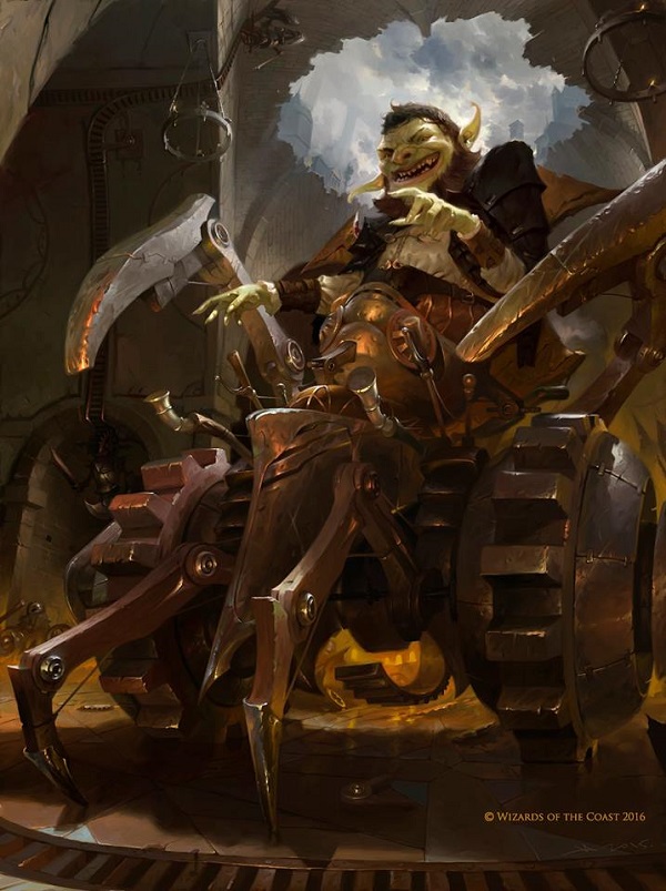
Daretti, Ingenious Iconoclast by Victor Adame Minguez
Arguably the best reference I’ve seen used in a number of years:
https://twitter.com/victoradameart/status/766063413889859585
Daretti here looks considerably younger than other goblins of Paliano or even all of Fiora. Either he’s younger or he dyes his hair. Goblin hair dye would be something hilarious Victor would think of. Without his hat of his earlier version, you have to know what’s under there. He is no longer the saint, as iconoclast even in his name suggests.
I’m curious about the narrative of this image. Did he come from the hole in the ceiling? Was there an explosion? Did he cause it? Did he follow the giant lizard’s path down? Did Don Cheadle get the French drill to break him in? I like that he’s down where the construct machines are being held, I just don’t know why he’s there.
Construct token by Victor Adame Minguez
This was in the background of Victor’s Daretti. I just want people to see the larger art and notice the track it’s sitting on. Maybe it’s magnets keeping him on track? No idea how they work.
Spire Phantasm by Evan (Ev) Shipard
A tremendous amount of effort is required to paint a full background with a definite light source which needs an overlay of an apparition above it without adding the black lines of a 1970s Hanna Barbara cartoon or the assumption of a good enough Photoshop layer that students rely upon. Ev is a very, very talented artist. If anyone needs an interview these days, it’s him.
The more I see this art description symbol, the more I dislike it. It’s so forced and so unnecessary. They’re flat everywhere, added either late or not integrated into the art well. They do not help and are actively making the artworks of this set worse. Adding Ravnican symbols to signify the guilds is actually lazy, you should know by the art or the card will tell you. I can only postulate why it’s there but I can say there are better ways and this isn’t ideal.
Deeper references/homages
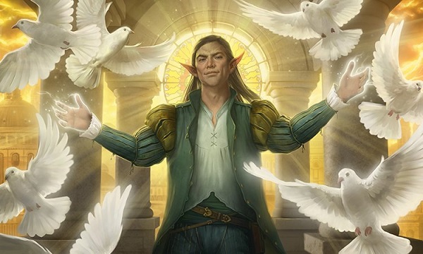
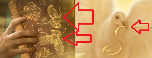
Emissary's Ploy by Howard Lyon
Yes, Howard is a mad man. Did he self reference his own art of Enlightened Tutor again? No.
Notice the doves have nothing in their mouths. Get your references straight. Cripes.
You can learn more about how Howard composed the piece over at Muddy Colors, a must read blog for anyone interested in Fantasy, Sci-Fi and Imaginative Realism art. The rose window behind him is stellar, if I must say.
Expropriate by Zack Stella
I’ve written on Expropriate already with all of Zack’s easter eggs here.
And yes, that is Leovold. He looks a lot less intimidating when he’s all giddy from all the treasures, isn’t he?
Deputized Protestor by Lius Lasahido
That’s a nice looking face. His brushes are getting a bit more distinct to my eye, like his muted backgrounds and how he approaches metals. That cleaver is very Lasahido. Speaking of that cleaver, have you ever actually seen one in Target? They’re so small! From playing in so many games, I had come to accept that the largest chopping knife was the size of my forearm. Instead, when we got one gifted to us for our wedding, I get this child size sharp toy. Turns out most aren’t that substantial. It barely weighs anything. I don’t use it.
This is a solid piece without much commentary from me because I don’t see anything that odd about it. Instead of going into deep architectural detail, he kept it misty and that works. We don’t have to nitpick because we can’t see, but the obscuring lets us know that he’s placed in a setting. Were we still to have core sets, this would be the perfect art for that.
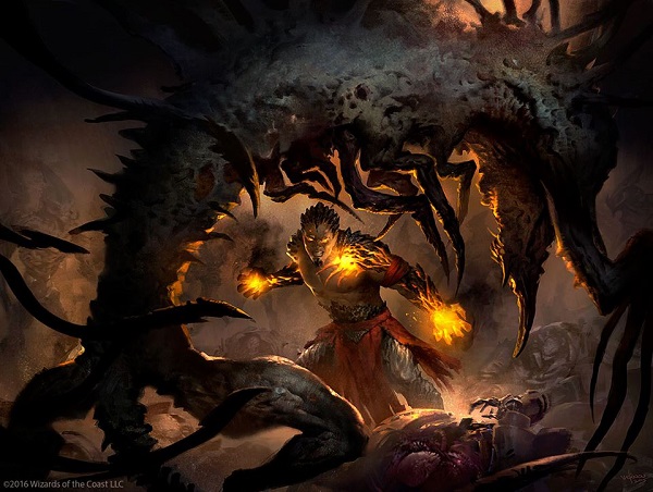
Phyrexian Arena by Svetlin Velinov
Can you get a better framing element than a Phyrexian curling around our hero, forcing our eye to zero in on Koth perfectly? I’m not sure the claustrophobic reality that Koth may be feeling, stuck on Mirrodin beating back an unlimited foe, could be shown better.
Velinov’s glow on Koth showing his rage and lit up body reminds me of Liliana’s tattoos that glow and bleed when she uses the Chain Veil. Showing magic within them or harming/aiding them brings the Planeswalkers to life and the effet of adding yellows to a highly shadowed scene works. It’s why Halloween uses orange or yellow with black, it pops!
I do wonder why he is here though. Is Koth stuck on the plane fighting in an arena? Is the losing of life an effect of his current situation? What’s going on!? I’m happy to wonder, I think that’s great in a supplemental set!
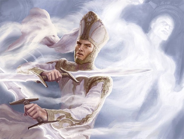
Custodi Soulcaller by Winona Nelson
That’s a nice looking ghost. The pseudo crown by moving around paint is a lovely touch.
This character is so a religious character, as white and gold either means pope or White Power Ranger and the detail would push me to pope. He even has a pope hat. I guess it’s also a Galactus hat, missing the two boomerangs. The cheek guards have me looking back and forth.

Image crop via wikipedia.com
I’ve been looking for minutes at the hat until i realized he was holding two double bladed swords. That’s pretty intense for a cleric looking guy. He must be well trained. I like that a religious feeling guy doesn’t have to have a mace, all tropey like Dungeons and Dragons. That also never really made sense to me that the D&D cleric, a religious warrior, couldn’t use sharp weapons because they draw blood. Paladins were totally cool cutting off arms though? Strange. She did a great job with him!
Wild Pair by Lars Grant-West
Sure, this art is not new to Magic. It was released with Duels of the Planeswalkers and Lars already sold the original. Ok, that is valid. But it’s the first time it is on a card so I’m including it. It always reminded me of the Animal Planet badger and coyote pair, hunting together as friends.
The beast has some rhino looking toes, which Lars would know, of course. They’re correct and he likely had good reference. The extra teeth might make him derpy, and we love him for that. Lars uses realism, then mixes some soft back lighting and an obvious odd location base to bring fantasy in. Man, I wish I owned this art.

Image via panoramio.com
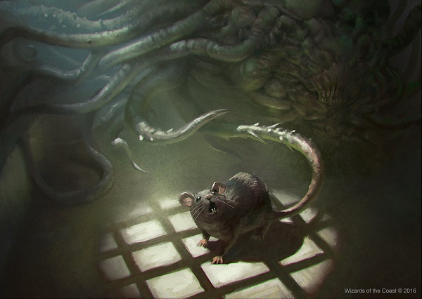
Sinuous Vermin by Jason Kang
The card art is totally an angler fish, dangling a cute wanted thing before it eats it up. I love that card concept, though the art description of rat is misleading. It could be more reminiscent of a rat instead of it literally being a rat with a long tail. I’m always about limiting confusion. Swarmyard ain’t going to help this lil guy, though it would be amazing!

Image via mentalfloss.com
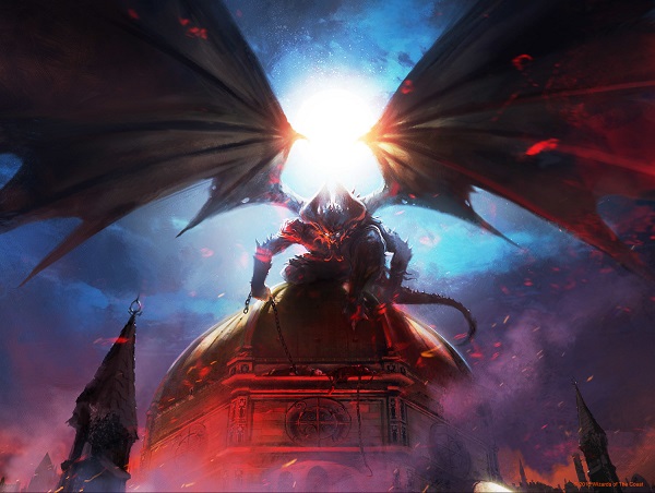
Archdemon of Paliano by Evan Shipard
Do you see the “chained” picks you need to make by the demon holding chained humans on the building? I sure did. That eerie easter egg is brought to you by high resolution, seeing things you can’t see in a 2x3” card frame.
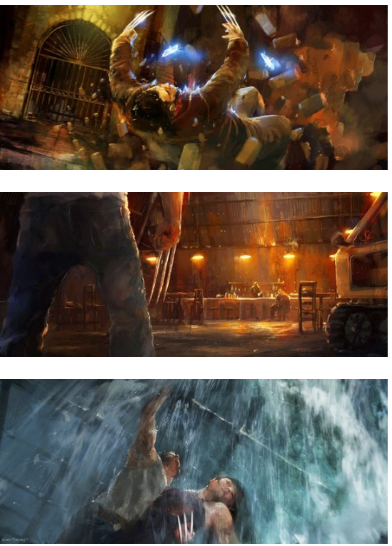
Evan did concept work for the origins of Wolverine movie and works with Cartel Artists on movies, which is pretty cool.
Entourage of Trest by Anthony Palumbo
This is an elf squad.
Where are they? In medieval Europe, inside large buildings with trade only meant one thing, they were in a church. They aren’t here, and the roof is enormous. This is like the new Vikings football stadium big considering the distance of columns. It’s grand and yes, it’s Italian!
The floor is also cobblestones, which differs from other illustrations so I wonder if this is in the High City or in Trest. I can’t quite tell other than the hipster kid on the far left, looking like he’s going to a vinegar drink concoction pop up fusion bar.
Palace Sentinels by Aaron Miller
I like seeing the two figures and though I shouldn’t, I automatically assign genders to them. The red scarf on the guard to the left, including being farther, makes me assume it’s a smaller person. It’s a man and woman team and Aaron gave the woman the larger weapon, a sword. I’m not sure why I can’t unsee that.
Nice lion. I don’t know what that has to do with anything, but I do like it.
So the roses are temporary in some places and in others, they’re gold leaf doors. That’s expensive and a difficult commission. The door I would compare to would be the Porta Sancta in Rome at St. Peter’s Basilica. It’s not the same necessarily for an identical gold leaf in the door, no, that’s more French, but rather the mix of materials. Check out the smooth marble, the column and the changing of materials. That’s so Italian and they aren’t afraid to show renovations and age, showing change over time. Their contemporary culture is literally built atop the Roman Empire, Italy is layers, just like their architecture.
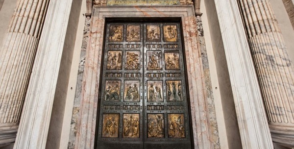
Image via univforum.org
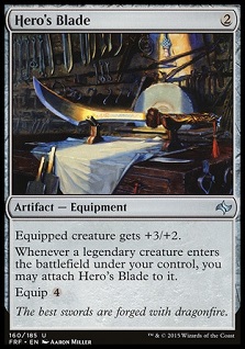
Spy Kit by Aaron Miller
That large . . . orange thing? It’s to melt the wax.
The pig ears? It’s not to feed puppers, those are costume elf ears.
He painted this digitally, despite the vials looking traditionally painted. Check the foil and see them glow:
https://twitter.com/PDXCentury/status/772587692903178240
Aaron can paint a study pretty damn well as showcased in Hero’s Blade and yes, I’m still salty he didn’t get one of the tutors of Eternal Masters. He would’ve killed it.
 |  |
Inquisition of Kozilek by Volkan Baga
Ant and I talked about this card on the Snacktime podcast as now adding a new form of flavor to “discarding a card” and that’s a headbutt. What’s more scrambling than a concussion? Beats me. Choosing Volkan to depict this illustration? Sure, he can do anything it’s pretty uncharacteristic of his Magic art commissions.
Finally, the pull of the shoulder spikes is very akin to grabbing someone in football, their shoulder pads, and committing a penalty-a spear. To lead with your head can hurt someone, a lot. I had a concussion from one, it’s from bad tackling or idiocy.

Stunt Double by Joseph Meehan
This is a pretty easy concept and art description. Paint a guy twice with slightly different poses, though nearly the same and put them on Paliano.
The hat bugs me because it’s not Innistrad. The humans are flying and while a clone-effect can do that, it looks like a mistake that they’re 10-30 feet or more, above the ground. The giant shawl looks to me like it’s covering a mistake that couldn’t be fixed because it’s so encompassing and the robe on either side of the back character looks like it was finished in 90 seconds. It’s odd because the paint over of the foreground hand was done meticulously, just like the back left hand except being painted too large.
I know he’s gotten some comments on painting over the Spatial Contortion promo card as well. Now some gaming companies are totally ok with that, I won’t lie, it was quick way to get something done or finished if needed. You don’t want to do that but in a bind, you have to get the card art done. It just looks amateurish. At the highest tier of TCGs, artists still do that? Yes they do.
Editor’s Note:
Mike’s Art Review of Conspiracy was so massive, we wanted to make sure it was given the space to breathe that it deserves. So, we’ll be back next week with the second half of his review! Stay tuned!