


I love late November.
It contains some of my favorite things: Norman Rockwellian America with Thanksgiving, a day built for capitalism, planning for holiday purchases, and the Spectrum art annual guide release. This year marks a change in Spectrum, as Flesk Publications took over the helm of printing the books from Underwood Books. It’s a passing of the torch from Cathy and Arnie Fenner, the founders of the Spectrum annual book.
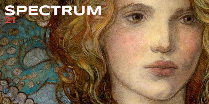
I write this every year, so here’s for Issue 20 and Issue 18. I took a little time off and missed Issue 19—sorry! Also, for a comprehensive list, I update an archive each year here.
Here are a couple things to know about this book, this annual art compendium:
- Magic has been slowly inching forward with more inclusions in the Institutional category of the book.
- Compared to any other gaming brand, Magic stands a head above the rest for submissions. As Wizards pays for a set number of submissions, at $20 each, they’ll invariably have more entries. This may seem unwise financially, but it raises the profile of the brand and shows the art excellence. It’s an investment in visibility, saying, “Magic is a validation tool for being great, and some of our artists making award-winning, fine artworks.”
- By having an artwork accepted into Spectrum, it’s something you can put everywhere. You’re award-winning, and that image should be all marketing materials because it’s a mark of quality.
- Artworks that are digital and make it into Spectrum tend to be difficult to see whether they’re digital. You’ll notice fewer plastic looking figures or shortcuts in anatomy. When people argue to me that digital is bad, I show them these works.
- Original artworks that make it into Spectrum often receive a bump in price for an original artwork. With twenty cards making it in, only nine of them are traditional artworks, and nearly all of them are already owned because they were made last year.
- Planeswalkers almost always make it into Spectrum. There are only a handful of times when they have not made it into the annual.
The book is on Amazon. It’s always in the $30 range, so the paperback copies are pretty solid at $25 currently. Use Smile.Amazon.com, and donate part of your purchase to a nonprofit while you do it!
If you’re ever curious about past versions, go to your local used bookstore. Often, I find one or two of them there for like $10 or so in incredible shape.
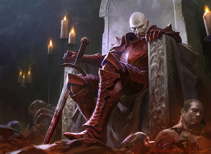
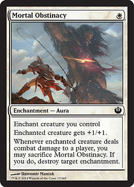
Slawomir Maniak – Mortal Obstinacy, Digital
This one shocked me a bit, but the more I see the in-focus/out-of-focus balance of the piece, the more I like it.
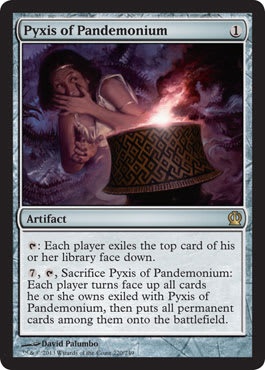
David Palumbo – Pyxis of Pandemonium, Oil, 12" × 16"
My wife sure likes Greek mythology, and this is a piece I’m actually picking up for myself. It’s just too good to pass up. I’ll post a high-resolution picture when I get ahold of it. The background reminds me of Giger.
Jesper Ejsing – Selvala's Enforcer (Scout of Selvala), Acrylic on Paper, 12" × 10"
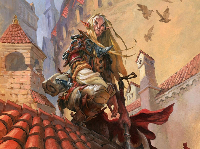
Jesper posts from time to time on Muddy Colors and elaborated a bit on this painting. I’m a huge fan of any Magic work that appears as though it could be from another role-playing game. The towers alone don’t look like anything else in the Multiverse, which brings depth to Conspiracy being a full set.
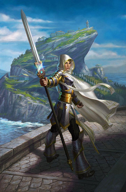
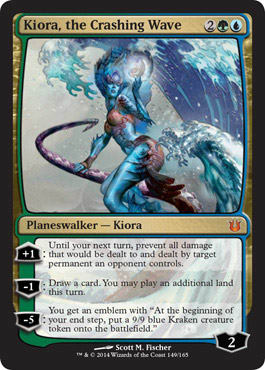
Scott M. Fischer – Kiora, the Crashing Wave, Mixed Media, 18" × 24"
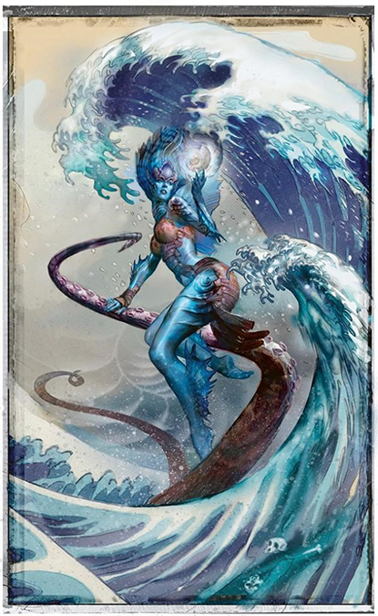
I’m not even surprised this made it to the list. While this artwork has been around awhile in Duels of the Planeswalkers as a playable character, it took the past year for someone to finally win it in an eBay auction, for over $7,000. We art collectors are all kicking ourselves for not asking Scott about it earlier!
P.S. Nice Great Wave off Kanagawa—huh?
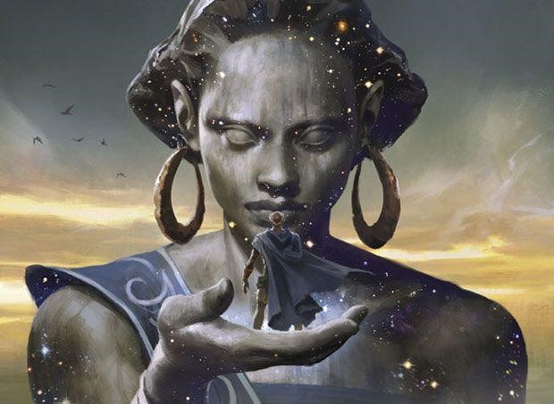
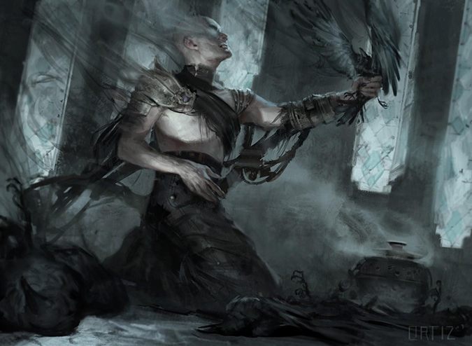
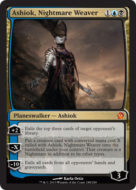
Karla Ortiz – Ashiok, Nightmare Weaver, Digital
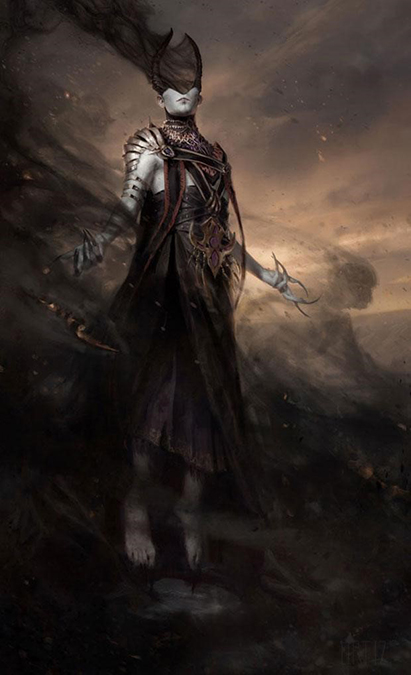
Karla’s usage of smoke that doesn’t feel like a quick and dirty late-night Twitch session makes me all the happy. While an advertising material originally listed Ashiok as male—later changed to really being ambiguous—I think this character received the depth Ashiok deserved.
I can imagine every cosplayer sees oodles of ways to express Ashiok via chiffon to leatherworking. I look forward to seeing this “art” up close.
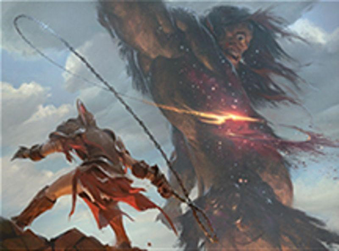
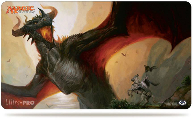
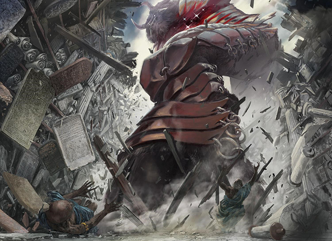
Lucas Graciano – Scourge of Valkas, Oil, 20" × 16"
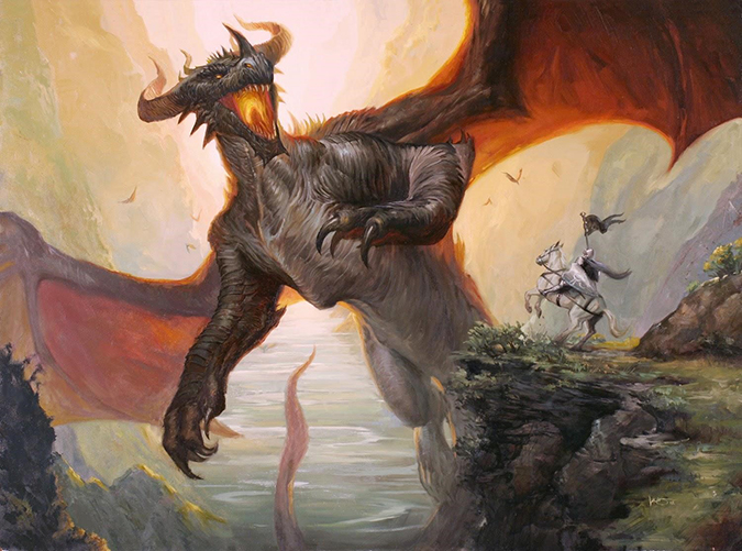
Cripes, that dragon is huge. The hands alone are enormously powerful. They should look awesome; Lucas was asked to add them later. I remember this being a little bit of a hullabaloo, but the dragons are better than drakes every time. Maybe if they didn’t add the arms, it wouldn’t have made it into Spectrum!
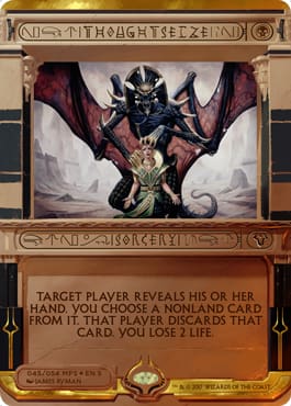
Lucas Graciano – Thoughtseize, Oil, 20" × 16"
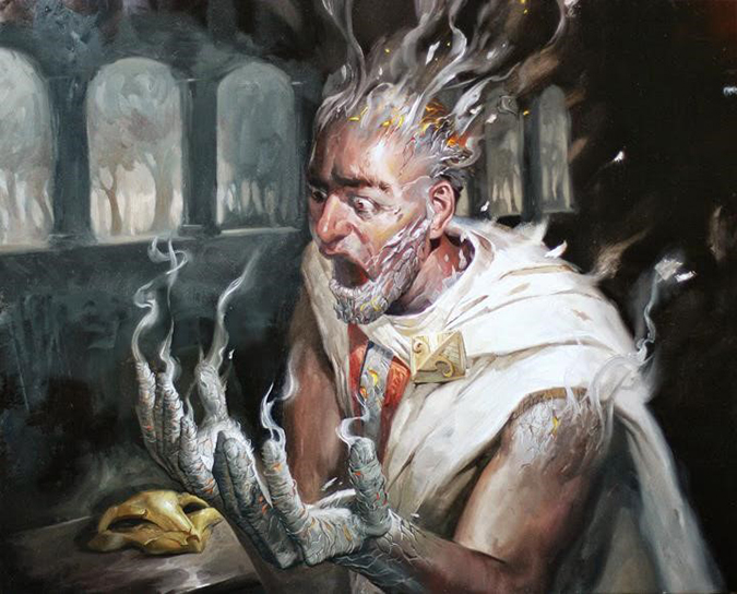
Another of Lucas’s really swings for the fences. He’s made a full scene, with enough realism to sit nicely with his looser, distant objects such as the trees and mask. I feel a lot is lost on the card for this one, especially in the ash. It’s just too hard to see at scale.
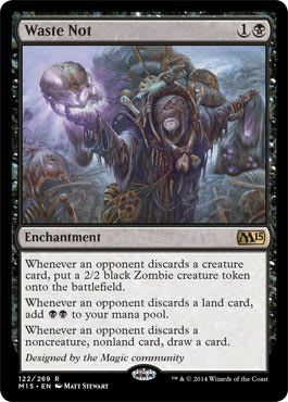
Matthew Stewart – Waste Not, Oil, 12" × 16"
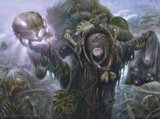
Ah, the community-created card’s art made it into Spectrum; that’s great! I’m happy to see that. Now, having Matt paint anything will net you a good art at worst. Add in a very defined location, and it’ll reinforce the design of the character. It’s almost a design out of a 1980s Jim Henson movie, with weight and bulk built on a character doing some menial mission.
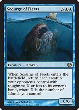
Steven Belledin –Deluge Kraken (Scourge of Fleets), Oil, 14" × 11"
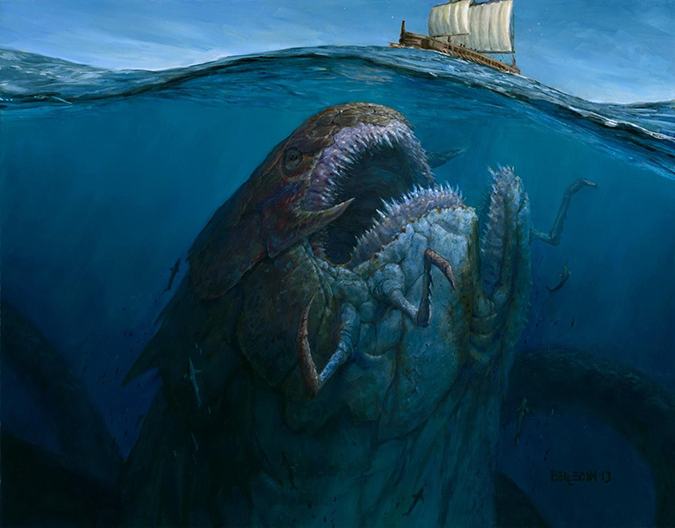
What do you notice first: the split mouth or the real/unreal eyes? I keep staring at one thing, and then my eye jumps to another, and then upward, and then I circle back down. Steve wrote about this piece a little bit on his blog. Also, for a Greek-themed set, this is one of the few artworks that doesn’t feel like it needs to be in the period.
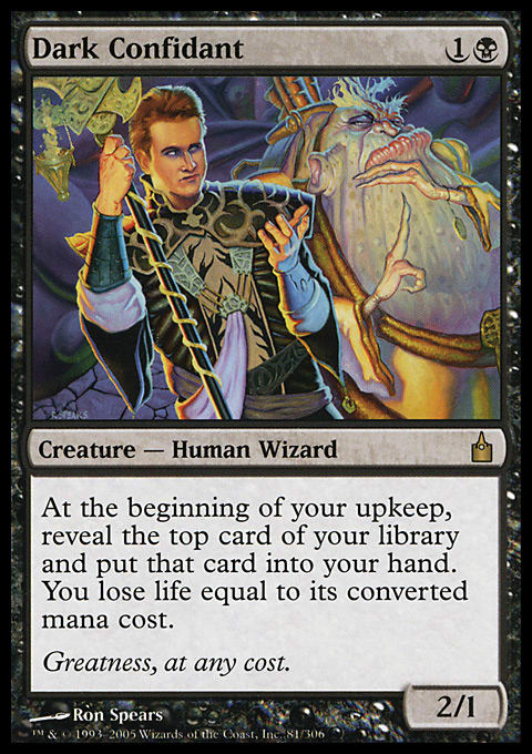
Scott M. Fischer – Dark Confidant, Mixed Media
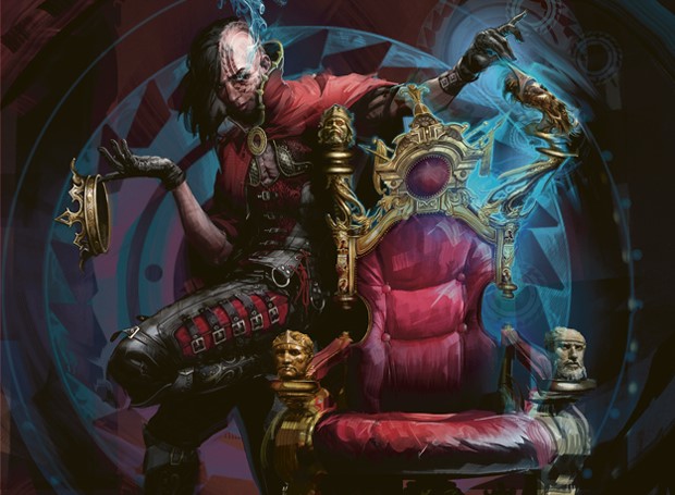
Did you see the warped top part of the chair the first time you saw this? Yeah, I didn’t either. I couldn’t get past the weird circle behind the character. I love the new imagining of the figure, adding a little more digital concept-building. He needed a refresh for being such an iconic figure.
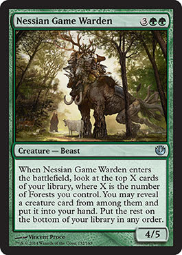
Vincent Proce – Nessian Game Warden, Digital, 5004 × 3643 pixels
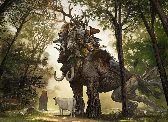
I don’t remember this card at all. I remember the art though. “Look at all those heads . . . Wait, does it have all the tails, too? lolwut?” Vincent is normally given environments with Magic, but give him some time, and he’ll sit on a design push, cranking out amazing for days on end. It makes you wonder when Elementals will be a core-designed character again, as though they were in the Lorwyn block.
Also, his background trees on the left are wonderful. They feel like the work of a school of 1800s painters whose name escapes me.
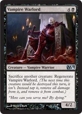
Wesley Burt – Vampire Warlord, Digital, 9" × 6.5"
Spectrum doesn’t really have any standbys, such as how Victorian hoopskirts equates to an Oscar. I would love if highly-detailed stonework or corbels would bump you up into consideration. I used to study them back in college.
This piece just has such incredible perspective painting on that leg up to the chest plate. Foreshortening any limb is a test in patience, and composing a scene around it can have a lot of issues, from weapons to furniture to lighting. All of it is on point; it’s great work.
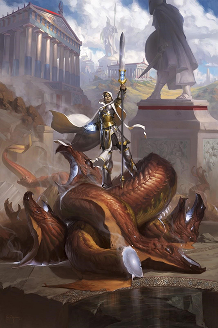
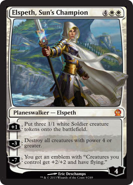
Eric Deschamps – Elspeth, Sun's Champion, Digital, 13" × 20"
There was a little pushback on Elspeth “showing her butt” in this image. I feel it’s an epic hero shot that’s a bit posed, but she’s a hero, and she’s on her way to do some business. The color palette even reflects the shot of us walking up to her—the top part is bright, and the bottom half is dark. Take a second, and cover half with your hand, and check it out! It’s a little perspective trick, and Eric pushed the path out of the shot to keep you looking top to bottom, as the path could’ve led your eye upward instead of straight on to downward.
There’s a lot of great weathering on the stone path, on the stones by the water, and on the temples. Nothing looks new, except for Elspeth. She’s out of place, and her otherness is on display, exemplifying the entire Theros block.
Tyler Jacobson – Theros, Digital
And that is how you compose a jumble of things while you keep your focus on one figure. Donato is a master of this, and Tyler is well on his way to get there. He’s receiving Planeswalker commissions, marketing artworks, and pieces that all matter in Constructed formats. His cylinders are firing, and I can’t wait to see him make the next piece!
Wesley Burt – Ephara's Enlightenment, Digital
Can Wesley study stone? Yes, yes, Wesley can study marble.
I see some concept-art tropes here made common with video games. God of War loved using the scale difference to show a god’s power. What is interesting here is that Ephara has her “elbow” touching the side of her body instead of away from the body. She’s gingerly holding the figure, not to show power, strength, and awe but rather to show interest, her listening ability, and being respectful. It’s subtle, but it’s the difference between a loving god and a smiteful one.
Chris Rahn – Ajani Steadfast, Oil
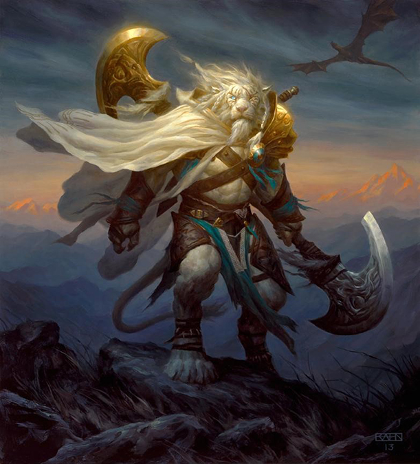
Maybe it’s a Frank Frazetta nod to standing atop a stone is a trope, sure, but damn it looks good. Chris has been adding some great touches of color to add some balance to a piece and focus your eye. I see that ray of light on Ajani’s face, and I see the two secondary light sources of red mountains.
It’s a Planeswalker—you can’t phone this in. His paycheck after his eBay auction confirms his hard work, and Spectrum validates his hustle.
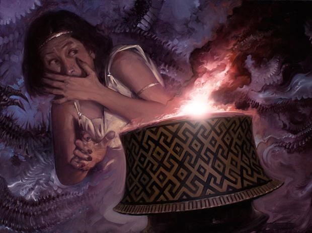
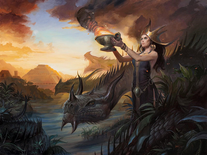
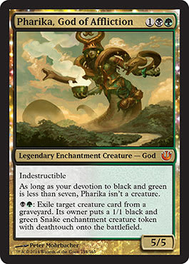
Pete Mohrbacher – Pharika, God of Affliction, Digital
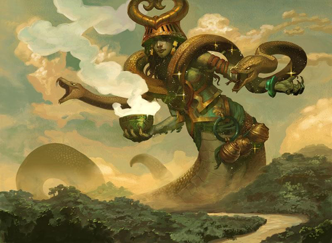
In 2014, artists nearly always touch up artworks in Photoshop or Painter, so it’s often hard to tell the difference at first glance. The white smoke looks exactly like acrylic paint, and yes, I was confused about whether it was truly digital when I first saw it. I even pinged Pete a message to ask whether he changed his media. That was an odd exchange, with him being confused at me.
It’s just an all-around great usage of shadow, from foreground to details of the water to clouds and the snake. He studied reference incredibly well with light, and it shows, with being included in Spectrum.
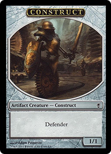
Adam Paquette –Clockwork Defender (Construct Token), Digital
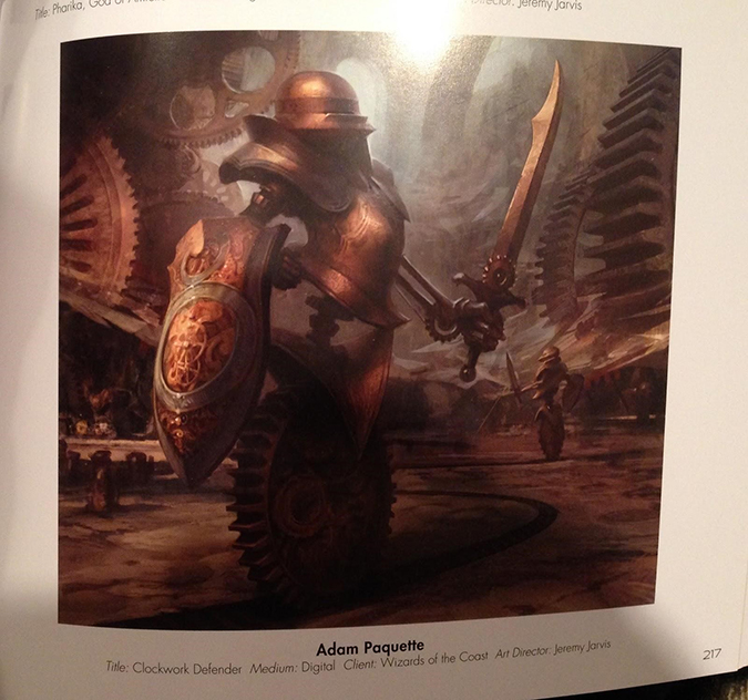
It’s whimsy back in Magic. Yes!
Conspiracy gave us a ton of intricate metalwork, with a very steampunk, Victorian style. Paquette is a professional with environments, and I’m unsure whether those gears in the background are gigantic or miniscule. I assume they’re huge, as the token is a 1/1, but I like the exercise that makes me question it. I can’t tell by the light. It makes me stare at the sheen on the shield, sword, and helmet.
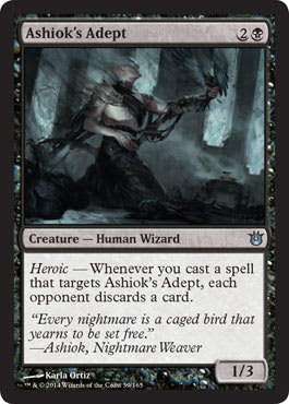
Karla Ortiz – Ashiok's Adept, Digital
Just stop.
STAHP.
Karla needs more Magic commissions. She never misses. Even the stained glass in the background is correctly made from great reference. It’s just all there: great anatomy, great reference, and a set of digital brushes that brings a lot of softness that far too many folks ignore when painting.
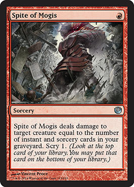
Vincent Proce – Spite of Mogis, Digital, 5004 × 3643 pixels (Crush the Learned)
Muting colors really does force you to focus, doesn’t it? He’s red and giant, and he’s here to do one thing: smash. I love the scrolls on the wall!
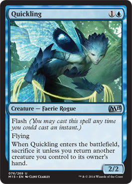
Clint Cearley – Faerie Tangler (Quickling), Digital
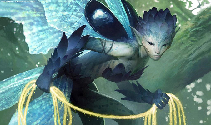
I guess this card went through a radical design change, huh? It went from art with the name of a “wrangling” mechanic to being just a flash creature. Interesting changes will always be part of the process.
I find it odd how the face is hyper-realistic compared to the looser lasso, but the overall effect gives the arm petals a softness to create a really fun top-to-bottom eye movement. The wings are beautifully rendered, allowing the digital transparency to really do its job.
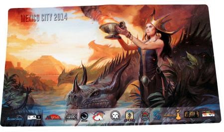
Lucas Graciano – Dragon Queen, Oil, 24" × 18"
This piece, while not Magic from card or created for institutional marketing, shows the next stage in art excellence. Lucas made this for the Mexico City Grand Prix. I’m waiting for the day for tournament organizers to just hire great artists—the art can be incredible. Costs are enormously higher, so in the battle of budgets, it’s too often a race to the bottom. This art shows that play mats don’t need to be marginal, and Spectrum gave the nod as well.
The Cards
Here are the cards, as seeing them in minute form shows you utterly how much is lost. Nessian Game Warden is the perfect example of detail being lost at card size. Notice also how there are zero landscapes or environmental inclusions. At $20 each for a submission, an environmental artist might submit ten pieces he or she has done in a year from Magic or Legends of the Cryptids or a movie he or she worked on. It’s actually uncommon for lands to make it in.
 |  |  |
 |  |  |
 |  |  |
 |  |  |
 |  |  |
 |  |  |
 |  |
These are the iconic artworks of last year—no question there. I’d test them out on play mats, deck boxes, and other products. They look a helluva lot better in high resolution compared to the tiny card-art box.
-Mike