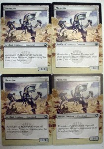
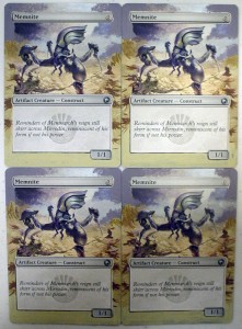
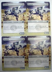
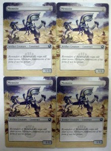
Today’s article goes out to all the little guys with big potential. We’ll be working on a little guy who just came onto the scene and has some big potential of his own, Memnite. People at the store were working this little guy into decks weeks before Scars of Mirrodin even shipped. He may only look like 3-legged robo-bug, but a turn one ‘Mountain > Memnite[card] > [card]Kuldotha Rebirth’ turn 2 ‘Mountain > Goblin Bushwhacker kicked’ is pretty good, not to mention the possibilities of ‘Trinket Mage > Memnite > Vengevine > Vengevine > Vengevine > you die, etc. I’ve seen it happen, and it ain’t pretty.
But back to painting, the citadel colors I picked out using for this are Skull White, Chaos Black, Codex Grey, Bleached Bone (a warm neutral/ beige), Ice Blue (a bright turquoise /sky blue), Liche Purple (a dark, vibrant royal purple), Dwarf Flesh (a nice muted orange/flesh tone), Graveyard Earth (a standard medium brown) and Scorched Earth (a dark brown/burnt umber). Since many of you have been reading this column for a few weeks, I’m going to go a little more in depth with some theory, and explanations behind how I make decisions about what to paint. For more information on the materials I use, you can check out my Q & A article here.
When you look at the artwork done by Svetlin Velinov, you can see there are really only 2 ‘strings’ of colors in the palette- the string artists call ‘cool neutral’, meaning a string of colors starting at white, going through grays and ending at black, (here mixed with some cool purple) and another paint string- warm neutral, a string which starts at white, goes through beiges, and ends with a dark dark brown. I only mention this because these are the most basic ‘strings’ of color from which all other colors on a classic painter’s palette originate. It’s almost like a painter’s version of black and white, and Velinov has painted an entire scene with these most basic building blocks. I find it very cool (no pun intended).

Because I like the colors he used so much, I’m going to be extra careful not to add any new colors of my own. I’m just going to extend the art, without too much variation, so there are only a few decisions to make.
The first decision I’m going to tackle is the clouds at the top of the scene. You can see that there’s a big, imposing storm cloud on the right, a break with light sky, and another more friendly cloud (RIP Bob Ross) all the way on the right. We get to make the decision whether the storm is gathering or dissipating. I’m going to expand the sky and separate the clouds a little more, and I’ll tell you why. Because the borders on cards are black now, everyone is used to seeing black at the top of cards. When you extend a light sky at the top of a card, the difference is dramatic, and gets a big ‘wow’ from the viewer. As an artist, I always look for ways to surprise the viewer. My friend Sean refers to this effect as ‘opening the top up’, which is apt, because it is very much as if the art is in a box, and we have an opportunity to open the box and let the art out.
Now that I’ve decided to make the top light, that directs to make the bottom of the artwork darker, so the dynamics of the art are kept in balance. That decision was pretty easy.
Since I know now what I’m doing with the card, all that’s left now is ‘Where to start?’. This decision is mostly a matter of preference; I tend to save the most complicated stuff for last. If there’s an issue of how to hold the card (I like to have the card in my hand while painting, I have a friend who always paints with her cards on a flat surface, another matter of preference) then that may affect your decision so your fingers aren’t getting in your work. I’m going to start with the beige/brown ground.
I’m just going to go ahead and underpaint Bleached Bone around the border where the ground is in the picture.
I’m going to mix some Graveyard Earth (brown) with my Bleached Bone to add some of the variations in the earth tones.
Next I’ll mix a little Dwarf Flesh (or a little bit of orange with Bleached Bone (or your neutral beige color) and add some of the warmer tones of earth.
Our last shade for the ground will be created by adding a sliver of Scorched Earth (dark brown) to some Graveyard Earth (medium brown). Look at the shadows in the little crags (not the Memnite’s shadow) to see the color you’re looking for. The shadow areas are smaller details, so I’ll use my small brush. Continue the pattern of darker whispy lines down the sides of the card, remembering that we’re going to add a darker color on the bottom, and fade it into the mid-tone of the middle of the card.
Let’s add some tiny streaks of Bleached Bone (beige) for highlights over the middle-brown tones we painted to mimic the texture of the ground.
For the last touch to the ground (for now) I’m going to take my ratty brush and drag a few strokes of Graveyard Earth (medium brown) at the top of the of our painted area to give the mountains a little texture. Working with drybrushing should be fast and easy, with short free strokes. Don’t overthink it, or it won’t look natural. These little strokes should take about 30 seconds for all 4 cards. Trust your hands.
We’ll come back to Memnite’s shadow, and the shading at the bottom of the card later. Let’s move on to the sky and our other ‘color string’ now.
I’m going to strategize again, so I know exactly how I’m going to tackle the painting of the sky. I think the best way to layer and have a natural look with out redoing any colors is to paint the sky first, then the lighter shade of the bluish/purple/gray clouds, and finally add the darker blue/purple/gray cloud shadows. It’s always best to paint dark over light, because it often takes extra paint to make a light color opaque over a darker color.
So I’ll make my sky color by mixing a bit of Ice Blue (light blue) into Skull White. This creates a very light sky blue that’s a little too cheery for this context, so I’m going to add a VERY SMALL sliver of Codex Grey (medium gray) into it. A ‘sliver’ is a bit of paint only on the edge of the palette knife blade. A couple tiny slivers of gray did the trick for me, so I’m going to take my medium brush and paint in the sky on the top and right of the card. As I’m painting the sky on the right, I notice that the color in the artwork is almost purely light gray in that area, so I’ve decided to go over that spot again in a light, light gray with my ratty brush to blend it in. After focusing on that small section of sky on the right, I’ve also realized that my light gray color is used to transition between the sky and the dark cloud on the left, but there’s a twist. In paintings, colors never stay in their designated area. If you look, you can see colors from one subject have been snuck into areas they wouldn’t logically belong to. This is a trick the artist uses to make everything in a painting look like it belongs together. There’s some grayish purple on the ground. There’s some beige on Memnite. And in the sky we’re painting, right in that transition between sky and cloud, there’s a pinkish-beige haze. To replicate that, I’m going to add a bit of my Dwarf Flesh to the light gray I mixed. Again I’m going to blend this in with my ratty brush. When that’s done, on the same strip of sky at the top, I’m going to blend some white with the same brush. It may seem like we’ve covered up our sky blue completely, but since we’re using the drybrushing method, we should have blue peeking out still from underneath. This definitely makes the sky seem much more realistic.
Next up, the clouds. Remember, we’re doing the lightest part first. First I’m going to mix a medium-gray using about 2 parts Skull White and 1 part Codex Grey (medium gray). Since we’re adding Liche Purple (royal purple), which is very dark, we want the gray to be a little lighter than the shade in the original artwork. Add a sliver of purple to the gray, and then another if needed, to get the lighter cloud color. Once I’m happy with what I have, I’ll take my medium brush and paint the clouds in. Afterwards I’ll go back and blend the edges with my ratty brush. This time instead of dragging the brush, I’m going to lightly dab it around the edges of the clouds, as if I was making dots with a pen. This is called ‘stippling’.
I got into the groove and forgot to take a picture of the sky blue on its own, but here’s where we’re at so far:
For our cloud shadows I’m going to add a little more Liche Purple (royal purple), and a little Chaos Black to our original color. With my ratty brush I’m going to use the same stippling technique to make a natural looking shadow.
Now I’m not sure about your painting, but looking at mine you may be noticing what I am. The sky is MUCH darker than I planned when we were starting out. I wouldn’t call this a mistake. In art there is no such thing as a mistake. This is what we call a change of plans. Sometimes the best parts of a piece are changed plans, as they keep things fresh and spontaneous. The solution in this case is very simple. Instead of making the foreground on the bottom dark to balance out a lighter sky, we’ll leave it light to balance out a dark sky. I’m going to paint another layer of Bleached Bone (beige) to make sure it’s opaque, and go from there.
With that done, let’s mix up the beige/flesh color we used in the ground earlier. Add a little Dwarf Flesh (or a a tiny bit of orange) to Bleached Bone (beige). Once again I’m going to use my trusty ratty brush. This cheap brush has been way more useful in death than it ever was in life.
I’m going to take the ratty brush again and make some streaks of Graveyard Earth (medium brown) in random direction in the ground on the very bottom for texture.
Our final step is Memnite’s shadow. I’m going to mix a tiny bit of Chaos Black into Graveyard Earth (medium brown), paint the shadaw, and then add some textural lines in black. Remember, this alter is about little guys with big potential, so we want the shadow to be impressively large.
And that’s it! Sign and date it if you want to, and be sure to seal it with a spray acrylic sealant to keep the paint from sticking to sleeves or binder pockets.
If you’ve been inspired/worked up the nerve to follow along with any of these tutorials, I’d love to see them! Email me photos of your versions of alters from any of the articles at awillson@jupitergames.net. I’ll includes them in the next article.


