


To date, there have been a total of 16 numbered Final Fantasy video game releases. What began as a role-playing Nintendo game in Japan in 1987 (1990 in the U.S.) has since grown into a massive, multi-million-dollar franchise. I suspect Final Fantasy is a gold mine for Squire Enix in much the same way that Magic is a cash cow for Hasbro.
Despite this long, extensive history, I have an embarrassing confession to make. I have never owned nor played a Final Fantasy video game. It's not that I'm opposed to it. I love classic video games and have a large collection (mostly from Sega). I just never got around to trying Final Fantasy and somehow overlooked the phenomenon altogether.
The Art of Final Fantasy
It is with this unfamiliar lens, that I am perfectly suited to compare and contrast art from Magic's Final Fantasy set. My approach will be simple. For each color (and colorless), I will highlight the piece of art that reminds me most of Magic with the piece that came straight out of a video game (and is therefore out of place). Because the reality is this set has a bit of both going on for it, likely in an attempt by Wizards to placate fans of both franchises.
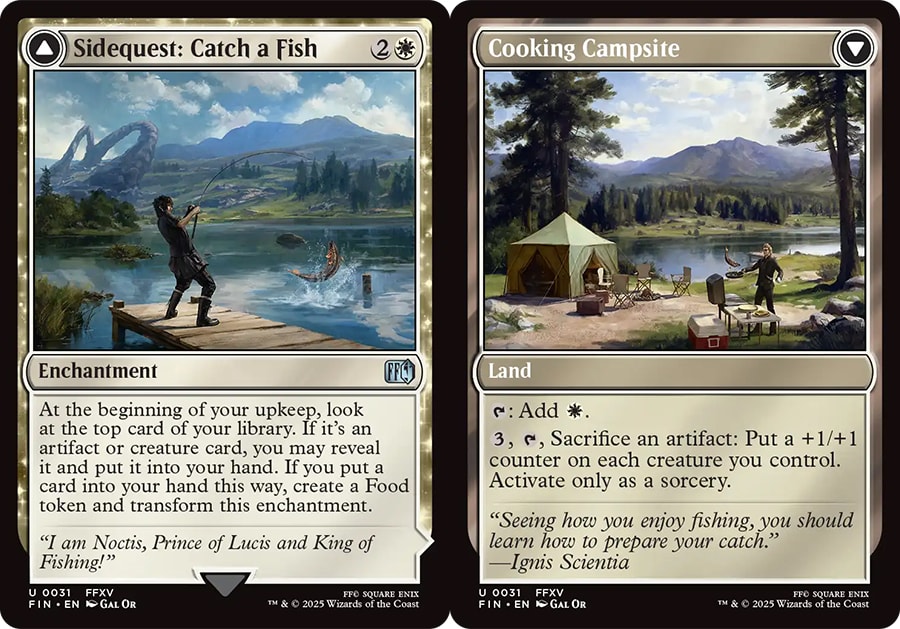
White - Aerith Rescue Mission vs. Sidequest: Catch a Fish
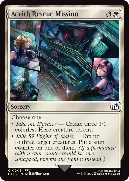 |  |
Ignoring the names of the cards for a minute, the artwork on the left looks bizarre for a Magic: The Gathering card. I see the outside of a tall building, and a person is running toward the stairs. Ok, there aren't too many fire escapes in typical Magic universes but I'm sure they exist on Capenna.
I can accept this premise. What I don't understand is why there are random frames within a frame on the periphery of the art, containing images of various characters. Are these people floating in a magical mirror in the sky nearby this fire escape? Of course not. This is some sort of frame cutaway effect, and it feels jarringly out of place on a Magic card.
Contrast this with Sidequest: Catch a Fish. While the card name is ridiculous, the artwork is consistent with a magical fantasy world. I admire the landscape in the background, including the interesting, circular stone structures in the distance (they remind me of one of Tempest's Mountains).
What's more, catching a fish may seem like too mundane of a task to show up on a Magic card. Up until recently I might have agreed, but with the printing of Fishing Pole in Foundations, I'd say a ranger using said fishing pole to catch a fish makes perfect sense in the Magic multiverse.
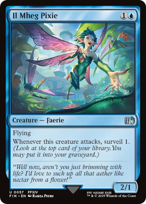
Blue - Memories Returning vs. Il Mheg Pixie
 |  |
I'll admit there were fewer incongruous Final Fantasy art pieces in Blue than in White. Most cards in this color at least resembled other Magic cards. One that felt a little out of place to me is Memories Returning. I have no issues with the art itself - it simply looks as though it was screen captured from one of the video games.
You've got a man and woman walking through a dusty room of sorts, with the faded images of the two as children exploring the same space in the past. It's not that it's a bad piece of art - I actually love the lighting from the windows and the expressions on everyone's faces - it just looks odd for a Magic card is all.
This incongruity stands out best when compared with other Blue cards from the set. There are many that remind me of older Blue cards, such as Dragoon's Wyvern (Sea Drake) and Quistis Trepe (some sort of Counterspell). Even Relm's Sketching and its dinosaurs would fit right in on Ixalan.
I chose to highlight Il Mheg Pixie, however, because I enjoy the colorful depiction of fairies and the fantastical landscape that surrounds them. This card artwork could have appeared in Lorwyn Eclipsed and it would have fit right in. In fact, this faerie card would fit in with many other Magic sets.
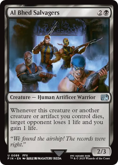
Black - Al Bhed Salvagers vs. Qutrub Forayer
 |  |
While Blue Final Fantasy cards mostly reminded me of other Magic universes, Black cards from this set were the polar opposite. So many of these cards look quite inconsistent with what I've come to expect from a Magic card. There's some sort of obsession with eyes in Ahriman and Hecteyes and the texture on Shinra Reinforcements feels bizarre to someone unfamiliar with the franchise. Don't even get me started on Sidequest: Hunt the Mark, depicting a bunch of flyers on the wall.
I decided to focus on Al Bhed Salvagers for two reasons. First, their attire seems a bit goofy and incongruous, even from person to person. Maybe that's the point, but they all look like they're in various stages of preparing for their next swim meet.
Second, what's with the guns?! While Magic has done guns in the past (particularly in Portal: Second Age), they show up infrequently in art, and not usually looking so realistic. I'm sure they fit in perfectly with the Final Fantasy aesthetic, but in general I find rifles incongruous with the fantastical multiverse Magic attempts to create.
While not more pleasant to look at, I am much more comfortable with the art on Qutrub Forayer. It's a zombie with a sword and some sort of magical power. We've seen 100's of zombies before, and a handful of them can even conduct magic (Acererak the Archlich, Boris Devilboon, Dreadhorde Arcanist, etc.).
The landscape that surrounds Qutrub Forayer also looks like a familiar, swamp-like area. Simply put, in the mind of someone who loves Magic but isn't familiar with Final Fantasy, Qutrub Forayer makes much more "sense" than Al Bhed Salvagers.
Red - Blazing Bomb vs. Sandworm
 |  |
Similarly to Black, there were some interesting pieces of art in Red Final Fantasy cards. At first, I was going to select Laughing Mad for my "out of place" art, but then I considered that this horrifying piece would have fit seamlessly within Duskmourn. Prompto Argentum was my runner up simply because the person in the foreground is flashing the peace sign - at least there was an interesting battle going on in the background of that one.
Instead, I landed on Blazing Bomb. The first thing that popped into my head when I saw this art is "Why does the fireball have a face?" In fact, this looks more like a Pokemon character than it does a Magic card. I love the coloring, and I am one hundred percent confident this card has a place in the Final Fantasy world. It just feels incredibly out of place in Magic.
I chose to contrast Blazing Bomb with something far more mundane - Sandworm. While it looks more like a wurm than a worm to me, I'm used to seeing giant, worm-like creatures in other Magic universes. In fact, there have been over 100 wurms across Magic's history.
Additionally, there have been 14 worms (though typically they're of a much smaller variety), so Sandworm has a home no matter how you slice it. We've even had numerous worlds with deserts upon them, so the backdrop for Sandworm is equally consistent in nature.
Green - [Jumbo] Cactuar vs. Esper Origins
 |  |
I didn't have to scroll far before identifying the Green card with the strangest artwork. That award goes to Cactuar (honorable mention to Jumbo Cactuar). Both Cactuars can be co-winners, really. I'll lead you choose between the surprised-looking, running cactus and the surprised-looking cactus with a twirly mustache. Either way, there are no other running cacti in Magic's history, and it's crystal clear that these are from a universe beyond your standard Magic fare.
Meanwhile, I was admittedly surprised when I saw Esper Origins because I hadn't realized it was in this set! I've played against this card in many Standard matches on Arena, but never considered this was a Final Fantasy card. The art, while somewhat abstract, is beautifully done and looks right out of a fantasy story. Not a Final Fantasy story.
We've had many abstract pieces of art across Magic history, and I thoroughly enjoy this instance. I could see this card being reprinted in many future Standard sets, and it would blend right in. I can't say that about Cactuar and friends.
Colorless - Instant Ramen vs. World Map
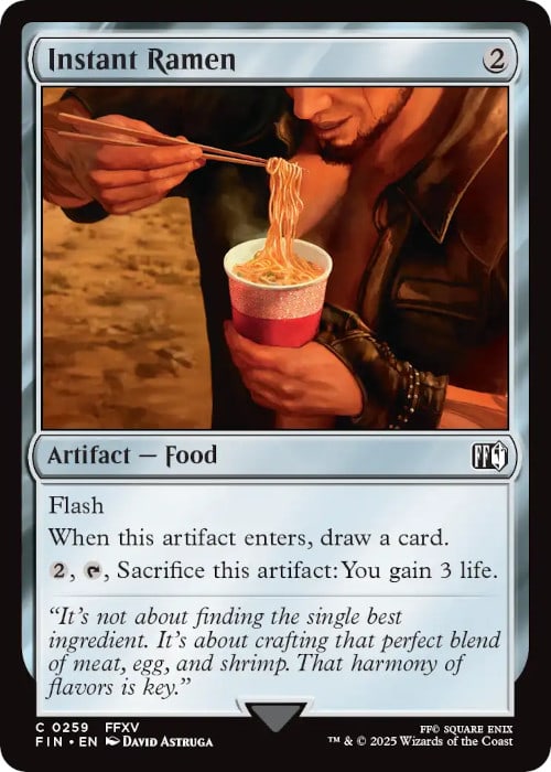 | 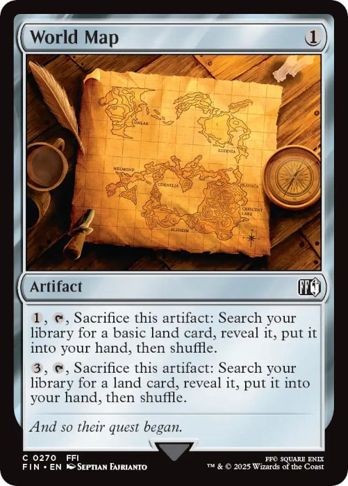 |
I don't think this will take much convincing. On one hand, you have a notable noodle dish from many East Asian cultures dating back to the late 19th century, reminiscent of many late-night college snacks. On the other hand, you have a map of a faraway land sitting on a desk.
Instant Ramen looks delicious, but I'm not sure how it fits in with Magic. Meanwhile, World Map reminds me of multiple older Magic cards, such as Sisay's Ring and Expedition Map. The latter would make sense in almost any Magic set, whereas the former is completely out of place outside of a Final Fantasy universe... unless there's a future Universes Beyond themed around Iron Chef.
Wrapping It Up
Nearly all cards from Lord of the Rings could have blended in seamlessly with historical Magic stories and universes. It was a natural fit. Final Fantasy, while still fantasy at its core, had a few more disjointed themes that felt out of place to the unfamiliar player (such as myself).
With this ignorant lens, I highlighted some of the cards that felt most out of place in a Magic set and contrasted these with the Final Fantasy cards that blended in smoothly. While many in universe Magic sets have giant worms, maps, and zombies like those we saw in Final Fantasy, other themes such as running cacti and instant ramen were incongruous.
Fans of Final Fantasy will likely say the set would have been incomplete without such references. I am more than willing to accept this position, and acknowledge that the Final Fantasy set was better because of their inclusion. My main point is simply that, to an unfamiliar eye, these concepts feel less like Magic than what we typically see in a set.
Then again, with so many future Universes Beyond sets in the works, Final Fantasy's approach will become the norm and not the exception. For those who carry my sentiment, we had better get used to this pattern going forward because I suspect it's going to occur more frequently, not less.
When I take a step back, I can honestly say I don't mind the disparate nature of these whacky cards. As long as the game remains fun and the Draft experience is enjoyable, I will continue to appreciate any new set Wizards of the Coast throws my way.