A lot is going on this summer.
It's ok.
It's time to slow down, and look at some art.
Today, I saw a new artist with some skill I want to highlight. In reaching out, I learned so much more than I expected and had to immediately stop my Core Set 2020 art review and invite you in. Enjoy meeting Hugh, the PIndurski, Pindur, the Canadian Magic artist.
Mike: First of all, who is Hugh?
Hugh: Let's see, in a nutshell I am a graphic-designer, father of two, husband, and triathlete by day and when the sun goes down I become an "artist." I've got a lot on my plate as you can guess, so I've had to make some sacrifices to make room for the things that are important to me. In my life it's all fluid; different aspects of my life demand more attention at times then others and in turn the other areas have to flex and bend. But, I'd say, "Hugh is sleep-deprived." But then again aren't most artists?!
My wife is also a triathlete. This will explain a lot.
On art, did you go to art school? How were you taught?
I actually opted to go to school for graphic design. I drew a lot of comic-type stuff in high school and I was either going to go away to school for animation or stay local and go to community college for graphic design. I played it safe and took graphic design. Very shortly after starting graphic design school I gave up on drawing as my creative endeavors were now being entirely redirected. For 17 years I gave up on drawing. I remember stumbling on some concept art speed-painting videos on YouTube on my lunch break one day and the desire to draw again was rekindled. But after 17 years there was a lot of fear and anxiety every time I picked up a pencil, and everything I tried to draw turned out horrible. But I kept watching videos and came across Feng Zhu, Maciej Kuciara, Scott Robertson, John Park-there was SO much knowledge that these artists were giving away. I just dove head first into trying to understand the fundamentals and made as much as I could. But I was also 35 years old, with a full-time day job. So, no joke, starting in the fall of 2013 for the next 2.5 years I woke up nearly every weekday at 2 or 3AM and made art until my day job started at 7:30. I joined the conceptart.org community (before the great exodus of that website), and look the opportunities to learn from John Park and Dong Jun (via Patreon), and more recently I did a mentorship class with Donato Giancola through smarterartshool.com. The feedback and paint overs I received from these artists was so incredibly important in my progression. I think without intentionally seeking the help and advice from much better artists I would NOT be where I am today. And to the other artists that I reached out to along the way to solicit advice I am so grateful for their generosity.
You started pushing at age 35. That's incredible! So where did you do this?! You live between Detroit and Toronto, have you always been there?
Yes, I've lived in London, Ontario for the last 20+ years now, so at this point it feels like I've "always" been here.
Sounds great. Will make a note the next time I drive to visit my brother in Toronto.
Your work is digital. Is there any part of it that is traditional based like thumbnails in pencil? (just curious)
I do keep a traditional sketchbook, but truthfully since baby number 2 arrived it gets neglected. With what free-time I do have it's spent on "play catch-up" on all the paintings that are due!
Do you make prints/lithographs of your art? If so, where and how can folks get them going forward?
I know the answer to this question should be yes, but sadly for the most part it's no. I do have a couple items up on my ArtStation store which I am slowly updating as my more recent paintings get released. That being said, I am more than happy to make prints of any of my work if people contact me directly!
Noted for the future, and I bet they will!
What does it mean to join Magic's rank as an artist?
It's still exciting. Truly, more often than not I feel like an impostor when I look at the works of Jesper Ejsing, Michael Hayes and Sidharth Chaturvedi. I feel like a very tiny prawn in a vast open sea talent.
Let's talk Magic art and the reason for the interview!
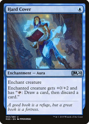
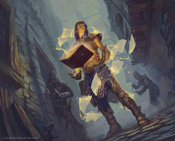
I was blown away by Hard Cover. It felt so refreshing, so familiar yet still new. Let's talk more on it!
At card size, this feels more spell than creature card. How did you approach the difference there, so as to not cause confusion?
Shit, can I be honest?! This was my second card and I still recall feeling overwhelmed. The art description called for a cocky teenage male wielding a floating spell book above his hands in a dark seedy alley - the pages are dissolving into a protective spell around him (something like that). Still a little star struck I simply set on creating an image that depicted just that. I didn't really consider spell vs creature at the time. My primary focus was not to mess it up!
Oh they are going to love you.
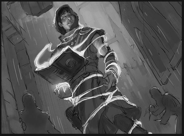
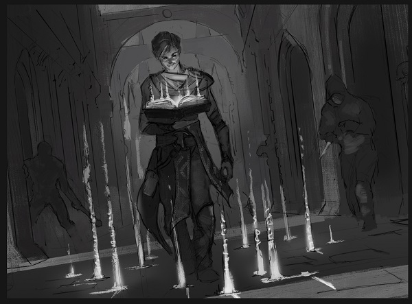
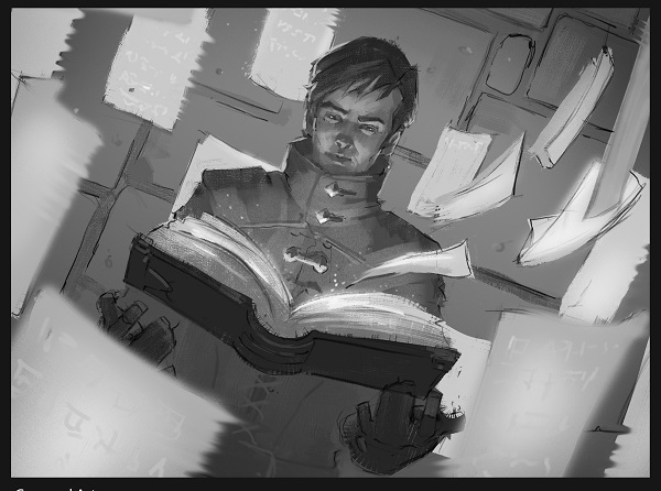
How did you go about choosing a thumbnail here?
My favorite, option B, was passed in favor of A. But the feedback was to take the swirling pages from option C and integrate them into A. See below:
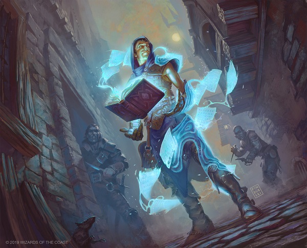
The scene feels very D&D, have you played the game at all?
Sadly no, it's a super long story as to why, but I can understand why you would say that. This particular image is maybe a bit more narrative than other Magic illustrations. The over-the-shoulder gaze and his proximity to the characters in the background make this one more story driven, which I am happy with because that was my intent.
Can you talk at all the leather/armor your character is wearing?
Given the context of the scene I didn't want to make his attire too flashy. Leather, fabric, and relatively vulnerable which paired with his expression and current predicament make his cockiness and confidence all the more pronounced.
You mentioned the shift from orange to blue, I feel the orange is much more D&D than Magic, which feels more blue on a blue spell. Can you speak on what Magic as a brand looks and feels like to you?
Initially I had selected orange because I had seen it used on some other blue cards and the colour scheme, I felt, worked really well with my image. But to answer your question, Magic as a brand, to me, feels a little less gritty and more polished then, let's say D&D. I think my work and style are a little less polished by nature so I think there is always going to be a balance I have to play with so that my art remains my own yet fits well enough into what is Magic. I hope that makes sense:)
Did you reference the character's face off someone you know?
So going back to that neglected sketchbook of mine...
Prior to this painting I had done some pencil studies of faces and expressions. When I started to tackle this image it came too easily because I had just drawn something very similar a couple days before. So this was one done from imagination/memory and I liked the drawing of it so much I didn't want to consult ref in fear of losing the expression. I did however, use a reference image of myself later in the process to confirm some lighting decisions.
The overhang, I see those timbers. That's good. Do you have any reference images that inspired you on realism there?
Oh yes! I've also done some work for Paizo's Pathfinder whose principal artist is Wayne Reynolds. More often than not I have to rely on and consult his art when doing work for them. He uses a lot of these architectural features in his work. I think some of what I have created here stems from his influence. That being said I did stumble upon some images of really good 3d models of medieval villages, so those were super helpful as well.
Thank you Hugh and welcome to Magic! We're happy to have you in our little niche of the art world.
-Vorthos Mike