


Very rarely does the construction of a 3D card go exactly as I expect. While I often start with a good idea of what layers I’ll cut and detail work I’ll do, as I start making layers and pieces, I usually decide to change some things. For example, on the Teferi I made last time, I started out with a layer that included all of Teferi, but later removed one of his arms from that layer. Other times, I go in with only a basic sense of what I want to do, with the intention of experimenting to figure out what works. That’s what I did to make this Arcanis the Omnipotent:
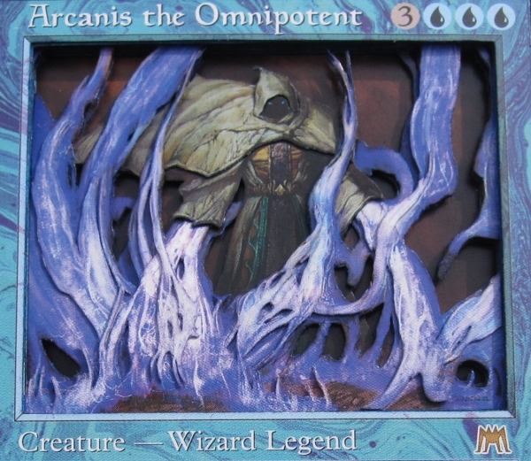
With so much crossing and weaving of the energy lines, I knew that Arcanis would be tricky to pull off. Certain details I am able to visualize thanks to experience, but with Arcanis, I honestly wasn’t sure what cuts would work best and what would look awkward; I had to experiment with different cuts as I went along. This way of doing things takes a lot more time and often ends up wasting cardboard as more pieces end up in the scrap pile. That same issue arose while working on Teysa, as you will see.
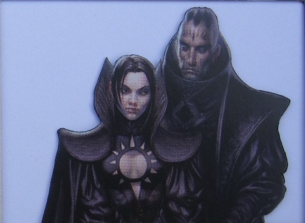
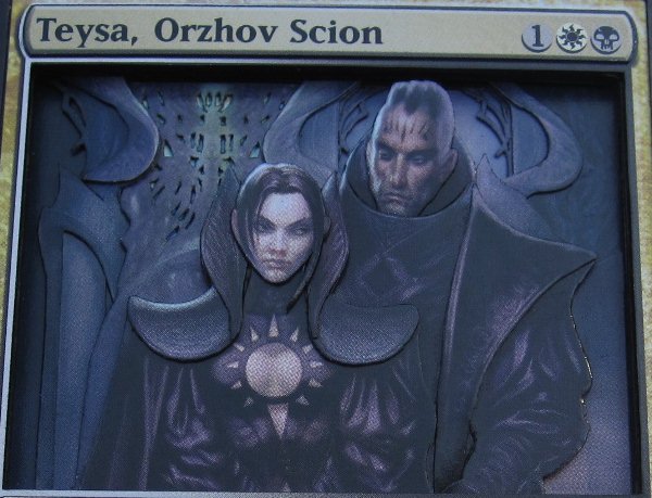
Though I wasn’t trying to rig the vote for which card I would cut up in this week’s article, it was no surprise to me that Teysa won. My Teysa deck was the last of my Commander decks to need a 3D commander, and it’s one that I’ve been putting off for a while. Having her win the vote was the kick I needed to force me to finally cut up the copies that have been siting in my binder for months.
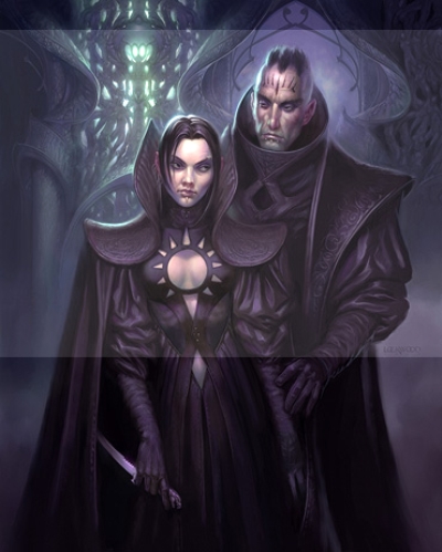
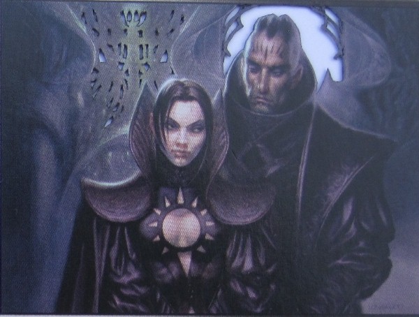
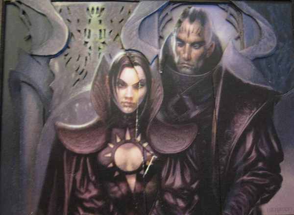
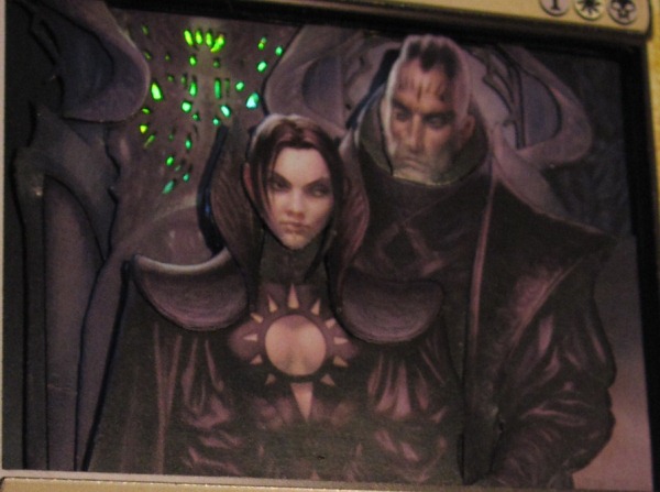
So, why have I been putting off working on Teysa? The biggest reason is that the art is so dark. In a piece this dark, it can be hard to find the borders of certain elements of the art. On this piece, the murkiest part is the blob of black where Teysa’s sleeve meets the man’s cloak. Luckily, the artist, Todd Lockwood, has a personal website, and I was able to find the full version of Teysa’s art there. It’s still very dark, but after cranking up the brightness, I’m able to get a better idea of some of the detail lines:
Another reason I have been putting off working on Teysa is that I wasn’t sure what to do about the glowing windows in the background. I finally decide to cut out all of the windows and put a piece of a blanked foil behind it so that the windows actually glow. To see what that is going to look like, I cut that layer first:
I know this layer will have to be cut more later, but for now I move on, cutting the next layer:
Look at those two layers for a moment and see if you can figure out which one is further back and which is further forward.
The reason there isn’t a clear answer is that I decided to weave these layers together. In the card’s art, you can see that the “frame” of the windows comes out from behind parts of the pillars but ends up in front of them. In the second picture, you can see that I’ve already made some cuts to allow that part of the art to bend back so I can slip the other layer through so it comes from behind and ends up in front.
This is getting complicated, so I take a break from figuring it out to work on Teysa and the man:

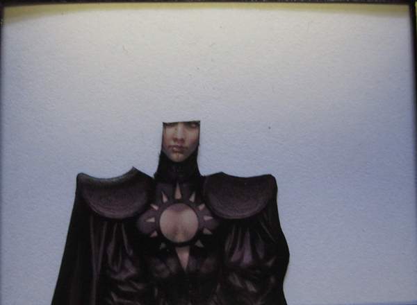
After cutting their basic layers, I work on detailing the man. Since his chin is tucked under his collar, I cut his head with a tab to slip down there, then cut most of his collar line, only leaving the part where it transitions from front to back.
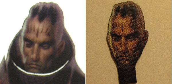
Right now, light shows through the slit clearly, but once the card is constructed, there won’t be any light; instead, it will look like completely natural transitions from one layer to the next.
I cut out the part of his cloak that looks to be something like a stole and shave it to about half-thickness, as demonstrated in my last article. Then I cut away his arm from his body so that the stole can go over his shoulder but then tuck under his arm.
Moving on to Teysa, I experiment with a lot of ways of detailing her head/shoulders/etc. It takes me a long time and a lot of wasted cardboard, but I finally come up with something I like:
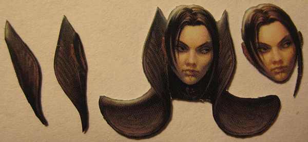
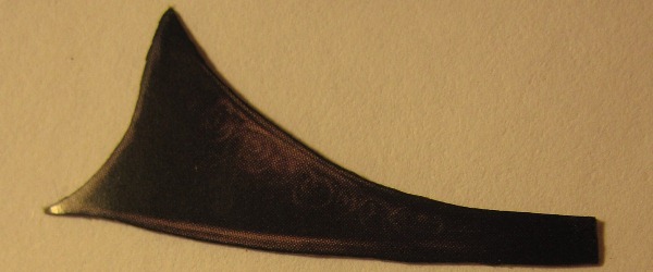
The pieces on the left are both shaved very thin, and there are cuts on either side of Teysa’s neck to make a flap that can be tucked behind her visible neck, shown here:
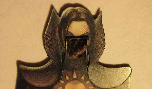
This is the same Teysa-only layer shown above, now cut down so the head detail can be added.
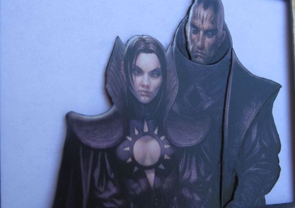
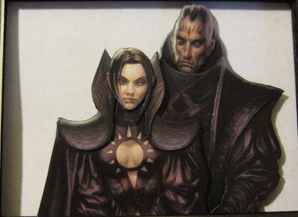
I attach the main piece of Teysa’s head as shown, then add on the other pieces. Here are the foreground characters together:
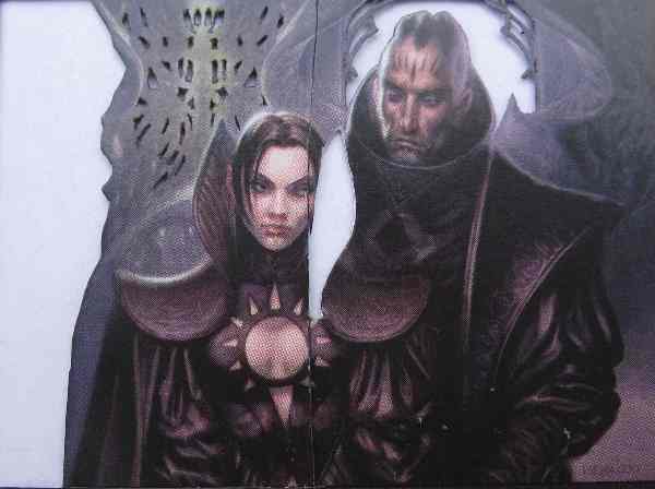
Now I return to my background pieces. They’re missing some chunks stolen to detail Teysa now, but there are other changes as well:
I cut away the side of the window piece, then cut a vertical line in the art on the other side so that I can slide the piece through the slot on this next layer:
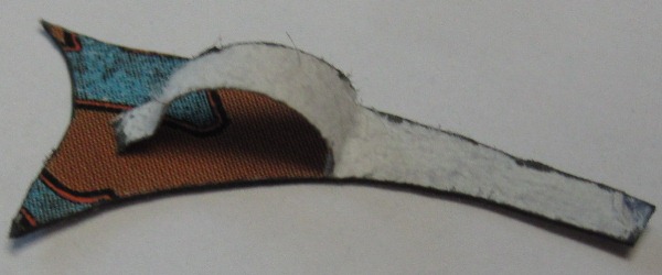
For the window piece to slide through and sit nicely, I needed to make a longer cut in that layer, as well as make a notch for the piece’s edge to cross through. On the left side of that picture, you can see that I decided to detail the column as well, for which I’ll need this piece:
The final pieces I need for detailing are the curved parts on the pillars and a piece on the right that is further forward than the pillar behind it:
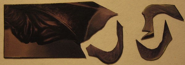
You can see that the curved piece will not extend beyond where it is visible, as I usually want such pieces to do. This is because I don’t have anywhere else to steal from unless I cut up another copy because of how much cardboard I wasted while figuring out Teysa’s head. Luckily, it’s a close enough fit that it’s only noticeable in the finished card if you’re looking for it. Here’s a picture of all of the background stuff put together.
For most nonfoil cards with modern frames, I do the top layers the same way: I take a copy of the card, cut out the art and text box, putting a copy of the card’s text one layer back so that the text is sunken in one layer. Then I cut out the information boxes from other layers along with another card’s border and use them to raise the info boxes and border of the top layer.
The finished stack is like this:
| Bottom Layer: | Random Common |
| Layer 2: | Spacer 1, far backgrounds of Teysa’s art |
| Layer 3: | Teysa: Background Layer 1 (overlaps with next layer) |
| Layer 4: | Teysa: Background Layer 2 |
| Layer 5: | Spacer 2 |
| Layer 6: | Spacer 3 |
| Layer 7: | Spacer 4 |
| Layer 8: | Teysa: Male layer |
| Layer 9: | Spacer 5 |
| Layer 10: | Spacer 6 |
| Layer 11: | Teysa herself |
| Layer 12: | Spacer 7 with Teysa’s text |
| Layer 13: | Teysa with art and text box removed |
| Layer 14: | Info boxes and black border raised. |
In addition, there is a square of blanked foil between Layers 3 and 4 where they overlap for the window section.
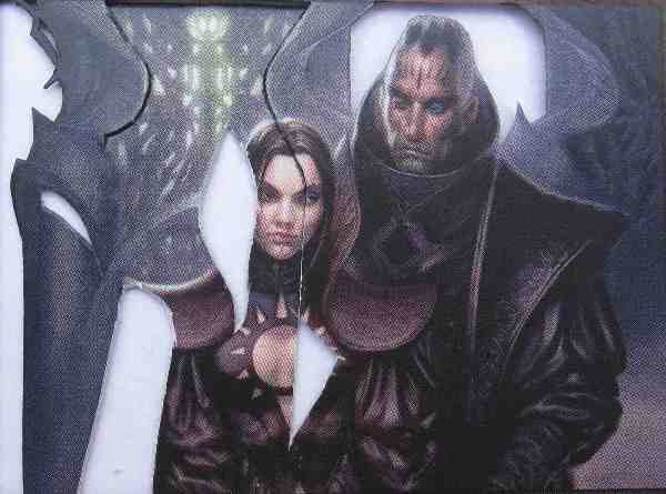
Since the foil is hard to see in pictures, I took this shot, which shows it better but makes the rest of the art look shiny and sloppy:
Thank you all for forcing me to work on a Commander I’d been avoiding. Now I can make another Commander deck! It was going to be Thelon of Havenwood, but with the new Legendary Fungus in the Commander decks, that might change.
Since “Standard common” came in second place last time, I’ll do one of those for my next article. That should make it easy for anyone who wants to follow along to round up copies to use. Up for selection is one playable common from each color:
[poll id="37"]
Drew Sitte
AlteredCity at gmail dot com
@AlteredCity on Twitter