

Welcome to the finale of Altered Reality Challenge #3! We've had a few hiccups along the way but I'm excited to announce the winners by popular vote and the ones determined by our judge panel. I am so excited that we had eleventy entries of all levels of skill and style entered in this round and I can't wait to see what comes of ARC #4 (being announced in two weeks!)
Before I announce the winners, I must note that there was a glitch with our voting system. There were reports of people being unable to vote, I went in and jiggled some cables, pulled some strings, and flipped some switches and it seemed to work. However I also know that it wasn't reflecting all votes immediately after they were cast. As far as I can tell, all votes were tracked even if they weren't displayed. It looks like the untracked votes were largely distributed across all entries, though trending heavier towards the top votes. However the votes which don't get displayed did not affect the order which was reflected in the results displayed so:
Popular Vote
1st. - Andrew Sitte (243 votes) - $30 Gift certificate
2nd. - Thomas Parker (tomcat_mu) (228 votes) - $15 Gift certificate
Judged Winner
1st. - Andrew Sitte - 24.34 points - $30 Gift certificate
2nd. - Marina Velo - 22 points
3rd. - Thomas Parker (tomcat_mu) - 21.67 points
(Update: It was pointed out that we had not included Marina Velo in the Judged top three as she deserved based on her score, this was due to a clerical error during scoring.)
The Judges
This round of the Altered Reality Challenge are judged by:
Jeremy Froggatt - Alterer and writer for StarCityGames.com, follow him on twitter at @jerfroggatt.
Don Wiggins - Owner of Don's Magic and Sundry, he sells altered cards on his site and is a fan of altered cards. He'll be giving more of an every-man sort of perspective. Follow him on Twitter at @TheSundry.
Andre Garcia - Andre is the artist for T:apped webcomic, an occasional card alterer, and playmat artist. He's artsy and a Vorthos. So he'll fit right in. Follow him on Twitter at @creatorpwned.
Artistic Merit: 7.67
Quality: 9.00
Innovation: 7.67
Total: 24.34
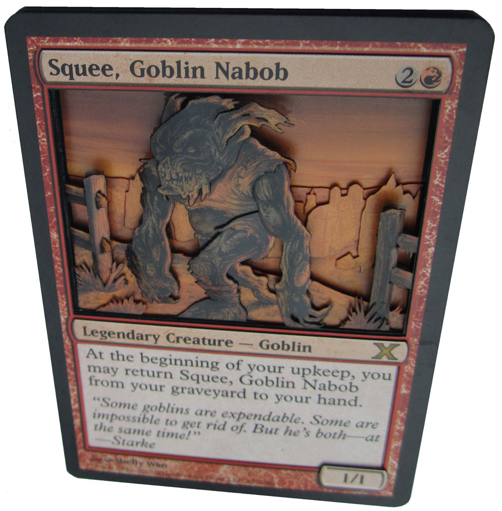
Andre: "First off, a disclaimer: I love Andrew's work. The 3D altered Riku he made a few weeks ago still comes out every time I start a game of Commander, and is easily the coolest looking card at the table. This example is indicative of the great work that Andrew puts into everything he does. The idea of showing Squee as a Festering Goblin fits the theme wonderfully. That said, the greedy vorthos in me wishes Andrew had fit a hybrid red/black border around the card to really drive the point across."
Don: "I really like the substitution of the Festering Goblin in for Squee - VERY creative solution for the prompt!"
Jeremy: "Doesn't matter which way you slice it; 3D alters don't cut it for me. Typically, these are done by layering a few copies of a card and sticking them down in the right order to achieve a 3D effect...yay. What Drew does here though, I would certainly consider 'art'. I'm not familiar with the image depicted, so I'm going to assume he's taken pieces from a handful of other cards to create his own scenery around our degenerate subject. The layering of the surroundings (seen much clearer when the card is tilted) is astounding. The city truly looks as though it's way off in the distance, and he's brought the fence and shrubbery forward expertly. What takes the cake for me though, is the little ends of the fence rails protruding from the post; masterful."

Artistic Merit: 7.67
Quality: 6.33
Innovation: 5.67
Total: 19.67
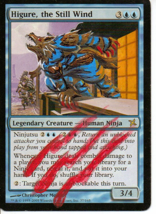
Andre: "Chris's effort features one of those serendipitous moments where a previous piece of art works perfectly for something seemingly unrelated. The full moon behind Higure is a classic take on the "howling at the moon" trope of wolves, were or otherwise. The colors are striking but fit the original, which is so important when doing an alter within the context of the card art. The red claw marks on the card tie nicely to the art and them, though I can't help but wish he'd put just a little more effort into making them look less like brush strokes and more like claws marks. Still a great piece though!"
Don: "Simplistic, but fairly nicely done."
Jeremy: "This piece is a fantastic implementation of the theme. The pose of the ninja native to this piece really lends itself well to the werewolf that Chris has added here. I also like where he was going with the slashes on the text box, though to achieve true depth, putting some black in the middle of the red claw slash would make it look as though the claws actually went through the card. The colours are well thought out, as he's included the light reflection from the house on the werewolf's rear leg and there was an attempt made at moonlighting on various parts of his face and body. Chris did, however, either use too large a brush for the bulk of the work or simply went a little too quickly."
Twitter: @JackieLeeAlters
Blog: http://jackieleealters.tumblr.com/
Email: jackielee@tabletoparena.com
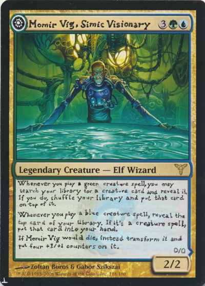
Artistic Merit: 6.67
Quality: 5.67
Innovation: 7.67
Total: 20.01
Andre: "Jackie has an interesting take on Momir, playing with new DFC models introduced in Innistrad. That said, I have to be honest - I don't really get why Momir was chosen for this particular card. Graft is a blue-green mechanic, but Zombie Momir is black-green. There's a certain disconnect that makes the subject and the theme feel forced together. On another note, I can appreciate how difficult it is to make a magic card by hand - the back looks rough, but it's ok because we can all understand that it was done by hand. What I don't get is why Jackie chose to re-do the text in the front. I get that the "day" indicator might force the name over, but I don't get why the entire text box got redone - it doesn't add anything to the piece. Also, minus points for no Golgari symbol on the back. Still, Momir's face is hilariously zombie-like - the ultimate nerd being hit with the ultimate brainless affliction. Perhaps that's what Jackie was going for?"
Don: "While I like the idea of turning Mumir Vig into a DFC, It seems to me that this goes beyond the purview of an Alter - this is actually creating a new card!"
Jeremy: "Whatup two sided card! Not only did Jackie do an entire custom side to a card, she also came up with transformation mechanics and painstakingly scrawled them into the text boxes. The attention to detail is fantastic on both sides and I'm really impressed with the imagery she's used on the new flip side. The lighting and shading is excellent and the new Momir actually resembles the original. Great work."
Email: insectile34@hotmail.com
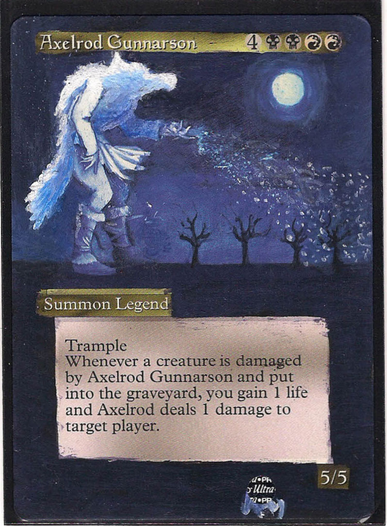
Artistic Merit: 5.67
Quality: 4.67
Innovation: 5
Total: 15.34
Andre: "This cards suffers from the severe lack of epic-ness of early legendary art. The design of these cards didn't do a good job of tying the colors to the cards to the art. This a black-red legend with blue-white art that evokes a sense of melancholy that is antithetical to the ferocity of the Rakdos way of life. We have to ignore the flavor of the card, which would be fine if the art had been done cleverly enough. I get that Kevin chose this card because Axelrod was standing in front of the moon, which ties into the werewolf theme, but the the most significant change to the card is probably the most ambiguous. The wolf's head lacks any discernible features whatsoever, and without that, we're left with little else. The art extension doesn't do anything because the original art was already super-bland."
Jeremy: "This Axelrod by Kevin is another well implemented theme piece. Adding the werewolf to this card is a little more humourous to me though, as he's already a freakin' giant, as if he needs any more special abilities! As for the paint job, the blue shades on the wolf proper are very well done, though he really lets the quality slip with all of the border work. Hacking the paint around the text boxes is fine, if you take the twenty minutes afterwards to clean up the edges, which it is clear he didn't do, and that's where this piece suffers."
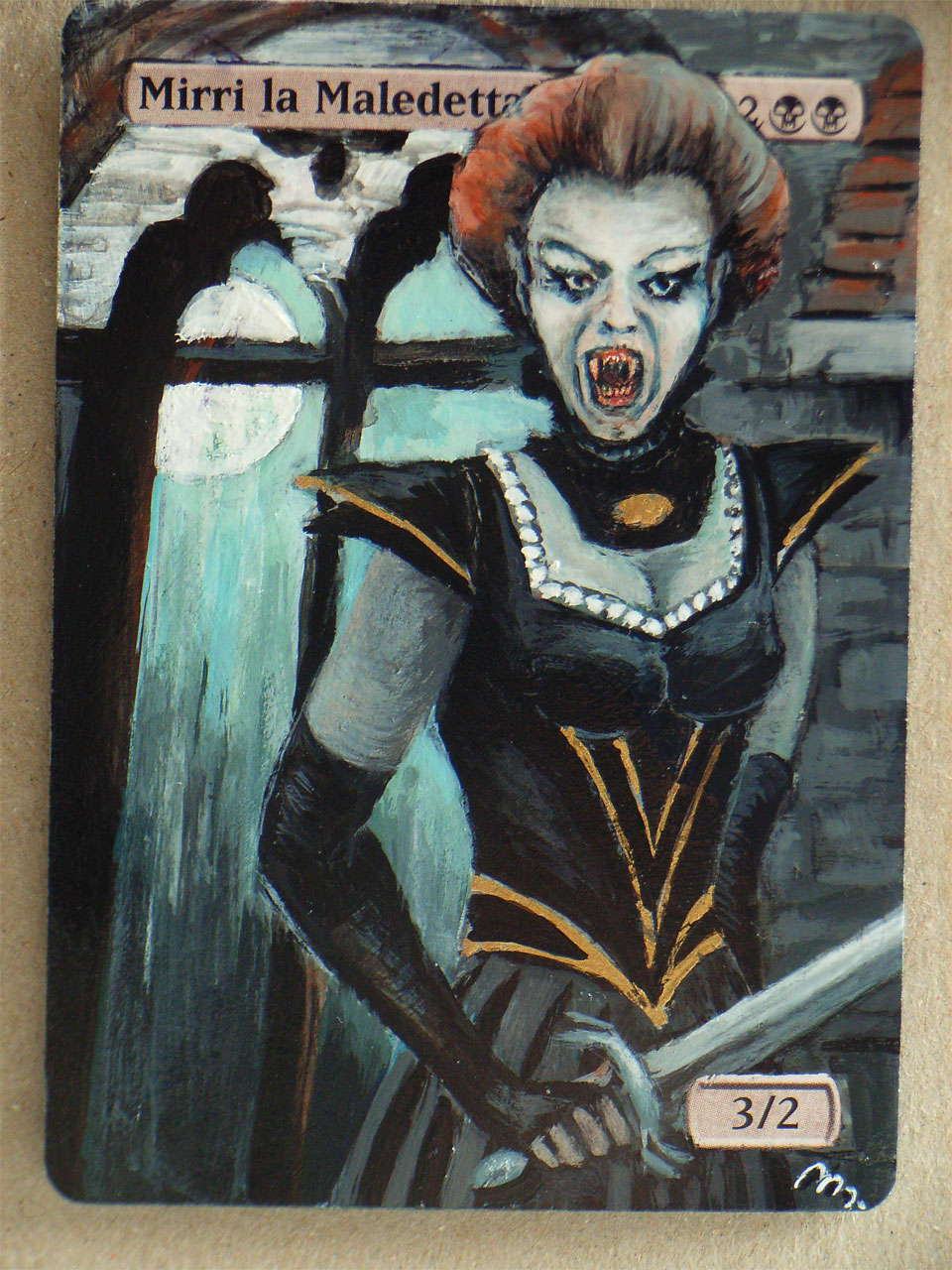
Email: marina.velo@ovi.com
Artistic Merit: 7.67
Quality: 7
Innovation: 7.33
Total: 22
Andre: "Marina really knocked this one out the park - let me just get that out of the way. The flavor is literally dripping off the card, right down to the choice of languages for this card. The Italian version of Mirri's name adds a magical (no pun?) element that is reflected in the arc of a woman who is unquestionable cursed (quick aside: Italian is my favorite foreign language for Magic cards, since it feels like the closest to Latin). On top of all this, Marina did a nice job of setting the mood with cool colors that contrast nicely with the red of Mirri's hair and the gold in her dress - both meant to indicate the last shred of life left in this cursed being. You can't go wrong with gothic windows in front of a moon, and I don't know if it was intentional or not, but the slight bat-shape hinted by the top of the windows puts a smile on my face. Full of win - great job Marina!"
Don: "Isn't this commander ALREADY a Vampire? Seems almost cheating on the prompt."
Jeremy: "This is one scary looking vamp. I love looking at originals because you get to see so many different styles being used between artists. Magic art as a whole has been streamlined to a point where it's difficult to discern one artist from another; getting back to the artistic roots is a beautiful thing. "
"Although 'beautiful' isn't really the word for a clearly pissed off vampire, she is still very well done. There is a good amount of emotion in the face and the backdrop Marina has painted is somehow captivating. Without seeing the artists name, I would have guessed it was a female that painted this...the breasts are a little small to have been painted by a man. =op"
Gallery: http://mdartalteration.carbonmade.com/projects/3182007#1
Email: M.D@europe.com
Artistic Merit: 2.33
Quality: 2.33
Innovation: 2.33
Total: 6.99
Andre: "I really, really don't mean to come off as a troll - but what is the point of this? Dakkon's clothes were extended to a skirt, which doesn't seem horrific in and of itself. Red was haphazardly splashed all over the card for, what I can only assume, is a gory effect. Except it looks messy and doesn't seem to have a purpose. There's no clear concept that ties into the zombie-werewolf-vampire horror them. There's nothing about this that I like (not to mention that magic's first maro-sorcerer was esper-colored - another Legends swing and miss)."
Jeremy: "Is this a scene from Dexter? Not really my cup of tea, this one. The colours in the cape are neat and remind me of Demonium's works, but besides that, I can't find too many positives to build on. I don't really understand what's going on here. There's a subject, and there's blood, but there's no indication where it came from and why it's all over the card. In the future, build more on the surroundings and if you see things starting to come off the rails, instead of plowing through with more paint, stop and scratch some off until you're sure of your destination."

Email: emailrada@gmail.com
Artistic Merit: 6
Quality: 6
Innovation: 9
Total: 21
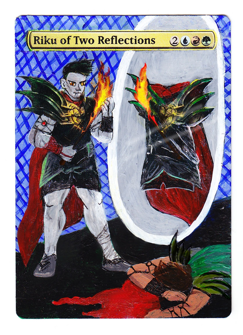
Andre: "Okay, before we get into anything else, I need to call attention to the AWESOME play on words that Rada used for the design of this card. That vampires (often) lack a reflection is pretty common knowledge, and Rada uses this very effectively. Therefore, seeing Riku standing in front of a reflection that only shows his sword and armor seems perfectly logical. It harkens back to the original art while exemplifying the vampire trope. The real fun comes when you realize that "spell" Riku killed "creature" Riku in order to make him "Riku of No Reflections" (take note Rada - you should totally try to change his name). The only real complaint I have with this piece is the weird blue criss-cross design in the back. Is this the favorite wallpaper for vampires? I don't know. It detracts from what is otherwise an awesome piece. Great work, Rada!"
Jeremy: "Why are you wasting all that blood Riku? You're a vampire, if you're full shouldn't you try to bottle some of that for later? Besides the wasted blood, I love what Rada has tried to do with this piece. Having Riku invisible in the mirror was a great idea (because he's a vampire, duh) but I think you should have changed his name to Riku of No Reflections..."
"For some reason this piece makes me think of the old Castlevania series for Nintendo back in the day, not sure why, but anytime art triggers something within, it's a good thing."
"The blue fencing type stuff in the background is what wrecks this work for me though, I feel like we should be in a castle or something, not in a bubble of blue crisscrosses."
Twitter: @descripting
Blog: http://www.stumptownhorror.blogspot.com/
Google+: https://plus.google.com/#116354814960727063783/posts
Email: descripting@gmail.com
Artistic Merit: 5.33
Quality: 5
Innovation: 5.33
Total: 15.66
Andre: "Blood splatter can be a tricky thing. Do it right and it'll tug on your sense of horror. Do it wrong and it looks like someone destroyed a jello cup. Unfortunately, it looks like this one sits on this side of a food fight. At first glance I thought this was a vampire on account of the blood around her mouth, but the clawed hands and moon phases strongly hint that she's a lycanthrope. The viewer shouldn't have to work to figure out what the piece is."
Don: "Was this supposed to be a Zombie or a Vampire?"
Jeremy: "I see what you did there with the moon cycle thingy, very nice. Reminiscent of the Guru lands in a way, which always goes over well with the art community for some reason. Then Rian takes us on quite the journey with the rest of the piece. Let's get the arm thing out of the way first by watching this short video. Kristen Wiig is hilarious...and I'll move along to the next bit; the blood. Using blood is fine by me, but it looks like she's been given a stubbly blood beard. Next: vampire or werewolf? Regardless of which, shouldn't she have teeth?"
Twitter: @swordstoplow
Email: swordstoplow@gmail.com
Artistic Merit: 7.33
Quality: 6.33
Innovation: 7.33
Total: 20.99
Andre: "There's not all that much I can say about this piece. It's fun and captures the fun of the old Magic art while using a newer concept as a basis. It's set at night in a graveyard, which the Mimeoplasm loves, and the skitched-together look fits the theme of the card AND the zombie theme. There really isn't anything bad I want to say about this. It's not over the top awesome, but it lacks anything to complain about. It's too damn agreeable!"
Jeremy: "Original and interesting take on our pal Mimeoplasm. His shape is pretty neat, having maintained the idea of two heads from the original art but doing them very differently and sticking them on a patchwork ogre's body. It's pretty well painted too, with nice details within both heads. He's also spent some time on cleanup with the toothpick! Overall, pretty nice piece."
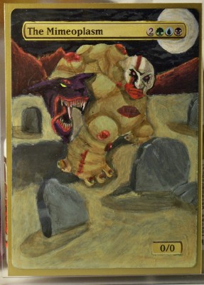
Artistic Merit: 7.67
Quality: 7.67
Innovation: 6.33
Total: 21.67
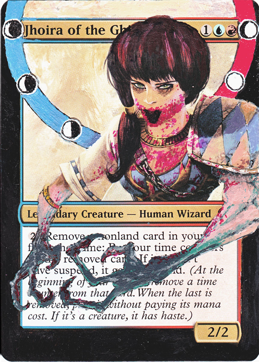
Andre: "There's no real connection between the card's flavor and the zombie state of it's namesake... ...and that's the only bad thing I can say about this piece. Jhoira looks perfectly zombified - the eyes are the same, but have a dead look that replaces the spunky, defiant look of her still-living counterpart. I have to admit, as a player and vorthos, I have a slight crush on one of the most broken commanders in the game, so seeing her like this makes me all sorts of sad, but that's the point of zombies, isn't it? Thomas does a great job at capturing the feeling of hopelessness one must feel at the sight of an undead friend. Does she still suspend? Oh man, she's even scarier now :)"
Don: "While very similar to Rian's this one is CLEARLY a Zombie. Much better done artistically, as well."
Jeremy: "Now that's a Jhoira! This zombified version is really well done. There is a sense of loathing emanating from that face that draws you in. The extension of her body downward is well proportioned and neatly detailed with tattered rags. I really like this one, thanks Thomas!"
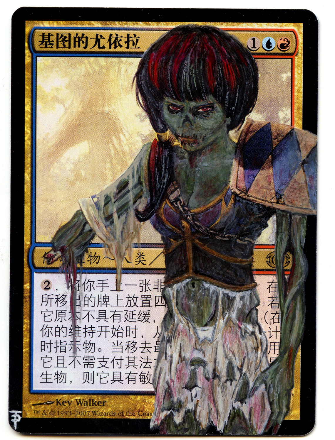
Twitter: @darkensaga
Email: tylerchester14@gmail.com
Artistic Merit: 5.33
Quality: 5.33
Innovation: 7.33
Total: 17.99
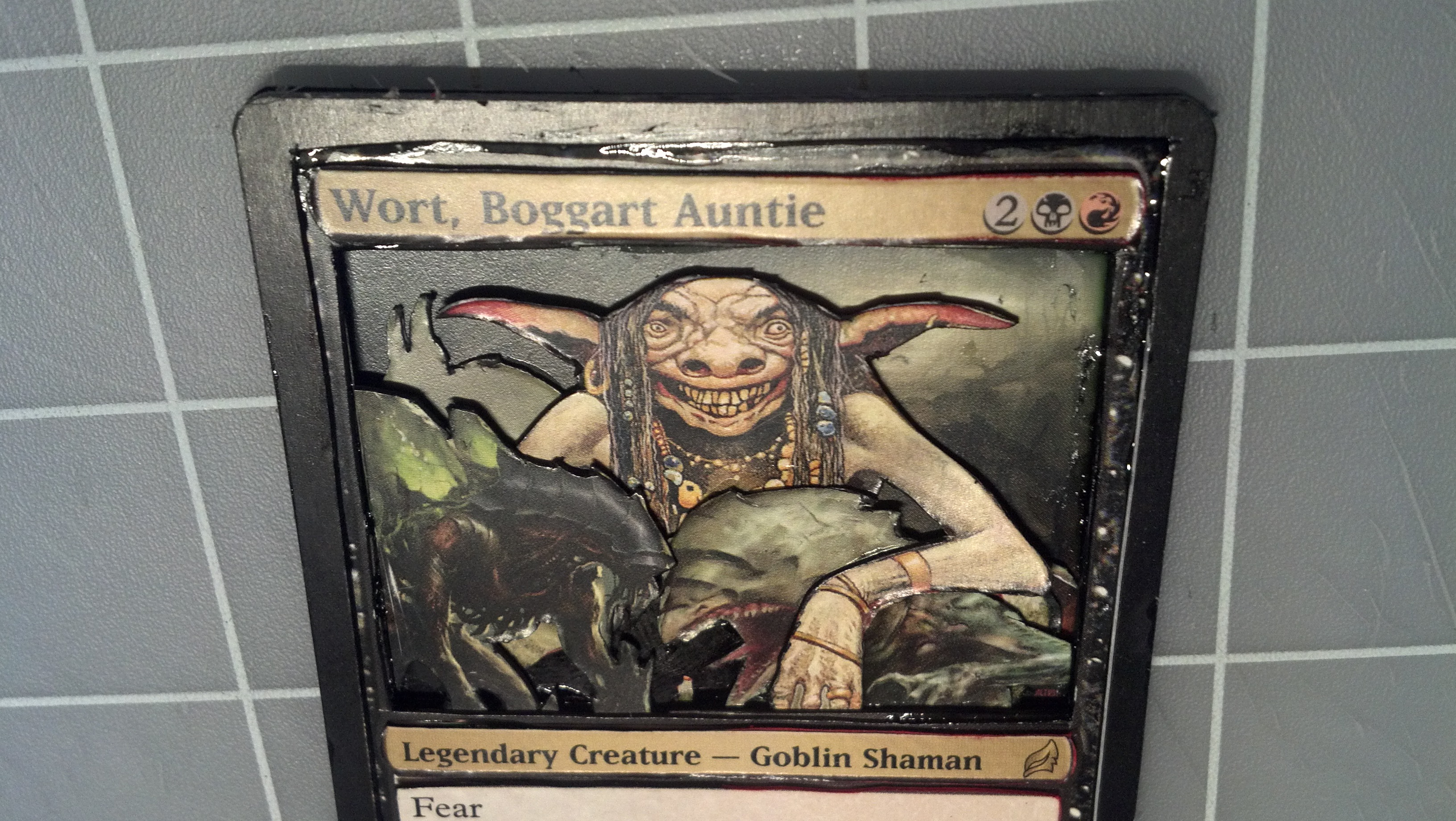
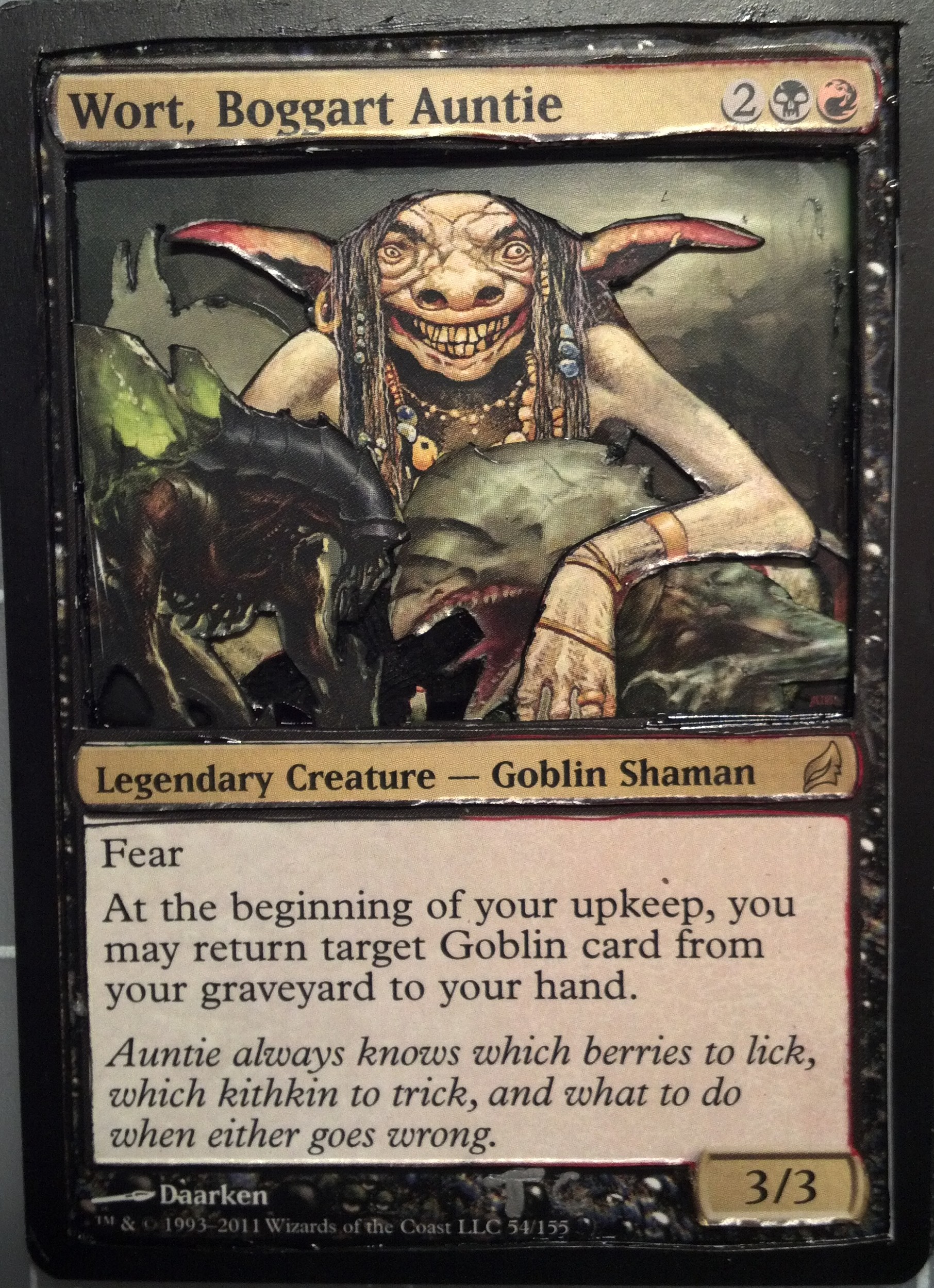
Andre: "I'm not a fan of the way the edges came out, but I understand that if this is one of Tyler's first 3D alters, he may still be working on improving his cutting techniques. That said, Lorwyn's Wort definitely had a darker edge as compared to her Shadowmoor counterpart, and Tyler makes good use of that. The phyrexians are at the top of Dominia's zombie list (in my opinion) and seeing her creepily hugging two infecting goblins just adds to the creepiness of the piece. I also appreciate the dominance of the black border, despite the red in her cost - you'd have to have a black heart to embrace the phyrexians. Great job!"
Jeremy: "We started with 3D, and we're ending with 3D. I just wish their places in my list were swapped so I could have gone to bed on a more positive note. *sigh* Sorry Tyler. First of all, I would suggest reading some of Drew's walk-through's and keep up on his blog. This to me feels like a first attempt, and if it is then that is okay! You never start with a masterpiece, believe me. I like how you went outside the box and tied in some other characters with Wort, that shows you can be creative. I think what the biggest problem is, is the amount of glue you're using to hold it all together. It seems to be oozing out all over the place. I'm certainly no expert, but a glue stick would have decent coverage and not leave excess behind. Some of the cuts are also a little sloppy...easy fix for that would be to take more time."