


Spring is in the air, and it began early enough to set records around here. We had snow one week followed by midsummer temperatures the next. In southern Ontario, we usually have snow on the ground until March, and when I was a kid, it used to stay wintery until April sometimes! If you're one of those people who still thinks global warming is a conspiracy, carry on smoking a pack of cigarettes a day, eat red meat at every meal, and don your tin foil hat with pride; you'll be okay. (Here's looking at you, @hackworth!)
Spring always brings about a great many changes; the weather, sprouting plant life, animals getting busy, and gas prices going up. A truly rare change came about for me this season, however. (If you're not interested, just skip to the pics.)
I turned thirty in December, and the following couple of months rendered me oddly reflective. I find it so bizarre because leading up to the big 3−0, I didn’t have any concern about how old I was; it was simply just another birthday. I began concentrating mainly on the negative things in my life, like the repairs needing to be done on the house, the new clothes and shoes I didn’t have the money for, or the occasional poor behavior the children were displaying. The big one, though, was something I’ve struggled with for a few years now: making little more than minimum wage while my wife brought in roughly twice my income.
In January, it sort of boiled over with a string of negative events at work. Nothing really disastrous happened—just a few stupid things that, coupled with my frame of mind at the time, led me to seriously want a change. I talked it over with Tiffany one weekend and just decided to hand in a resignation letter. I sold flooring in that retail store for seven years, and it seemed that the longer I stayed, the more comfortable I became until almost all ambition was drained from me.
Not wanting to burn the bridges that were built over the last seven years, I wrote a very nice resignation letter and sent it in to the boss. The following day, he took me out for lunch to thank me for my services, and we discussed the business, the employees, and what I was planning on doing next. Of course, I had no idea at that point, so he very generously offered to let me stay on until I found what I was looking for.
Not two days later, I received a call from a big wig at one of the flooring suppliers we work with asking me if I had the time to sit down with him at a coffee shop to discuss an opening as a sales representative at the company that would cover a fairly large territory with my house situated roughly at the nucleus. Obviously, I eagerly attended this impromptu meeting where he told me that my now-previous employer had let him know that I was leaving the company and would be a perfect fit for the position! The rest, they say, is history.
“They must often change, who would be constant in happiness or wisdom.” – Confucius
Don’t be afraid to take the plunge if you’re on the fence about something. If something bothers you in your life, change it. Life’s too short to be surrounded by things that don’t make you happy.
Now that the life lesson section has been covered, let’s dive into the awesome alters from March!
March 1
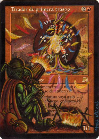
The first thing I saw in March was this rather comical interpretation of a Goblin Sharpshooter—or not-so-sharpshooter it seems. Toni Micol is the artist who put this goblin’s skills to the test against a helpless bird of paradise while cooking his earlier prey on an open fire. I like how well the highlights on the goblin are done due to the nearby fire. The bird’s expression and the feathers everywhere add a great deal of comedy to an otherwise horrific image. I’d imagine this is the sort of scenario that would take place if Wile E. Coyote were to finally catch the Roadrunner.
This beautiful mountain painted by Poxy is based on a real place: the Banaue rice terraces in the Philippines, whence Poxy hails. I can’t imagine walking around a place such as this in real life; it’s simply breathtaking.
March 4
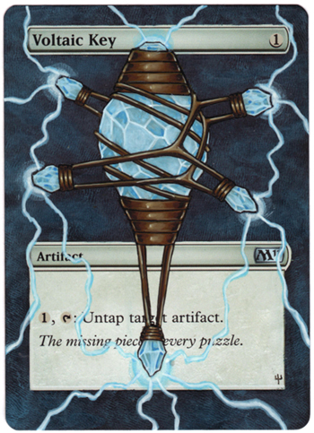
Jumping ahead a few days, I found this really cool Voltaic Key from Dewil. He’s taken the small key held by the hand in Franz Vohwinkel’s recent version of the card and blown it up for us to see in all its glory. Even the background is awesome thanks to Eric Klug’s popularization of the fingerprint!
March 5
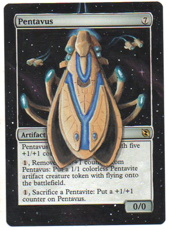
Having spent countless hours playing Starcraft and Starcraft II in my gaming career, how could I not put this piece in the review? There is no better card that Nicolarre could have chosen to put a Protoss carrier on. If I ever see a Pentavus hit the table again, I’ll probably start saying things like, “Mine more vespene gas,” to everyone around.
March 7
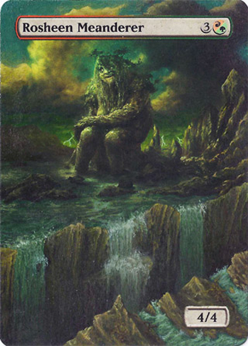
I love some good extensions, but I always have a rough time figuring out what to fill the text box with for the full-art ones. Masuli has produced a quality solution to that problem with Rosheen, however. He’s put a decent amount of detail into the crevasse, with rock highlights and waterfall splashes really lending depth to the piece. Fantastic work.
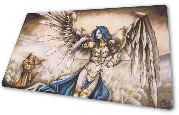
I’ve previously never showcased anything that wasn’t a card, so I apologize ahead of time to you alteration purists out there, but I’ve been following Tom Gartin’s work on play mats for a long time now, and I recently decided that I couldn’t leave them out anymore. It’s still an alteration, really; he’s altering a blank play mat into a beautiful one . . . That counts, right!?
Tom’s Facebook page is an absolute must-visit if you’re into dope play mats, so take some time and go through all of his photos—there are so many killer mats to see! Just like card alterists, Tom takes commissions regularly and can incorporate practically any idea you have flawlessly into a beautiful, artistic play mat. I’ll be placing my order soon, that’s for sure.
March 9
Sandreline really seems to adore the four-seasons approach to altering. I’d wager that after the success of her first few seasoned sets, the seasonal requests have been coming strong. My favorite of the group is the summer (top right), as I’m always easily impressed by quality clouds, though the water lapping at the shore is nice, too.

March 10
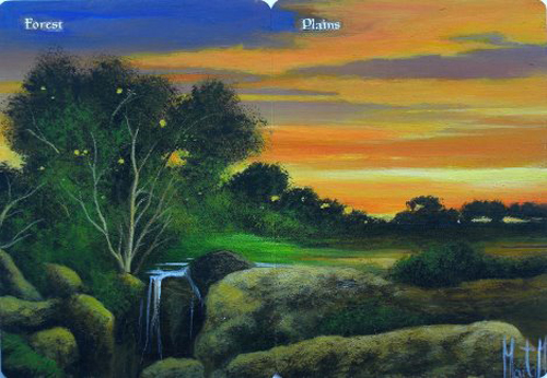
I never become tired of Marta’s multi-card concoctions, especially when they’re in my Commander colors. In fact, I had the high bid on this Forest-Plains duo she posted on eBay until some spaz outbid me in the last three seconds. Ah well, that’s eBay for ya.
March 12
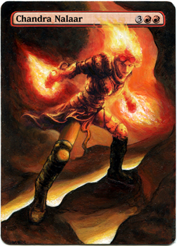
Like the Rosheen we saw earlier, this Chandra Nalaar is an excellent full-art extension. I’d expect nothing less from the veteran alterist Adunakhor. The shading throughout is well done, and the leg positions don’t seem overly awkward when compared to most full-art planeswalker attempts. I do find the black outlining on her right (forward) leg a little excessive, though, whereas it works for the back leg as it’s in the shadows more. Overall, it’s a great full-art, though.
Yet another Poxy dual that is simply off the chain. My wife even commented on how good it was when she walked by the computer just now! Earl, you’re easily the best dual alterist out there man. Does anyone else get a John Avon vibe from this one?
March 14
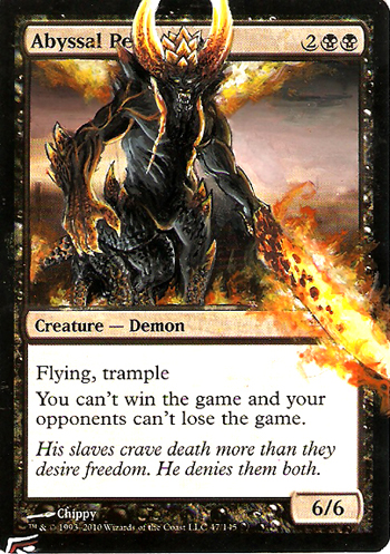
This truly wicked Abyssal Persecutor that Blackwing Studios has produced is much more fearsome than the original. The character is well proportioned, highlighted, and scaly, but my favorite thing about this alter is the sword. It looks as though it were done in a completely different style to the beast proper, who is built with crisp lines, but that’s why I like it.
March 16
Hilarious. How else can you describe Yurius’s Black Knight? We’ve all watched this dumb movie at one point or another and wondered how Martin Lawrence could read this script and then be like, “Hells ya, I’m in!”
This image is straight from the front cover of the movie. (No, I don’t own it; I had to Google it.) Yurius has done a fantastic job transposing the image onto the card. This must have been fun to paint! Hah!

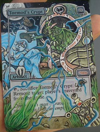
The second piece from March 16 is this wacky Tormod's Crypt art from Blackbull. Like many of his works, it takes a minute to process everything that is going on. It’s great that the art on a small card can hold my attention for so long due to its many intricate details. The shortened bubbles around the text, cost, and DCI logo are some of the nifty things about his work here. It’s a great way to maximize art space all while keeping the important information around.
March 17
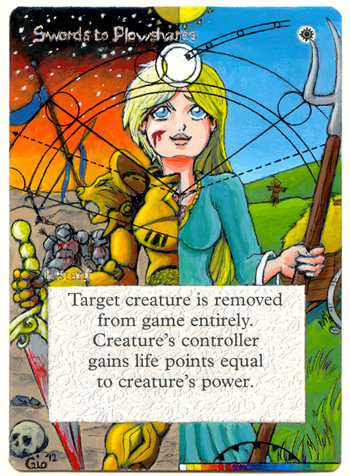
I don’t believe I’ve showcased anything from Spade in the past, though it’s hard to know with all the alters being produced these days. What I do know is that I love this refreshingly cartoony approach to such a Magic staple. Literally going from swords on the left to plowshares on the right definitely makes for a cool piece of art, though the Gurufication of this piece I feel really took it too far and cluttered the image. It’s very well done nonetheless.
March 19
This was certainly a day of heavy hitters as both Klug and Sandreline post cool new pieces.
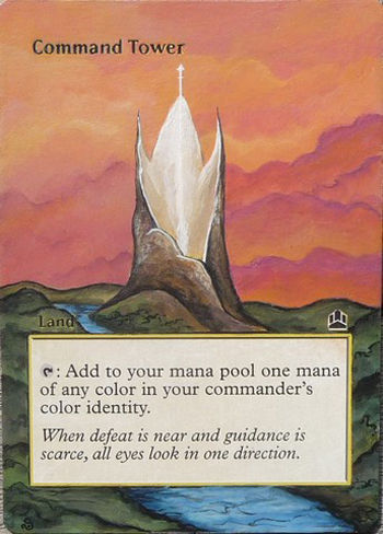
I absolutely had to include the Command Tower from Sandreline as it’s an image from my all-time favorite movie growing up: The Neverending Story. If you haven’t seen it yet, it’s worth finding somewhere and picking up if you’re into fantasy, which you really should be as a planeswalker. This is the Ivory Tower where the empress of the land resides before . . . nevermind, you need to see the movie! Thanks for the memories, Sandreline, but if you still have possession of the card, you need to put Falkor somewhere in the sky!
The second piece of the day, from Eric Klug, is this amazing border-changed Ruhan. The entire image has been completely retouched to make him jump out more, which definitely works if that’s the intent. The adoption of the one-time border change attempt, though, is what makes this piece incredible, from the mana and set symbols right down to the bottom red texture. Stellar work, my man.

March 20
A second double-header day brings us the opposite of the previous day’s veterans: two artists who are new to the review series.
First up is Thalio, giving us an underwater treatment to our favorite spinning device: Sensei's Divining Top. I’m sure many others enjoy when two cards that share a combo or interaction are art-mashed, and putting the top in the Academy Ruins is brilliant. Thalio has managed to replicate the ruins pretty well, too, when you compare this to the original the basic shapes are mostly the same without having carbon copied it. Kudos!

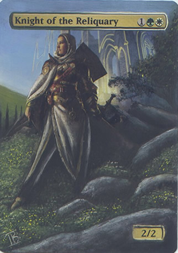
The second piece, and another fantastic full-art extension, was produced by a guy whose name I have to copy and paste: Iban Bengoetxea. The stance on the knight looks fairly natural all the way down, and the tiny yellow flowers are a really nice touch. The one thing that I noticed, though, is that the structure in the background doesn’t have any little bits above the text box. I don’t think they need to be big tall towers, just little nibs to show that it’s there. Regardless, awesome work!
March 21
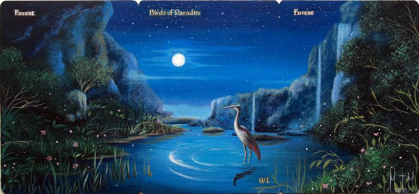
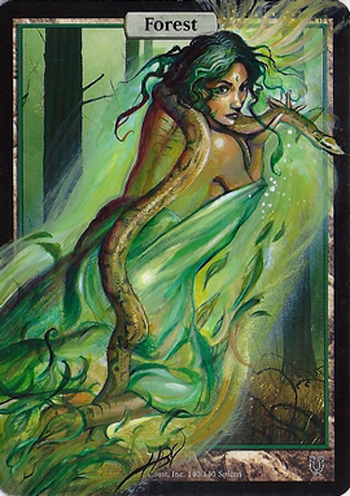
Let’s make it three double days in a row, and what a day it was. Easily my favorite piece(s) of the month come from Marta Molina and her mural of Forest, Birds of Paradise, and Forest. All her work is just so amazing—it makes you want a fully-Marta’d-out deck. For fun, hold your hand up to block the bird out as if you’re looking at two forests. They both look like forests by themselves, don’t they!? So awesome—I just wish the picture was bigger.
The second of the day is this oversized Damia, Sage of Stone from Yurius. Steve Argyle’s original is fantastic, but Yurius just takes her to a whole new level of evil with the wicked grin and snakes 2.0. Be afraid when your opponent slams this commander on the table!

March 25
A third selection of the month for Sandreline brings us this really cool stained-glass-looking Hanna, Ship's Navigator. I’ve seen a handful of cards given a stained-glass-type makeover, but they’re usually very busy, and using a ton of different colors—which is okay, as that’s what real stained glass looks like. I, however, like this approach better. It brings more attention to the subject and less eye strain.

March 28
Did you think we were going to go all month without having a Demonium piece? Blasphemy.
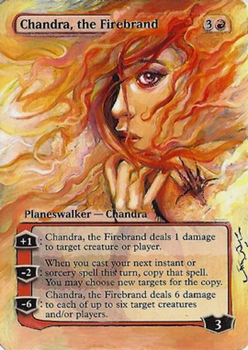
Chandra, as only Demo can paint her. Crazy emotion on her face, cool, colorful hair, and a new planeswalker shoulder branding to boot!
March 29
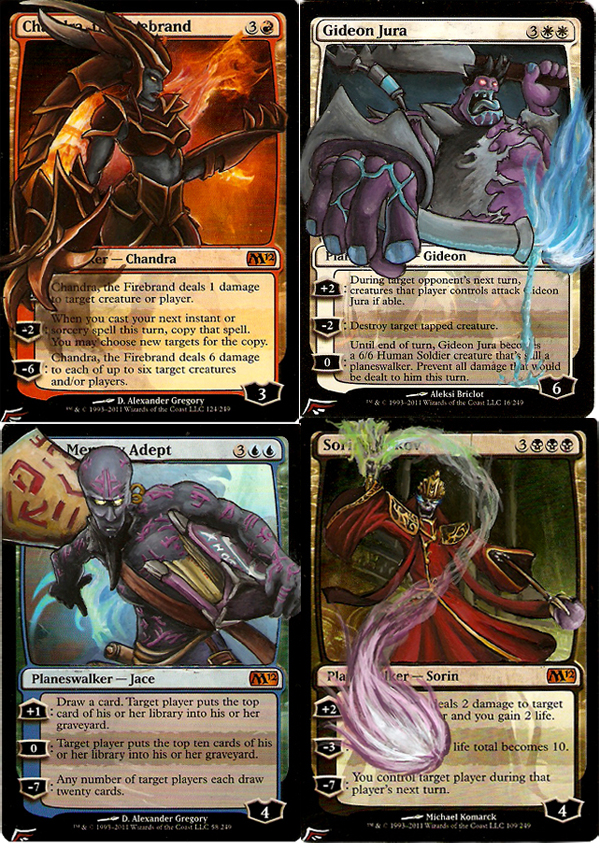
Blackwing nails a sweet set of planeswalkers, tying in another game I’ve spent countless hours on: League of Legends. When my friends and I first started playing, my main character was Ryze, so the Jace/Ryze really does it for me. The other ones are Chandra/Shyvana, Gideon/Dr. Mundo and Sorin/Karthas. This set will certainly make a happy Magic/LoL player out there.
March 30
We close out the month with another sweet Demonium piece, and it’s the first basic land I think I’ve ever seen him paint. It’s sexy, but well covered and a little snakey. Her hair even looks like roots in some places; whether that was intentional, I’m unsure.
With that, we have another month of awe-inspiring alters in the bag.
I’m hoping to complete the April review for the first week of May—I’m trying to get back on track now that I’m settled into my new career.
As always, let me know what you like or don’t like below.
Until next time,
Jeremy Froggatt