

Kaladesh is a bottom-up Magic: The Gathering setting. What that means is that the expansion set was created by Wizards of the Coast designers with mechanical themes in mind, having art and culture layered upon it. This is how most sets are designed and frames much of the discussion on art, choice and inclusions.
— The Making of Kaladesh by the Magic Creative Team
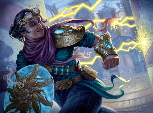
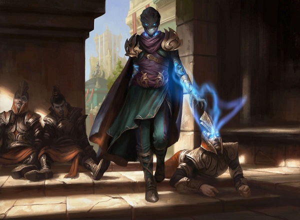
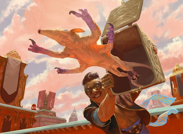
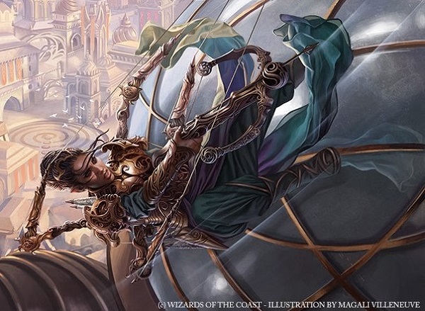
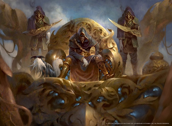
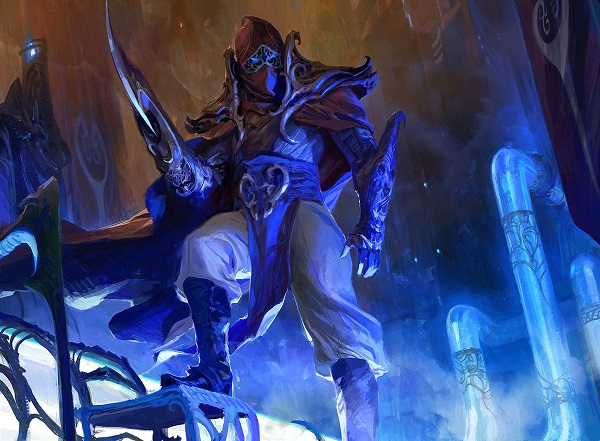
Alley Evasion by Scott Murphy
Before I dive into optimistic steampunk, easter eggs and more, let’s discuss what’s the same in Aether Revolt from Kaladesh. To base what’s new and unique, we should always level set. From hidden Eldrazi popping up out of nowhere and Elspeth randomly being killed by a god, understanding what the penultimate step was will be helpful to understanding both how art changed from the first set of this block and also some art rules that emerge.
In short, Aether Revolt is a beautiful built world that struggles to showcase the conflict concisely to players not fully engaged in the storyline.
What’s the same?
In Kaladesh, a few visual cues to reiterate from my Kaladesh art review should be mentioned. As sets do not have a beginning, middle and end anymore, going from Lorwyn to Shadowmoor is a jump, compared to mere Lorwyn to Morningtide. Small shifts are ok, large ones are harde to grasp. Shadows Over Innistrad to Eldritch Moon is one example, they don’t feel like the same plane because they aren’t. Eldritch Moon is really Zendikar on Innistrad, literally.
The themes, ordered from my first review:
1. Kaladesh tinkers with how much realism is in fantasy.
To put this point into perspective, we need to look at Kari Zev, Skyship Raider below, who looks hyperreal. Her monkey is not a bandar or a gremlin, it’s a real monkey that exists on Earth. She’s very much grounded in reality and placed into a fantasy setting. She has a teenager’s sass, offering an attitude, a life, a fantasy, and persona for new players to see and try on for themselves. As those new players build decks, especially kitchen table or commander decks, cards like this are incredibly valuable for representation and access.

Kari Zev, Skyship Raider by Brad Rigney
2. It is a plane of swirls.
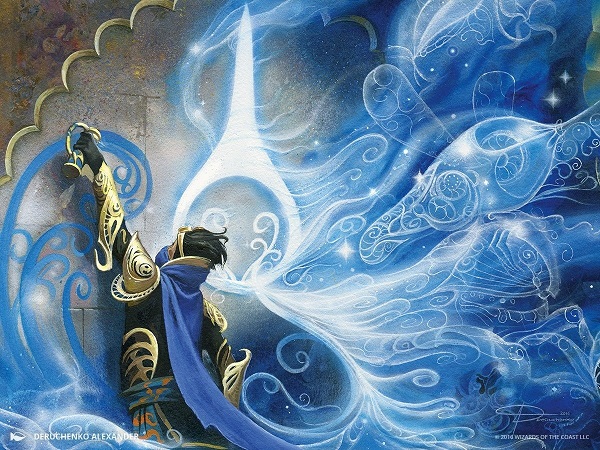
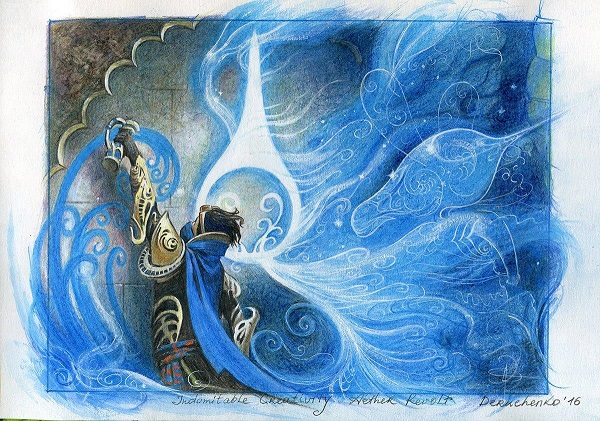
Indomitable Creativity by Deruchenko Alexander
Notable in Aether Revolt is Alexander’s work here with the working rough below. He works traditionally and finishes the piece digitally. Look at how the armor shines more and the thopter in the swirls gains thicker llines with shading. I love seeing colors being worked in the formative stage, allowing me to appreciate the final image more as I’m looking for how an artist added depth.
The swirls of Kaladesh are still omnipresent. I’m looking at them closer now, trying to find a royal symbol. They’re only graffiti depicted in Aether Revolt with the rebels, shown above. Consider the swirls and this logo to be an underground symbol. It’s opposite would be a logo of royalty that is also ever-present, but it’s visible on people. Think of the golden fleurs-de-lis aplenty on French painting and you can see how a social class would visually show on any occasion to gain favor. Instead, inventors hide their unifying symbol to prevent the Consulate from arresting you. I can appreciate that.

Louis XIV after Hyacinthe Rigaud. © The J. Paul Getty Museum/
It was an absurd amount of work to add more swirls, more filigree, though. I could link a bunch of artists groaning or grumbling about it and I’ll leave them nameless. It was hard for them, no question about that.
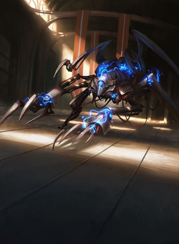
Check out the background below. It is incredible though, isn’t it? It feels like a Castlevania level mixed with Conspiracy to create a perfect harmony of mechanical and living matter.
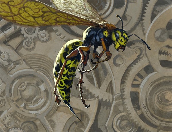
Foundry Hornet by Christopher Moeller
3. Shivam found references that could’ve been added and due to time and expertise, were not included.
He has since been utterly welcomed into our community and we all learn things from him.
https://twitter.com/elektrotal/status/822116201304231936
He’s worth a follow, look him up on Twitter. His Tumblr posts on pronunciation are well worth the click too. Here’s one to get you started.
4. Gremlins competed with both monkeys and bandar visually and in mental capacity.
Scrounging Bandar by Shreya Shetty
Ragavan by Daniel Ljunggren (Monkey token)
Gremlin by Jason Rainville (Gremlin token)
Sure, a bandar was in the set. The three creatures were only intensified for what’s cutest or best by casual players. The more invented creature that fit Kaladesh only, the bandar, was pushed aside for both the snoot creation and the pet monkey. I would pet all three though.
5. Few artists knew Indian culture well.
Those who did made beautiful works including Filip Burburan using the correct Indian Elephant due to its ears. Mark Rosewater mentioned how the player base wasn’t ready for a top-down Indian culture set. I’m not sure I agree anything non-Western European is ever fully ready, and that’s with Ravnica being Eastern European and Slavic.
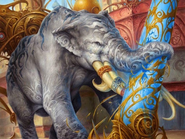
Greenbelt Rampager by FIlip Burburan
6. Masterpieces are nice and will affect art collectors in a myriad of ways.
Mark Zug found out how a painting could hit $4400 from people emailing him over a few days. We followed along on Twitter as I got the email updates and it was mighty fun.
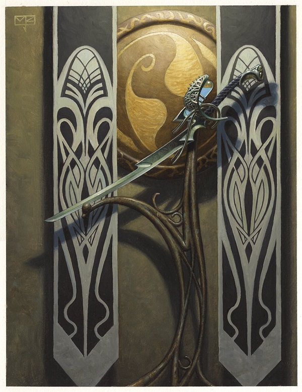
Sword of Body and Mind by Mark Zug
7. Religion is absent, though in real life, India’s culture is hard to describe without it.
Being cognizant is paramount for any wading into world building. Constantly with culture that still exists, “Is this kosher?” needs to be asked. American Indians are still very much part of many cities and cultures, putting a headdress on a human warrior is the closest art description comparable I can find to problematic depictions such as this:
https://twitter.com/elektrotal/status/809434400391712769
Though with Ajani, and a religion that has non-human avatars, there is bound to be overlap and there should be nervousness internally to get art made. This is a pretty egregious miss and something that wasn’t looked at very close.
Cultural appropriation is not black and white. It’s gray all the time and difficult to find how to celebrate vs. insult a culture. Let’s revisit that topic in a future column. To get inspiration from thin air is comically absurd, all good bits of culture come from somewhere. It’s how they’re applied often that’s more important than if they are.
8. Lightning round easter eggs.
I touched on them a few months ago and of course I’ll mention more at the end. There will always be some that pop up out of nowhere.

Kari Zev's Expertise by Jason Rainville
To explain the continuity, let us not forget that there are only two sets to tell this world’s story.
As I was trying to use only the art and flavor text to understand, I struggled. As the story ramped up, if one didn’t read the online Magic Story and/or Art Book, it became hard to follow other than the Gatewatch vs. Tezzeret and the local government. I guess that’s ok?
I don’t want to be only a critic, unable to see silver linings and exceptional creations. There are phenomenal artists being commissioned pieces that fit their skill set perfectly from award-winning art directors. It’s the story that struggles to integrate in and I don’t think that’s inherent.
To understand why, you would have to read on the corruption in the consulate by Jay Annelli and then revisit the cards. I feel the Gatewatch’s storyline will eventually trump everything in a set, akin to an anime where some episodes, they just eat and the story doesn’t move forward. I have a feeling a block just on that, just gathering friends in Ravnica or Dominaria is coming soon.
Back to art, and why I’m here, I noticed extensively more about the world of Kaladesh worth mentioning here in Aether Revolt. They aren’t all new, but they feel new upon pointing them out.
What’s new to me (maybe you too)
Banners are everywhere.
There is an undercurrent for why that is, which I’ll get to. What I’m curious about is with how many thopters they have, are giant banners that flap in the wind really the best way to show compliance, allegiance or festival advertising?
I get it, ribbons and banners are part of the aesthetic of the plane.
Wizards started this bottom up though, it’s not like India is known for banners, cloth or vertical things outside buildings and they’re a must-include item. I like the touch and consistency, it just defies logic, which is where I sit in the fantasy vs. realist argument. We have to hope the fantasy is that something is keeping the banners from blowing into thopter wings, killing a citizen or two a week because announcements have to be two stories tall.
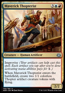
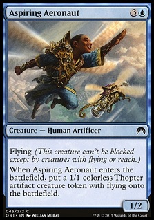
Maverick Thopterist by Zack Stella
In case you missed the exchange, Zack Stella painted Maverick Thopterist for Aether Revolt as a grown up based on the card below by Will Murai, Aspiring Aeronaut. Both dodge the banners as the fly freely. Notice the mechanical change of a ½ to a 2/2 and ![]()
![]() moving to
moving to ![]()
![]()
![]() ? It’s good to see growth in mechanics as well as art.
? It’s good to see growth in mechanics as well as art.
 |  |
On that point of banners are also the fashion of Kaladesh: scarves
Kaladesh citizens, rebels, inventors, and even Aetherborn just love the decorative type as it clearly isn’t cold there. High fashion there means scarves, make sure they’re on point.
Scarf #1
Maulfist Revolutionary by Scott Murphy
Scarf game — strong
Contrapposto (shift of weight to hip) — notable
Halo power sword — check
Soft yellow back light with colorful wardrobes — definitely Kaladesh
Speaking of light, do you see how we can see details despite being in shadow and is still readable as a card in a card game? Scott’s quite good as reference and realism, y’all should like his art more.
Scarf #2
Sram, Senior Edificer by Chris Rahn
Chris’s painting has all the details from a miniature city, two background figures and a construct to his purple scarf that says luxury. He is like the kid that traveled to New York as a sophomore in high school and his only souvenir was a Burberry scarf. And boy does he work that scarf into nearly every outfit he puts on.
A shame the painting only sold for a hair over $2000. It is a tough time of the year after holiday spending. Maybe people didn’t see the soft reflected light from the gold city to his armor and face. It’s really quite well done. The eBay winner got a steal. Sorry Chris.
And no, I don’t know what the guy in the upper right is doing either.
Scarf #3
Yahenni's Expertise by Daarken
Of course the Aetherborn who calls someone, “Darling,” would have their scarf be purple. It’s the royal color, tyrian purple was for the longest time so rare that only a few sea snails in the world would create, making only the wealthy be able to afford it and the association became royal. If you got caught in year 1300 wearing a Minnesota Vikings ¼ zip Starter Jacket and you would be killed quickly or be lauded as a king, maybe both.
As for their expertise above, I wish for you to always appreciate the little things the Wizards art directors add to sets. This is a good artwork. I can’t understate that most games you play have decent artworks made by art coordinators who only pretty much know what they’re doing. The Magic brand has award-winning art directors who either no longer paint, or do so in their free time. How I can tell this is through these art rules many Magic card commissions follow. It’s so easy to just have Yahenni absorbing and thus killing one human. Adding three figures means the development team has to keep the card -3/-3. That’s powerful in that creative can guide a card and force an artwork’s power level. It could also be designed perfectly too! In writing an art description, you have to be sure the extra work to add a figure or three help the card’s storytelling, which it does.
Finally on this art, you’ll notice a strong light covering the top half of the artwork, splitting it. This helps recognition and retention, so you don’t confuse this card art with a creature. Put just Yahenni there and it’s no longer a spell. Make a small scene and whether it’s an instant or sorcery, it’ll work better, even if the soldiers don’t have scarves.
Art popped up radically fast online for Aether Revolt
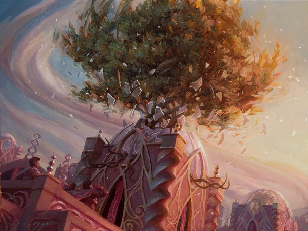
Unbridled Growth by Ryan Pancoast
I figure Ryan’s work tells that story best. Check out his thick paint on the swirl around the tree. It’s his scoff at using Photoshop blur effects of aether and instead he applied beautiful, thick paint to tell the same story.
A source tells me no policy shifted in announcing when the full card spoiler is up, the current crop of artists are a just a bit more social media savvy and aware than previous years. The one week preview season could be part of it — artists posting their art in record fashion. By a community all watching each other, they just knew when things jumped off their non-disclosure agreement and were to be shown to fans. It was easy to follow for artists because it was so constant for a week.
Diversity is everywhere
I will not accept diversity as normal because the rest of the industry is struggling with every game and intellectual property created. Wizards does an all right job at it. They can always do better, and we can celebrate while still asking for more. That is ok.
Here are a few examples I saw. That search took 10 minutes and much of that was to resize images poorly to illustrate a point: it’s not hard to find diverse characters anymore.
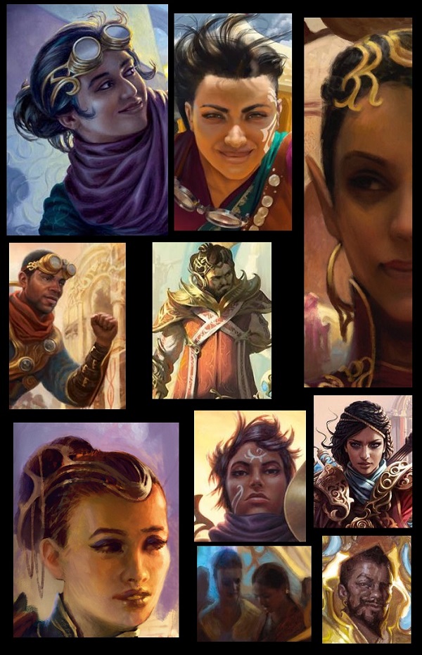
No, a game will not be for everyone. They are doing their best and they are continually pushing internally. Art directors take this seriously. They have an acute awareness of representation. Kaladesh is good on this front. It’s not amazing yet, and you should know that this set was made years ago with Origins. These two sets are just filling in the rest of the plane, expanding where they could.
The best is yet to come and already, it’s pretty good.
Whimsy is the same, as it always is
Despite every 20th Reddit thread arguing how the art used to be better, we have countless examples of non-Steve Prescott art that brings us the joy, the fun, that you had in 1997 like a little girl with an Ornithopter toy playing in the street.
Ornithopter by Mathias Kollros
Much of that nostalgia for art is because the cards you played in your first deck weren’t all rares. You played a variety of rarities and not all cards were full playsets.
Now, nearly every deck you use is mythic rares, rares and only has the occasional common. As most Planeswalkers are digital these days, same with high tier mythics that aren’t masterpieces, what players “perceive” to how a set looks is defined by what they use in their constructed decks, not by what a new player and surely not a life gaining instant, would look like. Sets actually look like commons and uncommons and the more enfranchised you become, the farther you are away from that experience. The preview season emphasizes this as well, with a glut of commons and uncommons coming out on the last day, despite some of them filling out the world with depth!
The fun is still there, as is the painterly quality. I urge you to just look:
Wrangle by Jason Rainville
Look at this guy and pet artifact dog.
They’re going to have a great day, breaking things then napping with snuggles. Of course they are. It’s just fun.
Add a muted palette of red to orange, and Jason added in a light blue scarf with a pink and blue sky. It’s lovely. I wish it were a painting, I would probably buy it. It reminds me when I let my dachshunds outside as I come home each day. They race outside to sniff with their snoots, free at last.
Speaking of snoots, Geoffrey is a master at motion graphics and lives in my city of Minneapolis. Can you get the point across that gremlins are supposed to be playful more than this gif?
https://twitter.com/livingcardsmtg/status/821819729044238338
Communist feeling art
While it’s known to many of us, including Bruce and John Dale who have been talking about it, a few things to note on Kaladesh being a communist state.
https://twitter.com/ReserveList/status/783377243154382850
While a resource is regulated, and the working class is trying to reclaim it, it really only affects a minor group of citizen-inventors. Now, of course, the public transit runs on this resource as inventions were confiscated with their rebellion leader almost executed in public.
The creative use of the aether though? Why would a tailor care? How would a teacher need a supply of aether? They’re optimistic and revolutions need hope, a struggle. To stay that everyone was in the revolution, as the cards illustrate, is hard to believe for me.
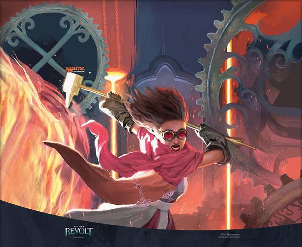
Pia's Revolution by Clint Cearley
The panorama for both sides of Pia and Chandra’s revolution hasn’t been released by Clint Cearley yet. It will be soon I’m sure. I just want to see gears become complete. The goggles on by mother and daughter are just icing for this visual delight.
https://twitter.com/ReserveList/status/783379028581416960
I got more of a Macintosh advertisement feel from it, though even that is based on propaganda of 1984, or today frankly, and then the Soviet Union. All that is old is always new again.
The problem I see visually is that with the renegades, the rebels, their goal beyond opening aether lines is hazy. There is no manifesto for what they actually want. They want aether again, and good stuff! And, Chandra!
The consulate is not fully evil, it’s a boring government that really does want the best for its culture. Maybe terrorists that want to open up supply lines to uranium (aether) isn’t the best idea. While Baral did exist and singlehandedly did horrid things, aether is dangerous. All terrorists see themselves as revolutionaries. Chandra is an overpowered terrorist for this plane. When will she be satiated? When will the death of her father and her grieving not affect the entire population. Is her revenge really just about the limited aether pipeline or is it personal, lasting long after demands are met?
After all, for the average citizen, life isn’t that bad. Thinking deeply about world-building and how storyline can affect art makes you understand why choices are made, and how even best intentions can be puzzling.
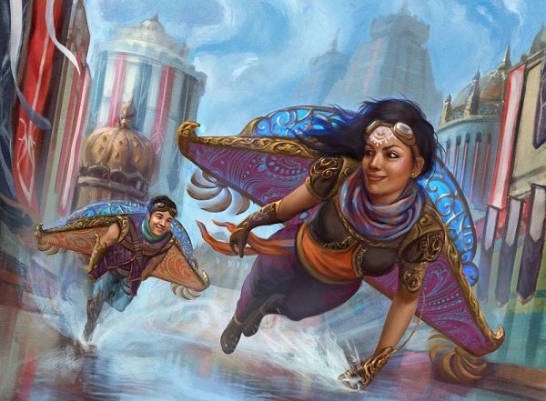
Wind-Kin Raiders by Shreya Shetty
Magic artist Shreya is new to Magic. You may not know who she it though if you know anything about movies, you may know her from her texture painting work on movies for Rhythm & Hues in Los Angeles. We’ll hear her story soon. I urge you to marvel at one of the few depictions of normal life in Kaladesh going on at the same time as the revolution.
Notice how the flavor text names how their club, their society, is considered small, but the duo don’t appear to be poor. They may only be rich, not wealthy. Rich people are professional athletes; wealthy people give them their checks.
Flavor texts like this help inform that the revolution, the Aether Revolt, is far more than a privileged few. It just doesn’t look like a revolution with people in the streets, being oppressed. There is no way they can have evil looking things as rampant, as dark. We just had two full blocks of dark, they need light. And light is not oppressed, it’s cheery and propaganda fueled, just like old Soviet art. It’s one of the cutest family scenes in the set.
What did we see that worked perfectly?
Open ended characters created opportunities for players.
Fan fiction isn’t something I normally engage with, though I did see some new ones cropping up about Scrapper Champion. They can’t mention every legendary creature and definitely not every cool looking random one, though the inclusion is a welcome one. Artists were pushed to add more detail, more emotion, more diversity, and more effort across the board. In doing so, we got this gem:
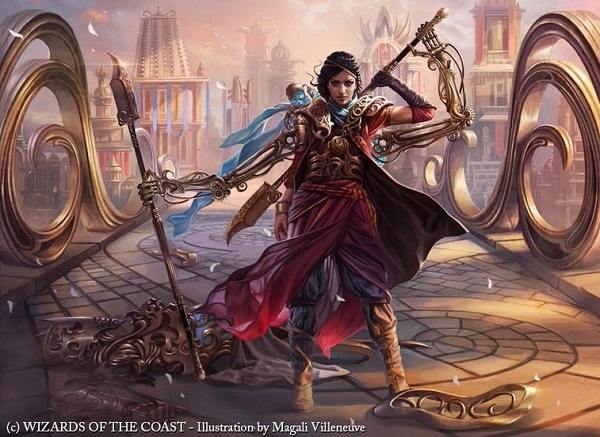
Scrapper Champion by Magali Villeneuve
Attention to detail is really, really high in this set and from the Duels of the Planeswalkers character, and the Kaladesh art book, we see white hair in a man’s beard who doesn’t look all that old. I have white specks in my beard and I’m in my early 30s. Now, if a Mother of Runes actually looks like a mother who’s forty, we’ll see a major step improvement and change. From here, it’s a small notable, non card art commission that’s very well done.
Image access here
Realism worked!
I like the renegade tools that could be concealed. The giant ones are so large that no concealment is possible, pulling me out of the world building. Some artworks though, are wonderfully done like Glint-Sleeve Siphoner below. This is flavor fitting world-building with a strong purple palette that you know I enjoy seeing. Prince is from my city, after all.
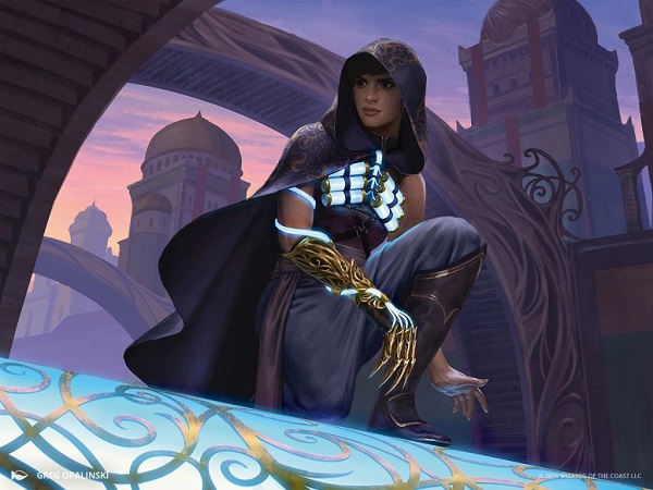
Glint-Sleeve Siphoner By Greg Opalinksi
Other thing that worked beautifully in this set are nods, geeky references to other intellectual properties. They’re unmistakable like Ripley in Aliens . . .
 |  |
Screen grab and crop from Aliens © 20th Century Fox
. . . I don’t mind borrowing from established visual cues, like Spiderman . . .
 |  |
Promotional image of Doctor Octopus from the 2004 "Spiderman 2" film. © SONY Pictures
. . . to Pokemon . . .

Image gif © The Pokémon Company International
. . . to Pacific Rim, which Lius Lasahido sketched in the first Kaladesh set as well, which we see emerge again in Aether Revolt:
Resourceful Return by Titus Lunter
There is some lovely perspective on Titus’s work, in case you haven’t looked at the card closely.
Ant Tessitore, on our Aether Revolt flavor gems episode, even found a Attack on Titan reference. They’re hidden in there, if you look close enough. Again, the player base is aging and fan service takes a different perspective than the norm.
Silkweaver Elite by by Magali Villeneuve
What didn’t work here visually?
How much realism do you want in your fantasy?
I struggle to believe the entire rebellion and many artworks feel to me that they struggle to reinforce that story. There is very little oppression shown, other than a few totalitarianistic monitoring and safety images, which I’ve mentioned. I reiterate this because it’s paramount to the story, yet visually it comes in and out of focus. With an entire year of darker sets, from Zendikar to Innistrad of horrible things happening, like a pendulum, it swings back to colorful.
To see security, you need to see a masterpiece that is sublime in its ability to show a fish-eye-lens of perspective:
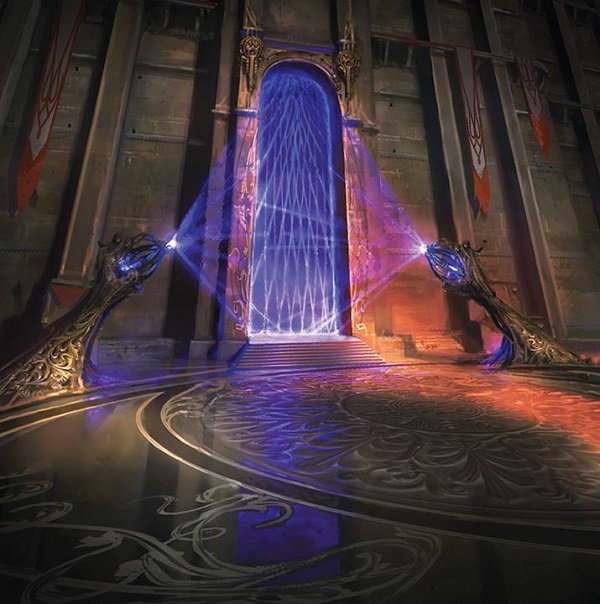
Defense Grid by Jonas De Ro
I get that bad people were around and some incidents happened that were negative, but one government for a plane needing a full revolution? It seems all such an isolated issue that the average citizen doesn’t care about, which I will keep repeating until it’s heard.
Aether Inspector by Sidharth Chaturvedi
I see a disconnect between the story and the artistic tone of the set.
For the tone of the cards, they wanted to portray this idea of happy idealism and optimism, but repression is pretty necessary for the story to function, and Wizards struggled to bridge that gap in both its writing and it's cards. Visually, you can’t have all soviet propaganda colorful without soviet realism. The card below is paramount to showing the conflict, we see a lense with the five storyline cards, that is why those exist. It’s impossible to tell a story without those five cards, because all five need to be highly playable. If they are not, the story can falter.
Perilous Predicament by Ryan Alexander Lee
This is about as close as we get, and Ryan goes pretty loose in its visual treatment. I love that. He’s applied well, and the impending doom, juggernaut idea is as fitting and troublesome as it should be here. There’s a whole dissertation on why the juggernaut vehicle idea should or shouldn’t be considered cultural appropriation or cringeworthy but I won’t delve into that here. Just know that it’s a thing and it should be handled incredibly delicately.
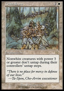
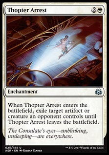
If they had written stories or made cards which also showed the ugly side of Ghirapur (which has certainly been extensively hinted at, but never explored in earnest) this wouldn't be a problem, and even now I struggle to find cards that advance the narrative other than the obvious five story spotlight cards and the process of the consulate. Cards like Crackdown could’ve been implemented and the outcry to genius of inclusion could’ve been a stage I would’ve loved to see examined vs. Thopter Arrest.
 |  |
The optimism was seemingly more of an artistic decision, and one that I actually really like in contrast to the grittiness and grimdark of previous sets, but it doesn't mesh well with the route they took the story. If my argument struggles in this review, congrats, you understand the nuance of the, “that looks great but . . . ” which is where I stand.
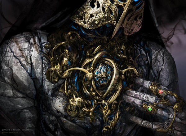
For an example I asked Vincent Proce about an artwork he created and I didn’t entrap him, I just asked open endedly, what’s up with that demon.
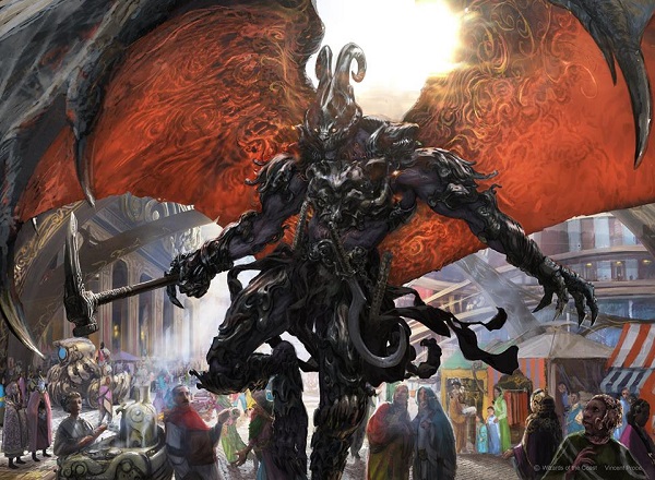
Herald of Anguish by Vincent Proce
— Vincent
Are demons really needed when the greatest evil are humas? Even the Black creatures, the aetherborn, aren’t really evil, they’re just selfish and hedonistic. That’s seen as more “you only live once” as youth about to expire rather than they’re flimsy crime lords or terrorists.
And then demons are there because they are. I understand that angels can need demons to balance them out, and they look cool. They look so cool. I just don’t understand why they’re needed. The creation of angels and demons has nothing to do with the story, they’re minor characters, and they aren’t really fleshed out in even the art book. I guess a cool looking thing is enough.
Quick Hits
I love lightning round and quick visual cues to check out. Going through every card can be monotonous and I know it’s hard to follow. Instead, skim these quick. They’re all fun, I trust you’re still here for the ride.
https://twitter.com/Mister_F_1692/status/820788909034639364
You know I’d pet that beard. Just look at this nugget. What a good aether dog.
Midnight Entourage by Lius Lasahido
Speaking of dogs, this is a metal looking god, even if it has legs on his back and reads more as spider instead of dog.
The stark light sure is nice.
Arcbound Ravager by Daarken
Renegade Wheelsmith by Darek Zabrocki
I want to note two things here, very quickly:
- That’s a mosque in the background. An arched doorway with symbols around it that’s colorful? That’s a mosque.
- Look at how rough the brushstrokes are to create background characters. That’s high concept work to show style without needing details. It also puts them in the background, not fighting with our main character. Even his kicked up dust effect isn’t as localized, making it feel like a YouTube Photoshop trick. A strong top right light gives us placement and it’s a nice little work.
In case you don’t follow him closely, Darek just had surgery on his hand, get well soon bud.
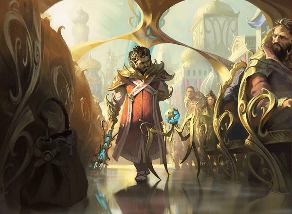
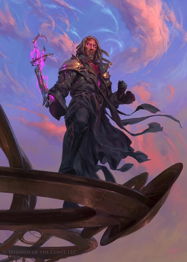
Tezzeret the Schemer by Ryan Alexander Lee
That’s Tezz, complete in a dull building in color, and yet beautifully carved. He balances the building with his elaborate dress.
Oh look at that, their belt buckles that are the Kaladesh set symbol match. Good eye!
https://twitter.com/tu_ku_siiii/status/818381753400246272?refsrc=email&s=11
Maybe they got a buy-one-get-one? I bet they’re buds.
Baral, Chief of Compliance by Wesley Burt
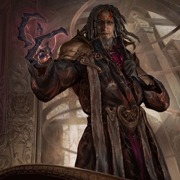
Speaking of Tezzeret, there’s another one in the set that’s also lovely.
Tezzeret, Master of Metal by Tyler Jacobson
Lovely sky and turquoise in his robe though, I must say.
Tyler works in house at Wizards, in case you didn’t know, despite very little news or updates are on that front. They’ve had a few changes as of late on the team, and with this new digital product coming, I could see them expanding soon.
One thing I can’t unsee, which has me thinking:
How long is Tezzeret’s arm? Where is his elbow?
See where your elbow sits on your hip. Look where it sits on his.
Aethersphere Harvester by Christine Choi
I cannot tell what this is at all. Which way is the front? How does it move? At card size, this silhouette doesn’t read at all. AND, there’s no placement. There are no mountains, no swirls, nothing.
This is a concept artist making a technological creation, which you can see thousands of times by searching speedpaints on artstation.com or DeviantArt. Loose can be great, this just looks muddy. A rare miss from a stellar artist.
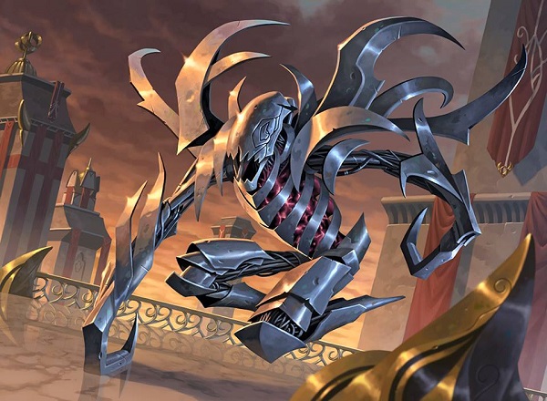
Victor has arrived.
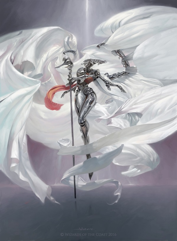
As an artist, a few pieces propel you upward into a commercial and recognized success. Every major artist starting with Magic and moving onto movies or gallery work has hit “that step.” For Victor, it wasn’t getting Daretti, a Planeswalker piece. He has become known because of this literal and card commission masterpiece
From the soft pinks and purples in the folds of the “wings,” to the smart usage of an angel with prominent hips, his choices and emphasis shown stand above his peers. This is the best art in the set and it’s not close. That he posted it on Christmas and became the most liked and shared artwork of the new set is not coincidence.
Tezzeret's Simulacrum by Craig J Spearing
In case you missed it, Tezzeret did visually add his etherium to the aether constructs. Look at the rib cage above and below.
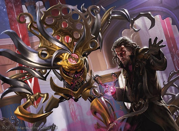
Tezzeret's Touch by Chris Rallis
Its insides are pink, which is apparently etherium on Kaladesh with aether, I guess? I love seeing it, finding the reference instead of assuming. As Craig did both images, smoking gun found.
I guess I was looking for more conflict, more New Phyrexia. Instead, here I see Mirrodin Besieged and only in the story spotlight cards, online story and art book. I understand what’s going on and from quick discussions at prerelease, the Gatewatch idea stuck, though players I talked to struggled to understand why they are in a conflict. “Too many gremlins,” was an honest answer as enchantments were created to deal with them.
Dedicating so many card artworks to world-building and the crackdown from the consulate helps to define what is happening, with resolution not fully coming to fruition on the cards. Some people aren’t even involved in this conflict at all, despite what we see for art descriptions in mid confrontation painted beautifully. It’s Indian, it’s Persian and yet it’s neither and uniquely Magic. This image is simplistic but it gets closer to what a bottom-up set can deliver in terms of being inspired by settings without fully appropriating them.
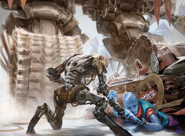
Sweatworks Brawler by Zack Stella
Showing a woman fighting here is pretty rad, I must say though.
I guess a totalitarian regime can’t be everywhere. To me, it just seems like the pushback is such a tiny group that it’s hard for me to believe it matters. The end of the art book even states that the Consulate’s intentions are that boring — to serve its citizens with the (safe) pursuit of happiness. I promise I’ll ignore the story in the future, the Gatewatch is going to be our only plot for the next few sets if not indefinite. Personally, I couldn’t care less as the art isn’t impacted by the Planeswalker gang much. The quality is still high, the variety still there and we still are wowed by brilliance with every new set. We’ve been spoiled to have illustration be so beautiful and still ask for more.
I liked this set. It looks great. The art quality has never been higher. Just look at this art. It’s beautiful and gross and has a story and is that a power gauntlet and what’s that mask? It beckons you in.
Gonti's Aether Heart by Vincent Proce
The one week of previews really dulled the senses for soaking up art. It moved them from deeply entertaining, getting a spotlight, into noise. And that noise is what made my personal inability to understand the story. Nothing unraveled to me. It just came in a clump and I can’t tell it apart.
It is as if we as players want artists to play the game, read the story and deliver their art descriptions with an extra narrative. We know Howard Lyon has already done it and that standard could be expanded to everyone. Once we have illustrative grandeur, the only goal is to deepen the meaning.
Thanks.
— Mike

Ornithopter by Howard Lyon