


I’ve been writing these a while, and it’s time to step back and examine what it means visually to talk about a set.
Before I started here at Gathering Magic—the first time, in 2011—art wasn’t really talked about on affiliate sites. I read posts on DailyMTG, Phyrexia.com, and the DailyMTG forums on art in a really randomized way. As the creative team for Magic is constantly working on world-building future sets, Matt Cavotta would have Taste the Magic, followed by Savor the Flavor by Doug Beyer, and in our current form, we have Uncharted Realms by various writers. We still receive insights into how the art is made via posts by the entire creative team with the Planeswalker’s Guides. I love these insights, but they’re often quite short. The real style guides are massive PDF documents with dozens upon dozens, if not hundreds, of pages of art and explanations on the setting.
These style guides serve the purpose of introducing a plane to artists to populate, but they don’t go entirely into why the plane looks how it does. Additionally, we, as viewers, surely don’t see behind that curtain all that often! This is where I wish artists would be allowed and encouraged to talk about being on a concept team, creating the visual aesthetic to a plane.
For example, “Creating the Art of Innistrad” by Jeremy Jarvis is one of the best articles ever written explaining the art of Magic set on a strategic perspective. It explains how visually Innistrad was to look. The entire block, in a nutshell, is a story of how humans lost their religious leader, an angel, when she fell into darkness and finally emerged. Jeremy rarely writes anymore, as he’s utterly swamped with work, but when he does, he nails concepts in a very concise manner. He’s an art director, so he knows using fewer words is best, and you can see how the story of Innistrad unwound, as Mark Rosewater elaborated on:
—Rosewater, “Dancing in the Dark Ascension, Part 2”
We received Innistrad, a set of seeing the plane from our perspective. We would see as someone in the plane would.
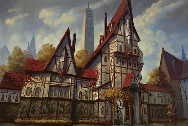
Gavony Township by Peter Mohrbacher
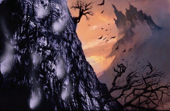
Concept art by Vincent Proce
Notice how small you feel up at the landscape. In Innistrad, we were to feel human—small and insignificant. Jeremy Jarvis and his crew conveyed that quite well.
The next set in that block was Dark Ascension. Rosewater continue continued, talking about sets in a series of acts:
Act One—Get your protagonist up a tree.
Act Two—Throw rocks at him.
Act Three—Get him down. 1/16/2012”
—Mark Rosewater, “Dancing in the Dark Ascension, Part 2”
The second set of Innistrad was darker, worse for the humans. Visually, it was darker and worse for a human but nothing else really changed. There was just more. While working on the set, writing flavor, I really did think it was to be considerably darker. I’ve mentioned this before.
Many second sets struggle with being unique, or really, anything. Often, they’re just pushed to 11 or diminished to a lessor form of the original kickoff set. Here are the last couple and how they tackled their middle set:
Return to Ravnica had its Gatecrash
Gatecrash really was just a fulfillment of the pent-up demand for players who identified with the remaining five guilds. Visually, it was the same Ravnica. The only change was the gate storyline, with Jace having to reunite the Guildpact or Ravnica would cease to exist. Due to guilds being so utterly popular, with people even creating clothing choices to coincide with guilds, the storyline was secondary, as was any need to distinguish Gatecrash from Return to Ravnica. The story didn’t need an act two.
Scars of Mirrodin had Mirrodin Besieged
Things became considerable worse for the native Mirran population, but we were given a glimmer of hope with the Mirrodin Pure and New Phyrexia marketing plan. It was worse, but the final set was unknown to players. This was a new concept, as the good guys should always win. The problem was that, in that case, the card Melira's Keepers was just a plant, a hope that was to be unfulfilled. You can’t “defeat” Phyrexians, you can only really slow them. Utter annihilation isn’t an option for foot soldiers. Two cards really nailed down the concept that even with Melira, hope of the Mirrans, victory was impossible: War Report and Remember the Fallen.
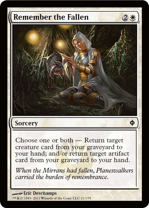 |  |
Looking back, even the thought that the Mirrans could win was comical.
Finally, Theros has Born of the Gods
Theros introduced us to having incredibly-digital-looking works in the fold. Much of the set is smooth, shiny, and hyper-realistic. To show the celestial and starry Nyx almost necessitates the need for Photoshop. Chris Rahn will always get around “needing to be digital,” but this set is the first in some time that is almost entirely digital other than heavy-hitting fan favorites.
The world hasn’t changed visually, it just showed more gods, more friction, more . . . things unsettling, but nothing in action yet. Elspeth is up to . . . something? Ajani is apparently coming. Xenagos already ascended, so . . . what’s the tension that is still to be done? Vecna wasn’t stopped from being a god, so . . . are they going to be killing gods now? Maybe. Let’s hope so; I did like God of War’s story.
The Top Ten Percent
Doing a full set review of each card is an option for me every few months, but I’ve learned a thing or two about them. Much is repeated, and the number of artists in each set widely varies but has settled into having a lot of artists receive one to three works. It’s just so important for an artist to keep retaining works that giving one a random combat trick or grizzly bear won’t kill the set, it fills a hole, and everyone is happy.
- There are so many bowls and cauldrons in this set.
There are utterly so many of these. I wish I could see the style guide or art descriptions asking for all of them. Damn, there’re a lot.
- Showing the landscape, there are a lot of temples alongside water.
There are a lot of God of War influences: the tiny, in-focus character up against the giant creature, god, titan, or giant. I thought, upon hearing of Theros, it would be a lot of shadowy folk, like Shadow of the Colossus. Some of that was true, but really, those are only limited creatures, and only a few at that.
- The color palette lightens up from Theros to Born of the Gods.
There is purpose to this. I just don’t know what it is yet. I’m sure, come May, we’ll see why.
- Everything looks digital.
Even traditional painters look digital in this set. Maybe next to all the other cards they swim together more and more.
The set has one hundred sixty-five cards, and the top 10% equals sixteen cards, rounded down. Roll over the card name or click on it to see the image. Let’s get into them!
16. Peregrination by Jonas De Ro
I’m so happy they’re willing to take risks. Change the architecture in this piece to more curved wall, and you could move from Persian to Chinese to Aztec within seconds. This piece breaks the wall that says, “I’m in a Roman- or Greek-themed set.” I love strongly-lighted works, and that’s why I’ve noticed Noah Bradley so quickly, considering he’s such a young buck. Great job to Jonas. Even without the card frame, this is a great fantastical depiction.
15. Pharagax Giant by Ryan Pancoast
This shows some of the differences in Born of the Gods versus Theros. This image is lighter—not as in less heavy or fewer blacks (though it does), but rather, the depiction feels less stressful. Yes, the paint is thin, and Pancoast is quite talented painting in traditional colors—having been admitted into the Spectrum Annual art volume a few years now—but the piece has some levity, some fantastical elements despite the very dire situation that is to come. Giants very often have a stark contrasting nature to them. People show them as huge via odd perspective, as shown here, but then darken them to show that they’re evil or ominous. That often-repeated notion of dark, shadowy giant feels lazy compared to the must-have book on “Giants” from David Larkin and the entire Lorwyn/Morningtide sets with lit, expressive giants.
14. Stormcaller of Keranos by Marco Nelor
Marco is a relatively new artist, and if you recall, he was the one who painted the FTV 20 version of Tangle Wire. (Which, oddly, is almost half the cost of the original art on CoolStuffInc. Seems like a deal.)
Stormcaller here is a test for your aesthetic eye. I think it’s quality, and here’s why:
- It looks to be a watercolor. It isn’t.
- It’s an incredibly simple image that only a very seasoned art director will know, “Yup, that’s it.” I look at this and feel the need to correct a bunch of things . . . that don’t need correcting. At card size, everything works here, even the foreshortened arm!
- The setting isn’t intrusive to the piece but also sets it in Theros by usage of only a few colors, like purple, and some concrete bricks. By skimming down to only the essentials, we see a super-tightly-composed scene.
- It shows a woman who isn’t a size 2. This is a huge, huge deal to women in the Magic community, and it’s arguably among the top three things that the Magic Tumblr community talks about. The “Women in Sensible Armor,” “Hawkeye Initiative” and the like are their jam, and efforts like this get Nelor onto their watch list. This is good. It’s how Cynthia Sheppard started, and that appears to be working out for her well.
13. Satyr Wayfinder by Steve Prescott
I will be using this card in two of my Commander decks immediately. It allows for a reanimate in B/G and fetches a land for 2 mana.
As for the art, it brings me happiness when Steve breaks out his Lorwyn/Morningtide palette of bright, vibrant colors and is welcomed with open arms into a Magic set. It moves the classical view of a satyr, a crazed, drunken rapist of a creature, into a curious, inquisitive, and innocent depiction. I’m sending Kudos to the creative team for pushing the Satyr concept into a more family-friendly zone. Choosing Prescott to depict one is like shooting a fish in the barrel. It just makes sense.
12. Crypsis by Daarken
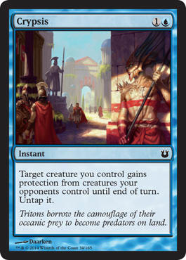
Unlike Innistrad, where all buildings were impossibly tall, we can see the triton just as anyone else would—at eye level. I like seeing the cities, the nooks and crannies, to see how a game shows a commonly-seen image. For example, in this world, do they have troughs at the side of the roads to gather water and debris? Can we see some type of sanitation system? Is irrigation present? How finely-cut are the stones in the walls? Has the city mastered the use of concrete yet? What are statues made of? I love analyzing cities, and Daarken gives us a glimpse into the lower-than-normal amount of foot traffic the city contains. I dig that.
It’s also a fun little storytelling image—and easily created. The wall can shift left or right easily in Photoshop, just as the far gate can move as well. He can fiddle to create just the right composition, and he did so on point! Very nice.
11. Swordwise Centaur by Slawomir Maniak
Finally, we have creatures that aren’t just in mid-fight pose. Magic has a lot of outside-the-ordinary imagery; it’s part of the brand (well, within a box, that is). If you see a new TCG or CCG, look at the art on the whole, particularly at what the warriors are doing. If they’re all in mid-swing, mid-punch, or striking a pose, you can tell the art director is either terrible or the people writing the descriptions are just winging it.
Writing an art description for this is hard. Picking the right sketch is even harder.
10. Floodtide Serpent by Steve Belledin
Steve wrote a full blog post about this piece here.
Two things to look at:
- The amount of water that is actually crashing is correct; whales really don’t disturb all that much water.
- The creature doesn’t actually land atop the city. It can cause just as much destruction by going hog-wild in the water nearby.
Often, many Magic depictions have a massive water creature landing on a city or lighthouse. That’s just unrealistic and unneeded. Steve knows what he’s doing and did the proper research.
Steve’s pretty damn good at this. Look at his lighting on every pillar. Happy to see him getting an image or two, despite moving cross country from NYC to Seattle.
9. Akroan Phalanx by Steve Prescott
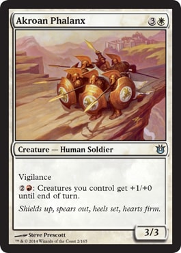
This can go on any wall, and I would respect any Roman or Greek history or art history teach a thousand times more if he or she can a print of this image in his or her office. It’s a timeless phalanx formation, and it’s shown here like it’s no big deal. It’s just another commission for Steve, shrugging at it, and bingo-bango, here’s an image that can stand out as being “in Theros” among over ten thousand other Magic: The Gathering images. Dragons, obviously, are harder at that sort of thing, being unique to the plane and setting, but when you create a lowly human, placing it exactly in time is pretty damn difficult. It appears to be an effortless depiction, and for that, it stands out and sure as hell stands out without its card frame.
8. Thunderous Might by Jaime Jones
This is an incredibly flavorful piece. You see, Jaime also made Awaken the Ancient, so this image feels to me as though it’s a continuation. A stronger mage has some sort of influence over the giant and plans something absurd. If it’s a giant, why make it stronger? What’s bigger than that!? What kind of wizard needs bigger bombs to win?
I hope more artists use allusions to older works and other cards they made for themselves. I know they’re often asked to reference another card, but adding a little extra nod that asks, “Did you see what I did there?” whether obvious or not, is something we Vorthos folk live for. More of that.
7. Drown in Sorrow, Noah Bradley
His The Sin of Man project looks to be influencing his other works. His personal project isn’t really a movie or book pitch, but rather a way for him to focus his personal efforts into something tangible. I like this ability to show his style and brand, not unlike a Karl Kopinski human. Though, in the latter case, you just know it’s Karl’s due to longevity of excellence—Noah is working on that, but he should get there in time.
6. Brimaz, King of Oreskos by Peter Mohrbacher
This is the cat warrior we’ve been looking for. Jareth, Leonin Titan and Kemba, Kha Regent never quite made the cut for interesting commanders or playable Standard cards. Pete received four art commissions in this set: two rares and two mythics, with Brimaz being the chase mythic and Mogis, God of Slaughter being a full God. I’m impressed. The card image is two images put together—one of a muted background scene with a very strongly-depicted solider card that begs to have a full resolution image being posted to Tumblr to see the full sword with all the bleed imagery connected. That cloth has life and helps move my eye again and again. Love it.
5. Plea for Guidance by Terese Nielsen
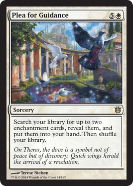
“But she always works on that type of board,” you may cry, but untrue; she switches it up and didn’t paint over or correct it in this piece. The clouds are just . . . Man, it brings me back to being dragged around Europe with my parents. My father was a German teacher, so every June, he headed over there with his high school students, and we often went along with him, touring Roman ruins, museums, and the like. Add some tourists with cameras, remove the sparkly Nyx, and you have Baden Baden or Trier, Germany.
4. Kiora, the Crashing Wave by Scott M. Fischer
Any time Magic utilizes Katsushika Hokusai’s The Great Wave, via a copy or homage, I swear the Magic community loses its shit. We love that image. Hell, I love it. It’s a great iconographic depiction that will outlive us all. Our blue color with its islands should use it more; it’s a visual shorthand. A future article will have to touch on visual shorthand.
Much has been discussed, satirized, and published on this art already. It’s a solid image, and I hope Scott gets more Planeswalkers in the future. A little more variety in that type of character would be a welcome change, and Scott’s an award-winning illustrator.
3. Odunos River Trawler by Seb McKinnon
Change the figure here to a hunched-over creature, grabbing the dead for his necromancer master, and see how different the picture is to you. Think about Germany and Poland, where Holocaust survivors were forced to gather their dead friends and family into lines and piles, preparing them for the incinerator. Marinate on the thought that one image could have different meanings by being so simple—so to the point. This car concept could be a thrull creature, a creature made of magic, sacrificed for mana, strength, or a gain of some sort. By taking a concept, the creative team breathes life into a stale concept into an image with a variety of meanings that transcend Magic. This is an open slate, and “emotive” is just the tip of the iceberg.
2. Temple of Enlightenment by Svetlin Velinov
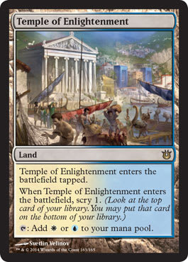
I really wish this image could be a panorama with an image on either side of it. It could show Meletis in action and having a before-current-and-future image could tie into basic lands and more. It’s a complete story using a mere visual shorthand. It could also preview the next set. That’s silly visual storytelling tie-ins and generally takes like five steps back when sketches come in. Hell, I barely see a connection here, but it exists, don’t cha know.
Great temple depicted here; it is the only solid thing in the image. Everything else is slightly translucent, forcing out eyes to the temple—everything around it is bustle, distractions to the central focus.
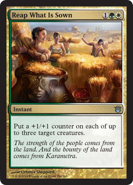
1. Reap What Is Sown by Cynthia Sheppard
Ugh, Cynthia is so solid. Men plus women plus a landscape minus stiffness equals a brilliantly-composed piece. The light is on, feeling like the wheat is gold, and value is thus placed on their work, their livelihood. The landscape is shown, but not even a central focus is to be shared with the harvesting of the wheat. The figures are placed, but showing one person fifty to hundred feet away with a single ox cart gathering wheat wouldn’t be befitting of a Magic card. This is a game, and some action needs to be shown—and shown it is.
Christ Cynthia is good. Get her a Planeswalker, stat.
She even mentioned that she feels she’s improved and is excited about her next block . . . I guess we’ll see, but for now, really take a strong look at this piece as soon as a higher-resolution image is available.
I’ve a short and sweet one this week. Brevity is the soul of wit apparently.
- Mike