


I like upgrading my life in a slow way.
When I get new art in my house, I enjoy putting in an area that needs an improvement. Adding more beauty to your life—a better aesthetic if you will—changes your everyday experience.
I don’t “pimp out” a deck right away; I just cover the bases. I acquire white-bordered cards, I pick up the cheapest first, and then I make very deliberate decisions on how I wish to improve it. I think of it as a lasting effect of the Scout Law’s “thrifty” tenet, and in doing so, it has made me more mindful of what to include mechanically first—and then visually.
When a new set comes out, I look forward to new reprints of cards to change out my current iterations. If there’s a more plane-specific Wrath spell or a Rancor that is fueled by rage, I need that hotness. It’s my favorite thing about seeing new art: to guess what the card is and then put into my deck. I’m very meticulous about looking up new sets, as I even write a big art review on what’s notable or a masterpiece visually in the set. It brings me tremendous joy and keeps decks fresh.
That said, I often have tunnel vision, missing a glut of art being posted for promo cards because I don’t play Standard. When I’m not at Friday Night Magic, I miss the FNM promos. Other than prereleases, I don’t see promos all that often. With that in mind, and with me always being about picking up great art on your cards, I’m going to showcase a few card arts that may be overlooked by many people. Most aren’t even expensive at all!
Let’s upgrade that Commander deck of yours!
Lands
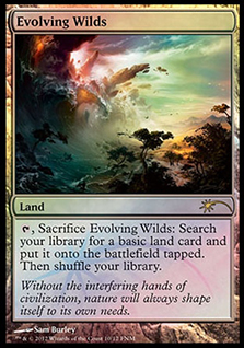 |  | 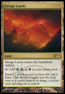 |
All three of these lands have a lot of motion going, giving the land aspect a little more organic life instead of being a still, lifeless snapshot. While Reliquary Tower is nearing $10, Evolving Wilds and Savage Lands are dirt cheap at both under $2 for some awesome art for your deck.
 | 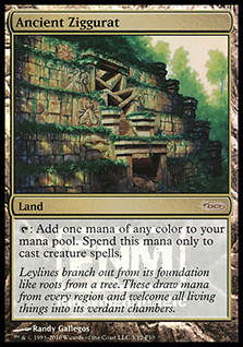 |  |
If the previous three added motion, these three have a little more stability in them. While Tectonic Edge could be a wild earthquake summer movie of a storyboard, Eytan went pretty small and localized for a destructive mechanic. It’s half the cost of the Worldwake foil, and I prefer this art considerably to that one.
Ancient Ziggurat is the calmest Aztec piece we’ll see in Magic for a while, and I love seeing real-world-looking imagery in art. I always try to find gothic cathedrals in art. (Hint: Ravnica has a bunch of them.) Karakas is basically a real-world mosque, and that judge foil, just like the original card, is silly expensive. But if you want one for your Commander deck, go with this artwork for sure!
Artifacts
 |  |  |
I don’t remember any of these three images when they were released, and art is my thing! Cripes!
All three of these are quite cheap, and I’ve seen the Hall of Triumph original artwork; it’s incredible up close. Chuck’s marbles from Theros are just stunning. While I love the original Hall of Triumph art, I have to go with Chuck’s rendition.
Door of Destinies has a little more fun depiction from Rob Alexander, as I imagine it more like a hobbit hole. It’s also cheaper than the original foil version!
Staff of Nin’s promo feels more epic, just like a 6-mana artifact that creates a ton of value should—compared to just a magic stick. Drawing another card is, and should be, depicted as a wicked-strong depiction.
 |  |  |
Steel Hellkite and Lightning Greaves are about as close to staples as I could find with reasonably priced promos. I like the originals, but I love these renditions. They look as powerful as the cards are in the game—something much harder to show than you’d think.
Dragon Throne of Tarkir is a card I don’t see a ton in Commander, but if you have a deck with little dudes attacking—or better, if Orc tribal becomes a thing—you need a khan leader in your version considering it’s so cheap.
White
 |  |  |
This promo Eternal Dragon was in Spectrum 14, selected as one of the best artworks in 2007. I love this card in my Uril, the Miststalker deck as a cycler that can help me get out of a jam, and it’s just so sad. He wants to do dragon things, and I’m just making him do a BS task. I feel you, dragon.
Honor of the Pure . . . I don’t remember this piece either, and I like the inevitability of the onslaught shown by making the lances airborne.
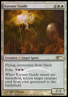
Karmic Guide is a stupidly expensive original foil, so this judge foil, while expensive, isn’t outlandish. The conceptual nature caught my eye as taking the mechanic into a universal depiction.
Blue
 |  |  |
One of my few quirks about writing about art is how often I see flavor mishaps. For example, Mirrodin as we knew it is gone. It’s all Phyrexian, as Mirrodin lost the war in the Scars of Mirrodin block. To “update” the image of Phyrexian Metamorph, serum (the silver stuff) is all Phyrexian oil, and images should be as well! This card is becoming harder to acquire, as it’s a 3-mana incredible Commander inclusion and is foil, and it’s art is awesome. It’s still not that expensive though!
Wash Out is a strict art upgrade by Volkan Baga. The card is from the comic books, and since not a ton of them were bought, the card is already $5 with nowhere to go but up in price.
Soul of Ravnica is one of Lucas Graciano’s few remaining original artworks; it’s huge and utterly beautiful. The card will be played in future Commander decks for value, and it’s crazy cheap now!
Black
 |  |  |
If you weren’t around for Mirrodin 1.0—or, sadly, 2.0 at this point—the suns were a major plot point in the first storyline—the green sun wasn’t in the sky. They only had four suns, and the fifth was a major plot point. We don’t see much of them anymore, as even the Modern Masters 2015 Edition promotional image of Etched Champion removed the background suns in the new image. This card is bleak, just like the plane. This image represents that one hundred percent, and it’s a fantastic Commander-playable card!
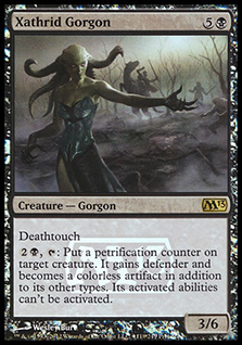
Xathrid Gorgon is a simple description done really quietly. Jeremy Jarvis likes to add a few “quiet” cards per block, and this card, when added to a Commander deck, gives a little flavor of calming your body down, especially with its mechanic.
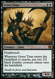
Grave Titan is among the few misattributed card artworks. Lucas Graciano actually painted this, not Nils Hamm. (It doesn’t even look like Hamm’s work.) This piece was in Spectrum 19, representing 2012’s best fantasy art, and in doing so, Graciano still owns the piece. It’s not for sale (NFS), but I’m sure that won’t be forever. I love the saturated, dark face. Upon closer inspection, you see the skull face, not unlike the grim reaper. It’s a cheaper foil than core-set foils with better art . . . Yeah, I’d get that.
Red
 |  |  |
Dragons shoot fire, sure, but they need to be born and raised in it like Bane to showcase what 7 mana worth of damage looks like. This art description really reinforces the fact that, yes, it’s a dragon, but there’s also a wide-eyed anticipation for destruction.
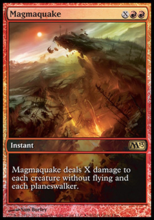
I like Magmaquake’s homage to Phyrexia and also to the twin towers building/industry scene of Saruman’s army!
And those goblins by Jesper? They’re just on point and hella annoying for any Commander player who has to deal with them!
Green and Multicolored
 |  |  |
Doubling Season’s concept as paper depiction is a brilliantly written art description by the creative team, and Chuck delivered on point for it.
I like Farseek’s normal art, but one overlooking Ravnica is too much flavorful goodness for me to not include in my deck.
I play Cultivate in every green deck I have, and this John Avon promo delivers a remixed land for me. It looks like something out of his mid-1990s repertoire, but with a central figure, making it feel fresh and new.
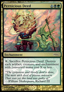 | 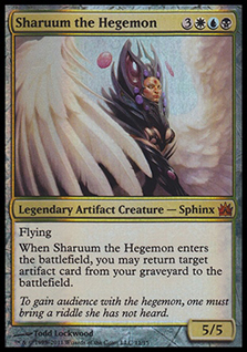 |  |
I always forget about these artworks. Pernicious Deed is a great mechanically-derived art description with beautiful smoke effects. Sharuum the Hegemon is an award-winning artwork, being in Spectrum 18, representing the best of fantasy art in 2011. Also, Todd Lockwood is a master, so there’s that. If you missed the Garruk Wildspeaker—I know many folks did, as it was a gaming promotional card—here you go. Garruk’s been printed a billion times, but I like Nils’s version here. He normally works so loose, with large brushstrokes and going more conceptual. This grounded-in-reality piece is just lovely to show his body paint (tattoos here?), and I use it in my decks all the time!
I hope you could find a few cards you may use. There is always more art to see, even for some of us who look at it all the time. I wrote a previous article on this idea in Better Basic Lands. I’ll do these more often, as I know a ton of art has been lost to the ages if you don’t look for it!
Mike