


I’ve been writing a little while here, talking about Magic, its art, and how flavor makes an impact on the game. Since I began writing more or less weekly since 2011, I’ve had a few things that I haven’t been able to land. One near the top is an interview with a Magic art director. To be fair, I haven’t been pestering the creative managers, brand folks, or PR people as much as I could’ve, but regardless, I’d dust off a proposal and resend to them when I could. Receiving a Vorthos-type preview card is also in that dusty pile.
For those of you who don’t know who art directors are, they’re the ones who commission artists to make the visual worlds we play in. The most notable is senior art director of Magic Jeremy Jarvis. While there are other art directors, from the stellar marketing art directors like Matt Cavotta—working with the graphical elements from booster box colors to all sorts of product stuff—to Dungeons & Dragons art directors—who help out with Magic from time to time—Jeremy is the go-to Magic guy who can give artists their big breaks or allow them to paint something magnificent. To say illustrating your first card is a big deal is the understatement of a fantasy painter’s career. In a sense, it’s a legitimization of one’s ability. When Jeremy knows about you and calls you, you can get a pat on the back because you have an instant following, and fans will look you up before every convention you attend.
I always scour for whenever Jeremy writes for the Mothership. I’d check his archive here. The Planeswalker’s Guides articles are basically a committee approach, easing up some of the massive style-guide explanations of what he could write. If you’re even remotely interested in Vorthos things such as art direction and use of symbols, you need to read his ten articles. As for him, there has been one article, long ago, giving some insight into Jeremy, and that can be found here.
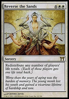
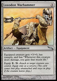
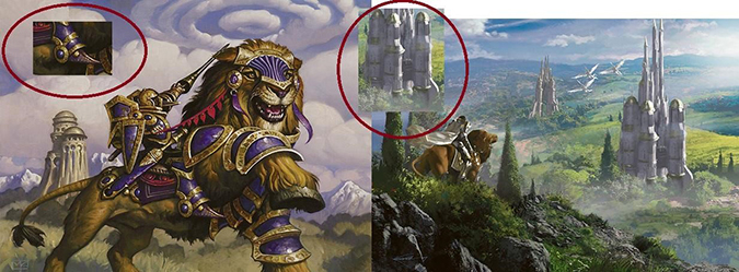
In short, he is an incredible art director, is entertaining as hell in person, and has made some incredible art. He was in Spectum’s annual art book for these two images: Reverse the Sands and Loxodon Warhammer. Kind of a big deal.
 |  |
Onward to the interview questions!
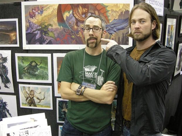
Steve Prescott with Jeremy Jarvis at GenCon in 2008. Image via DailyMTG
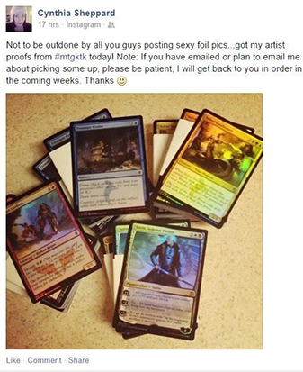
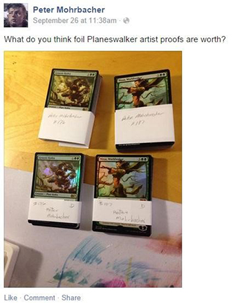
When will artists begin receiving foil artist proofs? Will they receive them in all languages? I assume past projects won't get these. Will all products be receiving the foil proofs or just core sets and expansions?
I can't officially commit to a date, as sometimes there are circumstances outside of our control, but "sooner rather than later." They will be in English only (as they have always been) and only produced on products going forward. Foil proofs will be created for a card if a foil version of the card exists in the product. Sorry, Commander, but yay From the Vault!
(Mike: It appears that they just came out!)
 |  |
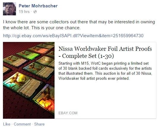
(Mike: I’d like to point this out from Pete Mohrbacher. He has got all thirty of his Nissa, Worldwaker proofs being sold for $6,000. For $200 apiece, is that worth it? That’s for the market to decide, but have you met those Magic Librarities collectors? Someone in there just might.)
What's the most challenging aspect of creative development? Why?
All of it! Every part of it is hard if you're doing it well. I guess that means the real answer is, "Our own high standards are the most challenging aspect of creative development." The long life of the game also adds pressure. We don't always get to do the most obvious thing in all places. There is an increasing amount of can't-do-X-in-this-setting-because-we-spent-that-trope-in-setting-Y and, conversely, "Well, in the next five years, we are certainly going to world-premise-Q, so we need to hold this idea for the benefit of Q's identity and richness."
 |  |
Does Magic have a unique visual identity? Is it supposed to?
All visual properties will have a visual identity. Even if a property has the absolute lack of any sort of cohesive visual identity, that will become recognizable as its visual identity. So the question is actually, "Should Magic's visual identity be deliberate?" (Yes, it should.)
 |  |
What's the hardest part of making a cohesive fantasy world through card art?
It's card art. Literally, the card part of card art is what makes it difficult. The size and format of the medium are not openly conducive to communicating an awe-inspiring sense of immersion. Beyond that, the randomized nature of acquiring the game means we can't deploy information or visuals sequentially. We have to be really good at fully using every card as an opportunity to show something that both is cool on its own and contributes to the setting's greater appeal, no matter whether you see that card first or last.
 |  |
What are some examples of details that go into art and world development that players might have missed?
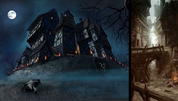
I don't think players "miss them," per se, but I do think we work really hard to provide thematic depth that a lot of people would not naturally verbalize. For example, the large greaves used in Bant armor and the fact that Bant castles are held off the ground by huge pillars were both employed as visualizations of being load-bearing . . . of having and dealing with the weight of responsibility. How many people would point that out directly? Probably not many, but it makes Bant a better Bant than it otherwise would have been. Same with using “first-person camera” on Innistrad to encourage a sense of personal dread. This happens on the writing side, too, a clear example being the use of a real-world language basis (or family of them) to inspire the proper nouns of a given setting. Again, I don't think people miss it . . . they know that Experiment Kraj is named "Experiment Kraj" . . . but they might not openly realize why that makes Ravnica a better Ravnica.
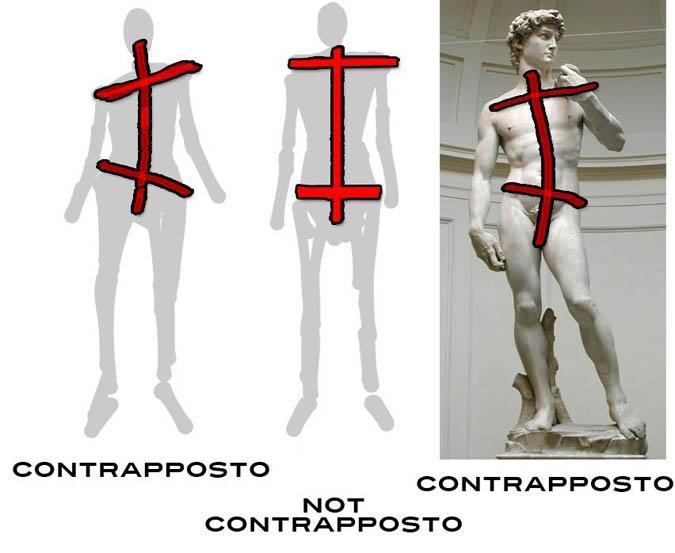
On a related note, Mike, I was impressed that you called out contrapposto in Theros art. That was a side effect of pushing for heroes to be shown in poses "as if sculpted that way" rather than as a comic book cover would portray them. I think that made Theros a better Theros.
 |
 |
 |
Who, specifically, writes the Magic art descriptions? Could the community ever write one?
Every set has what we refer to as a lead concepter: one of our writers who is responsible for that set's card concepts and resulting art descriptions. Sometimes, multiple writers contribute, but that's the model. Then, the descriptions go to that set's art director, who reviews and comments, usually watching for overarching elements or themes he or she wants (or doesn't want) to see.
For the community to write an art description, we would have to be willing to expose the community to the card's mechanics. Descriptions are always written in response to (A) what the themes and needs of the set/setting are and (B) what that exact card does. So it would be a rare opportunity, given how guarded card mechanics are.
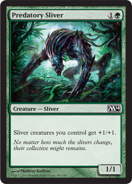
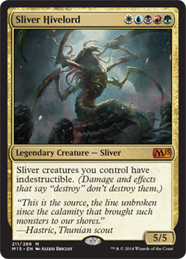
Slivers – Can you explain to readers the past thought process on how they were changed and why two cards were changed back visually to the original form while keeping the more humanoid version?
Yep. It was a classic case of moving-target syndrome. When we started work on the redesign, it was because "the one thing these cannot be are Slivers." They were mechanically different, so they would be a new creature type. We were referring to them internally as Sleen. No idea if that name would have stuck. Goals and parameters were given to [concept artist] Richard [Whitters] and me to achieve this. Then, at some point, it was decided that there was enough equity in the type "Sliver" that these would, in fact, be Slivers. The expectations of the goals and parameters, however, stuck for some reason, rather than being reassessed with the type-line decision's reversal.
Now, given all of that, I would have preferred that they look somehow different than original Slivers. They are mechanically distinct and therefore should not be confusable on the table during play. Original Sliver morphology gags are pretty played out as well. We felt it during Time Spiral block, as we were just having to do weirder and weirder things with their very limited anatomy. "Maybe make this one's head into a tuning fork?" We needed to open up visual possibilities in the ways that they could physically adapt.
As to the spotty return to their "original" form, the visual narrative I'm trying to construct is that when they are very young and are "open canvasses," they look very similar to the originals. But these Shandalar Slivers are better at adapting and mimicking than we have previously seen, and they will adopt any mode of locomotion other than crawling-on-belly as soon as possible.
(Mike: That . . . actually makes a lot of sense. I kind of feel terrible for writing on this, but my last point rings truer. With Jeremy’s feedback, it all makes a lot more sense as Slivers being in the larvae stage that just evolved differently. Mike hides under the table, scared of thrown objects by community members.)
 |  |
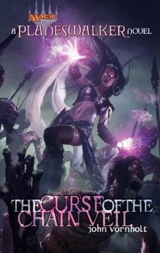
As for Curse of the Chain Veil—the book that was never released on Liliana—was there any art inside of it? If so, could you share any of it with us now or on a future Arcana?
There was no interior art. The cover was completed by Michael Komarck, though, and you guys have seen it.
What conventions do you traditionally attend each year?
That changes too drastically from year to year for me to give any sort of good answer. I would love it if we had a Magic art-direction presence at all major conventions, but that is currently unrealistic due to workloads. It takes a lot of work to prep for a convention, and doing both that and my day job can be challenging. Any aspiring illustrators are encouraged to send links or low-res submissions to artdrop at wizards dot com.
Thank you, Jeremy.
I know you’re crazy-busy all the damn time; I really appreciate it. Also, big thanks to Colin Kawakami (@ColmDanger) and Kayla Tippie (@KaylaSmiles85) for their help in setting up the interview! Also, aspiring artists, use the artdrop!
-Mike