


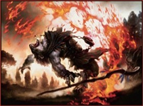
You’ll notice in this group that there’s a change in art—again.
Remember when the sky was falling and everything was digital and awful? Remember how Jeremy Jarvis was ruining Magic and such? Oh wait, it’s not his fault; it’s Mark Rosewater’s . . . probably . . . or something.
Notice all the new artists here. For a smaller set, there is a ton of new talent into the fold. Also, oddly, there are some pretty serious greats.
Many of my links have some great content hidden in there. Hope you enjoy!
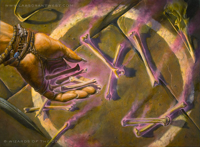
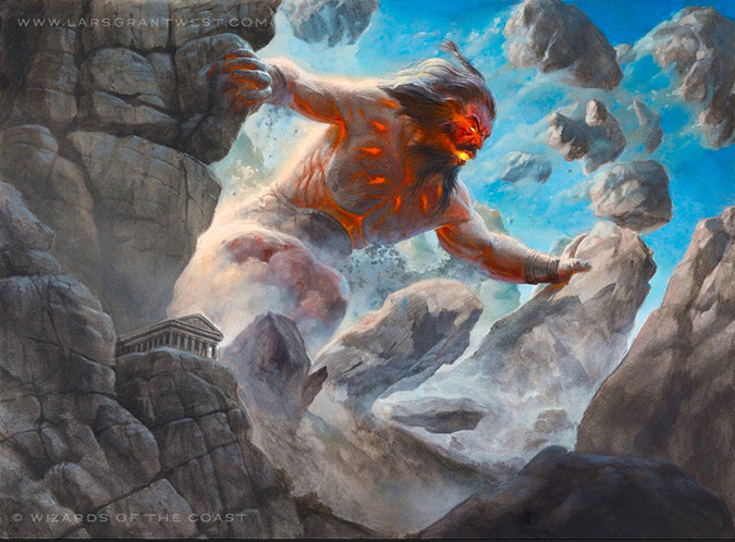
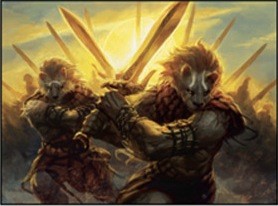
Lars Grant-West – 2 in the set (3 overall)
- Read the Bones
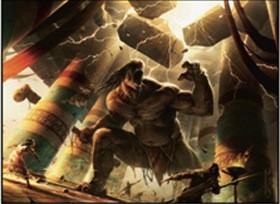
- Stoneshock Giant
- Sylvan Caryatid (buy-a-box promo)
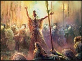
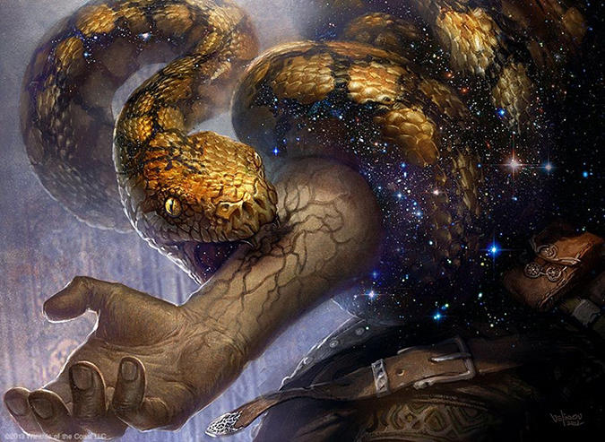
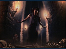
Upon seeing Read the Bones, I immediately raced back to memories of the Boy Scouts as a bored rural bumpkin in central Minnesota. Our Scoutmaster, an avid dungeon master in his spare time, riddled us with a game, Magic Eskimo Counting Sticks, that was one part counting of sticks and the other part a hidden secret. I suppose this game was basically all ancient auguries were. This is a flavorful card that’s basically a Limited card, one made for Drafts and Sealed play, but it won’t break into the more serious-business Constructed formats. It’s a shame, too, because very flavorful cards that fit planes the best—Greek-feeling—should last longer than a mere year or two.
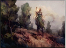
Lars can do anything—let’s be serious here—but for Christ’s sake, can the man just have a set of four lands to make a panorama again? Ain’t nobody left to make them anymore. Jeremy Jarvis, I’m just saying: In a time of change, with new artists having broken the door down, can we get some nostalgia in the near future? You know he’s down to ride.

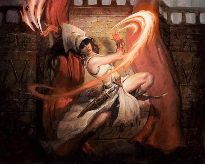
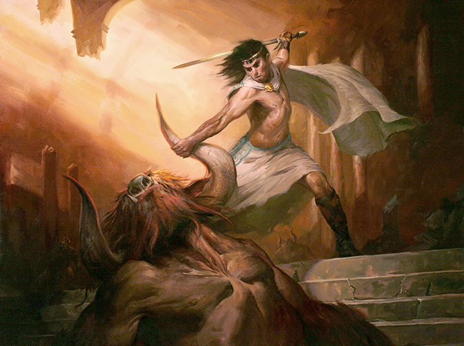
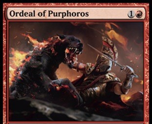
Lucas Graciano – 4
- Flamespeaker Adept (Oracle of Flame was the original name)
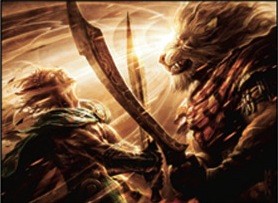
- Ordeal of Heliod
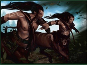
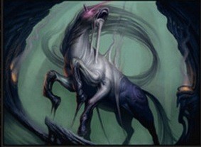
- Returned Centaur
- Thoughtseize
So, commissioning artworks to artists is basically Sudoku except there isn’t a perfect answer, and a mistakes will bite both of you in the butt and then force you to reassign it to someone else, with less time and higher stress. In doing so, what Lucas has here is a very typical set of commissions. He receives one amazing commission, one potential, and two cards only seen in Limited. The commission of hot-damn-amazing, great, and decent is a way to spread the love around. Not every artist can get all the Chris Rahn wins nor should someone have entirely unplayable cards either. Artists know they were hosed when people don’t come to their convention booths to have the cards signed or ask them about artist proofs or the original artwork.
Lucas has one of the boom-boom cards in the set that will make him actual currency with Thoughtseize. He then has a potentially playable card with Ordeal of Heliod—and then two kinda limited pieces. If every set for which you receive commissions has one playable card, within only a few years, you’ll have a pretty decent following if you are even terrible at having a social media presence.
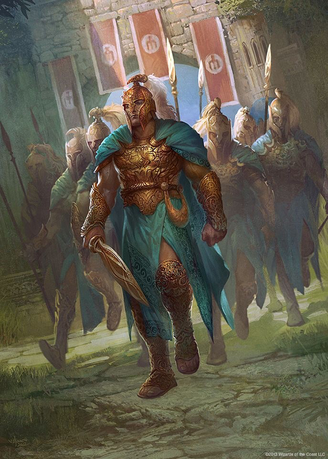
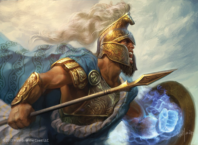
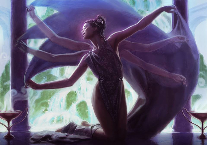
His Ordeal of Heliod is obviously the best image. The art was used to preview the set, and the musculature, the idealized musculature, is just damn awesome. I want to see his reference image so damn much. The light is great, but the figures nullify really everything beside themselves. They’re simply captivating from their motion lines. That sword, horn, and thrown robe all pull and push my eyes to the center, not allowing me to look away.
Of course, this original artwork is long gone. C’mon now. Lucas posts about it on Twitter when it’s on eBay, and it always sells for crazy amounts of chips, and I’m not talking Ruffles.


Maciej Kuciara – 2
It bugs the hell out of me that Maciej posts nothing about Magic anywhere on any of his sites. Yes, I know he works for Naughty Dog Inc., who made The Last of Us. That game, oh man, is one of the best I’ve seen—like ever. I didn’t include it in my Video games as art, not quite Art talk, but I easily could now with hindsight.
He probably cannot post Magic because of nondisclosure agreements, but it’s still frickin’ annoying. If anyone knows him, help a brother out. Could he maybe post a high-res every now and then on Facebook? Maybe he could send some high-resolution images to a few Tumblrs. Buehler?
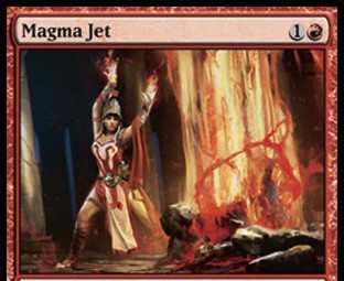
He took Magic’s aesthetic and mixed it with his concept-artist style to get this Magma Jet hybrid situation—not too shabby. It’s a successful experiment that, of course, Magic hype man Evan Erwin loves.
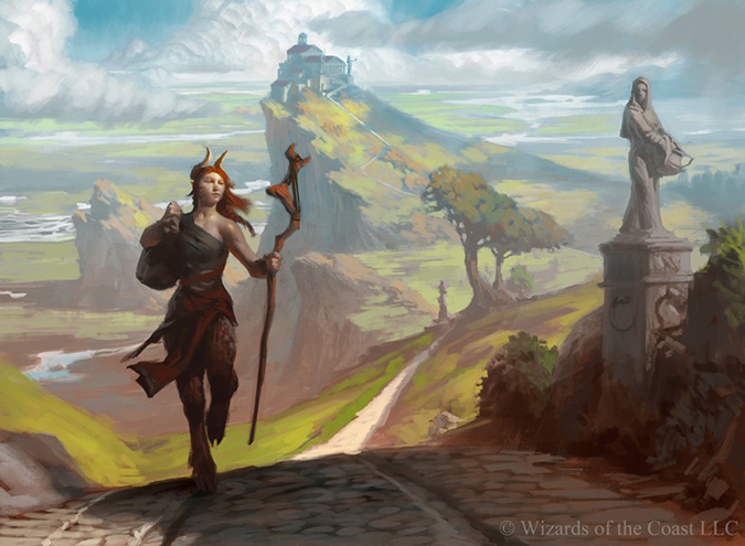
Magali Villeneuve – 1
@Cathaoir1, but she has her tweets protected
Let’s put things into perspective.
This is Magali’s first published Magic artwork. Magali does a lot of work for Fantasy Flight Games, including many covers. That is not an inherent quality difference, oh no, it’s just that for an artist, stability of work is paramount.
Should she have been working for art director Jeremy Jarvis and company years ago, she absolutely should’ve been called in her native France, but risk is a thing. When you’re doing covers and a few cards per living card game set and you have a good relationship with an art director, do you try for a few Magic cards and live the dream only to possibly not fit or be ousted by a style change? Eh? Well?
I’m happy she finally broke through. Her very highly realistic depictions are the next in the line of Magic art shifts.
Mark Winters – 2
Mark, like Magali, also loves that hyperrealism.
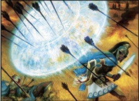
Gods Willing is a very strong image that is friendly to everyone. I love me some nonplaneswalker cards of the characters just doing stuff. The core sets have really taken the signature-spell motif to whole new levels, and I find them flavorfully fitting. While the arms appear a little off, anatomy-style, in the foreshortened shoulders at card size, it’s nearly impossible to see.
Mark Zug – 1
Two things:
- Mark got a marquee Theros race.
- The race is a riff on Zombies.
Great job, Mark, as always.
Side note: Some of his Spectrum-included oil original Magic paintings are still available to purchase.
Sider note: They shouldn’t be available. Someone should’ve snatched them up years ago. Spectrum arts are basically fine art of the fantasy art world.
Mathias Kollros – 3
I want this to be a slow-rolled cycle of creatures so bad over a few years. With Nemesis of Reason already made, it feels like a naming punt, a derivative POS example until you realize that this fatty could be part of something bigger. Kollros knows his creatures, you guys. He’s been making Call of Cthulhu gaming artworks for years. It’s a bit too much of an influence here with the eyes of the creature, but I can deal with it here. I’m not blind; I see what he did there. Warhammer Fantasy sneaks itself into Magic sometimes, too, with their Dark Elves. One day, I’ll cover a bunch of other gaming influences . . . one day.
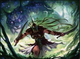
His Feral Invocation is a great example of what I thought was coming in Theros: strong warrior women. I am not disappointed. The card has to focus on the lynx, but perhaps he had two to three other sketches wherein the woman was more prominent. I mean, we’re that close to Magical Christmas Land for depicting women in Magic. Thank the creative team for really stressing gender representation in the game and artists loving the chance to showcase their creativity in making it work well.
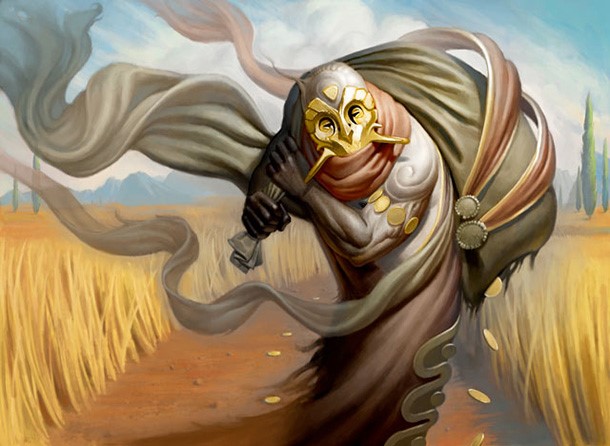
Matt Stewart – 5
Young artist tip: Matt Stewart is not a Muppet. He can and will do amazing things when given the opportunity by himself, with no interference. For every Gift of Immortality masterwork (Christ it’s good!), you can and will make a Fanatic of Mogis. That is the range for Magic. There are some quality differences—even in artists, and even in commissions. Cynthia Sheppard posted about this on Facebook. You must be incredibly selective about what you post online. Don’t take it to heart and be depressed about it, but keep in mind that when given a few images, you will have the stupid-amazing and the acceptable. The faster you can realize where the image is going, and then maximize its final form, the better off you’ll be mentally and financially. You cannot choose how played the card will be, but do ask. If it’s a rare card depiction, you need to swing for the fences. When you make it to Matt’s stage, choosing which rare is “best” is when it becomes hard.
I’d like to think artists in the same set of commissions—all under nondisclosure agreements, mind you—would discuss commissions to decipher which one will hit it big, but I doubt they’ll take the risk to find out.
Why the hell does that matter?
The better the art on a better card, the more print sales, alterations, and artist proofs for a higher value, which will result in money in your pocket. One big-time card can pay for an entire convention weekend if you understand the market. (And if you nominally charge for signatures, which you should.)
Great job on the lot Matt, and good gravy, keep up the hustle. I’m not at all surprised Gift of Immortality went for $2,325 on eBay. I am surprised that he didn’t reach out to the community a bit more to bring it to $3,300. God knows many of us will help artists out if they just ask. We live on Twitter; trust me.


Mike Bierak – 3
Lucky dog, Mike got three really amazing commissions.
None of three were super-difficult art descriptions either! This is nice, and the upside on all three are amazing. He got Temple of Abandon, a very playable card, that will have people asking for signatures for at least two years, a burn spell that could find a home, and a Minotaur lord that is by far among the best sleepers in the set for an artist. Were I he, I’d be holding my artist proofs of the Minotaur for a few months, waiting to see what comes of the Minotaurs later in the block and by winter. That could make a $5 artist proof into doubling his money, and with a little sketch, tripling or more. That seems so insignificant, but an $850 commission plus fifty artist proofs at $5 all selling within months is a huge upside. Make those five-dollar bills into a Hamilton and a Lincoln, and he’s damn near doubled his original commission cost! That’s some serious business. I really wish we had in Magic some type of broker, a consultant of sorts who could help artists out. Artists are notoriously bad with money, and with only a little help, a consultant could really make their financial situations better. PACT will do a lot, yes, but game by game, little pockets of industry might be a little too much for PACT to entirely cover—at least right away.
Mike’s Temple of Abandon looks like a style I’d search for in making a Talisman expansion. If you look, or can find, an early Sidharth Chaturvedi work, it’s something along those lines. Though Sid has become stupidly great in a very short amount of time.
Mike? Great job, and look at the business of the cards. Don’t leave money on the table!
Min Yum – 4
Min made one of my Commander commanders in Melira, Sylvok Outcast. Compare that image to Baleful Eidolon. Look at the concept art influence of rougher lines and implied form to Artisan of Forms. There is a spectrum that is unknown to us as viewers. Does Jarvis yell, “Make it more refined because I know you can do that shadow business,” or does he let it just naturally go? It’s hard to tell.
I think Min Yum could’ve done an awesome job at doing the new Slivers. Keep the figures rough so it would be hard to tell if a creature was wholly new or homage. Add in Nils Hamm to them, and players are probably a lot happier.
On a personal aesthetic level, I like more refined forms on cards compared to concepty gestural images, so I like Artisan of Forms. It’s also the only artwork that, without the card frame context, appears to be in a Greek-themed Theros block. I know that removing it from context is cheating a bit, but moving illustration into art into Fine Art requires it to be so. There’s a lot going on in that image, and it deserves a close look when playing a Limited Draft. Peer at it closely the next Draft you’re in, and wonder why her clothing choice as a wizard isn’t that distracting, even in a halter top.
Nils Hamm – 5
The new world order of top-down design has enabled cards such as Dark Betrayal and Sip of Hemlock to work. No other game has these underlying hidden rules as Magic does with its color pie. Other games have mantras saying, “Well, because,” or, “Well, we need it to,” that removes logic or a way to check concepts against a norm. Magic has it, and the flavor oozes out of concepts, mechanics, and art because of it.
Those two cards are amazing for very different reasons.
Sip of Hemlock brings the real world back into Magic, which it rarely has anymore. Yes, Grave Bramble is a nod to the Plants vs. Zombies, and flavor text by Plato was on cards printed back in the 1990s such as Fissure, but as of late? Well? I’m happy to see them not totally ignoring Greek tropes and history. That’s just good, approachable designing. From the art to the name to the flavor text, everything aligns perfectly.
Dark Betrayal shows what the black color is supposed to do. Black is self-interested, often arrogant, and selfish. What explains that perfectly? If you kill someone who’s an ally, in your color, that’s black. I’m surprised it took this long actually. The art could’ve been a bit more of a nod to Caesar and Brutus, but Nils had an art description to work from; you can’t just wing it.
I like Sip of Hemlock for its simplicity. It appears Kev Walker edited down to just the most important figure, action, or scene—great work.


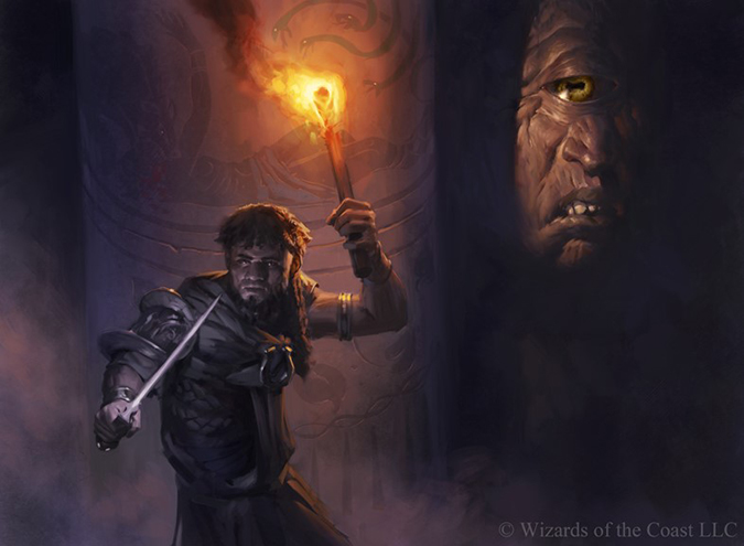
Noah Bradley – 3
I’m waiting for Noah to break the fourth wall in his work. When Steve Argyle did so with Damia, Sage of Stone, it propelled him to being a fan favorite. While folks appear to love Noah, he could do more, and he knows it.
He’s looking closer at how the art is made, taking time off, and getting back into painting originals, not only to make money, but also because it’s good for him to grow.
The Fade into Antiquity is a study; I get it. Compare it to Temple of Mystery, and you can see where he’s headed. I wish his burn spell of Anger of the Gods was an original art because if that sees a lot of play, it’s going to make all the money since Noah works large with traditional paintings.
The temple has his light usage, so, chicken dinner winner it is.


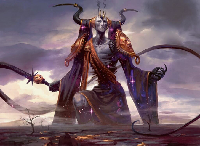
Peter Mohrbacher – 6 (7)
- Dauntless Onslaught
- Erebos, God of the Dead
- Ill-Tempered Cyclops
- Pharika's Mender
- Stymied Hopes
- Swan Song
- Bird Token
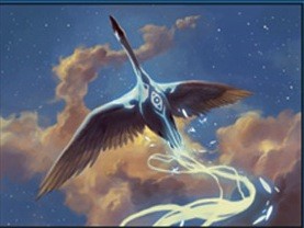
Swan Song is just amazing—a fantastical swan, very much playable in more Constructed formats and a clean image. Again, we have an edited-down (curated, if you will) image that cuts through the chaff to the core. I prefer it over his Erebos actually.
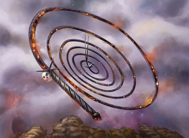
Stymied Hopes is so close to being a staple of decks. Were the cost to play it only ![]() , it’d be a house. Were the conditional part of the mechanic to require
, it’d be a house. Were the conditional part of the mechanic to require ![]() to be paid, it’d be silly-good. As is, it’s fine and will only be seen in Limited. It’s that close. Artists look at cards and, in a vacuum, and even in the card file, the final tweaks aren’t made, making prominence or planning time to make “the good one” better is impossible. Peter put a lot of work into the figure while still making an amazing Swan Song and a God. He balanced out the hustle well.
to be paid, it’d be silly-good. As is, it’s fine and will only be seen in Limited. It’s that close. Artists look at cards and, in a vacuum, and even in the card file, the final tweaks aren’t made, making prominence or planning time to make “the good one” better is impossible. Peter put a lot of work into the figure while still making an amazing Swan Song and a God. He balanced out the hustle well.
A quick odd note on Pharika's Mender’s mechanic: It makes no sense to me and really gave Peter the shaft. Who doesn’t want a Gorgon to have statues around it, looking all cool and flavorful?! This could’ve been a Human even. There’s no real reason it needs to be a Gorgon mechanically. Maybe it’s a last-minute development change of cards. I wouldn’t be surprised.
Good God, too—good God as well.

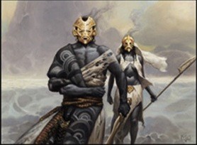
Phil Simmer – 2
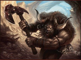
I like these nonhuman figures. The Minotaur is indeed awesome. It was used in promoting the set. Really, that’s a marquee notice if an art is perceived to be good. Have you seen it before you saw it on the card? Yes? It’s good art or at least better than average.
I have to add some Haterade powder into my Arnold Palmer this afternoon, though, due to that Minotaur’s axe. It looks like it went through revision hell. It’s bent, the rim-lighting feels off, and it feels too small. I’ve worked in Warhammer; I know that too big doesn’t exist, and this is no different. It feels a bit forced or finished late. Both are fine, not a worry, but for future commissions, don’t make Phil hustle them out. He likes creatures like my boy Chris Burdett. Since both are new this set with two images each, keep a lookout for them in the near future—Theros should have a ton of beasties.
Ralph Horsley – 2
Nylea's Presence is just wonderful. Ralph rarely does lands or environments, but when he does, he does incredibly strong work. Remember Fire-Lit Thicket and Boseiju, Who Shelters all? Both are just great, and this piece is no different. That purple should fight in the image, but I think Theros will seem, in hindsight, to be the sparkly purple plane.
Ralph is a super-nice guy. When you see him at a convention, you’ll see his absolute pile of original artworks he brings. Take five minutes to go through his work and ask some questions. In his British typical self, he always has an interesting story to go with every piece, and you might learn a few things, too. I always make time to hear about his process.
To see process shots, go here, and click the right arrow! It’s awesome!
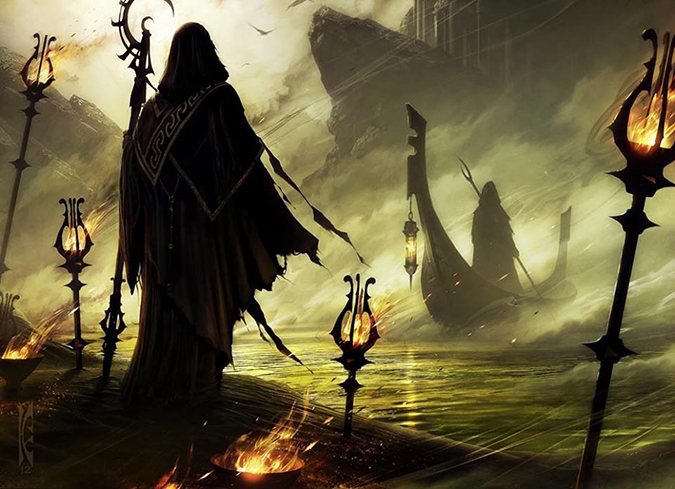
Raymond Swanland – 5
Glare of Heresy is that cool; I hate the ally idea. Rescue from the Underworld has the best flavor. Defend the Hearth is a standalone great image. Temple of Deceit is really hard to see. Divine Verdict has a “meh” art description. (Remember that artists have prompts.)
I love the Rescue from the Underworld. I’m ever a Castlevania fan, sure, but the flavor behind it is just as flavorful here, as it is there—Charon the boatman needs to be paid to help a brother out.
 |
 |
From Greek myth to the incredible art video game Don’t Look Back, going into the underworld and coming back is a very common “To Hell and Back” trope. Magic is ever trying to fit recognizable tropes into the game without forcing them down our throats. Add in a super-cool Swanland image with torches and hooded figures, and we’re in the money, baby. If only it were always this easy.
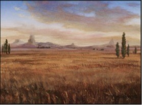
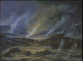
Rob Alexander – 5
I was going to simply write, “No comment,” on these five, but that’s a bit unfair to myself, readers, and Rob. I rewrote a pretty aggressive section, too, which was nixed as well. In short, none of these lands speak Theros to me. None feel Greek in nature. None are strong paintings with any innovative or strong motifs from lighting to composition. None feel fresh; I’ve seen art like this back in Odyssey, especially the Forest. The Plains-as-field has been done a hundred times already, reminiscing thoughts of Russell Crowe in Gladiator walking through the fields, which is even Roman, not Greek, in nature. The Swamp with marsh gas could be done well, but it feels quickly done, without intention or specificity. The Mountain with purple added is always a good choice, as John Avon’s purple mountain majesty in 1996 showed, but this depiction feels like a Kamigawa mountain or grasping at something unrealized. The Island is so close to being a really cool composition, but either by cropping or by focusing on lifeless clouds, this piece falls a bit flat. The Forest is a composition piece—it almost looks like a theater stage with painted greens to create a scene. The lighting is just not his usual quality, and frankly, it’s wholly underwhelming.
Compare these to him receiving all ten shock lands in the original Ravnica block, which were amazing. Perhaps his receiving zero commissions in Return to Ravnica could be telling. Is this kind of concerning?
So, perhaps since I can’t say anything positive, I should’ve been silent, but that’s just lazy and unfair to everyone. “This sucks,” is the least helpful feedback; it tells them nothing. I could dive into point-by-point explanation, but images like this won’t be posted online for Facebook friends to adore in high resolution because they aren’t the best. I don’t have an obligation to cover them, but perhaps I should. Who else will bring this to light? I know there are a hundred environmental and landscape artists who would kill to have a shot at a Magic commission, and we have a veteran saying, “Yup, these are good enough,” and it’s okay. Nope. Not good enough doesn’t work here. This game isn’t a Kickstarter project built out of a garage. People make a living off making 2” × 3” depictions. Never, ever waste the opportunity.
Not a good group of commissions for Rob. Hope he bounces back to his normal awesomeness soon.
Going forward from this day, month, and year, how do you want me to cover instances like this? Is silence better? Not? Let me know in the comments.


Robbie Trevino – 2
I remember seeing Robbie Trevino’s portfolio. Perhaps it was at Spectrum and just being blown away by how refined his concepts were for non-art-directed works. His Ethereal Forge artwork looks like the Returned, or Nostron, mixed with an angel. This is style-guide type work and I’m not totally certain some of his works weren’t just bought and put into the slush pile for future cards.
Compared to his portfolio, he’s wading into Magic as of now. He gets the look and feel; he just needs some boom-booms to flex his creative talent. The windy drapery in Gray Merchant of Asphodel looks like a study with a future Baneslayer Angel–type depiction hitting the tournament tables and wowing fan boys and fan girls for years to come as a knockout piece. I have high hopes for Robbie. Look at his portfolio if you have time. I linked to it above.
Ryan Barger – 2
One thing about Ryan Barger’s website: Check out his Card Art section. Do you notice how he has Magic first and then goes downward? It’s a bit of an unspoken truth that there is a ranking of games. One day, we’ll have to write on the order, the ranking of best to, um, not as awesome.
Wavecrash Triton appears as though it should’ve been “titan” due to scale, but perhaps not. It would be comical to see titan move to triton
I like his self-hating green card the most. I’m ever a fan of great lighting when figures interact with one another. I love the idea of a green “kill” spell that isn’t a Hornet Sting. It’s flavorful and makes sense. While he didn’t get the Tarmogoyf of the set, one can’t win all the time, but he’s receiving consistent work, which he has going for him, which is nice.

Ryan Pancoast – 2
Blog (Hasn’t updated in a while.)
“Hmm, stompy foot, crap, who do we get . . . um, Wear // Tear artist Ryan Pancoast? What’s he up to? Doesn’t matter; slot him in.”
He’s a lucky dog got two eternally playable cards for Commander. That Hydra is begging to be in a deck with Doubling Season and counter manipulation. I love Hydras, and it’s a solid, memorable image for a rare. Like a plaid shirt with a striped tie, it just works.
While I would’ve loved a falling angel, maybe a nod to Icarus or Phosphorus/Lucifer the Morningstar, chocolate and peanut butter don’t always have to mix.
Not much else to say; Ryan does good work with very few errors or things out of place. He makes military battle scenes, and random crap isn’t added. Everything he does is intentional, and in doing so, he does both incredibly well.

Ryan Yee – 2 (3)
- Bident of Thassa (promo)
- Thassa's Bounty
- Yoked Ox
Ryan has had two of my favorite images of the past few years. I have a short list, and Blood Bairn and Endless Ranks of the Dead need mention every time I can stand atop a soapbox. They’re like breakfast for dinner, everything you want, at a time you’re not supposed to get them. Welcome surprises are awesome.
I think he really shines with low-lit images. Basically, if it’s a black card, he’ll be awesome at it. That said, Yoked Ox could just as easily be an oil painting for how well the brush strokes appear.
Thassa's Bounty is such a fun still life that would be amazing looking in a board game. It could almost be a community chest where you get some resource, you know? (Hint, Wizards: Make a board game!) The Bident looks all right, but he didn’t really have a lot to work with, you know? Imagine the art description: “Make this tuning fork thing near the sea.” Um, okay then.
Yoked Ox is a fun image with great fur coloration and a masterful usage of the digital paintbrush. This card will see some play in control decks, so were I Ryan, I’d prepare for some alteration requests from people because the card by itself is worth about $.05. Getting a little extra cash by churching them up would be wise—especially as they’re being speculated in the community. Maybe alter a few and throw them up on eBay before the jury is back. Get that money.

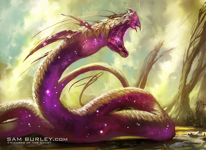
Sam Burley – 6
- Erebos's Emissary
- Heliod's Emissary
- Nylea's Emissary
- Purphoros's Emissary
- Thassa's Emissary
- Horizon Chimera
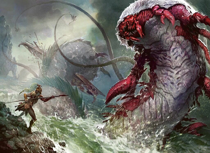
Sam had this to say about his Chimera:
That explains why it’s not the traditional D&D and Greek lion/goat/serpent combination and why it needs to be seen in high resolution. Damn little 2” × 3” visible canvas.
While I think the Emissary cycle is fun and neat and they’ll be played in Limited all day, they don’t move me much. The chimera’s daintiness, especially with the fine art background, is where he has incredible strength. Give him more landscapes!


Scott Chou – 1
Since Kor Spiritdancer and the Trinket Mage reprint, Scott really hasn’t gotten a lot of really visible tournament-playable cards. His prominent artworks have been on promotional cards. While fun, they aren’t seen by a ton of people. Visibility is huge, and while Asphodel Wanderer is a card, memorable to players it won’t be. This is forgettable by art description. It isn’t a Returned card, showing the golden face, which will be memorable to Theros; it is just a Skeleton creature in an extremely flavorful set. That said, Scott got a Magic card and was kept in the mix. That matters a lot more than you know. This could’ve been given to literally hundreds of people, and Scott got one. Sometimes, just being in for the final minute of the football game is worth it—it’s more than sitting on the sidelines, you know?
Seb McKinnon – 4 (6)
- Akroan Horse
- Returned Phalanx
- Unknown Shores
- Vaporkin
- Soldier Token
- Nighthowler (promo)
Vaporkin and Akroan Horse are exactly what we should be seeing from Seb. Both allow him to add some atmosphere, interpreting the card and bringing some of that fine art/conceptual art into Magic.
I see Nighthowler as a contemporary version of giving a nod to Nils Hamm.
That horse and that elemental should be oil paintings, garnishing accolades from game designers as “quintessential Theros.” If huge, we’d be talking imaginative realism pieces, especially the Vaporkin. Digital is great, don’t get me wrong, but when you make hot-damn-amazing, a simulacrum only takes you so far in the fine art world.
I was hopeful for Seb when I saw his first card and have been happily seeing him garner more commissions. I want him to get that marquee, eternally awesome card. I hope we’ll see it soon.


Slawomir Maniak – 5
When I first saw Fleecemain Lion, I thought Terese Nielsen made it.
Seriously.
It appears to be his best art—I’d say without having seen high-resolution images—and one helluva good playable card. Slawomir did well this time around with three rares, a mythic rare, and a Limited-playable Aura.


Steve Prescott – 4
I love Steve’s color palette. Go back into the Lorwyn/Morningtide block, and his images, just by paint, stick out from the group even with a bright color motif all around!
The Sphinx is great, yes, but I want everyone to see Warriors' Lesson, especially in its depiction of logical, flavorfully immersive warrior women. I want this to stand out! They are made really well, and the creative team didn’t do lip service for this set. They actively tried to “fix” their problems with depicting women. The strong woman versus strongly-written women differs a lot, and a required reading is Natasha’s recent blog post, On the Elusive “Good Female Character.”
Side note: The sandals have a terribly cheesy name. That’s prefix-and-root-word creation, which doesn’t quite fit with the rest of the cards.

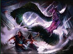
Svetlin Velinov – 3 (5)
- Spellheart Chimera
- Underworld Cerberus
- Viper's Kiss
- Soldier Token
- Shipbreaker Kraken (promo)
Looking back, Svetlin has really had some amazing artworks as of late. The promo Umezawa's Jitte? The Mimeoplasm? Vedalken Shackles? Thundermaw Hellkite? Preordain? Hellrider? Even Memnite is pretty serious. I hope he isn’t disappointed by not receiving any immediately playable cards. All three of his new cards could be playable very soon—they just need decks to be built around them. I wouldn’t be surprised by any of the three being seminal in decks.
I see his Hound of Griselbrand as a forerunner to his Underworld Cerberus.
I love his Shipbreaker Kraken. It was preview art, so that’s gotta mean something! It’s flavorful and depicts the setting of Theros compared to Zendikar. Things are big, huge even, yes, but they can be killed by heroes with Spartan-like tenacity. Svetlin has great framing eye, and the “Hans” in the foreground to show size is just magnificent in the template.

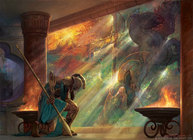
Terese Nielsen – 1
Well, this is fun. Upon first seeing this card, I wondered why the hell an enchantment-removal card was so expensive. Later finding out that creatures are enchantments, I then wondered why the sun god Heliod decided to smite a Thassa temple. Gods fighting seems cool—that’s a great Greek idea, sure. It just feels like an odd art description.
This card kills enchantments, which are religious manifestations of a god’s influence.
This card kills creatures, which are religious avatars and creatures of a god.
So, Magic doesn’t often make enchantments into locations like a home, castle, or temple.
I like the idea of a physical enchantment, and when said thing is destroyed, the enchantment ends. Imagine a mystical elven tree or a lava tube filled with magical forge properties. Ray of Dissolution muddies the waters more so with light destroying, well, something.
Terese’s Thassa depiction on the wall is great. Keep up those Easter eggs! Everybody loves those!
Giving a guess of greater than $1,000 for the price on the original art of this.
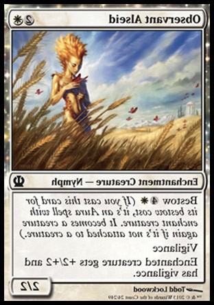
Todd Lockwood – 2
Whoa, Todd’s back!
Other than his Cruel Ultimatum in From the Vault: Twenty and the Silverblade Paladin buy-a-box promo, Todd’s been a bit out of the Magic world. Yes, he has reprints in things such as Modern Masters of course, but new things? Well . . . yeah.
He did a great pair of Nymphs here! One thing to note: If you flip the Observant Alseid, look at how much clearer the temple becomes in the far distance. Odd how that works, no? Our eye begs for the blank space to be filled in, and lo and behold, Todd gives us a little treat. When it’s the normal way, as it’s printed, the Nymph has space, showing the vastness of the field. A simple flip can do wonders, and both ways need always be looked at when an image comes in.
I like both, but I love the Observant Alseid as a strongly-positioned card that makes me look around the image instead of registering and moving on.
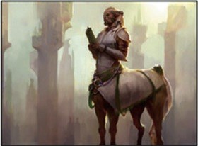
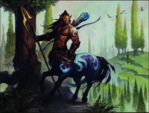
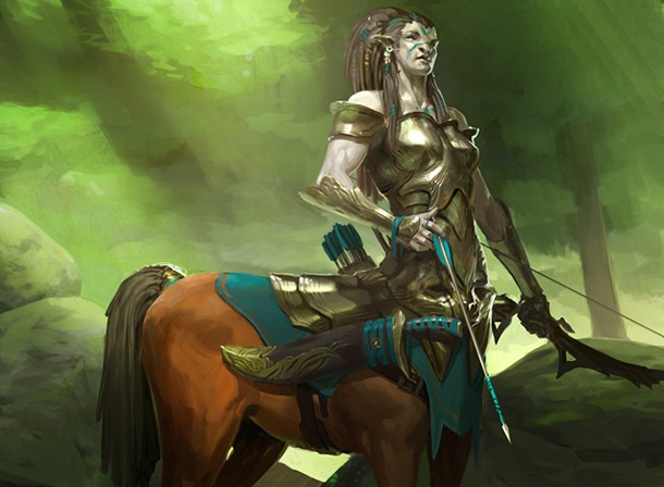
Trevor Claxton – 2
Pretty nice lookin’ Centaur he has here. It’s very cool to compare his color palette to Steve Prescott’s, knowing that a wide variety of styles are accepted in Magic.
The centaur looks like it’s severely cropped, no? It just feels . . . odd in the template. Maybe he had more or was told to zoom in to the current image. I’m trying to think-sketch of what this would look like, and I’m struggling a bit to see it. Maybe he’ll post a sketch in the near future. We fans love to see the progression. If you take screenshots during the process, even more fun for us. If you make a .gif of it, that’s Evan Erwin–approved Magical Chrismas Land. That’s the type of thing you post to Reddit.
Tyler Jacobson – 2
I heard at Spectrum that Tyler received some commissions in Theros. Neither of these appears to be what I had in mind. I’m assuming he has a planeswalker or a serious-business Giant or titan in his future. When his next cards come out, be very sure to check them out, and stop to think about his process. He works in a sketchbook and you could purchase the original sketch since digital images have no singular final form. I saw his book at Spectrum Live, and it’s pretty damn cool.
As for these two, Voyaging Satyr is just a fantastic scene. It’s a quiet scene that has a close, near, far, and crazy-far in one shot. If you know scene sketching and Dan Dos Santos’s seminal blog post on the subject, you’ll know how hard it truly is to do. Great work by Tyler.
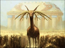
Volkan Baga – 4
Sketches were all found via Mark’s Comics, so thanks to them for posting them!
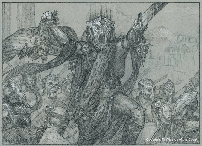
I’m happy to hear that Volkan has an American game store helping him price and sell sketches with his original art and artist proofs. Nearly every artists could use a little help in the marketplace. Even the best businessmen could use a few pointers every now and then. I wish folks with zero web presence would do this. We have all this American money; why do you not want money? It’s a personal thing to sell art, but hoarding it just sets it up for fire or flood damage. I’m just saying, it’s a thing.
I’m a huge fan of Cavern Lampad. After seeing the sketches and the PG change, it still stands out for me. (Also, Nymphs have to be covered in Magic! Have you seen real depictions of Nymphs? They’re always naked—always.) As for the Lampad, there’s a reason backless dresses are never really unpopular—they can be incredibly classy and flattering. Obviously, it has to be the right dress! I’ll have to delve into beautification of male and female forms and the historical precedents. Think the dimples of Venus and painters emphasizing them as a mark of beauty. So noted.
Wayne Reynolds – 2
Where Steve Prescott has a signature color palette, Wayne has a way with showing movement using his own colors. Pathfinder basically built an entire brand using Wayne to great success.
I love his Time to Feed. That tail whips me into and out of the piece in one swift sweep. If anyone saw ArtOrder’s Dungeon Delve images, you know how important elongated limbs and tails can be to composing a scene. Wayne is mental for detail—his words, not mine—and a lot of care goes into not only formulating the scene but also into adding all the little bits and jingles to make it move from amateur work into silly level of expertise.

Wesley Burt – 4
Yes, yes, yes . . . So close!
Of his four cards, the Boon Satyr is the most playable card, and it appears to be fourth in terms of great illustrating prowess.
The Dissolve and Reverent Hunter are both things I’d love to see all day, but that Setessan Battle Priest is just gravy. (Dissolve looks oddly like Mark Poole’s daughter, too. I just noticed that. I wonder if more artists depict friends, such as with Echo Mage by Stewart, who painted fellow artist Eric Wilkerson.) It reminds me of some sort of teenage superheroine whom people would cosplay. If I had a fifteen-year-old daughter, her dressing like a robed elf at a Renaissance Fair just wouldn’t be acceptable. If you’re going to do it, do badass. I hope this image gets all the nods on Tumblr. God knows those Vorthos fans are just diehard fans when it comes to badass women in a variety of styles.


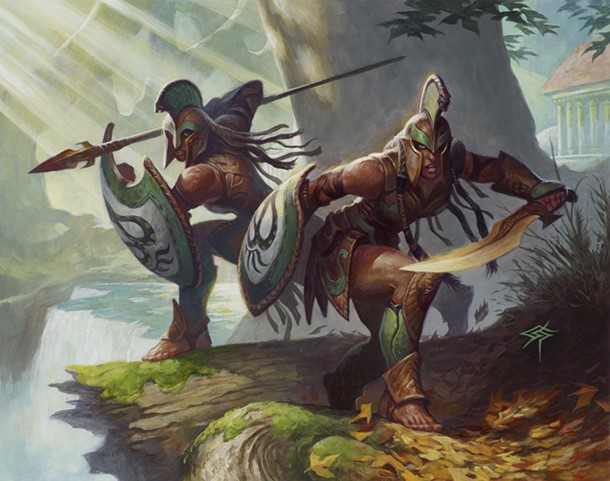
Willian Murai – 2
There’s a very cool couple here. This is a legendary duo that “counts” as one creature. This could open up a ton of design space where one card “counts” as two for other combat purposes. I also love the idea that one of them could be 2/1 and the other could be 1/1 to make a nice little 3/2 duo. We can have straight, gay, and lesbian couples. That would be incredibly flavorful, especially since gay legions weren’t that uncommon back in antiquity. Google it; you’ll lose a full evening reading. Trust me. I’ve done it.
Anax and Cymede was a preview card, and they tell an amazing story to immerse us into the setting. They don’t really tell us anything other than that it’s Greco/Roman time in Magic land.
A quick note on Battlewise Hoplite: Since it’s digital, adding some sort of script, text, or something when adding a magical element, only visible in high resolution, makes fans love you. Keep a hidden Easter egg for yourself and for those willing to look, and people will then look at every future card you make to see it, with only minimal work added in.
Winona Nelson – 4
Facebook (updated the most)
Showing movement and dance by painting multiple arms on Prophet of Kruphix is awesome. I would love to see more of this. It feels medieval in nature—maybe as a future Ramayana tie-in. Do that again!
Her other pieces are great, but I just really, really want to see her other sketches. I’m not sure on the legality of all that jazz, but it’s very much worth looking into. Content is expensive online, and fun, creative content is even harder. Keeping up a blog is tough, but when you just recap what you did, with info that no one else can know, it writes itself. I’m sure Lost in a Labyrinth had some awesome sketches, maybe as a David Bowie homage . . . maybe. Let’s hope so. It feels like art director Jeremy Jarvis has been spreading the wealth as of late. Winona illustrated a Chandra planeswalker in the core set, so she was offered a couple of drafting cards, ones not played much in tournaments, this time around. Maybe there’s a secret cycle of being in favor or balancing out the boom-booms. I think we’ll need to hear about that when their art director retires in a long documentary. Kickstartering would be fun indeed.
Anywho, great job by Winona, as always.

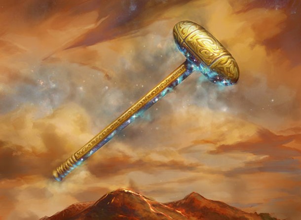
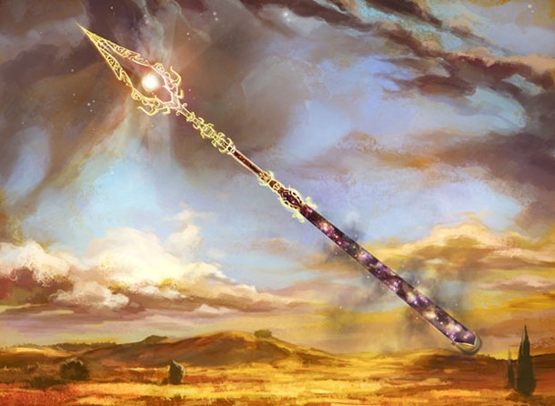
Yeong-Hao Han – 6
Who is going to be signing these damn cards forever!? He is going to love getting sore hands from signing this set of cards over and over and over again. These will be used in the Commander format from now until the end of time. I’d be very, very slow to sell the artist proofs, and slowly, ever so slowly, I’d pick up a few cheap ones on eBay. Altering the gods onto the cards would be frickin’ awesome. I’d start checking that out immediately to make fat, fat paper stacks from fans at conventions.
I like the weapons, and I look forward to reading the art descriptions and how many revisions were needed since they are so high-profile. Tell us the story; we would love to hear about them since they inform the entire block until June 2014. Slow-roll the info out if you’d like!
I like the Spear of Heliod the best. The little bit of land we see is just wonderful contrasted with dark clouds and some warm colors in the clouds. It’s just a great muted usage of colors.
P.S. Check out his iOS game Blendoku. It’s a pretty fun distraction that’s easily played when you have a few seconds to spare while you’re waiting in line.


Zack Stella – 4
- Battlewise Valor
- Chosen by Heliod
- Colossus of Akros
- Ephara’s Warden
I had to look to find out whether Ephara's Warden and Seller of Songbirds was made by the same person! Christopher Moeller made the Return to Ravnica Human though.
While I feel the Chosen by Heliod is a seminal Theros depiction, it has to battle against Ephara's Warden for me due to the black figure pottery in the background. That said, the Aura is the clear winner. The contemplative, pious scene is very based in the Magic white color, and that wall is just gorgeous. Even from a distance, the card stands out as something happening with small elements darkened to keep them out of the focus.
I learned a few things after writing all of these this week and a half. Artists rarely read online articles when you critique and examine their artworks. Also apparent is that many writers of art are either into the love–hate relationship or, frankly, have no idea what the hell they’re talking about. While I’d love to write in depth on more than two hundred cards, hearing that deep talk about lines, cool color palettes, and proportion shifts for that long loses readership damn near instantly. It’s just too niche.
Most artists don’t know I write about art and flavor week in and week out. I even received a message saying, “Great to see you emerge,” as though I wasn’t doing this weekly. It’s funny how that works, you know? I left this column for a year and lost readers. I had to rebuild a soapbox and gain the trust of you, the readers, again. While we may not agree on everything, the fact that this here be art and flavor has to sink in eventually. I’d like to think so at least. In doing so, I have to be more vigilant about how I talk to and about artists’ works. They can take things seriously and to heart. I don’t want a paintbrush lobbed at my head at the next convention for writing something too fast because tone is hard. Ever send an e-mail too fast? Yeah, I’m guilty of that, too. At the same time, seeing an artist obviously say, “Good enough,” sure as hell can’t exist. I’ve seen too many talented artists not get their shakes for someone to grow complacent.
Basically, this: