Typically, when a new set comes out, our writing team covers the art and illustrations of the set, highlighting iconic and unique pieces of art we take a particular liking to. I've written up a number of such articles, given the growth in my appreciation for Magic artwork.
This week, I want to do something a little different. Rather than talk about a brand new set, such as Final Fantasy, for which I don't have any strong appreciation (given I never played the video games growing up), instead I want to talk about an older set whose artwork I genuinely appreciate. I'm talking really old. Like 31 years old!
I want to cover art and illustrations from The Dark, Magic's fourth expansion set!
The Dark - Background & Context
The head set designer for The Dark, which released in 1994, was Jesper Myrfors. Experienced players who have been around the game for a while like myself may recognize the name. That's because Jesper was also an artist who created numerous pieces of art for Magic already. It's interesting that an artist wanted to lead design of a set, and this led to a groundbreaking, thematic approach to The Dark.
Jesper Myrfors had a vision for The Dark: he wanted to set to feel a certain way. On Magic's timeline, The Dark takes place after the Brothers' War. It was a dark time (no pun intended) - times were hard, there was a lot of uncertainty. Myrfors wanted to bring out this atmosphere with the mood and tone of the set. According to Mark Rosewater, this was the first set designed to communicate a mood and tone in this way.
How did Myrfors convey this dark mood in the set? He showcased the dark underbelly of each color, to make them as dark as possible. This theme is readily apparent when examining the art for The Dark. Let's take a look at a couple examples from each color to see how this darkness is truly brought to life.
White: Martyr's Cry and Festival
For each color, I honestly could pick nearly any card from The Dark. Myrfors really hammered home the dark theme of the set, and it shows on every piece of art. I selected these two as particularly strong with the set's theme.
Martyr's Cry is one of the most disturbing images in the entire set. Jeff A. Menges depicts a religious figure being burned alive, with a church-like building and a nearby house in the background. By itself, this is already a deeply disturbing image. When you add on the fact that this is rooted in reality, I develop a deeper appreciation for the artwork. The fact that this card is White, and yet is so dark in nature really epitomizes what The Dark was trying to deliver with its tone.
Speaking of tone, if a card called Festival was to be printed in virtually any other set in Magic's history, it would have depicted a party or carnival of some sort. I'm envisioning dancers, bright colors, jesters, games, food, etc. In the actual printing of Festival from The Dark, illustrated by Mark Poole, we get some of this. I see jesters and bright colors, and even a ritualistic mask. We also see, however, a disturbing, almost-demonic figure in the background. He's holding a skull, and even though he's dressed like a colorful and playful jester, the demonic etching on his forehead suggests he's anything but. Festivals during The Dark's times must not have been very festive if these were the characters running around.
Blue: Amnesia and Psychic Allergy
Turning White on its head and taking the purity and nature of White to an extreme is one surefire way to make the color dark. How did Myrfors accomplish this with Blue. He leveraged some very psychologically disturbing images to do this.
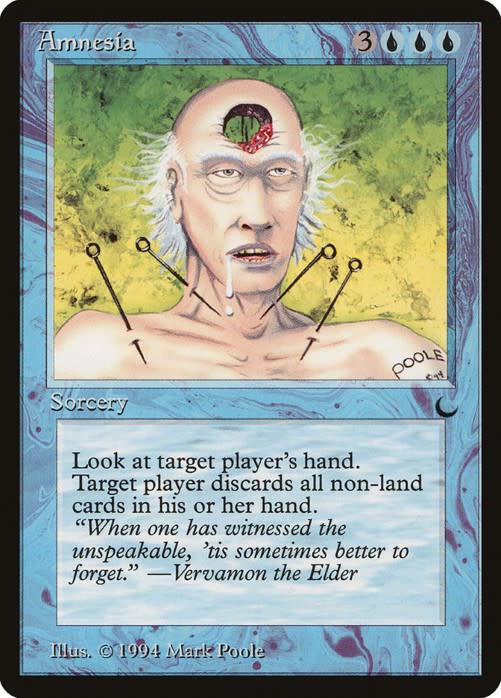
For example, consider Mark Poole's artwork for Amnesia. The concept of forgetting everything could be depicted in numerous ways, and we've seen similar themes on cards like Memory Lapse and Memory Erosion. For The Dark, this needed to be taken to the extreme. What better head?! That's certainly disturbing! Then for good measure, Poole added sizable needles through the figure's skin in his neck and shoulder area. If the hole in the head doesn't give you nightmares, the needles sure will.
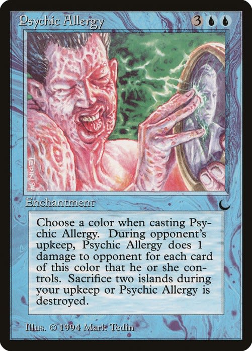
Mark Tedin also depicted a psychologically disturbing piece for Psychic Allergy. The figure in this image has some major skin issues, and you can sense the pain and disgust they're experiencing when they touch the picture in their hands. The swollen lip is a nice touch - Tedin could have depicted an allergic reaction to something in so many ways, but the way the figure is depicted really brings out the stuff of nightmares.
Black: The Fallen and Inquisition
Black is the one color where one doesn't have to try too hard to bring out a dark theme. That being said, the artwork on Black cards in The Dark go an extra mile in depicting a dark tone. I could have picked any of an array of cards to bring this to life, but I settled on two I found to be particularly disturbing.
First there's The Fallen, one of the most disturbing creature artworks in the game's history. I don't know where to begin with this art, illustrated by Myrfors himself. Is it the figure's teeth that creeps me out most? Is it its eyes, shrunken and red in deep eye sockets? Perhaps it's the deathly skin color. For me, it's a combination of all three of these plus the hair. I feel like the hair gives the figure a human-like feature, which makes the figure a true mockery of a person. The fact that they have such normal (if a little unkempt) hair makes the figure a little too similar to a real person - just realistic enough to be lifelike.
In a similar vein of Martyr's Cry, we have another religiously accented card in Inquisition, illustrated by Anson Maddocks. There isn't tremendous detail to the card, but honestly, the details wouldn't add much to the card's tone. The facial expression on the central figure is so disturbingly dark, and you can empathically feel his pain and suffering while he's under spear point. Black may have demons and other dark creatures that go bump in the night, but sometimes a depiction of pain and suffering is even darker because you can feel those emotions yourself when viewing the card closely.
Red: Eternal Flame and
Out of the five colors, I feel like Red had the toughest time connoting darkness in its artwork. Many Red cards from The Dark depict creatures with a darker nature, or else a simple display of pyrotechnics. Two that stand out to me are Eternal Flame and Sisters of the Flame, for very different reasons.
In Eternal Flame, I interpret Mark Poole's illustration as a dark and nefarious religious ritual. This is portrayed via the ritualistic garb the two figures are donning, with ancient runes and all. The dark face covering they each rare are what really drives home an evil tone. Then there's the burning pyre in the middle of the art, burning brightly and eternally to serve whatever evil purpose the two figures are pursuing. The art itself is brightly illustrated with reds, purples, and greens, but I would not want to walk in on these two figures while conducting this ritual.
On the other hand, we have Jesper Myrfors' Sisters of the Flame, which depicts a normal-looking person, face lit red by the fire she's presumably staring into. What I find dark about this piece is the use of color (and lack thereof) in the art. The sister is wearing black clothing, and her ritual is conducted at night, giving a near-black backdrop. All you see in the card is the woman herself, face lit up, face in awe, and wearing some sort of emblematic necklace. The darkness comes in the juxtaposition of a mundane figure and a dark, haunting backdrop.
Green: Elves of Deep Shadow and Lurker
In Magic, Green is all about nature and organically themed creatures and spells. How can something natural be turned dark for The Dark? I believe these two cards do a fantastic job doing just that.
First, there's Elves of Deep Shadow, also illustrated by Jesper Myrfors himself. By the time of The Dark, Magic already had a pretty defined elf theme. Llanowar Elves, printed in Alpha, introduced the idea of an elf creature in Green that tapped for Green mana. Makes sense. But what if an elf wasn't so honest and pure? What if she changed her focus from the life nature infuses and toward a darker practice of the arts? Likely, you'd end up with Elves of Deep Shadow, wearing black makeup and black clothes, practicing arts at night, and resulting in black mana generation (in exchange for some life loss). The entire card is brilliantly designed for a set like The Dark, from its goth-like central figure in the art, to its warped mana ability.
I chose Anson Maddocks' Lurker for my second Green card because I think it does a fantastic job depicting how a "natural" creature can look dark and evil. What exactly is a Lurker? Since 1994, the card's creature type has been updated to be a Beast rather than the eponymous Lurker. But somehow, Beast doesn't do justice to what this card's art represents. Sure, it's a beast in the sense that it's a generic, monstrous creature. That creature type doesn't do justice to the menacing teeth, sharp claws, and creepily human-like torso. My interpretation is that this used to be a human, but was turned evil and monstrous by nature herself in a twisted, dark way, and that's why I love the art on Lurker so much.
Wrapping It Up
This was just a smattering of the dark and disturbing depictions in The Dark's art. Jesper Myrfor's goal was to evoke a dark sense of foreboding from each color in the set, and he definitely delivered! If you have a chance, I'd strongly recommend visiting Scryfall and browsing the many darkly disturbing art pieces from The Dark.
The set may not have contained too many iconic and valuable cards outside of a few (Blood Moon and Maze of Ith come to mind). That said, it's the flavor and thematic nature of The Dark that makes it one of my most memorable sets from Magic's early years. I have a smattering of cards from the set in my collection solely because of my appreciation for their art.


