


We’re back again!
So many days in a row of flavor. You’d better move back to meat and potatoes—no salt or pepper from this saturation of flavor.

I don’t recommending eating Scars-block cards, but Innistrad? Delicious. Get a stack of commons to start a fire and you’ve got yourself a helluva flavor-enhancer.
Try it sometime.
![]()
![]() – Enchantment
– Enchantment
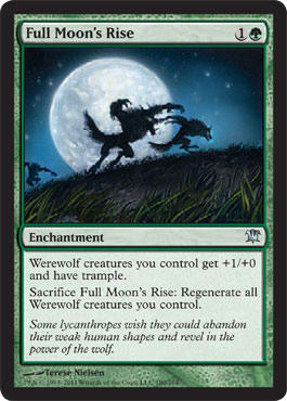
MJS: Capering werewolves! Almost too child’s-book-pretty for this, but the weres look so happy that I can’t help but like it. The mechanics on this card, I think, would be hard to illustrate effectively—I mean that to show both the trampling, stronger wolves and the regeneration could get a little busy.
ML: Children’s book cover! My fiancée’s uncle is a children’s-book cover artist. Real nice guy.
So, if I have this straight: Some werewolves are sad that they’re cursed, while others love it? Got it.
Could this art set up a future army of werewolves who are ready to battle an army of vampires? The moon rises and wha-bam—super-werewolves.
![]()
![]()
![]() – Enchantment
– Enchantment
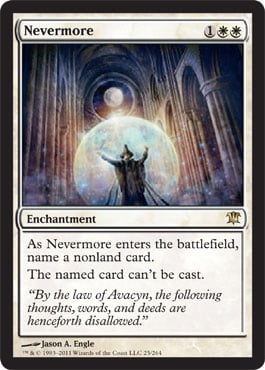
MJS: Loooove the hate cards! “Nevermore” is a spell name I actually would not mind shouting to the heavens, so in the vein of real-life magery applicability, this gets a ton of cred.
ML: The amount of discussion in the creative department about using a one-word name was, I’d bet, enormous. Legends and The Dark used many standard names, and Poe needs to creep into a horror set, no?
Great church columns.
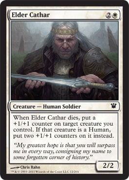
![]()
![]() – 1/2 – Creature – Human Cleric
– 1/2 – Creature – Human Cleric
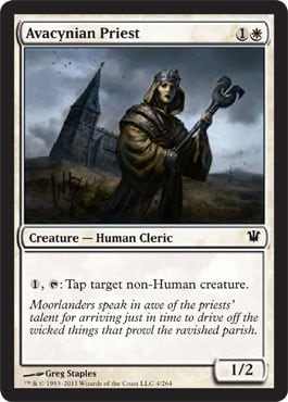
MJS: This receives high marks for being a very realistic depiction of a female fighter. She’s not too skinny, her hair is neat and out of the way, and her facial expression is serious. Thank you, Greg Staples.
ML: I have to agree with MJ here.
I like the word choice of priest over cleric in this card’s name. All clerics are priests, but not all priests are clerics—willing to pick up a mace and bash heads. Is this card like a cathar, but not? I bet cathars roll up in an entourage with a pair of these cats behind them, like a raiding party in Warcraft II. (You brought archers with a knight.)
Another off-center piece.
![]()
![]() – Instant
– Instant
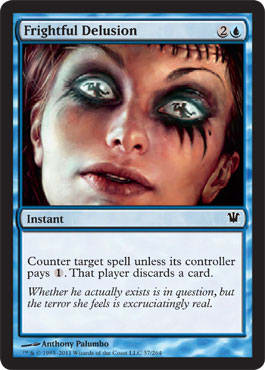
MJS: Artistically, stellar. So much nuance to her skin and features. Ke$ha, welcome to Innistrad.

ML: I’ll take your Ke–dollar sign–ha and raise you:

ML: What’s going on with the figure’s head? Are those stitches?
If she’s a zombie, she’s being countered. Clever.
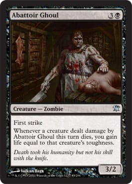
![]()
![]() – 3/2 – Creature – Zombie
– 3/2 – Creature – Zombie
MJS: So, when he kills dudes, he takes their body parts and gives them to me so I can increase my strength? That’s how I’d interpret his attributes from a flavor standpoint, given that he’s depicted as some kind of butcher.
ML: Exactly.
This looks fantastic in this set. It’s a common creature in many video games, and I’m happy that Wizards found room to make an iconic trope fit in.
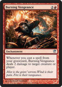
![]()
![]() – Enchantment
– Enchantment
MJS: This pops. I looked at the high-res version and realized it’s a woman—great, equal-opportunity incineration. I couldn’t figure out what those little posts on the left-hand side are, though.
ML: I pick it up. I assume they have something to do with being a Skaaberen, based on the similarity of elements related to stitching zombies together. Granted, that’s blue, but it fits.
Look at this close-up and notice that the fire isn’t random: It’s a geist. You’ll see the chain in the top-middle of the piece.
It also explains that geists can be different colors: Sorrow is black, wind is blue, and vengeance is red.
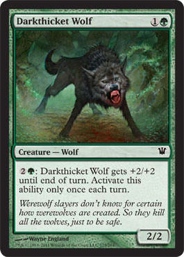
![]()
![]() – 2/2 – Creature – Wolf
– 2/2 – Creature – Wolf
MJS: What is the point of this flavor text? I don’t think it advances or informs us of anything important.
ML: Medieval city-council members set forth decrees to kill “evil” cats, despite the rats that were actually spreading the plague. It ramped up the spread.
MJS: The picture is all right—seems pretty standard, and a little like wolfie just drank a big cherry Slurpee. I think it could’ve been pushed a little further—a portrait to answer the question of what makes a Darkthicket Wolf?
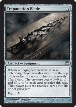
![]() – Artifact – Equipment
– Artifact – Equipment
MJS: This name sounds awesome, the blade looks cool, and this set is racking up “words MJ had to look up” quite rapidly. Not sure I get it flavorwise, though. Don’t even know if the definition I found is the relevant one. Since Mike loves to pontificate on things like this, I’m just going to let him tell us what’s up.
ML: Big word for MJ! Yea!
tre•pan
[trih-pan] noun, verb, -panned, -pan•ning.
noun
1. a tool for cutting shallow holes by removing a core. 2. Surgery. an obsolete form of the trephine resembling a carpenter’s bit and brace.
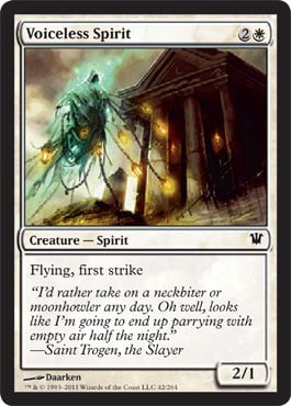
![]()
![]() – 2/1 – Creature – Spirit
– 2/1 – Creature – Spirit
MJS: Lovely. Looks a little like Death got a part-time job as a lantern salesman, though.
ML: Flavor text is so forced. Let me explain why.
If Saint Trogen is a cathar—a skilled evil-vanquisher—would he be colloquial, shortening words for gruff meaning and faster talkin’, or would he be formal and polished, enunciating and pronouncing words correctly? Is he somewhere between the two?
Now reread the flavor text.
Which one do you think he is?
In the art, this perspective shift works great, as you would be looking up at the ghost and building. This is especially true if you’re waiting for the ghost to land to get a whuppin’.
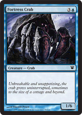
![]()
![]() – 1/6 – Creature – Crab
– 1/6 – Creature – Crab
ML: Is it a delicacy in Nephalia? Probably not, since if you kill one, that’s a lot of crab meat to go around. Since it’s a common, I’m sure there are a few of varying sizes near the coast. Maybe Nephalians kill one to celebrate things—like a pig roast. Now that’d be a sight: an altered card of sailors eating a gigantic crab. Fun.
MJS: L’ingOL. Crabs always get a free pass as far as I’m concerned. Freakin’ adorable.
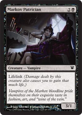
![]()
![]() – 3/1 – Creature – Vampire
– 3/1 – Creature – Vampire
MJS: Something Silent Hill–ish about this to me, like I’m about to see something scary from my vantage point under a footstool.
ML: Yup. This is probably an art-direction suggestion that was taken too literally.
MJS: It’s a pretty picture, she does have the Markov hankie in hand, and the flavor text is pointing in the right direction as far as Sorin is concerned. I am curious if she’s wearing nightgown, or if the cocktail-length dress is on the cutting edge of Innistrad fashion trends.
ML: I think that implies a lot about vampire high culture, MJ . . .
MJS: If so, Olivia Voldaren and Liliana might be guilty of being so last year, and I don’t think those ladies would be very happy about that . . .
ML: The lighting seems very spot-on except for the paintings on the wall. They would shine slightly in the light. Acrylic or oil paint, when light crosses it, slightly reflects light. (Yes, I know how color works, and that it’s just reflected light.)
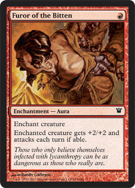
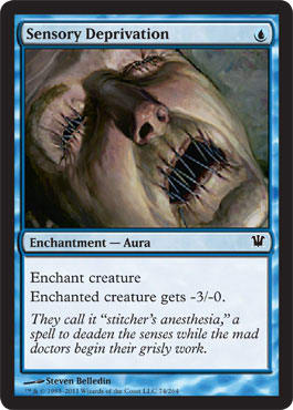
![]() – Enchantment – Aura
– Enchantment – Aura
MJS: No. Not my style. The name is hard to say, and I couldn’t figure out what was going on in the art.
ML: Hold me back, bro!
In typical bro fashion, he has odd facial hair and wants to take his shirt off. It’s odd that they’re going to burn him, though. Isn’t it Frankenstein’s Monster who’s afraid of fire? I thought so.
Love the name on this card.
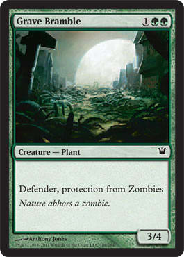
![]()
![]()
![]() – 3/4 – Creature – Plant
– 3/4 – Creature – Plant
MJS: Going to defer to Mike. I have no strong reaction to this card. And I don’t know anything about how zombies and plants interact, historically.
ML: It’s a game. MaRo loved it and made a card for it.
The name and flavor make sense.
Magic has a rich history of plants attacking and eating things.
One issue: The moon is coming up incorrectly. It’s too large. If it were that big, Nephalia wouldn’t exist because of the tides being crazy angry. Also, Candelabra of Tawnos would be mass-produced. It’s the same reason that the movie Independence Day is considered laughable because they wouldn’t even need the death rays. The size of the ships alone would basically make Nevada into lake shore. (Side note: Minnesota has more lake shore than any other state. True story.)
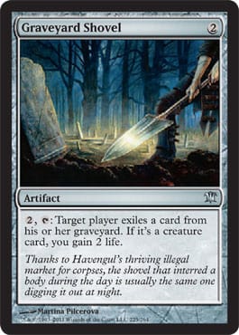
![]() – Artifact
– Artifact
MJS: I’m not sure about the flavor on this one—if you were digging out a corpse, wouldn’t it be coming back to life, being stitched into something, or otherwise somehow ending up on the battlefield? The other cards in the set seem to say that things being dug up results in their becoming active once again—not in their going away permanently. The other thing is: That is a really flat, really shiny shovel.
ML: It’s a spade, really. We used to use them back in the Boy Scouts for digging signal tower holes.
I wish this had two abilities and was an Equipment. With a meat cleaver and pitchfork in the set, you’d think a shovel would do the same. This is where rubber hits the road in top-down design. Where do you maintain consistency and set boundaries for overused tropes? I don’t have an answer for that.
The flavor text shows the multiuse functionality, but it only goes to 9, not to 11.
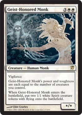
![]()
![]()
![]() – */* – Creature – Human Monk
– */* – Creature – Human Monk
MJS: A really unique piece for this set. Almost anime-like in feel and finish. I love it, though I have to say that it seems a little out of place amid the rest of the illustrations.
ML: I wholly agree. Five years ago, we wouldn’t even think it odd for a piece to be out of the apparent aesthetic. Now, it feels awkward to even think of deviating from it.
I’m not sure if that’s a net positive benefit or not yet. As top-down, happy-action design time comes more into fruition, we’ll see. One thing is certain: Art will either flourish or be stifled.
I like abstract art, and this piece follows through for me.
Gorgeous clothing on the monk. Okay, that’s kind of odd, but the figure is beautiful. Her outline is a little distracting, but it’s not a negative aspect.
![]() – 1/1 – Creature – Human Rogue Werewolf
– 1/1 – Creature – Human Rogue Werewolf
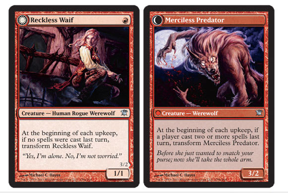 |  |
MJS: I absolutely adore how the werewolf looks like the Waif—my fave transformer so far!
ML: Nice hair integration. Thumbs-up. You fulfilled the resonance from front to back without having to repeat the background. Good.
Waif is also the name for “heroin chic”—a style of how models looked that Kate Moss popularized in the 1990s. It was not a good thing. This art, on the other hand, is a great thing.
![]()
![]()
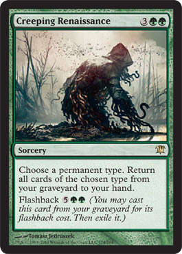
![]() – Sorcery
– Sorcery
MJS: I love the name of this card. And the colors and light in the art are gorgeous; my problem with it is that when I first saw it, I thought, “Wow! . . . Eldrazi?”
ML: I thought the exact same thing.
I feel this is a lot more Cthulhu-styled than it is reminiscent of Eldrazi, though. It feels like an eldritch creature from Fantasy Flight Games, for sure.
Cards like this can make people understand what playing actually is.
Huh?
Well . . .
We’re all planeswalkers and we cast spells. By showing how dead creatures we cast can be recast, it brings us down to that level again—as opposed to just “Mike playing MJ in a card game.” I doubt this type of opportunity will be missed again. We’re in unfamiliar territory for creative.
The only question I have is whether WotC wants us to be cognizant on a daily basis of the fact that we’re supposed to be planeswalkers.
![]()
![]() – Sorcery
– Sorcery
MJS: This is a good match. A lot of synergy.
ML: Synergy.
MJS: That picture is sick. It illustrates the card, but it isn’t ham-handedly literal. Also, Ryan managed to give that zombie lady (?) a lot of character. I totally empathize with how she’s feeling! What a great piece.
ML: She’s in a mausoleum. Cool. She’s wearing the traditional color of royalty—purple—denoting how, perhaps, a ghoulcaller chose to make a regal person come back to life. Neat. Considering the lightning outside, maybe it’s not a ghoulcaller, but a Skaaberen instead. Nah, but keep lightning in mind when you see it. That’s what it usually means. Write that down.
![]()
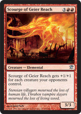
![]()
![]() – 3/3 – Creature – Elemental
– 3/3 – Creature – Elemental
MJS: Are we sure this isn’t Chandra’s Scourge of Geier Reach? I keed, I keed! I like this a lot—he really looks elemental—but I can’t stand that his front trunk and tusks get cut off by the frame.
ML: Two things are needed for that. If you zoom out more, the ground becomes more apparent and adds little to the picture. Also, what is perhaps an obelisk becomes visible in the back-right. Art director Jeremy Jarvis did a great job cutting it off.
Hint: He also sets up alterers to add to the frame.
![]()
![]() – Instant
– Instant
MJS: The spray of blood is superfluous, but other than that, this has to be among the prettiest ways to die ever. I’m pretty sure that moonbeams don’t impact you in a plasma-spraying fiesta. It should be more like soul-shriveling of the wicked—clean, cold, quick. So the flavor is jarred a bit. Without the bloody gush, this would have been one of my favorites from the set.
ML: Maybe a lightsaber-esque searing and scalding of the flesh would’ve been better for MJ.
I like the perspective here; it makes me look closer. I like looking closer.
![]() – Enchantment – Aura
– Enchantment – Aura
MJS: I can’t even look at this to comment. Bordering on too gross, guys.
ML: I’m going to use my roadside Cash Cab call-out to conjure Drew Sitte.

ML: Pretty much. Fun fact: The art director for Jyhad was Richard Thomas. He’s one of the original artists for Alpha and Beta and has made thirteen cards.
![]()
![]() – Instant
– Instant
MJS: Whoa, Winona! This is evocative. It’s flavorful, and Olivia’s quote is well-crafted to illuminate her personality—but, my God, that is a ton of ketchup.
ML: Nice boundary push, Winona. Jarvis pushed her to make something that isn’t often done. Gore is not a common concept that pushes through self-censorship.
That Avacyn symbol is used everywhere! It makes sense—look at our religions and their logos.
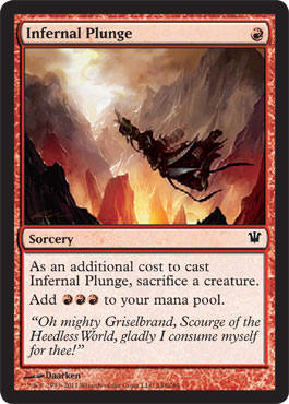
![]() – Sorcery
– Sorcery
MJS: This makes me laugh, but I totally want to play it. The mountains and sky are really lovely; but that idiot in the foreground . . . ugh.
ML: Ah, he’s a cultist, and Griselbrand is a demon. Ooookay. If you don’t have that information, can you decipher it from the name?
If you remove the figure, is this an amazing landscape? Is Darrken saying, “Hey, give me some more land commissions, chief”? I don’t know, but I hope he gets some more. Those mountains look ah-nice.
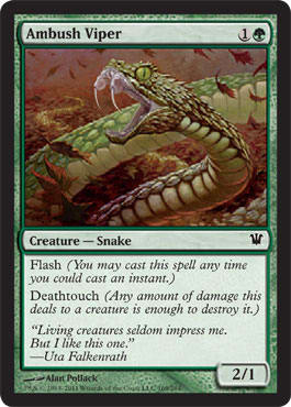
![]()
![]() – 2/1 – Creature – Snake
– 2/1 – Creature – Snake
MJS: I like this card! House Slytherin is very happy.
ML: This card looks amazing in foil. I don’t know much about the foiling process, but I hope the art directors are allowed to pick what stands out and what is muted. If so, it’s really, really showing in recent sets.
Should Uta have a title to show that she’s a vampire? Probably.
This shows that vampires here are definitely undead. They’re not the result of some weird curse.
![]()
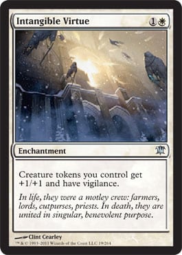
![]() – Enchantment
– Enchantment
MJS: This is among my favorite illustrations in the set. I am just thirsting to see what’s inside of that window. The light is calling me. I would love to have a giant print of this hanging up in my dungeon. I mean—my living room.
ML: I love this art, too.
If churches celebrated Halloween, this is what it’d look like.
It feels a little too Orzhov, but Ravnica was like a hundred years ago in game time.
This needs an alternate art. Please be good in a deck so that more art is demanded. I’d love to see if Clint has other versions.
High-res here.
A history lesson for you: If you ever visit Paris, Chartres, or Cologne, look at the portals to the churches and cathedrals. They’re all white limestone or a similar stone. Try to imagine them all painted. They originally had fully painted statues, narratives, parables, and stories to inform commoners of Biblical stories. If you’re Christian, think of the Stations of the Cross. That type of iconography was everywhere.
Why does this matter?
When fantasy artists draw and paint churches, they’re almost exclusively white/ivory or a dark gray. Very, very rarely are they painted in the Western world. Islamic culture retains this colorful exterior in more traditional mosques, but Christian iconography has gone away with it.
Should this Avacynian church have ornamentation and color or not?
![]()
![]() – Instant
– Instant
MJS: He looks like he’s jumping down into a sea of zombies, which I guess is appropriate. It just threw me off at first. It’s really too bad here that the chain of his Avacyn-flail, or whatever, is cut off by the card frame.
ML: Agreed. The zooming-in might’ve been an overeager artist wishing to depict a ton of objects. For example, the original art for Telling Time is huge.
![]()
![]() – 1/4 – Creature – Zombie Warrior
– 1/4 – Creature – Zombie Warrior
MJS: Sure. Wow, that is a big axe. I think the scenic background is very well done in this picture. I’m dying for a vacay in Nephalia. Get it, Mike?
ML: I see what you did there, MJ.
Is the “literally” needed?
Beautiful coastal castle. Probably has a bad foundation because of its proximity to the water. It isn’t Arizona, where people don’t have basements. They need dungeons and such.
![]()
![]() – Sorcery
– Sorcery
MJS: First of all, she doesn’t look very scared, much less terrified. Second, the name of this card makes me think of like . . . night sweats, which makes me think of hot flashes, and then we’re just rolling down the menopausal flavor-hill. Not where I like to be.
ML: Oh, MJ.
I don’t think this victim is surprised; it probably isn’t her first time being attacked. Sadly.
That fact alone is very eerie.
Why is she covering herself? Is mind torture really the worst thing that is going to happen to her? Is she instinctively covering herself, or is that some foreshadowing?
Innistrad is a darker set and there’re some very terrifying things that Vorthoses are seeing in this set that have not been present before. Tread with caution. Information can be dangerous.
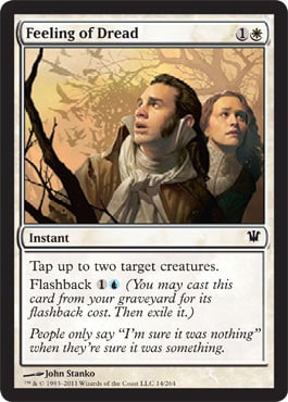
![]()
![]() – Instant
– Instant
MJS: This card made me think of Sarah Palin—until I read the “truth” part in the flavor text.
ML: I bet she trades English cards for Russian foils, since she can see it from her house.
Salem witch trials reference? Clever.
I don’t understand the flavor text, but I understand what the writer is trying to do.
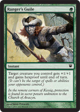
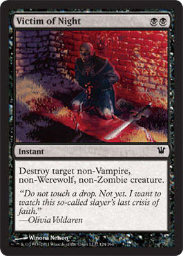
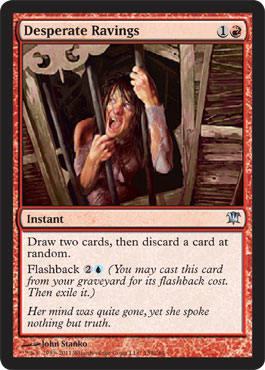
![]() – Instant
– Instant
MJS: Whoa, is she, like, made of wood? Just going on a date with Thing? Get ready for some hard lovin’, straight thuggin’, baby!

ML: Bark face, mmm.
A rather impractical hat, but if you have bark skin, you aren’t really looking to be stealthy.
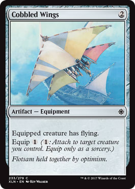
![]() – Artifact – Equipment
– Artifact – Equipment
MJS: Ahem. Looks (and sounds) to me like Phyrexian Skyfisher wings, or a Phyrexian Kitesail.

ML: Plus 2 Vorthos points awarded to MJ.
What’s a necro-alchemist? A Skaaberen? Here’s an example of either an early flavor text or a piece that didn’t reference the style guide. It’s fine, and it reinforces what we’re thinking already.
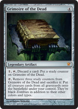
![]() – Legendary Artifact
– Legendary Artifact
MJS: Heart attack—love it. It looks dark and lovely, and the card is pure flavory silliness as a whole. Time to put my black robes back on and get to studyin’!!!
ML: I was asked, when I stopped into the prerelease, why this wasn’t called “Necronomicon.” I simply told the twelve- or thirteen-year-old that it wouldn’t make sense. They don’t copy real-world names anymore.
This very simple, top-down design is great for future sets.
![]()
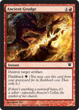
![]() – Instant
– Instant
MJS: Yay! Christmas comes early. Straightforward, hot, sharp. I like it. My only nitpick is that I think the flavor text should have seen the part after the em dash edited out. “If there’s anything a werewolf hates, it’s a collar,” is clever and awesome, and it stands alone. Let the symbolism in the art speak for itself about the rest of the flavor backstory.
ML: I bet they argued about that. “Will people know what an Avacynian collar is?” They had space, so I’m sure they added it anyway. I mean, there’s room for reminder text and having that much white seems like wasted space otherwise.
Nice shot, werewolf—you cleaved that thing.
![]()
![]()
![]() – 2/3 – Creature – Spirit
– 2/3 – Creature – Spirit
MJS: I adore the idea of this card—I really do. But that geist, at first glance, looks like wadded-up toilet paper.
ML: Maybe paper towels, maybe a leftover from Kamigawa put into a new background.
That ghost must’ve done something wicked evil to be shackled with that many chains.
Interesting choice in selecting triangle windows. Historically not quite accurate, but it’s a fantasy set, so it’s fine.
![]()
![]() – 1/1 – Creature – Human
– 1/1 – Creature – Human
 | |
MJS: Though this card really creeps me out, which I guess is the point, I have to say that I like it a lot. I wish the flavor text was also linked, however, as the art is. A couple lines could have said it all, really:
“It was not my daughter’s voice.” — Ekatrin
“. . . Uh, that is not my daughter’s face . . .” — last words of Ekatrin
ML: I suppose—it’s forced though.
Does this happen often? If so, can someone speak about cloistered children in the broader terms of their status and this type of situation?
How often does this happen?
Why and how does this happen?
Flavor text can answer any of these things. Here, it answered only to whom it happens.
![]()
![]() – 2/2 – Creature – Human Soldier
– 2/2 – Creature – Human Soldier
MJS: Hottest guy in the set. Sword is a bit small—no innuendo intended.
ML: Looks and acts like this guy:

ML: I hope this type of design rolls into other colors, too. Not sure what green would have, but red could use another goblin lord.
![]()
![]() – Instant
– Instant
MJS: Haha! This is too cute. The art doesn’t make me want to play it, since those two look like hipster kids who just got way too high and are now totally paranoid and walking through the park, but I really like the background and the nuance in their expressions. Mike will probably say something about the depth and/or pasted-ness.
ML: No need to; you just did.
MJS: Yeah, it’s a bit obvious, but I think it works. The flavor is a bit of a stretch—your weed-induced paranoia causes you to preemptively knock out (with a couple swings of a lawn chair) the other bros at the party (and also breakup with your girlfriends). Is that it?
ML: Let’s hope not. It’s like 9:00 a.m. in the picture. (Or sunset—regardless, it’s early.)
I like John Stanko; he’s good people. His depiction of a girlfriend or wife is fantastic. It’s not stylized; it’s not overly sexual; it’s just a medieval-looking woman. Great.
![]()
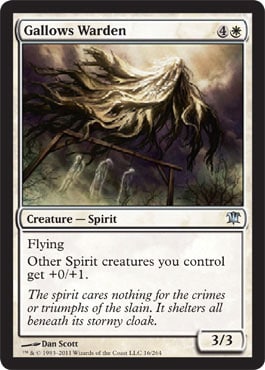
![]() – 3/3 – Creature – Spirit
– 3/3 – Creature – Spirit
MJS: He seems heroic in a ghastly way. I think this piece must be so much better when allowed to be larger than a card frame, but I still enjoy it at this size. I’m kind of a sucker for that rays-of-heaven lighting, but I think here it fits—he has a morbid duty, yet it’s a righteous duty. The lighting makes him seem much more like a white creature than he would otherwise be.
ML: MJ, you’re spot-on.
Another perspective-shift card. So many of those!
![]()
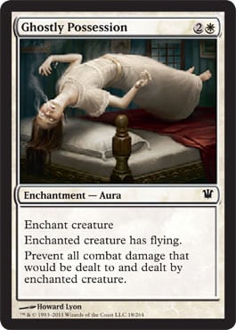
![]() – Enchantment – Aura
– Enchantment – Aura
MJS: This is terrifying. Moving on.
ML: No gothic horror is complete without a gothic-looking bedpost. True story. The lit clothing is fantastic for the “possession” shtick.
![]()
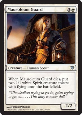
![]() – 2/2 – Creature – Human Scout
– 2/2 – Creature – Human Scout
MJS: Props for a solid body—not too waify to do her duty. On the other hand, tie that hair back! With life on the line, the last thing a good soldier is going to do is let her hair fall all over her face and inhibit her vision. Flavor question: Why does she create two spirits when she dies? I don’t see any way we can conclude that she has two souls in there. The way to correct this is to depict Mausoleum Guard as such:

ML: Yes!
Yet again, we as the viewer are depicted as being three feet tall. Granted, some of the Creative Team members are silly-short, but c’mon now. No need to make fun of Rosewater that much.
Thank you, David, for making the figure proportional. A+.
![]()
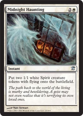
![]() – Instant
– Instant
MJS: This could have been a lot stronger. I don’t like the chalky look it has. The interior scene is nice, but the geist just feels rushed to me.
ML: I hope that’s the intention, MJ.
Is that a Sixth Sense reference?
Is that another perspective shift?
![]()
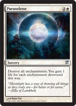
![]() – Sorcery
– Sorcery
MJS: This is beautiful. I enjoy cards like this—Sol Ring, Blightning, Deathmark, and Blood Moon—because they’re arresting, yet very simple, depictions that actually make you feel like you’re (literally, as in sparks-from-your-fingers) casting a spell. Something about the single focal point, dramatically lit, makes the magery part of playing these cards more tangible. It’s a really different feeling than the one I get when I throw out a planeswalker (Why is that tiny person helping me out?) or any card with a little figure-driven scene on it, such as War Report, Myr Superion, Timely Reinforcements, and so forth.
ML: Odd name, but we need some curveballs from time to time.
Does this card wreck my Uril Commander deck? Yes . . . yes, it does. Sigh.
Notice anything in the moon? Hmmm . . . write that down.
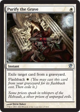
![]() – Instant
– Instant
MJS: A little confused by the perspective—at first, I thought he was walking up to the door of a tomb, but on second glance, it seems he might be leaning over a grave. Not one of my favorites.
ML: The art is dynamic, and the name makes sense.
What irks me is the flavor text.
What’s the Helvault? What is he talking about? What?
We’re in the home stretch.
Only one more review.


