


A saga is a tale of achievements. It's a narrative of the past to learn something from, most often a positive achievement ancestors or forefathers undertook that explains something in contemporary culture or gives us a way to find meaning.
Magic: The Gathering just added a brand new card type to their newest set, Dominaria. These brand new concepts are being welcomed by open arms from nearly every metric one could have outside the market research rooms of Wizards of the Coast. Not since the Lorwyn five set of planeswalkers have both a new card type and new art format been released.
After the first few were previewed, I started to look at the rarities of them. I noticed that these aren't hard to find in a normal limited environment. Players will see these, and they will see them often. What does that mean for a world building effort that has extensive research and details about each culture on a plane? How does a "lore card" open up new possibilities on Mirrodin, Ravnica, or a variety of other beloved worlds? We have the Tree of Tales there, but what of record keeping, what of memories? The stories of each plane vary from oral history to written word to other varieties of art mediums. In the absence of having a historical record, planeswalkers carry the burden of remembrance.
By allowing the in-game culture to dictate the art style, it allows immersion. And people know I am all about that. As Mark Rosewater stated, "you get to live through the stories."
This is the short little art review. Since the saga artworks are so unique and so divergent from precedent and history, I figured they needed their own spotlight. You have to consider them important when they even have plans for UltraPro branded wall scrolls of them. You don't plan out new products for something that you aren't sure are going to be amazing.

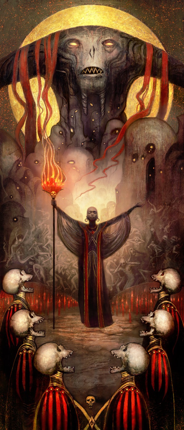
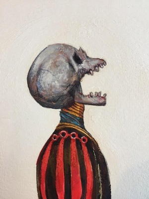
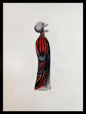
Chainer's Torment

What can we say about this that doesn't cheapen the effect.
Since artists were able to find a medium that could show human emotion interacting with other-worldly beasts, depictions of spiritual images, of underworlds and hellscapes have existed. In a time before mass production of written word with an illiterate public, shock value was the norm. Traumatizing children was the norm. Putting the fear, respect, or awe for religious figures had to be monumental as personal items, totems, and shrines were too expensive for home worship. When you visited a religious location, it had to be memorable.
I see a lot of references in the art here. Tropes are here for us to lean on. I see everything from Rodin's The Gates of Hell, to the Devil's Advocate and its living wall, to Dante examining a poor soul suffering as he traveled with Virgil. We have shared culture to show us that Chainer's Torment is not an unknown depiction.
Images via musee-rodin.fr, Warner Brothers
The painting itself shows us part of Vincent Proce's process. You have to go to a sketch, which he showed on Facebook to see some of the heavy inkwork and concept creation involved. It's a lot more gruesome to see, perhaps closer to pulp magazines. They're both very similar in conceptual execution, but one is built for thin paper and the other is built for sculpture. Simply by changing the mediums of these two, you get a religious depiction of what to avoid versus a human's choice and his damnation for doing so. They are the same scene but they don't read the same. I think Mark Winters worked with Kelly Digges very clearly to chose mediums to work with or against each other to get a variety of styles in their depictions.
Fall of the Thran

I know Jason Felix is traveling right now. I can see it on his social media and the art for this card isn't anywhere online. This is a fact of writing content dedicated to art, sometimes you need to take Cary Thomas Barkett's card overlaid from a youtube video to make it work.
Here, we see a stylized city, with power emanating from, presumably, a powerstone. It could also mean the destruction of their culture from battling Yawgmoth. This art is more of a memorial, a stone wall with gold and iron overlaid etching to show how the Thran were to be remembered.
I do wonder if this art actually represents the Thran as they wished, or how the future generations depicted them. Their society did crumble in the process. I look to 1800s black and white photos being hand-colored or movies called colorization and how we examine them isn't also how they did. It makes the scene relatable by adding color. Adding artifacts to Dominaria isn't Thran either, but some of the symbols have lived on in the Urza Block, as history repeated itself with phyresis and a large scale war.
History of Benalia

If an illiterate public needed to understand a scene from a biblical text from a sculpture, stained glass was the most "literate" time for when people couldn't read. It's characteristically high medieval in Europe, but stained glass is far from a medieval invention and definitely not just European. Arguably the most colorful interior of a church isn't a church at all. It's the Pink Mosque in Iran. It's a kaleidoscope of color with intricate arrangements of colored glass.

Nasir al-Mulk Mosque interior, Shiraz, Iran via Huffington Post
As the son of a carpenter, Noah isn't totally lost on the idea of stained glass. They're solid colors of glass at base level and he forced himself to push a lot harder than normal:
-- Noah Bradley
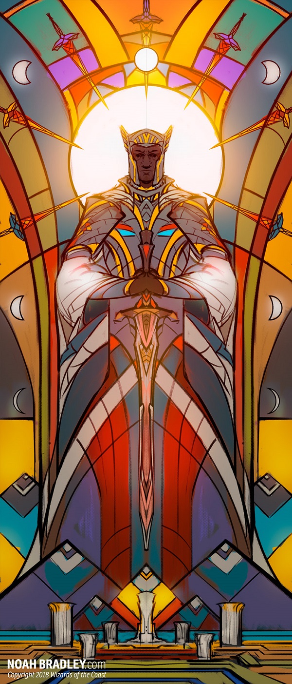
Examining stained glass, there are really five categories. With a history lasting thousands of years and more sagas to cover, I will keep it short from my perspective
Western traditionally painted stained glass
If you have been to a church in Western Europe, the side windows with the vertical figures? Those heavily painted Biblical scenes are what most Americans think of when they hear of stained glass.

Patterned stained glass
I normally think of this group as post-war stained glass as it is simply stenciled, as if the actual colored beautiful medieval stained glass window is being reconstructed. This can also be rose windows, for the less complex ones.

Contemporary stained glass
Very rarely is this style painted. Instead it's more collage, using solid, single color pieces of glass to make abstractions. Also, this stained glass is very rarely not abstract in form. They often are commissioned to make a Brutalism architecture more colorful and inviting.
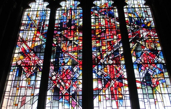
Image via docbrown.info
Tiffany Stained Glass
If you've ever seen stained glass on a lamp shade, it's likely this style. It's often a variety of thicknesses, with opaque glass to show solid colors. I look for circles and nature scenes, which are warm and approachable compared to traditional medieval painted stained glass. If you see birds or butterflies, really any vine or trellis things with wine? And it looks like early Americana? It's Tiffany.

Faceted Stained Glass
Also called dalle de verre, this type of stained glass becomes most apparent when you see it from the outside. It's flat and the connecting lines of epoxy resin don't look black like the normal leaded glass windows. I think of mosaics when I see these, as they are made from laying the glass on a table or slab, and then overlaying the connective epoxy resin between the glass shards. It means one side tends to be flat, and the other has some texture, which really refracts light beautifully on the inside of the space.
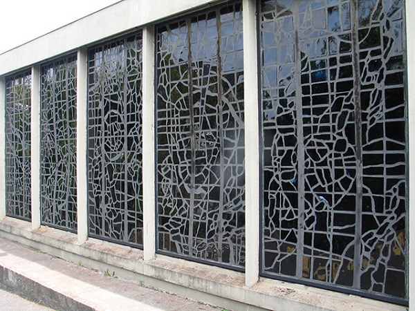
Image via everythingstainedglass.com
After going through that little explanation, we can see that Noah chose painting atop his digital creation of stained glass to mimic the more traditional depiction.
Phyrexian Scriptures

 You have to exclaim that starting the set with this artwork set the tone for the preview card season. It's everything that a nostalgic set can create. It has a call back to a playable card from the past in Dark Ritual by Tom Fleming.
It has thick canvas textures, forcing even unaware players to look at the card art. You can't assume this one is digital at first glance because of Joe's choice to use acrylic paint for the first time for Magic.
It's a lovely evocative piece that brings the mid 1990s set-in-their ways players to examine a new set. They might even buy a booster pack again, re-engaging the game because at least one piece looks like the art they loved when they were kids.
Rite of Belzenlok
That sure explains what the figures in pain and the weird stylized homes are in Dirge of Dread printed in Masters 25. I posed the question and Seb wouldn't budge. He painted these together. Those rocks are stylized Cabal homes. At the time of this article being written, he was already hundred of comments deep on his Ask Me Anything (AMA) post on Reddit, explaining as much as he could to player sponges, soaking up his every word.
I did get something out of him, in terms of the continuation: For me it was a continuation of the dirge of dread -- in that one we see one figure, but Rite of Belzenlok, we see multiple -- multiple victims, their cries joining into the music. They are evoking mass sacrifice to summon the demon. Mark Winters was very clear on creating a synergy between the two cards, he told me Dirge of Dread had to be the verse, and Rite of Belzenlok had to be the chorusâ.â.â.â
Considering he worked out some color studies traditionally painted to get the singing figures right, this is his recognition piece for people to pay attention to him. He is an amazing artist, and while he works digitally, he doesn't always and he wants you to know that.
 |  |
Acrylic, pen and pastels on 200-gram cold press paper, 16.5 x 12"
Song of Freyalise

This sure does look like watercolor, doesn't it?
Perhaps it's the drop in opacity for his digital brushes that fools our eye. Maybe we're used to that alabaster skin tone that Rebecca Guay painted in watercolors so often.
I don't see Min Yum posting Magic art very often and it's a bit sad. We as players want to appreciate, celebrate and give thanks for depicting the favorite of the elves. I wish we could.
The Antiquities War
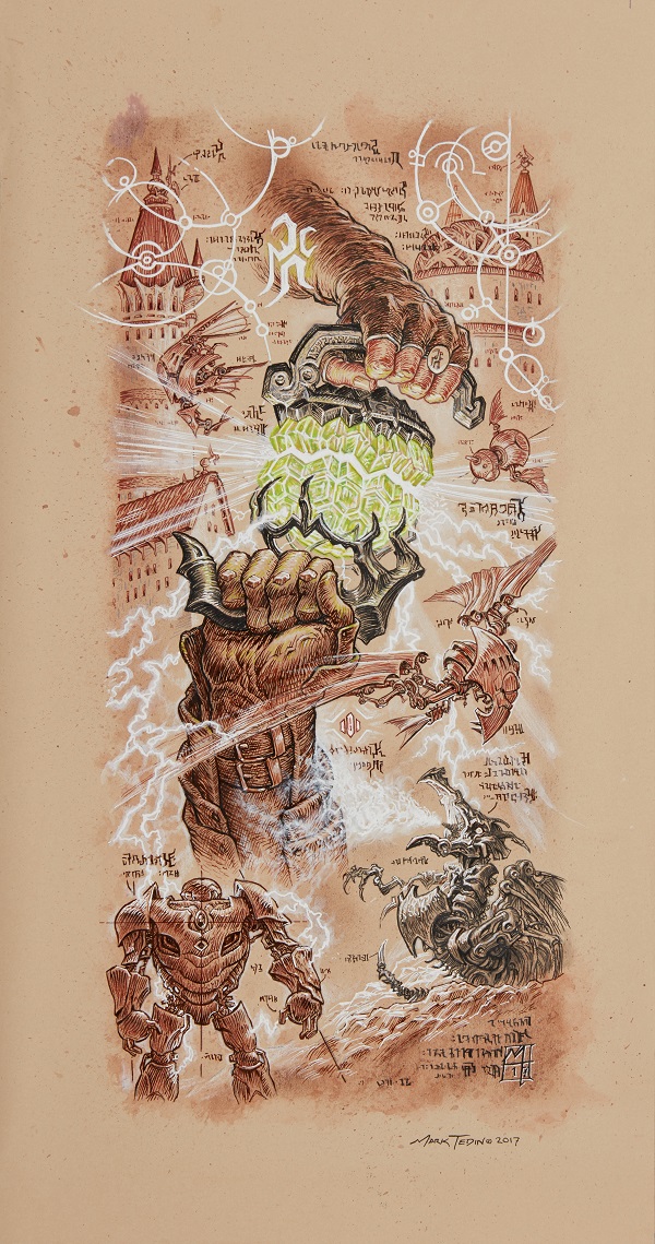
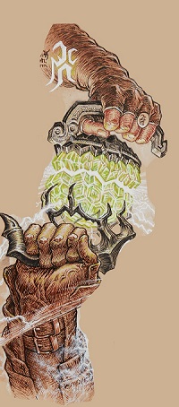 This was the preview card Ant Tessitore and I had for the Snacktime podcast. It is Mark Tedin's return to Magic. We discussed it in depth, with each figure either being representative of Mishra or Urza, with his seal shown on the card Brand, being his hand.
This collage by Tedin is Dominaria's original sin, akin to Eve with the apple in the garden of Eden. It sets off the brothers war and eventually cataclysmic events, the second time around. I got ahold of Mark and asked him a few questions on the art:
This isn't a painting, but rather a white chalk, or watercolor pencil on toned paper. How did you choose that medium?
At first I was going to paint it with gouache or perhaps go at it digitally, but the art director Mark Winters asked if it could directly reflect the look of a written document on aged paper and not just depict the contents of a scroll in a realistic setting. So I ended up finding a toned paper that reflected that look and gave it a more bookish feel with watercolor, colored inks and using plenty of traditional ink nibs.
What did you enjoy the most out of this illustration?
I got to re-visit the Brother's mechanical gizmos which in itself was fun but I think framing all of the parts with analytical handwritten notes and geometrical forms was enjoyable as well. It was a challenge to make it all seem flat and scholarly but give it enough dimension to keep it interesting. Urza's written script were all extrapolations of that personal symbol that you see on his costume and on one of his greatest inventions, Karn. Looking closer, there are very few letters that end up repeating, so his alphabet must be lengthy and very esoteric!
The center hands, they are breaking apart a powerstone, did you have any inspiration for that?
The stone itself has been interpreted in so many different ways across many cards and other platforms (such as comics), I thought at the very least it should be fist-sized, multifaceted and perhaps too energetic to touch safely. When they get pulled apart, you can bet all hell will break loose. Each handle shows off the differing design approaches of their inventions: Urza with a more logical clinical feel and Mishra with a more expressive aggressive look.
It's a lovely piece and the dragon engine along with the Ornithopter are a hit of unfiltered nostalgia. When Wizards asked Mark to do it, who else could cover antiquities war?
The Eldest Reborn

What an entrance to Magic's brand Jenn has had. The art is great. I would urge you to stare at the waves crashing against his body in the middle of the image. It's characteristic of the style and I think a little interview might work out great rather than talking about just her inking abilities.
Who are you and what's your deal?
My name is Jenn Ravenna, I'm a concept artist and illustrator currently working in Seattle. During the day I work at Microsoft on their XBOX team.
What's your "style" of art, for those who see this for the first time?
My style of art can range from realistic sci-fi and high fantasy paintings, to character concepts, to ink drawings influenced by Asian brush pen work.
On your first Magic commission, The Eldest Reborn. How did this come about? Were you approached by Wizards? Did you submit your portfolio?
Mark Winters was looking for someone who could do sumi-e ink. My friend Carmen Sinek, who was working with MTG at the time, thought of me and suggested my work. I submitted my portfolio and got commissioned.
How did you choose this style of art?
In choosing the style for the commission, it was all in the brief. They wanted something an artist in Dominaria would potentially create. Mark also gave me specific references to key off of - a mix of very simple sumi-e ink drawings and Japanese woodblock prints. For myself, I started ink work because of Jake Parker's "Inktober" event, which occurs annually in October. It's a challenge that pushes artists to create an ink drawing every day, good or bad. I was always intimidated of doing traditional work until I started the challenge -- then I discovered I loved ink!
Clearly, Magic is now a household activity. Adrian, your husband, also has done Magic card commissions. Only a few times have a couple both worked on the brand, especially at exactly, or nearly the same time. Did that impact your work at all? Improve it? Hinder it?
Luckily we had our commissions at different times. I'd say it didn't impact my work much, aside from getting critiques now and then. People seem to be surprised to find that we're not competitive with each other since we're both artists. But we try to help each other out as much we can and be a source of balance whenever our schedules get crazy. As long as he's not giving me feedback at 2AM in the morning we are usually cool.
Obviously this a major character in the game of Magic. How did you approach doing research on Nicol Bolas?
I spent a lot of time studying the design of Bolas himself, and other artists' renditions of him. It's a dragon and he has a complicated design, especially in the face, so trying to simplify Bolas in ink form was a challenge. I spent a lot of time practicing different ways of reducing his form down while trying to keep the power present in the image. I think I practiced his tail and the arm of his wingspan a dozen times before applying it to the final image. In terms of the story in the piece, I stuck close to the brief itself, as I wanted to make sure I got things right as a new artist and it was very specific, important piece of lore.
Will people be able to get prints or reproductions of this?
Yes! People can order Limited Edition prints and standard prints at jennravenna.storenvy.com! The Limited Edition prints are being made locally here in Seattle, and will be printed on special large 20x30 rice paper.
How has meeting/acclimating to Magic's community and culture been?
It's all been positive so far. Everyone has been really welcoming and kind, and I am floored by the response to The Eldest Reborn. I was very anxious about the release of this card. Would they like the style? Would they like this interpretation of Bolas? Could I do it justice? What would they think of this newbie? I worry too much, but I can't help it sometimes. But everyone has been so warm and nice, it was been so rewarding and it's really helped my confidence.
For artists wishing to break into Magic, the best people to ask how are the most recent folks. How would you say you broke in? What was your special something that you think made the difference?
Have your work ready to present for any kind of random opportunity life will throw at you. I feel like I was in the right place at the right time for this specific assignment, and I feel incredibly fortunate for that. I also kept doing what I love -- which was the personal ink work. Be persistent. I had submitted my portfolio to Wizard's at least 3 times before I got my first commission. And if you get rejected, always be self aware of what you need to work on, always try to improve and learn. And if you're a professional artist, consider your position in the industry and ways to be kind and generous. I owe a lot to my friend, Carmen Sinek for recommending for the job. I hope to pay it forward.
Beautiful work Jenn and welcome!
The First Eruption
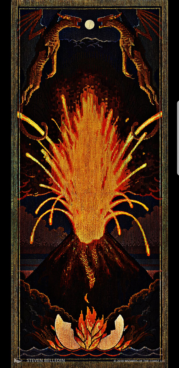
A tapestry is what the art director Mark Winters asked for in the art prompt. Surely Steve could've painted a piece and made a filter or layer texture atop the tapestry to wondrous effect. Instead, he chose the hard route.
 On his blog, Push and Pull, Steve Belledin explains in painstaking detail how he destroyed brushes, his back and eyesight to make vertical brushstrokes that mimicked woven fabric across the piece. While he certainly gives us an Eeyore's perspective, the man cares. Art is suffering has never been more apt than this work.
From the feature article on the Wizards of the Coast website, an excerpt from the art description: "This Saga is a woven tapestry depicting a myth told by the Ghitu people of Shiv. The Ghitu are nomads, so they weave representations of their important stories into tapestries that they can roll up and take with them.
This Saga depicts an enormous volcanic eruption that, according to the Ghitu, gave rise to their fiery home continent of Shiv. They believe that Shiv "hatched from a shell of stone around a yolk of flame."
Sagas asked for something new, and sticking to a prompt can create brilliance. The risk is immense as a minor brand might not have artists like Steve who muscle out brilliance because of skill and sheer will. Other brands might need to cut cards with art that is late and not strong enough for print. I can't underscore how bold Winters was to ask for this, and when Steve said he'd utter do it hard and live, that an art director could trust the process. Dominaria will be remembered for years by the dedication of the team responsible for its reboot and recreation but also from artists. Artists like Steve have worked on the brand for years and were not going to put in marginal work.
I'm utterly impressed and were an art show to exist that included Dominaria, this piece has to be in it.
The Flame of Keld

I highly suggest reading the thread that Kelly Digges jumped into, talking about the political nuance of this saga. Without a full jpg rendering, it's a bit harder to see.
https://twitter.com/kellydigges/status/984168712063279104
It's a grate depicting a mytholgical event, with a culture that values fire and the connecting thread it has between the Keldon people.
I see Henry G. Higginbotham here. Higginbotham was one of the few artists who took photos of still lifes. His artworks for Magic, the big four, were all items that he photographed, and the Claws of Gix were an actual sculpture. Lake here uses the digital medium, and the hyper realism of his rendering should give you a deeper meaning as Kelly explained.
The Mending of Dominaria

In Adam's tree, we see a few figures. Clearly shown are Freyalise, Lord Windgrace (the cat), Karn and Teferi. They stand atop a globe, Dominaria, being the connective thread from destruction to life. They are the trunk that stabilized the world and the tree.
We should be thinking the trope of the world tree, giving life, maintaining, but they as sculptures should also show their sacrifice. It's the strongest Saga card name, and requires the most background to understand its concept.
You don't need any background to see that Adam knows how to apply light to a living tree. There aren't many colors used and yet it's organic and beautiful.
The Mirari Conjecture
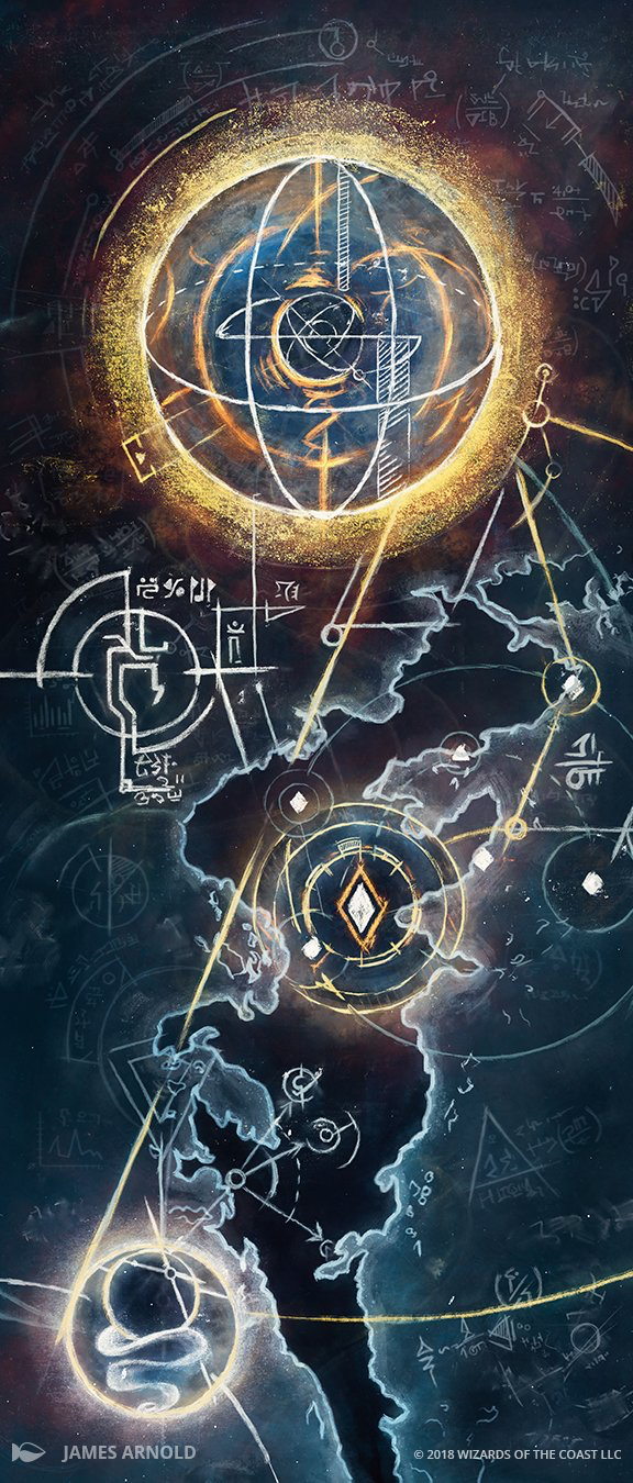
James is not a Magic artist by trade. He's a former Gathering Magic writer and now the Wizards of the Coast graphic designer for R&D. How this came to be was that James was working on the Saga frame and was talking with Mark Winters, the art director. Tell someone that you'll commission an artwork for someone else, but keep that door cracked open and James will kick it open. He hustles like that. The Mirari Conjecture was a labor of love for James. He has an entire blogpost on the art, which you should very much read.
I appreciate the chalk medium as it shows how it could be written, then rewritten with new information as to where the Mirari was located. The art description even stated, "Imagine trying to reverse-engineer a nuclear bomb from a fallout map--except they're having some success with it."
It's a triumph in that it is utterly unexpected. It is from a non-traditional Magic artist, using non-traditional media to show a radically different immersion of an investigation. I'm also thrilled Wizards is willing to give internal folks a shot at art. With Taylor Ingvarsson joining the team as an art director, I hope he gets a shot at some commissions just like James, Mark Winters, and Cynthia do currently with Kieran Yanner.
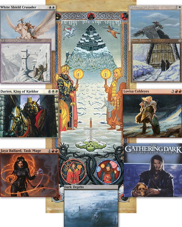
Time of Ice
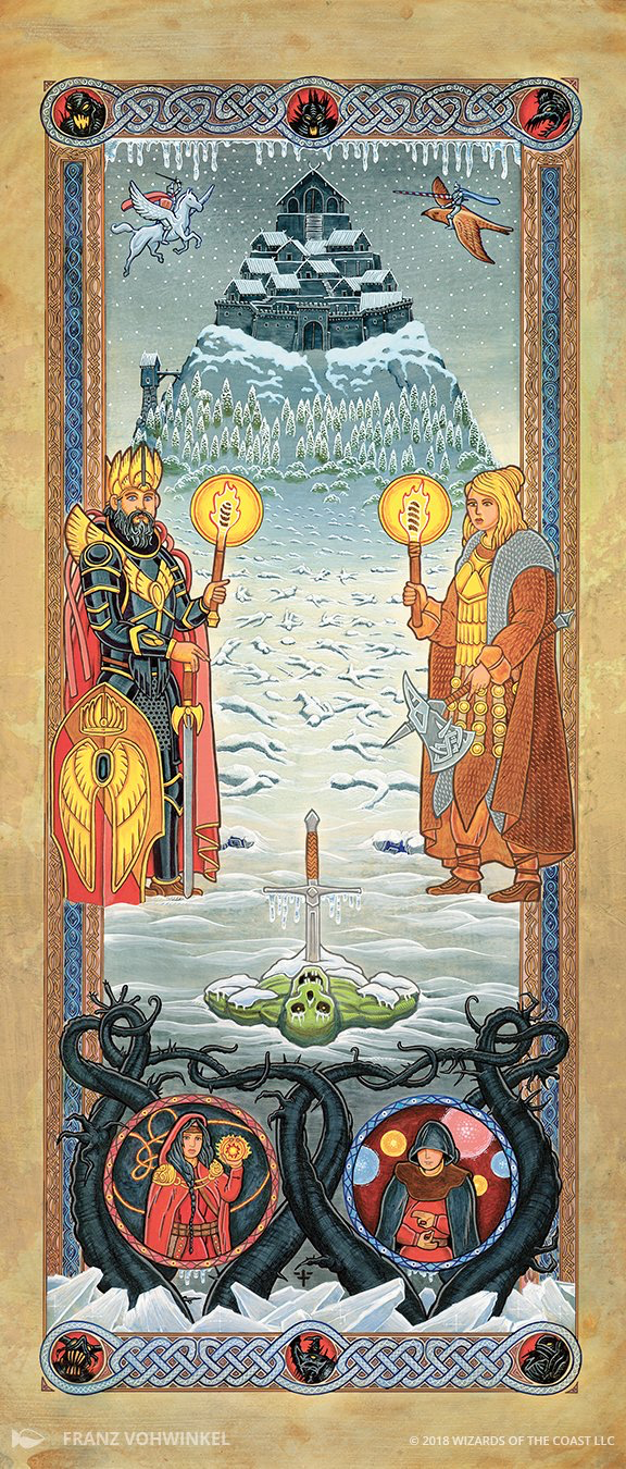
We often skip the early medieval art when visiting museums, my wife and I. After seeing the hundredth Calvary depiction or Christian triptych, it's hard to differentiate quality amongst them. As they have a similar purpose of using size and placement to show importance, realism is less important than the mood. Magic art can learn a thing or two from the art period and Franz delivers a masterwork.
For those wondering why art reviews come later and later, even after a full set has been out a while, it's for one reason. Players should be given the time to soak up the art. We wouldn't get group projects like this one from Reddit if myself with some expert Vorthoses just laid it all out. It's less fun, there's less discovery. Artists who both add references themselves, like Howard, or have a full listing from the art description like Franz here have a window of excitement to behold. It's uninhibited discovery and the less the artist says, the more rabid the information is. And yes, that's Lim Dul dead in the middle bottom, despite what Jay says.
Triumph of Gerrard
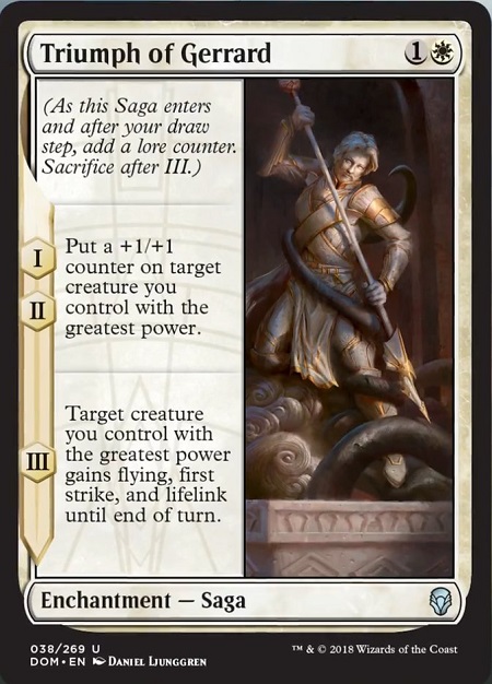
This has a lot of references in it, so I might as well ask the people close to it, like the artist himself. I'll ask in English though.
Daniel, what can you tell us about this piece. Clearly you had some inspiration here.
One of the inspirations in terms of basic ideas and feel was "St George and the Dragon". I've seen the statue in Old Town in Stockholm many times, so it made a good starting point next to other depictions that I looked up myself.
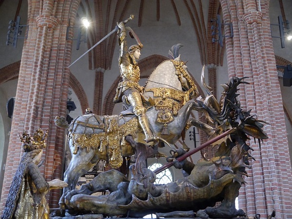
The other main inspiration was the statue of "Laocoön and His Sons".

Image via wikipedia
Other references I used: a bunch of white marble statue references in different lighting conditions, designs provided by WotC (the look of Gerrard, the symbolic parts of the spear etc), as well as inspirational images that capture things I'd like to incorporate into my painting (for example use of soft and hard edges, and the painterly look). I like to gather tons of relevant references to make sure I don't miss a good element that can help me make the painting stronger. Most of the references I used had a bright sunlight covering the whole statue, but eventually I needed to boost the focus so I pushed a few areas into soft shadows and kept the important parts in light, to make it easier to give the eyes places to rest for a bit before moving on. It was interesting and fun to paint an abstraction of the event that occurred, and with the symbolism it got that extra layer of depth.
I'd like to thank Mark Winters (the awesome Art Director for this image) for the support and supplied references.
You also caught the Weatherlight ship schematics in the background of the left side, right? James Arnold, he's doing good things for the brand. You'll see his nods and winks a lot more often in the future.
https://twitter.com/mythictalesmike/status/981898067128520704
https://twitter.com/ESP_MTG/status/981941024024035332
I agree Erik. The Sagas have brought Magic to a new level and I want them now in every set.
--Mike