


I've been thinking about the Food Chain art by J.P. Targete from the Teenage Mutant Ninja Turtles Magic: The Gathering set. One of my favorite pieces from among Targete's previous work was Wedding Ring from The Lost Caverns of Ixalan Commander. The dilapidated, corroded bones of a hand with this huge purple glare from a gem on the ring finger is quite the statement.


That illustration of Wedding Ring felt like a mixture of the familiarity of love and that imagery of the horror of eternity. It's a morbid, yet weirdly loyal interpretation of marriage. It's gross, but powerful. We see that in the mixture of the blacks, and whites and greys - the morbid - in the background, but that splash of purple - that love, that power. It makes me want to be found wearing my Wedding Ring when I'm worn down to bones, my love lasting that long.
Now, this article isn't about Targete, but it is a little. Targate just has me thinking about the evolution of Magic art over time. Looking at their rendition of Food Chain next to their rendition of Wedding Ring throws some things into sharp contrast, and I want to explore that a little today.
Disclaimer
I am not an art professor; I'm a writer. I've consulted and interviewed someone online who I consider a connoisseur of Magic art, InterestingMTGArt. I asked them questions and wanted to assemble some kind of deconstruction of Magic art over time. For the sake of brevity, I'll be referring to them throughout the article as "Interesting."
Tried and True Magic Art
Before we can talk about the trajectory of Magic art decisions, let's talk about classic Magic art. The Classics are what made this lovely game what it is today, and we have to respect where the game came from, artistically speaking. When we change things, we have to understand what we change and why.
Lightning Bolt by Chrisopher Rush
- InterestingMTGArt
"Bolt the Bird" is one of the most iconic phrases in the Magic community - well that and "do you pay the one?" Lightning Bolt is so mixed into the zeitgeist of the game that players still say they're in "bolt range" when someone is at three or less life. The reputation of this card is inextricably intermixed with the art of the card.
It depicts a storm incoming. Direct, nonspecific. Powerful. Divine. Chaotic. It's hard not to feel a tug toward the imagery here. It's hard not to feel like it fits. Magic cards' arts are meant to be flavorful. They match the passion and feeling of a card. They become iconic because they match the tone of the act of playing them.

While not his most classic piece of art (the Mox cycle would want to have a word with me if I tried to make that claim), it's a piece that showed that Magic has room for humor and a bit of silliness, and doesn't have to always be serious swords & sorcery fantasy. We can have both, they can coexist without being discordant, and I think that rules."
- InterestingMTGArt
Magic has always had a sense of humor. They love a little reference. They love flavor. They love making their players feel something. It is quintessential Magic to try to bend the serious archetype of the game to get a feeling out of its audience. It is quintessentially Magic to bend expectations, making us smile or laugh.

A modern piece of art for a standard Magic set would likely be rooted in a specific place in the Magic Multiverse, potentially with a specific character, but given that those aspects of Magic's identity hadn't been figured out when Alpha, et al. were being made, it's not rooted anywhere or in anyone that we recognize, which helps it retain this mysterious, magical, slightly dangerous air..."
- InterestingMTGArt
I love what 'Interesting' is saying here. Time Walk is sort of a starting point of Magic art that is so unintentionally inclusive, like Lightning Bolt before this too. They want people to add onto it. It is innocuous yet so impactful. It doesn't want to say too much, to make too much of a statement about what Magic must be and is still a classic piece of Magic art to this day.
These initial pieces of art tell me something about what Magic wants, has always wanted, to be - flexible, funny, inclusive, and impactful. And I don't think that bending the rules of surface level aesthetics goes against this belief. That's why they did Edge of Eternities. That's why that set was so successful, yet so divergent aesthetically.
Magic's Art Trajectory
I asked 'Interesting' if they liked like the current trajectory of Magic art. There was no denying with sets like Edge of Eternities and Marvel's Amazing Spider-Man that the boundaries of what is considered Magic art are bending. I wanted to know if this was the right direction for Magic.
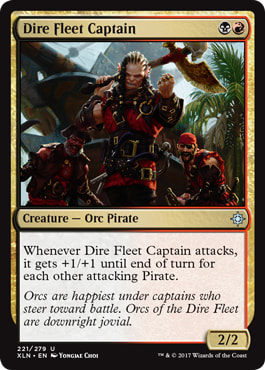
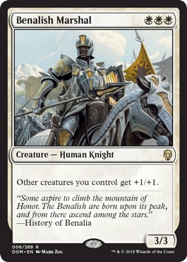
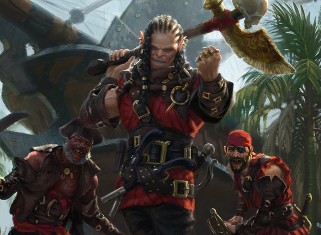
This was fascinating to me. I've always thought, even before Outlaws of Thunder Junction's aesthetics, Ixalan seemed to toy with the idea of pirates and guns and canons in a way that was divergent from what I would consider to be Magic aesthetics. It was wildly different from Dominaria - a weirdly specific high fantasy knight's templar aesthetic.
 |  |
 |
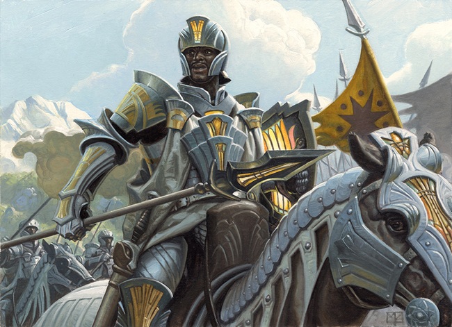 |
Below - Benalish Marshal by Mark Zug
I tried thinking about what exactly the aesthetic of Magic art was and I couldn't exactly place it. I asked 'Interesting' if the bending of boundaries of what was considered Magic allowed for more different yet good art to fall into the category and they said I was right on the money.
Japanese Treatment
I became curious about times when Magic bent what was expected of the game in terms of art, so I asked 'Interesting' for some insight. I figured it would surround radically different looking sets, but surprisingly the first one they mentioned were Jace Beleren and Chandra Nalaar's alternate art cards from the Japanese Duel Decks: Jace vs Chandra.
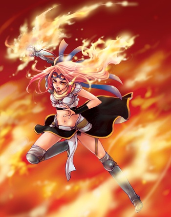 |  |
Right - Jace Beleren by Yoshino Himori
This product was released on December 3rd, 2010. It was, according to 'Interesting', the first time Magic featured anime-style art. From my perspective, anime-style art has made the value of cards go up incredibly. They are highly sought after. I know price doesn't mean the community prefers the art, but it does mean something that those cards are sought after. I hadn't even considered it a divergence from what was considered Magic art. It seemed very in line with what they had already made, but thinking about it, it was nothing like art in previous sets.
Frames
The next cards 'Interesting' mentioned were the Inventions bonus sheet frame from Kaladesh and Aether Revolt.

They, "broadened how a plane's personality and/or a set's theme could be expressed through the card frame."
It seems so normal for a Magic set to have new frames now, but that isn't even that long-standing of a tradition. Kaladesh was only 10 years ago and Magic has been coming out since 1993. It has become the new normal after 10 years, though.
New frame treatments are how some players prefer their cards too. Granted, I know a lot of players who don't like them, but it's in steps like this, steps in the right direction and missteps, Magic is allowed to change. We can only grow if we change first.
Secret Lairs
'Interesting' mentioned that the initial run of Secret Lairs from the late 2019, "provided an avenue for Magic to print cards with art that deviated wildly from Magic's typical visual style." Notably:
Personally, I've recently become a fan of Molly Mendoza's Secret Lair art. I like bold colors and bolt depiction of surroundings. Their Myrel, Shield of Argive for the recent Encyclopedia of Magic Secret Lair gave me chills. This sort of art would never typically make it into Magic sets.
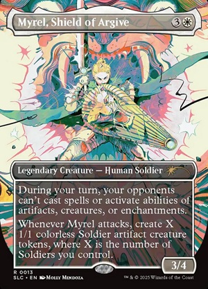
Myrel, Shield of Argive by Molly Mendoza
Before Secret Lairs, I didn't care about Magic art. No offense to the artists, but I like very bold design. Most Magic art I had seen was very safe and typical. I would just buy the cheapest version of a card because the art didn't matter to me. I couldn't recognize the art of a card if my life depended on it, it was that bad.
When I started getting into Secret Lairs, I started getting into Magic art much more generally. I appreciated some non-Secret Lair arts that pushed boundaries like Titania, Protector of Argoth from Modern Horizons 2 by Iris Compiet and Dollmaker's Shop // Porcelain Gallery from Duskmourn: House of Horror by Cacho Rubione.
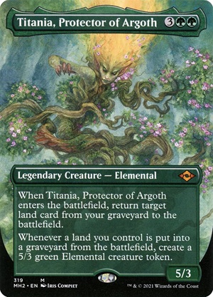
Titania, Protector of Argoth by Iris Compiet
They were bold and colorful. Titania was the first foil card I enjoyed as a foil. It made me enjoy aspects of this game that previously I didn't.
Conclusion
So, what does this have to do with Food Chain by J.P. Targete for TMNT?
Daarken's Food Chain art from Double Masters 2022 was the inspiration for the TMNT Food Chain art. I love a good little allusion. This art is grotesque on purpose. It is supposed to mirror the barbaric - and gross - nature of the source material. It is comedic in the way Animate Wall is, to flavor the card in the vein of Teenage Mutant Ninja Turtles.
I wanted to discuss whether the art for this piece passes the vibe check for a Magic set, though. I think it does. It pushes the boundaries of what Magic is aesthetically a bit, I'll admit, but how important is that? Magic does that all the time, little by little. It's good for the trajectory of the game's art.
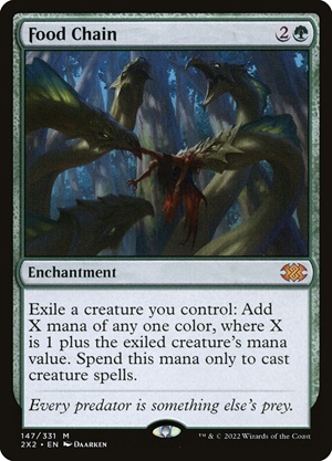

It harkens back to flavor of its original source material. It understands its internal aesthetic. It's loyal to that, but if you just don't like it, I'm not going to argue with you. I'll be honest, I don't like it either. I prefer the Daarken version. I like the brutality over the silliness. However, I reject the idea that it isn't within the bounds of what we define as Magic's aesthetic.
We can have nuance. We can respect a piece of art and still dislike it. It can be well made and well executed and not be something you want to buy or engage with. It can be something you don't buy and still be fine for the livelihood of the future of Magic.
Enough ranting. These are my thoughts. Tell me yours. I'm @strixhavendropout on everything. A huge thanks to @InterestingMTGArt on Bluesky. Their email is also interestingmtgart@gmail.com
Connect with me everywhere else: LinkTree