


I wish I had taken a picture of my deck for my Eternal Masters draft. I was shaking a bit from opening a rather expensive foil card and traded most of my cards away for sealed packs. Eternal Masters sealed booster packs will make for a great addition to future chaos draft boxes I build for charity fundraisers.

I stared altogether too long at all the art, and the draft picks piled up next to me, as per usual with a new set. I don’t know what to make of it. With all the new art, it isn’t really a reprint set like Modern Masters. It also does not feel like a thematic expansion set either. From a visual context, as the art Vorthos I am, I see Eternal Masters as a pseudo core set.
Read what Doug Beyer had to say while discussing the core set of Magic 2012, in Core Curriculum:
“We're tasked not only to provide simple cards for new players, round out Standard with staple must-haves, and make Limited fun, but also to make the set feel like a collection of recognizable mainstays of the fantasy genre.”
Let’s rewrite it and see how similar the context is:
We're tasked not only to provide simple cards for established players, round out the eternal formats with staple must-haves, and make Limited fun, but also to make the set feel like a collection of recognizable mainstays of the fantasy genre.
They even reprinted Serra Angel. I can’t make this up. Keep that note in mind as you look through cards and read this review. “Would this look good in a core set?” Would it fit?
One art “gag” to look for: limited color palettes. I did not write about reprinted cards, frankly. Talking about a new border/frame is a little outside my experience, but I do touch on it when it’s relevant. Take note for how quiet new card artworks appear to be in the set. Cards like Sinkhole, Wasteland, Seal of Cleansing, and Phantom Monster are all limited in color palette but still have depth and focus across digital and traditional media.

Image via gomedia.com
If you want to learn how to train your eye to see gradients a little better, I’d download Magic artist Yeong-Hao Han’s app called Blendoku. It’s a fun little game to play when you have some spare time and it’s oddly addicting.
I love finding the obscure amongst the known. They call you a hipster if you like non Budweiser beer, and I delight in finding something new instead of the familiar. When I build decks, I look at every card art version to see what thematically fits and visually works within the deck. With this set, we’re given multiple variations of paprika to spice up our decks.
Let’s roll!
NEW ART
There isn’t an order of best to worst, or first previewed to last, here. It’s as I posted them in, and when things are similar, they show up next to each other.
Wasteland
Wasteland by Eytan Zana
What a wonderful time we’re in where players can’t tell digital from traditional paintings. It removes the upturned noses over what is better or preferable and instead allows us to focus on what’s important —masterfully created art. The limitation of the palette, using only a few colors and just hues and shades of them, creates really quiet yet stunning pieces in this set.
And yes, people of Reddit can stop posting that Wasteland is City of Brass. We know. I think the entire town knows.
https://twitter.com/themanasource/status/699274735255949313
Rorix Bladewing

Rorix Bladewing by Clint Cearley
Ant and I talked about the flavor text on this wonderful dragon, referencing Bladewing’s death and his eventual reanimation as Bladewing the Risen. It’s great to get a new Red dragon in Magic, another of Wizards of the Coast’s mainstays.
 | 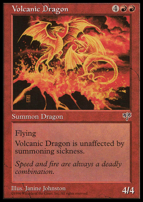 |
Also, the secondary wings Rorix has in the original art can be seen here, but it’s mighty tough to see at card size. What you can see is a beefy dragon, which is more similar to Thunder Dragon or Volcanic Dragon by Chris Rahn. The thick neck and face almost feels dinosaur-esque, which made me wonder if Lars Grant-West painted this before I noticed it was Clint’s work. (The man knows animals, as he worked at a zoo before. There’s a reason he always does Elephants.)
Clint did an amazing job on this Dragon. I’m confused who painted it. I’m looking for details, it pushes a standard of new new Dragons and I couldn’t be happier.
Control Magic
Control Magic by Terese Nielsen
Terese has been with us a long time and her recent work has found an iconic niche of collages. Adding geometric shapes to create a narrative and multiple meanings is not something trading card games commission for art. This is almost entirely a Magic phenomenon and those that do exist are copycats to this style and simply do not last due to branding pressures.
Let’s celebrate the teachers who had you make collages in art class back in elementary school for instilling the knowledge of what a collage consists of. We all know what they are, whereas it’s hard to tell why Donato Giancola is such an incredible painter. Quality is relative and collages democratize the process — adding a bunch of stuff together to gain more meaning is what Magic shoots for and Terese has been doing it since the beginning.
Her first set of commissions? In Alliances? At the same time as Force of Will, Energy Arc was also created. Check out the left circular design above the person’s head in Energy Arc and then look at the Guru Island. That collaged in element was actually reused, in a sense, for a later concept.
 |  |
Terese even has some artist proofs left of the card on her website.
Check out some others from her catalog of card artworks for collages. They’re worth getting in foil. Some of the illuminated parts are unreal.
Mystical Tutor
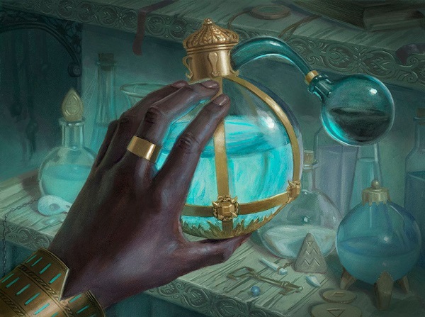
Mystical Tutor by Lindsey Look
There is no longer a “Magic hand artist” like there used to be with Donato Giancola. Instead, we have a short list of artists who can fit the bill whenever needed. If there was someone closest to that, though, it would be Lindsey. In case you haven’t realized, she has been around making art for years, but was formerly Lindsey Messecar, in case you’re searching for her other work. She did a bunch of work for other TCGs. Yes, she has improved, as all artists do, so be kind.
As for this art, she worked under Dan Dos Santos and, like Volkan Baga under Donato, you learn a thing or two from working in an artist’s studio with someone phenomenal. What moves you from a random artist drawing a hand and a thing to a great artist is in the details.
- Look at the woodworking details on the table behind the hand.
- Look at the correct lighting on the bracelet.
- Look at the limited color palette that make the person’s hand and the gold pop.
It’s so well done, in fact, that art collectors fought until it hit $8300 on ebay mere days ago. It’s one of her better pieces and let’s hope she gets more major commissions like this in the future!

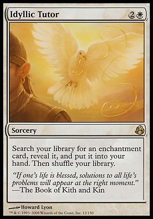
Enlightened Tutor

Enlightened Tutor by Howard Lyon
Howard is firing on all cylinders. That hand is lovely, showing age, tension and a delicate love of picking up a rather favored book.
From Muddy Colors, a must read art blog that Howard contributes to:
The cover ended up with a couple doves with gold threads in their mouths as golden inlay. The reason this worked out well was WotC (Cynthia Shepherd was my wonderful AD for this card) gave me the green light to give a nod to a previous card I had done, all the way back in 2007. It was the 6th card I had done for Magic, and was titled Idyllic Tutor so I felt it would make a nice Easter egg on Enlightened Tutor, tying the two together.
The art description didn’t have the birds!
HOWARD ADDED THE BIRDS HIMSELF BECAUSE NODS TO THE PAST ARE AWESOME.
HOWARD, YOU ARE AWESOME.
Artists have pretty straightforward art descriptions to follow; but, like all games, if you have an incredible suggestion art directors are rather friendly people and will always consider clever nods to the past.
 |  |
Do you have a librarian friend?
Do you need some art for your house that even grandma would love?
Check out his limited edition giclees. They are a great limiting factor of making digital art valuable to collectors. Screenprinters have been doing this since the technique was invented: make a print run, keep it limited and don’t do another run. That’s how that works. If the quality is high, getting one of his giclee prints on canvas will be the closest thing you can buy to “an original” of this work. Perhaps in five to ten years, we’ll see ton of examples like this. I hope we do.

Chrome Mox
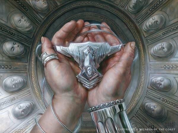
Chrome Mox by Volkan Baga
So where is this? I can’t place it, nor do I know if this is looking upward at a vault, or downward, at a floor. I’d assume a crypt, but where? I can’t place it but I can deduce where it could be from context clues, as there is nothing much to say other than Volkan paints impeccable art.
Let’s examine all the aspects of this painting to get some plane placement:
- Volkan Baga studied under Donato Giancola. Knows hands because he was taught by a living master. They’re dirty, human, and look like a soldier’s hands. They fit.
- The man is holding a Chrome Mox, which is chrome, which is not Mirrodin, the world of metal. Also, the humans there have metal bits in them at best, and are totally phyrexianized at worst. Also, where did they get marble?
- The gauntlet is shiny, almost Bant-like, of Alara, but the pauldron is too small. It could be Bant but the masks don’t fit the iconography there.
- There are death masks on the wall, but they aren’t gold. So, it’s not Theros? Furthermore, the faces look very similar, compared to the death masks of Theros, which vary widely in character.
- So this painting is at one of these places and none of them. Wouldn’t a core set also be set in more than one setting? Well yes, yes it would. They’re ambiguous to fit multiple planes, many of which werr fixed in the final core set, showing us five origin stories of planes. By making it plane ambiguous, Chrome Mox fits flavorfully everywhere. That’s not an easy feat to accomplish.

Returned Phalanx by Seb McKinnon
Vampiric Tutor

Vampiric Tutor by Raymond Swanland
On a technical level, you first look at it and it all makes sense. It feels very Black to me with a knife, skull and old looking hand. Wait, Mystical Tutor looks similar.
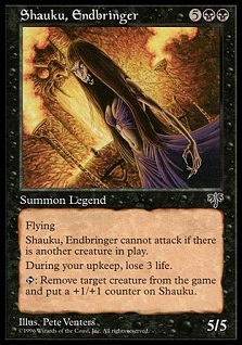
The original concept was a Vampire, Shauku, Endbringer, getting blood from students, of which, we can see her as a non-attacking, not immediately threatening foe. Her card then reiterates the life (or blood) loss. Neat! Two cards reinforcing a theme for the Vampire. That’s cool. The new card has no references to any other card. It looks and is flavored for a core set, unrelated to any single plane, which is plenty all right. We can’t keep mentioning legendary characters from forever ago. It also is located within a wizard’s study. And if you didn’t know, that location a huge trope for Magic. I wrote on it a few years ago.
So, the artist had to take a still life image and make it both flavorful, on-color design, and something interesting. That’s much harder to make unique than you think, not even to mention readable at 2”x3”.
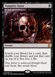 |  |  |
What I cannot ignore is one question. Why was Raymond given this commission?
He embodies movement, action and dynamism. If you need a scene of anything dealing with war or a combat trick, Raymond is that guy. He knows movement and kills it every time he gets a piece pushing to his strength. Of anything, he should be the last person to choose for a quiet, contemplative piece, especially with this art description. I mean, he’s done Blood Rites and Lens of Clarity for hand close ups, and even those are more dynamic than this. There’s a story why he was chosen and I don’t see his body of work or the level of Magic art wanting to select him for this commission. I literally just mentioned Lindsey Look and Howard Lyon. Maybe they were both busy. Those things do happen. Mountain bikes work on roads, but they’re made for mountains.
 |  |
 |  |
Bloodbraid Elf

Bloodbraid Elf by Raymond Swanland
This, this is Raymond’s jam. Tons of things are moving among her necklaces, the trees to her guiding hand, and I’m going to get stabbed by said elf. Fun is had, art is made that we will love, and decks have a new staple to get four copies.
Cripes this is a lovely painting. I like how he’s reintegrating dreadlocks into more paintings, just as he did during the Alara block. The shoulder pad is large and spiked, not unlike a bunch of planes with Trolls and Ogres, but not normally for Elves. It’s a great little addition and speaks to the change of the five shards into one Alara. You see, there were no Elves on Jund. The Elves were on Naya. Though the berserker part of Bloodbraid here? That isn’t a Naya Elf, that’s a new Alara Naya Elf dealing with life in Jund esque areas. Check out a concept art piece by Justin Sweet to show you what I mean. Those are humans below and the shoulder spikes in concept translated to Jund.
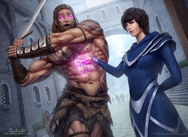
Diminishing Returns
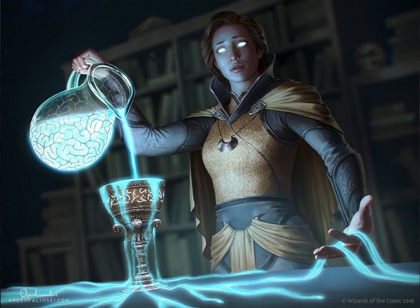
Diminishing Returns by Greg Opalinski
It’s a brain pitcher. Great idea for a “laboratory” themed bar near some college campus. It’d probably have some sort of Zombie subtheme too.
This piece caught me by its very digital lighting, of course, but I didn’t get distracted by it. If anything, the glowing goo made me stare at it, then invited me to look deeper. My eyes dance around her holding “the returns” and I try to place her clothing on a plane. The meticulous care of the goblet is clear, as is the blurred bookcase behind her, slightly lit yet unimportant thus muted.
It’s a strange image, yet it’s very much on point for Magic branding and a cosplayer’s dream for reference. I’d love to see Greg working on a concept art push, I’m sure he could kill it with civilian to nobility clothing options.
Timberwatch Elf

Timberwatch Elf by Yohann Schepacz
“Whole Squad”
The original Timberwatch Elf had an Elf standing on the side of a tree. While cool, that scene didn’t depict what the card did. Instead, the new art description had Yohann make an elf look like the front man of a band that is going to go to 11.
I like the stereotypical “bad ass male action hero” in small doses in Magic. Every other property kind of has that down. Even the underwhelming but overpowered loner in Jace is a thing. This hits the happy medium between the two on a casual all-star. Also, if you haven’t seen the foil card, you absolutely need to pick up a copy for your all-Elf Commander deck.
Pseudo dreadlocks on a blond elf? Yohann, you devil. Great work.
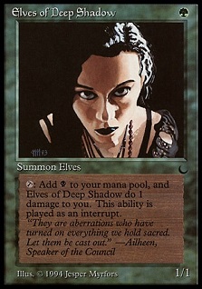
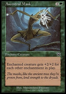
Ancestral Mask

Ancestral Mask by Magali Villeneuve
Magali can paint lovely faces. She has been doing it for Lord of the Rings and Game of Thrones LCGs for years. Add an art description of “face with magic” and great artists will just turn in amazing things.
Something to note about time. Were this to have been made in 1994, it would likely look like Jesper’s Elves of Deep Shadow. The art need is quite similar, it’s just the advancement of art descriptions for unique images in a game with over 10,000 images and needs to be mindful of the future. We look at the original Ancestral Mask and really, it’s a dancing Dryad, not a mask.
 |  |
Prodigal Sorcerer

Prodigal Sorcerer by Eric Deschamps
If Magic in 1993 had trope-looking white wizards with beards, then the game in 2016 should reflect twenty-three years of advancement both in culture and in representation. Why wouldn’t it? Why wouldn’t you want your game to be inclusive of more people? Aren’t you trying to sell to a wider audience?
The hair here is great. The facial scruff is contemporary. The clothing is outlandish yet reasonable. The background is simple but effective. The man’s race is not forced. The staff that pings for damage appears to be effective. Everything here just works. How lucky we are to have art that just looks natural. There is no uproar here, it’s just the standard for stellar art. Let that sink in.
Price of Progress

Price of Progress by Yohann Schepacz
Manfiest Destiny huh? She looks scared as hell. And can we celebrate the pickaxe is being held by a woman, yes, but not a Dwarf? I know, we need Dwarves to return to Magic triumphantly, and I can’t wait for them either, but they didn’t force them in here, did they? Again, this is Magic in 2016.
Notice the limited color palette. It’s quiet, it forces you to focus on the action, then the trail of sparks bring you to the payoff, her surprised face. How fun. This is the exact look you’ll get from opponents if you’re a Red player and you drop this on their fancy, dual land, foil, foreign, signed-card, faces.
Finally, in foil? This card glows. It’s beautiful! Every cube needs this version, absolutely.
Wirewood Symbiote
Wirewood Symbiote by Yohann Schepacz
Now THAT’S a bug.
Yes, sure, Tom Baxa can paint a gnarly looking insect that is feeding off you. If you’re feeling something a little . . . friendlier, try this art out for size.
The yellow essence being stolen from the elf totally gives me a GRIMM TV show vibe, where every “magical” thing created involves hormones, pheromones or secretions. It consumed the fatigue of the past, like lactic acid. I like that pseudo-science realism. A shame the show went down the tank so quickly. Or is it something else . . .
The bug is totally giving him the power now.
“Let the wild in. Channel its strength.”
—Freyalise
The entire concept was flipped on its head. Bouncing an elf doesn’t quite make sense as the art shows us, but untapping to “refuel” via adrenaline or some type of enhancement makes perfect sense.
The veins are what you can’t un-see when you blow the card up to this size, right? I struggled to see them too at the 2x3” card sized box for art.
Maelstrom Wanderer

Maelstrom Wanderer by Victor Adame Minguez
Get your scale birds out of here. We need scale deer. The perspective shift really helps to show just how massive this thing is. 7/5 feels like a made up number and should be utterly huge. Since we saw it from above last time, comparing the two pieces didn’t feel real. Though, we have no real idea where it was located and just assumed it was Alara.
Great work by Victor on the perspective shift of close to far in the top right. The leg is jutting toward us and it’s just a framing element, pushing our eyes to the left. If you look up and right toward your ceiling slowly, you’ll see the effect he makes us do subconsciously.
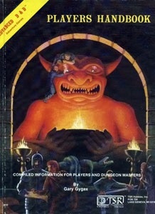
Gamble
Gamble by Winona Nelson
Winona made a weird goblin effect into a tight little digital painting that takes a new art description and delivers us a swift-footed thief. I love the crowbar and the Asian woman thief as a little modernity mixed into a generally medieval fantasy game. It’s not a white guy in a black cloak, you know? We don’t often look back on artworks that omit the easy, lazy choice in character creation. The Wizards art directors do a great job hiring stellar artists and push the boundary in art description.
And yes, this is both an Indiana Jones and an A D&D Player’s Handbook reference in one fell swoop. They finally stole the eye gem, nice! And yes, the original painting to that player’s guide? When a major museum wants to put on an exhibition, it does exist and they should contact me. I don’t own it, but I know how to get in touch with who does have it.
Animate Dead

Animate Dead by Bastien L. Deharme
WHAT IS THAT CREATURE HE’S ANIMATING?!
If the question hit you too, Bastien did his job right.
Any spell with a long history in Magic, you want to see it doing its job. Think if Tinker was reprinted. Shouldn’t it be sacrificing a Mox to get a Blightsteel Colossus or Sundering Titan? Doesn’t that make sense? Of course. With Animate Dead, there wasn’t an immediately obvious choice, so I like the open ended giant.
The purple Magic is understated without being Warcraft, yelling at us in glowing magic runes everywhere. There is a scene around the figure that Magic artists can still utilize, after all.
Nimble Mongoose
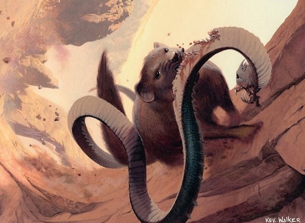
Nimble Mongoose by Kev Walker
Different camera angle and a ton of motion in the scene? That’s exactly what I want to see in a mongoose. They dance and yap around to mangle snakes. Turn your head upside down and you see a different scene, still working and innovative in its approach. Kev is a known creator and even he throws a couple curveballs for us who like to analyze art.
Sengir Autocrat
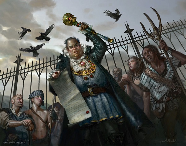
Sengir Autocrat by Aaron Miller
“Is this a good card?”
Well Aaron, it’s more of a fun card for niche Commander decks.
“It’s not a good card.”
Grand Prix events allow you to play Magic at an incredibly high level, play the weirdest formats , and do everything in between. I like going to see artists, and, most importantly, just enjoy a meal or a drink with them. I see them as guests and in any city I visit. I immediately check the artist lists to see who’s there, and what the artists are doing. At GPMinn, the local contingent of Minneapolis players booked a balcony at a local irish pub. It wasn’t because we wanted privacy. No, it was an easy, nearby place for artists to join us. Now, we couldn’t buy them a drink, but just relaxing with some known associates and hearing artists talk about the event, soak up some local flavor and talk about the cards they received recently or projects they’re working on was enough. They’re incredibly interesting people. Setting up interviews or promotions of their work or even social media planning? That is where it happens. Or we let Aaron know while the card isn’t good, his art was stellar!
Notice that the token has a beard where the other serfs in the normal art don’t. It’s a different shift in storytelling and a sad state of affairs to see fences in both scenes.

Serf token by Aaron Miller
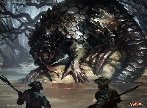
Tooth and Claw

Tooth and Claw by Johann Bodin
This art is such a phenomenal upgrade. The creature is unique, strange and interesting. The lighting has two sources, both of which are executed well. I like the storytelling of the investigation and I love seeing rock formations used to frame a scene. Howltooth Hollow and Kessig Wolf Run immediately jumped out to me when I saw this art.
 |  |
And the fur! Johann took the scene to the next step, repainting the semi-circular trees and giving us the single light source to show us the beast. This is a lovely token. It’s weird, sure, but the execution cannot be ignored. It’s dark at the base, giving us a pop of color in the center, a light source surrounds the figure and two trees frame the token. It’s already framed before it hits the card! The focus level is astounding and, as tokens, they should be instantly recognizable!
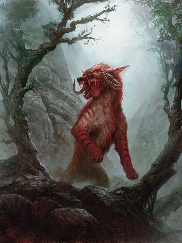
Beast token by Johann Bodin
Roots

Roots by Scott Murphy
Roots, like Seal of Strength and Seal of Cleansing below, fits into the area of timelines. Either the spell is happening, like in Roots. The spell happened, like in Seal of Strength. Or the spell will be occurring soon, like in Seal of Cleansing.
The original Roots was the after effect and both seals were in progress.
Changing the timing is art history theory. When you should show a figure and how you should show it depend on how well you could pitch the idea to the patron. From portraiture showing a seated figure to Las Mininas below, showing the act of painting became popular in the late renaissance. It was also way more difficult and paintings grew in size from inches and centimeters to feet and meters.
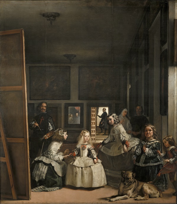
Las Meninas by Diego Velázquez, 1656, oil on canvas, 10′ 5″ x 9′ 1″, Museo del Prado, Madrid, Spain.

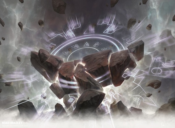
Seal of Strength by Noah Bradley
Seal of Cleansing by Noah Bradley
Werebear
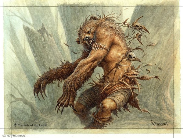
Werebear by Filip Burburan
Ant Tessitore and I already talked about our lovely preview card in our Snacktime podcast episode with Yichao. For those of you that missed it, the “bear arms/bare arms” flavor text was removed likely for international translation instances like the German one, needing to be rewritten as:
Er dient nebenbei noch als Anwerbaer.
Lovely bear arms by Filip. It looks like moss or the exterior of a tree. His work is so dark fairytale to me, bright and stark compared to the limited Grimm depictions I grew up on.
Mogg War Marshal

Mogg War Marshal by Jesper Ejsing
What can be said about Jesper just killing the details here? From the nails on the club’s skull, to the raccoon pelt, and the homage of the crown to the original gangster Goblin King. What sets apart the good from the great is when you look past the “everything looks right here, this checks out,” and stare at the fan service.
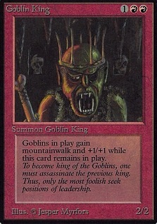
AND DID YOU SEE THOSE GLASSES?! The Foglios would be proud.

Humble

Humble by Chris Rallis
“No”, I said to Chris, “the scepter there was not intentionally painted to be Isochron Scepter.”
Though, I love the idea that people are looking for Easter Eggs. Not everyone goes full Steve Argyle, hiding things in paintings.
I do want to discuss the art description though. So, in looking at this, a White instant spell was originally intended to be the Planeswalker Serra humbling Radiant the archangel, on Serra’s Realm, a plane made entirely of White mana, shown below.
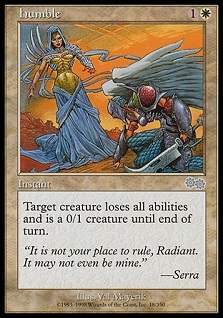 | 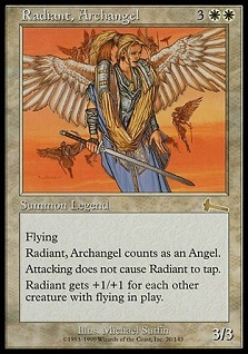 |
Talk about a radical change in art description. Now, this is a trap set by White magic to protect an artifact? How weird is that? White protects artifacts? Since when? Oh, yeah, it’s kind of White’s thing to protect from creatures. There are four auras that do that. Also, Relic Ward does indeed, exist. Moving to the idea of a protective cocoon around an artifact is a great next step and a new concept for Magic. Clever. Maybe we’ll see that design space expanded sometime soon, like oh, a set on Kaladesh.

Firebolt
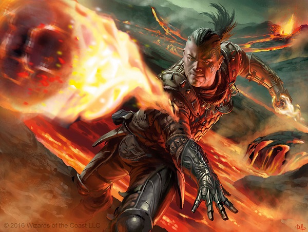
Firebolt by Chris Rallis
I love me a strong gauntlet. Despite Wizards’ not using character tropes often, occasionally we’ll see “high fantasy wizard hat” esque items make their way onto cards. I like when we’re given a little treat, like a little cayenne on your corn on the cob. I see what you did there. The character isn’t needing to be “shiv firebolt master #7” but rather, “make a guy look cool with fire coming at the viewer.” It feels open ended and the minor choices can really breathe. Like seeing a gauntlet.
Sure, the blur is real on the piece though I don’t really mind it here. The character is so interesting looking that I want to examine everything he’s wearing. I can imagine cosplayers are loving his look.
Ghitu Slinger

Ghitu Slinger by Clint Cearley
This is digitally painted but traditionally applied. Check out the thick brushstrokes on the finger point and on the “wheel spoke” center of the whipping sling. Normally the sling’s past movement is just blurred digitally and, traditionally, you’d paint some darker lines to show past movement. Clint here blended the two to create a beautiful effect that maximizes traditional knowledge while cutting no corners digitally.
Nice huts back there huh? I wonder where they are. Dominaria is my bet . . .
 |  |
Goblin Charbelcher
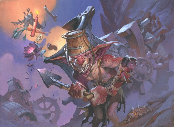
Goblin Charbelcher by Jesper Ejsing
If you ever see a light purple in a Magic card, you should immediately think of three people: Jesper, Paul Bonner and Steve Prescott. All three of them don’t use black but rather utilize a darker purple for horizons. It’s not liberal usage, but if you had to guess, think of those three first.
SnackTime mentioned an Easter Egg here, with the helmet missing a piece from the sketch to the final. A mox was removed.
As for whimsy, this could be a holiday promo and it would work. This could be an “un” card, and it would work. We don’t always get treats like this, reminding us of the days of Foglio but they do exist. You just have to look for them. Sometimes, you don’t have to look hard, like here.
Emmessi Tome
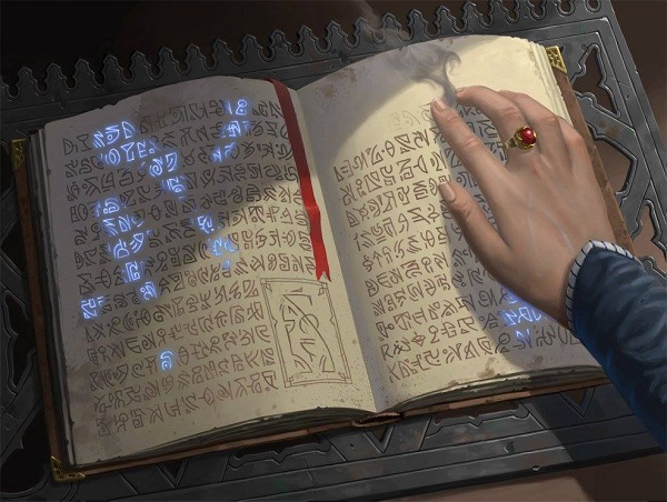
Emmessi Tome by Craig J. Spearing
I love runes in art. They’re just such an open ended assignment for artists to fill in. What base do you find to deviate from? Sumerian? Hebrew? Stargate SV1?
Check the veins in the hand. Great work by Craig to have faint blue coming through the blood vessel, especially having done so digitally. That can be easily skipped if you haven’t the time to finish a piece.
Ticking Gnome
Ticking Gnomes by Wayne Reynolds
I did call Conspiracy the Professor Layton and the Curious Village set, though some of the artworks that have been popping up in Eternal Masters feel similar. It’s hard to tell if this art meant Eternal Masters has a deeper setting, or they’re just fun and we’re looking too far into them. Determining what art was used for a different intention is impossible with so much of it being new.
Instead, let’s celebrate that Wayne painted this traditionally and realize that whimsy is not lost in Magic today, far from it! You just have to look for it.
Goblin Trenches

Goblin Trenches by Filip Burburan
I like Filip. He and I worked together back in the day. He painted Warhammer stuff for me and I loved being able to commission a traditional painter. He’s a delightful man.
In order to talk about this art, I have to show my bias and also explain a key aspect about reprinted cards. Art descriptions change and radically impact your future interactions with the painting.
Take a look at the two images:
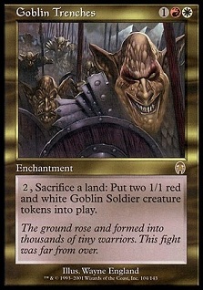 |  |
Two things radically change the image. The border keeps the image either darker or lighter. In black and white photography, you basically default to white unless you need a little drama or you need to contain the image. If you have a snowy scene, having a white mat makes the image bleed away into the mat and then leaves nothing.
The old set of Goblins are basically dark image with a dark border, and they’re marching. By changing both the border frame color, choosing Filip, and adding the trench in the art description, you radically alter the meaning. It’s more of a photograph vs. propaganda. It’s an intentionally dramatic piece. Wayne England painted you attacking with a ton of Goblins whereas Filip painted the act of sacrificing land for troops, pulling from World War I trench warfare . . . Counterspells often change the meaning from pre, during, or post spell fizzle in art descriptions in a very similar matter. This is how art direction changes meaning. Fun, huh?
Moving to its token, we see the minor red explosions become the focal halo around the main Goblin character. His limbs are elongated and his armor is extensive for a Goblin. They generally aren’t encumbered like orcs. I like the direction. It feels right.

Goblin Token by Filip Burburan
Nausea
Nausea by Will Murai
His sock game is not strong.
This reminds me of college, taking off our track spikes since we didn’t wear socks. We put baby powder in them to keep the moisture out. Slipping in your spikes, turns out, tends to annihilate toe nail when you do hurdles. They smelled like rotting leather in no time. It was awful.
Lovely work by Will in making the stinking cloud have a life of its own. It could be mere smoke and instead, it almost seems like a moving spirit. He could’ve kept it simplistic. Instead? Instead, there’s a lovely movement in it.
As for the two other humans, want to take bets if you search through his Facebook friends you’ll find these two people? Their hair is too intentional to not be people from reference, you know? I have a friend who was a reference model for Terese Nielsen in a painting. He now owns it and it is awesome.
Counterspell
Counterspell by Zack Stella
This is a traditional painting.
This is Counterspell.
And yes, that is basically a self-portrait of Zack. Imagine it with glasses and you can see the resemblance. That reminds me of Aleksi Briclot painting himself as Tezzeret and then later that Planeswalker being made.
This is one of those images that just seems so different from previous printings that it’s slightly off-putting. Zack has already heard feedback. It’s not that it’s good or bad, it just differs. If they do reprint this anytime soon, this is likely to be the version. It’s memorable due to the blue starburst and rather memorable by itself.
Stupefying Touch
Stupefying Touch by Greg Opalinski
Card size!!! *shakes fist*
Always with the 2x3” card frame. So much is lost. You can see the homage to Jace by the woman’s dress and you can roughly see where they are located; but, it’s hard to tell.
With a larger image, you can see the skyway/skywalk in the background. What plane are they on, Ravnica? Dominaria? That surely doesn’t look like Ravnica. It’s too traditional and the characters don’t lend themselves to guilds other than Azorius and Gruul, I suppose? I would guess Dominaria.
I see some lovely painted realistic hair on the woman. It feels very anime inspired.
Force of Will

Force of Will by Terese Nielsen
What else can be said about Terese being able to remake her arguably most iconic painting for Magic? Well, the alterations for years will be circular in nature and just lovely to see.
You noticed that she has long nails too, huh? She got ‘em did and no fire will be affecting her tonight. She’s going out.
Prowling Pangolin
Prowling Pangolin by Tomasz Jedruszek
Upon first look, this really does look traditionally painted based on the size of Tomasz’s brush setting. Real life pangolins are critically endangered and like other mini mammals, you just want to pet them. Would not pet this biggun’ though.
Notice the hats on the figures, they’re probably on Innistrad due to the three corners. Neat!
Elvish Vanguard
Elvish Vanguard by Steve Prescott, 12x24”
I recall having seen the painting before but couldn’t remember where. This painting was shown at Illuxcon in 2012 and the painting is enormous. Good catch by Drew Rosen to recall the cropped image from the larger painting. It was made for Duels and you can best believe, since it’s been made into a card, the original painting will raise in price exponentially.
Isn’t the little owl lovely?
If you really dig the image, Steve will be selling prints at GenCon and GP Dallas of this. It’s big and well worth checking out!
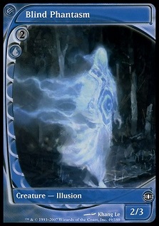
Phantom Monster
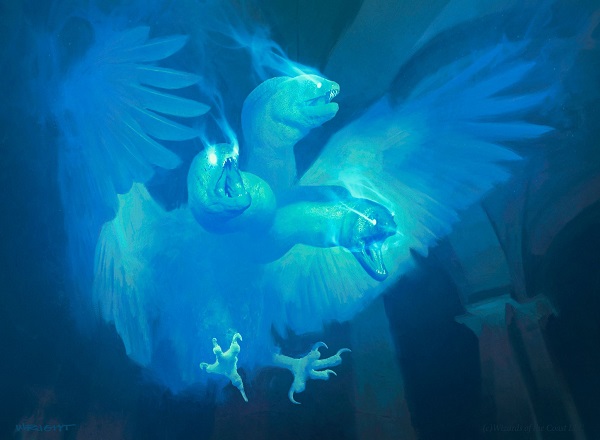
Phantom Monster by Richard Wright
Ghost? Illusions? Eel? Eagle?
It’s all the things? Yes?
The depth in the piece is rather impressive for using just the color blue. We don’t see many Blue cards that are all blue anymore. That used to be Red’s rule and has disappeared from common usage.
I love the strong visual connection to other illusions like Blind Phantasm, which also took my breath away when I saw it for the first time. It felt like Magic yet it wasn’t. It was a new direction.
Sensei’s Divining Top
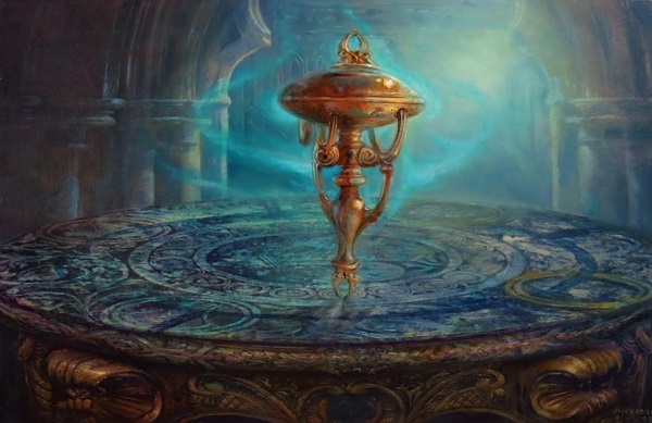
Sensei's Divining Top by Rob Alexander
This is traditonally painted.
How can you tell? Check out the turquoise wisps of magic . . . They have weight.
It also reminds me of a lovely looking Foucault pendulum, which, if you’ve never seen a giant one in action, you should take a visit. They served a simple purpose, to show that the Earth rotates. Now, they’re like an ancient medical device: it looks cool but its purpose is largely irrelevant and new creations are just for opulence and extravagance.
Giant Tortoise
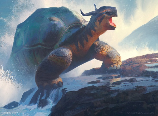
Giant Tortoise by Richard Wright
I loved this derpy turtle in the draft. It was a house to protect the U/W flyer deck. I just kept chuckling, thinking about those tortoise gifs where they’re eating strawberries. He even has his mouth open!
Coloration sure is nice. We don’t get to see a ton of orange in fantasy creatures. No, really. Try to find the color orange on creatures. Most of the time, it’s with fire and that’s about it. It’s just not a common color to utilize. Great work by Richard, making a lovely little waterfall with a big ol turtle hanging out atop it.
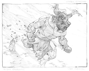
Carbonize

Carbonize by Lake Hurwitz
Check out the flames behind the minotaur. That doesn’t look digital, does it? His digital brushes are nice, sure. His knowledge of how acrylic paint can look is rather impressive.
Checking on his web store, you can purchase his original sketches, which he makes in pencil. You can also see the “B side” sketch he submitted as well. Not all artists will show or sell that work, so consider it an interesting idea and wonderful framing option if you get both.
 |  |
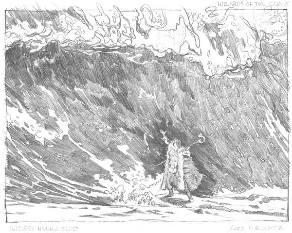
Hydroblast
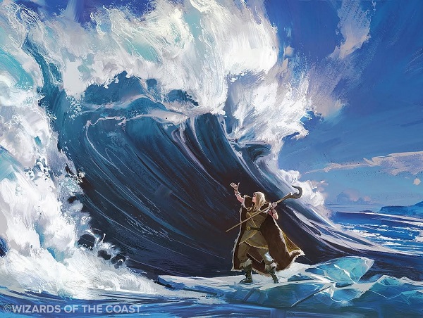
Hydroblast by Lake Hurwitz
Check out the white waves cresting on the left and top. HE IS PAINTING DIGITALLY. THAT LOOKS LIKE TITANIUM WHITE BUT IT’S A COMPUTER. Sweet baby Jesus does Lake not get the respect he deserves. That is incredible reference, applied to a fantastical pinnacle and painted in a medium you don’t expect. That said, his sketches will exist for a very short amount of time on his website. I’d hurry.
The sketch gives us a view into the original “wall of water” view, which is very 1990s Magic. I like the direction they took instead. It gives it more motion, as a counterspell should.
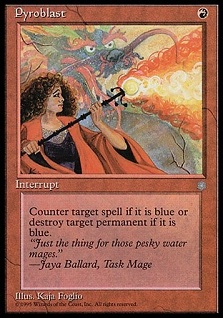
Pyroblast
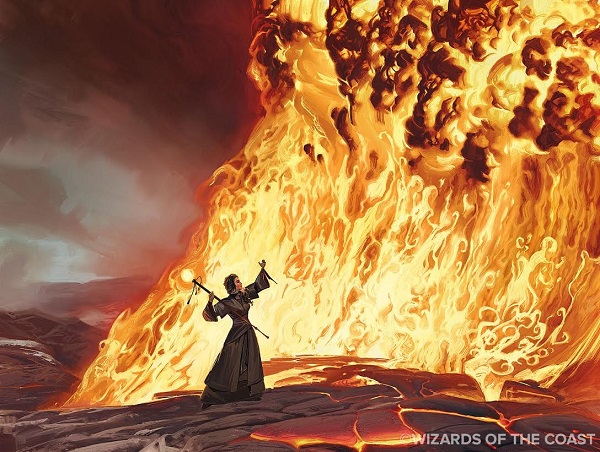
Pyroblast by Lake Hurwitz
You noticed that Lake used the same staff that Kaja painted, right? Of course you did. You’ve got a great eye for art details. Lake is getting on Howard Lyon level of integrating the past into his work, from Foglios to the original Wall of Water. That level of detail is excellent for fans like myself and keeps artists from copying an older piece by accident. (This happens in other TCGs, I won’t name examples.)
The focus is on the bright hot lava, complete with the correct reference coloration of the dark crimsons and maroons at the crest. I keep looking at the left and bottom to see a volcano and wonder why this Red mage is protecting itself from a Blue aligned spell, near a volcano. Ever wonder about that? What Blue mage would go there? Dead ones.
Void

Void by Jakub Kasper
“Oh biscuits”
It’s really hard to see his eyes at card size, a lament I often repeat. It’s impossible to see the blood explosion splattering on the throne, which is amazing. It feels very Cthulhu inspired to me in that sense.
What a fun little image. The more I look, the more I find. You see the pants he’s wearing have symbols on them and he’s going to drop his goblet too.
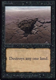
Sinkhole

Sinkhole by Jonas De Ro
Recall my theme of Eternal Masters feels like a core set. Also, check out the limited color palettes? Bingo, we’ve got another.
It turns a traditional trope of “land being destroyed” on its head. We don’t look down, we look from within. You, as the Black mage casting this, are *in* the hole. You’ve already been hit by a Wasteland and you figure, at this point, why not go all in and destroy the land and settlement entirely? Oh Black, you’re such a selfish design.
The piece features incredible lighting which makes your eye move from middle to bottom right, then arrow back up to identify the light coming from the top right. That’s skillful work!
 |  |
A lovely set of cards this go through. Let’s hope the next time they do a reprint set, we’ll have similar amounts of new card artwork!
A few images could not be found in any capacity online and artists could not be reached. Apologies if one of your favorites could not be included.
Buy this art soon before it skyrockets in price, especially the foil versions!
-Mike