


Hi, I’m Mike. I’m the art-beat writer here at Gathering Magic, and today, I’m going to be reviewing the art of Oath of the Gatewatch, Magic: The Gathering’s newest expansion set.
The set delivers on feeling more like Morningtide than it does a third set condensed down into a second set. The Lorwyn/Shadowmoor mini-block transitioned to Shadowmoor/Eventide really oddly and lost a ton of people because everything went weird fast. Established visual norms radically changed, and while that aurora shift from day to night was storyline-intentional, it was also at the same time as Planeswalkers while still having oodles of overprinted Coldsnap sitting on the shelf. It couldn’t win with all the random crap going on.
Oath of the Gatewatch, I’m happy to say, has righted the ship on the two-set block, and by introducing pivotal events, or pivotal moments, it has allowed a story to weave into a set without making a hundred cards show Gerrard of the Weatherlight eating lunch. The art book has encapsulated the story incredibly well, and for those of you used to modern kids’ media, pivotal events translate to TV and movies with ease. I see what and why they did that.

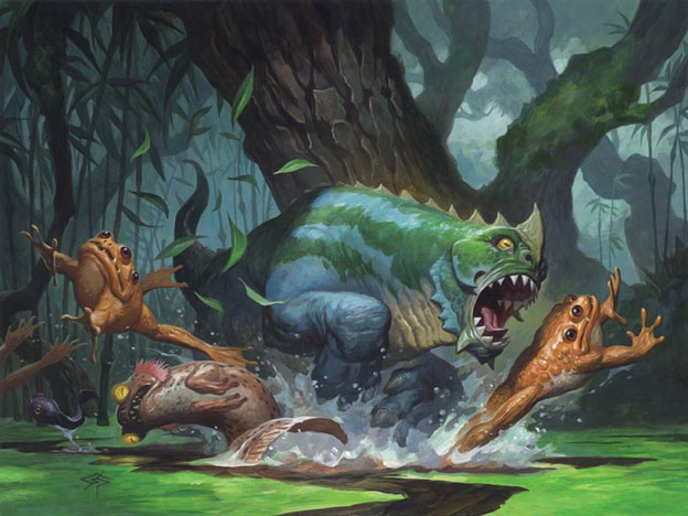
Call the Gatewatch | Art by Yefim Kligerman
I hope we can learn a thing or two and enjoy some parts of the artworks you may have missed, such as the intentional omission of blue or green. Read on, and let’s look at the visual culture of fifth Zendikar set.
Visual Identity Overcorrected
I mistakenly said in my Battle for Zendikar Art Review that:
I thought there was visual diversity. I was wrong because I was looking from my perspective—as someone who stares at art all the time, I felt there was variation. Boy was I wrong because I didn’t think it through.
You see, my wife used to work in a low-vision lab at the University of Minnesota. They conducted experiments with new technology to help people whose eyesight and quality of life couldn’t be aided with glasses, contacts, or surgery. They were trying to improve quality of life for people with braille, the elderly, and for those recovering from a concussion, among the thousands of other segments of research. My wife and I argue over color theory as being confusing in everything from toys to restaurants and why testing Magic for the colorblind and low vision should absolutely be a step in the art-direction process. We have consultants at the university whose only job is to help with accessibility and study things in the field. As far as I know, gaming doesn’t have any policy or processes to aid these affected people.
Then, I read this:
Art direction can affect accessibility - it seems that Kozilek is bringing in the color and sharper lines - Ulamog drained everything gray.
— Adrienne Reynolds (@DreamtimeDrinne) January 17, 2016
Adrienne is one hundred percent correct.
While Ulamog made sense to consume the land—making it gray visually—it also decimated visual recognition for those who would actually benefit from color. This seems nonsensical, but it’s such a simple fix—it could be a mindful action, and we, the player base, would never notice.
Seeing Ryan Pancoast’s palette of browns, blues, and grays, he created a wasted-away structure and landscape without even needing to show hedrons or much in the way of floating buildings. He did it quietly, and I see more Dust Bowl remnant than fantastic landscape. I think that’s a good thing, but as for visually making it easy to see, this artwork struggles.

Corrupted Crossroads by Ryan Pancoast
From the uniformity of Battle for Zendikar and a few pieces of Oath of the Gatewarch, Kozilek’s presence overcorrected the color imbalance to show that the Eldrazi differed by brood, but in doing so, these new Eldrazi in the future will be impossible to know what set they’re from except by the new card border versus that of the original Rise of the Eldrazi. The usage of purple blends the old and new.

Immobilizer Eldrazi by Svetlin Velinov
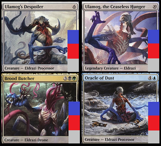
The rainbow colors are everywhere in Kozilek’s brood, but look closely: There is blue in the backgrounds of Kozilek-aligned illustrations, but those aligned with Kozilek have no blue on the creatures. They go straight from green to violet. Strange, huh?

If you go back to Ulamog’s brood, there is no green. If you remember Kozilek's Sentinel being green in Battle for Zendikar, you’ll compare it to Ulamog and notice Ulamog’s blue arms more vividly. It’s making factions more visually similar. It’s just hard to see over dozens of cards by different artists.
This brings us to Warping Wail.
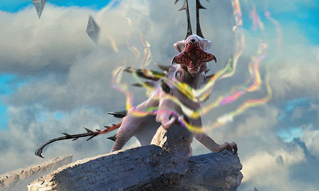
Warping Wail by Jason Felix
Warping Wail is already comically known as coming out of the Spore creature creator, and it’s not wrong. It does look mega-digital, plastic, and in no way a creature of a world. It’s a thing and just looks strange.
The Eldrazi were originally intentioned to be unimaginable horrors, unable for us to comprehend, akin to H.P. Lovecraft’s eldritch horrors. This worked out all right until we saw giant, very designed tentacle monsters. Most of Lovecraft’s stories build up the horror by the human mind trying to comprehend—the monster comes, and the story ends.
Eldrazi started as this, but the situation changed: “Oh, these things are everywhere, and there are little ones.” Call of Cthulhu’s entire franchise wants to be horror, but it becomes muddled in having little baddies you can kill, and that’s where it deviates to fall flat. Another tentacle thing with a weird name you need to kill in Arkham Horror is fine, but, “When do I get to fight Cthulhu?” I will be looking at every Draft with Eldrazi, needing to check if it’s Drone or Processor and what power and toughness the Eldrazi has. I can’t tell by the art alone. If I see a bear, I assume it’s a 2/2. When I see a Dragon, I assume it’s a 5/5. When I see an Eldrazi, I have no idea whether it’s a 2/3, a 3/2, or an 8/8. Misplays will occur because of this, and I think that’s avoidable.
Even fantastic Eldrazi depictions, like one of the best Kozilek-brood depictions below in Reality Smasher, struggle with knowing how large and what their ability actually does.
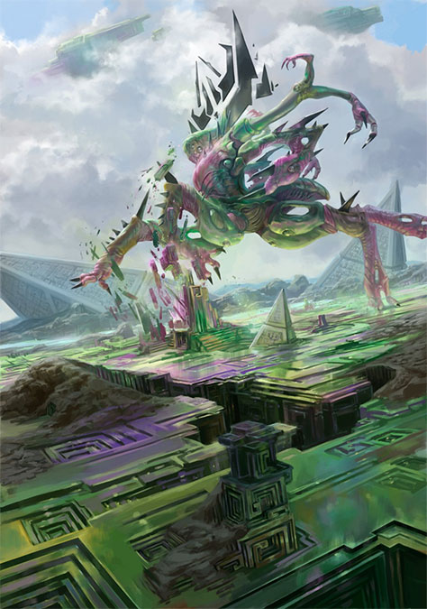
Reality Smasher by Jason Rainville
The depiction, I think, in this case, is supposed to be confusing.
Kozilek’s brood bends gravity, time, and existence itself, and this artwork attempts to confuse you. The more I stare at it, the more confused I am as to how the bismuth actually is corrupted or created by the Kozilekians. That is actually correct, from a world-building perspective. Great work by Rainville, as usual.
After doing a few dozen more images, I came back to this artwork, and I remembered where the sunken hedrons were from in the background. It’s the style guide from Mark Tedin’s mind.

We went from purple Eldrazi in Rise of the Eldrazi to gray ones in Battle for Zendikar—which were difficult to differentiate—and finally to Oath of the Gatewatch’s rainbow/bismuth-colored oddities. It does make me wonder, were Emrakul to have her own set, what the visual identity would be. Since the block went from three sets to two, I can see some visual inconsistencies that would be inherent in any great shift like this.
Art Fumbles, a Twofer
I’m not a huge fan of pointing out things that are bad or worse in artworks, as most artists know something went sour. That said, even great running backs fumble the ball from time to time and are still considered great.

I’d like to change the conversation of an artist who didn’t try hard enough to a variety of outside issues resulted in a subpar creation. The argument that “the artist didn’t do it well enough,” is lazy and nearly always wrong.
When you have three or more commissions, your focus as an artist will invariably be elevated for one of the pieces. Maybe the rare takes more of your time, or perhaps a dragon’s head just doesn’t look interesting enough for your liking and your grandmother also passed away that week when your dog also got off its leash. Life happens, and while you’re in the office, most folks will forget, and everything is fine. With art, the work created lasts in this game forever.
I hope to illuminate a little here and show that not all issues have one source of frustration—often, there is a multitude of reasons.

This art is lovely and by one of the great artists, Matt Stewart. The art itself totally works for Zendikar, the figure is properly painted, and the elemental creature is interesting. What is a shame is that on our hunter’s chain are shards of Eldrazi aligned to Kozilek. That makes no sense.
Since art descriptions were written months ago, we have to assume they were originally physical shards of obsidian. According to the Uncharted Realms story “The Rise of Kozilek,” “They weren't objects, or even shapes—they were holes in space.” We also read on at “Retaliation of Ob Nixilis” that these shards were “tearing through the ground.”
Are these shards actual physical manifestations, obsidian, or are they holes in space? You can chain up holes in space? Poor Matt Stewart was just following his art description, and an art director didn’t touch base with the story team on this piece. It’s a miss—nothing more, nothing less.

As for Kozilek, I mentioned in “Eleventh-Hour Art Changes” that he was probably a change from another card and sources confirmed that, yes, Aleksi’s art was originally not Kozilek’s actual card but rather a spell. Also, the “Oath of” Planeswalker series could be Kozilek, and they were all changed late in the game. That would explain some of this, especially after Mark Rosewater hinting at that on his blog.
Was Alexi's art originally Void Shatter? Perhaps, but it doesn’t explain why the Jaime Jones Kozilek wasn’t used, which I would argue looks better at card size. Changing art from the original commission creates weird issues. It’s uncommon to have such major changes on prominent cards, but with moving from three sets to two, bumps occurred. You just have to look closely to see some of them.
Standout Pieces
I’m happy to say that the Snack Time with Mike and Ant podcast, the co-podcast production by Ant Tessitore and me, will be covering the set, card by card, discussing their art and flavor. I have a small novel of art notes, and Ant worked on the flavor and naming team for the set. Instead of writing more than ninety rough pages’ worth of notes, that will, in all likelihood, swim together into being verbose and useless, I’m focusing on only a few really standout images from the set.
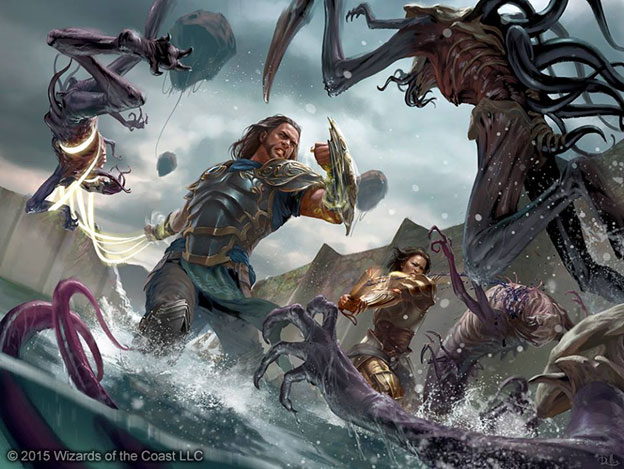
Shoulder to Shoulder by Chris Rallis
Chris Rallis had a ton of work in this set. This piece is one of his best. The art description probably asked for just two figures, so to you storyline Vorthoses saying there should be more: People, relax.
Here are some fun things to see closely:
- Perfect cosplay reference on Gideon’s front plate armor
- An Eldrazi tail
- General Tazri kicking some serious ass against an Eldrazi scion
- An Eldrazi talon (sliver talon, heh) that isn’t fully painted in high detail, so it looks like it’s moving without using motion blur
- A large, centralized Eldrazi hand, showing to us, the viewer, the throes of battle, and the overwhelming feeling
- A busted Sea Gate breach in the background, and we don’t know if they are outside the breach or the Eldrazi are that numerous inside the gate—it’s good ambiguity
This is a hard, hard depiction. I often tell people there are levels of art-making with commissions, and it always involves a horse:
- Figure standing somewhere that makes sense with weight, lighting
- Two figures interacting in a scene
- Two figures interacting in a scene, and one is on a horse
- A figure on a horse is interacting with many other figures
Rallis has two figures interacting with ease here. It’s a hard art description, and he did it flawlessly. This is one of the best artworks and should be a play mat.
Baloth Pup by Steve Prescott
We get to experience utter brilliance, transcendent art capable of winning awards, and setting standards for the entire trading-card industry. And then, we get a baloth who is basically a pupper. I want to pet it a hundred times.
Everything Lorwyn became could’ve been this artwork. Ancient Carp is this art, except you don’t have a pet fish, you have a derpy dog that chases everything outside.
Steve’s color palette is known to be gorgeous, his usage of frog whimsy was exhibited in Lorwyn block, and finally, he gets a perfect illustration to have fun on. If you have a child, this should absolutely be an artwork for your li’l baby baloth’s room.
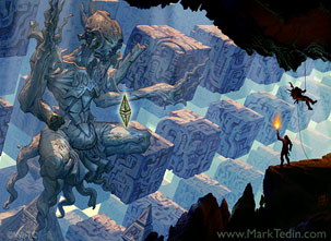 |  |
Eldrazi Monument by Mark Tedin | Natural State by Volkan Baga |
I talked about Easter eggs a little with the Misty Rainforest expedition in my last art review for Battle for Zendikar, and I’m happy they gave us some more visual consistency. Birds of Paradise are in Ryan Yee’s depiction, and that nod and wink to the player base—I’m happy to say—continued in Oath of the Gatewatch with the Eldrazi Monument being destroyed by vines. Fun!
And, in case you missed Cary’s notice of a style guide image of Havoc Sower by Svetlin Velinov, you’re missing out on the nod to Vorthoses who have been paying attention, looking for clues.
If you thought I'd miss an OGW visual cue to random concept art from the first Zendikar, you were wrong. #Vorthos pic.twitter.com/o4bhf4V7TC
— Cary Thomas Barkett (@Vronos) January 13, 2016

Sea Gate Wreckage by Zack Stella
Zack here shows not only the initial impacts of Kozilek’s corruption—bright bismuth—he also shows the soft corruption, which is rainbowed beginnings of the wall. Digital paint does appear to make the bismuth pop quite a bit more, but in doing so, you cannot forget that not all corrupted should be in high-resolution detail. That is brilliant painting, and since I know he started with traditionally painted underpainting, he could finish this piece in oil paint and sell to the highest bidder with ease.
His cloud and water work is strong, believable, and fitting in the scene—they’re details you can really appreciate if you stare at it for even thirty seconds. It’s a simple art description (broken wall, make it bismuthy), but the exquisite nature of the softness and forcing your focus on the break, with delights that unfold to the left and up and down on a vertical scale, make this a much stronger piece than you would initially see. It’s a ruin and would be beautiful in any office because it begs to be explained.
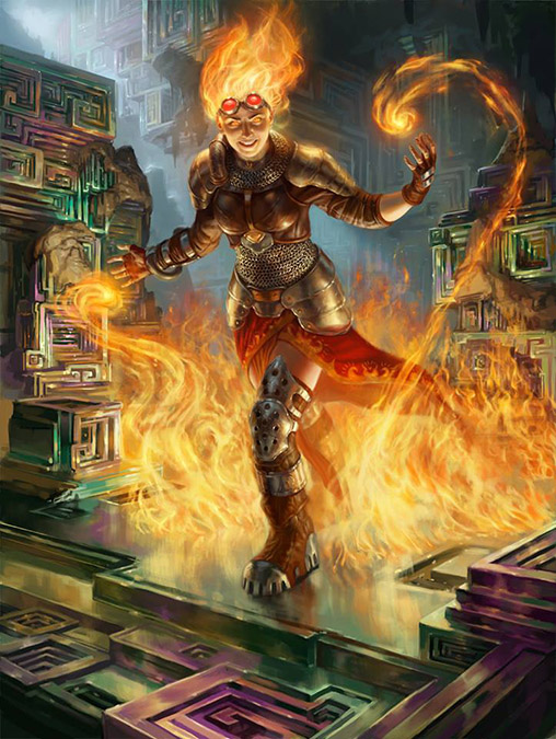
Chandra, Flamecaller by Jason Rainville
It’s the little things that make this go from another unplayable red Planeswalker whose name starts with C to a well-the-art-is-cool-but sort of card.
- Rainville knows how to create realistic-looking humans, and it shows.
- Chandra isn’t 5’10” and 110 pounds—she actually looks like she’s in her twenties.
- Chandra’s eyebrow game? Strong.
- The digital flames in her hands are muted, to showcase her, not what she’s doing. The opposite of strong, and looks great.
- A new ornamental edge of her cloak is notable; I haven’t noticed that before.
- The lighting off the bismuth ground looks correct and reflects nicely.
- The melting of bismuth? Looks like someone found some great reference.

image via cahillbismuth.weebly.com
Jason Rainville has been stellar for Magic in the past year. I’m sure he’ll get a few more women when we visit Innistrad. His ability to show realistic humans with interesting twists on clothing is very welcomed. I hope he has a chance to make some Innistrad inquisitors with cosplay-worthy clothing. After all, we do have a Magic art director confirming what we all want: the hats.
@MarkWintersArt @VorthosMike @ColmDanger @SheppardArts I just heard @GUDoug squee for joy
— Nick el Nutz (@El_Nutz) December 19, 2015
I’m finding that Rainville is pushing the boundaries ever so slowly to improve Magic’s art creation. He brought Magic’s depiction of black humans to a new level, and now, in Oath of the Gatewatch, diverse characters are actually apparent—it’s not just lip service. A dedication to diversity of forms and realism forces the old guard to adapt or be left behind to these young upstarts willing to push and extend boundaries of what is the new and improved normal of artistic depiction.
Original-Art Prices Crash
In case you haven’t seen me yapping on Twitter, Magic original art is selling nearly every day. Most of it is happening at the MTG Art Exchange Facebook group, but eBay is still the steady marketplace of choice for the “names” of current sets. Though, something odd happened as of late:

These prices appear to have sold at more than a standard deviation lower than what art has been selling for recently. By a tune of $500 to $2,000, these prices have undersold to normal realized prices.
Why?
Within the past month, two Alpha artworks have sold, Rishadan Port hit the market and sold for an estimated $60,000, numerous collectors sold dozens of pieces—from minor combat tricks from a decade ago to Arabian Nights and Legends works. Zoltan Boros and Gabor Szikszai also sold the majority of their collection through an art agent, with all art very priced to move. Many didn’t last longer than an hour on Facebook. Volkan Baga’s three artworks in Oath lasted hours after prices were posted in this same Facebook group. Some art is moving, but immediately posting art to eBay is no longer a guaranteed high-four-figure sale.
Art is rapidly changing hands as major collectors are shedding minor pieces from their collections. This has been a boon for people wishing to enter into collecting Magic art and logically atrocious for current MTG artists with paintings in Oath of the Gatewatch. It’s becoming easier to enter into buying original art and cheaper in the low range level, but you can only buy marginal to good art for under $1,000. Great art is always $1,000 or more, up from $500 or more. This is where patronage, getting to know an artist, and actually buying more than one piece from someone matters. The same goes with collectors who focus on subject matter. They may know an artist better than you and have a heads up. The collector then lets you know something is coming because he or she visited the artist’s studio and had some scotch. Relationship building will be 2016’s best course of action—and focusing your interest in a few artists instead of whoever got the bomb mythic that set will be valuable.
I’ll have a longer article on pricing trends soon. Remind me of it.
Concluding
The art is good in this set. It fixes a lot of the issues with Battle for Zendikar’s conformity, and yet, it leaves us wondering where in the hell Emrakul is located. A justice league forms, and interplanar conflict is now real again. Visually, I like the Super Friends concept; I just wish the Planeswalkers would actually wear different clothing to alter their dress to the plane. Cosplayers would kill for that.
We also saw more process gifs in this block, which is a wonderful change. I think we need to see more of those in the future. I’ve attached two that Howard Lyon made for a Muddy Colors post and a pair I made from Steve Belledin’s stellar blog. I strongly recommend reading both of them—they’re incredibly informative regarding art processes.
-Mike
 |  |
 |  |