


There are two arguments—gripes really—I’m asked at every Grand Prix:
- Why is all the art digital?
- Why don’t we see fun art anymore?
The first relates to the shifts that sway back and forth in Magic. Digital art was, roughly around the time of New Phyrexia, so dominant that only a handful of traditional artists were used. This was a full pendulum swing from the Lorwyn block, with a ton of traditional artists. We are now seeing traditional artists again, and with original art fetching potentially thousands of dollars, artists are dabbling in traditional painting.
The other is bit more complex. What players mean in wanting “fun” art is the whimsy.
 |  |
Tens of thousands of players have been coming back from the 1990s and early 2000s, a time when the game’s visual style was quite literally all over the damn place. It had space for digital works, comic line-work experts, and even photographed still lifes! They’re coming back to the game, and it just looks so different. The percentages of serious works are clear, and most importantly, the art on lands and environments are very mechanical; they looked manicured like a Bonsai tree: too perfect and obvious. While conceptual spells still exist, lands simply no longer are able to portray a conceptual environment. They’re obvious as hell.

Limited players need lands to be fully and clearly representative.
Look at the circled colors compared to the purple stars, which have unrelated information. Each card has mechanical colors represented, with some other stuff to fit the current set’s flavor. The Bloodstained Mire is really just a bog. Pull away from the mountain and into a The Lord of the Rings set with Gollum leading the way. As with the Flooded Strand, a strand is really any land next to water. This looks like a flooded valley, not a flooded beach. That’s the difficulty in making something new, resonant, and fun.
I’m not a huge fan of art that needs to be clumsily portrayed to convey the point. Make both colors, and black needs to be dark.
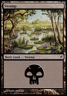
Some of the best lands I’ve ever seen were bucking the norm. This Swamp is utterly beautiful and different. Lily pads in a swamp? Liliana likes lily pads. I see you, Prescott . . .
Let’s put on our art-director hats and look at how Wizards has allowed artists to show nonbasic lands be touched by three colors.

Thanks, Drew!
Since Khans of Tarkir has tri-colored lands, it’s a perfect lens for the phenomenon of “showing the mechanic” instead of letting an artwork tell us for itself. Before we go to the current, we always have to look back to see where we’ve come from. Let’s go!
Tri-Color, the OGs
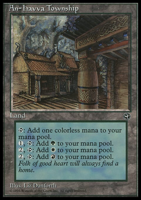
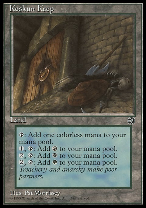
The original gangsters—allowing you to get mana fixing—were, in a word, terrible, like everything in Homelands. What they lacked in usage they made up for in art. Three artists all came to a conclusion that locations were fantastic to create, instead of showing mana or colors that correspond. They look like the Armada comic books that Magic had made right around the same time, with locations and perspectives from above to below. I dig that.
 |  |  |
 |  |
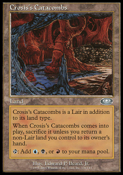
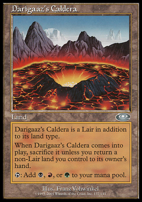
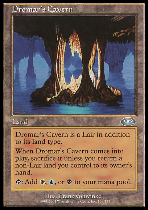
The Dragon Lands
Each of these artworks doesn’t show one of its colors. There are no trees in a caldera, and a cavern has no plains—or grass for that matter.
These are designed bottom-up, with the mechanic first, as needed. Most fetch lands are made like this. While the Dragons were flavorful and reminiscent, forcing a cycle through colors and having an art description match the forced Dragons feels kinda meh. Calderas? Cool. Caverns and groves? Very cool. Ruins and catacombs could be better things.
Speaking of the ruins, check out the actual image that was cropped in. That one is pretty extreme.
 |  |  |
 |  |

The Oddball
 | 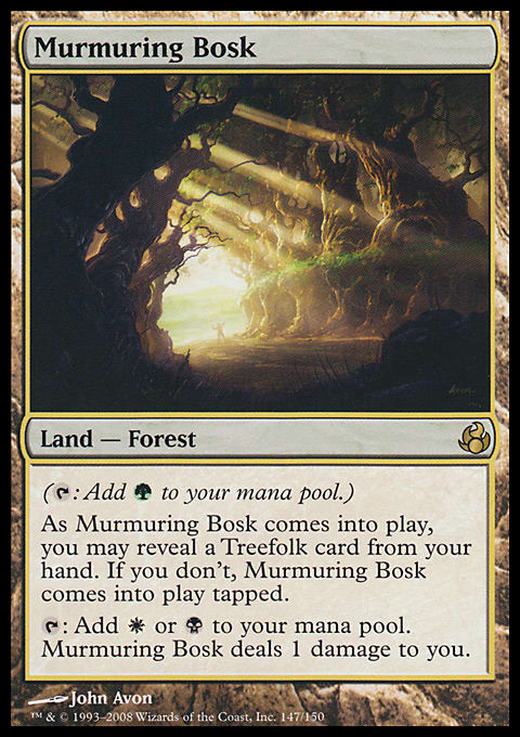 |
I love this singular card. Treefolk in Lorwyn and Morningtide were three colors, and the other “dual” lands had the reveal mechanic for coming into play tapped, but a third color needed a drawback. I love the idea of an instantly useful land that gives you some upside for damage or for blowing it up. It allows Commander players another nonstandard option. I could easily see a bigger cycle of these being revisited in the future. It’s just so clean. It’s a shame Faeries were so dominant then or this might’ve been used a lot more.
As for the art, it’s in a forest, allowing for the setting, with some distant plains with peeking-in light. Add in some creepy trees, and all mana-producing colors are represented. This is a fantastic representation, and it brings us a unique-looking land. It almost feels concept-art- or fairy-tale-inspired . . . showing the Lorwyn/Morningtide setting!
Shards Tri-Lands
These lands set the bar for amazing-looking environments that don’t relate to the mechanical colors of the mana. They brought in some amazing artists, all very established, reliable artists of Magic and the gaming industry. Whoever art-directed these were nervous zero percent for them being completed on time and looking incredible.
Arcane Sanctum by Anthony Francisco
 |  |
| Jungle Shrine by Wayne Reynolds | Savage Lands by Vance Kovacs |

Seaside Citadel by Volkan Baga

Crumbling Necropolis by Dave Kendall
The Panoramas (Not What I Collect)
The panoramas I collect are original artworks of four or more basic lands used in a set in a single painting. A few exist. If you find one, let me know!
What are the Panorama cards? There’s no better source than quoting from the MTG Salvation wiki:
They’re technically fetch lands, but since they work without searching, they’re a fantastic addition to any three-colored Commander decks.
As for the art, notice the Bant and Naya Panoramas. The other three depict scenes of the shards out of the style guide, but these two show the mana without hitting you over the head with it. The Bant version has fluffy white clouds, where angels and white/plains mana comes from. It then has the island and forest mana below the clouds. As such, it isn’t overwhelming you. Hell, I just noticed that there’s a creature in the cloud, and I never had noticed! Donato is a wizard with the brush.
The Naya Panorama has the mountain and forest and, presumably, we as the viewer are standing in the swamp. It looks very constructed, like a tourist trying to take a picture of New York or Paris from the right vantage point to include all the marquee sites. The Naya version is forced, the Bant one is subtle. Using a master artists in Donato Giancola helps, but the concept remains: Show the mechanics if you must, but don’t give each aspect the same amount of space in the card art.
Compare the Bant land Seaside Citadel to the Bant Panorama. Do you see that Volkan learned under Donato? Isn’t it abundantly obvious?

Bant Panorama by Donato Giancola

Esper Panorama by Franz Vohvinkel

Grixis Panorama by Nils Hamm

Jund Panorama by Jaime Jones

Naya Panorama by Hideaki Takamura
The Young Bucks: Khans Triple-Landers
After the shards set the bar, these environments aren’t the industry-leading Magic or gaming illustrators. These are digital concept artists, and the flavor of each’s khan really sets up what it looks like. The mana colors aren’t really apparent at all, and I’m totally cool with that. Unless colors are masterfully integrated, go with just a fantastic landscape, environment, or setting. After all, one doesn’t want a Treva's Ruins crop.
I am less thrilled with creating lands that will be used very extensively in Standard and Commander, and they’re, well, not high-quality art. Mystic Monastery keeps tricking my eye. Do digital artists take less time in placing windows? You tell me.

I find Opulent Palace to be really stylistically similar to the Ancient Ziggurat FNM promo, but that’s more because of color that subject matter. I didn’t think that tan color would ever fit more than one culture. Funny how that works.
Sam Burley’s work looks a lot like Drew Baker’s. Check Drew’s Library of Alexandria on Magic Online, and compare it to Sam’s land here. The foreground focus and the lighting feels analogous to me. It’s a bit off, but it’s worth a look for similar folks!


Frontier Bivouac by Titus Lunter

Mystic Monastery by Florian de Gesincourt

Nomad Outpost by Noah Bradley

Opulent Palace by Adam Paquette

Sandsteppe Citadel by Sam Burley
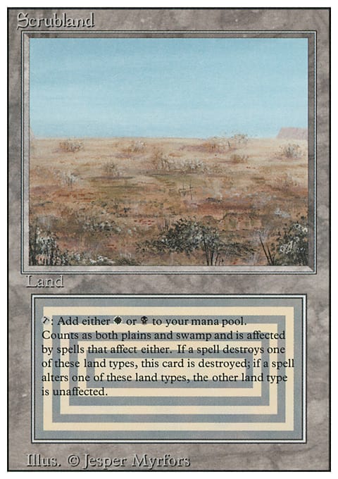
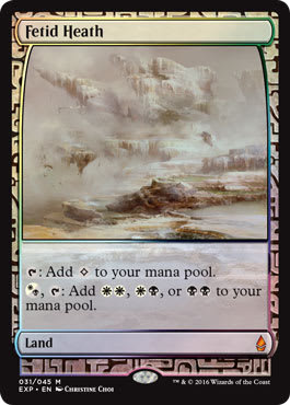
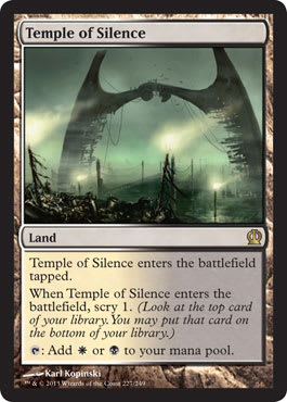
As a bonus, our final art is the best on-color and conceptual art in existence, forcing awkward dark–light scenes for over twenty years: Scrubland.
A swamp and a plain are radically different, and this Limited Edition Alpha art is basically a desert forest. Showing random plants in a desert has forced artworks of lights and darks, such as Fetid Heath, in the past. That’s an art-description issue, folks. Bring in today’s art description in Temple of Silence, and you see greens and turquoises, giving Orzhov’s lands some extra flavor other than just a desert scrubland.
 |  |  |
Enjoy the art!
-Mike