


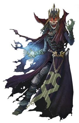
Recent monarch change
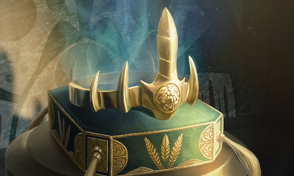
Monarch token by Mike Bierek
It’s such a shame there is a grammatical error on this token. Despite the effort by Bierek, every time you see this image, you’ll think typo, not stiff pillow. I mean, that’s a seriously overstuffed pillow, right? The crown doesn’t even make a dent into it and I see that it’s a pillow by the front right part of the top of the pillow.
It took me looking at this image for a while to see what the crown is reminiscent of. Is it Thundercats Sword of Omens with the curl? Is it Batman’s utility belt? Is it an arm bracelet? I don’t know but I feel like I’ve seen it before yet it’s new. I can dig it. Look for this crown or symbols similar to it on cards that allow you to become the monarch, it’s shown all over the place.
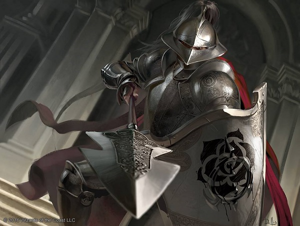
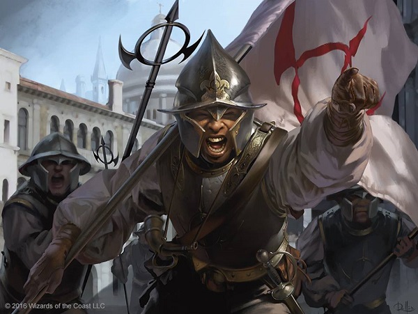
Throne Warden by Chris Rallis
Ant Tessitore, on Snacktime Cast not long ago, pointed out the main piece of this artwork: wet paint. This soldier was hired from a former monarch. The paint hasn’t even had time to dry before being put on duty again with Marchesa’s symbol on it. Oh he’s loyal to whoever is in charge, he doesn’t care what the new colors are.
As for the soldier, I don’t love extreme foreshortening and blur when it isn’t absolutely necessary and here it feels add on instead of fully needed. It takes me out of loving the filigree, the time Rallis put into polish his piece. The columns don’t feel super Italian to me, though the armor sure does. Later in the Italian Renaissance, armor got wicked elaborate. The high shoulder piece, with the big neck gorget? That’s normally for jousting but it isn’t needed, it just looks cool. In hand to hand combat, it’s nice but not entirely all that functional due to the limiting of moment. But boy it looks cool!

Keeper of Keys by Bastien L. Deharme
I love looking at an artwork and the gross thing catches my eye first.
“Man, that’s some nice slime.”
Another symbol of Marchesa’s dominance as she controls the key keeper. It worked for the Matrix heroes, after all.

Custodi Lich by Bastien L. Deharme
What does a lich actually look like? According to Dungeons and Dragons, they’re basically zombies that have showing bones with some magical spellcrafting sort of robes.
 |  |
The crowns and robe silhouette, especially usage of magic, sums up what a lich looks like. Most importantly, liches tend to have dark color palettes and are shown as evil. There have been a good lich or two but the common iconographic elements omit them.
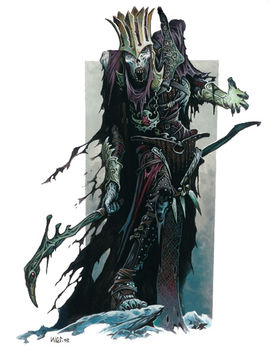 |  |
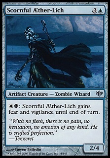
In Magic, they are known as zombie wizards and have kept the pre established symbols, like Scornful Aether-Lich with a robe and staff, or Havengul Lich’s crown and magical depiction.
 |  |
With Conspiracy Take the Crown, we have a new concept, the cleric lich. Having a priest live into the afterlife is rather strange and outside the normal narrative. While Blood Scrivener is the only lich to be found on Ravnica, Orzhov guild members would no question have some lich priests able to carry out religious taxation duties after their death. We have only seen one easily seen woman zombie wizard or lich in Magic and that’s a change to Coffin Queen. Makes you wonder if the Egyptian set will have similar depictions!

This Custodi Lich is a great addition to Magic and relates to Blood Scrivener by the scroll’s scribbles in the art. The claw/finger pointing at us is great foreshortening, the mood background is very Kev Walker and great for the piece. The undescribed face is also a nice touch by Deharme.
As for lore of this card, you become the monarch and in the art, he is indeed wearing the crown.
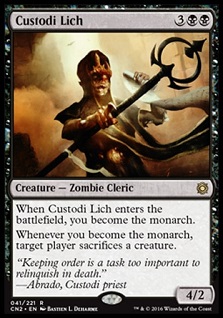
This means that while Marchesa might’ve retained the monarch title, tyrants and coups were constant for at least some period of time from March to August, as we saw the set art change rapidly with King Brago passing away.
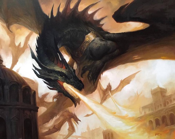
Skyline Despot by Lucas Graciano
Lucas is the new Todd Lockwood when it comes to winged, fire-breathing creatures. He has won a ton of art book inclusions for his dragons, his art awards are far from a few and like other marquee artists, getting “a Graciano dragon” has become similar to having a Rob Alexander landscape for your collection. Sure, it’s a Magic art collector niche, though the greater imaginative realism community commissions him often for covers. He paints traditionally and ability to show depth and roughness, driving focus to a central subject, is rather remarkable with a limited palette.
And yes, the monarch crown is represented by the dragon wearing something around his neck that feels visually similar, tying to its mechanic.
I like how the back creatures look more like drakes vs. dragons, as in Magic, drakes are more wyverns and lack front arms. They still read, at card size. You may think other artists are at the top of their game but you may forget the gems Magic has working for them, just quietly sitting at Grand Prix events. You have to look up close at their paintings though. Always ask to see them!

Marchesa's Decree by Chris Rallis
Chris has a few things going here that are so right. The lighting as being mood filled is fantastic. The focus of the piece being the distance between Marchesa and the prisoner is strong. The age of Marchesa here, showing a youthfulness that makes the “young tyrant” on the throne feel more impactful. It’s an evocative piece, not so much a realistic one.
What I can’t miss is why this piece is so far zoomed out. Let’s compare the current image to my crop below.
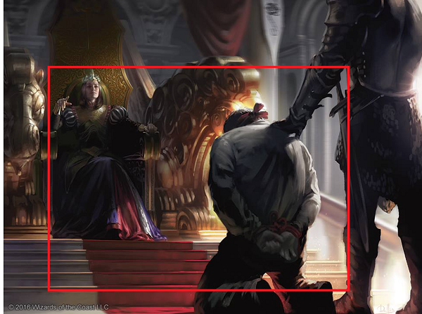
Does it change the meaning of the card art?
Or does it clarify more notably what the card does?
I wrote about cropping on Tumblr not so long ago and while those were comical examples, it is an art director’s choice whether to crop in or not. Some pieces even need a slight turn, to make a piece more dynamic. It often changes the mood of the piece, like it could here but I’m armchair quarterbacking, so take it with a grain of salt. Look for yourself!

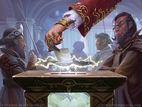
Illusion of Choice by John Severin Brassell
This is a difficult art description as it has four required parts of this image. A voting box, filled with votes, it getting another person vote in it, as there is some sort of election today. Before a vote is chosen, Marchesa, as known by her rings, is getting a vote via a small portal, committing one of the actual rare case of voter fraud. Also in the scene are nobles of a variety of races, being guarded by a single soldier. The scene reads as both Marchesa is getting a fraudulent vote and also that she is submitting a vote that will no longer count.
Are we to believe that Marchesa is cheating the election?
Or is Marchesa being cheated in the election?
Both options have a wonderful storytelling element and no one seems to see or care. Politics as usual, right?

Ballot Broker by Magali Villeneuve
For Game of Thrones, Magali did literally everything.
This is an odd art description for basically, a lobbyist. Wouldn’t she be closer to a ballot counting room or a board room? Instead, this is basically in a church? Check out the archways and light.
And is that a giant sword? Wouldn’t she have a dagger? It’s kind of odd, as in close quarters for votes, a dagger would get the point across better, keeping the broker near the votes. Regardless, Magali paints clothing exceptionally well. It adds to the setting and I’m happy she did it so well because I get to point out that she painted two different floors in the background. Cool, huh?
I tried to find the shoulder amulet in the game, whether it was a quicksilver amulet or something else. I loved looking through cards to find it. It was a fun search!
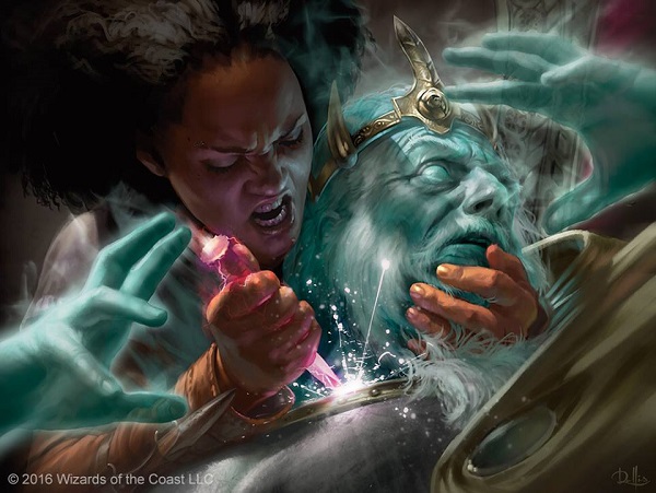
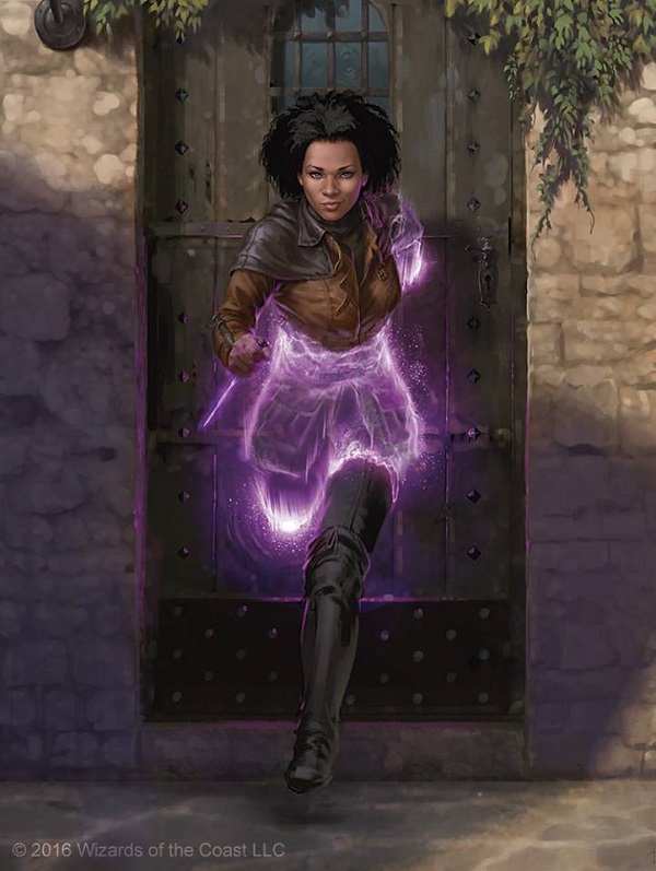
Regicide by Chris Rallis
Magic can show spells as pre, during or post spell resolution. I don’t think this piece could work if it wasn’t during! Were this 1998, we’d need a whole scene. Now, we get a graphic, aggressive close up that gives us full view of details.
Without the tight camera lens, we wouldn’t see the monarch crown up close. Kaya’s spectral dagger would just be a dagger instead of curious whether it’s actually magical or she made it purple like the Dark Crystal shard.

Image via muppet.wikia.com
Noble Banneret by Josu Hernaiz
If this isn’t a reused art piece, I’ll be shocked. It looks like nothing else in the set and right out of Game of Thrones or a board game. So, yes, the background doesn’t look Paliano-esque because there are really two cities there, making me unable to know which one AND a nagging feeling that this art is from another game, made to work here. The hair is also just outrageous. It’s full realism in a fantasy game. I’ll be speaking a ton more on that with my upcoming Kaladesh art review if you want to hear about that, how too much or too little realism can hurt a product.
The horse is really well done. It’s the hardest thing in any fantasy art creation-paint someone on a horse interaction with someone off a horse. The anatomy and painting from reference alone takes years to make look right.
Whimsy

Hymn of the Wilds by Jason Rainville
Isn’t that a nice little mix of animals . . .
Is that a velociraptor?!
WITH FEATHERS?!
A great job on background research by Jason. He added some fantasy and real creatures with some nods to America-bald eagles, to Jungle Book, with the puma, and Biblical Noah with the pair of deer. It’s a nice celebration of animals that are composed rather well considering how utterly odd it would be with all these random animals not eating each other.
Also notable in this pieces is the cool to warm colors from the bottom left and bottom middle to top right, where the carnivores turn into herbivore. That’s a nice touch Jason integrated. I like seeing that little gem. Good work.

Grenzo's Ruffians by Svetlin Velinov
I love this piece. It’s so easy to just phone this one in, putting forth minimal effort as it isn’t a marquee rare or Planeswalker card. Instead, Svetlin gives us a little gem.
He had a ton of fun painting this, didn’t he? The goblins are a random squad that has our favorite with a soup ladel and boot for a hat, sure, and that feels like goblins would do, but you need to see the seriousness of the main foreground goblin to compare. We are looking at goblin Little Rascals:

Image from Universal Pictures
The goblins are all super unique in their personality, from scarred goblins, to eyebrow rings and a difference in wealth. One of them has a nice helmet and then there’s one with plate armor supplemented with brick shoulder pads, and boot gobbo. Maybe some are better thieves, I guess?
A for visually, the larger bulbous nose is in sharp contrast to the normal sharp, jagged nose in Magic’s goblins, which differentiates them visually. They also show age, which you can see from scars, white hair and their weathered appearance. Most other goblins die early and often in Magic’s history like Goblin Bombardment or Goblin Grenade. Odd that they differ.
Final note is the gargoyle in the background. Paliano has them, meaning they know how to divert water in an aesthetic sense away from a roof. It’s Italian and fun.
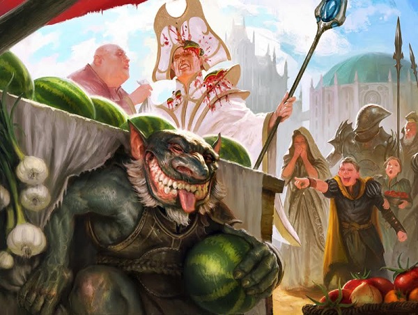
Besmirch by Mathias Kollros
Again with the whimsy.
A stellar art description was made with watermelons is fun and playful. I like the still life aspect of the fruit, garlic and tomatoes. It servces the religious figure right to wear white near a market. It’s rather unwise.
I love the fact that Mathias, a German, snuck in a background dome that reminds me of Munich’s most famous church, the Frauenkirche. It’s the cathedral and everyone knows what it is.

Image via traveladventures.org

Grenzo, Havoc Raiser by Svetlin Velinov
Yes, the goblin hanging from the chandelier is pretty good, sure. I love the minor details. A goblin is stealing books. Why would he do that? It’s probably part of the art description as that’s a pretty odd inclusion for a goblin, even a smart one.
The lighting is a little weird, as it’s forced so we can see the figures. The little tripped goblin on the right has no reference light, but it’s a minor nitpick.
The triumph of this card is showing goblin’s who have aged. As they’re impulsive little idiots, seeing older goblins is more rare in nearly every game. Here, we see Grenzo from another angle and his still receding hairline is honest. The little goblin in the bottom left is having the same issue every man over thirty begins the deal with. That’s delightful because it shows that Grenzo takes care of his own, and goblins can have some sense of security that they will grow old and won’t need to become bombardments, yoloing for the win.
Lovely faberge eggs Svetlin included too.
Burgeoning by Titus Lunter
If you don’t live in Minnesota, you might not have ever made a trip to the Mega Mall. Oh, rural folks call it that, or the easier name, the Mall of America. The theme park within the Mall of America was sponsored by Knott’s and called Camp Snoopy. It had this old-timey Magic/children’s literature feel mixed with Minnesota’s Charles Schulz’s cartoon brand, Peanuts. This artwork by Titus is straight out of that genre of imagination. It’s playful and bright, European at a broad level.
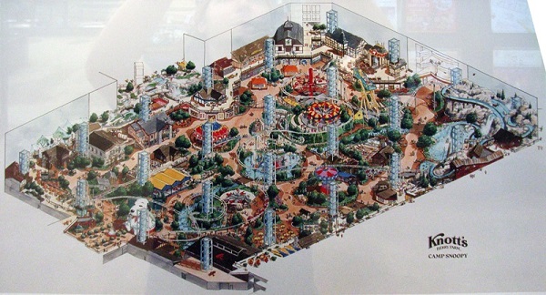
Image via themeparkreview.com
This storybook image is a Selesnya world, but uncontrolled and unplanned. As if a new guild and religion took hold in a town. It’s so sudden that the man in the window is going to have a very bad morning. That's some cute humor added into the work, I like searching for those and being rewarded for looking closer.
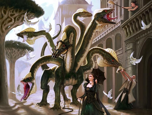
Domesticated Hydra by Mathias Kollros
Remember the whimsy I mentioned from it being an un-set? Check out the right side priest getting his hat stolen from the derpy hydra. It’s a minor addition that not all sets are allowed to include.
This is a digital work though the ground has a softness of using a limited palette of browns and white to it. By adding white to a color, that is called adding a tint. It becomes less saturated in color, or less intense. Conversely, adding black is adding a shade, making for a more intense, darker color. It’s a lovely dirt ground with pillars that balance the softness. This is a really insightful piece into the set, as we see pigeons, the mosquitoes of Europe, well manicured trees showing wealth and domes in the background, placing it on Paliano.
I’m not sure I love the victorian woman in front, as it fights the Italian theme of the set, but if a woman travels to London and wants to bring back some flavor, good for her. She looks like a boss.

Coveted Peacock by Christopher Burdett
Chris talks about the peacock a little on his blog. The tail is just phenomenal, blending turquoise in front of really delicately painted purple, orange and yellow clouds. It’s a lovely piece.
Again, there’s a tower in the background. It places them and yet it doesn’t in this case. I like it to fill out an image the more I see them.
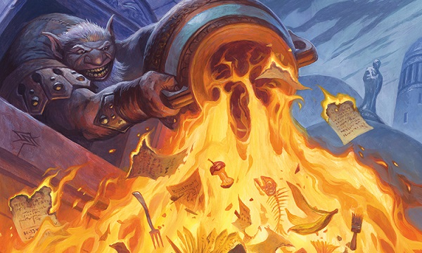
Garbage Fire by Steve Prescott
When I see Steve’s art, I recall back to 1990s whimsy fondly. He enjoys including little comical details like the apple, fish and fork in this painting just like he did with Baloth Pup. In that piece, the areas in Green aren’t really needed for the art but add to the art experience by allowing some fun, some deeper flavor into the piece. Garbage Fire is no different.
 The name is also fire, obviously, with Garbage Fire giving us some insight into the culture of Paliano by Steve showing us a statue in the background. Normally, figures atop buildings are saints, religious figures and such in medieval cities. It wasn’t until much later did philanthropists or just political influence could a railroad baron get a dedicated space in a city park or atop a building. I would assume that’s the Italian influence from world-building as Paliano isn’t exactly a religious city. Also notable is that the garbage has documents in them. Maybe decrees or writs? It shows literacy isn’t a rarity in Paliano and more importantly, the goblin infiltrated someone who can write. He’s probably in the High City atop the columns/pillars and not below. It places the goblin more exactly with such minor effort.
And it’s traditionally painted, the fire feels like it should with yellow fire making the fish bone red hot as an outline. It’s lovely, isn’t it?
Jeering Homunculus by Steve Prescott
Before we get to Steve getting all the fun, check out the opulence on the dress of seemingly normal citizens yet dirt ground instead of cobblestone or concrete. Everything they’re wearing feels like The Hunger Games’ Capitol and yet, some of them still have fruit. Have you tried to walk with a tomato in your pocket?
As for the homunculus, if you listened to Snacktime, you heard that Ant mentioned that he wrote this flavor text. It references “Fblthp had always hated crowds” from Totally Lost. It’s a clever tie-in, it really is. Steve took the goofy, turned it to 11 and wearing the crown of artist who does whimsy the best, he has an oversized mouth and think feet on this odd little guy. Were Magic to have been invented today, the Foglios you remember from the 1990s would be Steve Prescott. In ten or twenty years, Steve will still be signing weird cart art he did. We enjoy it now and of course we’ll have amazing nostalgia then.
Diversity
Natural Unity by Ryan Pancoast
Is Ryan painting this to make us appreciate warm and cool tones? You bet. That background is so good with the unique fantastical tree. It appears at first like a limited palette of colors until you look closer. He beckons you in by forcing you to choose between the shade and tint, trying to find details he casually added.
He painted two women, idealized and thin, yet very strong looking. Those are mighty big weapons for pretty small biceps, but hey, we don’t need full realism in our fantasy game, right? And am I really looking at musculature in a piece that is a master study in warms and cools in Magic? It’s astonishingly good.
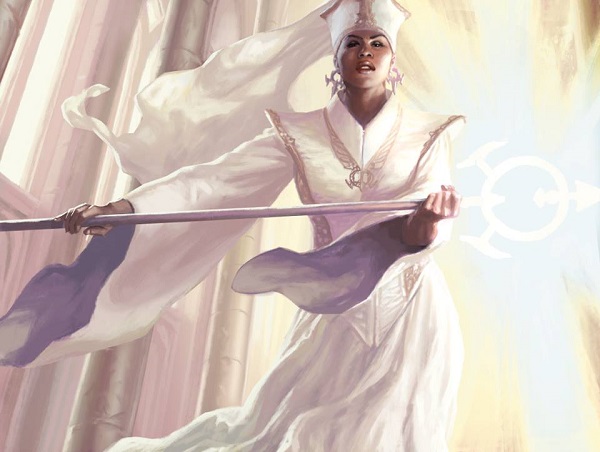
Sanctum Prelate by Winona Nelson
This is a fun piece. Let’s break this down.
Winona took a religious character, painted a black woman in white, with a triangle allusion outfit to nod and wink at organized religion? Nah, she wouldn’t poke the bear like that in a Magic card. Nah.

Image via happehtheory.com
She kept the focus tight on the character, giving an asymmetrical background with some pretzel earrings but that’s about it. She kept it very simple and didn’t over think the painting. She also did it digitally, in case you were wondering.
Paliano Vanguard by Chris Rallis
I remember when painting women in realistic armor was this giant Tumblr initiative and tons of art directors looked at it every day, seeing what snarky examples of bad armor or great armor were posted. The recession was an odd time.
Cards like that are *actually* what the set looks like, not the rares and mythics. If you take the best commons and the uncommons of a set, that’s what it will appear to players when they draft it, in other words, when the art is most seen and recognized.
So, what do we see? We see soldiers of mixed races, white shirts, and plate armor. Additionally, each soldier has multiple weapons, and symbols on weapons and a flag that connect, making this a city guard without even looking at the name. Painting a garrison member is about as normal a commission as one can get.
This black woman is painted rather well. I don’t love the background, which feels like Chris ran out of time. The lighting on the weapons and the shifts in photoshop on them make me think he had to paint her well and then move onto another card. This isn’t a rare, after all.
If you stay on the focal point, her, the art is good. If you look at it closer, you’ll see some speed applied but I like the piece. Even with minimal time or effort, it’s still leagues ahead of other games, let’s be honest.
Recruiter of the Guard by Jason Rainville
Look, another dome!
So, I will admit, I talked to Jason about this piece. I won’t seem wicked smart in breaking it down on my own.
Yes, the sketch looks similar to this as well.
No, I don’t think the symbol needs to be on the piece either. An art description would add that, an artist never would as it fights the focus of the piece.
If you crop in, check at how different the piece feels immediately.

Jason is a very, very good artist. If you crop in, the piece is a triumph. He would tighten up a few lighting details, which is standard and the piece goes from ok to one of the most prominent depictions of a woman of color in Magic in recent years on a major card.
I keep wondering if this was merely the wrong sketch chosen for the piece. Of all the French Revolution and Spanish Civil War homages that I know Rainville probably could’ve drawn from, this is the sketch an art director would choose? It feels safe.

Smuggler Captain by Winona Nelson
That nose ring jumped out at me, I see that. I asked Winona about it and she laughed as I mentioned the 1990s with nose and eyebrow rings that mixed with oversized JNCO jeans and wallet chains. They did seem cool back then. The idea of “this captain is cool” is reflected by the purple and gray three-cornered-hat and slight smirk.
I’m not sure what to make from the triplicate buckles on her clothing but I love finding patterns like that. Mundane details that Mike looks at too closely? That is my jam.

This original painting sold in hours over at MTG Art Exchange on Facebook and I’m not even remotely surprised. Lucas is like Ryan Pancoast, you know who he is and you like their art, but you really don’t understand how strong of painters they are until you see the work up close.
Adding to that, this painting is a diverse elf home run. We get to see a thinly manicured beard, representative of a barbershop of Paliano, getting the explorer his news and a fierce cut. Lucas didn’t stray away from showing an actual black man, what he’d look like, were he an elf. The hair is great, the face is great. The pose is great. Hell, Lucas referenced an Alpha card in Wanderlust and you probably know that already if you’re on Tumblr. It’s just a solid depiction of a new direction in art, mixed with Graciano polish on a beautiful landscape. This is Magic in 2016 and it’s wonderful.
Wanderlust by Cornelius Brudi
Adriana, Captain of the Guard by Chris Rallis
This angle, it’s hard. Chris had so many different camera angles and cards this set. It’s almost like he finished one card art, then got another, and another and then after, we see that he knocked out this incredible artwork.
He hides her hair, keeping her confident and arrogant just by not lowering her head and only looking having her eyes look down at us, the viewer. That weight shift is fantastic, showing us that she’s more of an olympic javelin thrower than shotput athlete, or wispy model, as she shouldn’t be. She has muscle and we can allude form even with armor on. It’s so stellar, I cannot even handle that Chris got a form down so well in armor. Phenomenally hard commission and he killed it!
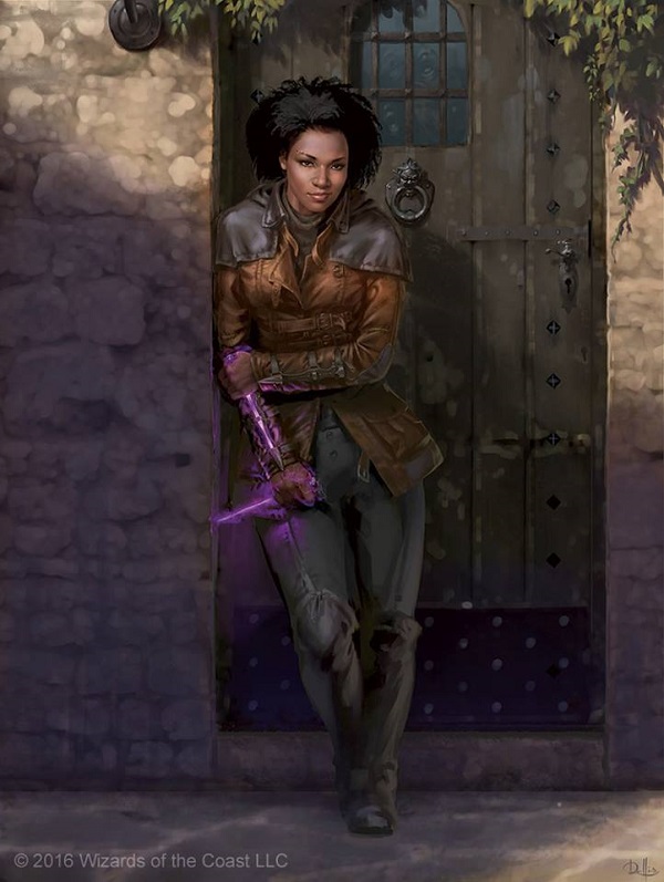
Kaya, Ghost Assassin by Chris Rallis
Kaya, Ghost Assassin by Chris Rallis
What else can be said about the marquee image of the entire set that hasn’t been said yet?
The art is fantastic, the character oozes personality and it looks like a Magic character.
The one thing I do wonder is whether the simplicity of her scenes will omit her from art awards for being a rather dull composition. You can still win at a character and yet create only a pretty good artwork. Let’s hope we see a lot more of her.
After reading this battleship of an article, I do need to make it known that many artworks that large images were not made available for a variety of reasons from being no vacation, to a lack of interest to a death in the family. This is that list:
Spectral Grasp, Palace Jailer, Echoing Boon, Crown-Hunter Hireling, Custodi Peacekeeper, Splitting Slime by James Paick, Fang of the Pack, Protector of the Crown, Assemble the Rank and Vile, Thorn of the Black Rose, Incendiary Dissent, Weight Advantage, Caller of the Untamed, Capital Punishment, Pyretic Hunter, Animus of Predation, Deadly Designs, Goblin Racketeer, Mausoleum Turnkey, Garrulous Sycophant, Skittering Crustacean, Lieutenants of the Guard, Canal Courier, Menagerie Liberator, Orchard Elemental, and Regal Behemoth.
Most artists are very happy to share a larger than card size image with me, after a few years, they start to expect it. As such, artists are not given a heads up when their card artworks have been previewed or publicly shown. They either pay attention closely to all previews, or a community member tells them. This has to change. A simple email to all the Magic artists working on a set with a link to the day when the whole card set is shown before a prerelease i that should be done. For some reason, artists are not encouraged to share their art, thereby aiding previewing a card set, keeping hype high and providing free advertising to Wizards.
I wish a resource existed from Wizards PR or via a requesting system to get access to jpg images for articles such as my column here. Relying on international artists to be timely and gaining trust for sharing images is often difficult for an artist working for a studio, or worse, remotely for a movie. This would aid so many thousands of people to appreciate the art.
I hope you enjoyed my little stroll through Paliano and Conspiracy Take the Crown. While it serves as a core set in terms of variety of artists and depictions, this go around the art directors really gave us a cohesive set with Italian buildings, unique goblins, more women shown per card and realism that looks and feels correct.
-Mike