


Upon the announcement of Innistrad, we knew we needed to write something for it. Mike knew a considerable amount, since he worked on one of the sets in Innistrad, and MJ wanted in like a crazy, 4:00 a.m. Gaga-monster wanting to get front-row passes. As M12 didn’t have a review, we felt Innistrad simply could not be ignored.
Things you cannot forget:
- Artists do not see the final card. They get a commission, and many, many times the card is changed before they see the final version.
- Writing flavor text is incredibly difficult. Take any normal Tweet and then divide the length by three, and have a name, art, and mechanics to integrate while being transformative. It’s comparable to writing good poetry. Anyone can do it, but typing does not equal writing, and it surely doesn’t mean good writing.
- Keep in mind that Art Director Jeremy Jarvis wanted a human’s on-the-ground perspective with every card. Imagine that you are actually there. Art has to fill this role. For example, if you see a dragon on a tower, imagine you’re in another tower looking at him.
- Artists often update their DeviantArt pages more frequently than their personal websites or blogs.
With any further ado, let’s dive into this gravy boat filled with blood flavor.

![]()
![]()
![]() – 2/2 – Creature – Human Shaman
– 2/2 – Creature – Human Shaman
ML: I struggle with the flavor, the taste, of this card.
The Skirsdag is a Creative Team invention, and a cultist is, well—it is what it is. That’s fine, but cultists are quite overused at the moment. Fantasy Flight Games loves cultists. Their mythos depends on it.
Did I submit a few names in Dark Ascension to concept them as cultists? Sadly, yes—I’m not exempt.
Back to this card.
I find the art to be trope-laden, which is good for the first set in a horror block, but it doesn’t speak “Magic brand” to me. Block out all but the artwork with your hands. Does it look like a Magic card, or does it looks like promo artwork for Castlevania? (Look at the smoke’s color. Symphony of the Night allusion? I’d like to think so.)
I also love me some gothic-looking windows that are placed in medieval-esque games. I want lancet windows on our eventual house, but I have to choose between them or a tower, says my fiancée. I’ll choose tower. The flavor text isn’t the strongest conceptual work, but it makes sense. The Skirsdag like blood and fire, and some sort of glory is coming. That tells a lot about the future of the block.
MJS: I should have covered her in my cocktails article! Pretty, Dita Von Teese–style girl manipulating some kind of flaming shot, and here are her minions: Skirsdag Cultist Stooges, Larry, Moe, and Curly . . . sigh. I wouldn’t mind getting invited to a Skirsdag Cultist house party or watching her burlesque show, but other than that, I agree with Mike’s comments.

![]()
![]()
![]() – 4/4 – Creature – Bird
– 4/4 – Creature – Bird
MJS: This card really makes me think of Game of Thrones . . . I like it. The bird on the lower left is giving me the eye, and while it’s a dark scene, there’s all that light on the horizon that says “hope.” Flavorwise, it seems to fit Innistrad, but it also falls into the very generic medieval/gothic/fantasy category. Crows are everywhere. These crows look like basic crows. The one thing that saves this from being too generic is the flavor text. Crows that consume words are definitely Magic crows, and I want one.
ML: I really enjoy when Creative flexes its muscles with plural names. For example, what’s the word for a group of rhinos? It’s on the card. I love finding obscure references. For example, what’s the plural for X? It’s Y. Fun. Use this chart in the future.
Does the superlative fit the card? Yup.
Do you know how many crows it requires to make a 4/4? Me neither.
Does it matter? No.
People will see this card a lot due to the super bomb-potential of this in Limited. It’ll be a high pick.
I’m not sure why crows like people dying. Vultures do, sure, but crows? They’re irritating creatures, and my dachshund barks at them. Yes, the name and flavor fit the ability, sure, but it’s a crow.
Drew did a great job of showing perspective over a city. It reminds me of Ravnica—showing off the city. Most medieval depictions rarely had perspective pieces from a bird’s-eye view. Even maps were of relative places. (Medieval being the 500s to the 1400s.) I do wish they’d bring the crows to a higher level compared to a human view, as that’s what a medieval person would see. There’s a reason that churches were tall and things went upward. The opposite perspective was only God’s and the birds’ to see.
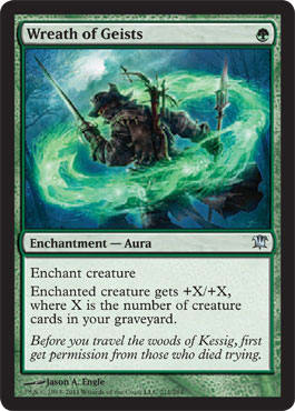
![]() – Enchantment – Aura
– Enchantment – Aura
ML: This will fit in nicely with my Christmas-themed Commander deck that I haven’t built yet and don’t plan to make.
Scrooge alter needed? Scrooge alter needed.
The card speaks a lot more to the flavor of the entire set than simply to a freelance flavor writer gone wild. Ghosts + Woods + Wreath = What country? Kessig is a terrain of autumn, of fall colors, and of harvest. Imagine an October/November climate.
That, my fellow flavorphiles, is Germany.
I don’t know if the flavor writer knew about the importance of wreaths in the Black Forest region of Germany, but the card oozes folklore myths of the region. More on that later.
The art is fine and explains the concept well. It’s a spell after it’s been cast. I feel that seeing a spell conjured up before a battle or before entering the woods could push the flavor a little harder, but the art and the flavor text aren’t created at the same time.
MJS: I love the idea of having a protective shield of spirits about you. For vanity’s sake, I would have preferred the central figure be female—other than that, I think Mike said it all!

![]()
![]()
![]() – Sorcery
– Sorcery
MJS: This pair looks like those dudes from Pirates of the Caribbean—you know, the balding one and the one whose wooden eye keeps falling out? Nice to see them out in Innistrad— they make me giggle.
ML: This might be an “artist gone wild” piece. Yes, it’s a very straightforward art depiction—two zombies—but a strong direction has to be in place. The style guide will help on depictions, but in this case, it’s far too . . . obvious? Like MJ said, it does feel piratey. I thought more in the Walt Disney World style, except dead, of course. It feels like a standard, kitsch zombie-pirate that you’ll see a hundred times on DeviantArt.
The name is fantastic. And to tell you why it’s exceptional: “unhallow” is a Dungeons and Dragon spell.

![]()
![]()
![]() – 5/4 – Creature – Demon
– 5/4 – Creature – Demon
ML: More “drinking and Magic” cards for MJ. I’m sure she’s pumped.
“Gift” means “poison” in German. Funny, that.
Imagine that the flavor text said this:
He likes the prayers of his cult and their belief that it matters.
Does that make it lose its luster? Does it seem more dull, or simply more obvious?
How does the fact that a demon with a cup loves his cult allow you to draw a card and lose a life? Is it the cup? Is it only the cup? Could the “gift” be used both as a prize and as a poison a little better? Maybe. It’s an okay text, but since the name and flavor text don’t always match, it’s very tough to integrate, and it’s impossible to predict that will happen. One can dream that a Creative Team staffer would “guide” a hand, though.
The more I look into this art, the more drawn in I am.
Are the wings reminiscent of derivative art? No; I explained this a few weeks ago. It’s a reused idea, whether Peter was conscious of this or not. I would assume he wasn’t, because Peter is a new artist. I doubt he looked through thousands of cards to make a Fallen Angel allusion.
Is his skin comparable to Liliana’s tattooed curse? Maybe.
Is this demon in a manor or in a church? Look at the circular paintings or mirrors on the wall. He was summoned here, and more importantly, Avacyn’s auras and enchantments don’t seem to affect demons indoors. Apparently.
MJS: Bro demon, like I said in my Mage-Craft Cocktails II article. He looks like he’s having a great time, but I prefer for my demons to act with a bit more decorum and gravity, thank you.
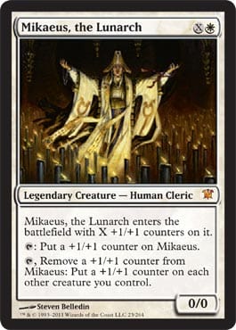
![]()
![]() – 0/0 – Legendary Creature – Human Cleric
– 0/0 – Legendary Creature – Human Cleric
ML: Interesting how in a horror-themed set with a very religious tone that the religious leader is depicted in the first set. Two planeswalkers are made, and the main non-planeswalker character, save the angel Avacyn herself, are all in the first set.
How wide open is the rest of the plane? Quite.
The artist, Steven Belledin, did a blog post on the piece. It gives a little insight into art-making and art direction. Time constraints are a very real issue with commissioning artists who aren’t going away any time soon. His finalized personal version has double to triple the number of candles.
I do agree with Belledin. How can Mikaeus be so lit with so few candles?
I love the color scheme on this card. It’s very recognizable, and it borrows from Roman Catholicism heavily, allowing for quick resonance with a glance and a perfect real-life medieval allusion.
MJS: Mawage, sweet mawage, and wuv, sweet wuv, heh heh!
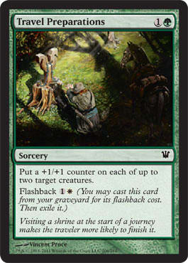
![]()
![]() – Sorcery
– Sorcery
ML: Great top-down flavor, but why isn’t this an instant or an enchantment? Think of it: You visit a shrine before going on a long journey, and either it wears off right away—+1/+1 until end of turn—or, since you prayed there, +1/+1 while it’s out. Must have been a development change. It could be a shrine like Kamigawa’s, but I digress.
Why does that horse have an elk’s shadow? Is that part of the strengthening? If so, that’s clever.
I love the wooden shrine made from a tree. You harvest the wood, but you give some of the wood back to the forest. It’s a pagan belief mixed with city Avacynian religion. This is exactly how it would happen in real life, especially in the backwoods of a region like Kessig. You don’t give up your local religion immediately—you appropriate usages, like Christmas or Easter.
MJS: I don’t mind it being a sorcery. It’s a prayer—you called on your faith at the shrine and received an answer that assists you on your journey. Mike’s shadow call is awesome. It looks like the horse is being crowned with the power of the forest—elk or otherwise.
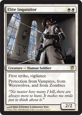
![]()
![]() – 2/2 – Creature – Human Soldier
– 2/2 – Creature – Human Soldier
ML: Name makes sense, size (2/2) makes sense, and abilities make sense, but why does he have a miniature crossbow?
If you look at the high-res version, you’ll notice that he’s educated and affluent, with paper posted on his walls, tall windows, and an inkwell on his desk. Very few people could read in the medieval times. If you’ve ever been in a medieval city, you’ll notice how taverns and shops have names with large pictures of whatever the ware is. A tavern would be a beer mug, for example. More on this later.
I don’t have a preference of digital versus oil paintings versus other media, but one thing that drives me crazy is the flatness that digital art must constantly fight.
The weapons on the wall and the hand crossbow on his hip of a fifty- to eighty-pound variety look simply pasted on. That’s a layer in Photoshop that needs some more love.
MJS: I’m a Jana/Johannes fan, but I hate this guy. I hate his face and everything about him. He looks like some idiot who stumbled out of the 82nd Bar & Grill across the street from my house, and he thinks he’s gonna get some. What is that in his mouth? A bar spoon? He just doesn’t convince me that he’s the guy who leaves me begging for mercy—he convinces me that he’s the guy who keeps trying to creep up behind you at the pool table or on the dance floor—whom you spend all night avoiding. Oh yeah, and his crossbow isn’t cool because it isn’t a Nerf mini-crossbow.
ML: Hasbro tie-in. A+, MJ.

![]()
![]() – Enchantment – Aura Curse
– Enchantment – Aura Curse
ML: I’d like to say how much I love Jaime’s blog. The artist, not the designer. The studies and inside view into sketches and finalized products are great resources for up-and-coming artists.
The subtlety of Progenitus is amazing. The straightforwardness of this piece is also exceptional.
Yes, it does feel a little Resident Evil 1—I get it.
Yes, this piece does reinforce the horror trope with a bloody library.
Yes, I’m crazy-excited about Curses as a subtype.
MJS: I look at this and see “technically awesome.” The books seem to have a lot of personality for inanimate objects, so I think I fall on the side of “approve” on this one.
![]()
![]() – 0/3 – Creature – Lizard
– 0/3 – Creature – Lizard
 |  |
ML: Flavorful, top-down design, yes, but it’s forcing it too hard.
Some questions:
Are lizards horrifying? If Ludevic has to sink 10 mana into a creation, how long is that in game-time? Was the previous version 14 mana for a creature smaller than 13/13, and was it killed by mobs or was its egg smashed? Does “test subject” mean that his previous versions were successful in reaching maturity, or not? Did Ludevic make the process more efficient, thus allowing a creature to survive? How can a 13/13 fit into a basement?
I love Hamm’s first image—the second image is confusing. Why is the egg shell still there? The creature clearly didn’t just erupt from there—it wouldn’t fit. Why isn’t either the egg larger or the egg shell gone?
The more I think about this card, the more confused I am.
MJS: Mike has me giggling. I don’t like the idea of a lizard horror. I’ve had pet lizards, and they were nothing but sweet—it was the damn feeder crickets that were horrible! They’d jump out of the cage and inevitably get everywhere but in the lizard’s mouth. Ugh! I can’t even think about it.

![]()
![]()
![]() – 3/4 – Creature – Zombie Drake
– 3/4 – Creature – Zombie Drake
ML: This name makes perfect sense—it’s a skaab as a zombified drake, and being a 3-drop in blue means drake. The subtype is super-clean.
Chris Rahn did a great job on the art. It looks like a bat upon first glance, as the details aren’t clear, but that urges you to really look at the art and allows the oil paint to really add to the macabre creepiness of a sewn-together zombie-drake. It’s a bit translucent, adding to the unnerving, undefined edges of a fully defined body. The translucent body does contrast the 4 toughness, but I digress.
MJS: Wasn’t Sewn-Eye a drake, too? Or am I totally off? Why are drakes the default pincushions of the airborne reptile world? I don’t think I can reasonably critique this, because I can’t stand the thought of poking needles into dragons or drakes. It makes me sad. Really.
ML: Sure it was, but it was all multicolored.

![]() – 2/2 – Creature – Zombie
– 2/2 – Creature – Zombie
ML: This is a pretty necessary name, flavorwise, to introduce the “Diregraf” name into the Magic lexicon. By being a tournament-playable card, the name has to be easily said. Will it just be “Diregraf” or “’graf?” It sets itself up for shortening.
I like the art, especially the overgrown Avacyn tombstone, but if the humans are so concerned about being raised as a zombie, why have an above-ground tomb? Did a necromancer dig out an entire tomb? This isn’t Diablo II with sarcophagi everywhere. That was M12.
The flavor text is very much something that many of us say colloquially. “X, well, Y.” It makes the ghoulcaller approachable.
MJS: Man, I remember waking up some mornings-after, while in college, and feeling just like she looks.
![]()
![]() – 2/2 – Creature – Bat
– 2/2 – Creature – Bat
 | |
MJS: I just want to say that I can’t get behind this card, because the humanoid side looks like a dang Victoria’s Secret ad! Right down to her perfectly placed dainty faingers and sultry, coy pout—I mean, a vampire can have these traits about her, but this gal ain’t doing ’em in a vampirish way, if you get what I mean. Her body type and aura all say “underwear model” to me, not “dangerous stalking vampire.”
ML: What happens when you add top-down designs with a strong flavor injection? You take a Kelinore Bat, add flavor, get another point of toughness, move up a rarity, and transform into a beast when you need to beat. But . . . if you need that evasion, change it back. I would’ve loved to see a flavorful bat to stay at common so I see it more often, but, that’s development for you. I feel that this card is like a vasectomy. It takes a lot to reverse the procedure, but if you need to, you definitely can.

Yes, the prefixes of both cards don’t really make sense, but the art is easy to recognize, and it’ll be an uncommon that I’ll pick quite often in Pack 2 to force black.
Nice identical art. This is the first Transform card that I really see that is identical—in this case, due to the moon. It just cannot be ignored. Sure, it’s there in all of them, but the moon identifies it as identical here.
MJS: Mike’s commentary is great—agree one hundred percent.

![]()
![]() – 2/1 – Creature – Vampire
– 2/1 – Creature – Vampire
ML: So, this this is an infant, sucking on blood instead of milk.
Infants are hungry, and vampires are normally black, thus new vampires are red infants, while black vampires have been undead for some time.
Got it.
Could there have been subtler ways to do this with spoilers and flavorful hints instead of forcing it out on a card? Maybe, but for people who don’t pay attention to Vorthos issues, I get why.
It feels plainly obvious to me, trite even, but for the majority of players, they have a “Huh . . . neat.” reaction. It’s similar to the vampires being sparkly for fourteen-year-old girls—different but acceptable.
Nice usage of whiff.
Nice gate.
Nice commission to Cynthia Sheppard. She’s a first-time Magic artist, but a longtime illustrator who is critically acclaimed as a Spectrum-winning artist. I hope she gets more commissions in the future.
MJS: Mike, what’s “whiff”?
ML: A whiff is sniff. A more colloquial sniff.
MJS: I think the art fits. She does have an infantile look on her face, though really, I’ve never seen a baby do quite this pose/posture while nursing. My son, at least, looked more like a one-eyed pirate with a leg of mutton while he did his thing. This is very vogue—very consciously styled. I like the glam-vamp look she has—the fiery red hair is simply gorgeous against her white skin.
I’d love to see Cynthia do a planeswalker lady for us.
ML: MJ has a pirate baby.
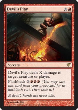
![]()
![]() – Sorcery
– Sorcery
ML: This is the first card that had me wondering if devils or demons would be more apparent in this block.
I like reusable Blaze.
How much better is this than Flaming Gambit?
ML: It’s a bit similar to Red Sun’s Zenith so soon, but I’m okay with it. This type of effect, especially at rare, won’t warp Limited and won’t affect Constructed much at all. It’ll maybe change Cubes maybe.
Beast’s Play.
Child’s Play. (Great charity, check them out.)
Devil’s Play.
Demon’s Play.
Could this be used more often? I’m not sure.
The flavor text implies that the Devil is therefore angelic? “Idle hands are the Devil’s tools/playthings/playground.” That’s what any religious upbringing would say, but . . . .he’s . . . the (a singular?) . . . .Devil. Mmmkay.
MJS: You forgot Role Play.
ML: You clearly didn’t.
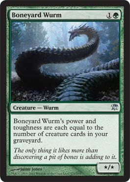
![]()
![]() – */* – Creature – Wurm
– */* – Creature – Wurm
ML: Y U no Lhurgoyf?
I feel that someone in design is wearing a trollface on the Wurm’s face to make us think it’s a Tarmogoyf, but it isn’t.
I love this dragon/wurm/snake art. I like how the flavor text makes an allusion to a pit of snakes, making a player’s inevitable “wtf, mate; that’s a snake, yo” reference double-troll-like. Love it.
MJS: This is a sexy wurm. Jaime really got the weight right—he looks heavy, like he’ll crush bones as he slithers across them. The texture of his plating feels right, too, and he’s not shiny. In other words, obviously not from Mirrodin.
![]()
![]() – 2/2 – Creature – Human Archer Werewolf
– 2/2 – Creature – Human Archer Werewolf
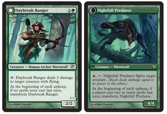 | |
ML: I mentioned how the Screeching Bat was the same image twice but with figures transformed. This type of card, with different figures, different backgrounds, and Photoshop levels unbalanced, is crazy-dark and makes retention difficult. If you have three to four different Transform cards in a Sealed game, this one, due to the art difference, will be harder to memorize than the others. It’s minor, sure, but a misplay will happen because of it.
The werewolf feels very much like an Innistrad werewolf. Big top, small bottom—got it. The Ranger’s arms seem huge. The right bicep is . . . gigantic.
The names are flavorful and fitting. This creature is a ranger, and it’s hunting to shoot flying things for 2 damage! Transformed vampires in bat form? Seems right, especially as werewolves hate vampires. Team Jacob!
MJS: I think Mike just shouted Team Jacob . . . I knew I liked the guy for a reason. Daybreak Ranger’s figure is awesomely curvy and athletic at the same time. She looks like she can actually use the weapon she’s holding, and she cleans up well into wereform, too, though I will say that it looks like it has a bit of Schipperke mixed in there with the wolf bloodline—almost too cutesy in the face. Killing with cute is fine, too, though—killing is killing.

ML: I’d pet that dog.
![]()
![]() – 2/2 – Creature – Human Werewolf
– 2/2 – Creature – Human Werewolf
 | |
MJS: It seems like the sheep would catch on . . . idiots.
ML: Yuuuup.
This is one of the few cards I’ve ever seen that indicates a very specific time and that isn’t a spell. This werewolf couldn’t be a shepherd for more than a month. Seems like a foolish job choice. He also could’ve been infected (Infected? I’m going with it.) while he was just a normal shepherd. It seems bad for a local economy to lose so much clothing and food, or for it to take such a risk by having a singular male watch over a flock. Maybe this area hasn’t had werewolves yet and they’re gaining territory.
Good job of reusing the location for the art.
![]()
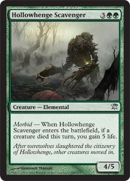
![]()
![]() – 4/5 – Creature – Elemental
– 4/5 – Creature – Elemental
ML: Does this art look like something you know?
Who cast the elemental spell if all the citizens are dead? Did it just happen?
I’m always worried when I write that I don’t put odd letters next to each other. English is a funny language, as it tries to shorten and bastardize anything formal. This card is now “’ollo’whenge.” Say it in a fake (or real) British accent. I would expect that pronunciation is exactly what a commoner would use.
MJS: (Spontaneously breaking into Tha Gatherin’ rap) “So go head gain five off yo Fangren Marauder, I let that bleep slide just a lil more than I oughta . . . ”
To me, it was reminiscent of Force of Nature.
That’s it for day one, folks. See you tomorrow, when MJ and Mike battle again.
P.S. Start thinking of Halloween costumes. Magic has a lot of choices, but you know what Mike is going as:


