


Wat.
Vorthos content on Thursday?
Did Trick fall asleep this week?
Wat?
Not quite.
MJ added an extra dose of crazy, and our Vorthos review of Innistrad will be coming out periodically. It was overseasoned with too much flavor. Unlike my tenderloins, which have two ingredients—salt and pepper—we have a ton of materials, and we need to slowly air it out.
So, take a seat, I’ll open the bag slowly, and let’s smell that flavorful air of Innistrad once more . . .
![]()
![]() – 1/1 – Creature – Human Advisor Werewolf
– 1/1 – Creature – Human Advisor Werewolf
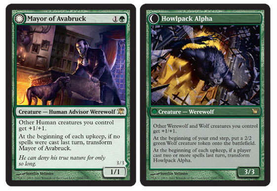 |  |
ML: Svetlin keeps the color scheme consistent. Look at the fur on the werewolf’s arm and the human’s coat. In pieces where the background cannot be reused, elements can tie the pieces together through subtlety.
I do wonder if he’s aware that he’s a werewolf. Would he really keep a dog if he knew? If he does know, that dog is intended to be the appetizer for the night. That’s so cruel. If not, this is another card in a series of exact-moment depictions.
MJS: I think the dog suspects—look how he’s got his hind end slightly tucked, his tail down, and his ears limp. Looks mighty worried to me. The detail on the desk and map is fabulous.
And, this isn’t my forte, but was interesting: If you look at the pictures on the wall on the Mayor’s right, the middle portrait could be Child of Night.
ML: Good job, Pancoast—you can draw a great mustache. Read what Ryan said about them here and here.
The assignment required that I include the mayor studying a map in front of a big window (or with the window somewhere in the room behind him). The trick would be to get the lighting right. — Ryan Pancoast
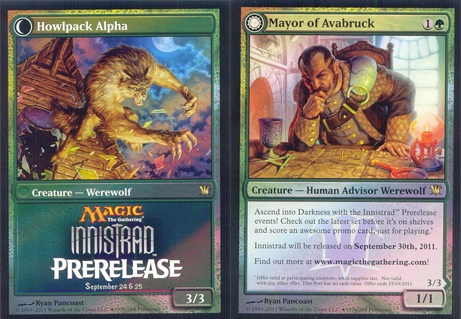
I love this promotional piece. It’s very clean and informative to new players who are looking over the counter to check out Magic. It flips. Fun. I wonder if they looked into making it card-sized for Cube players? I bet they did, but then realized that they needed a larger size for promotional usages.
The names are dead-on, significant, flavorful, and beg the questions of what a howlpack is, where Avabruck is, and why they didn’t use that fantastic mustache on the original art. It’s because they want you to get that promo!
This is one piece that really exemplifies how two different artists interpret characters. It’s shocking when planeswalkers are shown in different light due to the branding usages, but for minor characters, seeing other aspects of them is refreshing.
MJS: These are lighthearted fun compared to the originals. The barista who served us this morning had that mustache. He plays Commander.
ML: Baristas are a subgroup of Commander players. The extra coffee allows them to play longer games.
![]()
![]()
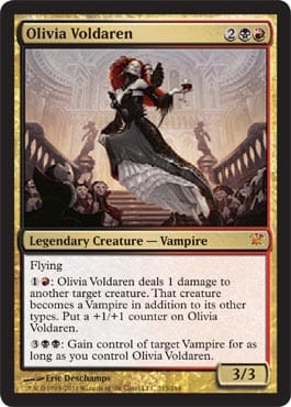
![]() – 3/3 – Legendary Creature – Vampire
– 3/3 – Legendary Creature – Vampire
ML: Alrighty—Olivia is a key vampire, and Voldaren is likely a family of vampires. She appears to be the matriarch. The opulent architecture is amazing.
The card, on a flavor standpoint, seems okay, but why does she deal 1 damage instead of 2? Does Sorin thirst more than Olivia? Guess so.
And yes, the “knee” situation with her right hand has been raised already. MJ?
MJS: Mark Rosewater gave this explanation this week: “Some people seem confused about the art of this card. Olivia is grabbing a piece of her dress and pulling it up with her fingers. The confusion is that you can’t see the back fingers holding the cloth. The artist kept the visible fingers straightened, as a balled fist holding the fabric would not have been elegant. That’s all that’s going on.”
I figured that she was supposed to be holding up her skirt and that it was simply a matter of not getting the drape of the fabric right—and not that it was supposed to be some kind of reference. It’s hella awkward. The rest of her outfit is pretty sick, though. The one thing I take issue with is . . . no shoes? Looks like a black-tie event to me. She’s working a nice red pedicure, but the “bare-feet” situation seems arbitrary. Maybe she’s eccentric.
Some of the revelers appear to wear heron-inspired masks. Ha! Vampire humor. I’m wondering if this is the Voldaren family estate or if these vamps seized this place from some churchy family and are now partying to cement their claim? The statues at the head of the staircase look angelic.
The other thing I like is that blood is repeatedly served in big ol’ crystal red-wine glasses. Blood = Oregon Pinot Noir? Sure. But I will say that glassware, just like anything else, should be appropriate to the time and flavor. Some of the glasses I’m seeing around Innistrad look much too modern.
ML: If you’re that old and have that much paper, you should have some Lil Jon–type opulence. Just saying.
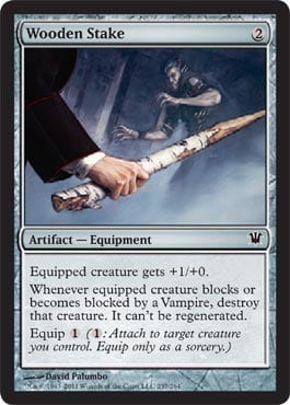
![]() – Artifact – Equipment
– Artifact – Equipment
ML: I already explained, in a previous article, my thoughts on the artist using birch wood here. Yeah, it’ll work, but there are better woods to use. I’ve made signal towers back in my Boy Scouting days, and the wood disintegrates quickly. Yes, the figure could’ve cut a branch off a tree and sharpened it before venturing after this vampire—maybe birch even has a pagan significance. It also will make sense if anything picks this up. Even a Squadron Hawk could pick up a wooden stake.
The “clear versus fogging” perspective change is a nice addition. The fog seems frivolous, but tombs and subterranean areas aren’t often clear . . . or so Bob Salvatore tells us.
MJS: I like how the vampire guy is the very embodiment of grossed out by the stick: “Egads! Ugh! My stars! Yech!”

![]() – Artifact – Equipment
– Artifact – Equipment
ML: Relevant reprint with new art? It fits the flavor quite well, as werewolves aren’t normally scared of fire. I love the perspective shift—it allows a more holistic view of what Innistrad looks like.
A couple of questions I have:
Avacynian magic is also red? That torch doesn’t appear to be burning anything.
If you “throw” this, it breaks? It looks like iron.
Do females always need thonglike garments on the back of their armor?
Are towers going to be more common in this set? Werewolves can’t fly, and vampires must be selective on whom they choose. Is it safe to say that people are scared more of werewolves than of vampires—or, as hinted by this card, are they way more terrified of the undead?
MJS: Yes, Mike. We actually have built-in thongs that appear whenever extra gluteal titillation is needed. Nice butt she has.
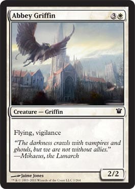
![]()
![]() – 2/2 – Creature – Griffin
– 2/2 – Creature – Griffin
MJS: This is so scenic and picturesque; yes, very white. The only thing I dislike is that the griffin looks pretty darn tame.
ML: Jaime, you’re painting while the block is hot.
It’s a cool, calm, and foggy morning outside Thraben’s cathedral in Gavony. I feel immersed in what “white” means in this area. I get that provinces are colored in a sense that Ravnica’s guilds were, but griffins outside a church are pretty white. Each of the artists is adding to the setting in this expansion, and it improves the art. That’s good world-building, folks.
The background is great—the griffin seems to be an added layer. I don’t get the integration. Without the name, it’s just a griffin in front of the cathedral. So by integrating the name and card together, you get that the griffin lives there, but the flavor text states that allies aren’t apparent. He lives at your church. He might even hang out in the rafters during a sermon—I don’t know. It’s very, very close for full top-down integration. I’m sure that in two years, since this is “cycle five” in design philosophy, small quirks like this will be veal-cutlet smooth.
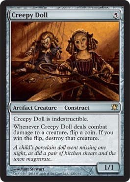
![]() – 1/1 – Artifact Creature – Construct
– 1/1 – Artifact Creature – Construct
ML: Did she (it?) kill the other doll?
MJS: What a cute date for Stuffy! She totally killed the other doll, Mike. She didn’t like the gossip around him and the new Farrah Fawcett Barbie.
ML: Farrah looked good back in the day, girl.
It was a cute date gone wrong. So I Dated a Homicidal Doll with Dull Scissors is more like it.
I like the flavor reuse. It’s good for the game to have Vorthos scour the reference. This one is obvious; the subtle ones are yet to come.
What is really significant about this piece is how much other artists like it. Matt Stewart wrote about it extensively on his blog. This quote drives home how important their blogs can be: “The uneasiness should come from the contrast between the cuteness of the child’s toy and the evil and cruelty of its actions.”
Notice how major artists comment on his blog. Matt’s also a really nice guy.
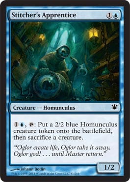
![]()
![]() – 1/2 – Creature – Homunculus
– 1/2 – Creature – Homunculus
ML: Oglor doesn’t understand syntax, but says “return” instead of “come back.” His vocabulary is huge, but he can’t use it—like a normal American student who travels to Spain. Fun!
While searching for this very intricate card art, an idea came to me: What if the Creative Team/Art Director would send out an e-mail to artists when the art spoils or is released?
These artists could, then, if they wanted, write a blog post or post a high-resolution artwork to their DeviantArt page. Get it while it’s hot. It’d help the artists focus advertising, and a release might be able to aid artists in marketing their prints and products.
MJS: I don’t understand syntax and therefore empathize with poor Oglor. I have a conceptual problem with this card, in that I always pictured homunculi as extremely eloquent in their own way—more like R2 and less like goblins.
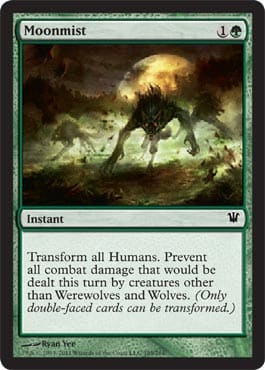
![]()
![]() – Instant
– Instant
ML: I first wondered why mist would be the key here. I didn’t get it. I work at a planetarium; I got confused. After getting the Fog card reference, I facepalmed. Stupid Vorthos.
Could this be used in a Commander deck based on wolves? It’s just another Fog effect, and there are already a ton of them.
Great art direction, great artwork, and the proper size of a moon. Neat. I’ll get one in foil for sure.

MJS: It’s fine. Mike, what about this moon?
ML: The moon appears larger when sunsets or sunrises happen . . . also, when aliens who like Reese’s Pieces come to visit.

![]()
![]() – 2/1 – Creature – Vampire Scout
– 2/1 – Creature – Vampire Scout
ML: Sweet Limited eight-pound-six-ounce baby Jesus.
Common?! Ah hell.
My hometown house looks like these homes. I swear that we’re the only non-farm house in central Minnesota that looks like a German house. We don’t run around in Minnesota weather without shirts, though. Well, usually. Though, springtime in Minnesota does mean shorts as soon as we get a fifty-degree day. We yearn for our summers of fishing, wakeboarding, and getting tan on our over fourteen thousand lakes. We also won’t accept fall until we have to. Halloween is often a snow day, yet “outfits” don’t seem to mind.
MJS: I have to completely disagree on this one. How much more conspicuous can a scout get? This guy ain’t interloping anywhere—village wives for miles around are lined up at the first glimpse of his topless bod shining in the moonlight.
ML: There be encroaching on wives, that’s for sure.

![]()
![]()
![]() – 5/5 – Creature – Spirit
– 5/5 – Creature – Spirit
MJS: Clever name. That kind of humor, when it shows up, really says “Magic brand” to me. Flavor text used to have more of this, and I like it. It shows that this game is made by and for people who can laugh. Take ourselves too seriously, and we end up obnoxious and really lame, really fast. Oh, and this art is lovely. The spirit with its head turned toward us is creeping me out. Wonder about who he or she was and about the manner of his or her death.
ML: I, too, noticed the fourth wall breaking as it did in Ferris Bueller. That . . . is awesome.
It is troublesome to see flavor text with ancestor worship from a religious leader. There’s a disconnect there from established religion like Orzhov and Innistrad. Sure, ancestor worship is a pretty common pagan belief, but does it belong after it’s been used it in Kamigawa and Ravnica? I don’t know.
Good art, Daniel. Good stuff.
![]()
![]() – 1/1 – Creature – Human Werewolf
– 1/1 – Creature – Human Werewolf
 | |
ML: This would make for a great Legendary rare. There will be a ton of blacksmiths, though, so I get it as a common. The hands in each artwork connect the two pieces—a task performed by the backgrounds of many of the other Transform cards.
The ironsmith sign is located by the werewolf’s mouth, but, from an art director’s perspective, it seems added in. Normally, a sign would be above a door and on multiple sides. The broken door is emphasized, and the sign would be hard to see, considering that it would be sideways. That said, if, from our vantage point, we can see the werewolf and the entire building, a flat horizontal picture should also be on the store. Streets are normally small and crowded, with the high density attracting people in. It’s an odd medieval quirk, but it’s something that someone who knows medieval history will pick up.
MJS: The eyes also belie the link. The flavor text made me laugh aloud on this one. Nice.
![]()
![]() – 0/1 – Creature – Human Advisor
– 0/1 – Creature – Human Advisor
 | |
ML: I see the reference of the clothing and the corner of the religious building behind the characters as foundation points.
I see how people could think that “civilized” is the opposite of being “homicidal.”
I see how that looks like Bane.
I see flavor text being colloquial and formal at the same time.
I see a card that I probably won’t play. Sorry.
MJS: I see tiny hands.
ML: I’ve got these tiny hands.
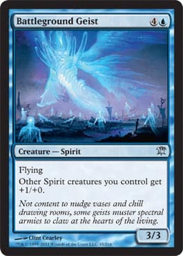
![]()
![]() – 3/3 – Creature – Spirit
– 3/3 – Creature – Spirit
ML:
Battleground Geist.
Graveyard Geist.
Exiled Geist.
Yes, it’s a Captain Obvious name, and sie Germans will be pissed to know that we’re taking their words, but you don’t always need to reinvent the wheel with names.
Clint’s in this new wave of artists, and I do love fresh talent. This isn’t Clint’s masterpiece, but it’s a straightforward and artistic depiction. By his own admission, he simply ran out of time.
MJS: This turned out pretty well for a time crunch, in my opinion. That geist is exotic, and I like how she’s set against the purple in the sky. The trailing-off of her left wing and sleeve add movement.

![]()
![]() – Sorcery
– Sorcery
MJS: Going to give me nightmares! Nicely done creepy.
ML: The moving hands in this promotional video are fantastic.
Those hands reminds me of the Granfaloon (Legion) from Castlevania once you’ve broken off the creatures.
Why is one of the more flavorful arts used on a Limited card!? Why does this always happen?
Evil ML: Because, it isn’t solely a Limited card, stupid.
ML: It’s a Whirlpool Whelm that always works and that costs twice as much, then four times as much. I hope this gets used in a super-fast blue aggro deck with illusions. It’s a pseudo–Time Walk. It’s a bad one, at that, but I’d love a flavorful card getting in there.

![]()
![]() – Instant
– Instant
ML: This is a Limited blowout card. Yes, I’ll kill your dragon-type creature with some 3/1 dork. that’s awesome. The untap ability is a blowout, and the name conveys the mechanic more than the ambiguous Web. (Is Web an offensive or defensive spell? Does it turn you into a spider? It’s quite unclear.)
Who is the Lady of Videns? Is this a Vorthos insider joke that is meant to be lost on Melvins?
Why do vampires like spiders? Is that a Vorthos insider thing?
Anyone else see Yolanda instead of Yonda?
James hasn’t updated his blog with the piece yet, but he always posts Magic artworks, so he will. Check it here.
MJS: Another brunette heroine for Innistrad? I could dig it. But I tend to hate flavor that names a bunch of people whom we never meet or care about. I doubt we’ll see the Lady of V, but maybe I’ll be proven pleasantly wrong. To be picky, this doesn’t look much like a spidery grasp. It looks like she’s redecorating with funnel web wallpaper. She is gorgeous though, and I would buy her an Avacyn Ale.
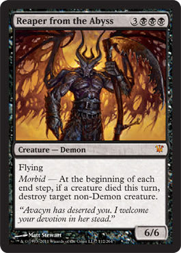
![]()
![]()
![]()
![]() – 6/6 – Creature – Demon
– 6/6 – Creature – Demon
ML: Occasionally, art directors give artists curveballs. Matt isn’t normally a big demon-type artist, but I’m happy he got the commission. You can see his original sketch here. The bat wings are a nice touch, in the style of Lord of the Pit. They feel worn and fitting in a horror world.
I’m confused about to whom “he” is talking. Wouldn’t any demon-worshipping cultists already worship him? Is he talking to a fallen cathar? Are fallen cathars demon-worshippers? Kinda confusing, you guys.
MJS: Not a fan. He looks extremely conservative, quiet, and predictable for a demon. Like an accountant-demon. And, FYI, he ain’t doing much flying with those wings.
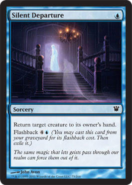
![]() – Sorcery
– Sorcery
ML: The art is fantastic for this horror set, not only because it works well for the top-down-designed set and because horror doesn’t always need to be gore-flooded in your face, but because John Avon keeps getting nonland commissions. I bet that foil will jump out of the card frame like Zelda on the Nintendo 3DS. Great job, John.
The flavor text is clever and makes sense, but can’t the card bounce things other than ghosts? Yes, dear reader, but that’s the point. You don’t need to encompass everything in that space below the mechanics. Sometimes, you just want to tie an elegant card name to a strongly executed artwork with flavor text. This example is a “Vague + Specific + Specific” concept. Start looking at other cards, and see how many of the names correspond to the art and flavor seamlessly while being specific with all three versus being vague for all three. It’s eye-opening.
MJS: I agree with Mike.
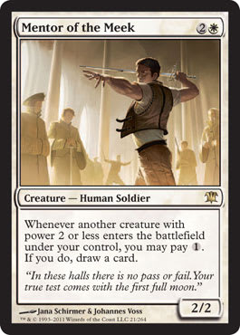
![]()
![]() – 2/2 – Creature – Human Soldier
– 2/2 – Creature – Human Soldier
ML: I worked for the Higgins Museum in Worcester, Massachusetts some time ago, and they had a sword-fighting club. I immediately had a very vivid image of that club again.
I love the usage of lighting to emphasize the mentor. It works incredibly well.
His left hand and those fingers seem . . . odd.
Some insight into Innistrad’s people. Look at how old the mentor is compared to his “students.” Is their life expectancy shorter than average? Why would that be?
Richard Whitters interviewed the German duo not long ago in Milk and Cookies.
MJS: What’s up with the pretty-boy flood? I see Zoolander walk-off, and if this guy were going to mentor me, I’m ninety-nine percent sure that it wouldn’t be in these halls, but that it would still fall into the category “swordplay.”
ML: Better be able to turn and swing left.
MJS: Can I say that? Did I cross the line there? Sorry. I’m just annoyed that what I thought would be a fat, bearded, angry weapons-master is this Ryan Reynolds–lookalike turd.
ML: He’s so dreamy. Poor ScarJo.
![]()
![]() – 1/1 – Creature – Spirit
– 1/1 – Creature – Spirit
ML: It’s one step removed from the invisible man trope for horror. The trope has a flaw, which the flavor text uses.
It’s not a Standard Constructed–playable bomb, but that’s not the point of it. It’s the new aim of design, and it’s very successful in this card.
I was a bit confused on the lighting on this piece, but imagine that a night lamp is out of the frame. Digital art can create light that is a bit too circular for emphasizing focus, but since the card art is so small, some aspects, like a simple street light, have to be omitted.

![]()
![]()
![]() – 1/3 – Creature – Human Cleric
– 1/3 – Creature – Human Cleric
ML: I like Wayne’s usage of glowing chains for the exiling ability on the werewolf. Binding and restricting are very white abilities. Magic is great because of its tertiary abilities and bleed colors—all the good stuff that Rosewater speaks of. Binding via nature is green, and denying spells/creatures is blue, yet binding and denying is white. Funny, that.
The name describes that werewolves are “fiends.” Neat.
P.S. If you see Wayne at a convention, get things signed, as he doesn’t often sign through the mail. He’s a friendly gent.
MJS: This is all good stuff. I wasn’t a Tariel fan, but this style of Reynolds’s is growing on me.
![]()
![]()
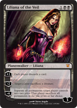
![]() – Planeswalker – Liliana
– Planeswalker – Liliana
ML: Oh, Lily.
You’re back.
I’m happy that Steve got the commission after Aleksi Briclot’s iconic design. Steve’s work has been improving every year. I love how he’s interacting with the community and giving insight into his work by showing an alternate artwork of the piece. He’ll continue to have success in Magic, and I look forward to seeing what his masterpiece will be.
Liliana is not the most approachable planeswalker. There’s a reason that Chandra is more easily branded than Ms. Vess. The art fits her personality, the card name fits her new role of being tied to the Veil, and the setting behind her fits Innistrad.
Things to keep in mind:
- Artists have art directions, but the direction isn’t all-encompassing unless it’s a planeswalker. Liliana must have the Veil, she must have some sort of headpiece that’s similar to the original, and she must exude sex appeal.
- Digital art is perfect for planeswalkers because they don’t have imperfections. Yes, digital art can create very individualized facial structures, but the minutiae, the imperfections, and the skin discolorations are quite difficult to do without a paint brush. Even a digital pen only comes close. That’s not a negative in this work; it actually plays to Liliana looking ideally perfect—ageless, even.
- If you look at Liliana in high resolution, you’ll notice the background doesn’t appear to be finished. That is intentional. Steve has realized that you could go into detail with digital paintings at one-thousand zoom and smooth every curve and color-match every angle, but the piece becomes flat and stale when you zoom back to the normal card size. To counteract digital’s lure of resolution, Steve blurred some pieces of the background and intentionally made things out of focus. Why? To counteract an aspect of digital painting, yes, but also to make the viewer see the card art as a photo would actually be.
For example, if you look into the distance, over a horizon for example, it blurs. Human eyes cannot focus at great distances, and when they can, things blend together. It’s what makes a fall foliage painting of leaves so gorgeous and why the Mona Lisa’s background, with its very notable contrasts between light and dark (chiaroscuro), is so notable.
MJS: I’m assuming we’ll find out later why she has no tattoos . . . I dislike the tilt more on the card than on the original piece. I think Mr. Argyle could have found numerous other ways to make her look slightly and unstably dangerous. But the colors, the details . . . I think everything else is working fine.
ML: So much tilt in this set. So much. Look at your player’s guide in the fat pack.

![]()
![]()
![]() – 2/2 – Creature – Human Rogue Werewolf
– 2/2 – Creature – Human Rogue Werewolf
MJS: Can I just get away with saying, “Hot”?
ML: No. “Hawt”? Yes.
Like all of the werewolves, this has three subtypes. The most memorable change I have seen in recent years was the pirate change—Talas Explorer, Talas Scout, Talas Researcher, and Talas Warrior all have three subtypes: Human, Pirate, and a third that is different for each. I love that it’s possible, and I wish it were a full trend, but it’s a shame that Rosewater doesn’t think that tribal will be done again. Even a Vorthos has a smidgen of Melvin from time to time.
If the rogue is very aware of turning into a werewolf, and even enjoys it, can she control turning back? Does she switch back, find some clothes to wear, and then snatch the purses? I hope there’s a woman in the party being raided, or she’s got some awkward clothes to wear back into town. (Her clothes don’t have spandex and she isn’t Hulk—those things will shred.) I assume she plans ahead.
The artist, David Rapoza, has a great little blog and DeviantArt page, and you learn there that the man loves him some Teenage Mutant Ninja Turtles.

![]() – 1/1 – Creature – Vampire
– 1/1 – Creature – Vampire
ML: Yes, his strut is similar to the Strutting Leo meme. Yes, a nobleman will strut through his village, and being a vampire will definitely increase his swag. He actually taught Taavon. True story.
Wish I could strut that fast.
MJS: Strut race—Magic Cruise 2012. Gogogogo.
ML: So going to happen. 1:00 a.m., post-Magic event, beverages expected.
ML: Is he really a king? I’m not sure. If so, wouldn’t he be Legendary? Is there more than one king? Which Stensian group of vampires are the “kings?”
Maybe they all consider themselves to be nobility, akin to a senior executive account manager.
Vampires with egos? Nooooo. Couldn’t be.
MJS: More Zoolander. This time more appropriate. Vampires do drink Orange Mocha Frappuccino when not imbibing blood, after all.
ML: OMF please!
Collect all six reviews! You only have to crack twelve more GatheringMagic-branded cereal boxes!