


We are back to visiting one of Magic: The Gathering's most beloved worlds this month in Guilds of Ravnica. This is the third full block visit to the plane and two immediate visual differences cannot be understated: Dimir has been pushed to visible and Ravnica in Autumn is a wonderful addition.
A little background is needed to understand Ravnica as a whole, so let's go!
The Czech Setting
Ravnica is a Czech set, modeled after Prague most prominently. It differs from Innistrad slightly by only a few hundred miles. Innistrad has more of an 1800s Prussia look that differs from Ravnica's 1600/1700s look. The modern lines of countries are arbitrary, but think of Ravnica as Baroque/Rococo, and Innistrad as Pre-World War I northeast Germany. Innistrad's German Empire to Ravnica's Austro-Hungarian empire.
For simplicity's sake, because we are talking about a game here, Innistrad is the area around Berlin and touching the Baltic Sea (Nephalia), that also includes Munich/Bavaria, which is Kessig. Ravnica is Prague, Vienna, and largely the first few countries east of Germany/Italy which aren't on the Euro currency. They all seem to be white Europeans and homogenous, though they are very different politically, from socialism to leisure activities and economic prosperity. Also, they're great to visit. I had more fun in Bratislava than any German city.
Via a Quora response thread
How these sets and areas overlap is the autumnal season.
Autumn in Ravnica
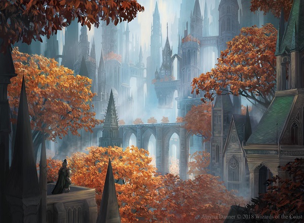
Visually, we can see the difference in a new/old version of a wall in Circuitous Route, along with Rococo spires in the same picture. It's older than Prussia, older than Kessig, yet the fall leaves look like Kessig if it had large cities. The Selesnya guild represents it the most, with the beautiful dappled light passing through the upper leaves of trees. James Gurney of Dinotopia fame has a full page on it in one of his two-part masterpiece art books, Color and Light: A Guide for the Realist Painter. By having light "dapple" the hedge maze, Milivoj can focus on the character in front of the maze, showing scale, and also make a more dynamic composition as your eye guides you from shadow on left, to brownish orange trees within.
This sets the tone for the set as familiar yet somewhere new.

Alayna continues the note of scale human to the plane.
Here, we see the sheer scale of the spires of the plane entirely encompassed by cityscape. We don't often get to see the skylines much, and I'm happy her base sketch shows us the trees as central focus as well. Great use of fog/mist as well for a fore/mid/background harmony.

Take three colors - brown, green, a light purple and only those to make this scene. Check, successful.
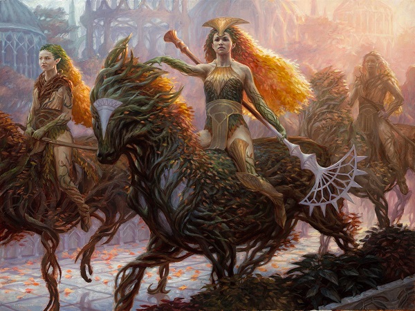
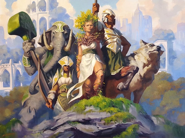
The centaur vs. horse choice is great, with Ryan Pancoast's being the morning scene to Nils's twilight. Organic beauty executed at a high level is now a tool in Ryan's repertoire.
I love seeing multiple viewpoints of the same character or location. I think it gives the world more depth, allowing for more daily life depictions, like a market, or that they do indeed have cobblestones.

By using more tonal elements, that is, lighter grays, it pushes the buildings into the background, allowing for us to see scale. And as a reminder what shade, tone and tints are, read up on them again here.
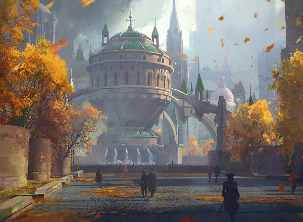
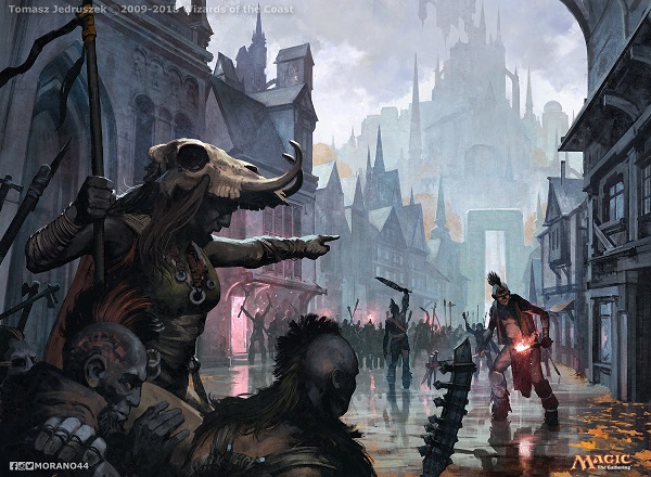
For a bookend, check out how lovely Tomasz's vanishing point ends in a flat tall archway on Ravnica. This was the image that made me both happy to see a scene in their daily life, but a sad one.
Daily Life Depicted
In this set, more than we've seen in recent years, we are able to see normal citizens of a plane.
As the game is about a battle, a duel, showing the average person is rare. This new Ravnica bumped that up in backgrounds quite a bit to show a narrative and that is art direction done exceptionally well. The cards are still readable in a 2x3" art box and you get a mini story? That is absurdly difficult to have on first sketch, though with great artists, it is a bit easier I must admit.
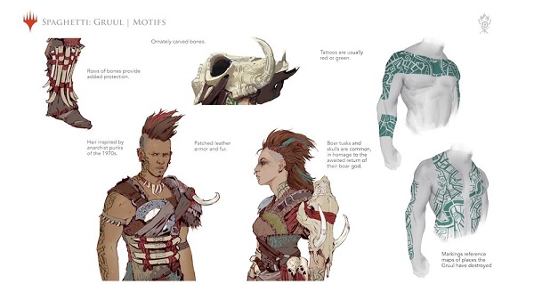
Going back to Tomasz's work - Gruul is the one guild that I struggle to understand. Ravnica is a plane that's entirely city, an Ecumenopolis. As such, Gruul is the guild that is all about freedom, doing whatsoever they please. We don't have a real world analogy to their lives. They don't build structures, they don't all wear guild clothing and yet, have their own culture.
The Street Riot picture had an Elk Skull helmet and it now clicks.

This photo above is the new tent city encampment in Minneapolis, Minnesota. While other Pacific Northwest and warmer climate cities may have these temporary tent cities, but they aren't great for extended periods of time due to climate. Minnesota is far from hospitable year round. Our winters are shockingly cold, and having been a boy scout, sleeping in a vinyl tent is horrible for anything under 40 degrees Fahrenheit. (4-5 degrees C) Our weather currently is around that temperature and it often drops 50+ degrees below that.
An overwhelming number of people in our tent city are from American Indian communities. While I shouldn't have connected an elk skull to this human rights issue of the lack of affordable housing and mental health support, I can't help but connect a game's guild wishing to be free, living off the grid, to a very real community in my city who wish to be free, and feel forced off the grid.
Drawing inspiration from a community is encouraged for diversity, and allowing people to see themselves in Magic. We get social commentary in games by taking issues and using the lens of the game to understand them more deeply as some inroads may both celebrate and educate.
Gruul needs more visual definition, and due to the new and improved Dimir, I would wager they will be the revamped guild of Ravnica Allegiance.
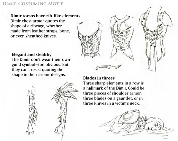
Getting back to daily life, I have to mention Dimir's visual update of high fashion realism in this fantasy game. Just as Gruul doesn't wear their guild logos, Dimir doesn't either. In making the update visually, they changed this aspect from the Gatecrash set in Return to Ravnica block, explained by Jeremy Jarvis in 2012:
There are belts, but fewer of them. Instead, we see this:

Visually, they're high fashion on an Italian runway mixed with gamer cool. Add in the threes, and we see a fantasy film noir. Let's see them in action below:
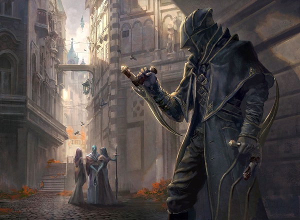
Daily life on Ravnica is shown most in the Dimir cards, as their acts aren't seen and only alluded to. Instead of showing a person being killed, you see the scene or act before it happens. Visually, a scene with a Dimir agent isn't an omen. That's too vague. They are the handwriting on the wall. The imminent danger has become apparent.

When a single concept art scene can show the daily life of Ravnica during a rainy day, guild members in appropriate poses, and also represent a core mechanic? It's Faustian to loop everything together so neatly.

Besides Dimir, we also get to see more of the characters. It's as if who they are is more prominent. Cards like Devkarin Dissident show us not only clear hair styles, but also perfect cosplay reference. Check out that scarf? That could be made immediately into a Golgari item that isn't all bug looking. She's one of their Devkarin elves and yes, they can look a bit Gruul when they're above ground.

Speaking of, I love that the high fashion Dimir male-centric clothing contrasts against the Golgari's highly feminine organic clothing.
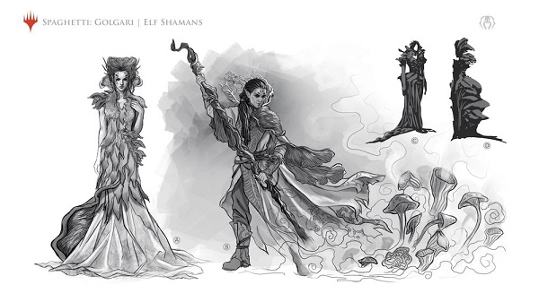
This is a radical transformation from Golgari's roots as plant zombies, with a much more jungle feel to them in their original iteration.

Original golgari concepts via arcana
Examine the brand new concept art from Magali Villeneuve, a master at painting pretty people. Also, look how the elven men can make mushrooms into high fashion on the streets of Ravnica.

Their precedent of Savra was pushed in Return to Ravnica's visual build of Golgari, explained by Jarvis further:
Now we see exactly what they meant and what they worked toward back in 2012!

State of Representation
Changing gears, let's take a quick look into how Ravnica is doing from an equitable and diverse standpoint. Just as our society looks different now compared to when the first Ravnica was released, the cards can reflect some semblance of cultural awareness.
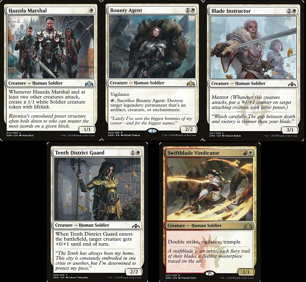
In an international game, surely Magic on Ravnica should at worst be as diverse looking as Eastern Europe, and much more varied at best. Let's check in with the Boros, as many of them are human soldiers, providing a better baseline than the moot point of whether or not elves count toward diversity.
We have the main character of the original Ravnica storyline, Agrus Kos, and a woman soldier. That's off to a decent start.

Return to Ravnica Block's version of Boros had a full six images showing women or people of color. I love the idea of the two-person team showed in Precinct Captain, with a token being the diverse character. Also, Palisade Giant is a woman - Boros's only female giant. There is a distinct lack of people of Asian descent in the Boros Legion, however.

And we are finally in Guilds of Ravnica, the first of a three-set return to the iconic plane.
In one set, we have a full five images that are women or people of color. It's such a minor change, it's literally making Boros Recruit or Towering Thunderfist add a woman or person of color to them. That's what they did with Haazda Marshal. Josh Hass echoed Zoltan Boros's precedent of Precinct Captain and hit a homerun on Boros flavor.

They are far from homogenous. Soldiers are all people and adding one or two in a set is barely a blip over time, but looking at the same setting, we see a slight improvement every few years and that's a good thing for an art director to push for. If you aren't explicit in an art description, as a reminder, most artists will make a white guy. Magic has moved quite a bit past the default of the 1990s.

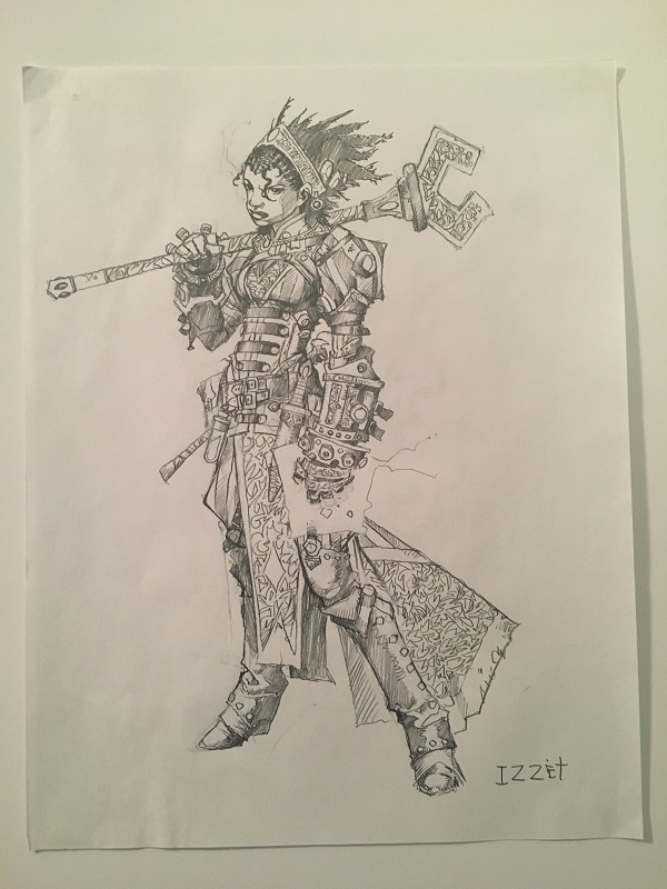
Also, we should note: since Return to Ravnica, the original concept art for an Izzet Guildmage was a black woman. I know this because I own the concept art by Wayne Reynolds. Compare and contrast the concept art with the art for League Guildmage. This is what you find in the style guides. Fun, huh?
Svetlin handled her hair spectacularly. Her facial shape is much more stylized than Magic normally is due to the favoring of hyperrealism, and I love it. Doug Alexander Gregory has a more stylized look these days and I'm happy there is still room for it in the game like Svetlin did below.

And did you know that Fun Isn't Dead Yet?
Humorous works are all over the set and more than just goblins too! Here a few fun ones I found that break the mold.
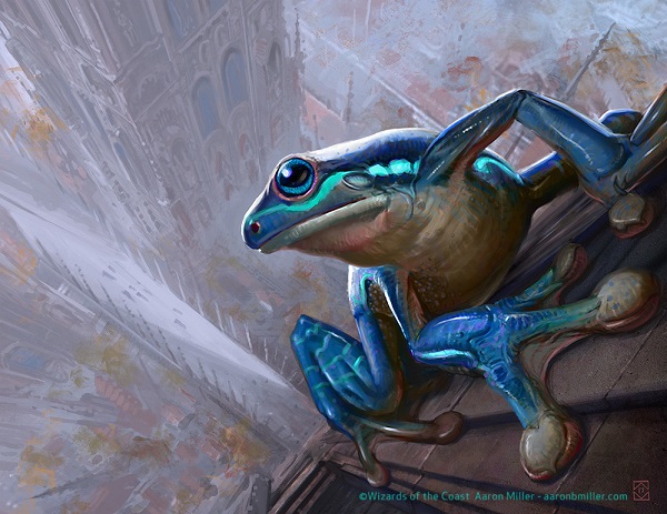
This frog is doing himself a look see.
Is Steve in the set? Ok, that's another iteration.
As if the main focus wasn't enough, the cats even love this indrik. It's a new Ravnica, full of bright life we haven't seen as much in earlier interpretations. I love the cats here.

Affectionate Indrik by Steve Prescott
Normally we don't see white being playful. They're the fascist color and clearly humorless, right? Victor did a great job showing the two-stage narrative while giving us some scale investigations on how buildings are made - plaster with brick, stone bricks, and arched windows.
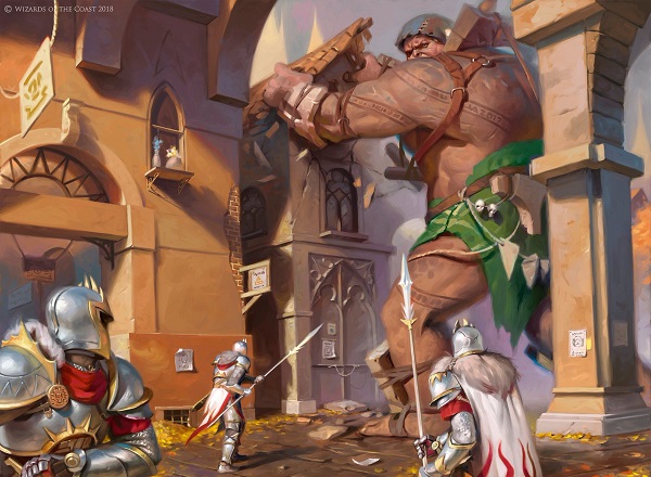
How much do you love his oranges contrasting with the giant's green clothing to make the focus of the piece pop off the page? Great work there Victor.

Remember how I mentioned Boros showing a better gender mix? Citywide Bust agrees.
Plus, Victor's reference pictures are always the best.
Bonus, photo ref. and maquette. pic.twitter.com/gmev1CQeWP
— Victor Adame (@victoradameart) September 19, 2018
Bonus, giant ref. pic.twitter.com/yZUKK3YUux
— Victor Adame (@victoradameart) September 19, 2018
The nonstop gif I've been seeing online sure is fun. I think it's the tongue and skateboard action.

As per any Ravnica set, to add whimsy, you need a goblin doing goblin stuff.
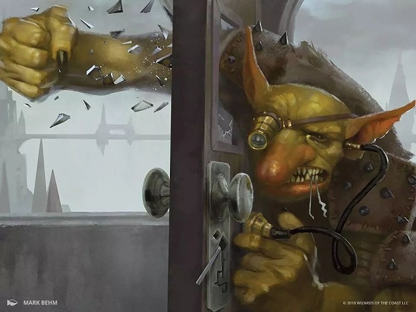
They do love fists on Ravnica huh? From Hammerfist Giant to Piston-Fist Cyclops and even Gravitic Punch, sometimes a weapon isn't as fun. This example by Behm uses the goblin, showing us a scene where he has the tools to pick the lock, then shows the inevitable conclusion when you give a goblin a job that requires finesse.
In the background, notice how a few simple brushstrokes places us on Ravnica. A single bridge with a solid line and thin triangles for the Baroque setting reinforces the height of the city. The window and the lack of screens or screendoors also tells us our current location. Minimal effort done to show a maximum amount of visual information.
On a personal level, I loved this art so much, I bought it.
He affectionately called it "Band Camp" and that feels so fitting. It's your squad. The squad.
Standout Artworks
As always, and as Ant Tessitore always stated, these are not necessary the best technical artworks in the set. Rather, think of good artworks with something notable where you should seek out a physical copy to put in front of your face. Armed with new knowledge, you can add a factoid to your FNM small talk.

Magic's history with conceptual, non-literal spells began in Alpha and continues in Guilds of Ravnica. The most notable example is Clint's work here. While the overall effect is hard to miss, I urge you to look closer and see the "blocks" exploding off the face.

The three daggers are directly from Return to Ravnica's reboot of Dimir being a visible guild. The solid line triangle is as well. Former art director Jeremy Jarvis wrote about it in 2012:

Twitter loves this artwork. Part of it is because of the updated Dimir character concept, which is amazing. Part of it is the intense focus on the character, yet not feeling like a character card. It's too plain. This is the most I've ever seen a spell that looks like a creature still work and avoid confusion. It needs to be a playmat yesterday.
As long as we're on Dimir, Joe Slucher has a pair of videos about 15 minutes each and they're fantastic and free!
An artist newer to the game, check out how Fossberg showed the effect of light:
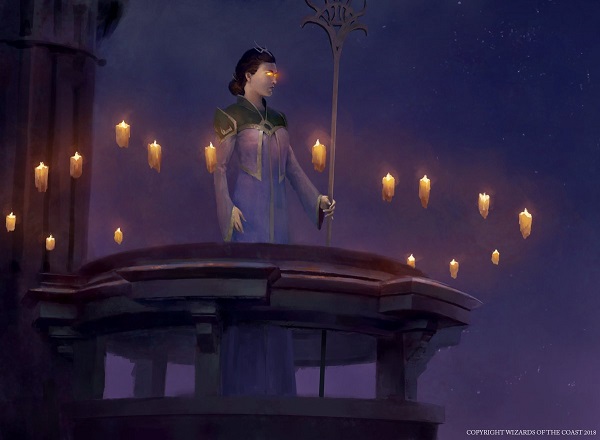
You have to see the art next to a foil card and I encourage you to seek one out. It's a card art you might entirely miss unless you have a foil. The area between the candles just glows, as if an oil painter started with an underpainting, then by adding layers above, they mix on the canvas. Alexander is a digital artist though, so his effect is the same concept except playing with opacities and making sure the color isn't so pronounced that it makes a purple/blue/orange blob. This is very difficult to do and not have that light make the art a jumbled mess at 2x3". It's quiet, it's simple and yet that technique is shockingly hard. Good work.

Howard knows how to make light blues pop. He and Chris Moeller covered all the umbra auras, a totem armor creation for Rise of the Eldrazi and since revisited. Howard's delicate usage of muted background tones, with light blues and whites as magical umbras are the precedent to the Dredge staple card Narcomoeba.
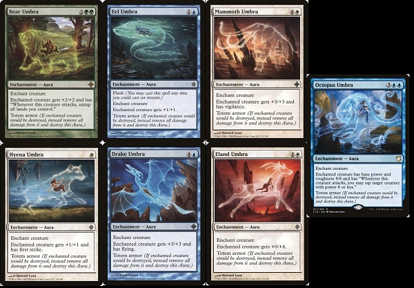
Howard added a little whimsy with the fishing boy, cat, and soft purples in his sky. Only in the Boundary Waters of Minnesota and non-cities of Canada are those colors of the Northern Lights/aurora seen, yet here they are on Ravnica. It's a fun piece; a whimsical take on a powerhouse playable card.
From a lighthearted Howard, let us move to a big dark mood.

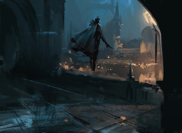
Now that's a mood. While the new Lazav is wonderful, Darek crushed this assignment.
I have very little to say because this sketch, this silhouette is Dimir to perfection. It showcases the city, and a silent assassin, a predator oversees like a hawk surveils his territory.
Using turquoise to show water with orange for the city? Darek lives in Poland. He knows the Czech influence, he doesn't live that far from it.
Sid's still very good. Sneaking in a Lord of the Rings reference with two people hiding in an archway? Clever move Sid.
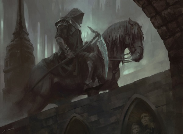
Whether it's the live action...

Image via New Line Cinema
...or the Bakshi original, it's a fun addition.

Image via Lord of the Rings by Fantasy Films, United Artists and Ralph Bakshi
And let us end this jaunt around Ravnica with the biggest October mood.

Dimir, you're the librarians of Ravnica. You don't speak much, but your visual narrative is driving this set and story forward. We should be looking to whether Jace defects as living guildpact and works with Dimir, reverting back to his old job as Infinite Consortium lackey, still wearing clothing that now fits closer to Dimir's aesthetic. That is all old news. Even without a story in place you can visually connect a major character to a guild.
I like this set and I cannot look away from what Dimir are doing. I have read zero of the stories for this set, nor have I looked into story spotlight cards on purpose and yet still I know the Dimir are significant by artists being asked to give us more. It is their set and I loved soaking it in.
-Mike