


Vorthos Wednesday, greatest day of the week. We’re together again to discuss the Vorthos trait of appreciation. I appreciate how some things in this great game of Magic: The Gathering never change—from windmill-slamming a drafted dragon, to saying how many you still had, to my boy, Giant Spider, being around for another core set.


Since the new format, Modern, is coming into fruition and not even listed on MtG Salvation’s wiki, let’s ask the most obvious change in these two cards: What’s up with the frame?
Discussing the borders and their change is nothing new. Mark Rosewater discussed it, Randy Buehler talked about it, and the forum Vorthoses yelled about it. I won’t repeat people because our time is short and I’m no longer nineteen, and I need to finish a paper on political philosophy for the morning. I’ll just reiterate a common message:
By being compliant, we have fully accepted this new frame.

Do I honestly believe that the modern card frame is good? Yes.
I think it has been successful in delivering every promised addition to the game possible. See Rosewater’s article for more information.
I say hurray to us for choosing new over old, because old is bad. New frames always trump the old ones. Usually. Except when the old ones are integral to the piece.
The Vorthos in me questions how a simple frame matters. I’m not the only one who asked this:
Art Focus
Jeremy Cranford, the then-current Magic art director, summed up his biggest problem with the old cards with a metaphor. He compared the card frame to the frame on a piece of art. A good frame focuses the viewer on the art, not the frame. The old Magic card frames drew too much attention to themselves and not enough to the art. – Mark Rosewater, 1/27/03
 |  |
Seeley was a Spectrum winner for best in fantastic art that year.
 |  |
These are both made by Magic art directors at WotC, and both were Spectrum winners.
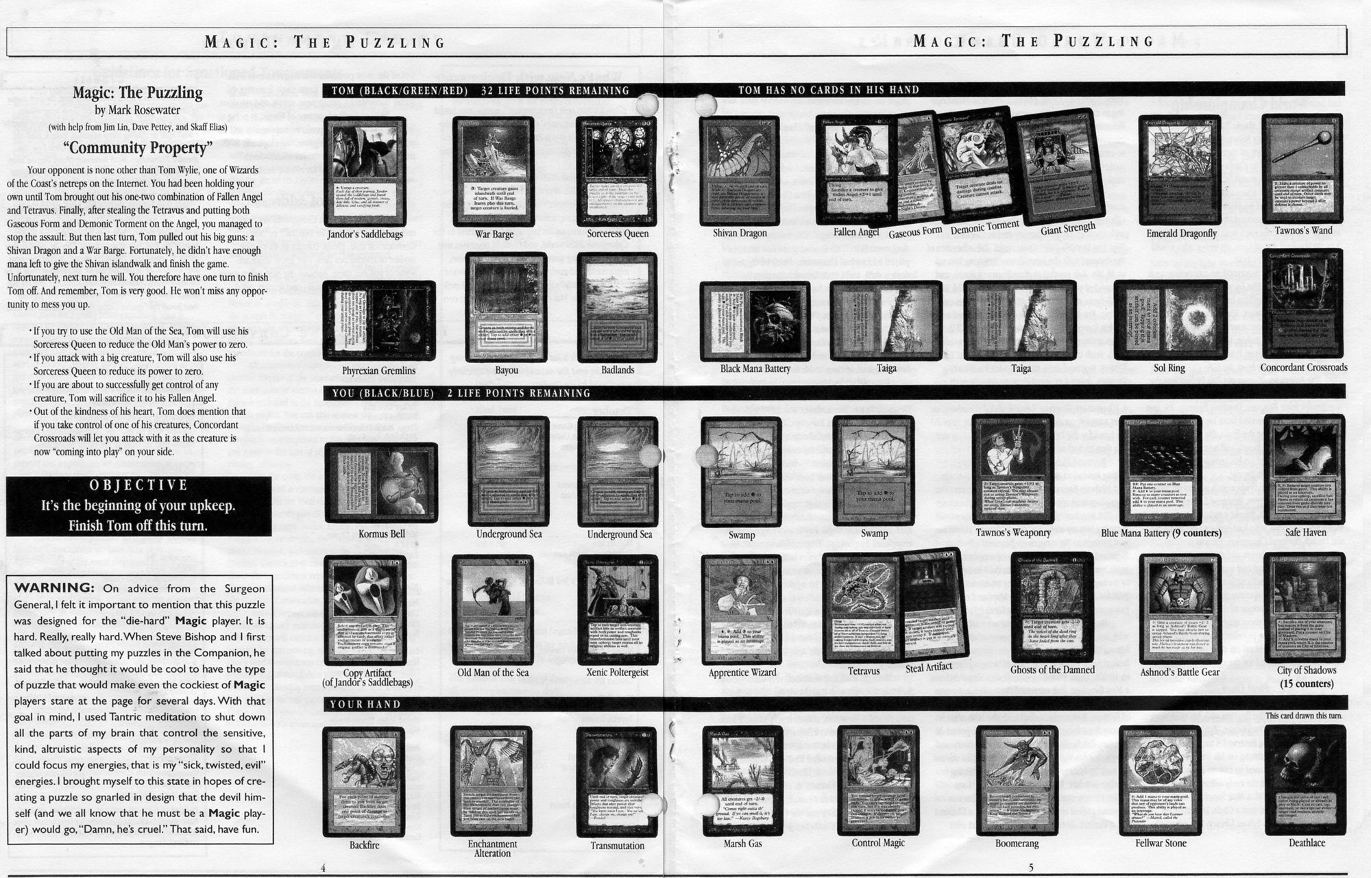
Are the new frames here transparent or antiseptic? They apparently allow your eye to focus immediately on the artwork, thus creating transparency. The gray is stark, and the art is stunning, this is quite clear. That’s not to say that Tedin’s and Seely’s pieces aren’t, but the game is one of retention, immediately gaining information from a glance of shuffling through fifteen cards in a draft or analyzing a very difficult board state such as Rosewater’s old Magic: The Puzzling articles in Duelist.
Unrelated picture of old school. Scanned image from the original, like a boss.
By changing the frame fully, it did focus the card and the art immensely, but in doing so, it closed a door on innovation until the next format emerges, post-Modern (hypermodernity?), and then you’ll be in just as much disarray as our current art scene. Slippery slope and Chicken Little combined all into one dystopia. Obviously.
Innovations have been subtle, and could continue, as I mentioned in a previous article talking about alterations.
The planeswalkers have used the card frame, but could a subtle color differentiation change a perception?
Say Chandra was lured by her ambition, could an infusion of black on her card somewhere be a sign of things to come?

The game was made in the early 1990s, and they rectified some of the early mistakes of using flat color, shown above, and integrated color schemes of gold and hybrid to give a full Vorthos holistic feel of cards.

Speaking of holistic, could the new frame be the postmodern view? Could the modern frame be integrated into the artwork? Would the cat be biting the plains mana symbol? Alterations are tackling this issue currently, as the any border can frame things. Every month in Cosmopolitan, an article discusses how to change your appearance to frame your face. Perception is reality.
To illustrate, this is a famous artwork Oath of the Horatiiby Jacques-Louis David painted in 1785.

This artwork is strong by itself. I won’t get into why it’s amazing; you’ll have to take my word on it or google it.

When a frame is added, the piece gains an element of professionalism. This piece is not sitting in a studio, it’s not in a gallery, it’s not even in your local museum. This piece is important, and the frame exhibits that. This piece sits in the Louvre.

Add to the meaning of the frame the size of the piece. The frame itself is over a foot wide. Imagine if the Magic border were wider or the frame more solid.
The frame matters. It matters a lot.
It matters so much that its value is exponentially higher and it’s deemed noteworthy when it does change.
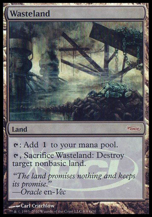
Since the card is now firmly in the modern frame, does an old frame add value? We’ll let another poster answer whether original art is “better” or “worse” for your pocketbook, but nostalgia is not to be discounted.

This card is now crazy expensive. Not only is it incredibly playable in nearly every Commander deck, this promotional card shouldn’t exist as printed; it should be in the modern card frame. I applaud Wizards for listening to Vorthos. Vorthos knows that despite the advantages the modern frame provides, sometimes you just want something to remind you of your first experience, to appreciate the old while embracing the new. Also, older cards weren’t in foil, allowing for Bizarro worlds where both promotional examples can exist, much to Vorthos’s delight:
 |  |
I would caution users to dismiss how significant this instance is. It’s new art with a new frame compared to the old art with a foil “idealized” form. Wizards now has Gospel of Thomas sitting in their lap. It, along with the other Apocrypha texts, does not always agree with the canon and should be read with caution. Wizards now has a precedent, and every Vorthos should be overjoyed that you can have your cake and eat it, too.
I’m off to continue painting. I have a dachshund and now a cat at my new apartment watching me. I can feel their gaze yelling at me to add things to the works!

Until next week, fellow Vorthoses!


