


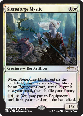
The new Grand Prix promo coming out of Wizards is begging for its art to be examined in depth.
I couldn’t wait to see this in higher resolution and learn more about the complex scene. I immediately got in touch with Johannes Voss and pleaded with him to have an interview about this piece.
It’s an artist interview; let’s go!
 In regard to art description for this piece, do you recall what it asked for?
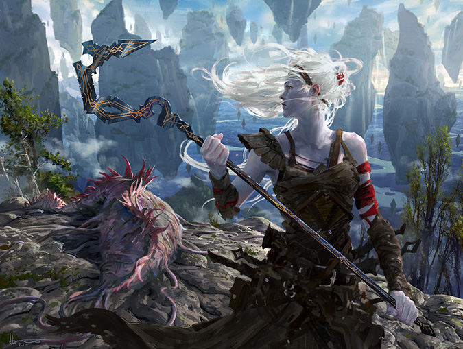
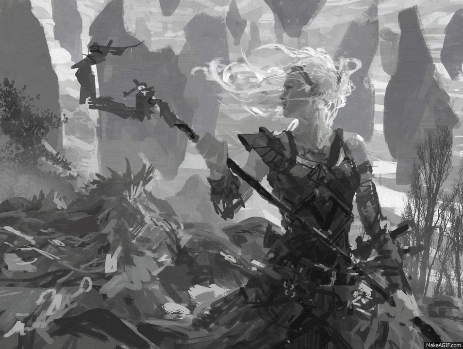
I don't remember it in detail, but it asked for a female kor standing over a dead Eldrazi and holding a stone-forged weapon, with the focus being on the relationship between her and the weapon she forged herself. It took me a while to realize that the name actually said . . . well . . . Stoneforge Mystic.
Ah, so it wasn’t just saying, “Here’s this card; please make it new.” Fun.
This kor woman super-tough and purposeful. What were you thinking when you read the art description? Can you walk us through your thoughts at sketch stage?
Obviously, the pressure was on with the card being as important as it is. At the same time, the fact that she had actually already slain her Eldrazi opponent in the moment we see her gave me a chance to avoid all the tired, super-kick-ass women tropes that I feel are just as objectifying than what we had before them. I wanted something human (well . . . kor-an . . . )
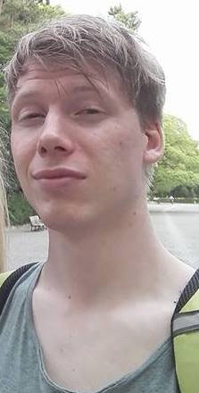
I think she wouldn't give much thought to how tough she is, as she's busy seeing her world overrun by monsters and doing her best to fight for it. That led me to the overall setup of her on a mountain summit, taking in the scenery and enjoying a single peaceful moment in the middle of all that chaos. My initial sketch even had her partially turned away from the viewer and looking at the setting sun, but I dropped that in favor of the more intimate shot on the mountain.
I love seeing initial sketches. Thanks for sharing!
Did you try to make any intentional differences from the original image?
I actually tried to not think about this at all. I had seen the original painting by Mike Bierek on the card, of course, which is an incredibly iconic piece. I feel that whenever you look at something before you start, it gets stuck in your head, voluntarily or not, and that affects what you do. As with Daybreak Coronet or Hero's Downfall, my goal when I paint something for a reprint is to see it as if it weren’t—I want to make a new image rather than a variation of an existing one. I would also feel that I'm disrespecting the artist of the original card—his or her work and vision does not need to be improved upon in any way, so I try to see it as a new card altogether, except that I now perfectly know the mechanics, which, of course, we usually don't.
Crowding out the senses for free yourself from influence. Smart!
What was challenging in making this piece?
It sounds nerdy since it is decidedly non-Magic-related, but I really wanted to capture the feeling of standing high on a mountain. I'm super-passionate about both rock climbing and mountaineering, and I had just gotten back from a month spent in the Canadian Rockies with my girlfriend when I started working on this piece. The impression of that high wilderness was still fresh in my mind. The feeling of the wind blowing, of the sky being just a little bit clearer, and of the air being just that little bit thinner, is incomparable to anything else, and I tried to channel it into the painting to convey all that the card is about: the character having fought the beast singlehandedly, being alive in just that moment, standing over the vast scale of Zendikar all around, taking back her own world.
What is your favorite part of this image?
The rock—sounds very nerdy again; I know. There's a small mountain near Vancouver that has a top that is just the most perfect granite with a few fir and spruce trees in between breaking it up. I don't even want to talk about how much time I spent on getting those rocks right the way I wanted them.
Sure, the Stawamus Chief mountaintop is known for rock-climbing!
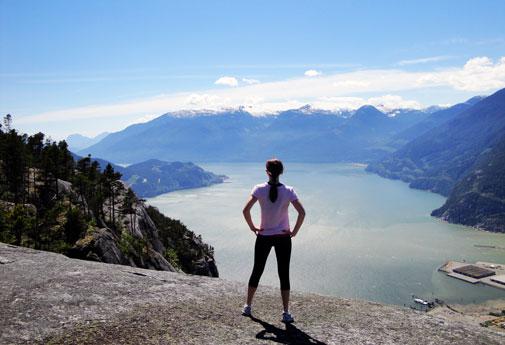
image via bcliving.ca
Did you have someone stand for reference?
No, I do basically all my work from imagination—I feel that reference used for only parts of the image takes away the consistency of the overall look. It's probably just my personal preference—a lot of people do great work referencing, and I could probably do with a bit more anatomic correctness, but at the same time, I don't want to sacrifice the strong vision of an image that you can build in your imagination when nothing else impedes it.
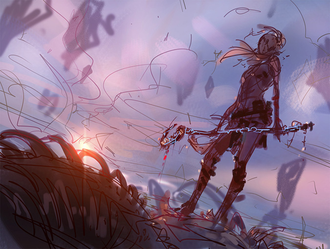
What is that in the background? Is that a dead Eldrazi?
Yes! That one was a challenge. A lot of their appeal—and what makes them Eldrazi-like—is their menacing presence, and you can't play with that when you're painting a dead one. So I tried to focus on the weight of it, lying flat and sprawled all across the ground. It was nice to be able to paint a foe that isn't the direct counterpoint in a composition.
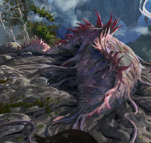
It looks fat and bloated, perfect for a dead giant creature. It connotes heft and size, which I think you did wonderfully!
I don’t think everyone knows that you’re a fully digital painter. What program did you use for this? Photoshop? Painter?
All Photoshop this time. I occasionally use IllustStudio for sketching and ideation, but in this case, I went in from a rough value block-in, I had the composition worked out in my head, and I wanted to focus on getting it absolutely balanced from the start. I find line drawings sometimes have pitfalls in that when you actually go into the painting stage, the weight may shift, and your image becomes too heavy in some areas or even tilts to one side. Starting with a value composition avoids that but brings other problems with it—construction and perspective are easier done in lines, and, for example, I'd never start an architecture piece with rough values.
Makes sense. Finding the lightest lights and darkest darks.
Are there prints available of this to purchase? If so, where?
Sure thing. I'll have them at with me at Grand Prix events where I'm signing. I'm also building an online store . . . soonish.
Do you have any plans to visit U.S.A. in 2016?
I'm still working out my plans for next year—but as I haven't done a GP in the U.S. yet, it's definitely on my list!
Ahem, tournament organizers. He’s available. Maybe someone could get him for two back-to-back weekends in America, and he gets vacation time between for him and his girlfriend!
You will probably have to sign and alter this card a lot from fans. Any idea in advance of what you would do?
It's going to be Restoration Angel all over again! I'm always happy to do that favor though. I play the game, too, and I know how much it means to have a card signed.
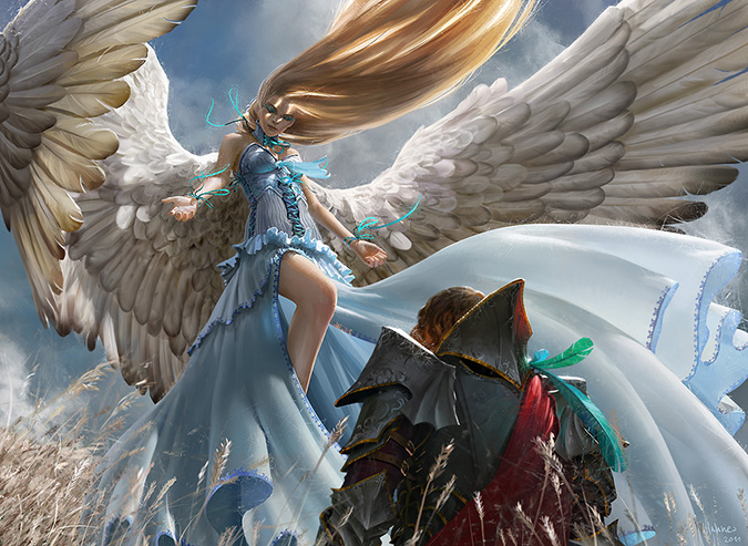
Restoration Angel by Johannes Voss
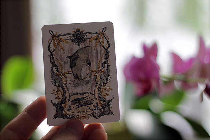
Switching gears, let’s talk your Patreon. Is it for tokens? How did that begin?
When I started designing tokens, I only did a couple, intending it as a little thing done just for fun, but the response by players was overwhelming, and so I kept going. At Grand Prix, players would just buy stacks of them, and so I started looking for a better way to get them to people, and I stumbled across Patreon. It's basically like a monthly Kickstarter—you choose a pledge amount, and every month you pledge, you receive a letter from me with new and different tokens. There're about one hundred fifty different ones now, about fifty of which are Patreon exclusives that you can only find there.
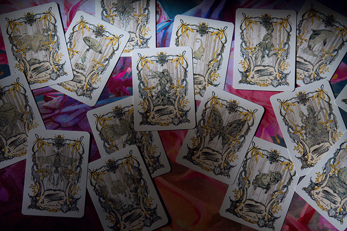
I see some traditional influences in the tokens, especially in the borders. I grew up in the Black Forest of Germany, and I feel I see some Grimm fairy tales graphic design on the edges of your work here, as well as other fairytale influence. Do you feel as though they're being influenced by something?
My commercial work is always fully painted, so when it came to doing something for fun, it immediately went into the direction of intricate, playful line work. I really enjoy that style but rarely get to do it because, for some reason, everyone in the industry wants realistically rendered paintwork. I wanted it to be different, and I guess that's part of the reason people really like the tokens. As for the influences, my being German might have left some fairy tales imprinted in my mind, but it's mostly a balance to what I usually do for work.
What are some things you are working on with the tokens? Any themes emerging?
Something that keeps popping up is silly humor—my mindset when designing new tokens is always drawing something for myself, not taking it too seriously, and, as a result, a lot of it is just what I find funny. I also always found the contrast between the atmosphere of Magic and the atmosphere of playing Magic interesting—you're dealing with dark fantasy worlds, death, and destruction, but when you're playing, you're most of the time joking around and trash-talking your friends. I wanted a bit of that in there, and as a result, I now have Elemental tokens insulting your opponents—before crushing them!
I hope a few folks will be able to see some new aspects of your Stoneforge Mystic. I love seeing progress images and how an artist digs into everything from lighting to blocking in color. I think more .gifs will be in my future in writing about art. They’re just so helpful.
If you still need a holiday gift, consider joining his token club! They’re mega-cool and would add some uniqueness to a Cube.
Thanks again, Johannes!
-Mike