


Greetings!
I'm writing this special column as a follow-up to Abe Sargent's excellent review of his Top 15 Commanderruminations header artworks. You can (and should) read it here.
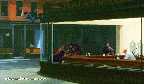
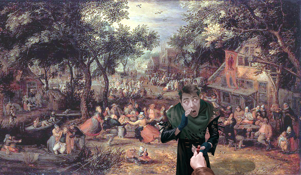
Every week my columns include a header graphic that is created by taking a famous painting and using image editing programs to put artwork from a Magic card into the picture. The example above is an old one that is made from a famous painting and not one, not two but FOUR pieces of artwork from Magic cards. Can you pick them all out? At the end of today's column I'll show you which cards went into that image.
Abe Sargent regularly produces well-written and thoughtful Top 10 and Top 15 lists and after seeing him write about his favorite land card artworks earlier this year I tossed out the idea of him looking at my header artwork. I've got over 150 pieces completed by now and was really curious about what a list of his favorites might look like.
Sometimes the "mashup" process is simple. Sometimes it involves a lot of layers, masking, fading, transparency, and tricks I've picked up in the 20+ years I've spent doing graphic design. It's fun and I was honored for Abe to agree to write about them.
Beauty is in the eye of the beholder, and while Abe picked a few pieces that I'm really proud of - Fblthp, the Lost and Golos, Tireless Pilgrim in particular - he also picked a few that I really don't think are in my personal top 50 much less top 15. I was thrilled to see that my best effort on what I felt was a sub-par week was still creative and interesting enough to catch the eye of someone with a lot of experience looking at and evaluating artwork.
I decided I would put together my own Top 15 list. I wanted to share some of my favorite pieces and also go into a little more detail on what was involved in creating some of these "mashups". I'll put numbers on them, but as with any list my personal favorites might shift from month to month or even week to week.
Before I begin I'd like to point you to the imgr.com albums where I've made these images available. Please take a look through them and see if any of my old Commanderruminations headers strike your fancy.
2017 Headers: https://imgur.com/a/72XiL
2018 Headers: https://imgur.com/a/Bw5n7
2019 Headers: https://imgur.com/a/sJgyOx5
Did you give them a look? Are there any you liked or even loved? Let's see if my Top 15 include any that you felt strongly about!
15. Death's Shadow
This piece was done for fellow NexGen Comics patron Michael Rapp. He won his first MagicFest earlier this year and I was quick to line up an interview with him. His modern deck ran Death's Shadow and I decided to create a piece for that column.

Death's Shadow is a card that sees fringe play in EDH in decks like The Mimeoplasm but isn't a mainstay of our format. I decided to take The Destruction of Sodom and Gomorrah by John Martin (1852) and use it for the background. I removed the two figures in the foreground and split the figure on the card from the monstrous shadow creature behind him.
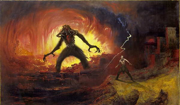
The result is much more striking and Michael even decided to have a playmat made with this artwork. I'm not sure it's brought him any luck but it made me happy to know that he liked it enough to want to play his games on it.
14. Karn's Temporal Sundering
In 2018 I started listening to the Commander Cookout podcast. One of its hosts, Ryan Peneff, had recently lost his job and was trying to make a go of it by producing and selling alters. I decided to see if I could give him a hand by writing a column about the process he goes through when altering cards. I sent him a Blood Moon and invited him to take his alter in any direction he wanted so long as he documented the process and provided me with enough details to allow me to write up a column.
Ryan chose a piece by Gustaf Dore, a famous woodcut illustrator. I wound up collecting some images of Dore's work and using them for a few of my header artworks. The unique woodcut style presented challenges that were fun and pushed me to modify the art from Magic cards in new and interesting ways.
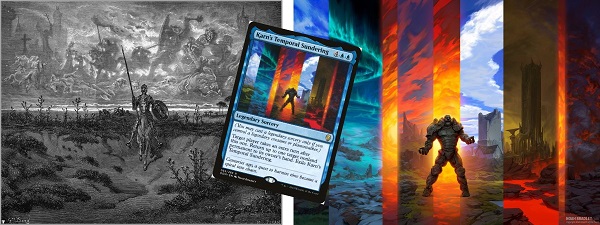
Abe happened to choose one of those woodcut style pieces for his list. I hesitate to include my own choice in this list. I love the original artwork for Karn's Temporal Sundering so much that I wouldn't go so far as to suggest that I improved upon it. I didn't, but I did make something new and interesting that I like very much.

I took a woodcut background from Don Quixote and put a rainbow overlay over it. Then I placed Karn into the center, gave him a shadow and a sun behind him. I think it's striking and I'm happy with it but I might still like the original art from Karn's Temporal Sundering a little more.
13. Whispering Snitch
Some of my mashups wind up being quite intricate. I have to do complex "masks" to separate the card art from the background and then I have to take part of the painting and set it up in the foreground so the final piece has the new character feel like it's a part of the scene. Not this one. This mashup was simple.
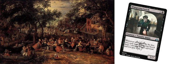
The original art was Kermis by David Vinkboons from 1605. My source material usually isn't quite that old and usually doesn't have quite this much activity. I decided to try putting Jason Rainville's Whispering Snitch into the foreground.
I faded the background so he would stand out and I gave him a shadow. The result makes me feel like our "Snitch" is separate from the scene behind him, but is also a key part of it. Maybe he's being given instructions to go murder someone, or he's been spying on one of the revelers and is reporting back to us on what he found out. This piece always sparks my imagination in ways that many of the other ones don't.
12. Darigaaz, the Igniter
I get a lot of my Magic card art from www.artofmtg.com. At one point I took a break from looking at recently released sets and took a spin through their archive of Magic Dragon artwork. A good mashup can be inspired by forms and shapes in the source material, by the perspective of the landscape or background I'm using or even something as simple as color tones.
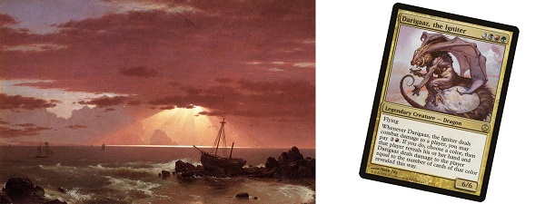
This particular header art took the well-drawn figure of Darigaaz, the Igniter by Mark Zug and married it with The Wreck, a painting by Frederic Edwin Church from 1852. I'm capable of shifting the colors in either the background or the Magic card artwork to try to get a final piece that looks like one seamless image. In this case I didn't need to do much at all for it to come out just right.
I don't know what Darigaaz is up to. I don't know if he had anything to do with the shipwreck or just felt like sitting on a rock and flexing for us, but I love the colors and the way the two halves of this came together. If only they could all be so easy.
11. Jace. Telepath Unbound
If Darigaaz was easy, Jace, Telepath Unbound was a challenge. I'm not sure what inspired me to marry his art with Thomas Couture's 1847 painting Romans in the Decadence of the Empire, but it was a fun and successful challenge.
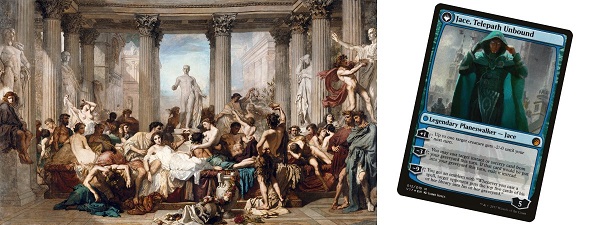
Jace wears a blue cape in the card artwork so I had to separate his cape from the rest of his artwork and then adjust the hue in its own layer. I wanted Jace's main colors to be closer to the blue in the lower left of the painting and I wanted his cape to match the tablecloth. Don't get me wrong - I have nothing against matching outfits but I felt like he might fit in better with a little fashion help. I also flipped him for some reason so he'd fit in better with the shapes around him.
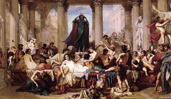
The final piece makes me wonder what Jace's reaction would have been if he had planeswalked into the middle of a Roman orgy. Would he be flustered beyond repair? Would he make polite apologies and beat a hasty retreat or throw caution to the wind and jump right in? Probably not the latter unless Wizards of the Coast as hired some new writers, but it's amusing to think about.
10. Timestream Navigator
This next one is a mashup that I have mixed feelings about. I love it, but because I'm the one that created it, I can see all the little places where I might have done things differently.
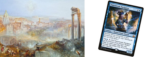
Timestream Navigator is a neat and creative card that I need to get a copy of. Because you can put it on the bottom of your library, it's perfect for a game-ending Tunnel Vision where you name a card and then mill yourself until you get to the named card. You follow that up by using Dread Return to put Laboratory Maniac on the field and then draw a card to win. There is often a Narcomoeba in the mix as well, but that's not why I loved this compilation.
When I merged Timestream Navigator with JMW Turner's painting Modern Rome from 1839, I extended the thin blue lines across the background. I then took the sections of her body that were framed by the blue lines and made the lower parts progressively more transparent. I'm not sure how obvious it is at first glance, but the intention was to make it seem like she was fading in (or out) of the current timestream. I even put her left elbow in a position where it's extended over one of the lines. It was a fair bit of work and while I wish I had lined up the intersections of the lines more carefully, I'm still quite proud of the end result.
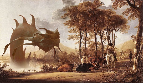
9. Arch-fiend of Ifnir (promo)
Some of my mashups have the Magic card art in the foreground. Some have the figure put into the middle of the layers. This next one has it so far into the background that it's easy to miss - especially given what's in the foreground.
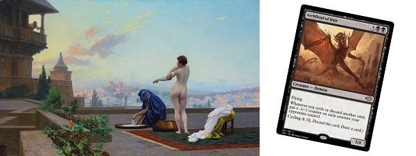
Jean-Leon Gerome's 1899 painting of Bathsheba bathing on a rooftop is the most racy classical painting I've used yet. The artwork is inspiring and I decided I shouldn't be the only one who had trouble keeping my eyes off of Bathsheba.
The insertion of this particular version of Arch-Fiend of Ifnir provided me with a perfect character in the middle of a perfect reaction. There he is, doing his best Godzilla impersonation, wrecking an ancient city when he turns and sees a beautiful lady having a sponge bath in the middle of the day. If I can interpret a Demon's body language I wouldn't say he's gawking or leering as much as he's just surprised and a little taken aback. The speech or thought bubble over his head might read "Hey now!" or "Hello there!" although he is a Demon so he might just as easily be sizing up his next snack.
8. Oros, the Avenger
Some classical paintings take a little extra work to fit a Magic card figure into, and some make it so obvious that the only question left is which Magic card to pick. Frederic Edwin Church's 1866 painting Rainy Season in the Tropics fits neatly into the second category.
When I went through my Dragons phase I knew I wanted to put Oros, the Avenger into a painting but it took me a while to realize that this gorgeous double rainbow landscape was the right fit.

Oros couldn't just get plopped into the center without any changes. After masking away the background of the card artwork I had to carefully lighten and tone the card so that it looked like it belonged in the mist at the center of the piece. The rock underneath Oros also had to be carefully cropped and faded so that it didn't look entirely out of place. It isn't a perfect fit by any stretch but I wound up really happy with the end result.
7. Warkite Marauder
As we creep toward my Top 5, I'm coming across more and more pieces that I could easily put in a higher position. This next one brings the character into the scene more effectively than almost any other mashup I've ever done and has an energy to it that is also unmatched.
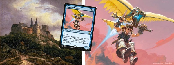
The Warkite Marauder is a wonderful figure, but it lacks context. Our hang-gliding Marauder is sailing through the skies, but where are they going and where did they come from? I tried to answer that question by pairing the card art up with a painting of The Castle of Bentheim by Jacob Van Ruisdael from the 1650s.
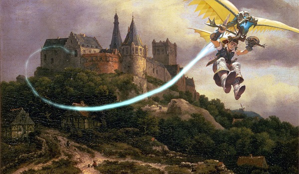
While extending the Warkite's thrust line all the way back to the castle might have been unnecessary, I really like the curve of that line and the resulting flow that it gives the final piece. I still don't know where our Warkite Marauder is going, but the mashup works for me in ways that are hard to put into words.
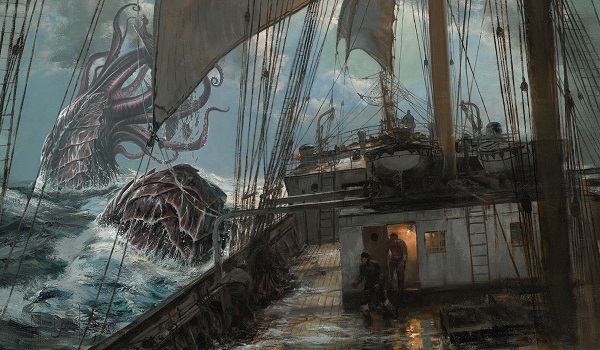
6. Stormtide Leviathan
While I had a fairly long series of Dragon inspired pieces, I also had a short set of mashups in 2017 that were inspired by sea monsters. Stormtide Leviathan might not seem like the most inspiring piece of artwork, and Seascape in the Morning by Simon de Vlieger from the early 1640s might not seem like a particularly inspiring painting, but sometimes the sum ends up being greater than the parts. I think this is one of those cases.
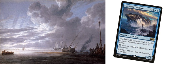
The key with this piece was getting the positioning and the lightness of our sea monster just right so it would fit into the background in a way that might initially go unnoticed. The story of the painting is no longer the shipwreck in the foreground or the life boat moving off to the left.
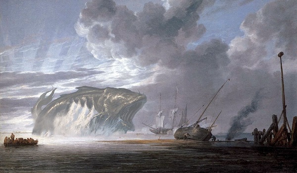
The new picture tells a very different story. Our Stormtide Leviathan is about to swallow a ship whole. I wound up really happy with the way it feels like it fits into the background like it was always part of the painting. Now we know what has been wrecking all those ships...
5. Hovermyr
I knew for months that I wanted to use Michelagelo's famous cherubs in one of my Commanderruminations headers but it took a humble little Hovermyr to inspire my fifth most favorite piece.
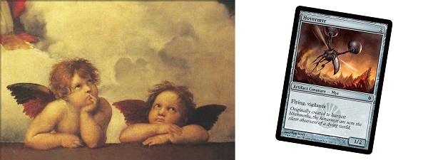
I'm not above making modifications to a classic painting if it will result in a better mashup. I decided to put our little Hovermyr at the top of the frame with a little motion line to show where it had been flying. I almost gave it a loopy path like Woodstock from Peanuts, but decided against it in the end. The second cherub did have to have a little work done on his eyes. It works much better with both of them looking up at the Hovermyr.
I should note that I have used www.inkedgaming.com to have playmats made from my artwork in the past. Sometimes I've been happy with the results. I had this piece done as a playmat and the result came out a little blurry - but I honestly blame the artwork I uploaded. The files up on imgur.com are 1200 pixels by 700 pixels and I think my cherubs might have been one of the few times that I actually started with background art that was a little too small. Online the image looks great, but my playmat feels like it's just a little lacking in detail.
4. Kraken Token
What? A token? I've got a Token in my Top 5 artworks? Seriously?
Actually, yes. This next mashup was one of the best ones I ever did because of how perfectly it all came together, after the long process of masking out and fixing the rigging of the ship.
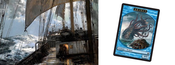
The image above looks quite modern, and is from A Night at Sea by Montague Dawson. Dawson lived from 1895 to 1973 so this may well be one of my rare pieces that shows a more modern scene.
When a mashup of a background painting and a Magic card comes together so well that it's hard for me to imagine the final piece without the added content, I know I've done something right. Now we know why those figures are coming out on deck. This is probably my most seamless work and the only thing keeping it out of the Top 3 might be the anonymity of the Kraken token. I mean really? A Kraken token made the Top 5? Look up at that picture again. You'd better believe a Kraken token made my top 5.
3. Emrakul, the Aeons Torn (concept art)
I used to blog over on my old Commanderruminations Wix site and this next piece is the one that pretty much started it all. I had the crazy idea that if I ever learned to paint I would love to take thrift store oil landscape paintings and insert weird characters into them. I then remembered that I've been using Photoshop since the early 1990s and I can do an awful lot with digital files.
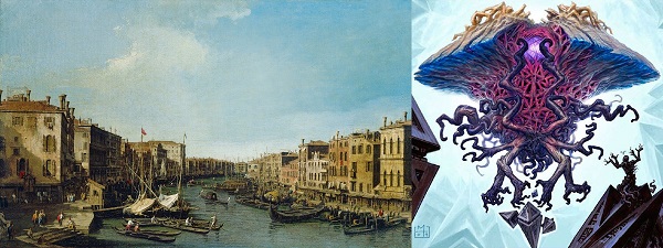
I came across some concept art of Emrakul by Mark Tedin, paired it up with Giovanni Antonio Canal's 1730 painting of Venice: The Grand Canal from the Rialto to the Palazzo Foscari, and the rest is history. Looking at this mashup every time I brought up the Wix blog site probably affected my opinion of the piece, but I do think it still stands up well.
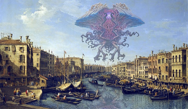
I faded Emrakul so that it looks like it is floating far off in the distance. The water has a flipped and rippled copy of Emrakul, faded and positioned so that it looks like a reflection. It's a technique I've used many times since then to better insert a character into the world of the painting. I don't know why I've never used this artwork for a playmat, but you can only have so many playmats, right?
2. Pearl Lake Ancient
My number two pick was also among the first mashups I ever did. I took Albert Cuyp's 1658 painting River Landscape with Horsemen and Peasants and married it with the artwork from Pearl Lake Ancient by Richard Wright.
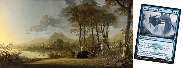
I wound up adjusting the tones in both the background painting and the inserted Magic artwork to achieve a really nice sepia feel. The Pearl Lake Ancient is no longer anywhere near as large as it is in the original card artwork, but has been given more character.
Our Pearl Lake Ancient might now be a wizened creature able to share prophecies or ancient lore, perhaps in return for one of those tasty cows? I think the colors of the piece are what really do it for me, and I'm confident that this would make for a pretty amazing playmat.
1. Ramos, Dragon Engine
Speaking of playmats, I've been rocking my number one pick as a playmat for the past year and I've loved it. I used to have a Squee, Goblin Nabob playmat, but when I had this one made I gave away my Squee mat to a young player at our LGS and haven't looked back.

I went to school out in western Massachusetts at the University of Massachusetts in Amherst, MA. My final pick uses an 1836 painting of The Oxbow by Thomas Cole. The painting is a view of the Connecticut river from Mount Holyoke after a thunderstorm is just passing by. I love Western Massachusetts and I love Northampton. I even spent many an evening at the LARP padded weapon fight practices at Mount Holyoke College in South Hadley back in the early 1990's.
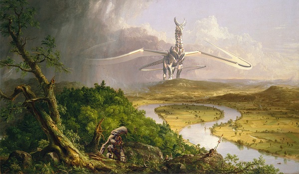
My choices for card artwork to mix with this wonderful painting were Ramos, Dragon Engine and a Myr Token. I chose Ramos because I just love the card, I'll maintain that he's one of the best 5/color non-cEDH commanders ever printed. I've written more about Ramos than about any other legendary creature and I even bought a special deck box and special dice to let me track my ![]()
![]()
![]()
![]()
![]()
![]()
![]()
![]()
![]()
![]() mana so when I play Ramos and "go off" I'm able to know exactly what I'm spending and what I have left in my mana pool.
mana so when I play Ramos and "go off" I'm able to know exactly what I'm spending and what I have left in my mana pool.
The Myr token in the foreground is not just an afterthought. I love Myr, but Ramos doesn't care a whit about colorless spells. My little foreground Myr is looking back at big old Ramos, sad that he isn't going to join in the fun and get to help power a Ramos deck.
I wound up extending Ramos' right wing with mirrored artwork of his left wing so that he would have a full wingspan, but faded it so that it was less visible through the thunderstorm. I've played a lot of games with this as my playmat and I couldn't possibly love it more.
Final Thoughts
That's it. My Top 15 might change from week to week but this is a pretty good sampling of what I think my best work of the past three years is. Abe's favorite 15 was a wonderful read and reminded me that putting my best effort into each week might not always make me feel perfectly satisfied, it might make someone else happy to see a favorite card (or token) presented in a new and unique way.
I promised I'd tell you about the art I used for today's column. The background piece is Nighthawks by Edward Hopper. You've probably seen it with Humphery Bogart, James Dean, Marilyn Monroe and Elvis Presley, or any of a number of other versions.
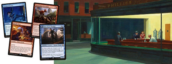
The cards I included are Daring Saboteur, Rowdy Crew, Rampaging Ferocidon and Jace, Vryn's Prodigy. Could you name them all? Did you notice that the advertisement above the diner was changed to "Ixalan Diner"? I had a lot of fun with that one, and given how much time I'm spending on it you can think of it as an honorable mention for today's list.
If this gets posted on a Tuesday, rest assured that I'll be back next Monday on my usual schedule with another installment of Commanderruminations. Whether you come for the artwork and sometimes read the column, come for the column and sometimes notice the artwork, or genuinely enjoy them both, thank you for spending the time to read my work.
If you do fall in love with any of the images I've created, feel free to grab them out of those imgur.com albums I posted at the top of today's article. If you go so far as to make a playmat, make sure you're using the 1200 x 700 versions. That's the best resolution I've got available and I was very happy with my Ramos playmat, even if my Hovermyr one felt like it came out a little blurry.
One last note - I will be at CommandFestDC and I'm planning on giving away at least one of my playmats. I'll be playing casual Commander games all weekend long. All you have to do is introduce yourself and share a game with me. I'll have the Hovermyr and Ramos playmats and would be thrilled to be able to pass either one on to a reader.
Thanks for reading and I'll see you next Monday!